|
| Group |
Round |
C/R |
Comment |
Date |
Image |
| 35 |
Jul 20 |
Comment |
To my eye the composition is very well crafted. I feel that the entire image is interesting but my eye is clearly drawn into the open end of the dock. For me the notes you shared are important, it allows me to learn. Too many inputs month after month give the viewer no ability to learn and improve. |
Jul 13th |
1 comment - 0 replies for Group 35
|
| 88 |
Jul 20 |
Reply |
OK, but keep in mind that the pedestrian was already in the picture. Getting him back in is an easy trick in either PS or On1. The gull will be much more work to get right.Also, can you take a crack at my Q? I'm still curious. Thanks for the dialogue by the way! |
Jul 13th |
| 88 |
Jul 20 |
Reply |
Thanks for the tip. I'll try that. |
Jul 10th |
| 88 |
Jul 20 |
Comment |
Rajani, this is another incredible image. I have several questions, the answers of which might be useful to all of the group.
Since this is a pano with multiple shots, you obviously were using a tripod. It appears that the tripod is in water and there is movement (waves) to the water. How did you keep the tripod from moving as the sand or light stone under the tripod shifted with the waves? With so many shots did you use PS to create the Pano? Did it stitch automatically or did you choose the stitch method that was best to render this image? I assume that you were in manual mode as most panos are shot that way. What shutter speed, ISO and f/stop did you use to capture this image?
Of just interest to me, why did yo not choose to shoot one more image on the left so that the island was not cut off at the edge of the image?
Thanks again for sharing these great images. |
Jul 9th |
| 88 |
Jul 20 |
Comment |
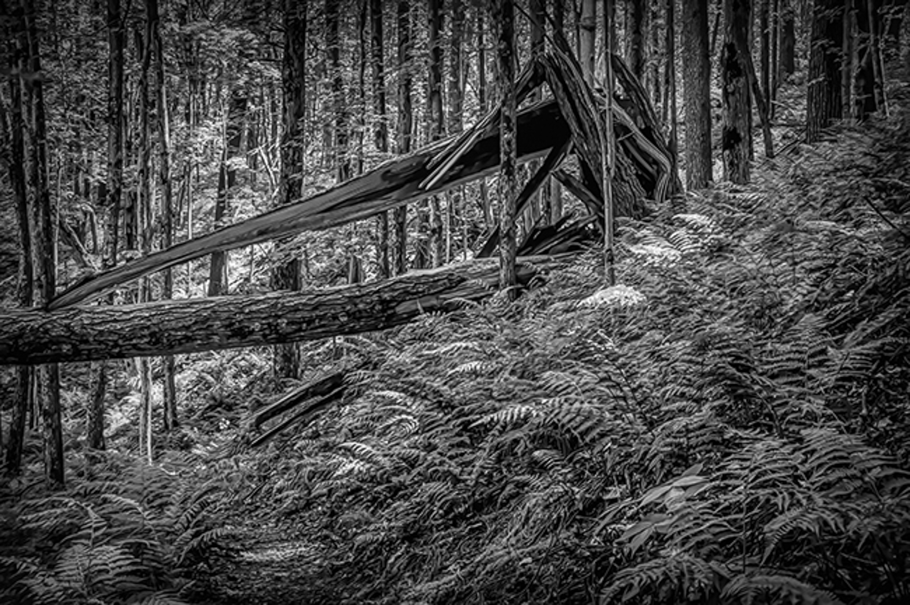
Trey, to my eye you have done a good job in post-processing and conversion to B&W. I feel that the detail in the foreground ferns adds to the quality of the image. I believe that you also strengthened the image by cropping out the bright ferns in the lower right.
I have been told by several very good photographers in PSA that in the Western Hemisphere the viewers prefer flow of the image from left to right. I have in fact flipped images and had them do better in exhibitions. For me, my eye kept following the ferns up to the break in the tree and then out the right side of the picture. So in the VF I just flipped in Horizontally. What do you think?
Also, you said that you shot at a shutter speed of 1 second. Was this on a tripod to get the sharpness that you achieved?
Thanks. |
Jul 8th |
 |
| 88 |
Jul 20 |
Comment |
Scott, from my experience you have done a good job in post-processing of creating the right light - that is, bringing out the shadowed areas so that the full image can be seen.
To my eye it is harder to determine where you wish the viewer's eye to come to rest. What is the fixation point you desired. For me my eye travels left to right from the tree on the left and its reflection over to the strong tree on the right.I am very interested to know where the eye of the creator - you - fixes when you look at the image?? |
Jul 8th |
| 88 |
Jul 20 |
Reply |
Yes, also a good suggestion. I like it! |
Jul 6th |
| 88 |
Jul 20 |
Comment |
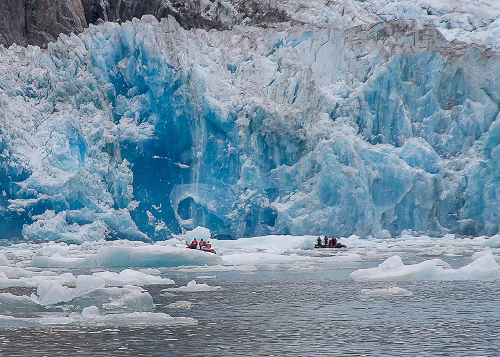
To my eye you have done an excellent job with the depth of field the exposure and the color of the ice and water. For me this brings back memories of our own excursion into Glacier Bay and the immensity of the ice flows. I believe that you have done a good job of avoiding and distractions to the viewer's eye.
I feel that you can strengthen the fixation point for the viewer's eye and emphasize the enormity of the glacier by cropping in tighter and placing the boats on the lower "2/3rds" point. I took a shot at that in the 5x7 ratio VF I have attached. It will look better on your own higher res image. Tell me what you think. |
Jul 6th |
 |
| 88 |
Jul 20 |
Comment |
Charles, to my eye I like elements of both images. I know from our work together that you prefer bold saturated colors. But for me this works only on the top half of the image. From my experience the color of the water in the revised image is not believable.
I think that since you want to capture the repeating patterns of triangles that you might try this image in B&W - where shape is emphasized. For me there needs to be something that stops the viewer's eye from traveling off of the page. It seems to me, that putting the closest pedestrian back into the scene might help stop and hold the viewer's eye at that point.
You said in your email that you are trying to be mindful of what the image does to the viewer. So the question I have is this. Is what it did to me what you expected it would do, or something completely different. i would be curious to know BUT on the other hand your simply thinking about my question might be useful in the future.
I think you are on the right track - ie thinking about what the viewer takes from your image.
Hope this helps. |
Jul 5th |
| 88 |
Jul 20 |
Comment |
Normally I assess the images in the order they arrive but I was taken by your work here and wanted to comment as soon as possible.
To my eye you have done an excellent work in turning an average original into a stunning final image. I feel that the cropping you did greatly improved the composition. That, together with the "realistic" saturation (something too many people do not get right) and colors of the foreground Aspens, draws and holds my eye right in the center of the image - looking back and forth from trees to hills. From my experience the shadows in the midground and background hills is spot on.
Well done! |
Jul 2nd |
6 comments - 3 replies for Group 88
|
7 comments - 3 replies Total
|


