|
| Group |
Round |
C/R |
Comment |
Date |
Image |
| 34 |
Apr 20 |
Comment |
To me this shows great creativity and makes an interesting activity of conjuring up the story that goes with it. I find the colors delightful and believe tat the post processing work to put these together is very well done. |
Apr 13th |
1 comment - 0 replies for Group 34
|
| 52 |
Apr 20 |
Comment |
To me this image has a wonderful blend of colors that play off against each other. I feel that they add to the main fixation point for the viewer's eye - the falls and stream. Looking at Mike's version, I believe that the desaturation of the green is a good move but I would not change the water. In my opinion the DoF also works well with the slightly softer (to my eye) rocks and flora in the background. |
Apr 13th |
1 comment - 0 replies for Group 52
|
| 88 |
Apr 20 |
Reply |
I made some adjustments to my image per comments from Sharon and from you. The final image is in my reply to Sharon. |
Apr 12th |
| 88 |
Apr 20 |
Reply |
I Did some work in Vivenza but saw more change in the stream with On1 Photo Raw Dynamic Contrast masked just to the stream. I also add a Vignette in On1 and this is what I got. |
Apr 12th |
 |
| 88 |
Apr 20 |
Comment |
Rajani, to my eye this is an excellent image and a great example of what can be achieved with a High ND filter. To me the colors draw my eye and hold it at the cottage. The DoF is perfect with the crisp grass (but not too much of it) in the foreground and the details in the background.
I believe that the out of focus tree on the right should remain as it is - I do not feel that it is a distraction that a "partial tree" in focus would present. For me the tree on the left could be left or taken out but given that indifference, in my own images, I tend to leave things in.
Your work is so good! If you could share more details of your post processing work I am sure that all would benefit. Have you entered this in any Exhibitions? |
Apr 9th |
| 88 |
Apr 20 |
Comment |
Trey, to my eye both the composition and the light are well done in the final image. I believe that by bringing out the color of the barn you have created a fixation point that holds the viewer's eye. For me this scene brings back memories of winters growing up in western PA and tromping through fields like this during extended small game season.
I really appreciate the details you have shared in the post processing. One question - were the presets all applied at 100% Opacity or did you back them off somewhat to blend the new look with the original?
It seems to me that the post-processing has created a "halo" just above the trees that was I cannot see in the original. If that is the case keep in mind that in PSA Exhibitions judging (if you enter those) that they often downgrade images with halos.
Thyanks for sharing this image! |
Apr 9th |
| 88 |
Apr 20 |
Comment |
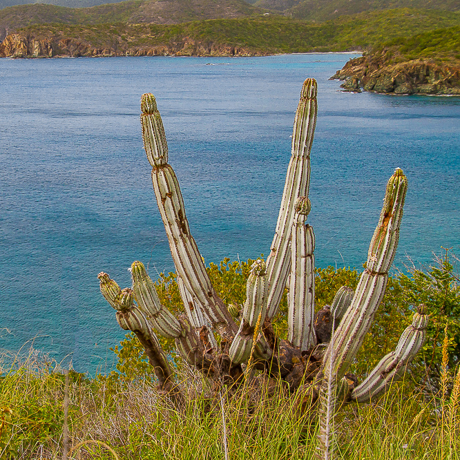
Lou to my eye you have done a good job in this image with DoF, sharpness and color. I feel that you have captured a fixation point in the foreground with the cactus supported by the coastline in the background. I feel that this image is a good example of not needing to cover the entire tonal contrast range in an image - by using a wide variety of color contrast.
From my experience I feel that Charles and Trot have made good suggestions. To remove the left to right imbalance I piut this into LR and change the ratio to a 1x1 - square - image. To me this removes the unnecessary parts of the image and further focuses the viewer's eye on the Cactus. I also removed one out of focus stalk. Tell me what you think. |
Apr 8th |
 |
| 88 |
Apr 20 |
Reply |
The river made a bend to the left I believe.'so even though it appears that I am on the left bank I am actually on the right. I actually
Lightened the rock shadows but I'm reflection I think you are right; they should be darker. |
Apr 7th |
| 88 |
Apr 20 |
Comment |
Scott, I like the way you have put together the two shots to yield an image of the entire valley. I believe that you have framed it well with the foreground trees, the distant mountains and the clouds. To my eye the image appears sharp and the colors are realistic - making this image a perfect rendition of what you saw.
In his book "The Art of Photography" Barnbaum talks about being aware of the difference between what the mind sees through the viewfinder and what the viewer sees in the final image. It seems to me that you saw the entire crater as one continuous "entity." The viewer sees the image with a strong shadow though the crater that breaks up the continuity of the crater floor. To my eye, in this case, it still works. But always keep thinking about how a strong shadow in the center of an image might change what the final viewer sees and thinks of the image. |
Apr 6th |
| 88 |
Apr 20 |
Comment |
Charles, to my eye this is a very pleasing and well constructed image. I believe that it must have been shot at or near the same time as your image of the college several months ago.
I feel that you have learned well how to bring out the color of the barn to enhance the picture! It seems to me that many people would tell you to crop either down to take out sky or from the right to reproportion the image. To my eye it is good the way it is and should not be cropped at all.
In my opinion the brightness, the color and the sharpness are well done. Good Job! |
Apr 5th |
5 comments - 3 replies for Group 88
|
7 comments - 3 replies Total
|


