|
| Group |
Round |
C/R |
Comment |
Date |
Image |
| 9 |
Dec 19 |
Comment |
From my experience this shows great creativity. I believe that the singular color of red on the black background adds nicely to the effect. |
Dec 5th |
1 comment - 0 replies for Group 9
|
| 52 |
Dec 19 |
Comment |
To my eye you did an excellent job in capture and post-processing of get the right sharpness and depth of field on this little guy. To me the colors are very natural. I feel that you chose the exposure settings well and got the brightness of the bird right without over or underexposing the water. Makes we want to go out and buy the 100-400 lens. |
Dec 5th |
1 comment - 0 replies for Group 52
|
| 88 |
Dec 19 |
Reply |
Yep, I like that! |
Dec 8th |
| 88 |
Dec 19 |
Reply |
I took your suggestion and softened the trees but not the water. I decided to keep the telephone pole. I do not feel it is a major distraction and am trying not to overly "sanitize" my pictures. |
Dec 8th |
 |
| 88 |
Dec 19 |
Reply |
My "psychic" has been impacted by PSA judged exhibitions where the more complex the image the better it does . BTW I'm not convinced that is right but it seems often to be the way they respond. So my Q would be, could you effectively have two good points of focus, the painter and the mountains? Just a thought. |
Dec 6th |
| 88 |
Dec 19 |
Comment |
Lou, to me this image shows some creative thinking on your part. I think you did a good job of positioning the easel to provide an interesting foreground without blocking the landscape - which I feel is the main subject.
It seems to me that the image would be even more interesting if you had been able to capture the artist at work at their easel. It may, in my opinion, have caused the viewer to remain longer pondering the image and what the artist was trying to do. To my eye the mountain in the background is less sharp less the foreground and the sky above it.
|
Dec 6th |
| 88 |
Dec 19 |
Comment |
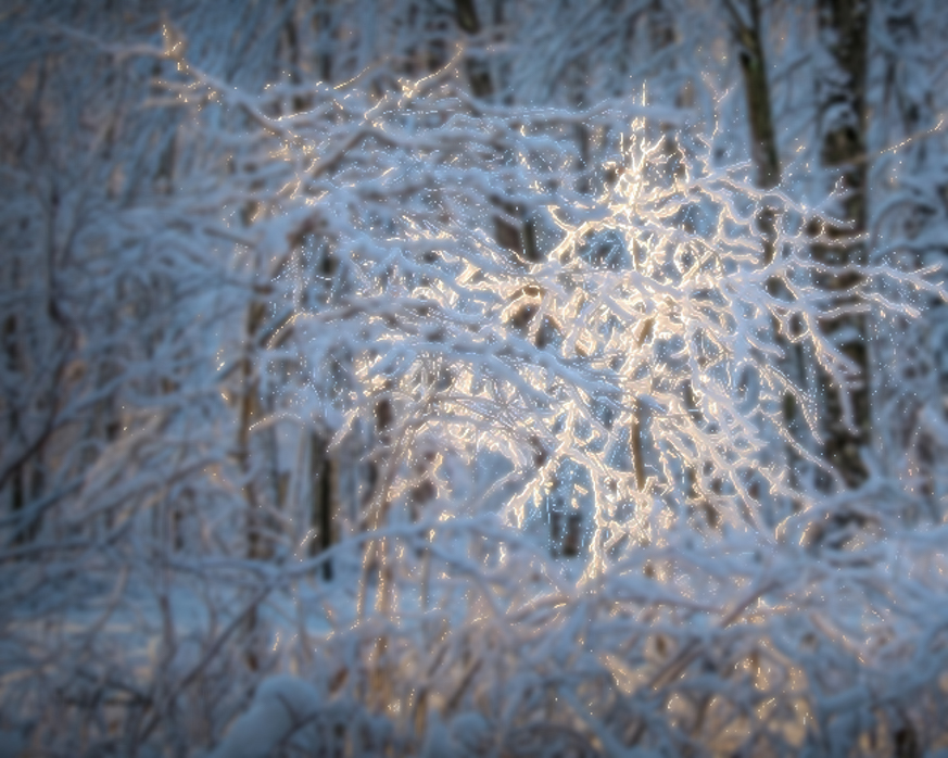
To me I applaud the creativity and your ability to see this lighting. To my eye the exposure and sharpness look correct. I feel that the color balance is also well done.
From my experience the depth of field is too great so that the viewer's eye has a hard time landing on the intended subject even though it is the brightest portion. In the VF I placed the image into On1 Photo Raw 2019 Effects. I created a Luminosity filter that blocked the bright tree. I then used the slightest (+2) Gaussian Blur on the rest of the image. I feel that it makes the brightest tree pop out from alk the others. I would be interested in your thoughts. |
Dec 5th |
 |
| 88 |
Dec 19 |
Comment |
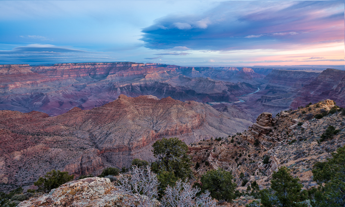
To my eye the sharpness and the depth of field are well done on this image. To me the sharpness of the city buildings together with the mid-ground mountains softness and Mt. Hood rising up behind them brings great depth to the image and lets the viewer's eye move from front to back. I feel that the contrast with the city adds more beauty and grandeur to the mountain.
From my experience the saturation of the sky may be too much anbd can possibly be backed down toward the original saturation just a bit.
Nice job! |
Dec 5th |
| 88 |
Dec 19 |
Reply |
I have found the latter to be an issue in the past. I feel that the monitor brightness can be deceiving. I now keep mine just below half. What is more telling is the histogram for the image. I try to get my subject about 1/3 in from the right on most images. |
Dec 5th |
| 88 |
Dec 19 |
Comment |
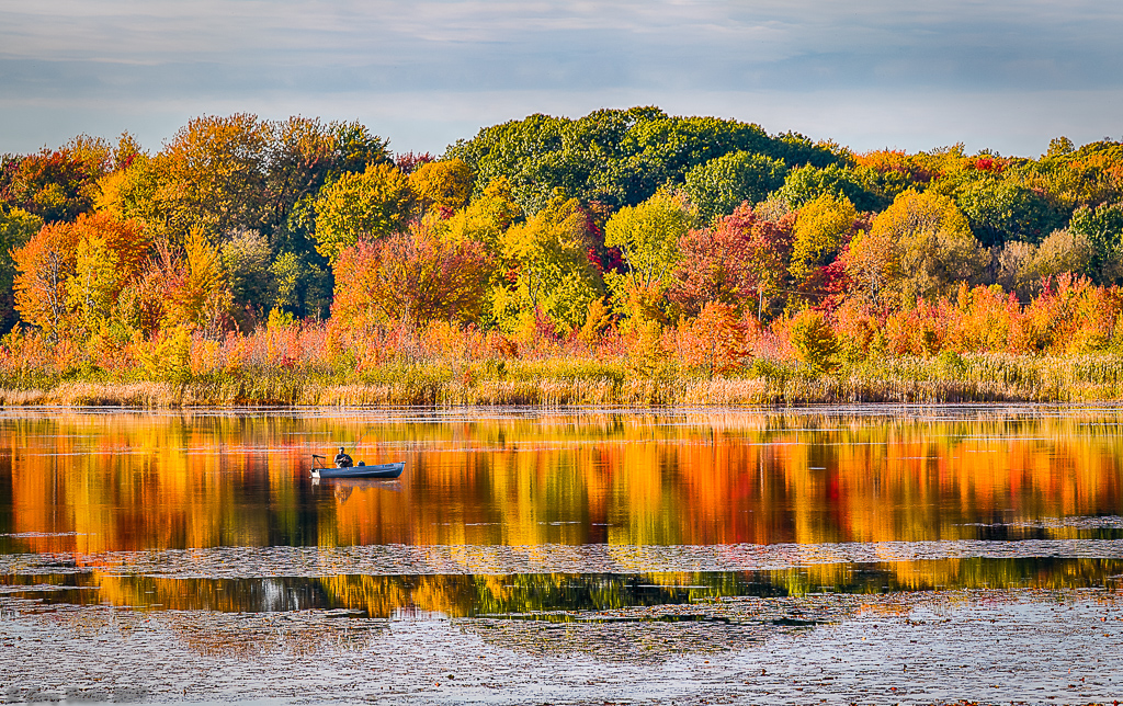
Scott, in my opinion this is a shot that is very pleasing to the viewer - it makes me want to be there to see this. I believe that you have done an excellent job with Depth-of-Field, Brightness and Sharpness. I feel that the enhancement to the sky color improves the image without making it appear overly saturated.
To my eye you are dealing with the samne issue as my image this month - too much ledge in the lower right foreground. I feel that to simply crop on the right would lose too much of the beautiful sky color. In the VF I put your image into PS. First I created a separate layer for the sky. The I moved the sky to the left - and cropped on the right. It seems to me that this brings the viewer's eye more onto the desired topography and yet retains the nice colors of the sky. Let me know what you think, |
Dec 4th |
 |
| 88 |
Dec 19 |
Comment |
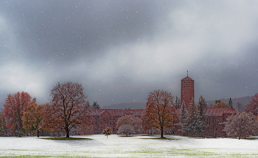
To my eye Charles this is an image with excellent timing (when you captured it) and excellent composition. In my opinion the "moody" skies in the background, the grass through the snow in the foreground and the beautiful architecture create three very strong layers. I feel that the position of the building among the trees pulls in the viewer's eye to the desired fixation point and holds it there.
It seems to me that Francis Hall is not bright enough to create the optimal contrast with the sky. In the attached VF I have placed your image into On1 Photo Raw 2019 Effects.I created a Luminosity Mask that blocked everything except Francis Hall and the trees. I significantly brought up the Shadows and increased the "Small" areas Dynamic Contrast quite a bit. See what you think.
Aweome Image! |
Dec 4th |
 |
5 comments - 4 replies for Group 88
|
7 comments - 4 replies Total
|


