|
| Group |
Round |
C/R |
Comment |
Date |
Image |
| 1 |
Aug 19 |
Comment |
For me you have done an excellent job of capturing this frog in a way that fixes the viewer's eye on him. I feel that the depth of field with the softer background supports this. I feel that the yellow leaf in the background adds some color harmony without being distracting. |
Aug 4th |
1 comment - 0 replies for Group 1
|
| 88 |
Aug 19 |
Comment |
Yes, I think that is a fair comment. I will have to see how far I can pull it without losing the wall coming out of the bottom corners. |
Aug 7th |
| 88 |
Aug 19 |
Comment |
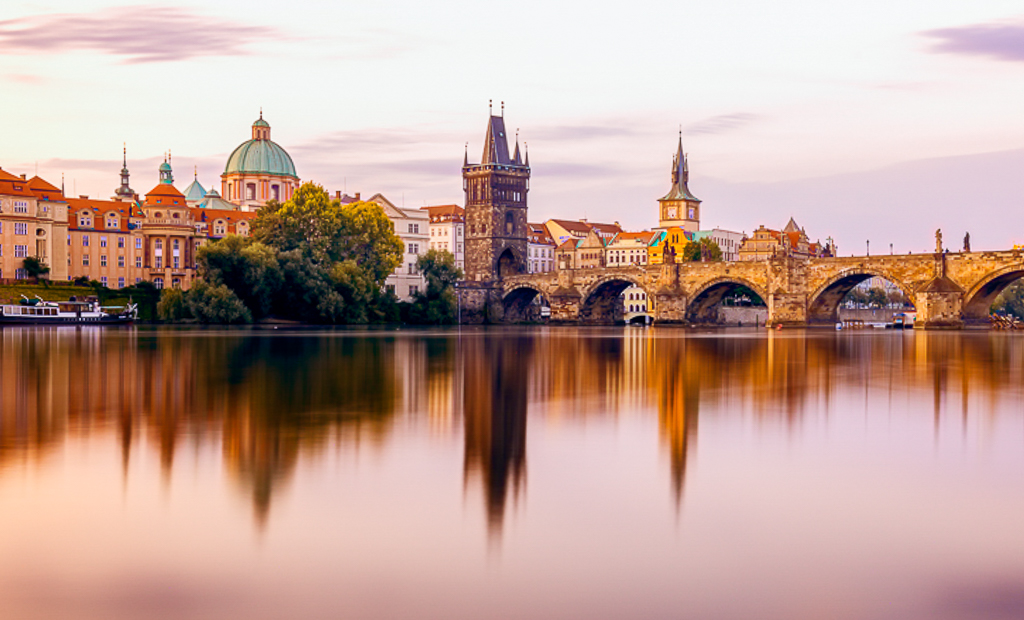
For me this brings back great memories of my time in Prague. I think you have captured a unique view of the city - as most people tends to shoot the bridge and the castle. I believe that the city and the bridge asre the intended fixation points and that is where my eye landed. To my eye the exposure and depth of field are well done.
It appears to me that your color balance has left the image warmer than any sunrise would truly be. (In the VF I have brought it back cooler a bit.) To my eye the two extra spans on the right add very little to the image and can be a distraction to the viewer. I feel that four sections and less water can keep the viewers eye more focused without losing anything. (Also in the VF.) |
Aug 6th |
 |
| 88 |
Aug 19 |
Comment |
I think that technically you have captured the shot well - it is Sharp, all parts are in Focus and the Colors appear to me to be natural. I feel that the highlights and shadows are correct.
Sumit, it appears to me that there is no fixation point for the viewer's eye to go to. I believe that the pier - the topic of the image - needs somehow to occupy a larger portion of the frame. Perhaps in Finishing you could recrop to bring greater attention to the pier. |
Aug 6th |
| 88 |
Aug 19 |
Comment |
Scott, for me this brings back great memories of walking this canyon, being stunned by the shapes and colors and trying to duck the myriad of other people in there doing the same thing. I believe that you have chosen a good formation - pleasing to the viewer's eye - and have captured very well the all-to-rare shaft of light that makes it to the floor.
To my eye you have given up some of the beauty of that shaft by reducing the contrast between it and the background walls. I feel that there should be more tonal contrast in the background. From my experience the walls are a bit more orange and less red - but that could be a difference in time of day or of year.
I would love to be there again, for an hour with no one else around! |
Aug 5th |
| 88 |
Aug 19 |
Comment |
I didn't mention it but I went into On1 and did a luminosity layer in the sky in a Tone Control layer. I went to the blue curve and bumped up the mid-tones. That is about the best I could accomplish with a mostly hazy sky. |
Aug 4th |
| 88 |
Aug 19 |
Comment |
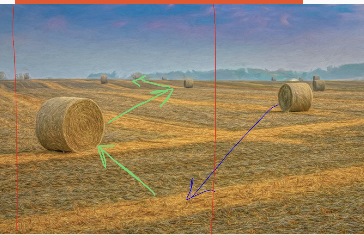
I feel a real connection to this image having grown up helping on a dairy farm - it brings back many memories. To my eye the "harvesting lines" and the finished bales are a great use of shapes and provide fixation points for the viewer's eye. For me the colors are balanced, work well in harmony and are correctly shown in the image.
To my eye this image might work well as a vertical image, especially if a bale in the center foreground could be moved, or could have been placed as shown by the blue line in my VF. I feel the image could then be cropped as shown by the red lines. I believe that this would have the viewer's eye then travel along the green lines - leading it into the picture. Just a thought.
Either way, good job!
|
Aug 4th |
 |
| 88 |
Aug 19 |
Comment |
I haven't but I will be watching for them now. I bought the 15mm used on Fred Miranda and would say so far that it is worth every penny. |
Aug 3rd |
| 88 |
Aug 19 |
Comment |
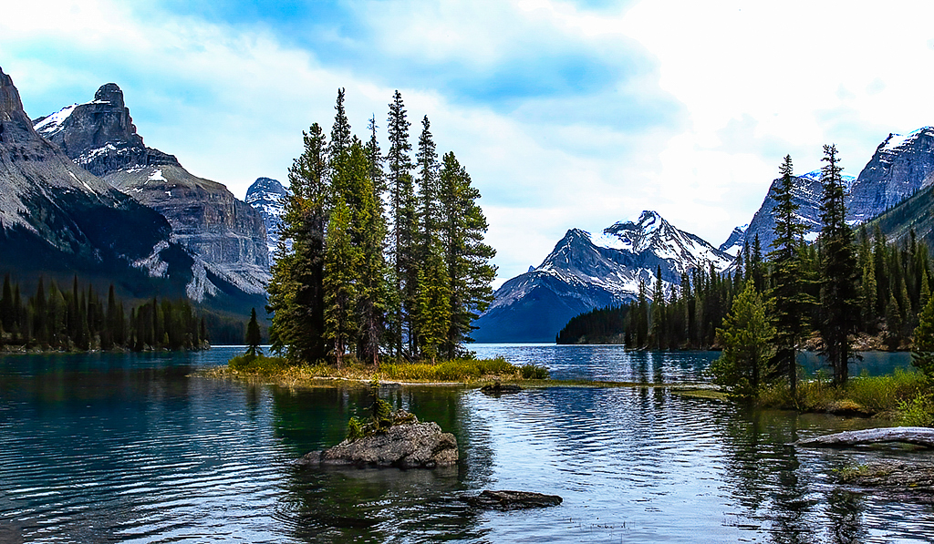
For me this image brings back many memories of times spent in National Parks observing the beauty of nature. I feel that the exposure and depth of field are well done. It seems to me that the sharpness of the island helps to direct the viewer's eye to the desired fixation point - the island. In my opinion the balance of color in the finished image also adds to the quality of this picture.
To my eye the shadows in the trees at the left and right are a bit to dark. To my eye the sharpness of the mountains in the background could be increased. I have tried to make these adjustments in the VF.
Nice Job with this one! |
Aug 3rd |
 |
| 88 |
Aug 19 |
Comment |
I feel that this image suggests a story of the colonial era when lands were claimed and then defended - it must certainly have an interesting history. For me the depth of field, exposure and sharpness are well done. I think the highlight and shadow work - especially on the wall and the sky to the left (with added contrast) have increased the appeal of the image.
It seems to me that the cannon extending out of frame on the right creates a distraction. To my eye the placement of the components of the picture in the foreground - both the wall and the cannon - lead my eye into the picture on the left and back out on the right - never giving me a fixation point to stop on. From my experience I would have left the darker cloud on the right in its less-saturated state. |
Aug 2nd |
9 comments - 0 replies for Group 88
|
10 comments - 0 replies Total
|


