|
| Group |
Round |
C/R |
Comment |
Date |
Image |
| 2 |
Jul 19 |
Comment |
In my opinion this is an outstanding image. I feel the shallow depth of field - with just the musician in focus - leads the viewer's eye to and holds the viewer's eye at the still fingers and the vibrating string. For me the various colors of the strings work in harmony and add meaning to the image. Well done! |
Jul 5th |
1 comment - 0 replies for Group 2
|
| 52 |
Jul 19 |
Comment |
For me both the side and the top via images are striking. To my eye you have precisely focused so that every small detail of the butterfly can be seen. You have broadened my experience by sharing the tip on the blue filter to reduce opacity! Thanks. |
Jul 1st |
1 comment - 0 replies for Group 52
|
| 88 |
Jul 19 |
Comment |
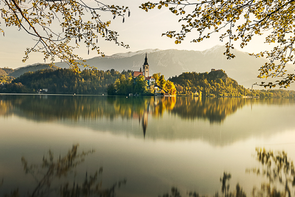
I feel that you often go "the extra distance" to get your images. That is admirable. To my eye the post-processing work with the colors, H-lights and shadows has added to the appeal of the image.
For me there are too many branches - original and reflection - and that is a distraction. I believe that these are nothing more than a frame for the church so I have cropped the image as shown in the VF to focus more on that church. |
Jul 5th |
 |
| 88 |
Jul 19 |
Comment |
From my experience I'd say you did an excellent job of capturing this with the phone's camera. I believe that the palm on the left, the waves in the water and the rain in the background set a mood and helps to tell a story.
To my eye if you wanted to develop the image further, I believe that you could remove the item in the sand in the lower center and adjust the shadows portion your RGB curve to bring out the details in the palm fond on the left a bit more. |
Jul 5th |
| 88 |
Jul 19 |
Comment |
To my eye you have done a good job of creating a foreground, a mid-ground and a background - all key components of a good image. It appears to me that the overall exposure, the depth of field and the sharpness are well done in this image.
From my experience I would have looked for a slightly different viewing angle that might accomplish one or both of the following - reduce the amount of "river" in the viewing field (about 50% now) or leads the viewers eye to churches in the right center. It seems to me that my eye is drawn now to the smokestack in the background as I follow the river. I believe that your title of "Not so Blue Danube" is correct so in the pix I sent you via email I altered the Blue Tone curve at mid-tone to blue up the river. |
Jul 5th |
| 88 |
Jul 19 |
Comment |
Thanks for the positive comments. Much appreciated |
Jul 3rd |
| 88 |
Jul 19 |
Comment |
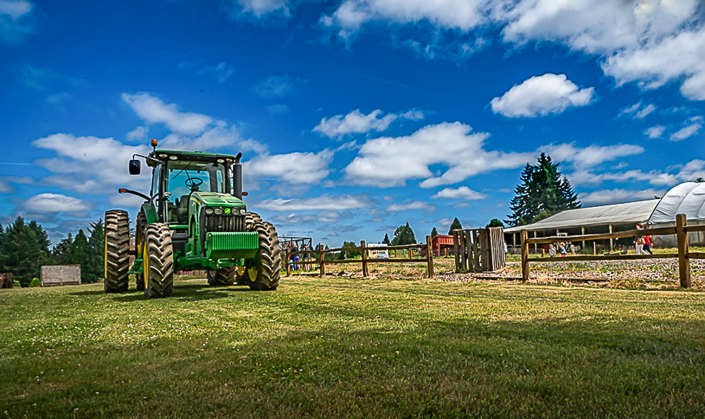
For me, having worked on a dairy farm as a teen, this image brings back many stories. I believe that the rich greens of the JD tractor and the blues of the sky create good color harmony. I think that the location of the tractor and the rail fence draw the viewer's eye to the desired fixation point.
To my eye the image is a bit dark. I feel that the branches in the upper right and the pines on the right do not tie to the subject of the image and could possibly distract the viewer's eye. In the VF I have removed them. From my experience the tractor could be sharper so I have attempted to adjust that as well.
Thanks for sharing this image! |
Jul 3rd |
 |
| 88 |
Jul 19 |
Comment |
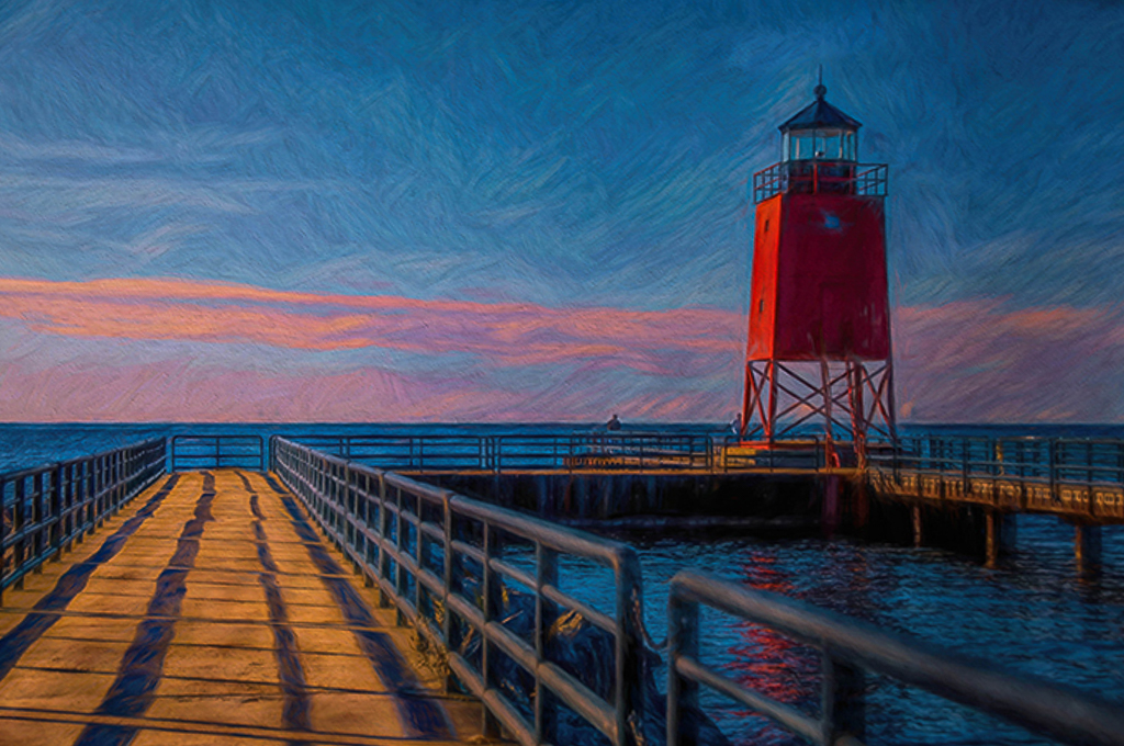
For me this image creates meaning and brings back stories from childhood. I feel that the visual distribution of the walkway and the lighthouse draw in the viewer's eye and hold it there without distraction. In my opinion the coloring is correct and the colors chosen work in harmony. I believe that the finishing you have added further enhances the image. Good job!
To me the horizon line must be straight - and I feel that you eye was fooling you on the lighthouse. I have straightened it in the VF. |
Jul 2nd |
 |
| 88 |
Jul 19 |
Comment |
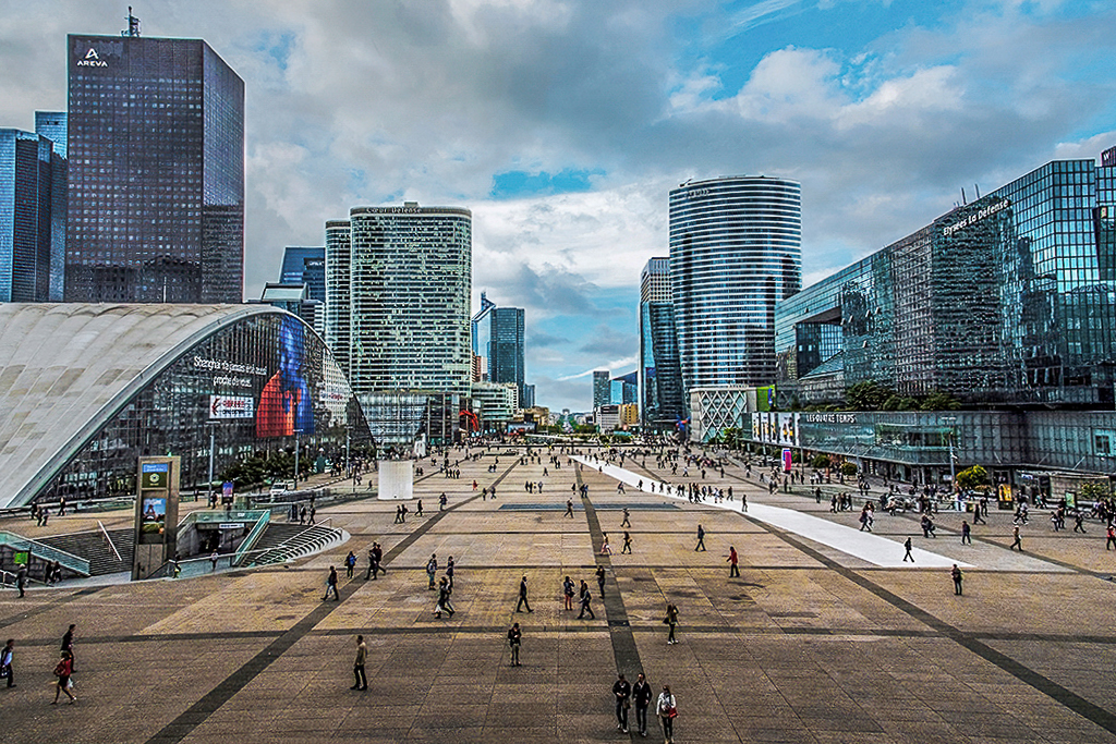
From my travels this is a unique image - one that I have never seen. To me the visual distribution of the buildings and "white carpet" do a good job of leading the viewer's eye right down the plaza into the heart of the image. To my eye the exposure and the depth of field are well done.
For me the replacement of the sky has left a halo around all of the buildings. (Last month you commented that you did not know how to get rid of the halo. I use On1 Photo Raw. In that program when you mask and remove a sky, and replace it with another, you have to use a "chisel" tool around all of the masked area to remove that line. I would think that your SW must have a similar tool.) I feel that the new sky has also created a lighting inconsistency, that is a sky with some sun but people with no shadows. It also appeared to me that the image was not horizontal. I tried to deal with some of these in the VF. |
Jul 1st |
 |
7 comments - 0 replies for Group 88
|
9 comments - 0 replies Total
|


