|
| Group |
Round |
C/R |
Comment |
Date |
Image |
| 88 |
May 19 |
Comment |
Thanks for the tip on f/stop impact on sun bursts. And yes, Photomatix has many more options for final finishing than does LR. |
May 17th |
| 88 |
May 19 |
Comment |
Trey, that is good to know. I understand better now why you use the amped up colors. Thanks for sharing. |
May 17th |
| 88 |
May 19 |
Comment |
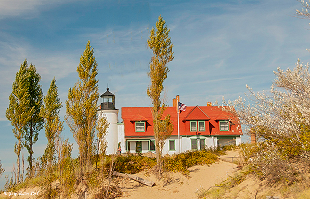
Trey, I feel that this image creates meaning for any of us who have seen the old lighthouses - it conjures up stories of times past. I believe that your composition - with one exception mentioned in a moment - is strong. In my opinion the viewer's eye is led to the fixation point of the lighthouse. I think that the reds, blues and greens in the image create good visual Harmony.
From my experience Trey you do not need the saturated colors to make this picture. In Bruce Barnbaum's book "The Art of Photography" he describes how bright colors at first grab the viewer's eye but then leaves them unsure of what the artist was truly trying to convey. As I said above, I do not think you need them. It appears to me also that the large tree hides too much of the lighthouse and forces a composition which downplays the beauty and centrality of the lighthouse. In the VF I took the liberty (forgive me) of removing the big tree, re-cropping and using the original with less saturation and diminished whites.
Forgive me if I went too far. |
May 10th |
 |
| 88 |
May 19 |
Comment |
Easier, before I printed it I cropped it out. Good eye though! |
May 10th |
| 88 |
May 19 |
Comment |
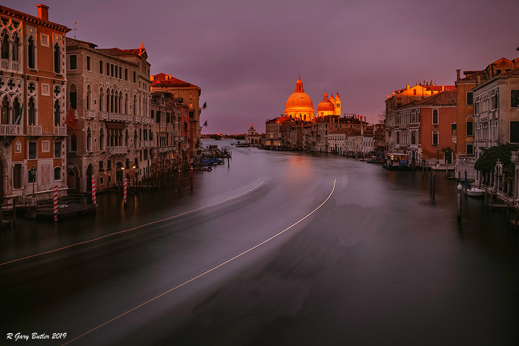
Rajani, I believe your combination of capture and post-processing has produced an eye-capturing image. From my experience you have done an excellent job of bringing out the golden color of the sunset without falling prey to the tendency to over-saturate. I feel that the depth of field with the foreground soft leads the viewer's eye right down the water to the sunlit dome - and the eye fixes there!
To my eye the third white line is not necessary and creates a bit of a distraction. In the VF (a rough attempt)I have removed that line and quickly tried to soften the very dark side of the right hand line. See what you think.
Nice job! |
May 9th |
 |
| 88 |
May 19 |
Reply |
Yes, I found the same thing. For those of us that stick to the observation platforms and main trails an unusual Bryce shot is hard to find. I did see one in my DSG Fine Arts group about a year ago that was taken with the roots of a tree dominating the foregrond and the spires in the background. It is quite unique. |
May 8th |
| 88 |
May 19 |
Reply |
Thanks Charles |
May 8th |
| 88 |
May 19 |
Comment |
Lou, in my opinion this is an excellent image of an interesting area of Chicago. I think there are many stories that could be told about this area.
I believe that the exposure and depth of field as well as the chosen brightness of the highlights add to the quality of the image. It seems to me that the lights on the right hand shore lead the eye to the desired fixation point at the bend in the river. From my experience the finishing, including the cropping, of the image is well done.
To my eye one area that might be tweaked is the tress on the left hand bank. I feel that bringing them out of the shadows - seeing a little detail - might be one small possible improvement.
Good Job! |
May 7th |
| 88 |
May 19 |
Comment |
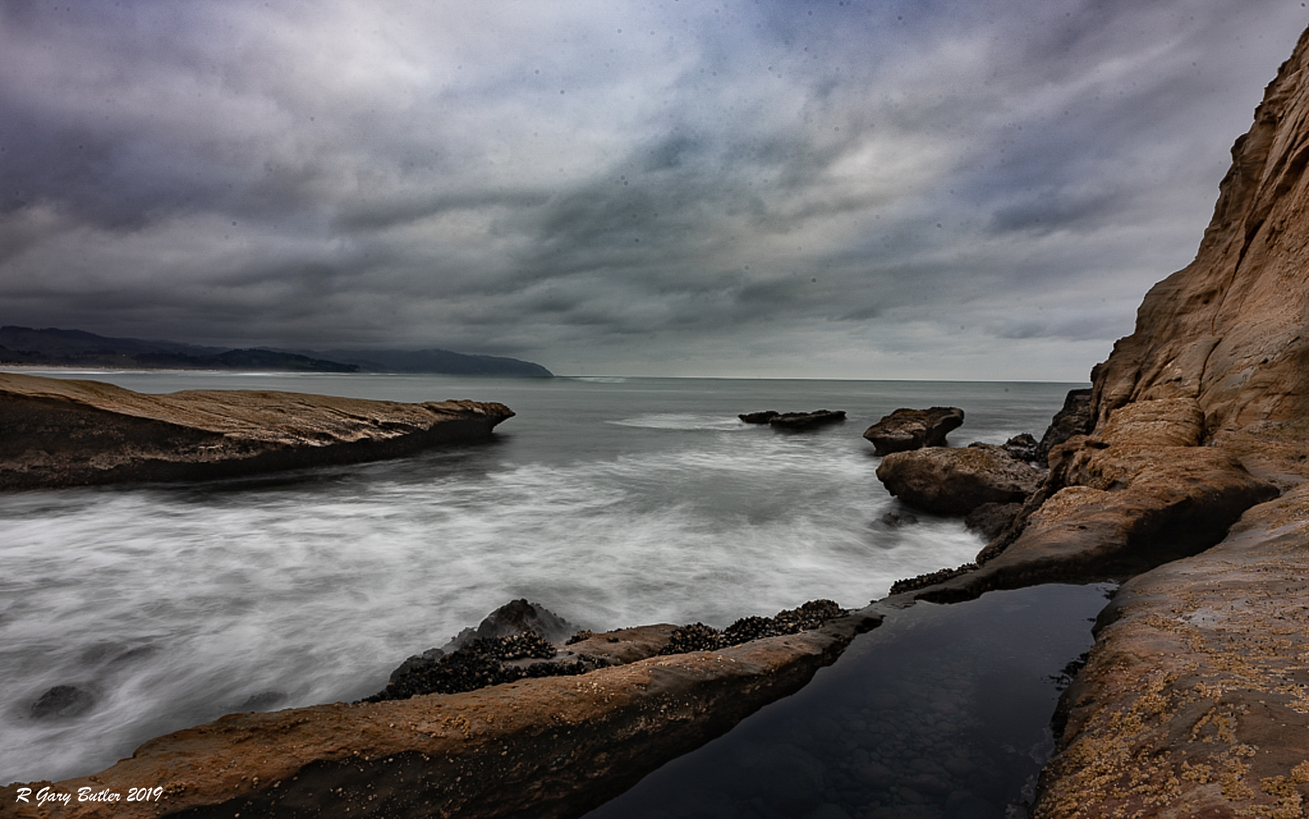
Sumit, from my experience this an outstanding image that invokes much thought. I believe that you have done an excellent job with the depth of field as well as balancing the browns of the rocks with the blues of the water and sky. In my opinion you have done a great job of framing the image so that the viewer's eye is led into and fixes on the lower right 1/3 point.
I feel that you could finish the image by taking out what I believe are birds but will appear to viewers' eyes as dust spots. I think the sky could be a bit less granular and I have tried to do both in my VF.
Nice Job!
|
May 6th |
 |
| 88 |
May 19 |
Comment |
Charles, to me the work that you put into each image is impressive. It appears to me that the work you have done with contrast has enhanced the lighting and draws the viewer's eyes to the domes as fixation points. I feel that you utilized depth of field well on the original and you have maintained the right hues of the formations. I believe that the time of day and the soft lighting adds to the image and brings out the domes from the mid-ground.
In my opinion you have lost a lesser, but still key, part of the image by removing rather than enhancing the distant sky. From my experiences at Bryce the saturation of the foreground in too intense. To my eye the saturation grabs me initially but then leaves me feeling the the scene is somehow incomplete - that the foreground is too strong for the background. |
May 3rd |
| 88 |
May 19 |
Comment |
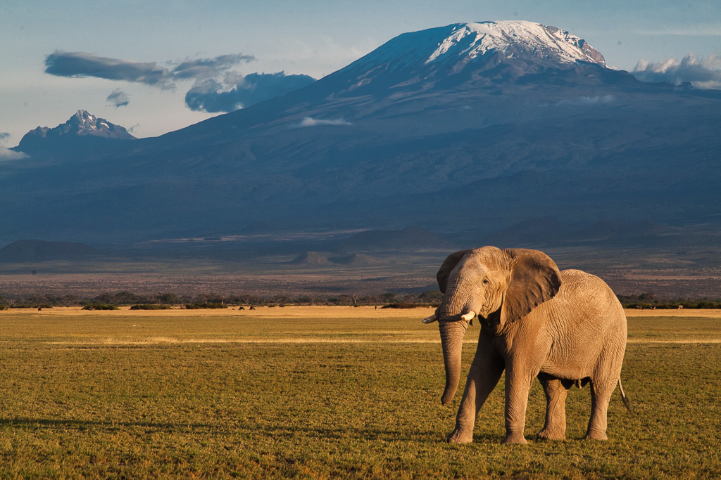
Scott, I feel that you have done an excellent job capturing the full depth of field with the f/13 setting. From my experience you have chosen a time of the day and angle of shooting that gives depth to the elephant in the foreground, yet minimizes - virtually eliminates - and distraction from the shadow.
To my eye the placement of the elephant and the mountain on the same side of the picture results in a left to right imbalance. The elephant in that position in my opinion distracts the viewers eye from the mountain. It would be very interesting to see the image with the elephant reversed and on the left foreground. I believe that the image is slightly cool (cyan) and in the VF attempted to white balance using the shadowed part of the mountain as a gary-scale reference.
Thanks for sharing! |
May 2nd |
 |
9 comments - 2 replies for Group 88
|
9 comments - 2 replies Total
|


