|
| Group |
Round |
C/R |
Comment |
Date |
Image |
| 88 |
Apr 19 |
Comment |
Good thoughts Trey. I'll work on it. Thanks. |
Apr 5th |
| 88 |
Apr 19 |
Comment |
To me the bright blue of the sky with white puffy clouds and the saturated greens of the grass create a very eye pleasing image.
To my eye the shadows of upper branches on the trunk of the tree created by cross-lighting yields several areas of high contrast that may be a distraction to viewers' eyes. I feel that the distribution of so many objects, possible fixation points, around the image makes it difficult for me to understand what you want the viewer to take from the image. |
Apr 4th |
| 88 |
Apr 19 |
Reply |
Thanks Lou. Will check them out! |
Apr 4th |
| 88 |
Apr 19 |
Comment |
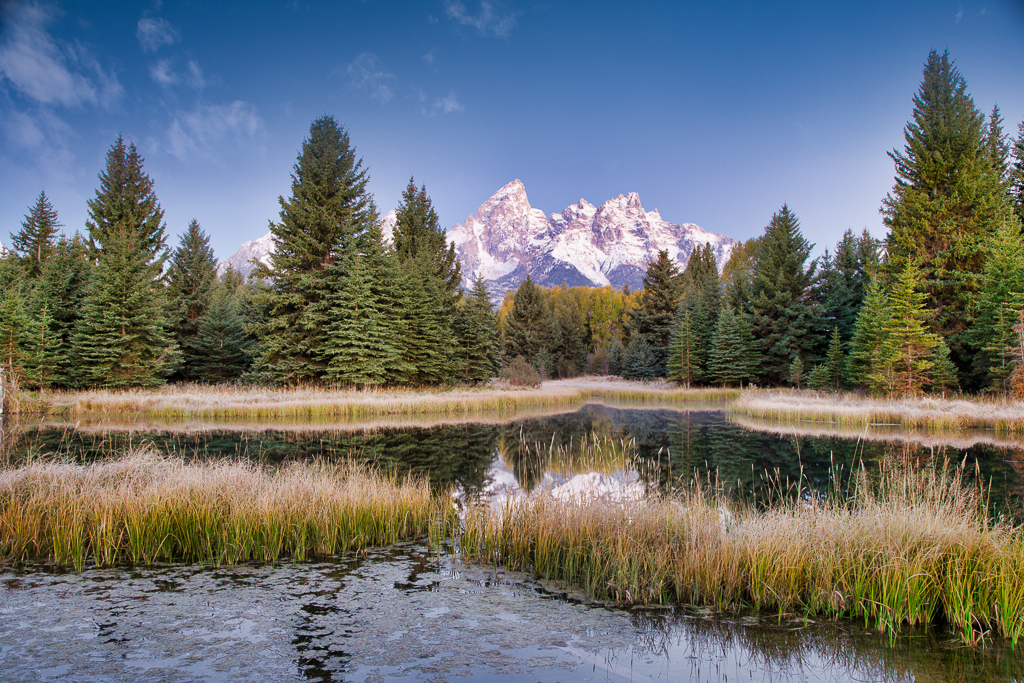
To my eye this is an excellent of one of the iconic American landmarks. I feel that the visual distribution of the grasses, the trees and the Tetons leads and holds the eye on the Tetons themselves. For me the brightness and the depth of field are also well done. In my experience the highlights and the soft shadows add to the quality of the image.
It appears to me that the reflection of the mountains, though accurate, is bright enough to cause a distraction to the eye. In the VF I have added a Multiplying Layer in PS to the reflection. Let me know what you think.
|
Apr 4th |
 |
| 88 |
Apr 19 |
Comment |
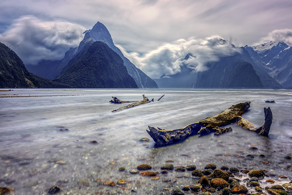
For me this image has great impact and brings back stories. It creates meaning for me because I have been there and to me this is one of the great spots on earth. In my opinion you have done an a good job of visual distribution of the foreground objects, the mid-ground hills and the cloudy sky. To me the depth of field and luminosity are well done and add to the quality of the image.
From my experience and from the "Art of Photography" the eye will want to move to the brightest, darkest or highest contrast parts of the image. I feel that the lower part of the hill on the right (darkest spot in the image) and the large tree or rock in the right foreground (high contrast) are distractions for those reasons. In the VF I have cloned out the hill and a few other objects on the right side. I placed a multiplying layer on the tree/rock to darken it and reduce contrast. Let me know what you think. |
Apr 4th |
 |
| 88 |
Apr 19 |
Comment |
Lou, to me this image has great interest as I just booked reservations to shoot Chicago architecture for three days in May. I feel that you have done a good job with the exposure, sharpness and color of the image - the last is very pleasing to my eye. I believe that the visual distribution right to left is well done.
It seems to me that the image may need stronger fixation points. For me the lack of focus (for want of a better term) caused by the waviness of the glass causes my eye to continually move looking for a place in the image to settle on. I feel that the lamp posts and tree at the bottom of the image are also a distraction, especially since they are in focus whereas the buildings are not.
I would be very interested in any suggestions of where to shoot in Chicago. |
Apr 3rd |
| 88 |
Apr 19 |
Comment |
To my eye there is great harmony in the colors that you have used here Trey. It also seems to me that you have good lines separating the fore-, mid- and backgrounds. I believe that improved the sky immensely with the new sky.
From my experience you have to be very careful when choosing a substitute sky - the lighting intensity and direction must match the rest of the image. It appears to me that the sky is lit from the right, but the trees are not. A "sunlight" filter masked onto the right side of the trees would make the scene more consistent. I feel that the dramatically increased color in the foliage and sky has had an effect of changing the trees trunks to a cooler tone. |
Apr 2nd |
| 88 |
Apr 19 |
Comment |
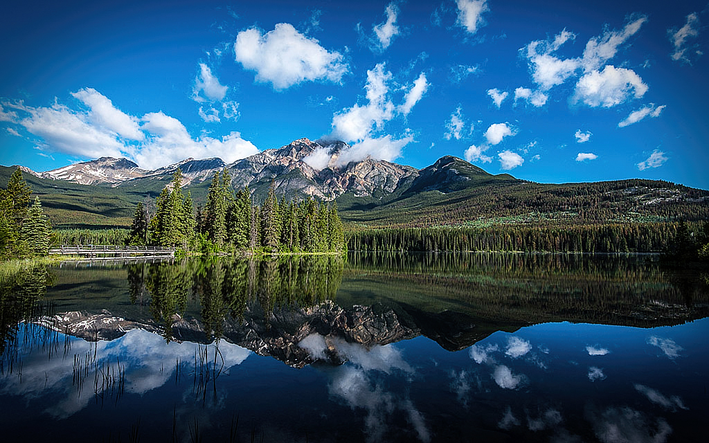
For me this image has great impact - it makes me wish I had been there with you to shoot this great landscape. I believe that your choice of a wider angle lens had added to the visual distribution of the image. I feel that the clouds (both in the sky and as reflected in the lake) are pulling my eye toward the intended focus area of the copse of trees at the water's edge in the mid-ground.
In my opinion Charles you might further enhance the draw of the viewer's eye by placing a vignette in only the corners of the image. I have tried this in the VF.
To my eye this is an. excellent image! |
Apr 2nd |
 |
7 comments - 1 reply for Group 88
|
7 comments - 1 reply Total
|


