|
| Group |
Round |
C/R |
Comment |
Date |
Image |
| 5 |
Aug 23 |
Reply |
See my reply to Barbara. Further comments welcome. |
Aug 19th |
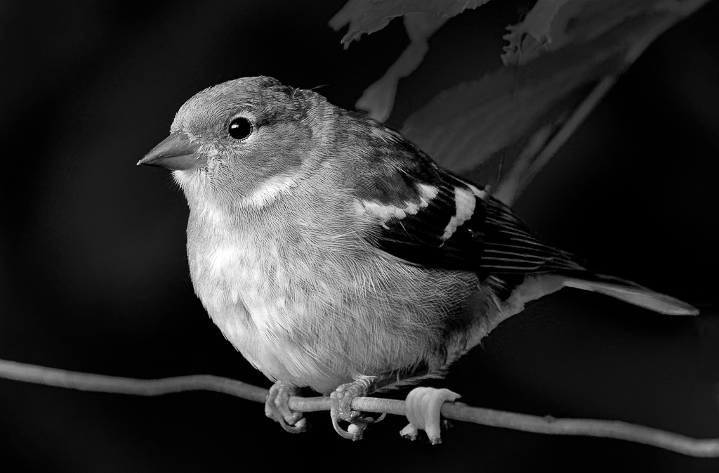
| 5 |
Aug 23 |
Reply |
I did play with the eyes and I think the image below is better. You have to go in very close to see the difference Comments please. |
Aug 19th |
 |
| 5 |
Aug 23 |
Reply |
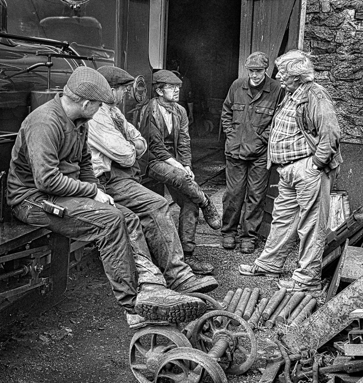
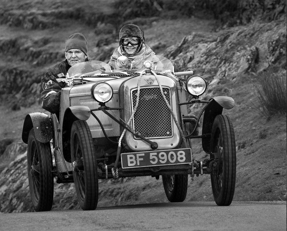
Mark, you have suggested blurring the background. To my mind, if you do, it gives a completely different image. Create a copy of your layer. Go into:
Filter>Neural Filters>Depth Blur then play around with sliders to get a blurred background you like. I have perhaps gone a little too far but I wanted to illustrate the point. On this new layer create a mask and carefully go over the wires which will have probably been blurred. I have done it quickly so may have missed some wires. What do you think? |
Aug 19th |
 |
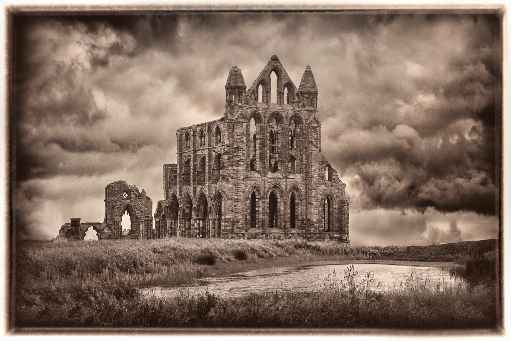
| 5 |
Aug 23 |
Comment |
How lucky you were to be in such a beautiful place. I don't mind the foreground but can see why others have suggested a crop. I find the greens in the centre trees and their reflection to be too intense and I would desaturate a little. |
Aug 17th |
| 5 |
Aug 23 |
Reply |
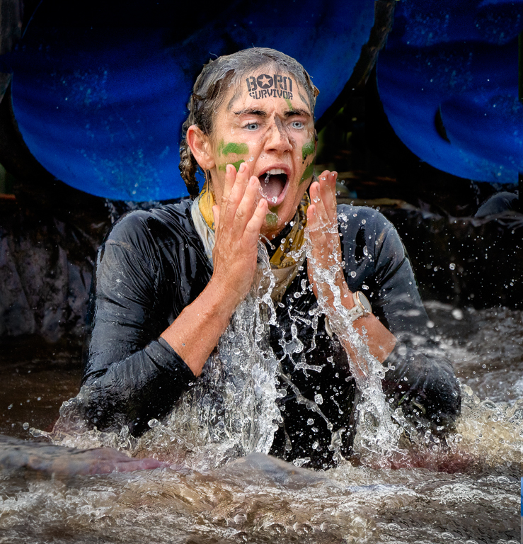
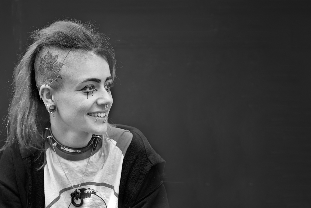
I agree the eyes are not quite right. I wonder if people would notice if I didn't mention it. I will do some more work on it. The rat is alive. |
Aug 17th |
| 5 |
Aug 23 |
Comment |
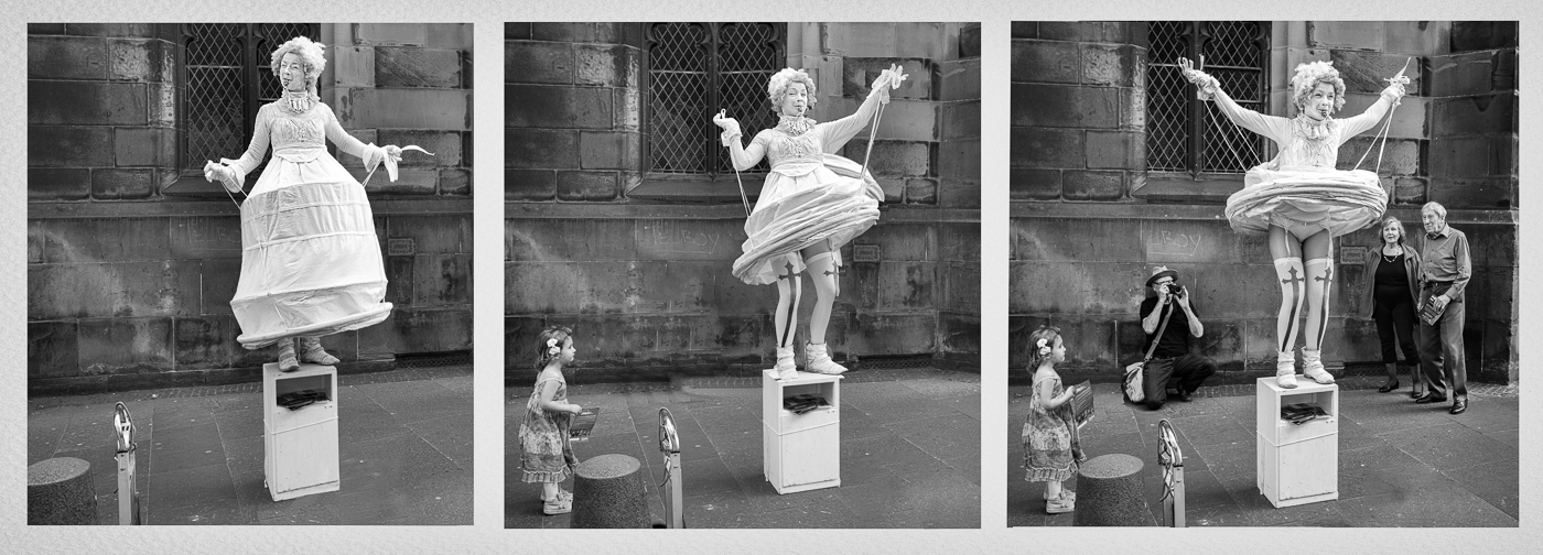
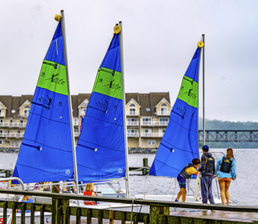
Every picture tells a story. I wonder what story you were trying to tell here? I'm not sure so I look to your title for an answer. Your title is "Young Sailors" and yet we are a third of the image (on the left) before we see part of a young sailor and then only the bottom part of their legs. The most prominent sailors are far to the right and on the edge of the image. I would either change the title or make the sailors more prominent in the picture. In the image below I have cropped the boat on the left, cloned out the white sail. On the right I have extended the canvas using the clone tool to bring the three young sailors more into the picture. |
Aug 11th |
 |
| 5 |
Aug 23 |
Reply |
Sorry I thought if I sent a link you would get to see all of my photoshop file. I think you only get to see the image and not the layers. |
Aug 1st |
| 5 |
Aug 23 |
Reply |
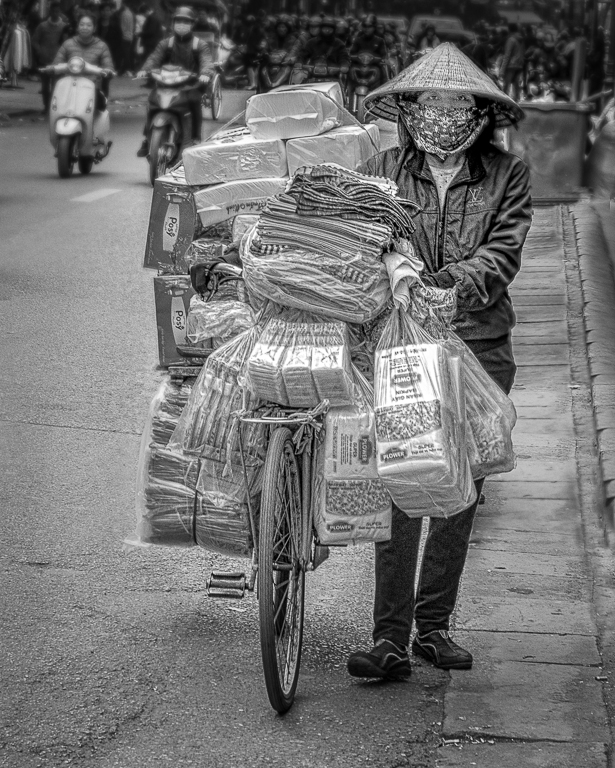
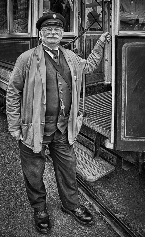
Thanks Pete. I have sent you a link via Photoshop so you can see what I have done. I also prefer my second version. On the next to top layer I used Bleach Bypass in ColorEfex taking contrast down to minimum then I reduced the opacity of the layer to 25%. |
Aug 1st |
| 5 |
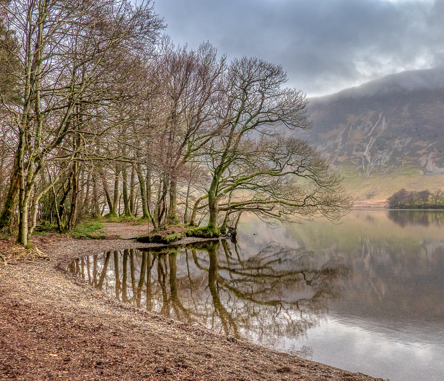
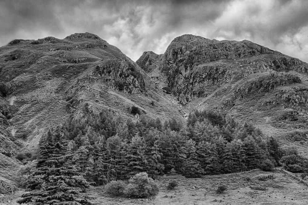
Aug 23 |
Comment |
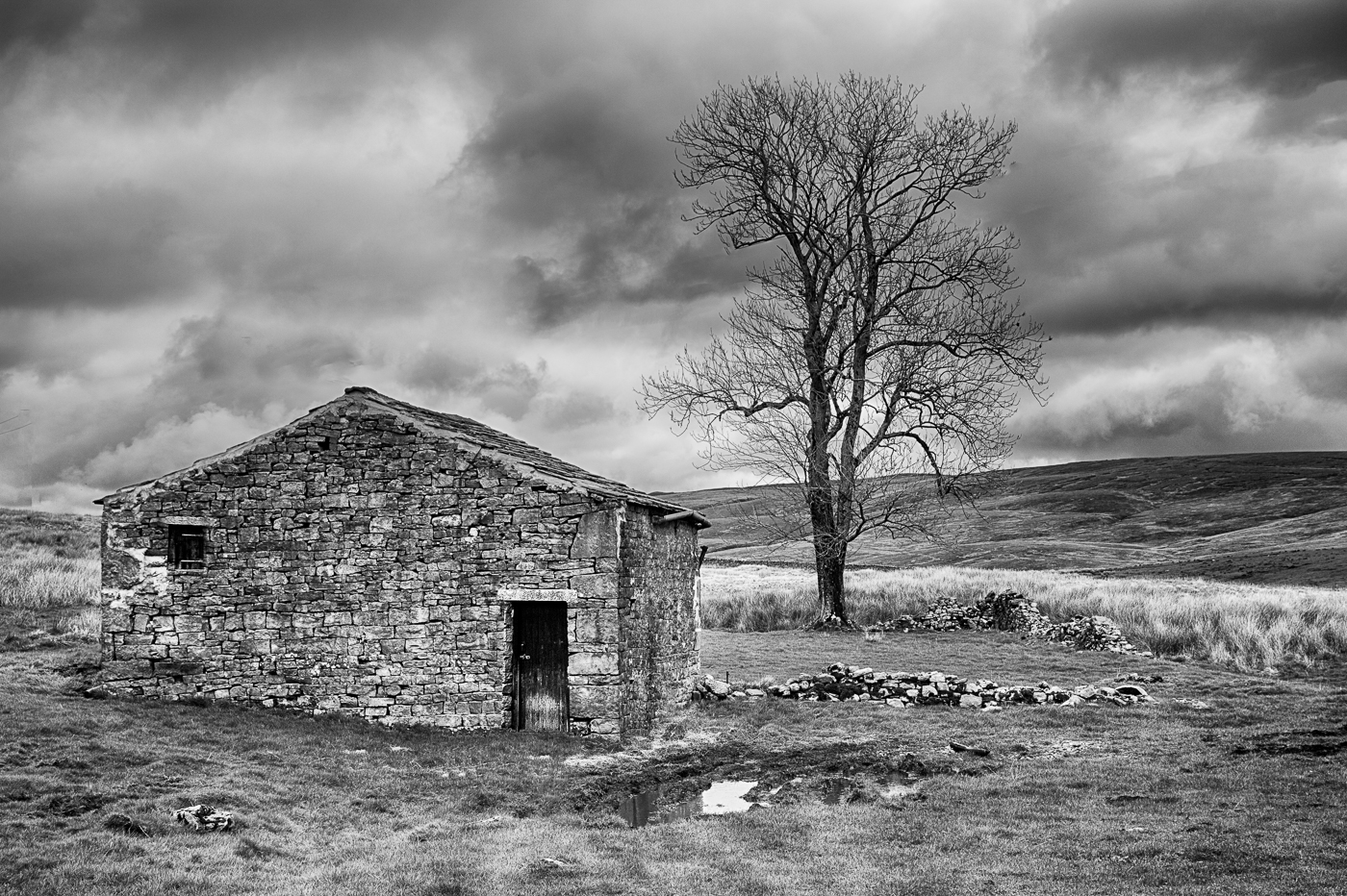
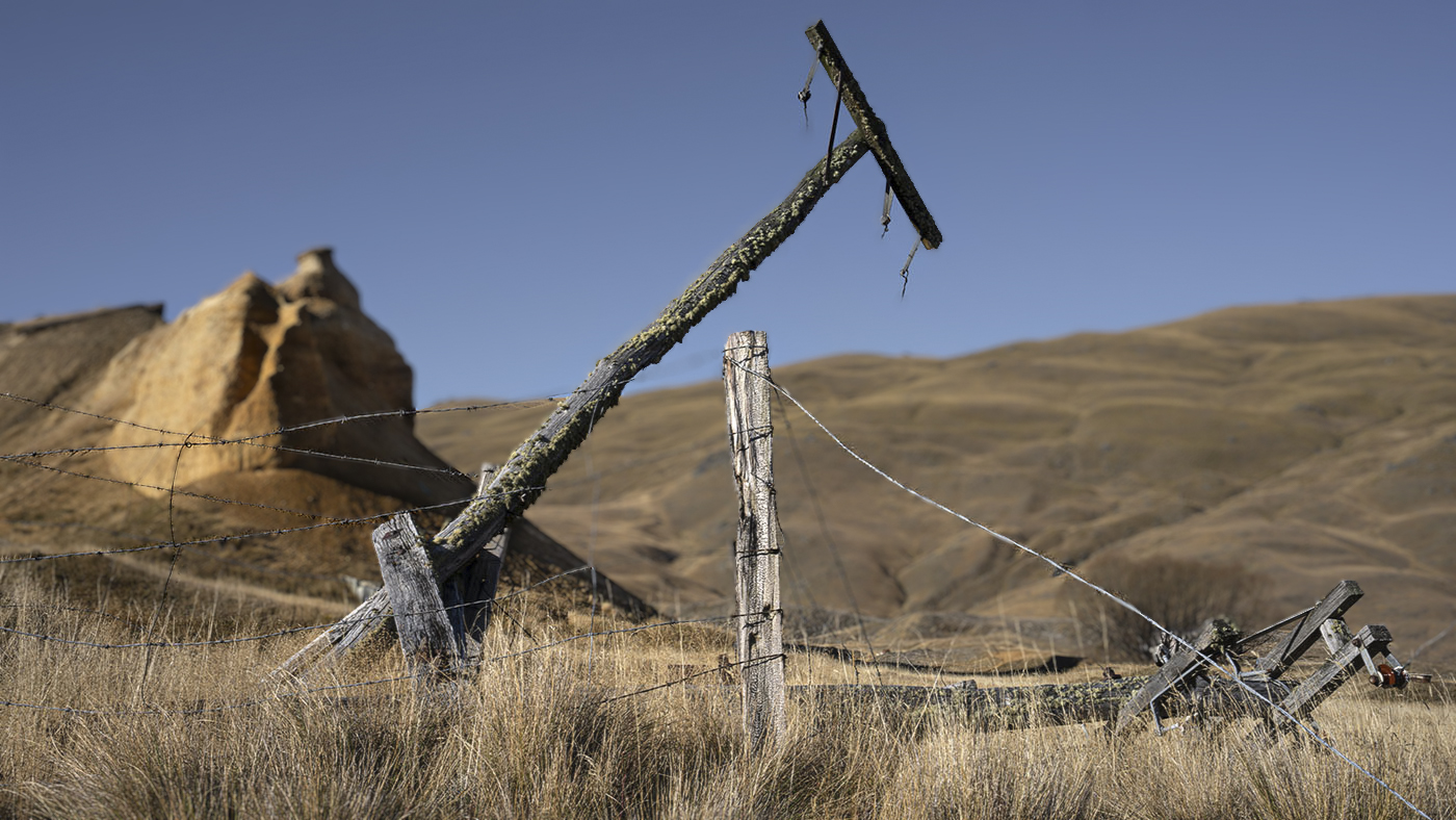
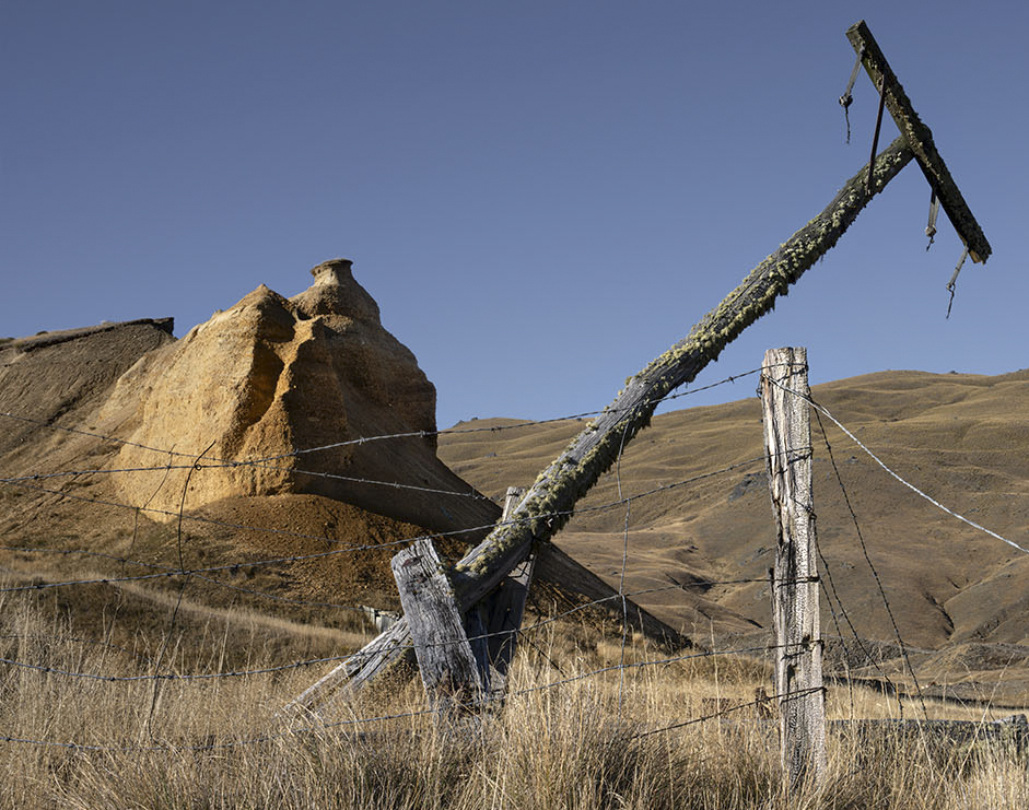
There are a lot of interesting things in this picture Mark. The grasses in the foreground leading to the old fence and the long post making a good diagonal across the image and then the interesting rocks behind. I like the blue sky and think clouds would be a distraction. My only problem is I don't know where I should be looking. If it were mine I would crop some of the right hand side so we concentrate more on the diagonal post and the rocks behind. |
Aug 1st |
 |
| 5 |
Aug 23 |
Reply |
|
Aug 1st |
 |
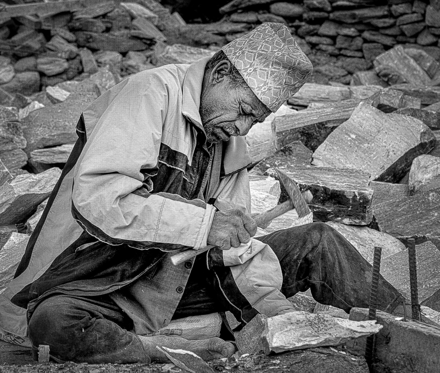
| 5 |
Aug 23 |
Comment |
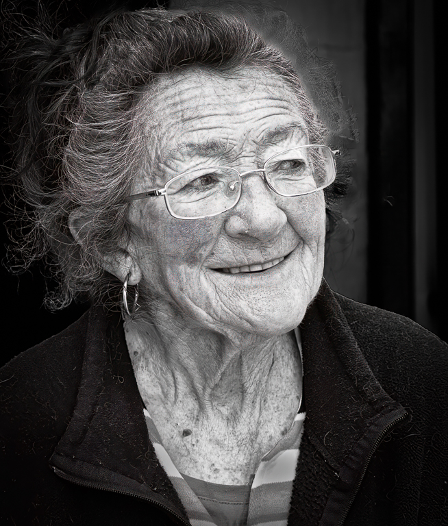
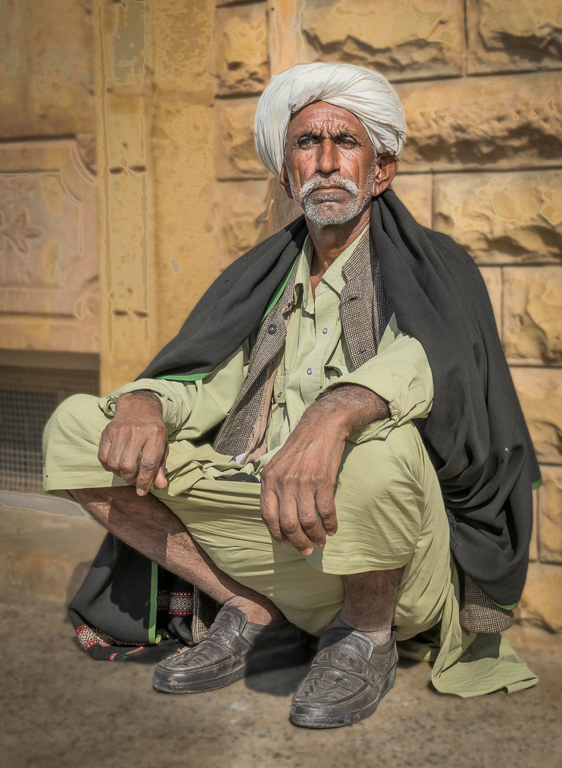
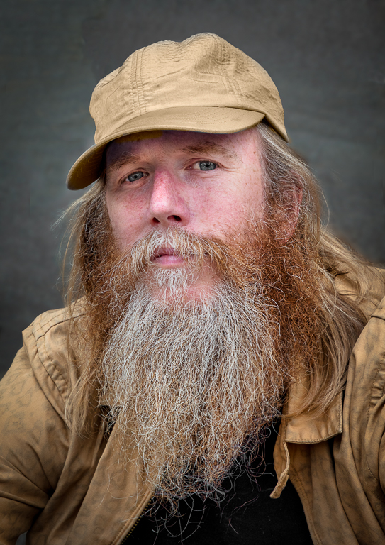
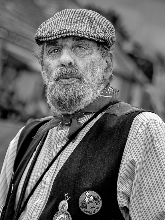
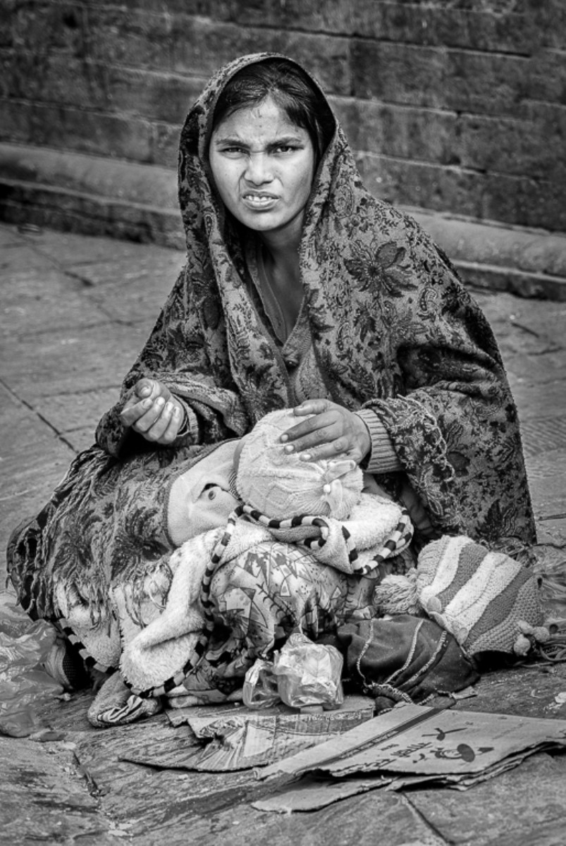
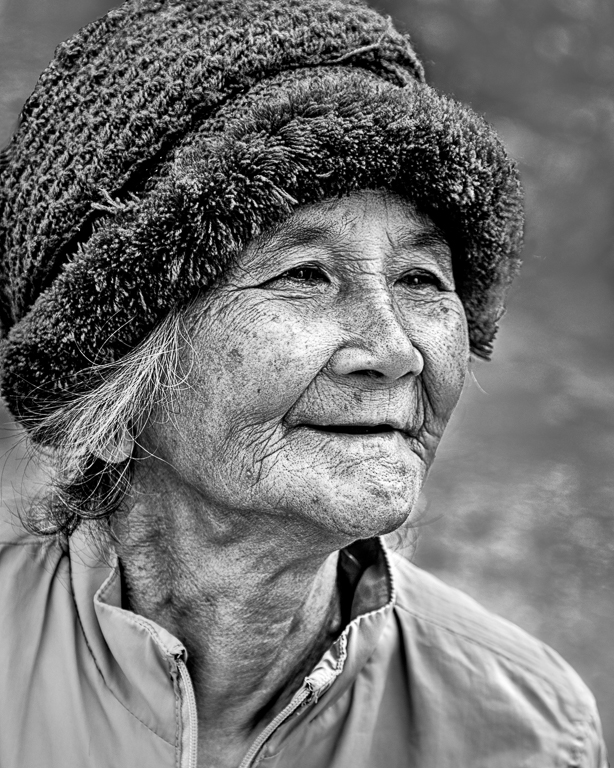
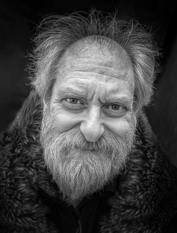
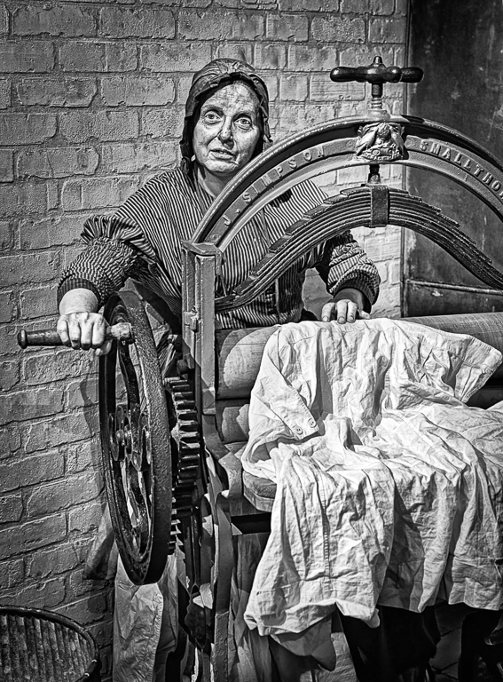
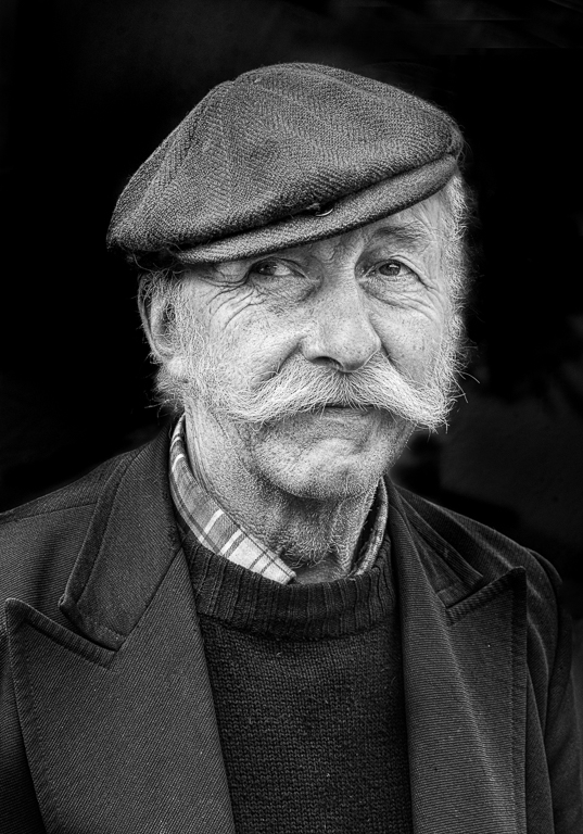
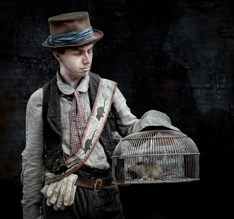
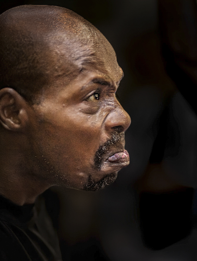
I had an image that I took a few years ago and loved it but it wasn't very sharp. I should have deleted it but couldn't bring myself to. Along came Topaz AI Sharpen and it solved all my problems. I suspect this is similar. I think you have a prize winner here. I love your composition and you have done a great job with the processing although I don't think this is complete. You have burnt out areas on his lip, nose and the top of his head. I used Topaz Neo to try to remove some of the Shine. This improved the image but not completely so on a new layer for each part I used the clone tool over the highlights I then reduced the opacity until I was happy. I made various other changes until I got the images below. I have 4 versions but show you 2. Comments please. |
Aug 1st |
 |
| 5 |
Aug 23 |
Reply |
|
Aug 1st |
 |
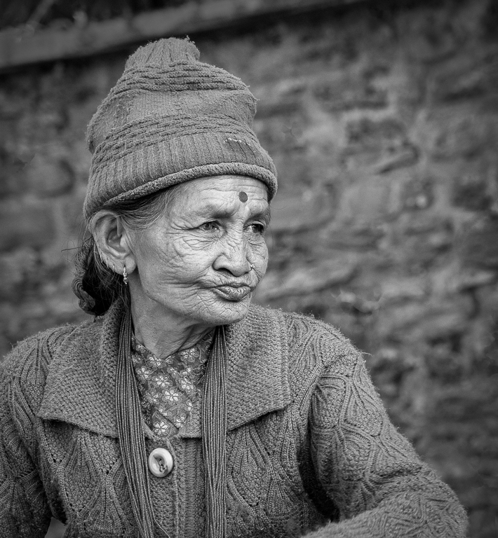
| 5 |
Aug 23 |
Comment |
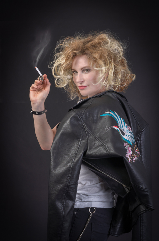
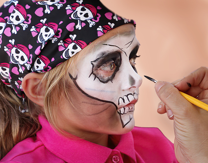
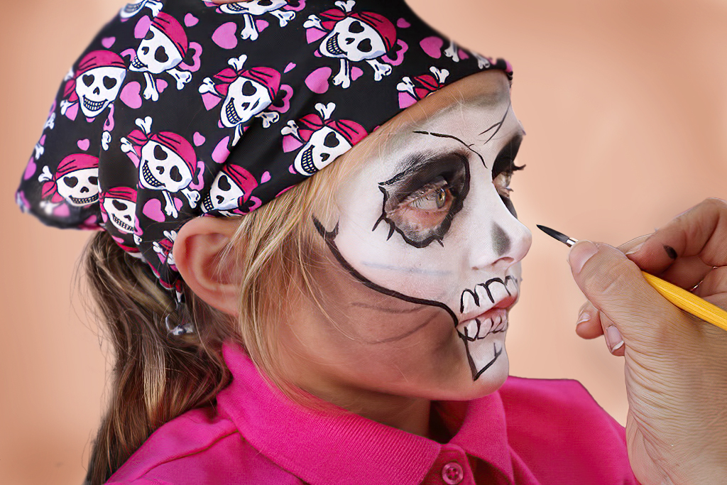
Your image and Pete's are very similar. I think the composition of both are excellent. The girls eyes and mouth are great and the hand is just right. I do think you can improve the image by better processing. The image seems to be over sharpened and as you say her hair "is not quite right". It was a good idea to use the top right as the background colour. In the image below I have cut the girl and hand out and put them on a new layer. Below the layer I have added a new layer and filled it with the colour from the corner. I have then darkened the outside and lightened the centre of this layer. It is very difficult to cut out hair as you have shown. If I struggle with this, to get round it, I just crop tighter. In this image I think cropping tighter does improve the image. |
Aug 1st |
 |
5 comments - 8 replies for Group 5
|
5 comments - 8 replies Total
|