|
| Group |
Round |
C/R |
Comment |
Date |
Image |
| 50 |
Sep 17 |
Reply |
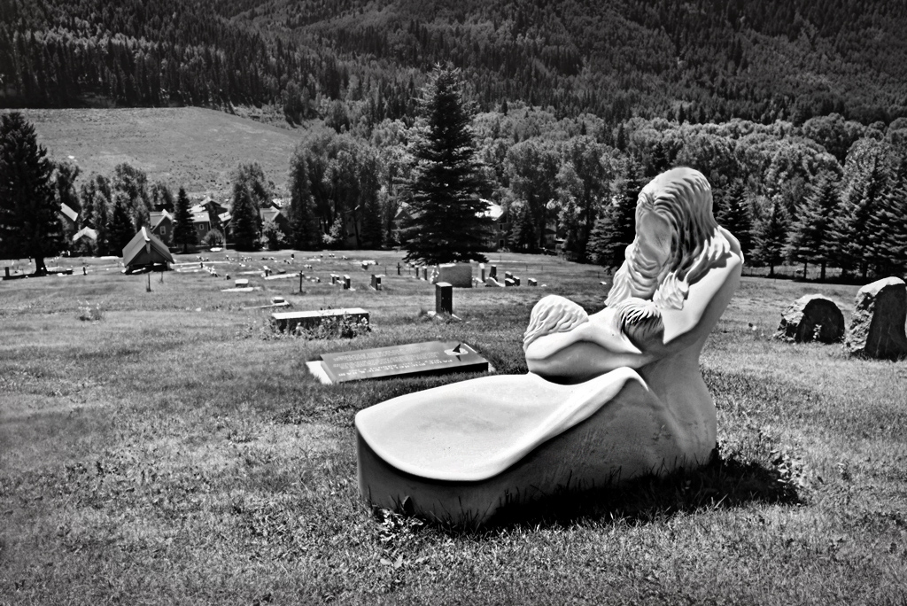
I retouched, initially by increasing the sharpness only on the statue but by as much as possible, to try to get some texture into it. I then used viveza to decrease the brightness, increase the contrast and increase the structure. |
Sep 20th |
| 50 |
Sep 17 |
Comment |
Another excellent still life. The only suggestion I would make is that you could possibly increase the brightness slightly but this is a matter of taste. |
Sep 20th |
| 50 |
Sep 17 |
Comment |
I agree that mono works best. I think you have a wide range of tones which is good. In this case I do not think that the frame enhances the picture, I find it distracting. |
Sep 20th |
| 50 |
Sep 17 |
Reply |
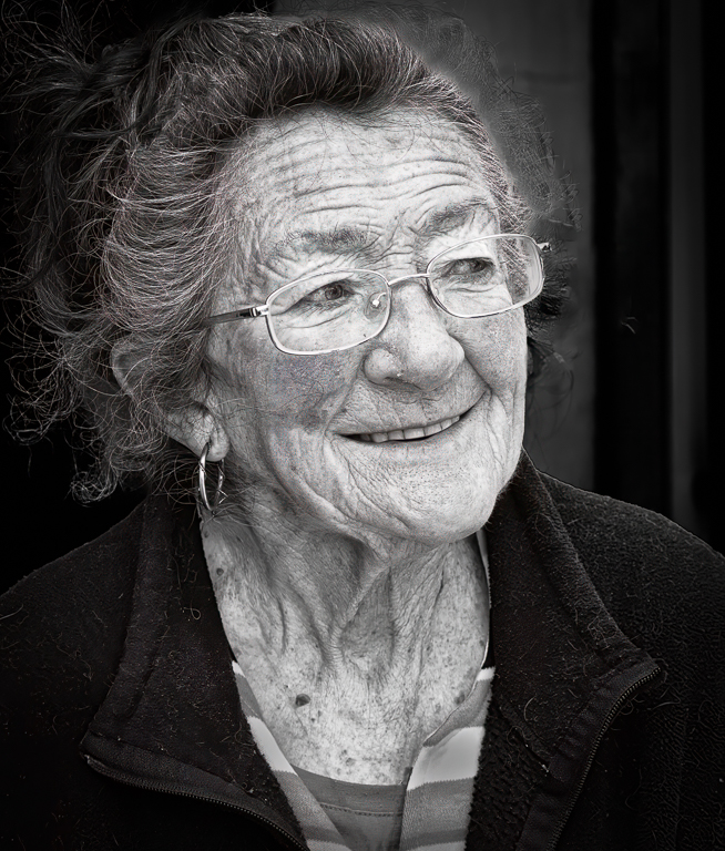
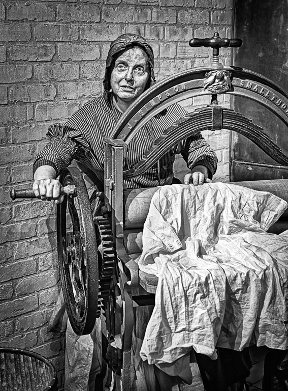
The large mono is the one I am looking for comments on. The "original" next to it is where the mono came from.
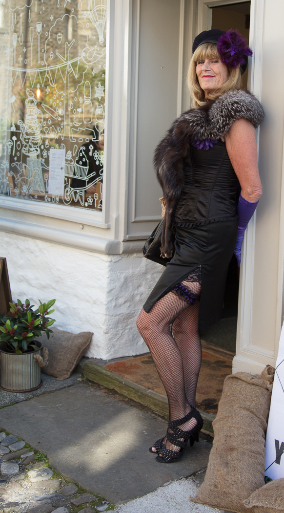
Cindy said that my image conveyed an interesting story. I uploaded the 3rd image to show her that the picture was a composite and that the lady came from a 1940's weekend I attended. All of my people pictures are taken "in the street" and are then usually manipulated to darken the background or as in this case cut out and placed in a new background. Hope this makes sense. |
Sep 14th |
| 50 |
Sep 17 |
Comment |
I prefer the mono and agree that Chuck's work does improve the image. I think your crop is perfect. |
Sep 11th |
| 50 |
Sep 17 |
Reply |
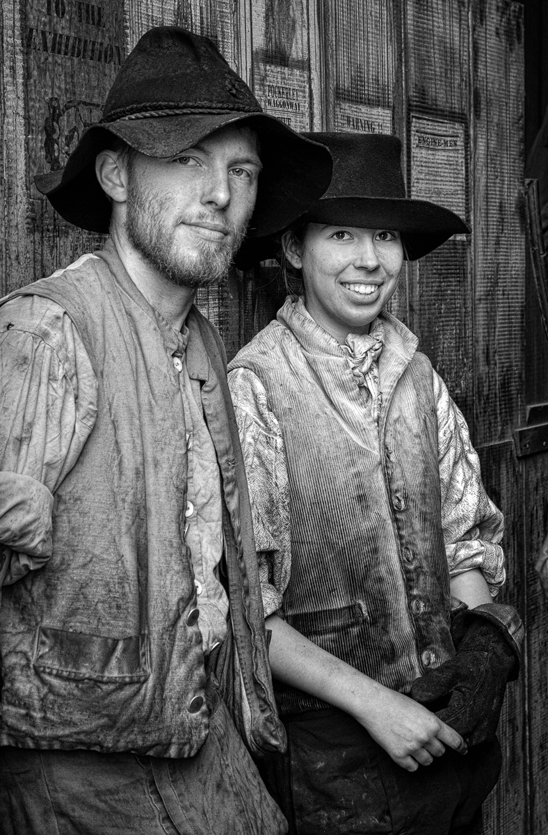
I didn't comment on how I did the image as I wanted to see if anyone would comment that it was obvious that the lady had been superimposed in the picture. The Lady was taken at a "1940's re-enactment weekend" last year and I have been looking for a background to "put her in". Last month my camera club went to a disused factory where I took the background. In April Jeffrey had an image "Milwaukee Street MPM" and in my review I put her into his street. I prefer her in his background. |
Sep 11th |
 |
| 50 |
Sep 17 |
Comment |
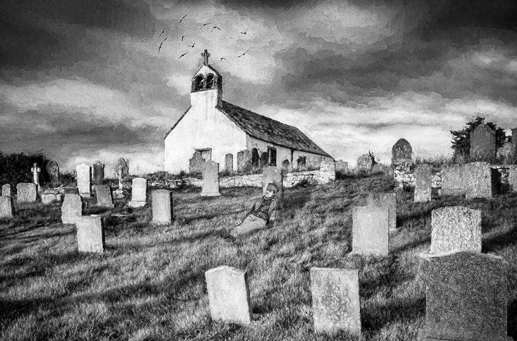
Generally I agree with Cindy but you may be able to add texture from the original file. I don't think the image should be cropped, everything is well placed in the frame including the headstone which is the main point of interest and as Cindy says all of the headstones are distinct. Attached is an attempt to put some texture into the headstone. |
Sep 11th |
 |
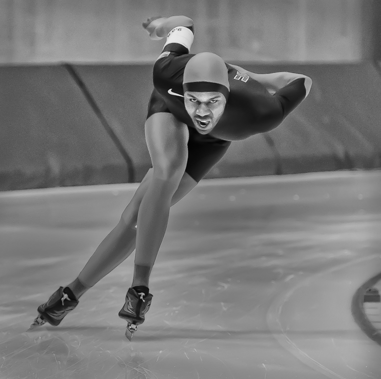
| 50 |
Sep 17 |
Comment |
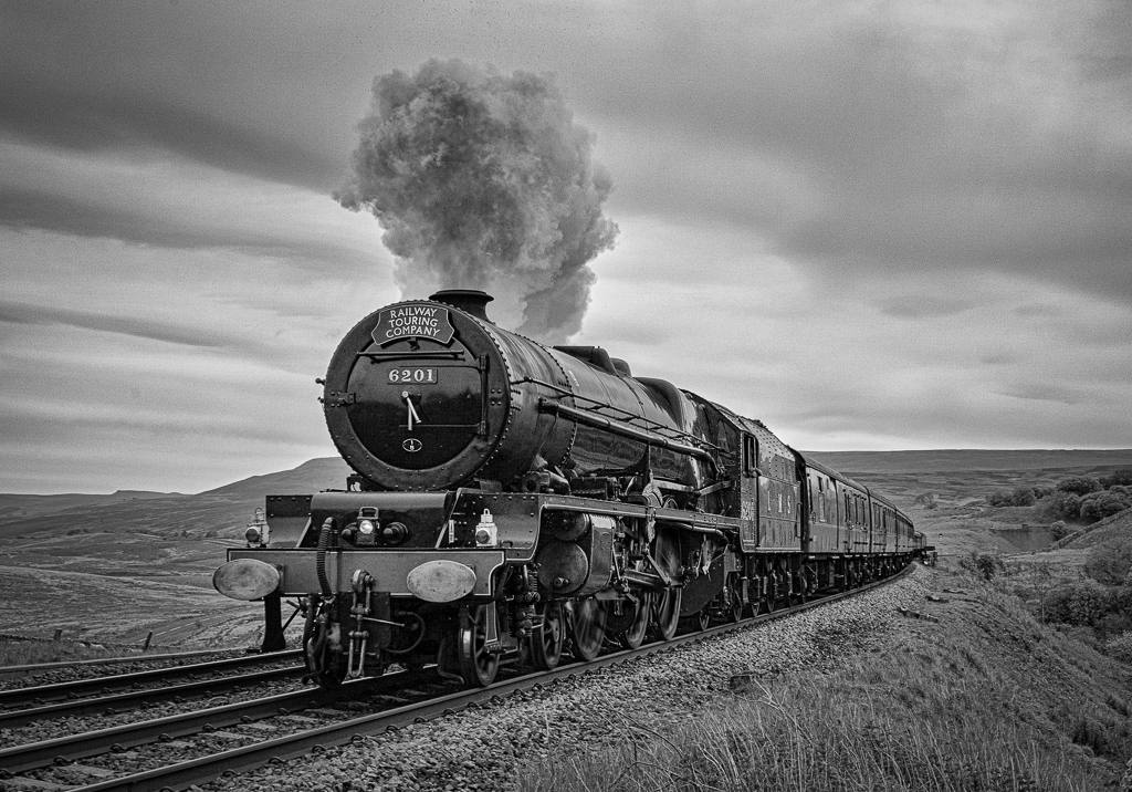
This is a fine action shot and you have done well to keep the skater in focus with an aperture of f2.8. I have played with the mono image to make the skaters face lighter and the background darker but I much prefer the colour version-the blue and red make the skater stand out- compared to your version or mine.
I have not heard that the Nik collection will be incompatible with photoshop but I think Adobe should try to buy the collection from Google. Apparently some of the developers of Nik are now working at Macphun who are offering a free Beta download for Windows (they already have award winning Mac software) https://macphun.com/ |
Sep 5th |
 |
| 50 |
Sep 17 |
Comment |
I think this a very pleasing image in both colour and mono. I assume it is hand held and if so you have done well to avoid camera shake. I find that my eye is drawn up the posts to the bannister and finally to the ceiling with all parts of the image being sharp. If I hadn't seen the colour version I would thought that it was appropriate to change it to mono but I do prefer the colour version. I think either could do well in competitions. To improve the image I would clone out the light in the bottom left hand corner. |
Sep 5th |
6 comments - 3 replies for Group 50
|
6 comments - 3 replies Total
|