|
| Group |
Round |
C/R |
Comment |
Date |
Image |
| 71 |
Mar 20 |
Reply |
Thanks Nancie. And I'm so appreciative of all the work you do for our digital group. Herding cats, well speaking for myself anyway. |
Mar 21st |
| 71 |
Mar 20 |
Reply |
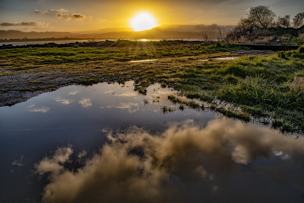
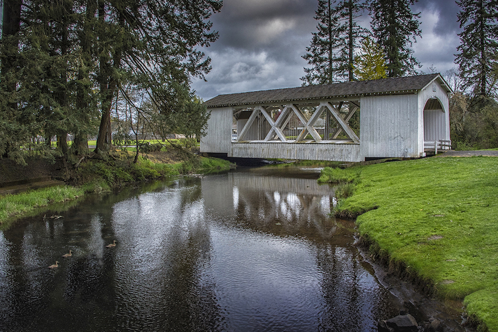
Thanks, I agree it would have been great to have that super smooth water in the foreground. It would have been nice to have shot with a neutral density filter to smooth the water, but the trees would have been moving and blurred then. John suggested shooting in front of the trees. I didn't even consider that while I was there. And, my husband was waiting for me while I was shooting, not the most conducive atmosphere for fiddling with lenses and such. I went back a few times but never had flat water. And face it, too lazy in the early AM to figure my filters out. |
Mar 21st |
| 71 |
Mar 20 |
Reply |
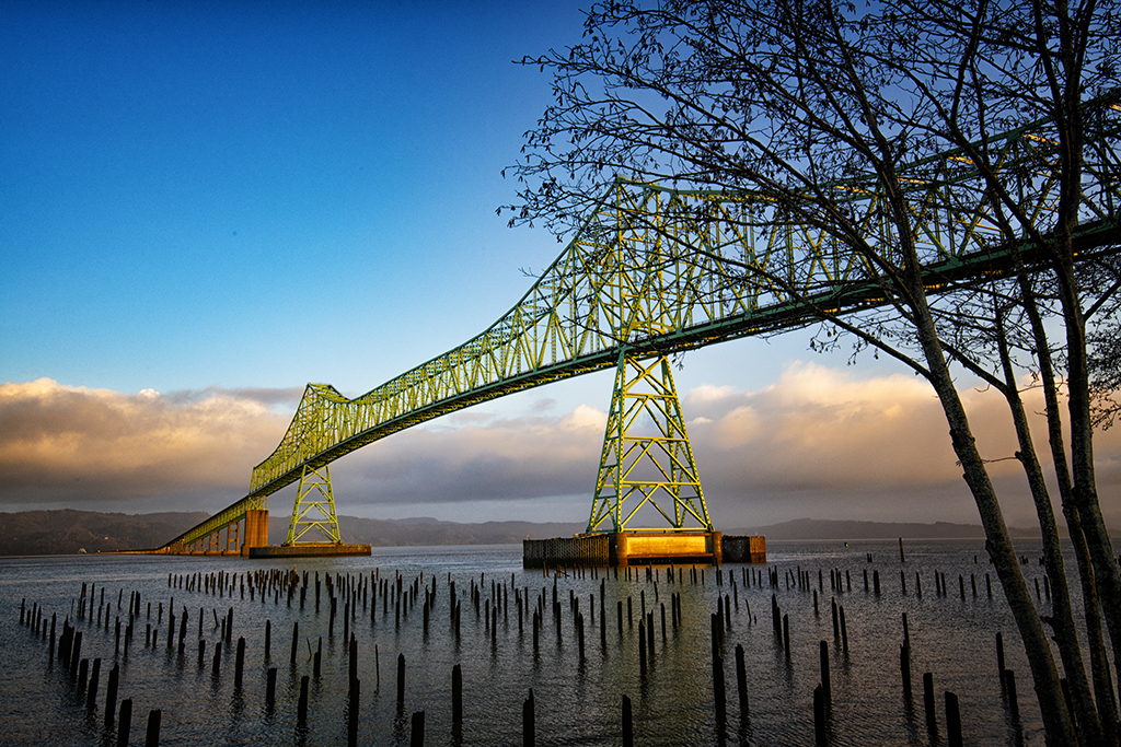
Interesting John, thanks. When I was there I was trying to figure out how to get even more trees into the photo. It never even occured to me to step IN FRONT of them. Maybe next time I'll see if that is a possibility. We all see things in different ways, and that's why we have this group of editors working with us. Thanks for your always thoughtful feedback. I was down at this bridge a bunch of times in the last few weeks. Wish I could zip back there now. |
Mar 21st |
| 71 |
Mar 20 |
Reply |
I returned to this bridge over and over in the last three weeks. On one trip a photographer friend said her photo friend told her she would never ever go across it! It's quite picturesque from the ground though. |
Mar 21st |
| 71 |
Mar 20 |
Comment |
John, beautiful color in the original image. You captured wonderful leading lines in the sand to bring my eyes into the photo. The leading lines are so strong and graphic that I feel a bit let down by the more wispy sky. I would probably crop off most of the sky and just have a bit of background showing. And, can you bring up the white sand (add contrast) without blowing it out, it seems a bit dull to me. The frame you have around it is brighter than the sand. Maybe you could have a black frame instead?
Agree with Nancie that the color version is quite cool. |
Mar 21st |
| 71 |
Mar 20 |
Comment |
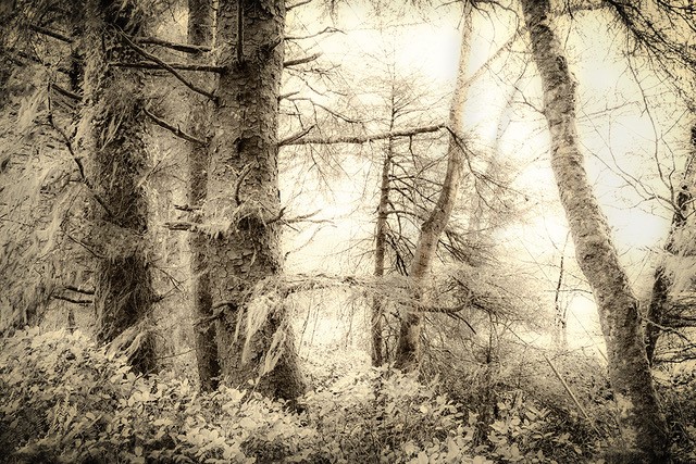
I like Nancie's addition of detail in the background and the power line removal but I like those trees she took out. The green is beautiful but my first thought was wouldn't this look cool in sepia? I think I thought that as the contrast between the softness of the foggy background and the super bright saturated colors was jarring to a unified feeling for me. It's always interesting that the things we notice and love ourselves don't necessarily translate to others. Maybe I'm just in a melancholy mood with all that's happening right now. |
Mar 21st |
| 71 |
Mar 20 |
Comment |
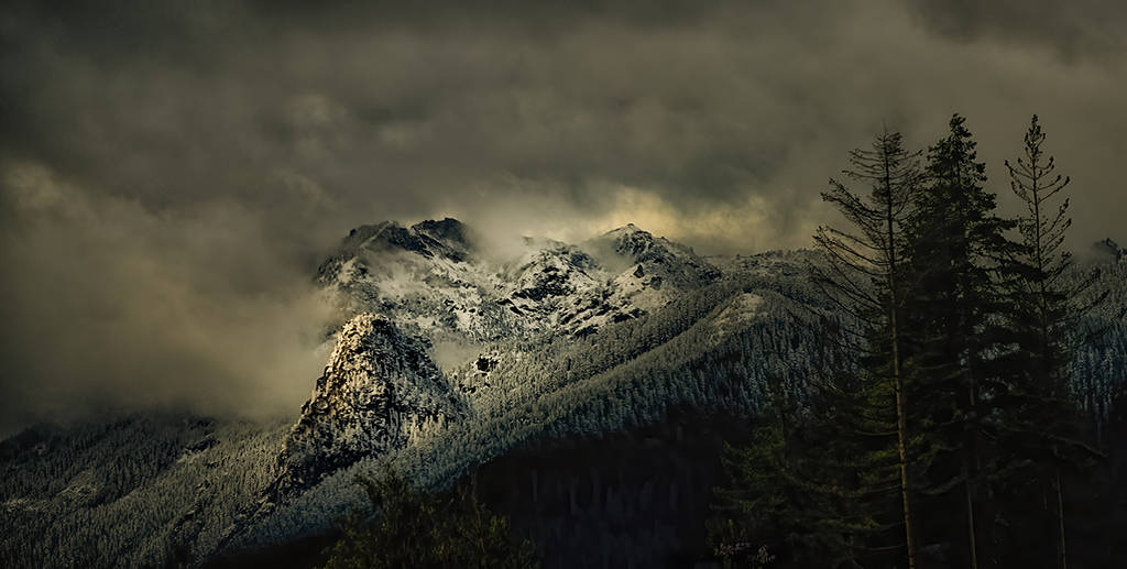
A beautiful drive for you. Pike's Peak is a famous spot, and a place I have never been, yet. The bright white foreground draws my eye away from the peak. I'm wondering if a gradient could add some subtle contouring so that the brightest part of this photo isn't along the bottom edge. Perhaps some cropping off the bottom would work. The snow is pristine looking, and must have been striking to see in person but may not allow me to focus on "Pike's Peak" |
Mar 21st |
| 71 |
Mar 20 |
Comment |
Gordon, an astounding image, I love it. I like your choice of composition with the bench on the left third. In studying this I might like it if the bench actually broke the plain (plane?) of the dark mountain behind it because the long gray arrow at the base of the mountain is drawing my eye out of the picture to the left. If the bench broke that line I think it would be a stronger image even than it now is. I hope I can someday think up something so cool as this to do. With all of our "home" time these days, maybe its time. Thanks for inspiring my creativity. |
Mar 21st |
| 71 |
Mar 20 |
Comment |
What a beautiful location to shoot. Lovely image. I agree with lowering the highlight of the white sand in the back if you can. I would use the camera raw Highlights filter and see if that works. Of course, you probably already did that.
I'm sure you were level but the hill curving down on the right makes it look un-level. I think you could "fudge" a bit by a little straightening. The Yucca plant could be nudged a bit and still look straight. I agree you could loose some footprints but I think one line of footprints might be evocative and add some humanity. I've never been there but what a stark beauty this has. |
Mar 21st |
| 71 |
Mar 20 |
Comment |
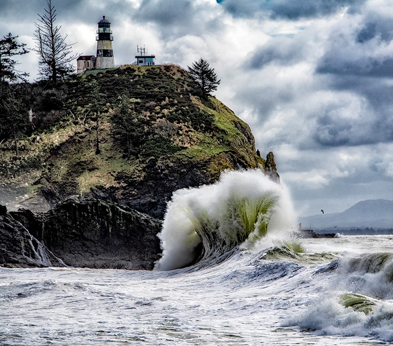
Oh Theresa, i had to laugh as I have spent two of the last three weekends shooting this scene myself!!! So, I totally understand the challenges and drama of it. The lighthouse IS backlit and therefore darker than picturesque pure white. White is a cartoon image of a lighthouse, this one is real. Nice color in the waves and the lower sky. The cliffs are in shadow so sky blows out a bit, but the shadowed white of the waves are not blown out, which had to be a priority for you. I find it hard to critique as I shot thousands of photos in this very spot this month!! If the waves are sharp, the lighthouse might not be of course. And, we needed a super fast shutter speed to get the wave sharp. I think an admirable job, and a lovely image. not much help from me |
Mar 21st |
6 comments - 4 replies for Group 71
|
6 comments - 4 replies Total
|