|
| Group |
Round |
C/R |
Comment |
Date |
Image |
| 34 |
Aug 21 |
Comment |
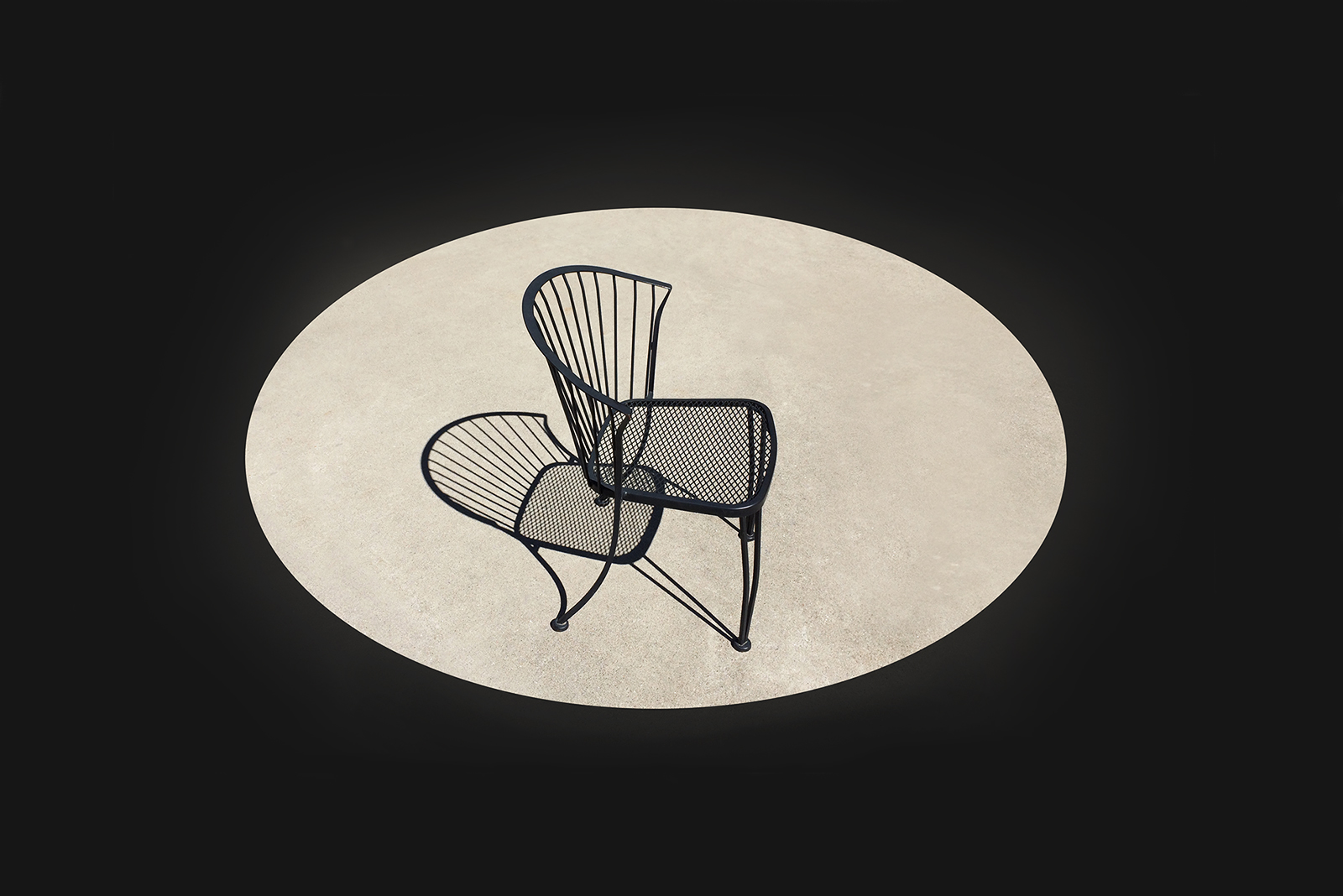
Again, Jan, I love your image. Your imaginative creativity, artistic background and technical skill have again combined to create a delightful image, perhaps an illustration for a children's book. |
Aug 18th |
1 comment - 0 replies for Group 34
|
| 37 |
Aug 21 |
Reply |
Thanks, All. A very lucky moment. |
Aug 30th |
| 37 |
Aug 21 |
Comment |
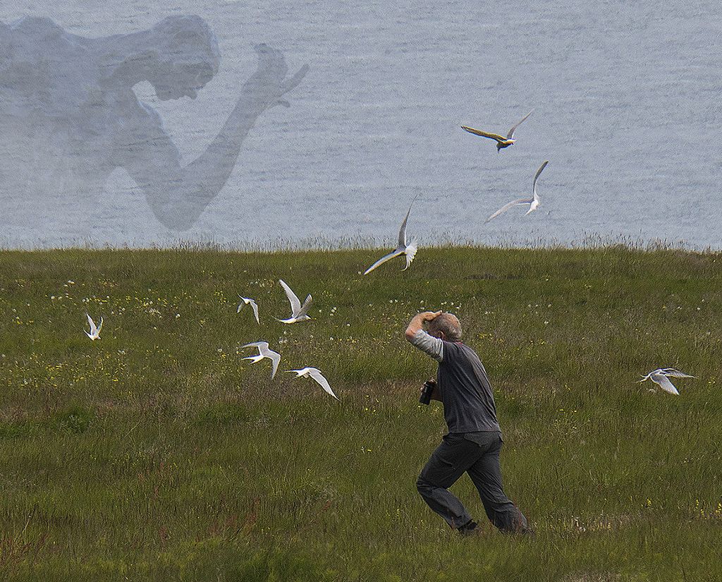
Glad you entered metadata on the raft as well as your camera; very impressive result. Well captured composition as both you and the birds were in motion. |
Aug 30th |
| 37 |
Aug 21 |
Comment |
I agree that it has an old-timey feel, but uncomfortably contrasty. I'd crop out the windows and then the body of the piano to eliminate his lower leg. Also the right portion of the piano. Then I'd reduce the contrast on all but the man and his piano. However, I realize that wouldn't be the picture you wanted. |
Aug 25th |
| 37 |
Aug 21 |
Comment |
Wonderful, detailed shot of a bird I'd never seen. Good depth of field. I initially liked the flowers; they did draw my attention. I was going to suggest desaturating or darkening them, but really like the way the lost their distracting impact in Howard's version. |
Aug 23rd |
| 37 |
Aug 21 |
Comment |
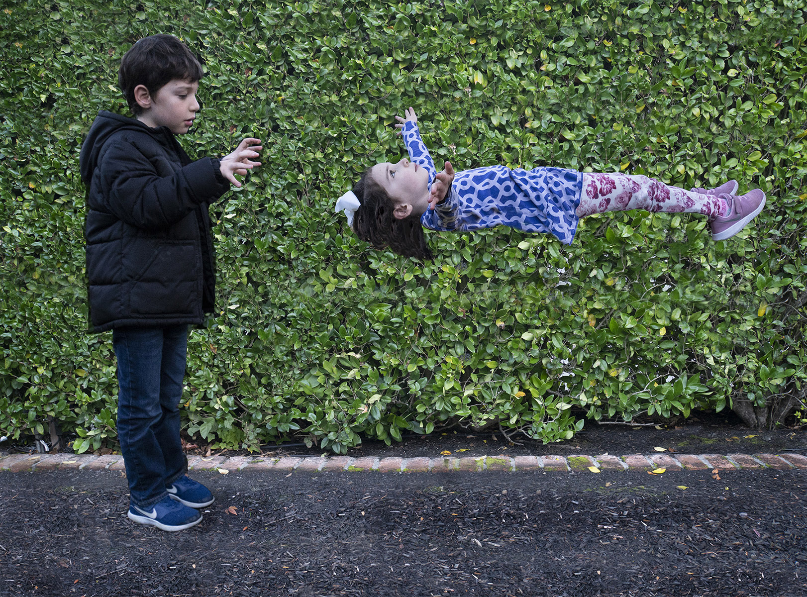
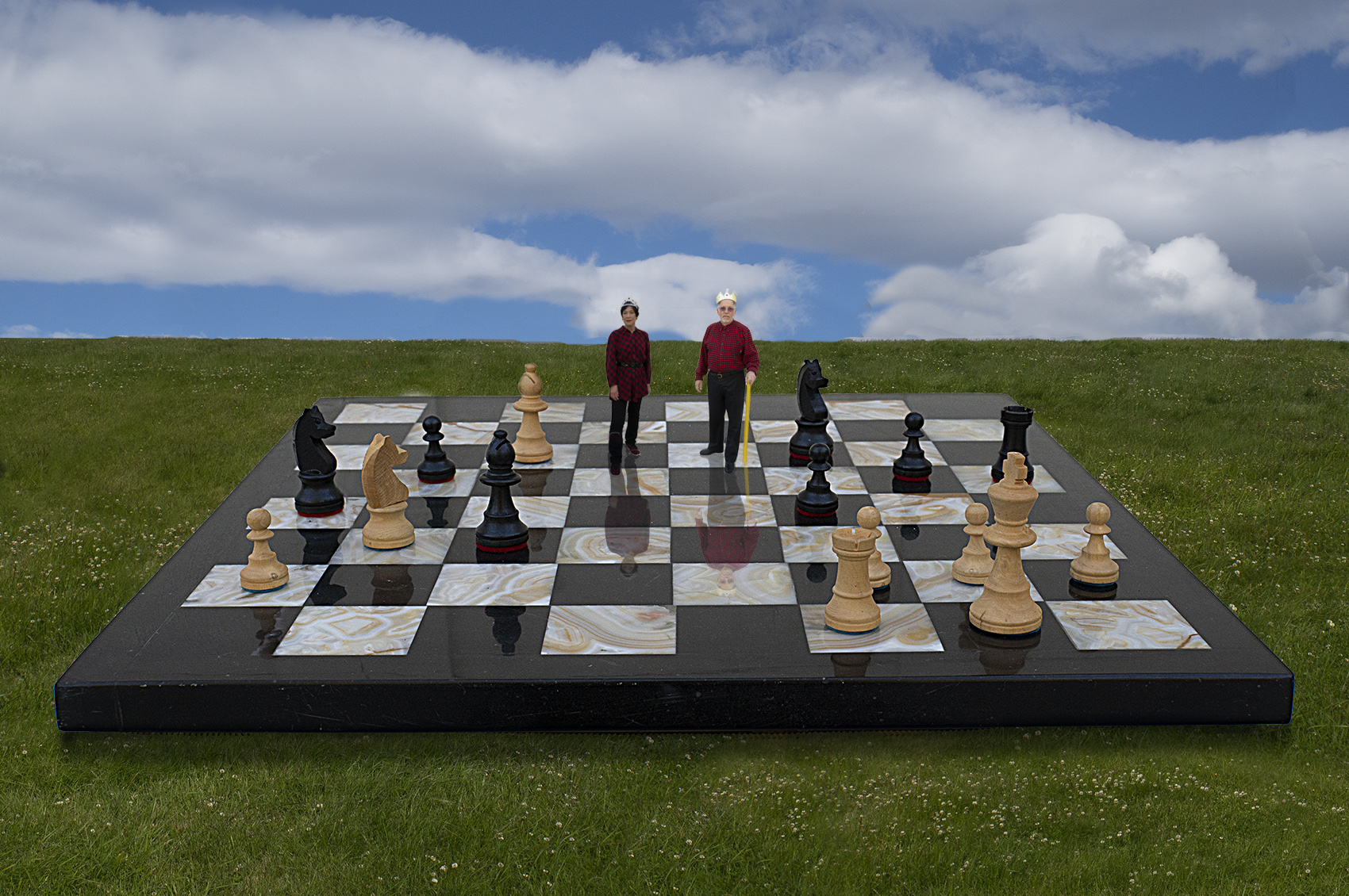
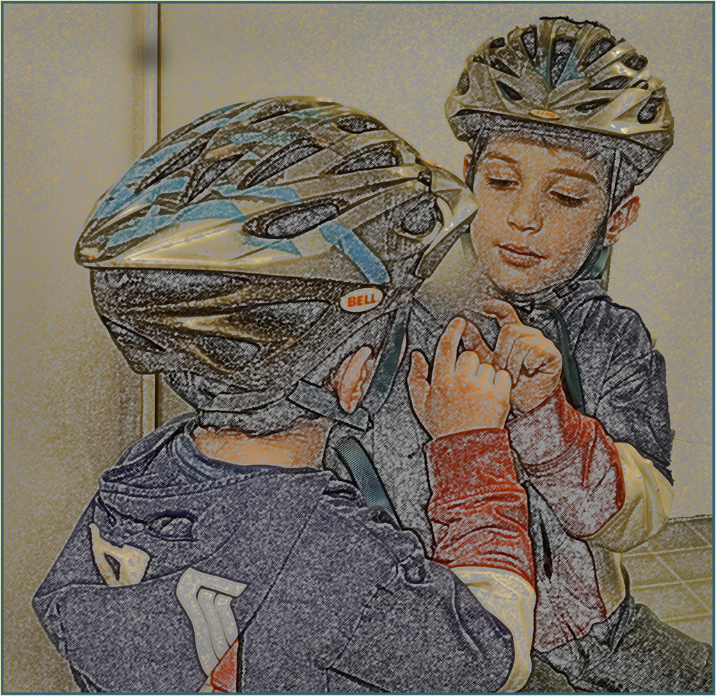
I love the fact that you cropped the adults. Reminds me of Charles Schultz's Charlie Brown; it's a child's world, which you have conveyed. Mono was a good choice. From the image, I think the title could be "Everybody Listen to Me" or "Look at Me." But you were there and know what he was saying/doing. I'd crop off the white pants leg, darken the floral coat, and vignette the bottom. Cute capture.
|
Aug 10th |
4 comments - 1 reply for Group 37
|
| 64 |
Aug 21 |
Reply |
Just now when I looked at my image, I saw a carpeted sky. Rather disorienting.
|
Aug 25th |
| 64 |
Aug 21 |
Comment |
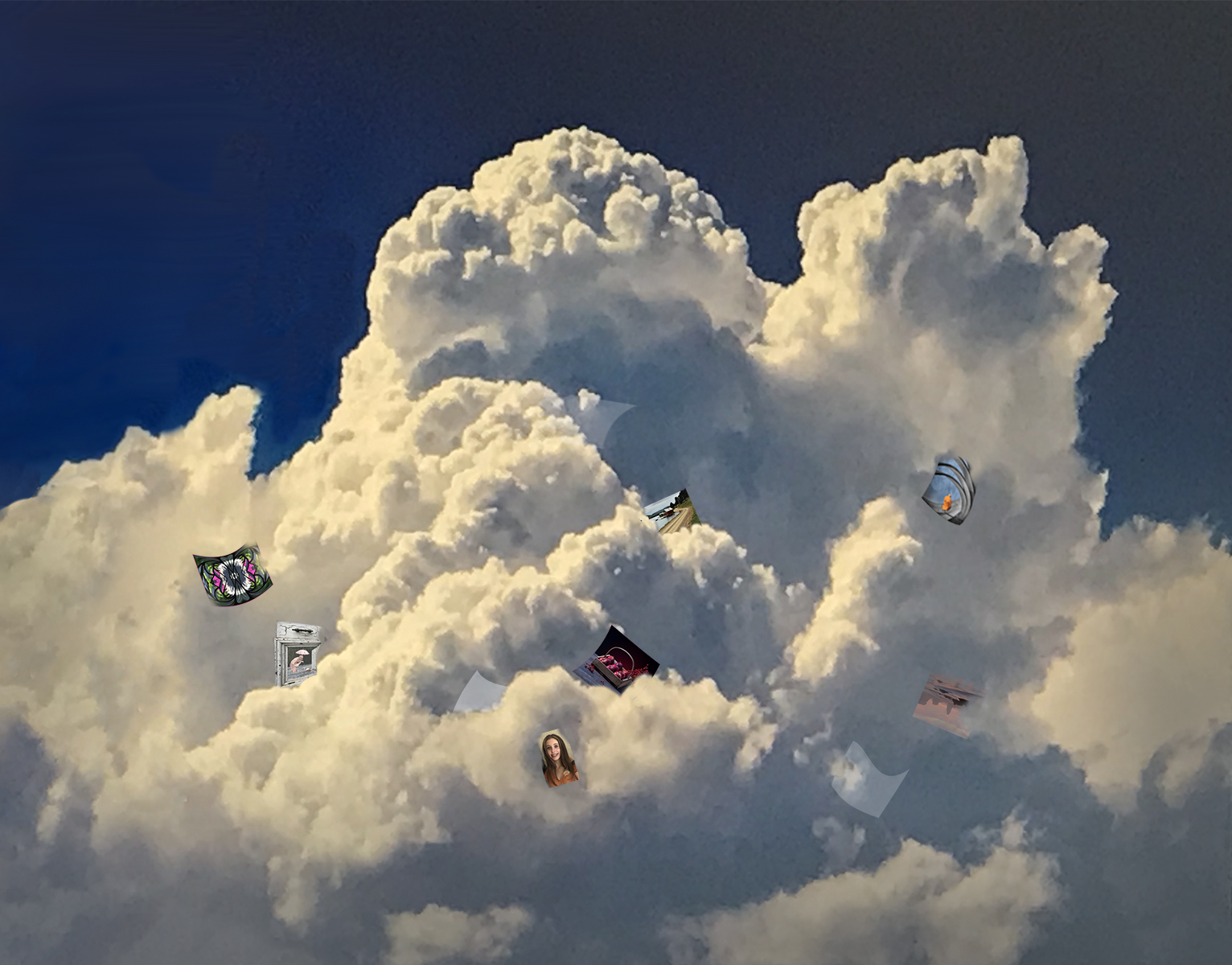
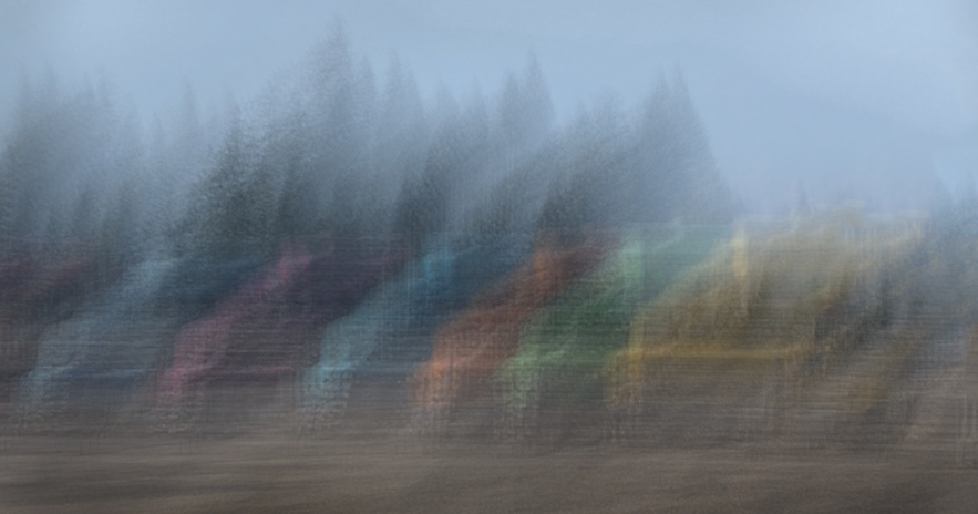
A fascinating, unique image, Jerry. The moodiness of the distant clouds with the overlay of falling leaves feels like two separate images, making me look near then far, some kind of switching in my brain, the same as when I look at the arrow on a FedEx truck. |
Aug 25th |
| 64 |
Aug 21 |
Comment |
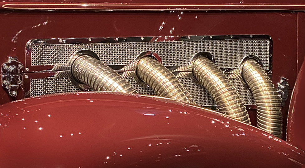
Good capture, interesting info about the car . . . and that you had one. Your panning is so successful, far beyond anything I have ever accomplished. I think reducing the contrast of the background would make it less distracting but still provide a separate backdrop.
|
Aug 25th |
| 64 |
Aug 21 |
Comment |
Good capture, interesting info about the car . . . and that you had one. Your panning is so successful, far beyond anything I have ever accomplished. I think reducing the contrast of the background would make it less distracting but still leave the beneficial, separate backdrop, an environment. |
Aug 25th |
| 64 |
Aug 21 |
Comment |
I agree with the above re the lighting, pose and depth of field. I don't understand the white on his fur. Would think it's snow except for the flowers on the ground. Possibly frost? |
Aug 25th |
| 64 |
Aug 21 |
Comment |
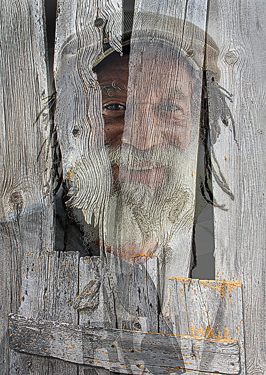
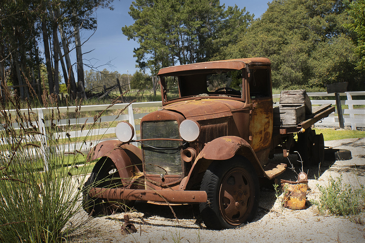
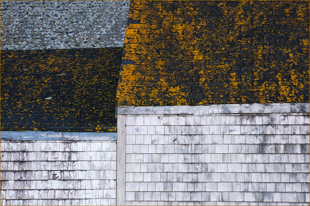
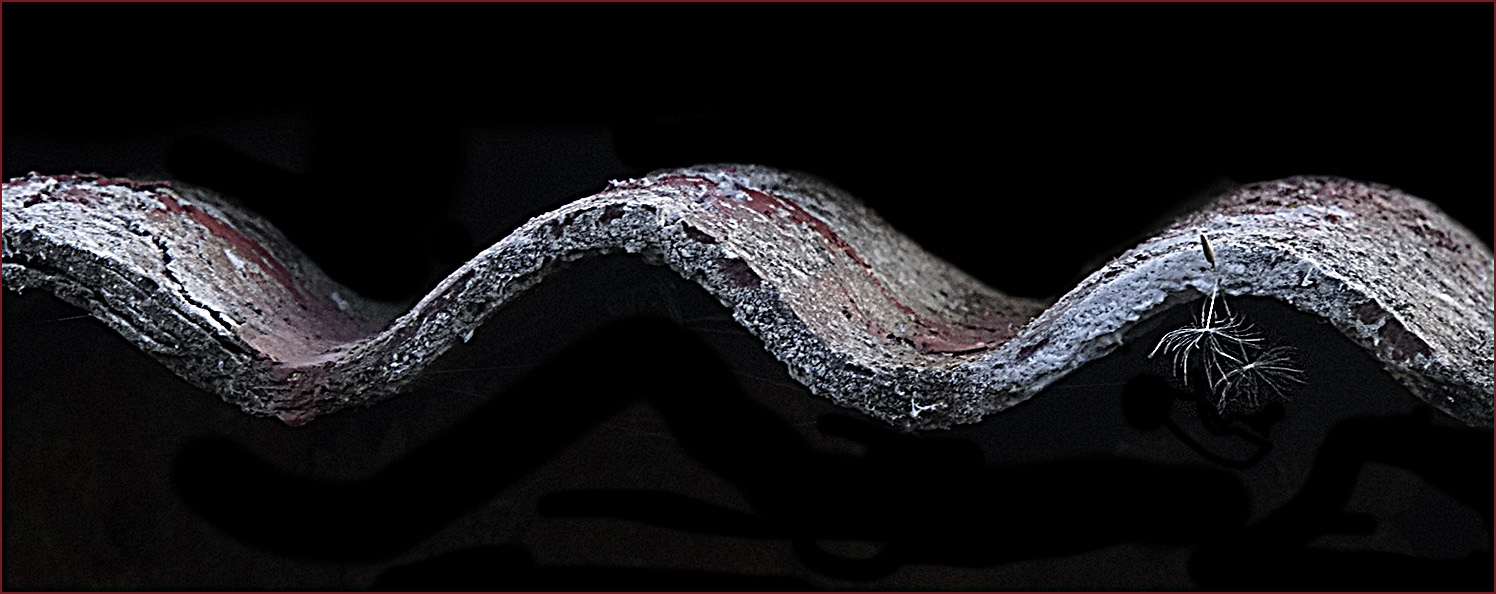
I like the original, but the mono draws me into the horizontal dark cracks and to examine the barely visible rectangular bits on the left. At first I thought the scratches were grass. They're another puzzlement. I find the partial bolts on the left and bottom more distracting. |
Aug 24th |
| 64 |
Aug 21 |
Comment |
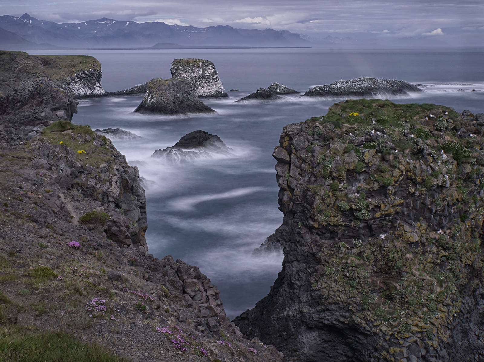
This striking scene was well-captured: good textural detail and the full greyscale range. Monochrome was an excellent choice. |
Aug 24th |
| 64 |
Aug 21 |
Comment |
Fortunate to find a bride at Bridal Veil Falls. I like the texture of the fern in front. My eye moves down the falls to the fern to the people and back around. I like the power of the water from this shutter speed, but agree that a more silky effect would match the bridal story. The upper portion might have detail if seen on a screen larger than my little laptop, which shows it as rather blown out. Jerry's crop, if in sepia, would remind me of a 19th Century Andrew Bierstadt painting. |
Aug 24th |
| 64 |
Aug 21 |
Reply |
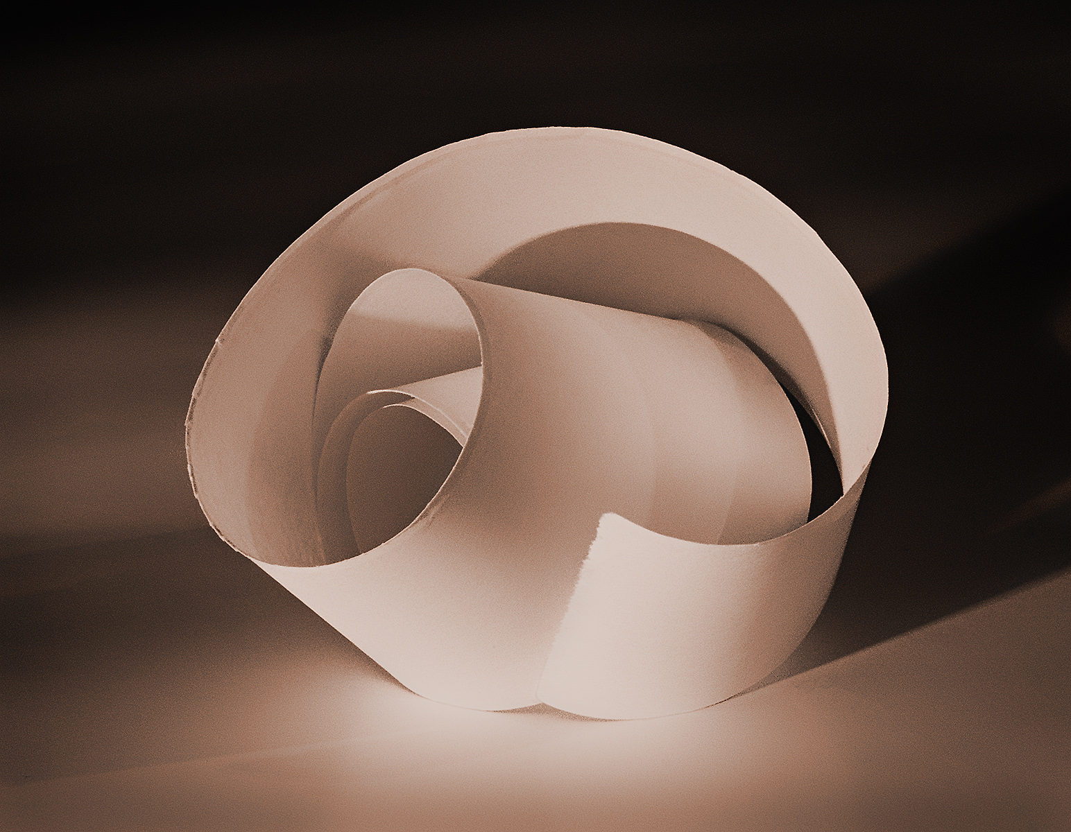
Thanks for stopping by Stephen. Are you suggesting the negative space be black almost matching the curved area? BTW, I get up with some Levitases in Green Bay, David and Louis. But it's not that uncommon a name. |
Aug 12th |
| 64 |
Aug 21 |
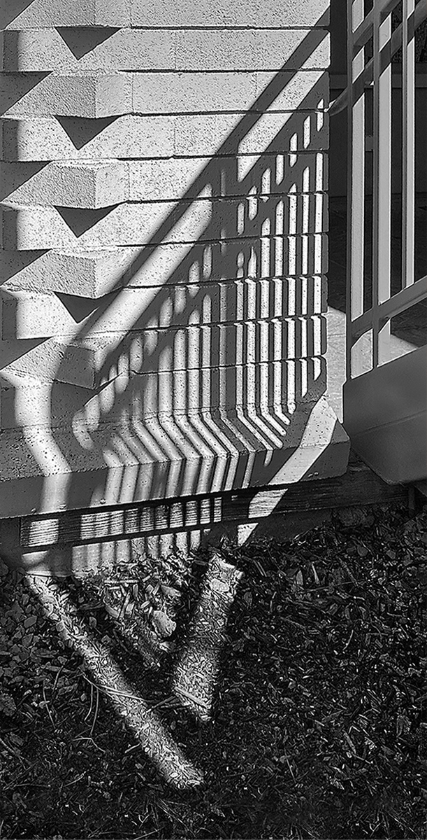
Reply |
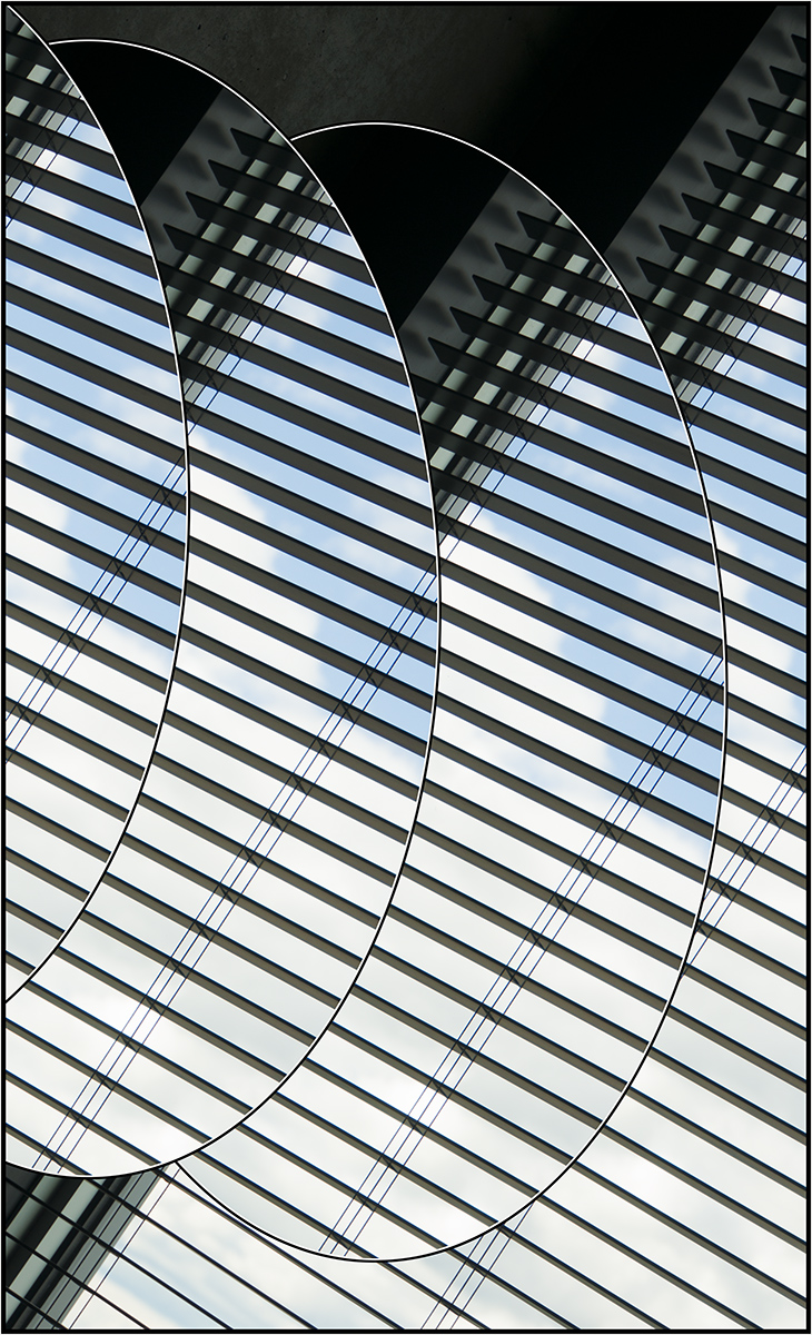
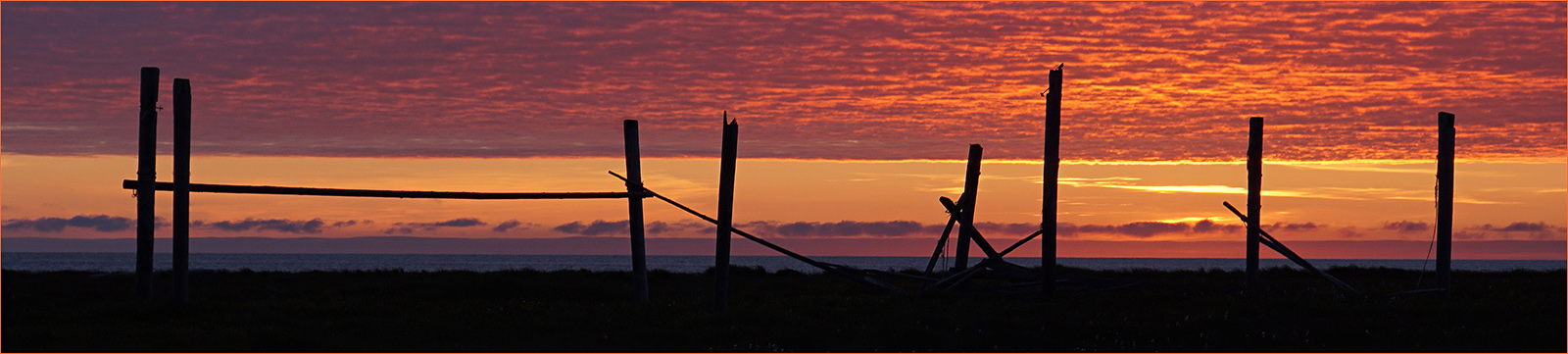
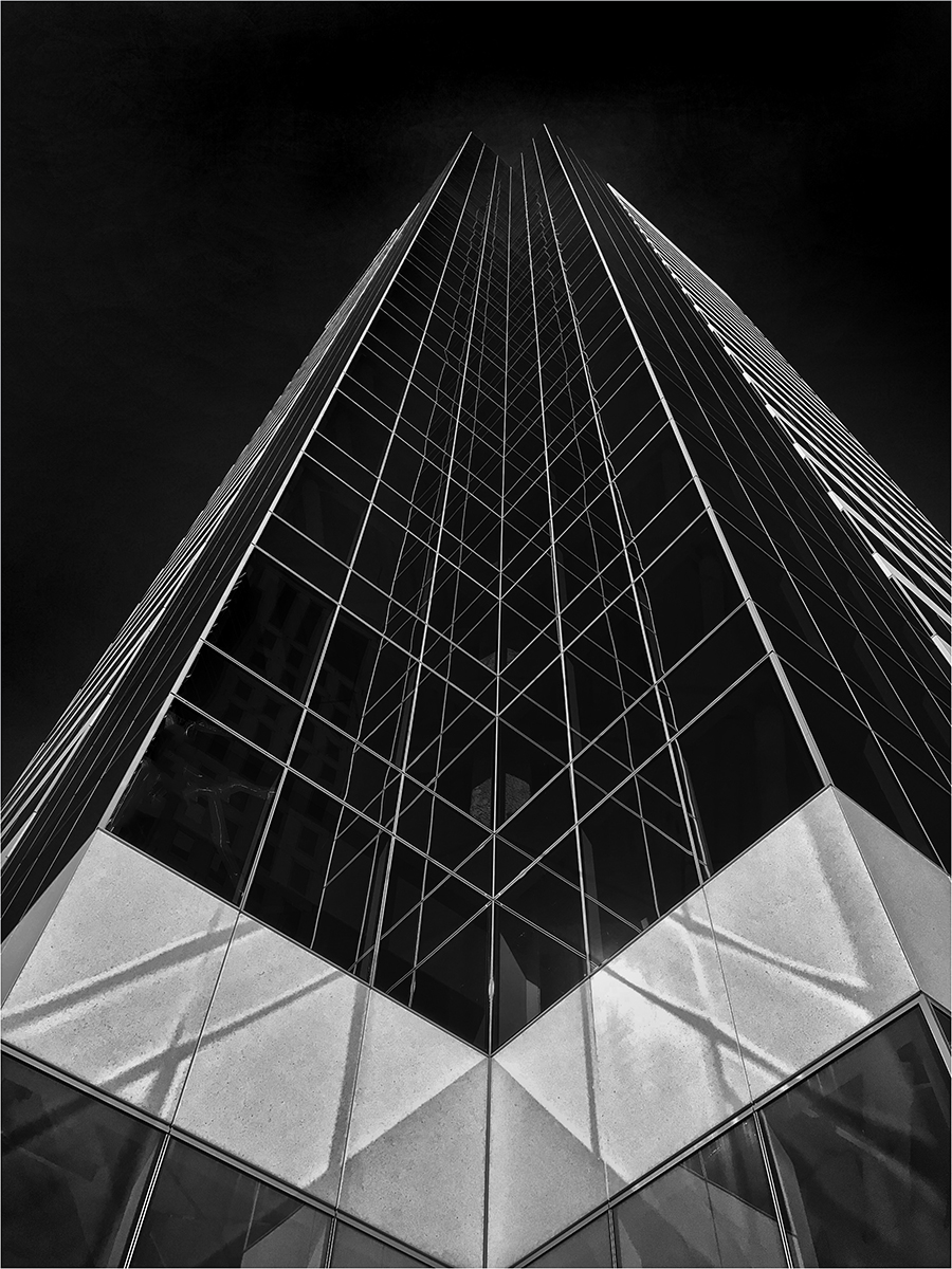
Thanks all. I had tried it without the keystoning. Didn't use that b/c I thought the white building related better to the dark one across the negative space the way I submitted it.
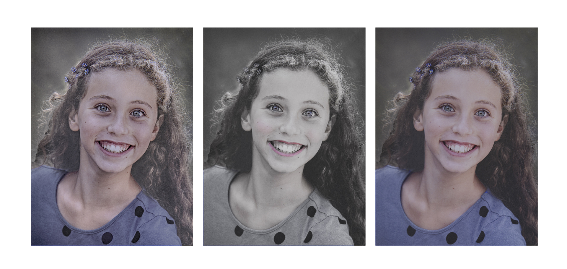
Not much response to my question of whether the colored or B&W version was preferred. Last week's judge gave the former a first place in Pictorial Masters. |
Aug 12th |
8 comments - 3 replies for Group 64
|
13 comments - 4 replies Total
|