|
| Group |
Round |
C/R |
Comment |
Date |
Image |
| 34 |
Apr 17 |
Comment |
Beautiful and dreamy, including the subtle frame. I, too, would sharpen the petal. I like the bokka on the right, which accentuates that petal. But I would crop from the left almost to the sepal. |
Apr 30th |
| 34 |
Apr 17 |
Comment |
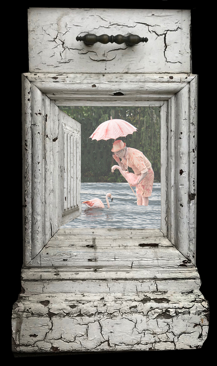
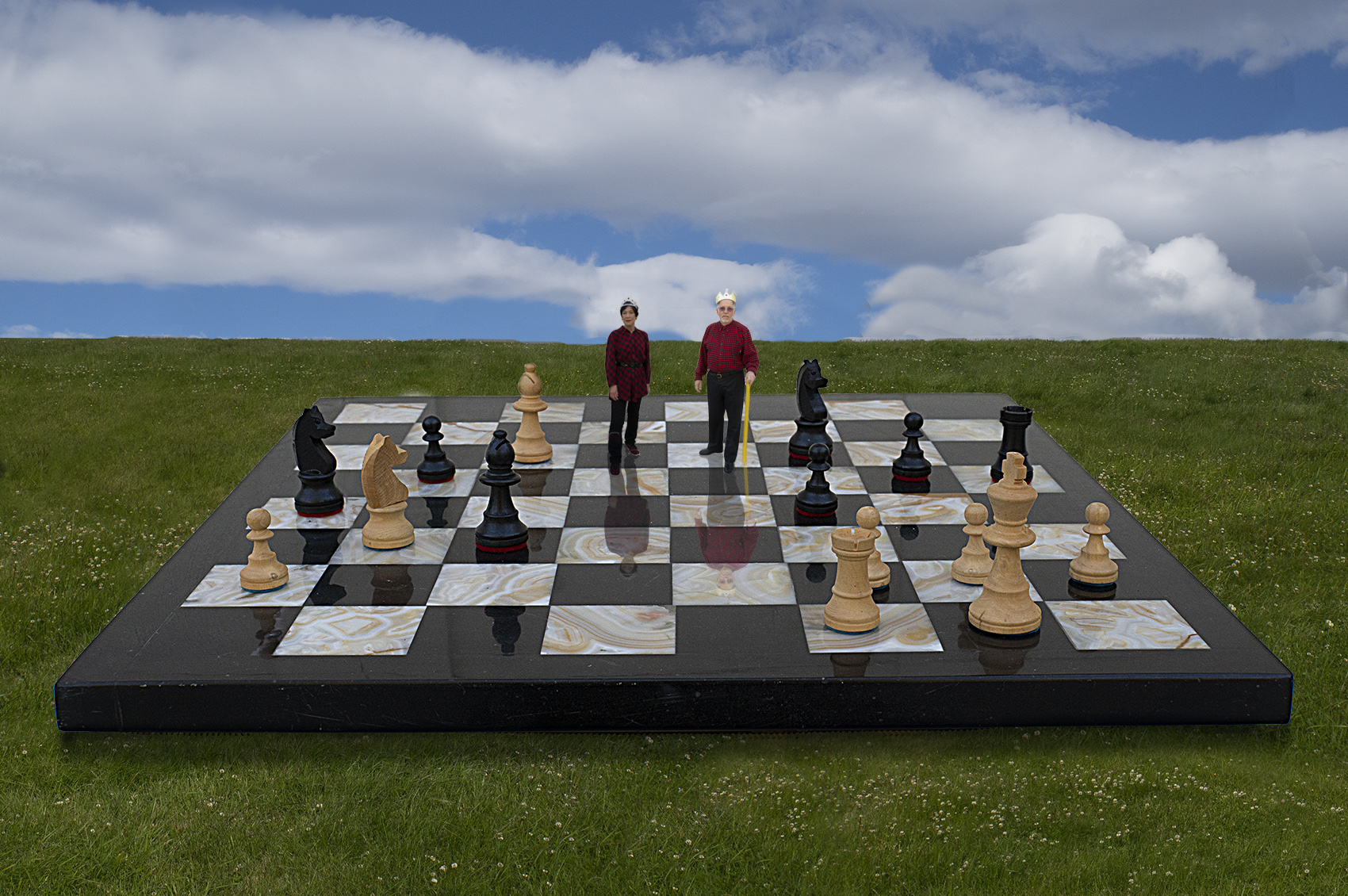
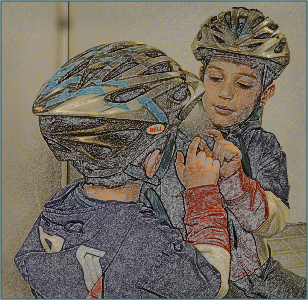
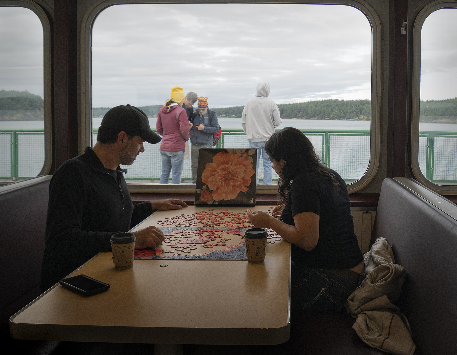
Georgianne, I love this project! Agreeing with the above on the successful exclusion and inclusion of elements. The woman's hand does look awkward without the cell phone. Could you have modified it to look more as tho she's grasping the bottle? Now that Phil mentions the directionality of the light on the people,perhaps you could use the plug-in Steve did above. The texture ties it all together nicely. |
Apr 30th |
| 34 |
Apr 17 |
Comment |
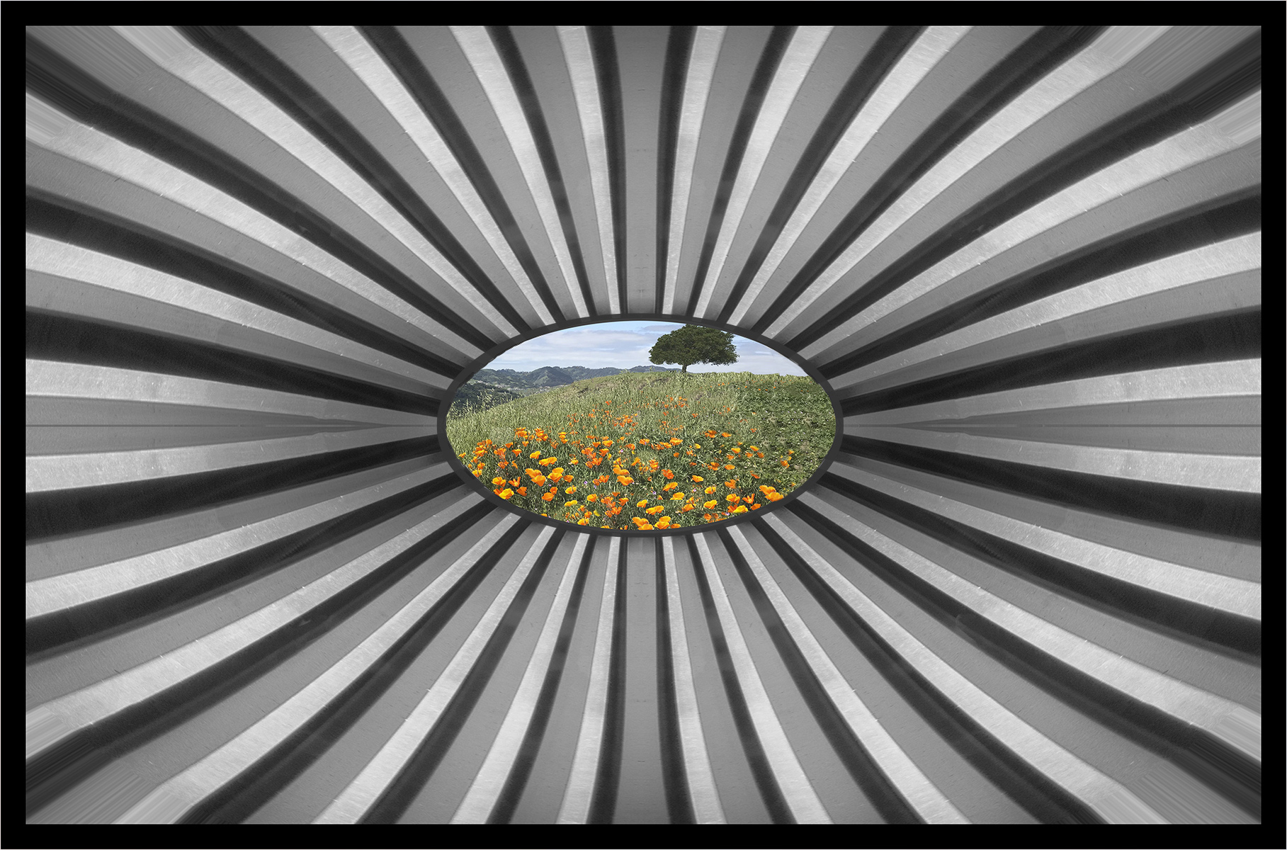
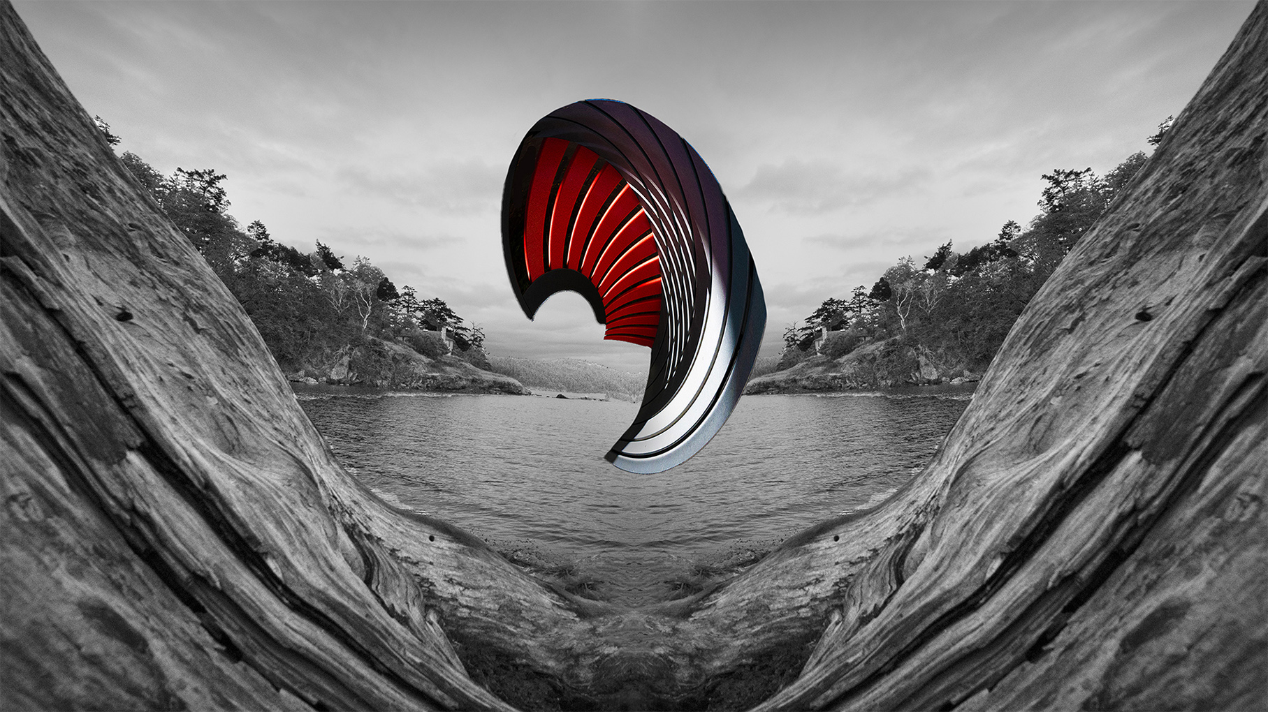
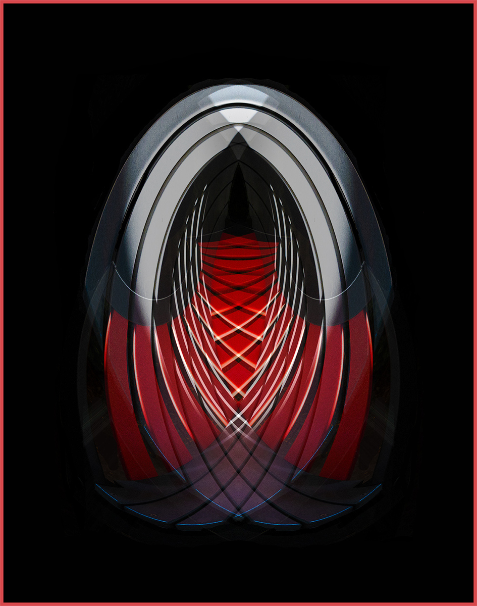
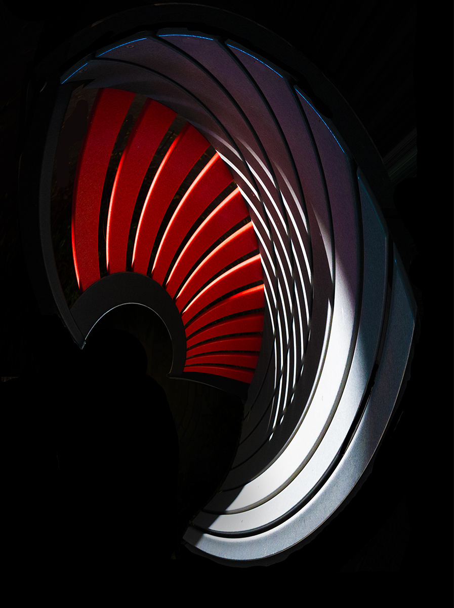
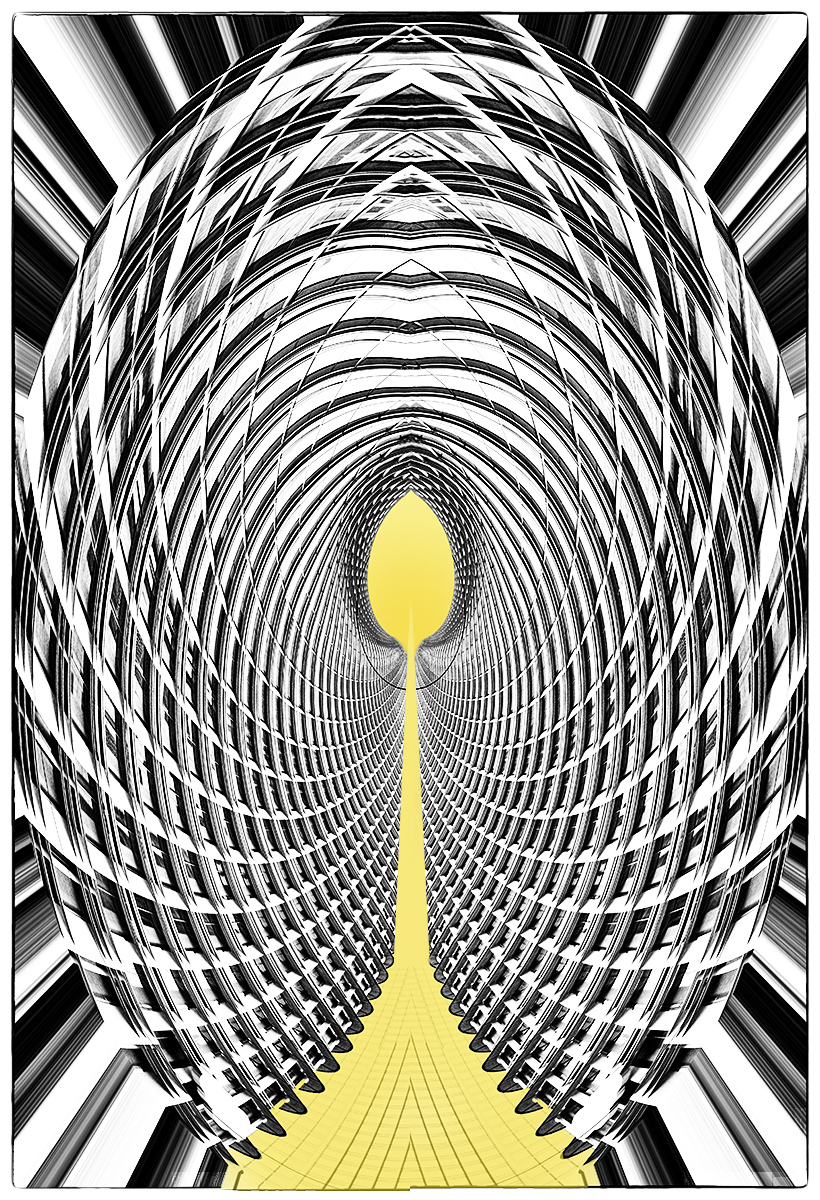
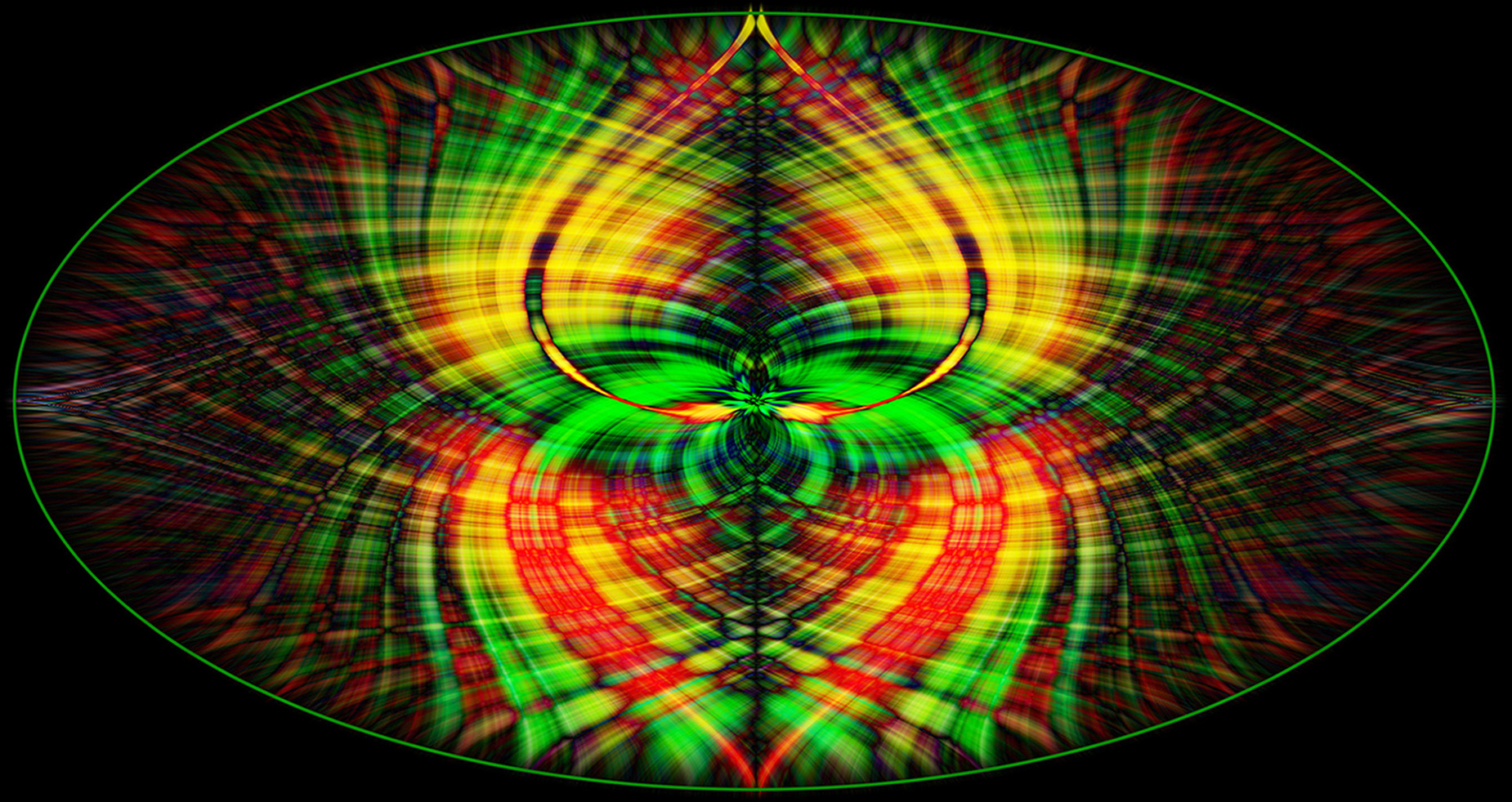
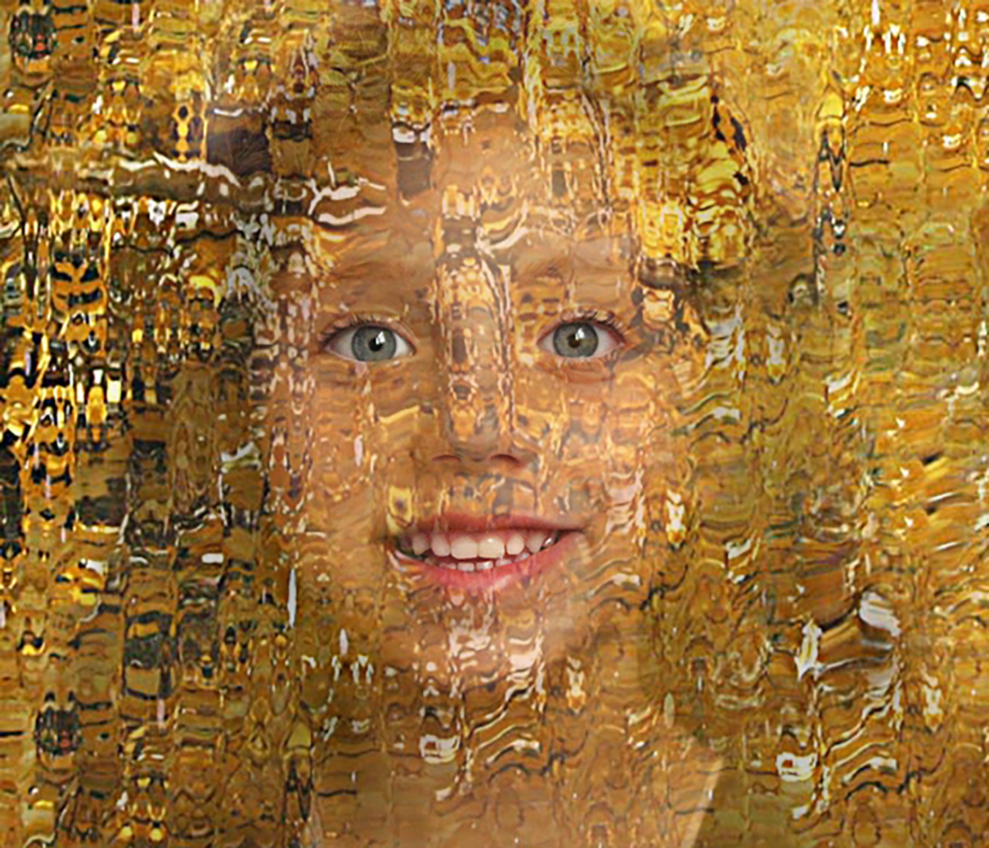
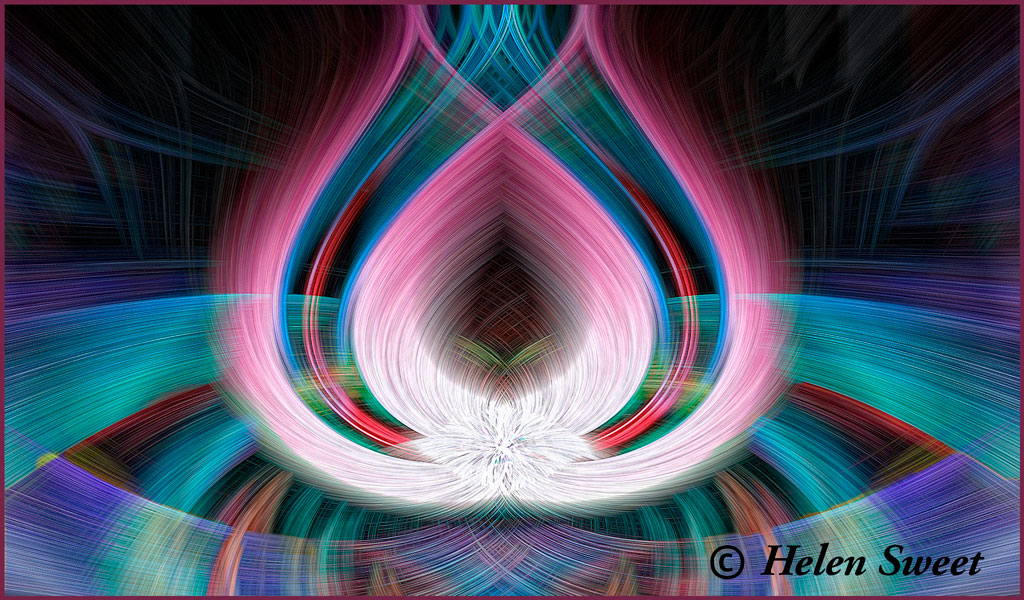
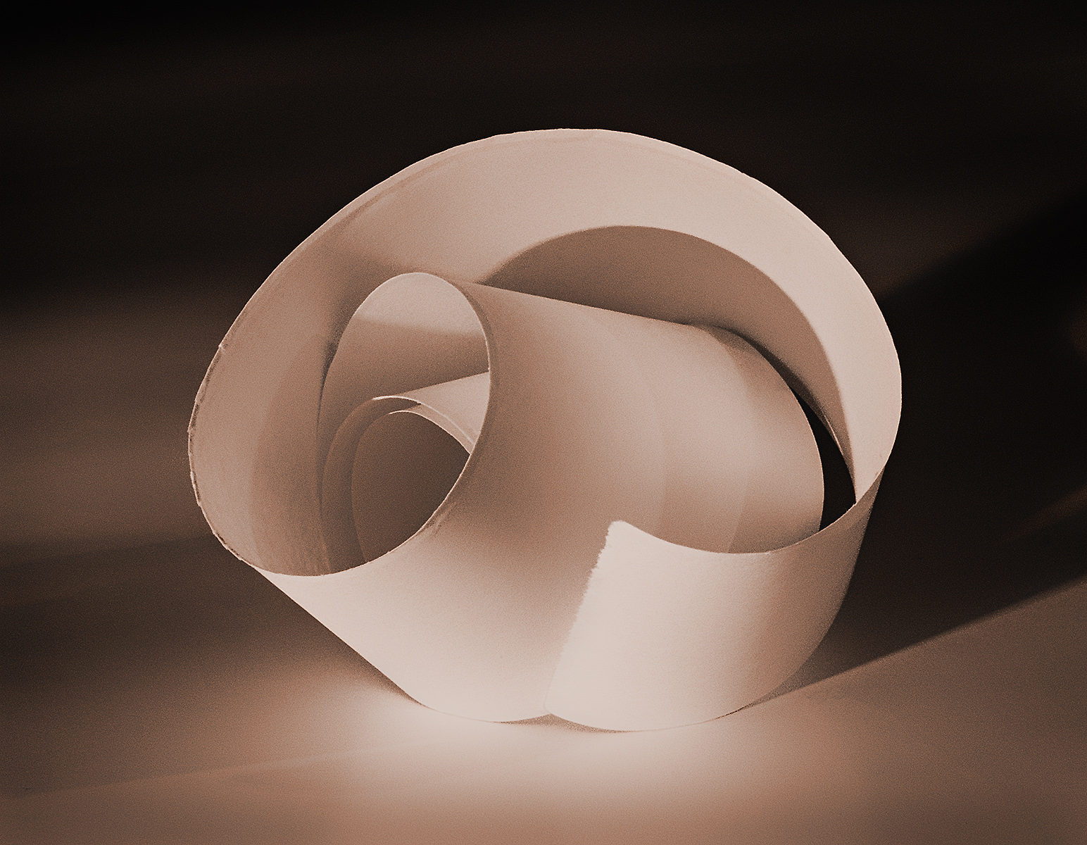
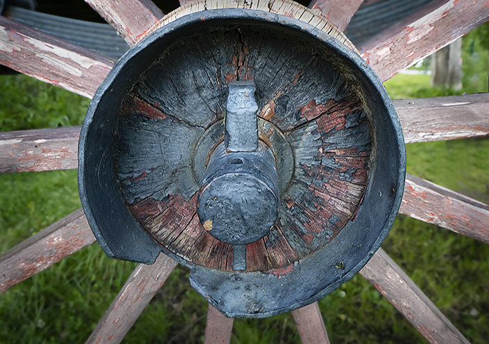
Amazing how much detail and color you were able to achieve starting with your original. I like the color/texture you've added to the gold and the lines in the complementary inner part pulling into the hole. I agree with Christine's suggestion that someone or something should be falling or diving in. |
Apr 30th |
| 34 |
Apr 17 |
Comment |
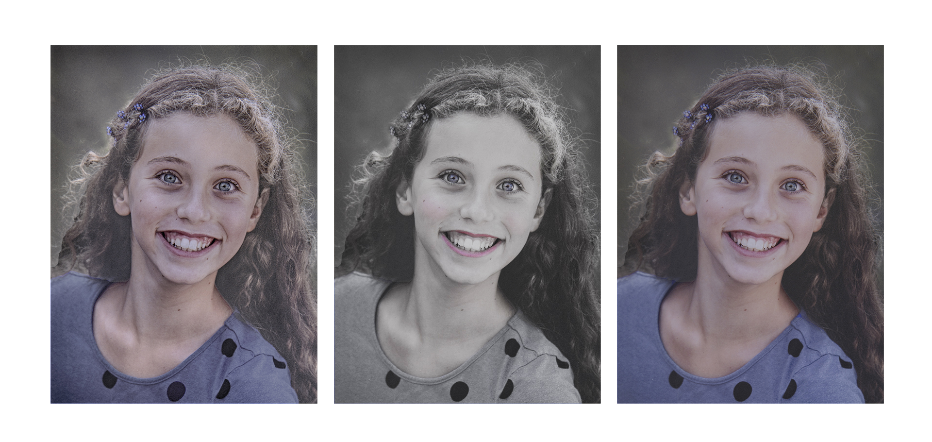
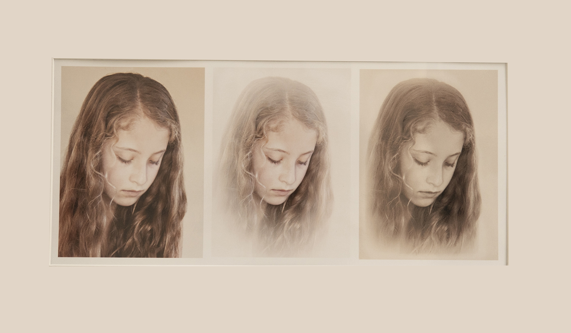
She is beautiful, Steve. I love her eyes and her beautiful skin in the original. Fascinating that you can change the direction of the light. But I don't have the plug-ins that you do. I agree that you've created a period piece with your modifications. I like all except the coloring, especially the green hair, and the flattening of her features. A lovely model for your "playing." |
Apr 30th |
| 34 |
Apr 17 |
Comment |
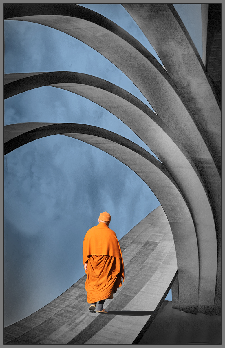
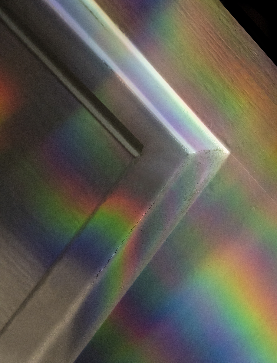
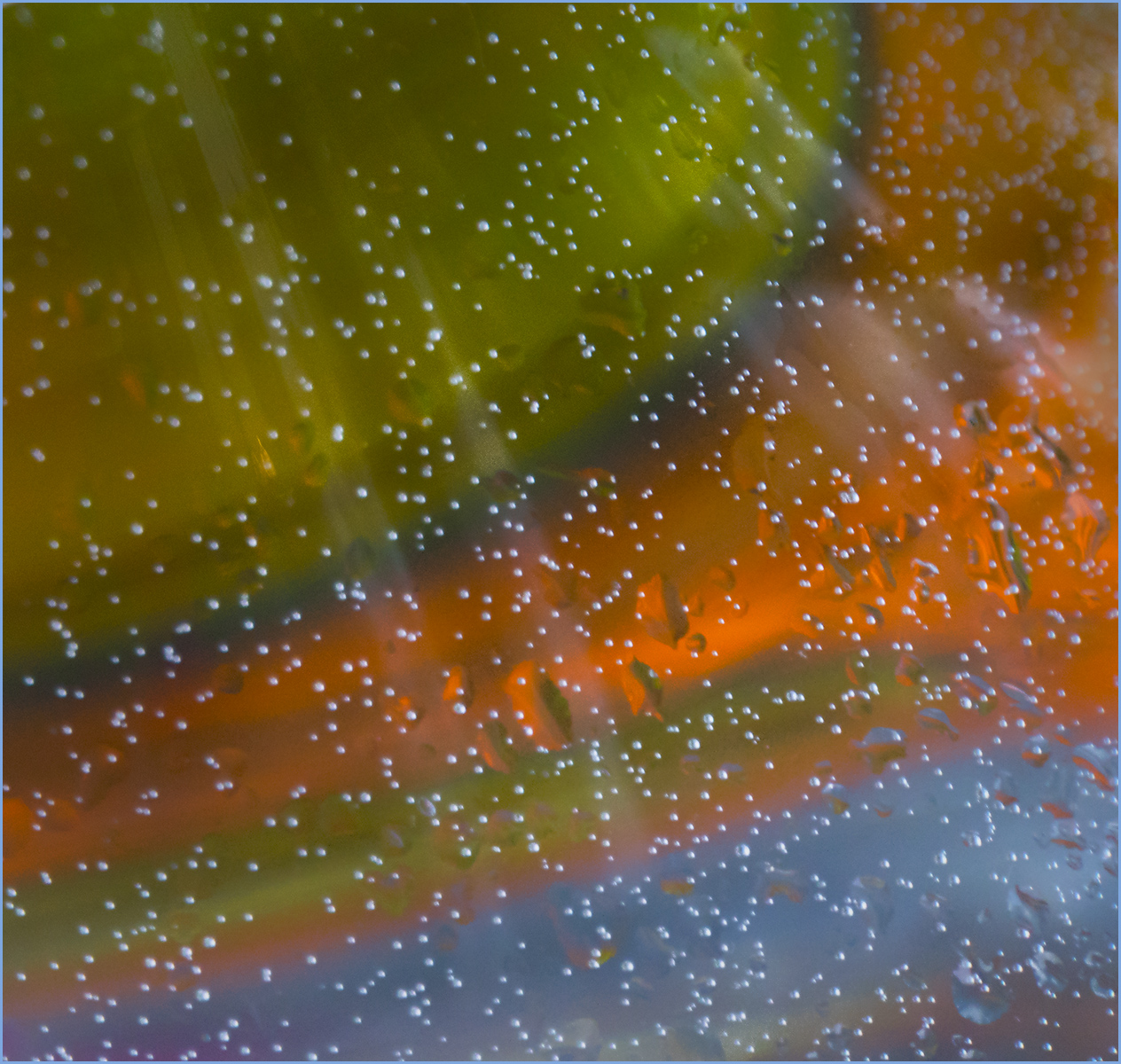
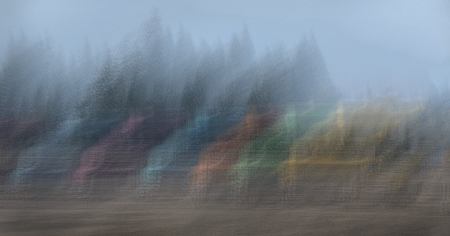
I agree, too, Candy. The lighting effect on the buds is lovely. The texture and vignette you've added to the bland background are perfect. |
Apr 23rd |
| 34 |
Apr 17 |
Comment |
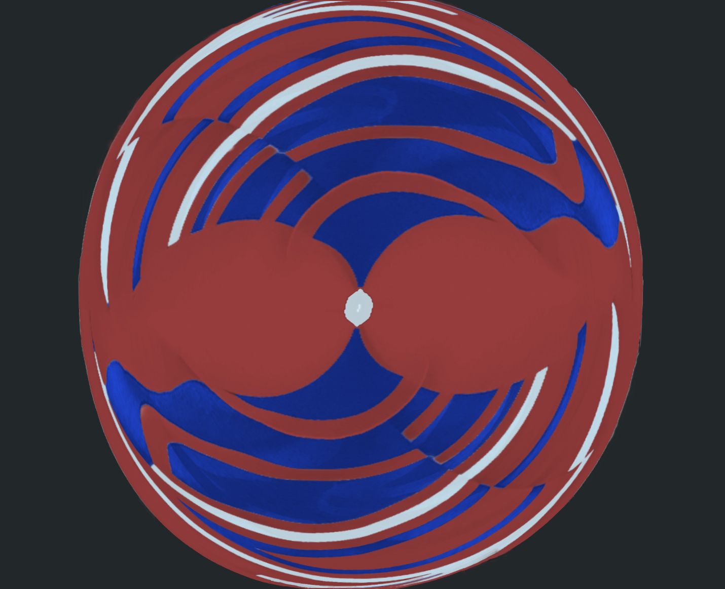
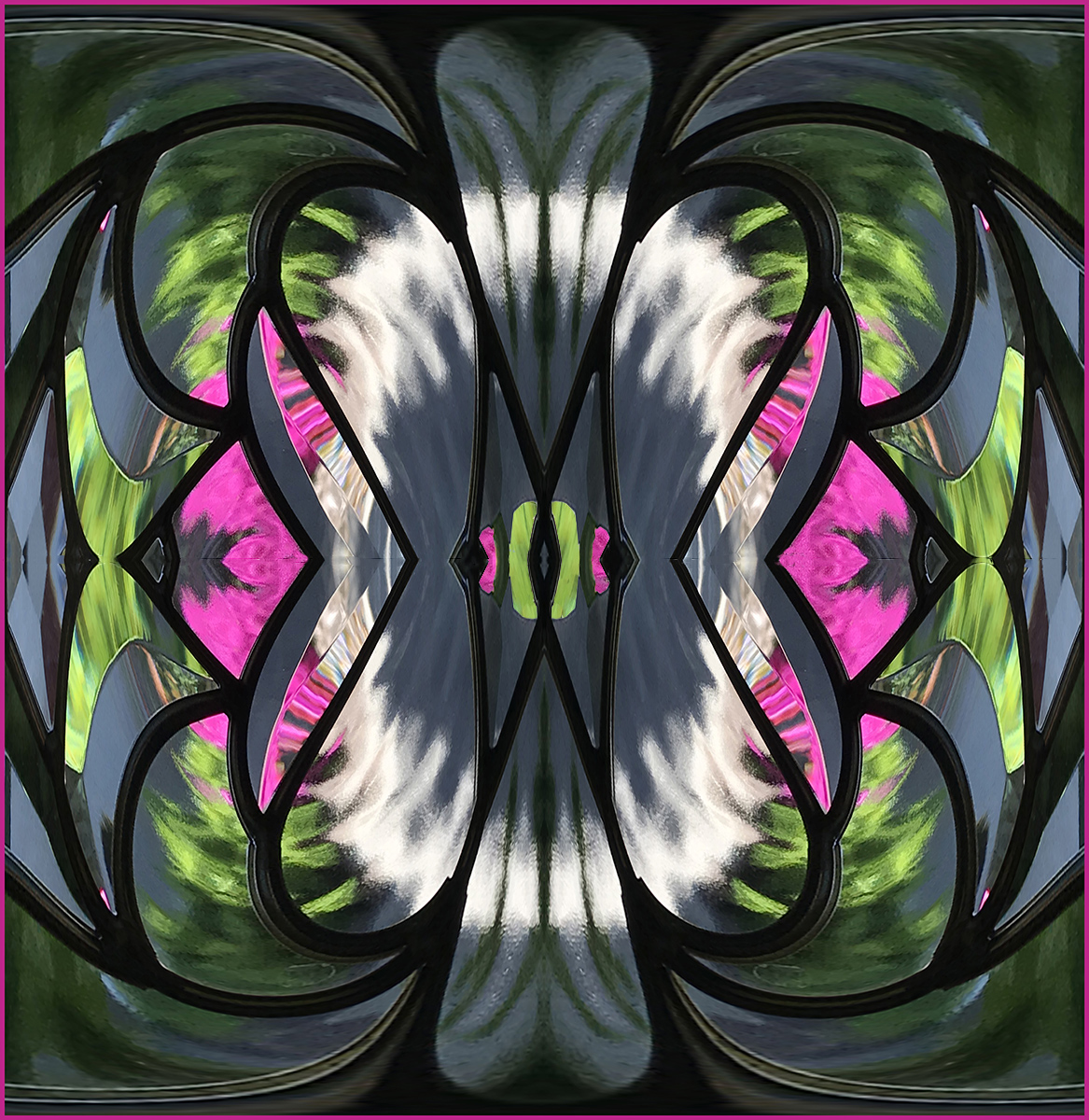
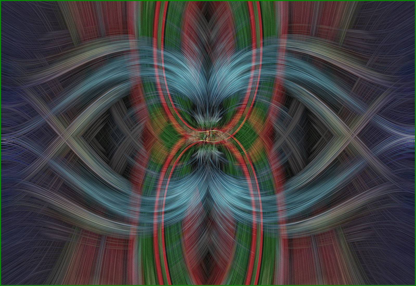
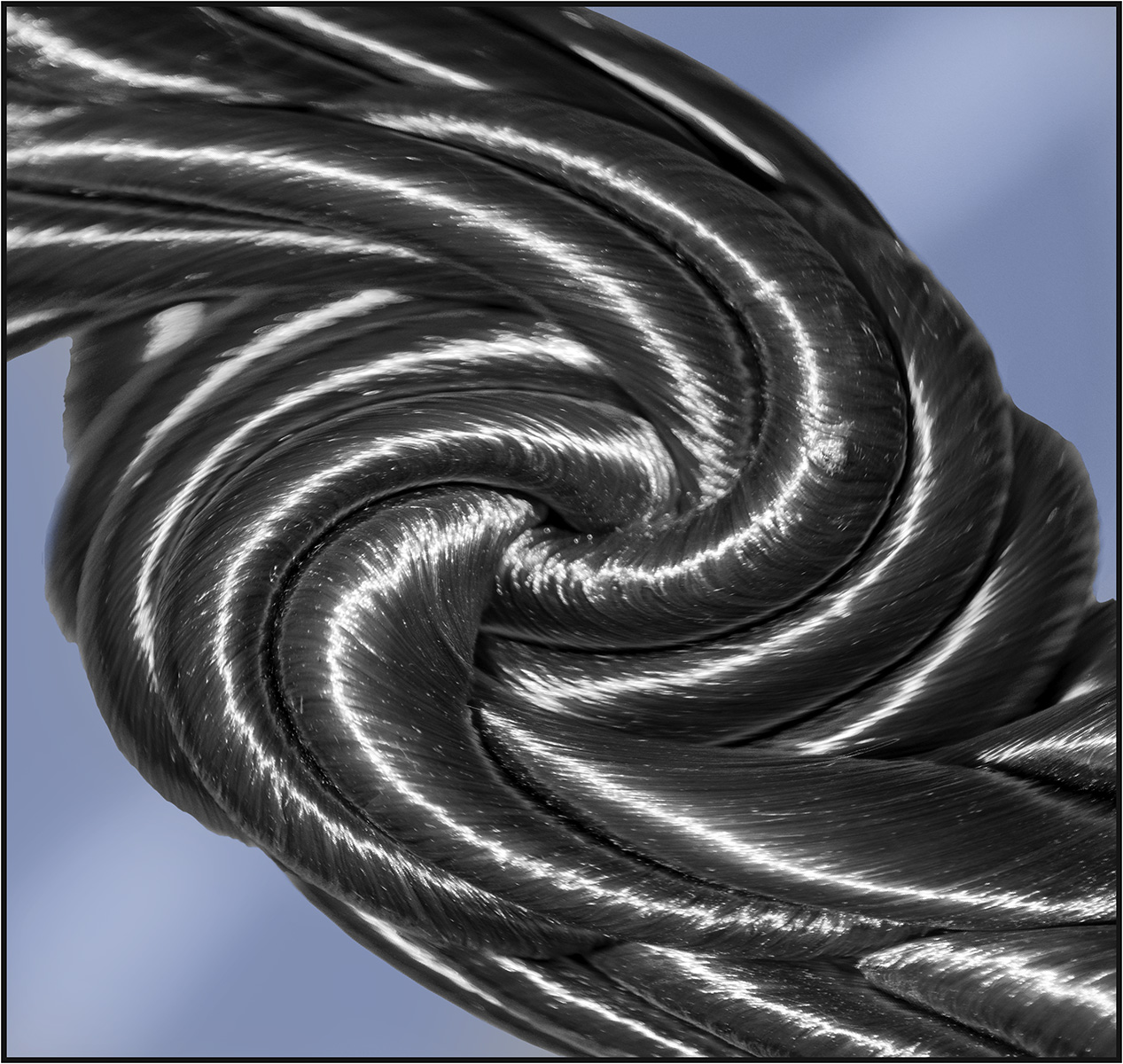
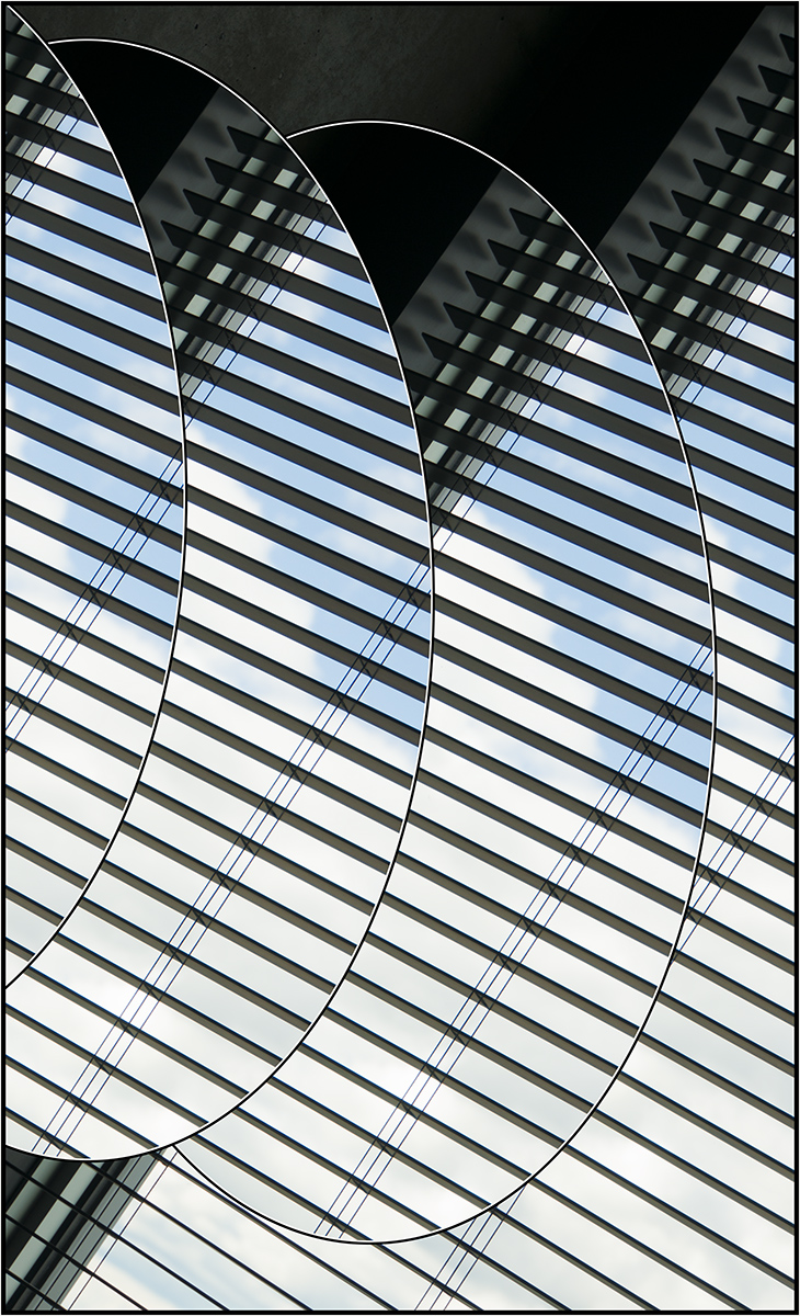
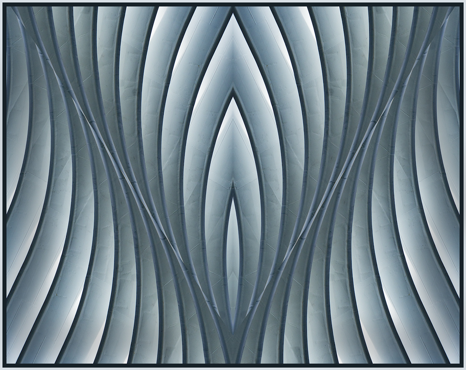
I like what you've done here, Jan. It pops like a shiny metal chain of some kind, and the complementary colors and blurred background are well done with your iPad app. I also like "original 2" where the center recedes into space. |
Apr 23rd |
| 34 |
Apr 17 |
Reply |
BTW, I got the formula off of this website, but it was before entries were accessibly archived. |
Apr 21st |
| 34 |
Apr 17 |
Reply |
Thank you, Steve. I'd never put it into my computer. . . just on a piece of paper in a file. How retro of me. |
Apr 21st |
| 34 |
Apr 17 |
Reply |
Thank you, Candy. I'd love to see the formula, too. Have looked pretty thoroughly, even for something similar which I saw several months ago in another Creative group, but no luck. Maybe with trial and error, I can recreate it.
|
Apr 21st |
6 comments - 3 replies for Group 34
|
| 37 |
Apr 17 |
Comment |
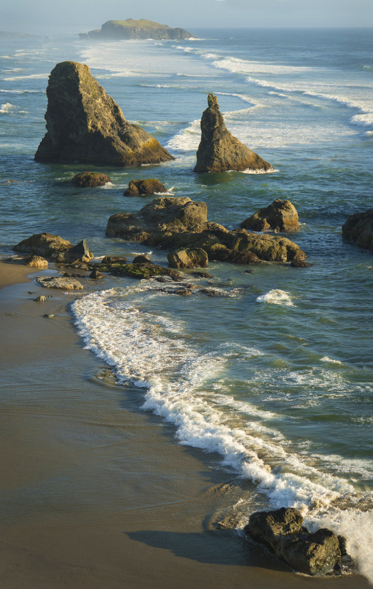
The sand is beautiful. I like the color and contrast of textures and the lines of the receding water. I just wish the shell had come to rest closer to the waterline. |
Apr 30th |
| 37 |
Apr 17 |
Reply |
I meant cropping from the LEFT, as you suggested Jim. |
Apr 30th |
| 37 |
Apr 17 |
Comment |
Good observation! I, too, like the composition. The colors of the water remind me of those in Monet's garden paintings. The contrasting textures and patterns are appealing. Could the ice have been sharper to accentuate the patterns even further? |
Apr 30th |
| 37 |
Apr 17 |
Comment |
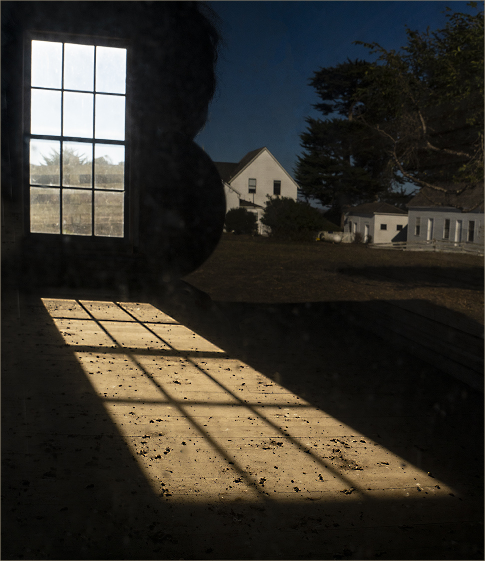
Good shot of hands at work. What was your f/stop? You have the narrow focus right where you want it, on the tiles. Unfortunately, it's also on her right knee. I agree about cropping that out. I, too, enjoy the toning and would have liked to see some hammer motion. |
Apr 30th |
| 37 |
Apr 17 |
Comment |
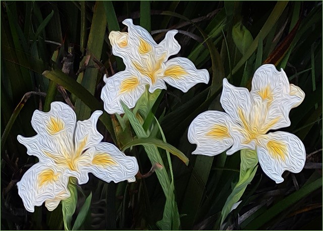
Beautiful, soft colors, Grace. I also like the positioning of the flower, tho I would have liked all (or less) of the top edge of the petal on the right so the cropping would look intentional. I like the sharpness of the green stigma and agree with the others that bit more depth of field would be good. |
Apr 30th |
| 37 |
Apr 17 |
Reply |
Yes, I think cropping from the rt to make it look deliberately centered would work.
Don't know whether I'd want to lose the wispy end of the whitest cloud, tho. |
Apr 24th |
| 37 |
Apr 17 |
Comment |
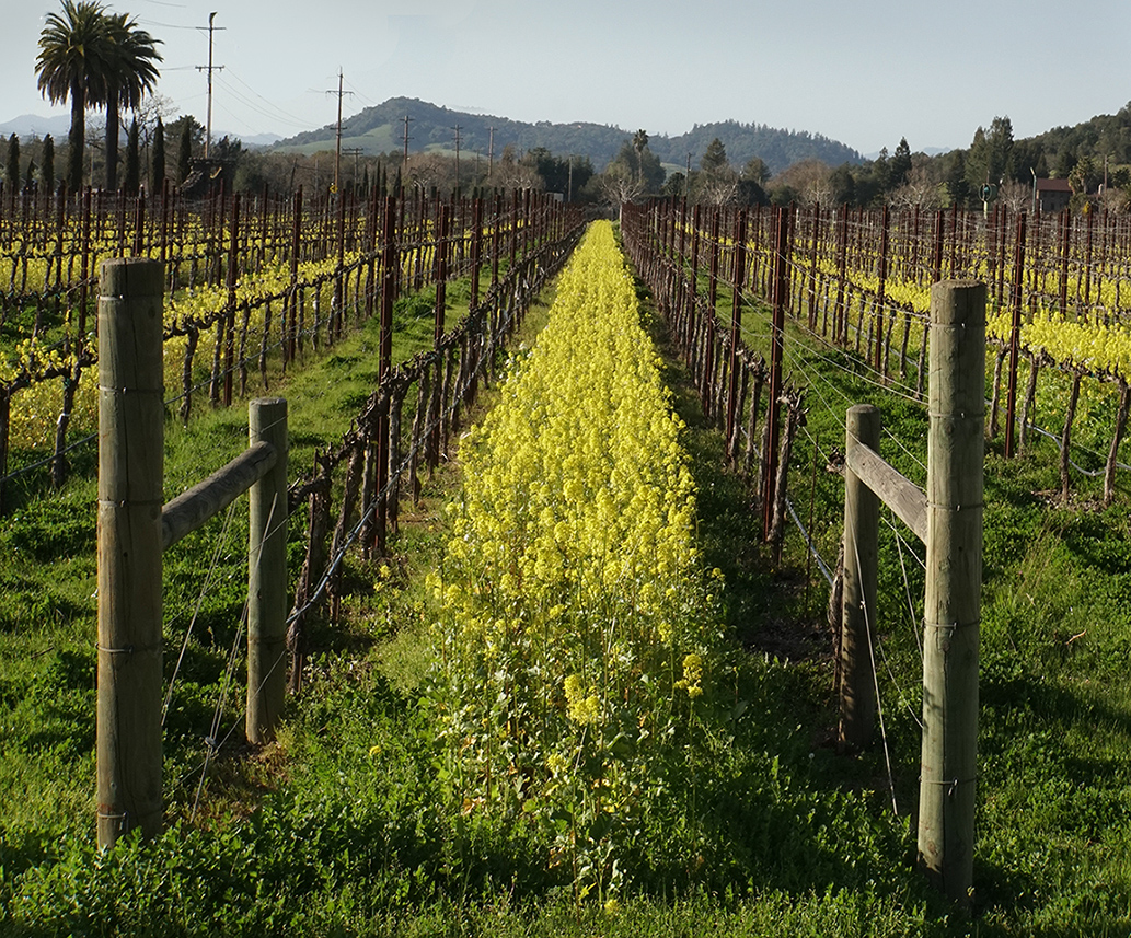
Beautiful image from yet another hike, Jim. I agree that the lily could be a bit darker, but I like your blurring of the complementary background. You definitely got it right, except for one nit. Is there something on the bottom of the petal to the right, or is that a miss in selecting? Also in the "V"s where the petals meet. If so, you might enlarge your image more during selection to give better control of the selection line.
|
Apr 23rd |
| 37 |
Apr 17 |
Comment |
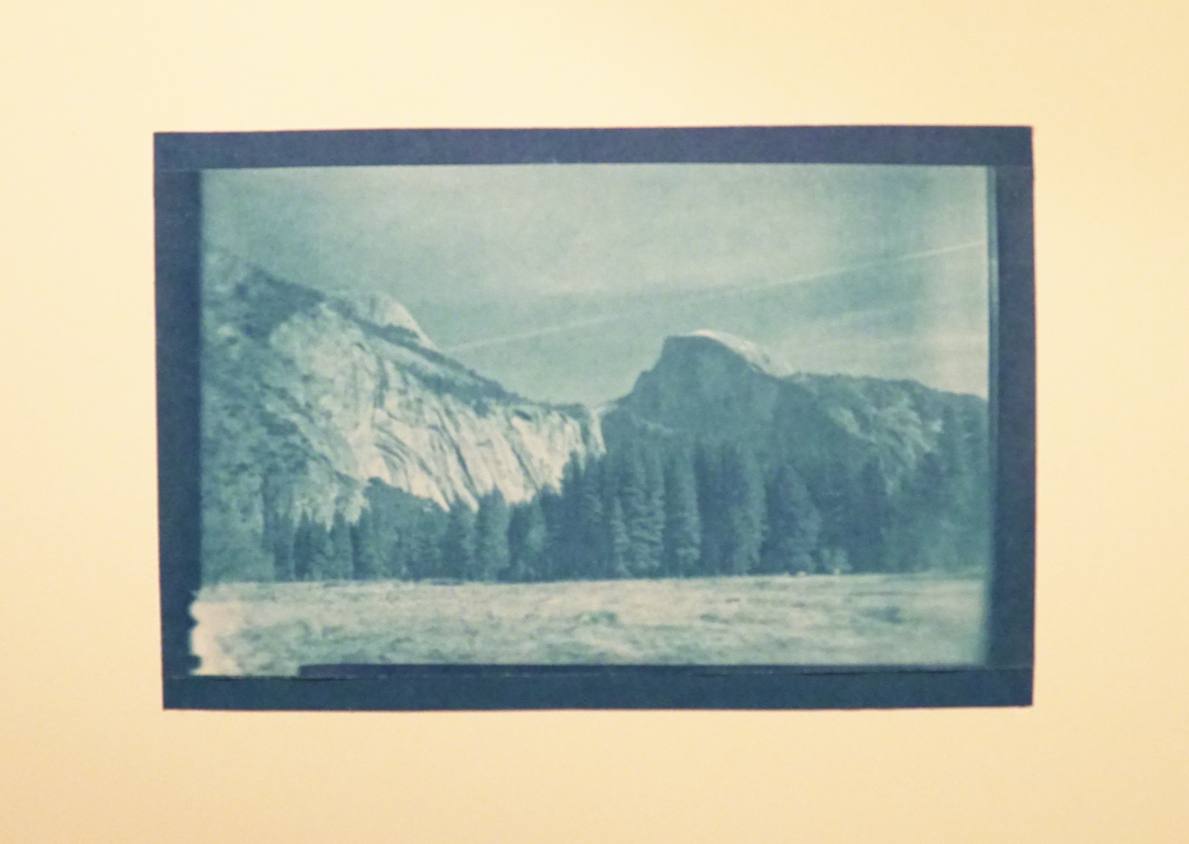
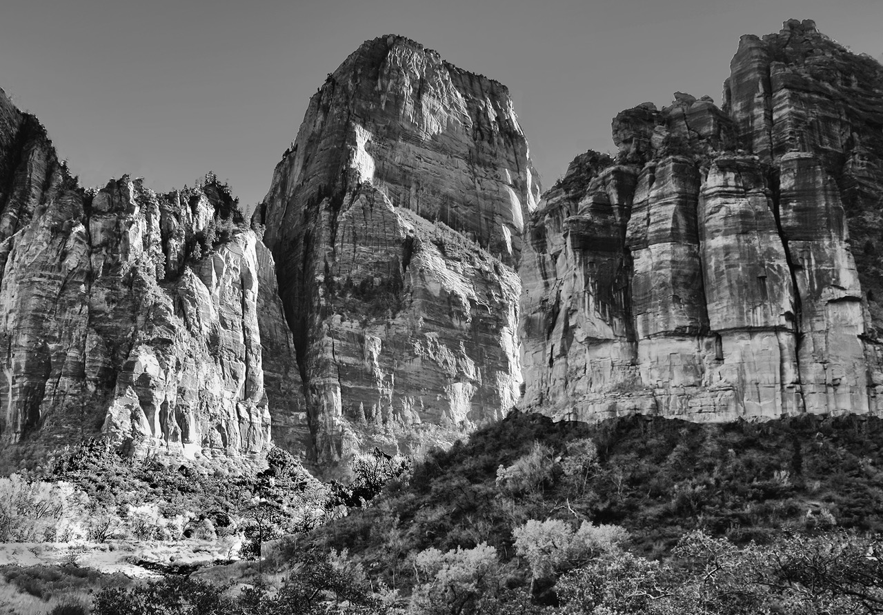
Really beautiful, Subhash! What an amazing shot without enhancing the color.
The peak closest to the center is so red it almost looks volcanic.
|
Apr 23rd |
| 37 |
Apr 17 |
Reply |
Thank you, Gunter. I'll try that.
|
Apr 12th |
6 comments - 3 replies for Group 37
|
12 comments - 6 replies Total
|