|
| Group |
Round |
C/R |
Comment |
Date |
Image |
| 56 |
Jul 23 |
Reply |
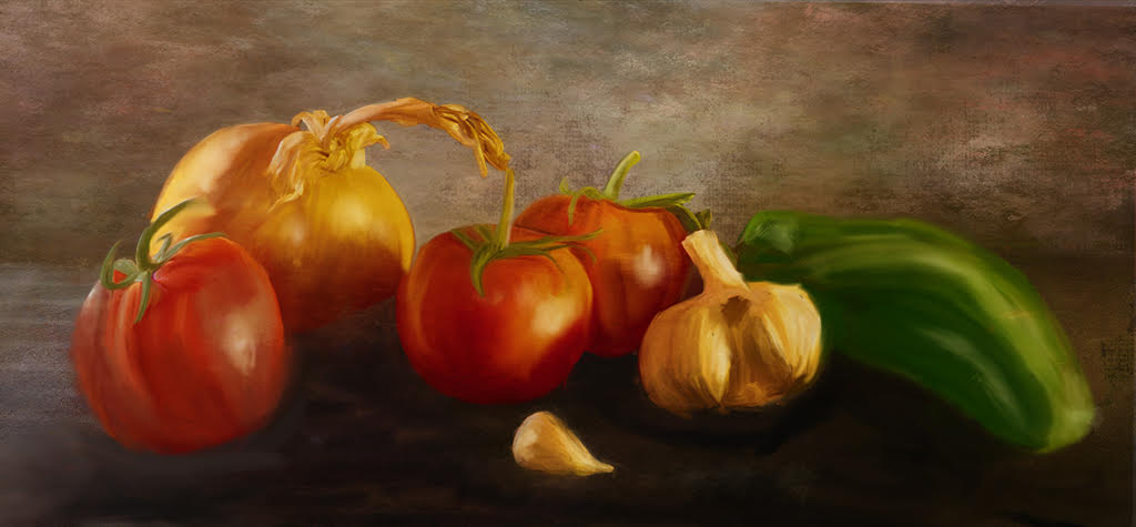
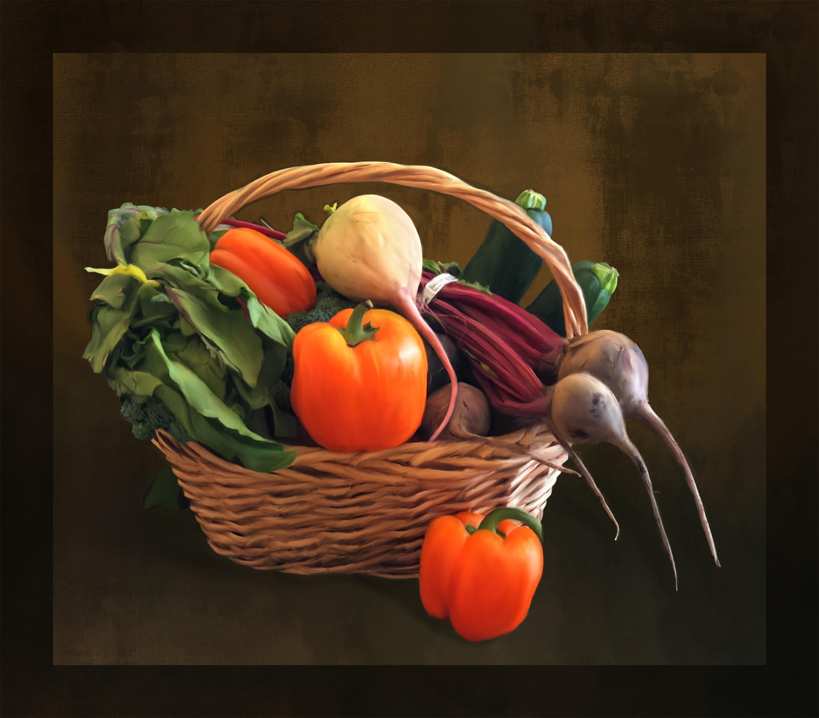
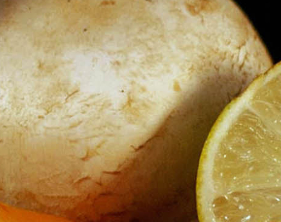
It does not appear flat to me but rather missing the texture of the potato |
Jul 28th |
 |
| 56 |
Jul 23 |
Comment |
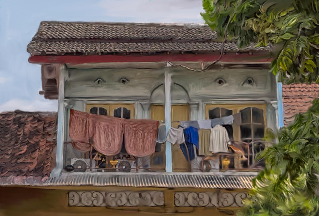
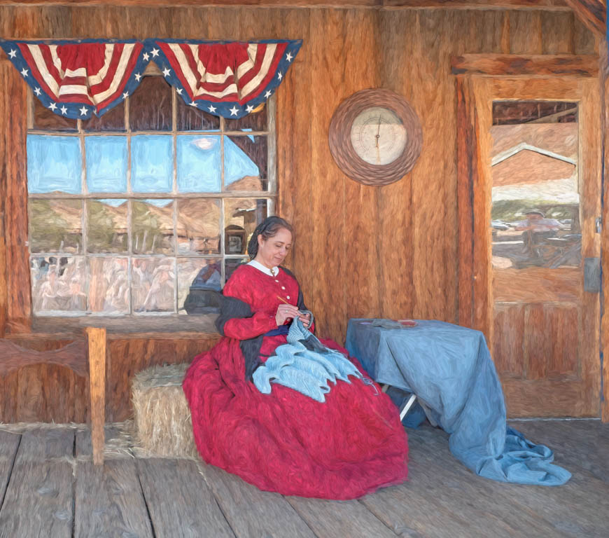
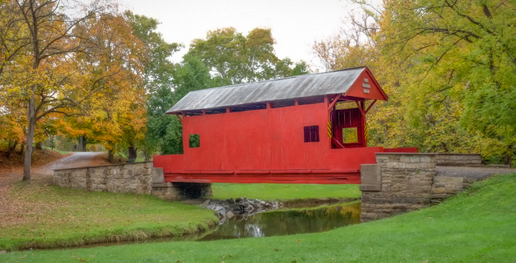
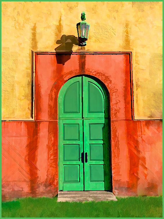
Wow, what an attractive art piece to my eye. I feel you made an excellent choice to use the background as a vignette of sorts with contrasting light to make the details, especially the sign on the barn, stand out.
I truly enjoy seeing the detail of colors, shading and painting strokes on the wood stack. To my eye that wood stack is a piece of art in itself. Nicely done. |
Jul 27th |
| 56 |
Jul 23 |
Comment |
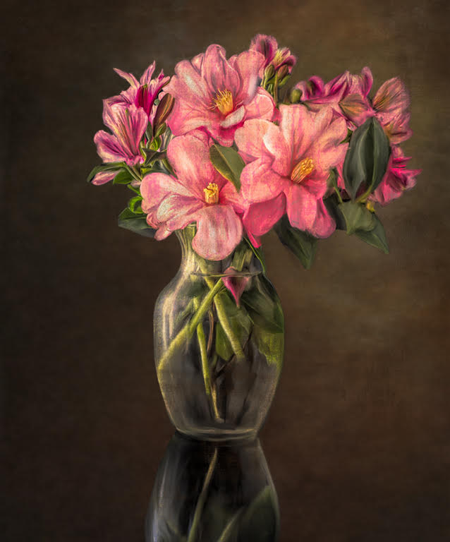
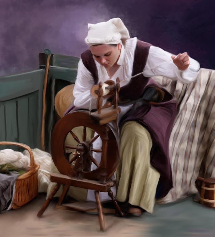
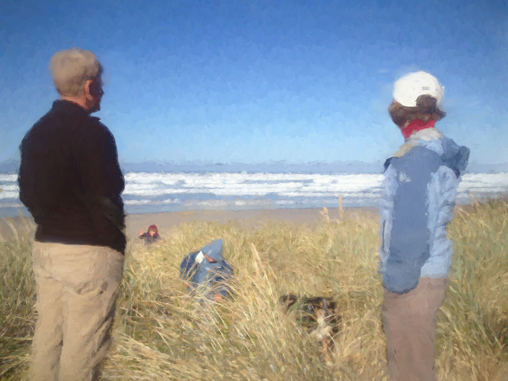
I really enjoyed the still life class and would like to find the time to take the advanced class. These classes just provided the incentive to do the work. However, I didn't get the opportunity to take it from Rick but the course still was wonderful. Your composition is really attractive to my eye as are your choices of veggies-their arrangement and color. I also feel your original choice of the bowl in the back adds height but it looks equally attractive without it. Your self-evaluation on the potato is excellent. Martha, I feel you are making fantastic growth in your painting skills. Congratulations on another very nice image |
Jul 27th |
| 56 |
Jul 23 |
Comment |
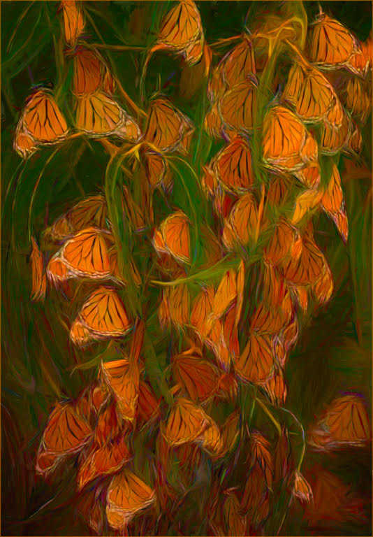
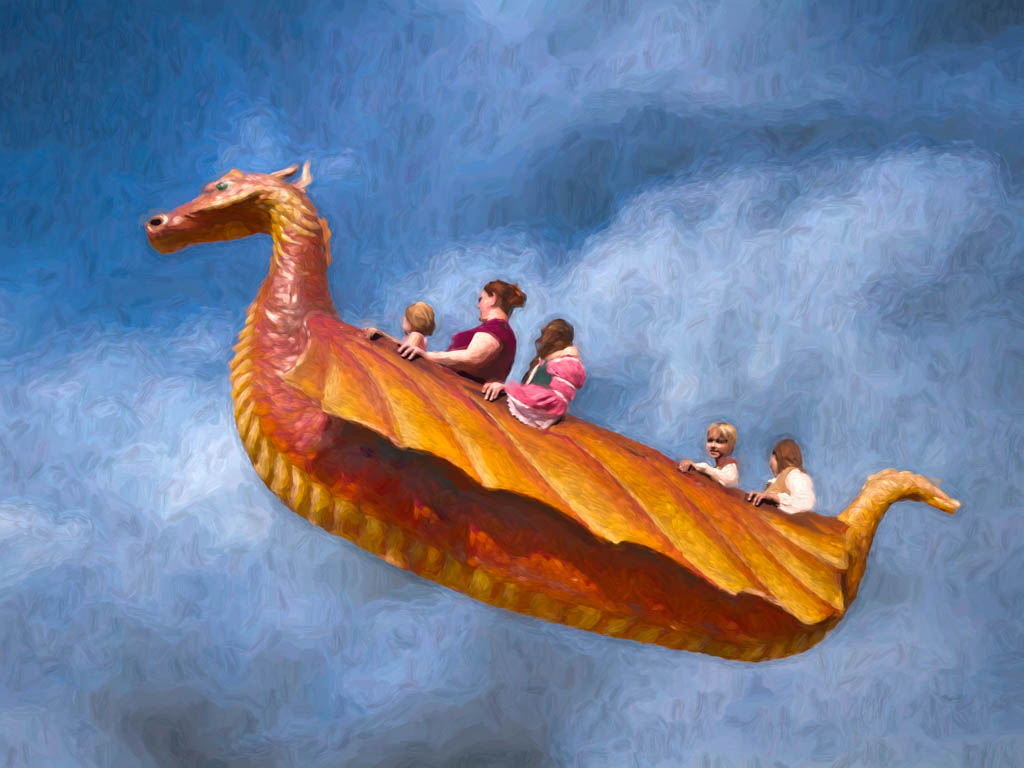
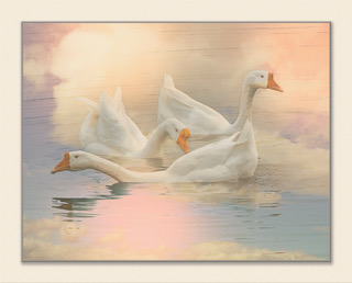
I find your elephant families such a unique and interesting subject. I personally, love the warm tones, and the use of complementary colors, like Cindy states, really makes this pop for me, too. It is so amazing to me how colors can make our images just come alive. Nice work. |
Jul 27th |
| 56 |
Jul 23 |
Comment |
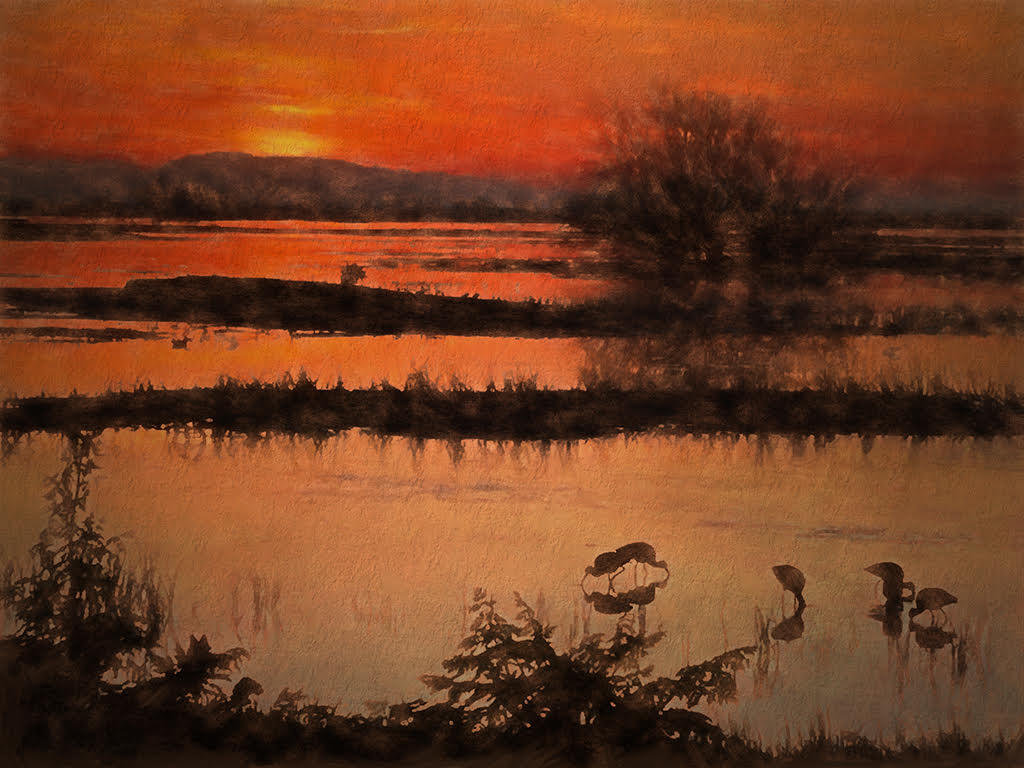
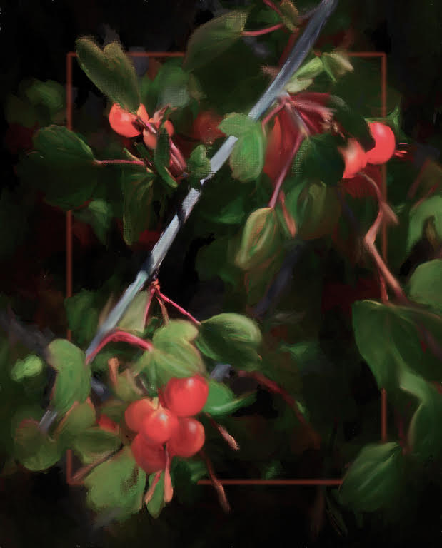
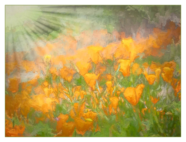
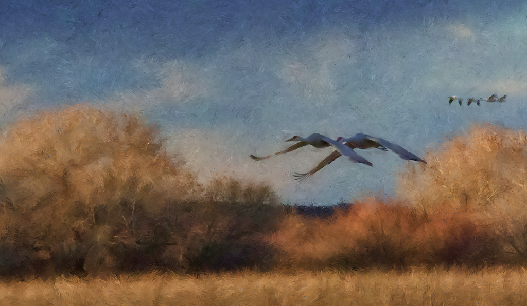
Your image had these lovely colors, but to my eye your processing and artwork really made them pop. Also, I feel your decision to remove the branches from the side and top really allowed my eye to enjoy the image with out the distractions of contrast.
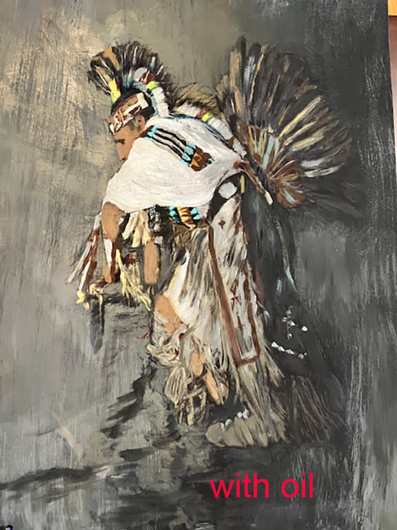
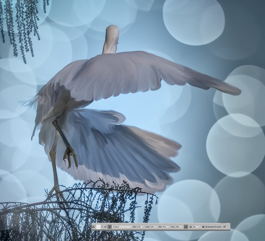
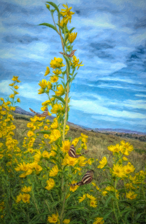
I feel Cindy has a great thought on the grass and I too feel that a bit of texture might be nice. One way to do this is to take your image into PS make a new layer and then go to stylize and add oil paint. Put a mask on it and invert with a white brush to bring back the texture and then adjust the opacity. see the edit. |
Jul 27th |
 |
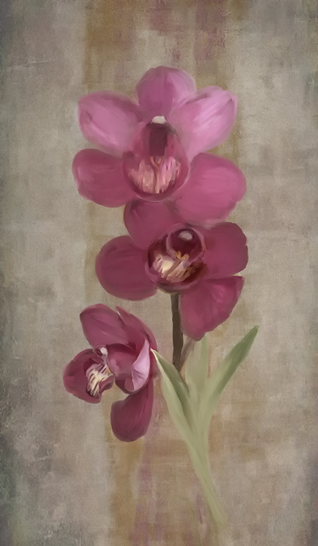
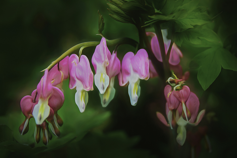
| 56 |
Jul 23 |
Comment |
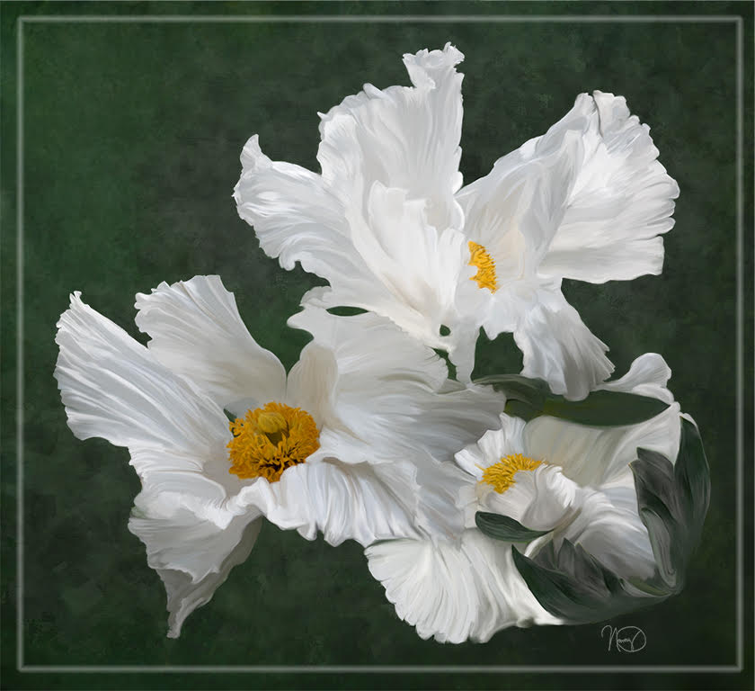
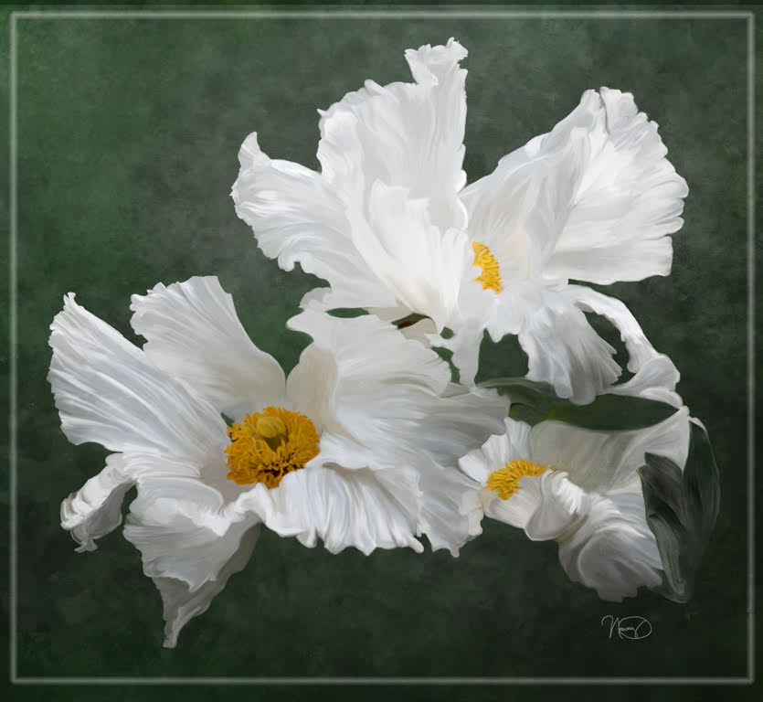
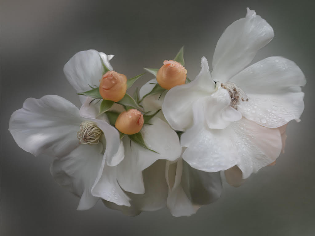
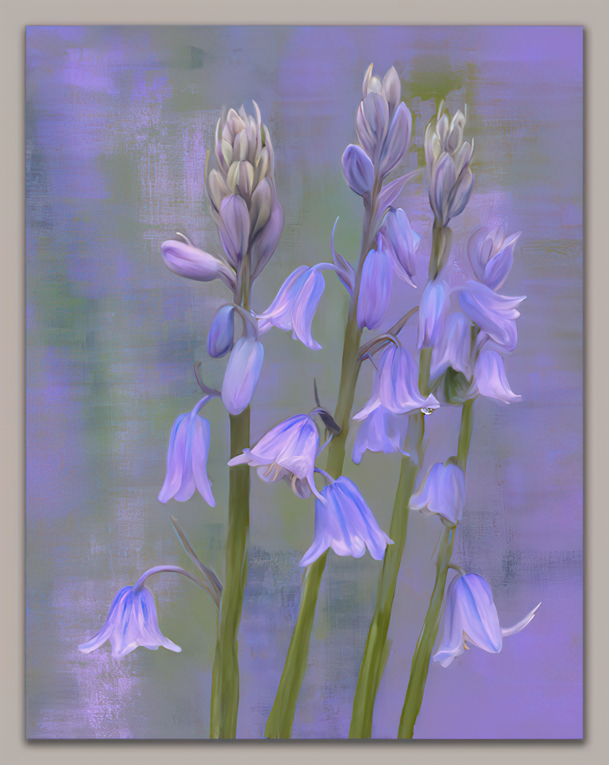
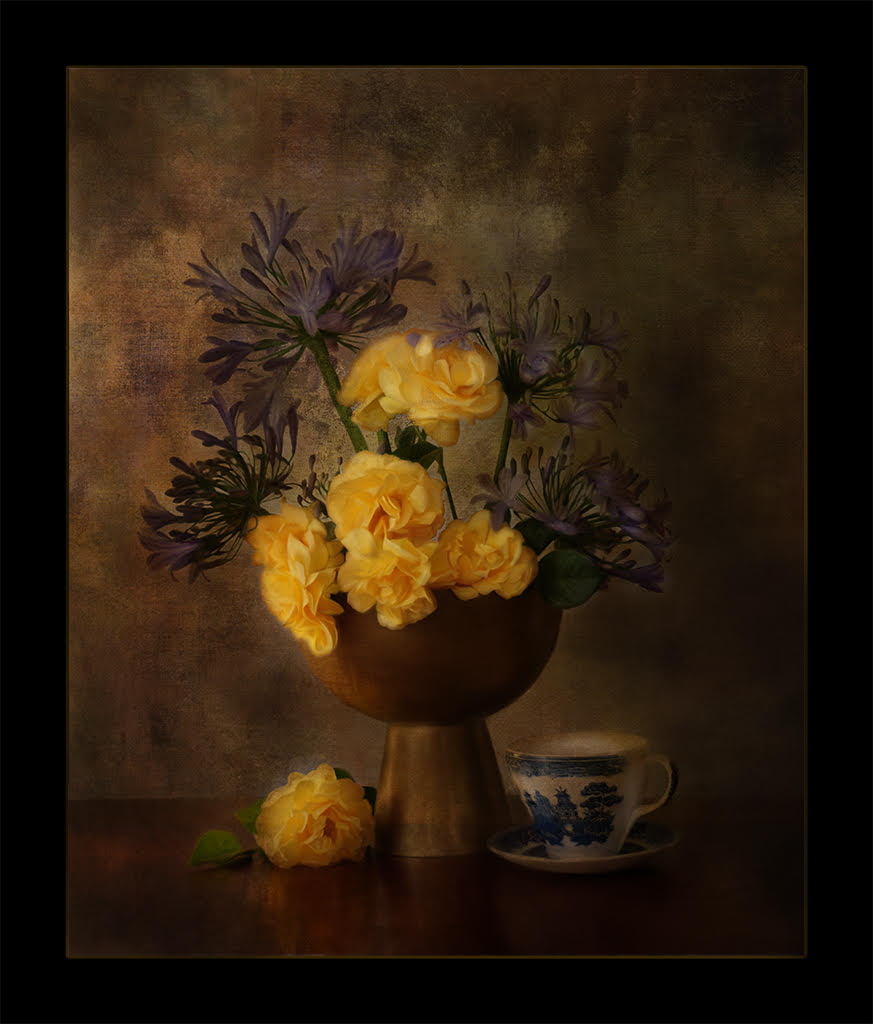
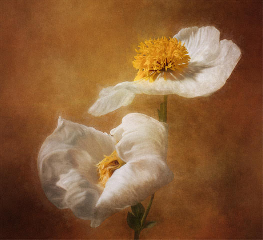
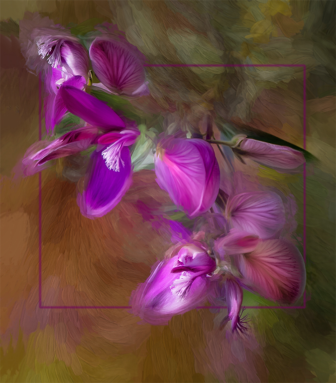
I feel your choice to use the complementary colors in the image of Red and Green supports the attraction my eye enjoys. I find the blending of the background leaves really makes the blossoms stand out and eliminates the distraction of the fine details in the leaves. However, the one sharp leaf in the upper right I feel really acts like a wonderful leading line.
Not sure where you are in your use of the mixer brush, but I used a wet mixer brush on the one blossom at the rt bottom to make it have sharper edges. This tends to bring the image away from the background and to my eye on the same plane as the other blossoms. |
Jul 27th |
 |
5 comments - 1 reply for Group 56
|
5 comments - 1 reply Total
|