|
| Group |
Round |
C/R |
Comment |
Date |
Image |
| 56 |
Apr 23 |
Comment |
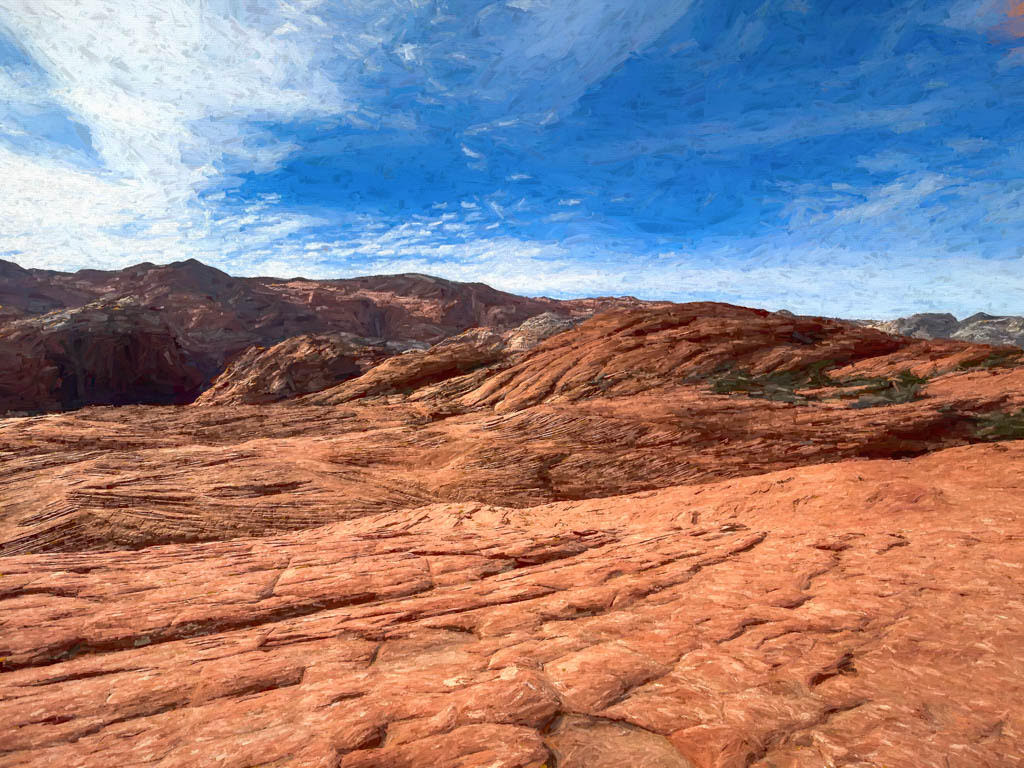
Thank you, Cindy. Actually, that sky was there already. The exposure was just too high. I seldom replace skies. I usually used Nik Color Effect Pro and "detail extractor"to bring out the sky. Often I need to do this using layers and masks and affect just the sky. |
Apr 12th |
| 56 |
Apr 23 |
Reply |
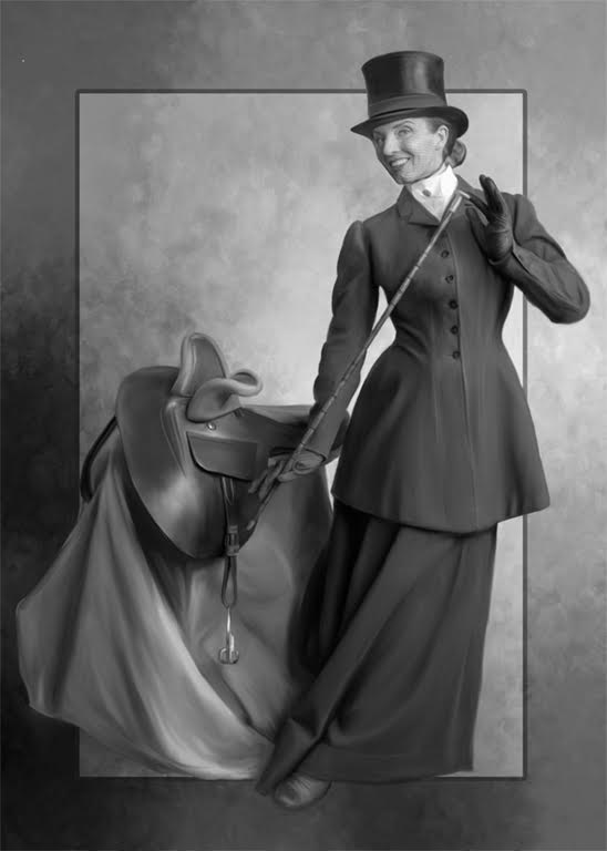
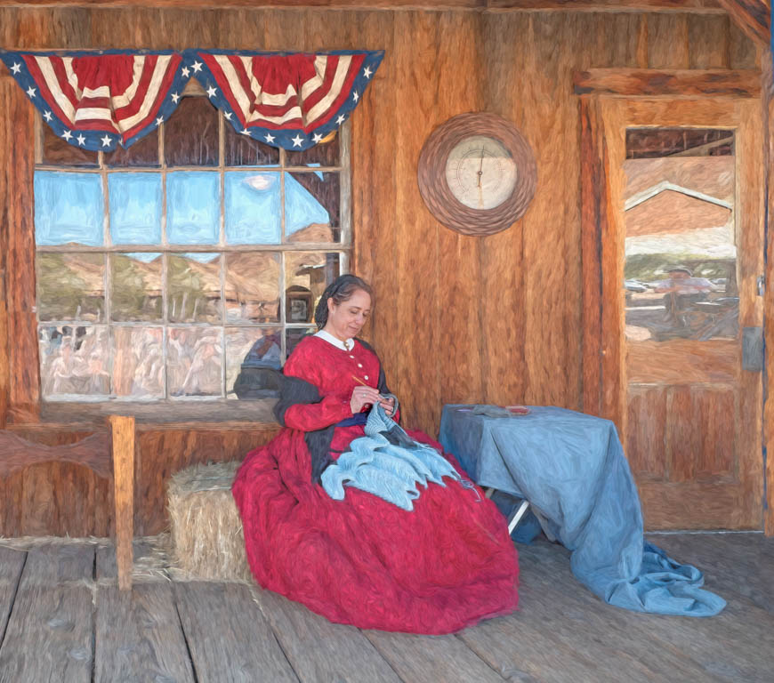
Yes, Martha that really looks great. Also, I see now your reference to the unedited one that isn't there. Yes, We would like to see all the artistic changes. |
Apr 11th |
| 56 |
Apr 23 |
Reply |
I will look closely when I get to my desktop. While on my iPad I can't see as easily but it appears as if you have really sharpened up that area nicely. |
Apr 11th |
| 56 |
Apr 23 |
Comment |
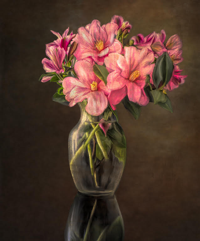
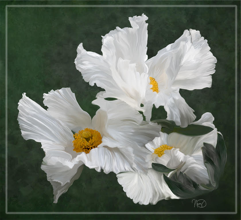
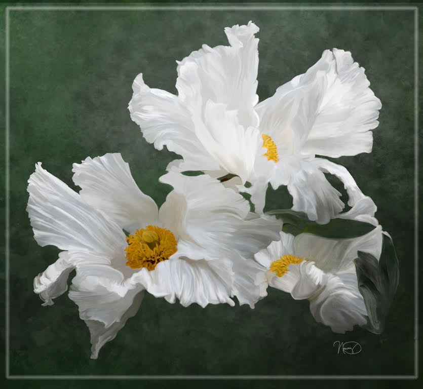
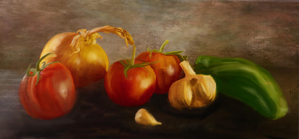
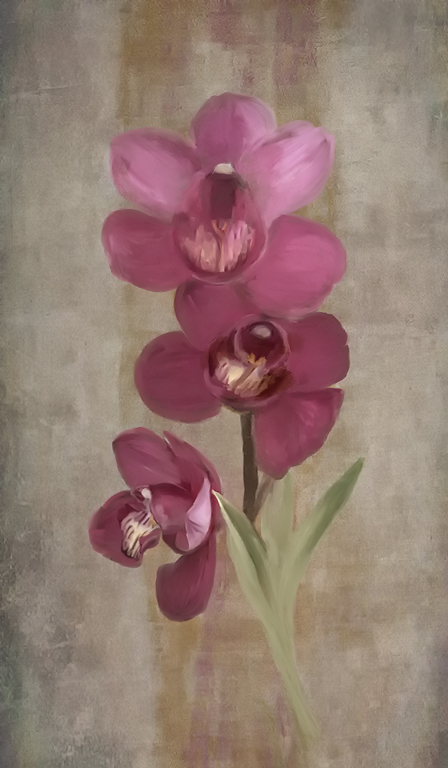
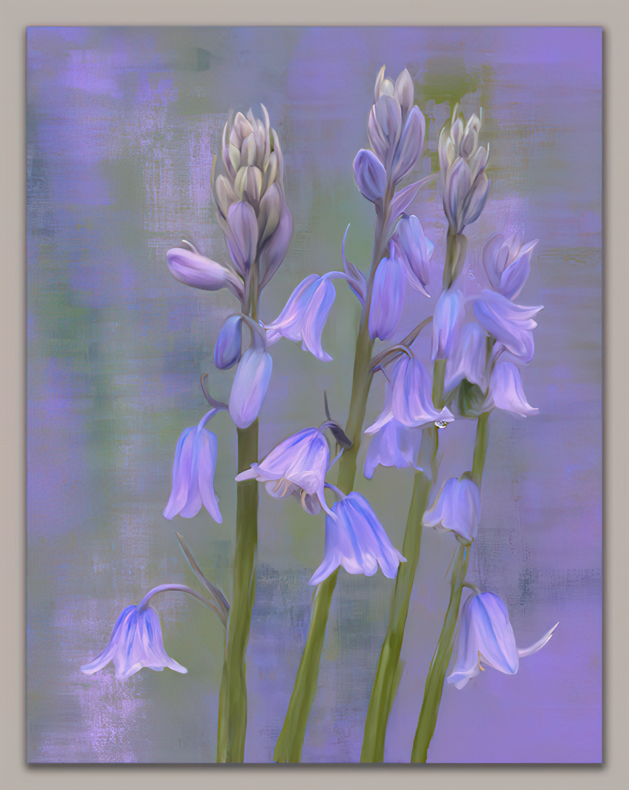
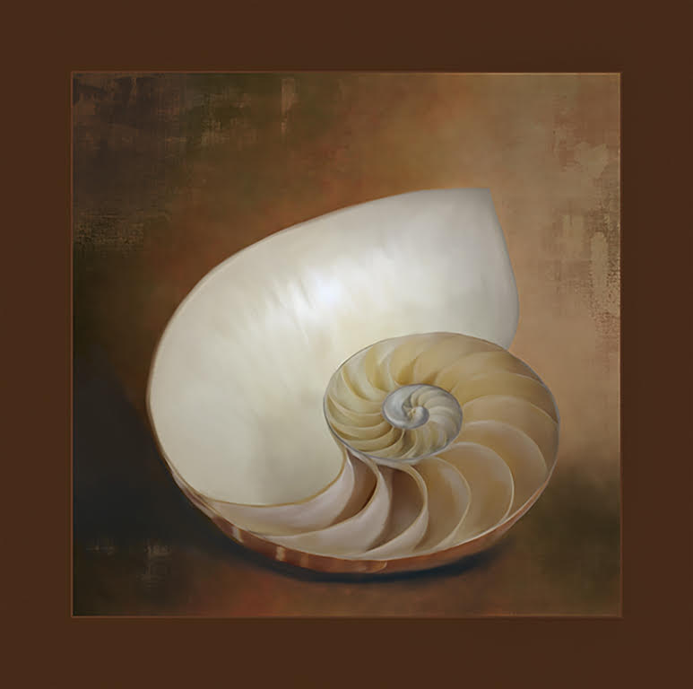
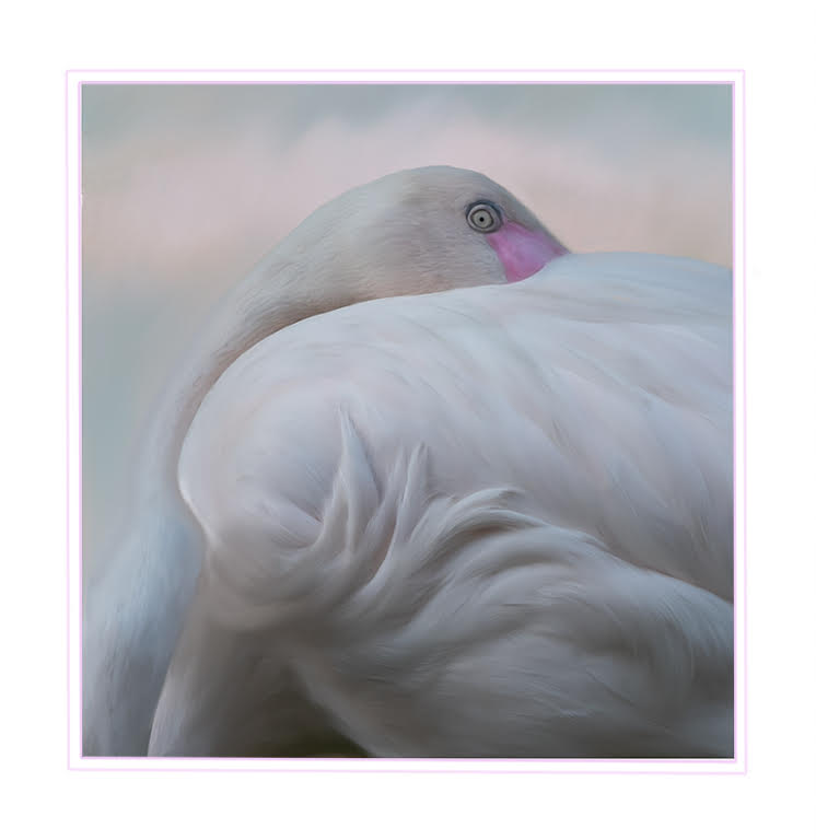
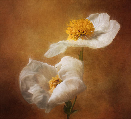
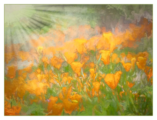
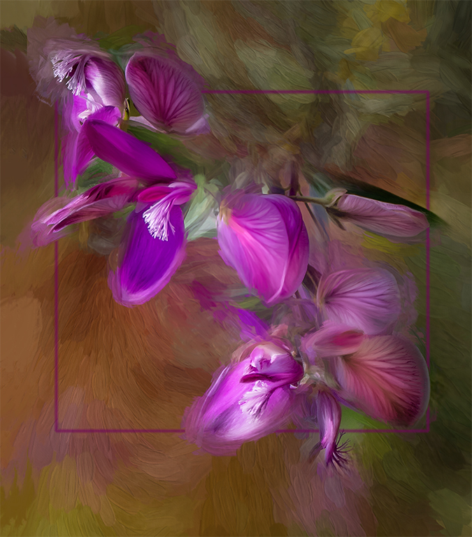
Yes, it does look photorealistic but it is beautifully done. Also, in a close-up comparison of the original and the painting you have really cleaned up a lot of blemishes on the original making your art piece a thing of beauty. I love the background with its texture appearance and is perfect for this art piece. I also look for flowers with unique qualities to add motion and "character". I agree they are by far more interesting.
This is beautifully painted in a more photorealistic style which is at the top of the heap in some photographic circles. PPA (Professional Photographers of America) really prefers this style so enjoy your beautiful work. |
Apr 9th |
| 56 |
Apr 23 |
Comment |
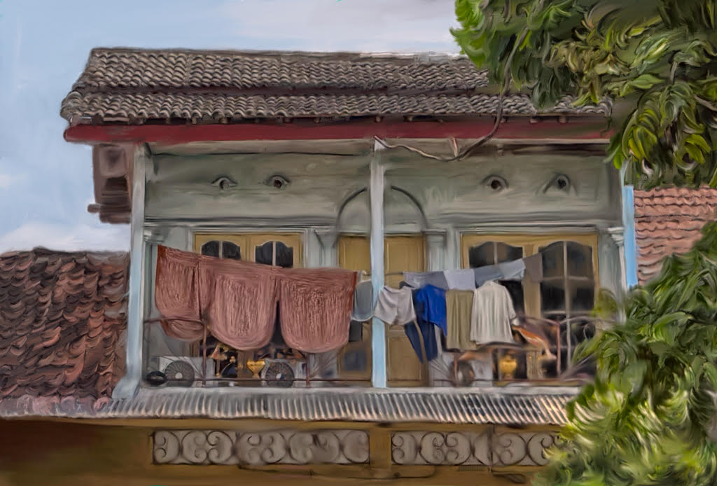
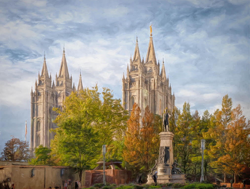
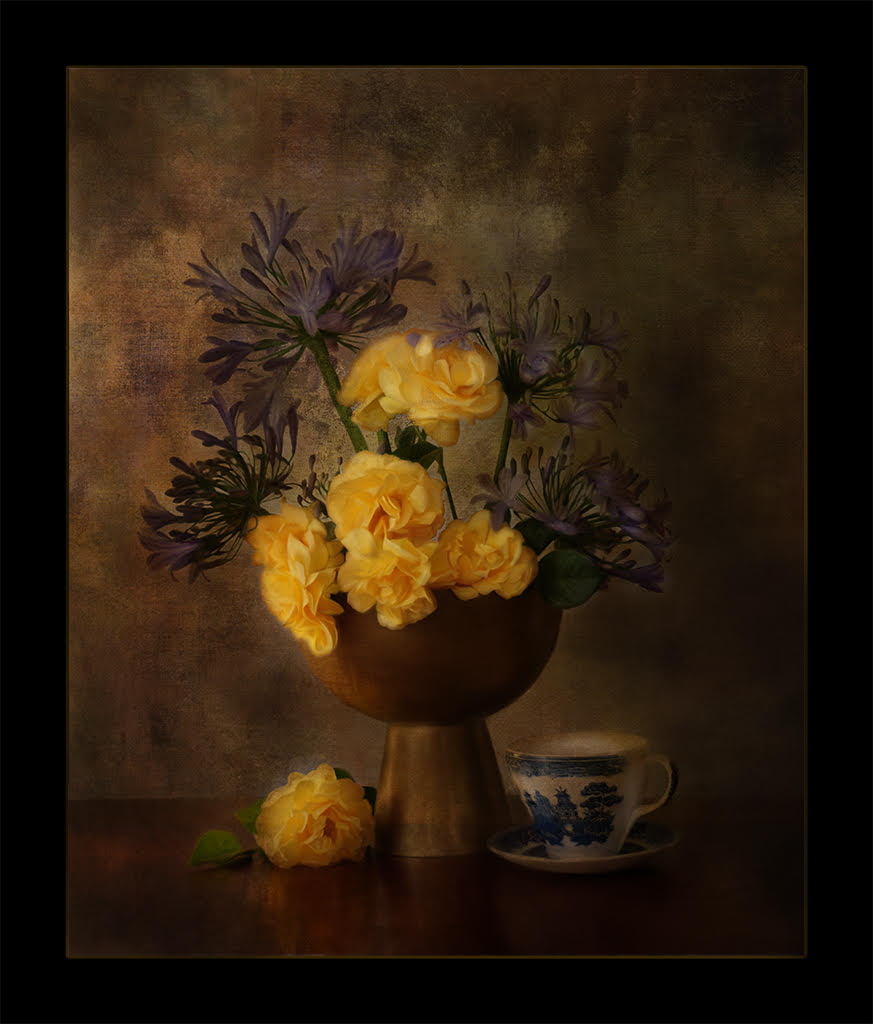
I really enjoy the finished background in your image over the original. In the original painting background, there is a sharp edge around the inside and it says "digital" rather than the one submitted as your final work which looks more painterly.
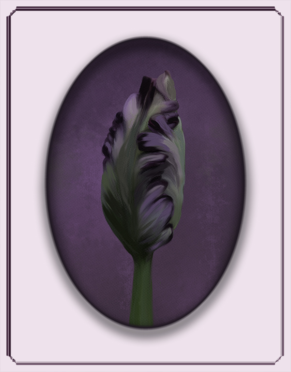
Love the composition of this bloom with the lovely center at the top. You may want to work at a closer position in Photoshop and keep going back and forth with your viewing. I think there are some areas that are not painted in the center. When I am doing this, I am working at 500 or so and then go out and back in to see how it is coming along. You may also want a more clean separation between the center and the petals. If it is a more painterly look, not to worry, but here I think sharpening up the edges, especially where the petals meet the crown center would add to the finished piece. You have done this nicely with the petals and the background, especially the petals on my right-viewing side. I love the bend in the one petal. It is a lovely flower and holds great potential. |
Apr 9th |
| 56 |
Apr 23 |
Comment |
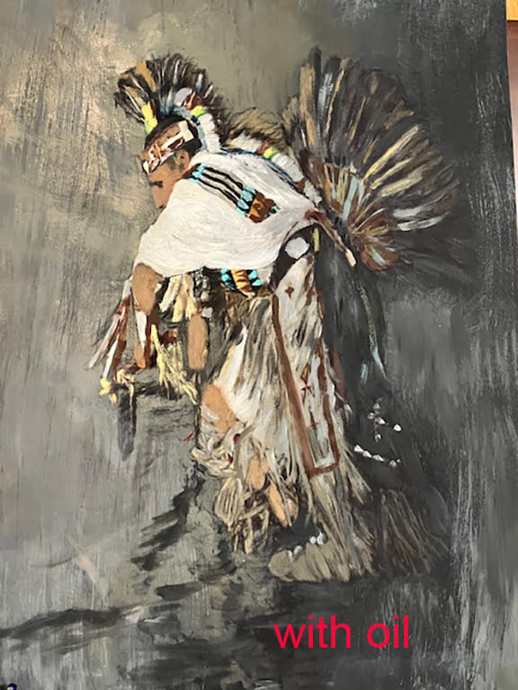
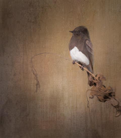
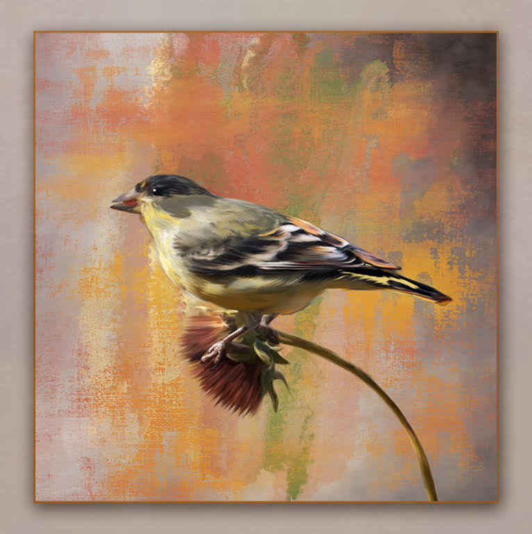
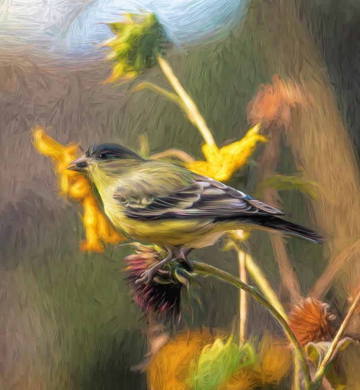
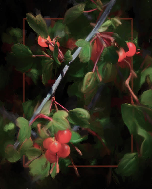
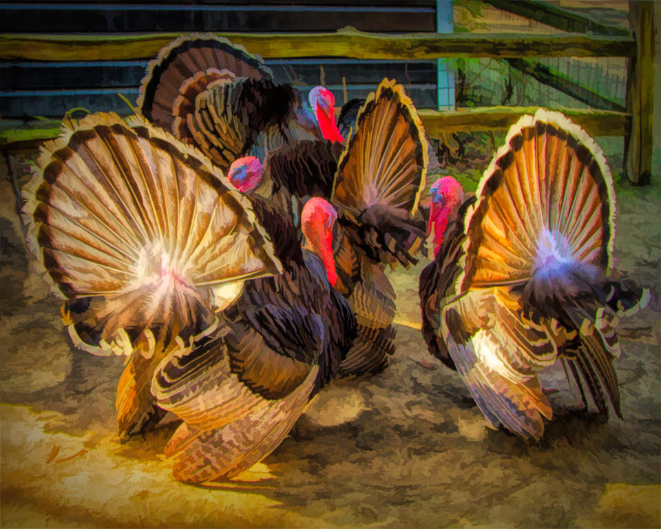
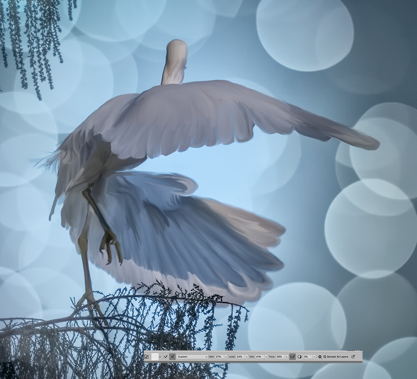
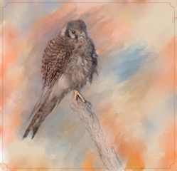
Yes, painting with the mixer brush is addictive and calming at the same time. Especially, if you play a bit of background music. I love the way you captured the leaves' unique texture and the overall warm look with your warm color choices, especially in the bird. Nicely done. |
Apr 9th |
| 56 |
Apr 23 |
Comment |
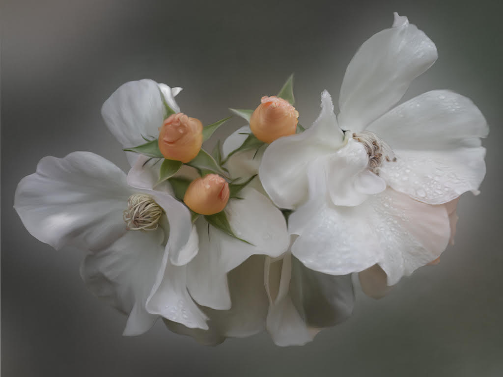
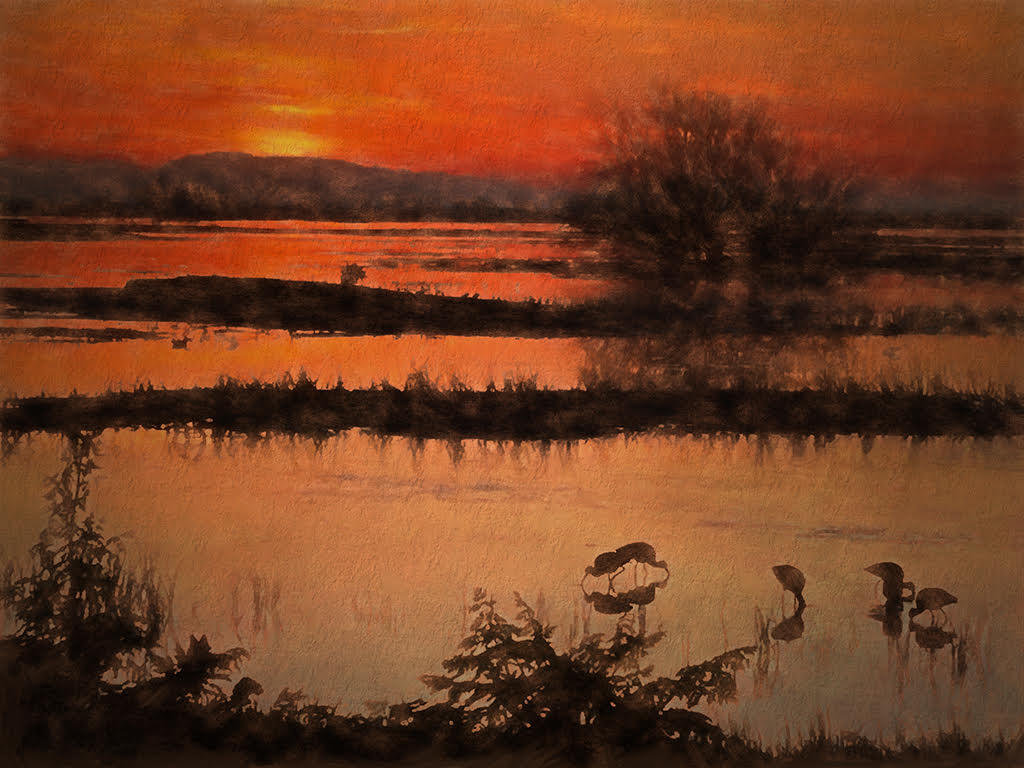
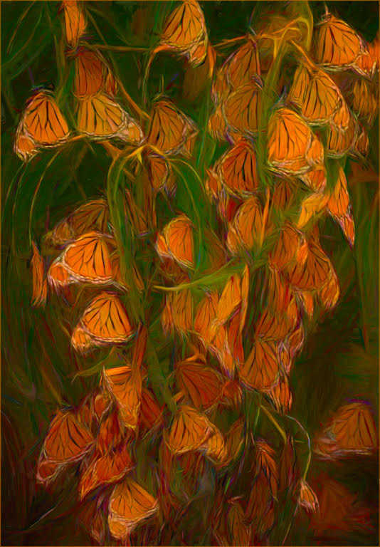
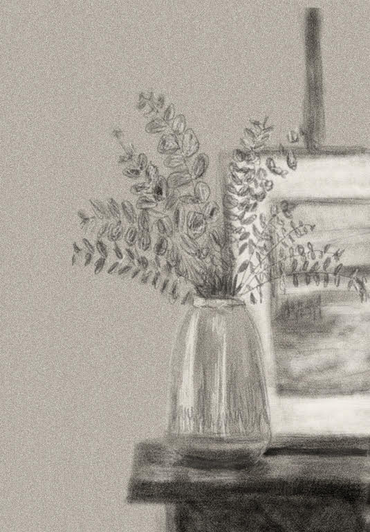
Love the colors of these brilliant greens and purples, they really catch our attention.
The background is just lovely with the very appropriate selective removal of plant pieces. What an interesting plant, too. Nicely done. |
Apr 9th |
| 56 |
Apr 23 |
Comment |
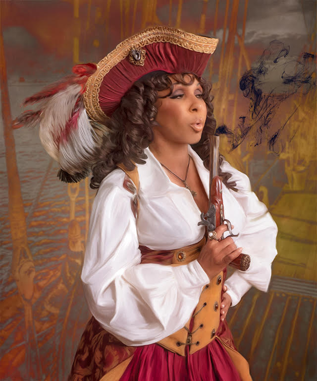
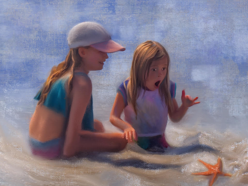
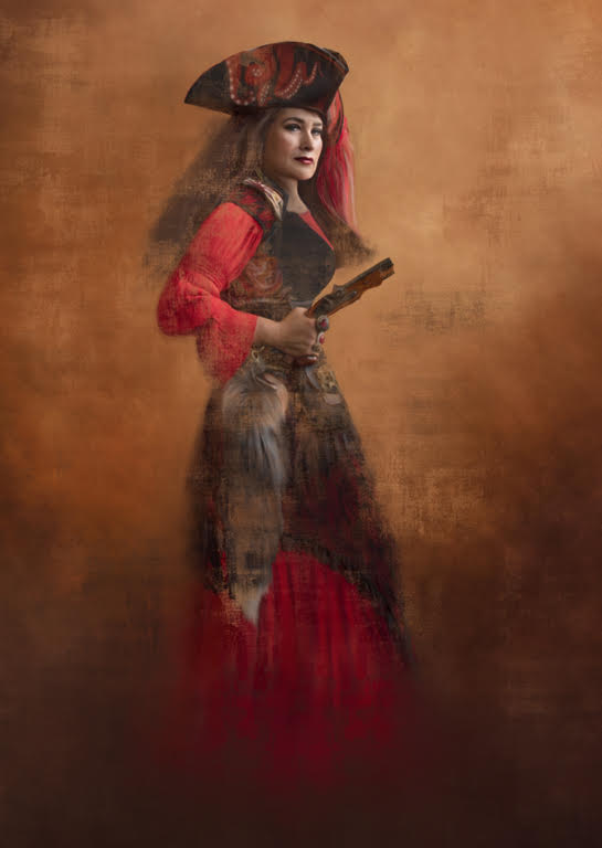
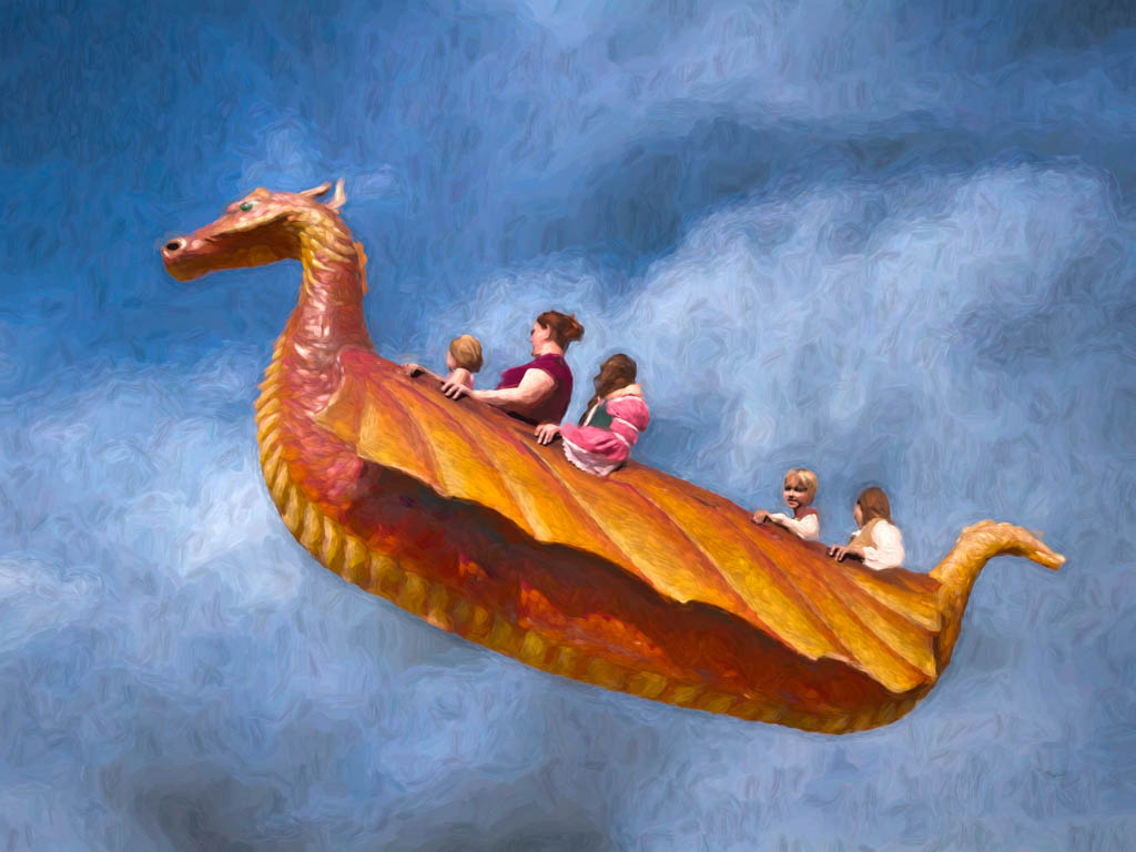
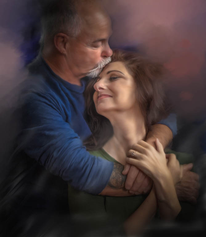
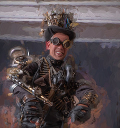
Gosh, this is fun Pat and you did a great job in handling this composite. Thank you for sharing all the steps you went through. Your placement of yourself in the corner with the right arm as a leading line and its interesting diagonal was nicely done with the lovely setting. Don't overlook "liquify" to knock a few inches off too. Congratulations. Yes, I love the ability to remove a few years off with the brush, too. |
Apr 9th |
6 comments - 2 replies for Group 56
|
6 comments - 2 replies Total
|