|
| Group |
Round |
C/R |
Comment |
Date |
Image |
| 56 |
Jul 22 |
Comment |
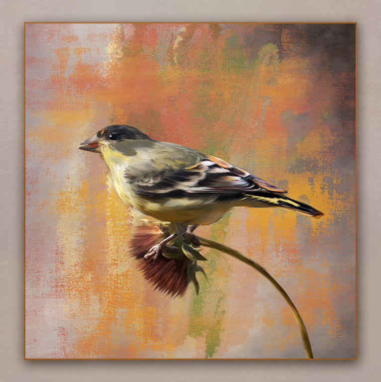
Thank you, Jaci. I really enjoyed the Youtube Video. I found it by just typing "Texture Blending Secrets". I have been using masks for years and this is an interesting new method and really learned a lot. I recommend it for everyone to view.
Here you have implemented these techniques and really added a lot of interest to your original image. The Textures you chose really compliment this image. Nicely done.
The only suggestion I might add is to look at the light on the leaves. It appears to be lit more from an above position of the sun. You might want to move the light addition more left at the top.
Thank you for sharing this technique with us. It is so nice to have you in our art group. |
Jul 9th |
| 56 |
Jul 22 |
Comment |
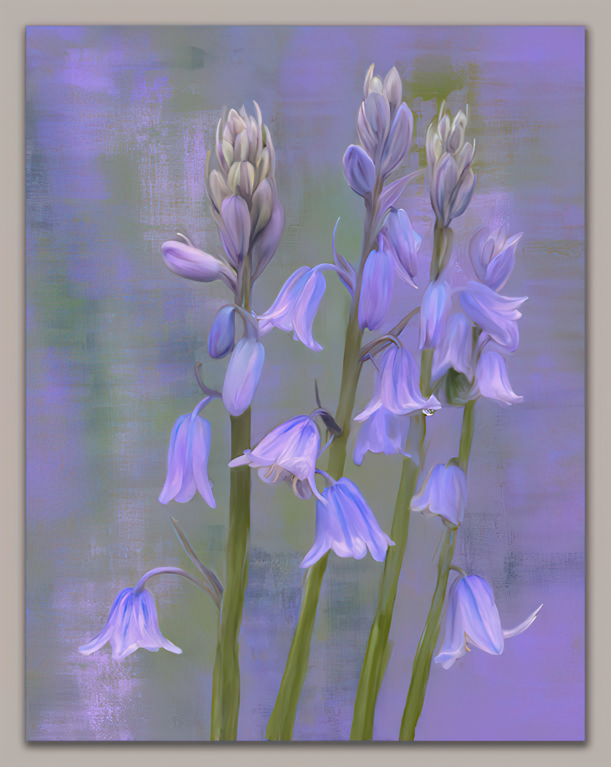
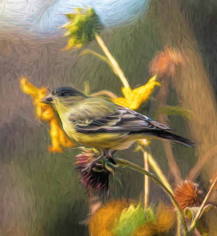
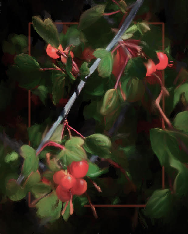
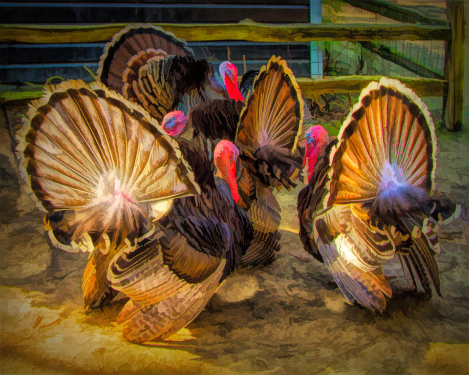
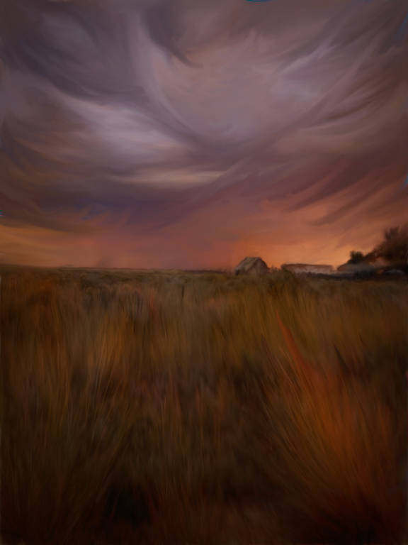
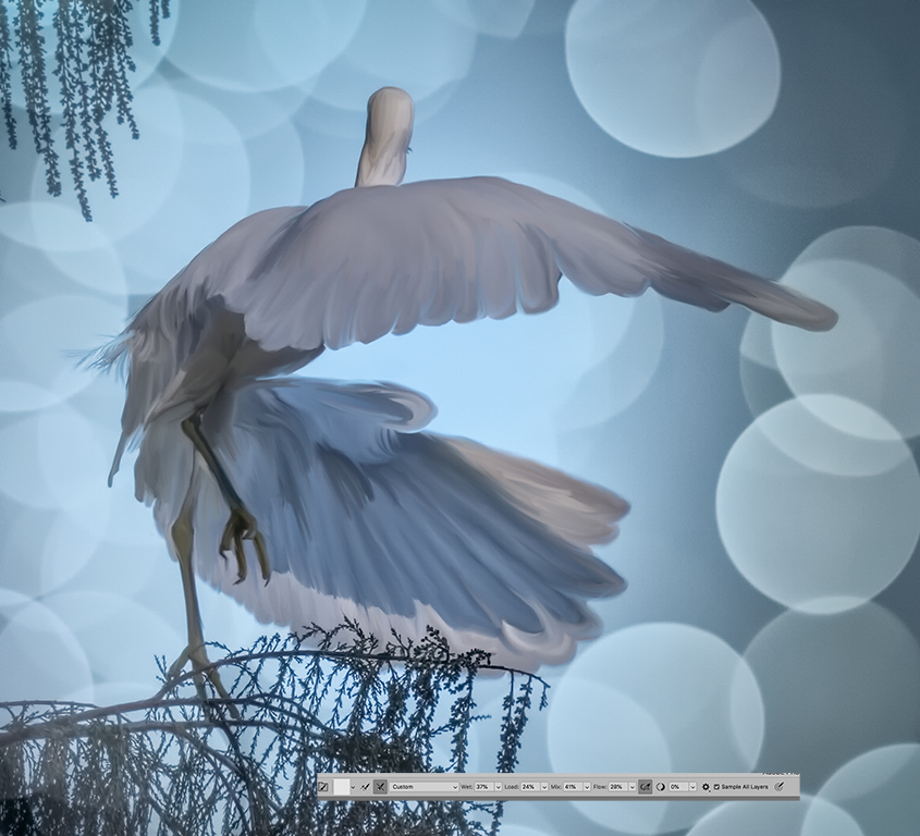
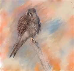
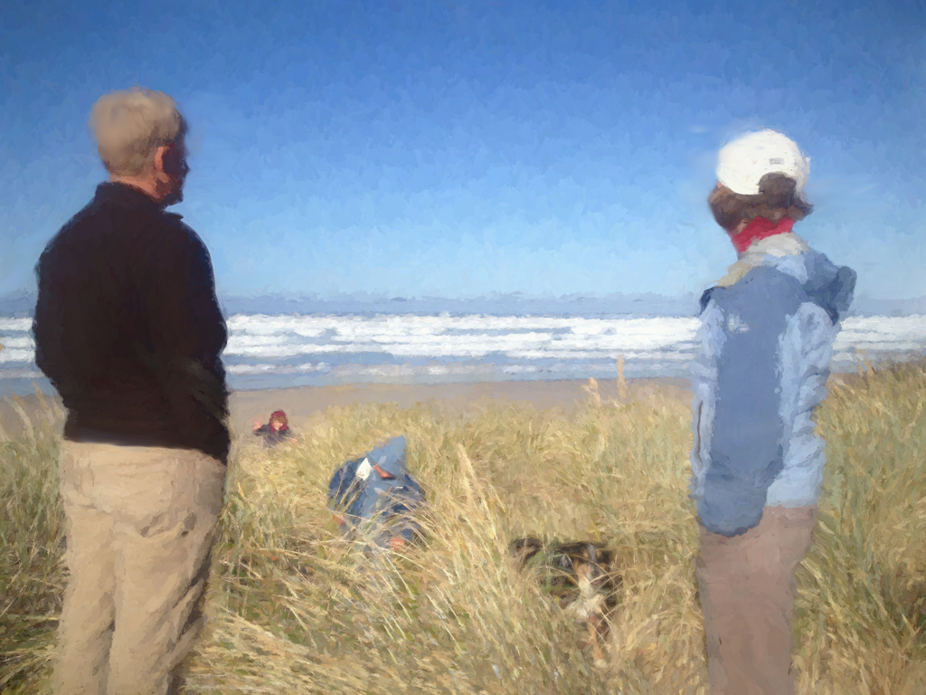
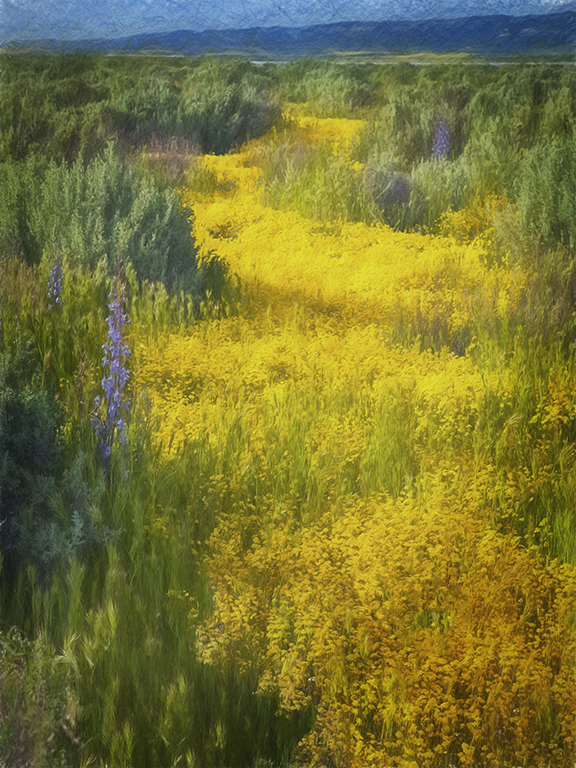
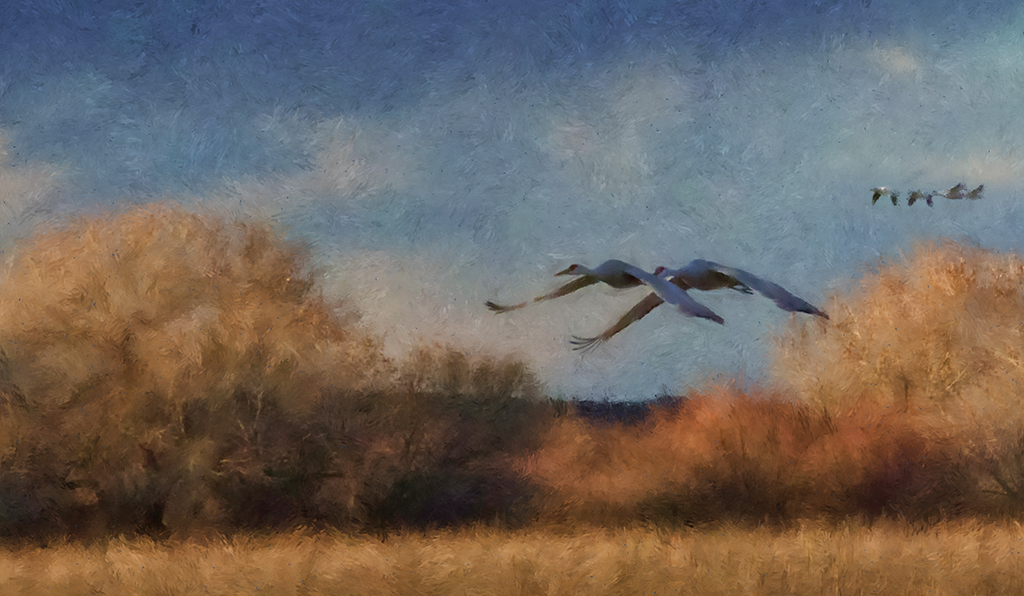
Love the composite of the background and selected Lupine stalks. Excellent selection. This selection adds such a lovely movement to the image. I really enjoy looking at your bird's feather edges and realize that I need to work more on mine. I like the way you have brush strokes of the bird meld with the background. Excellent work and makes the two go together so beautifully. Now you just need a grasshopper. |
Jul 9th |
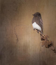
| 56 |
Jul 22 |
Comment |
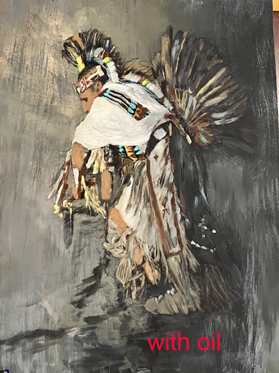
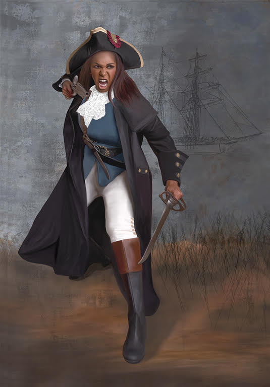
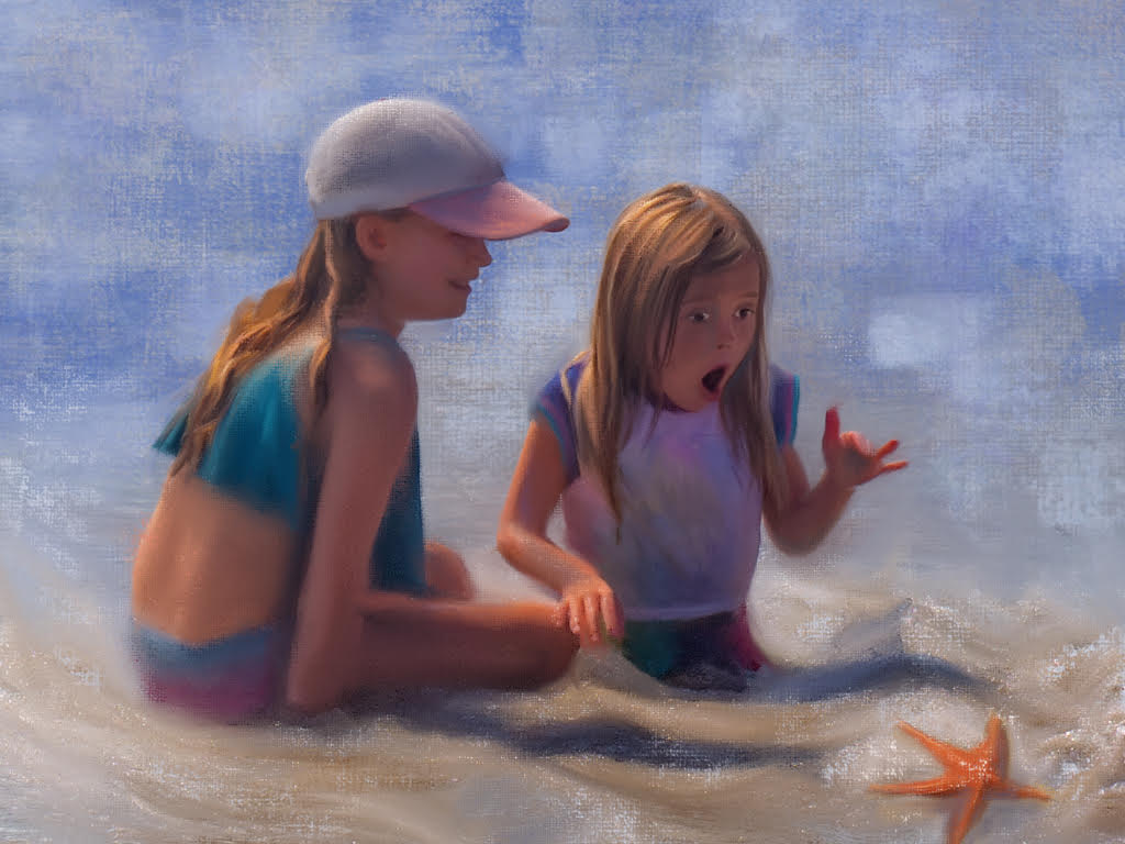
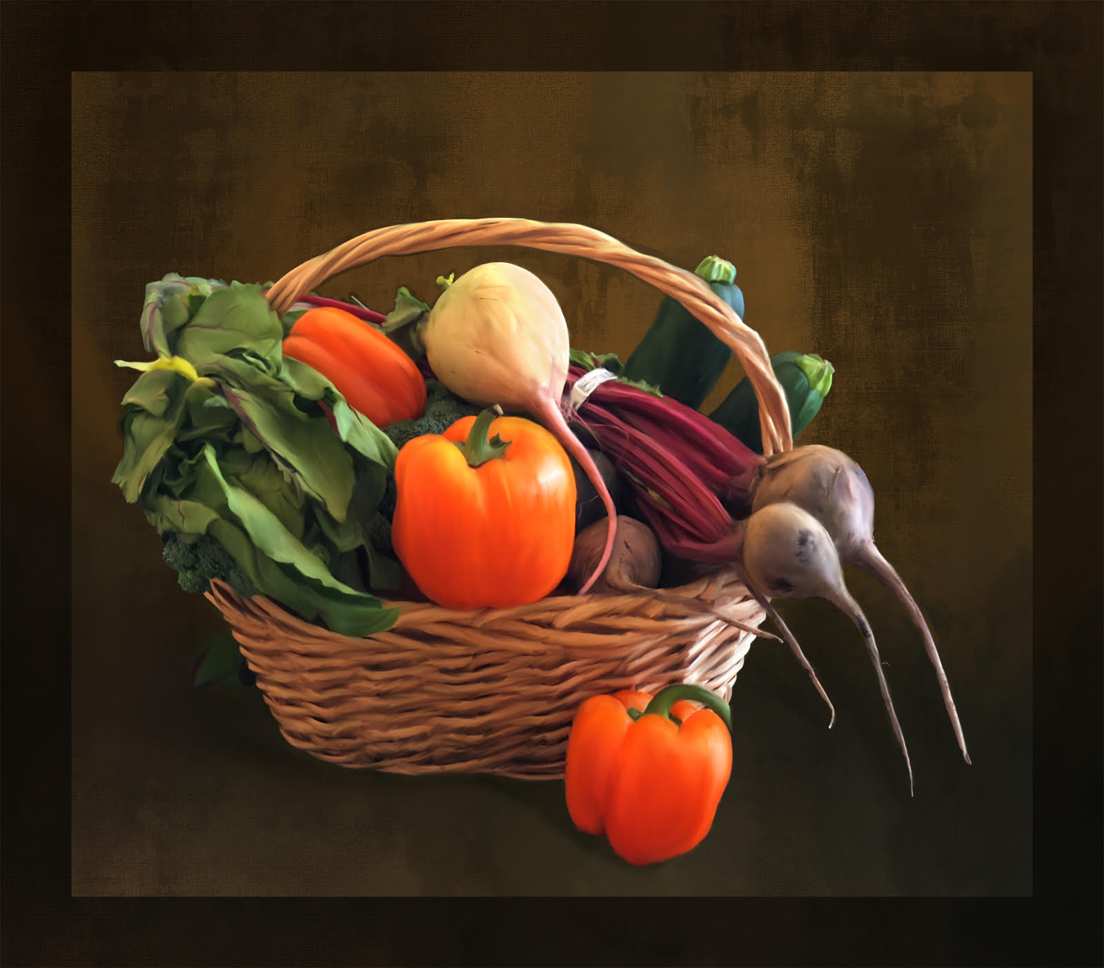
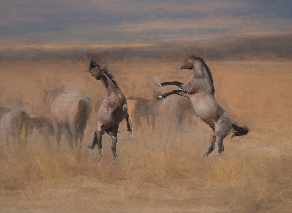
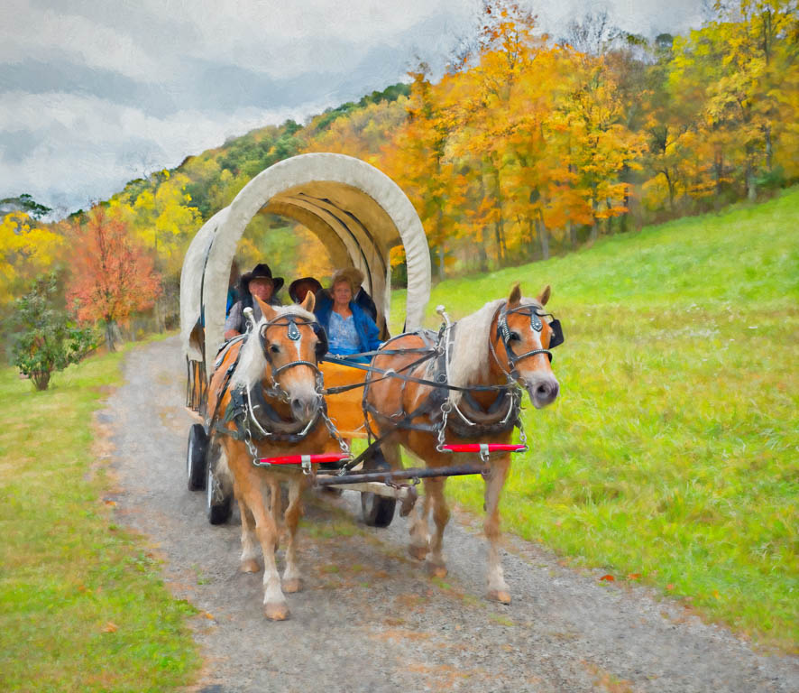
I think the two images are reversed so this comment is to the one labeled as Original with the signature and date. Love the capture of the bird with the grasshopper. This gesture of eating really makes your bird image stand out from all the rest.
Your mixer brush techniques are really getting good and I love the brush strokes in the stump and bird. You may want to try using the mixer brush on the background to give it more of a painterly match. However, all your work is Nicely done.
Winning image.
|
Jul 9th |
| 56 |
Jul 22 |
Comment |
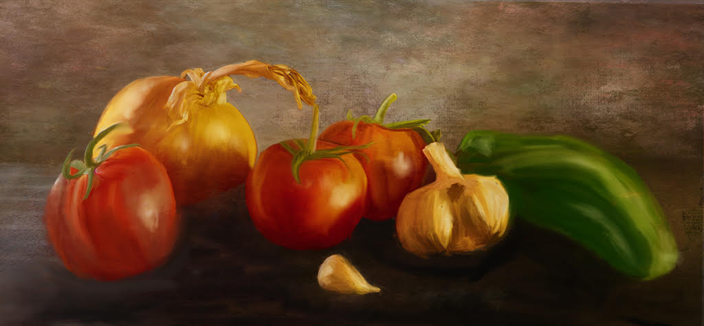
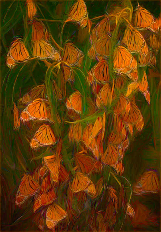
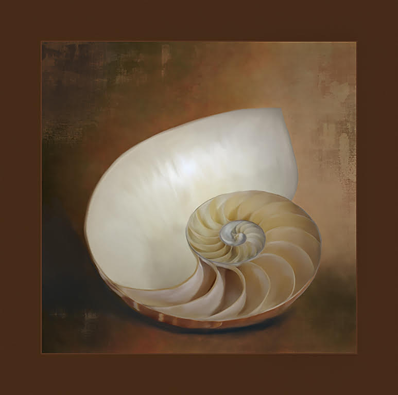
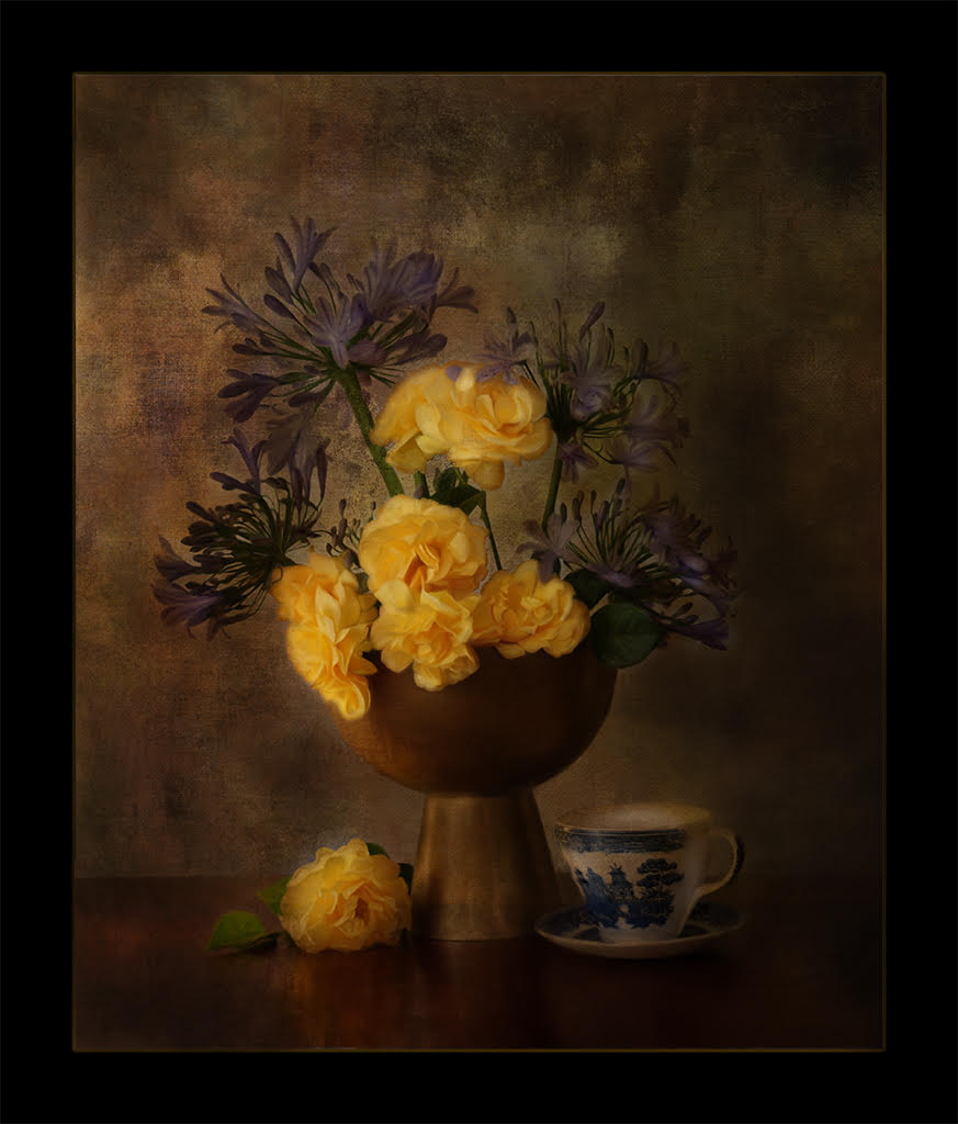
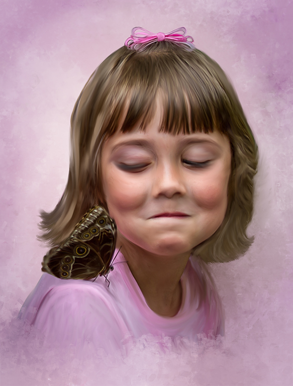
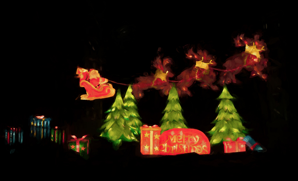
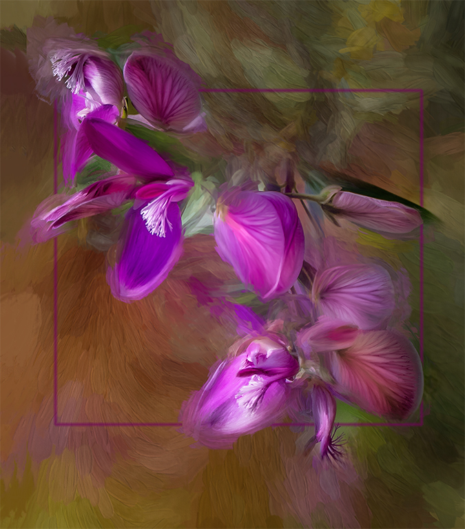
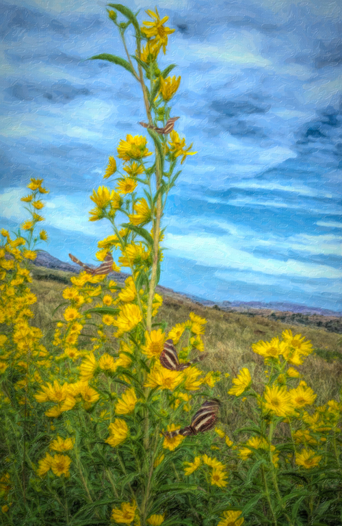
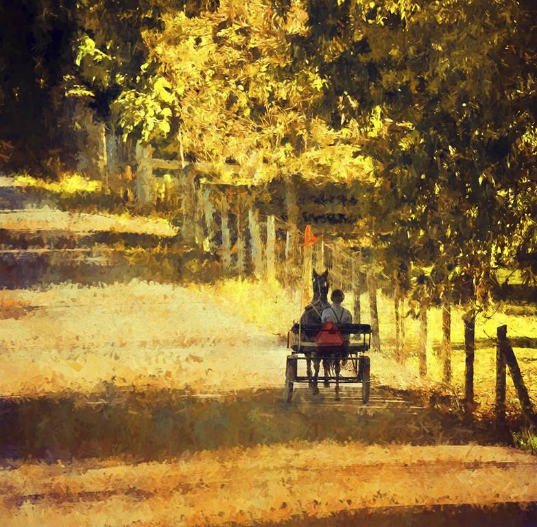
Love the composite of the ed leaves; I always find them so interesting, too. You did nice work with the background. There are just enough background leaves to give a feeling of placement in the outdoors but you eliminated the confusing elements. Nice job. I like the color on both of them and it makes them stand out. Personally, I think the green stroke is a bit too vivid and bright and you may wish to consider toning it down. It tends to be the first thing my eye picks up. |
Jul 9th |
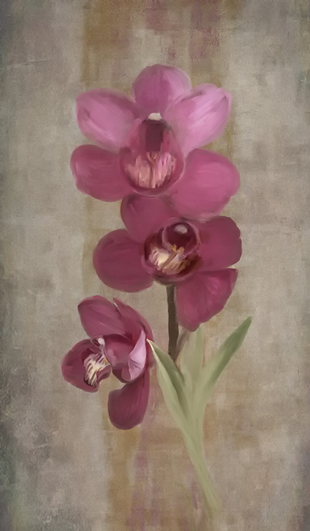
| 56 |
Jul 22 |
Comment |
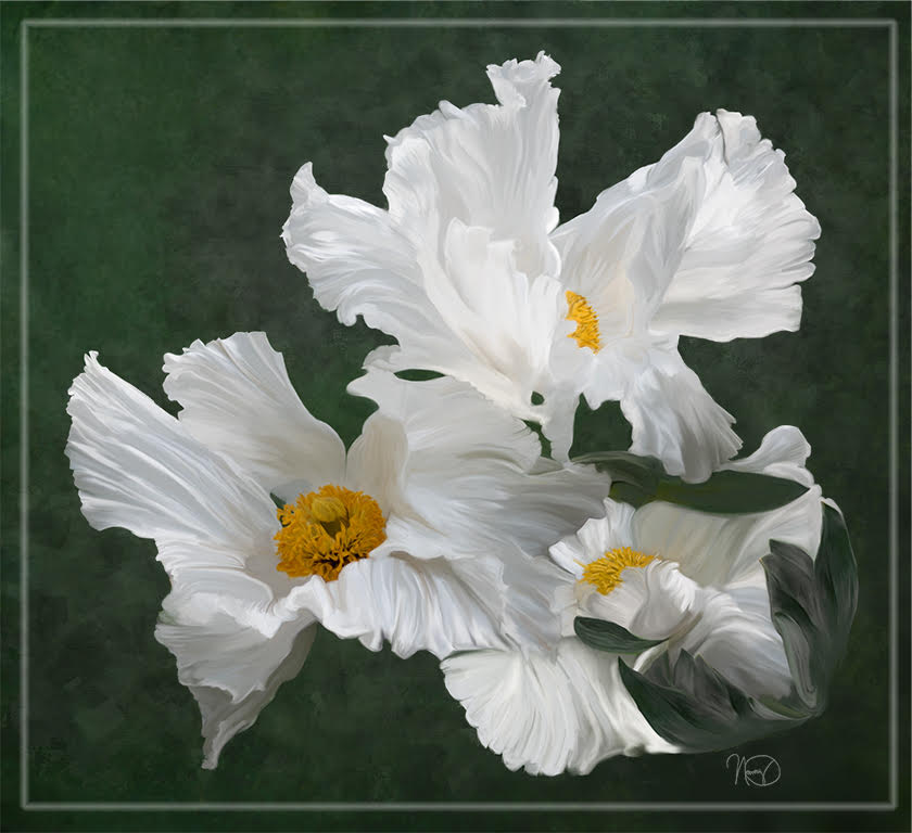
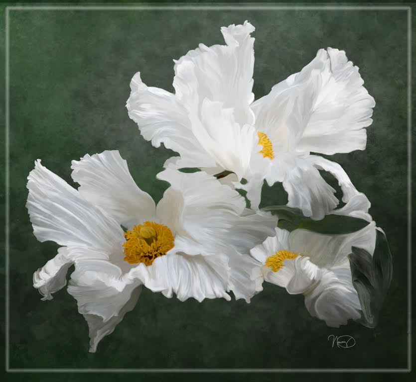
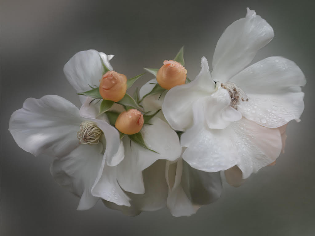
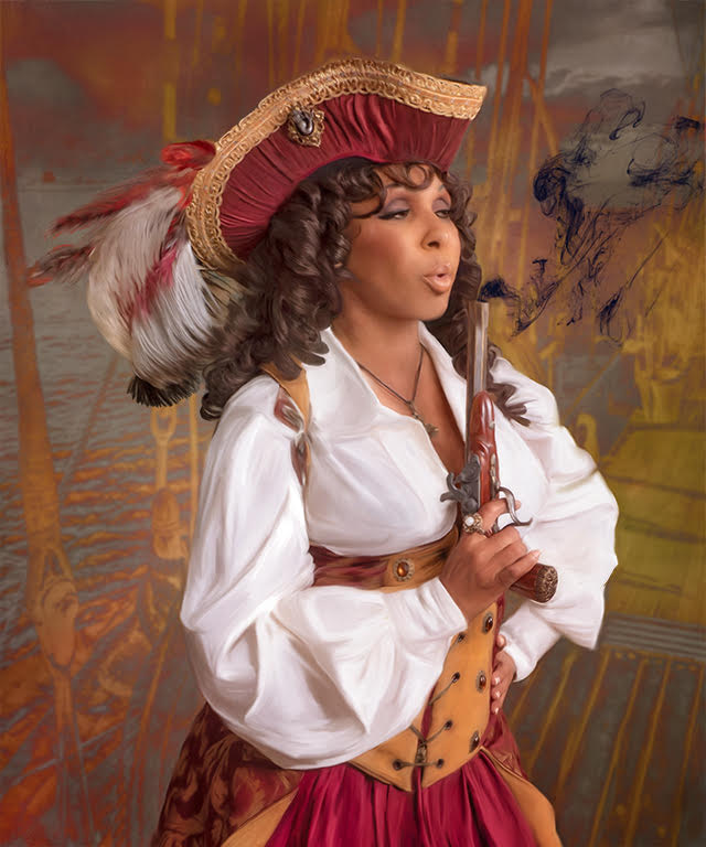
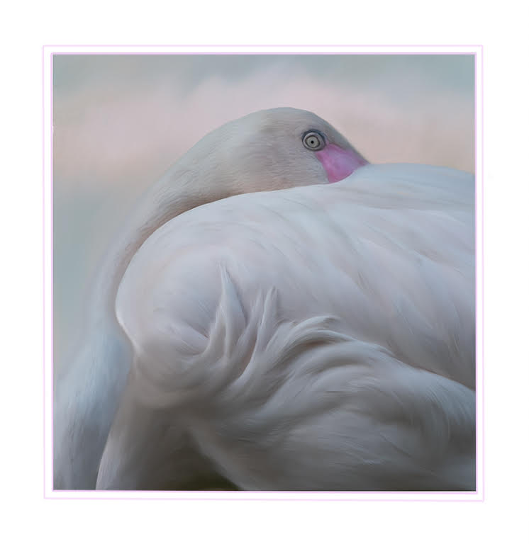
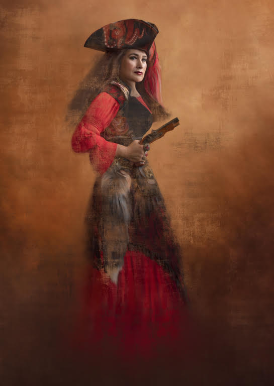
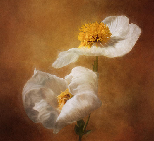
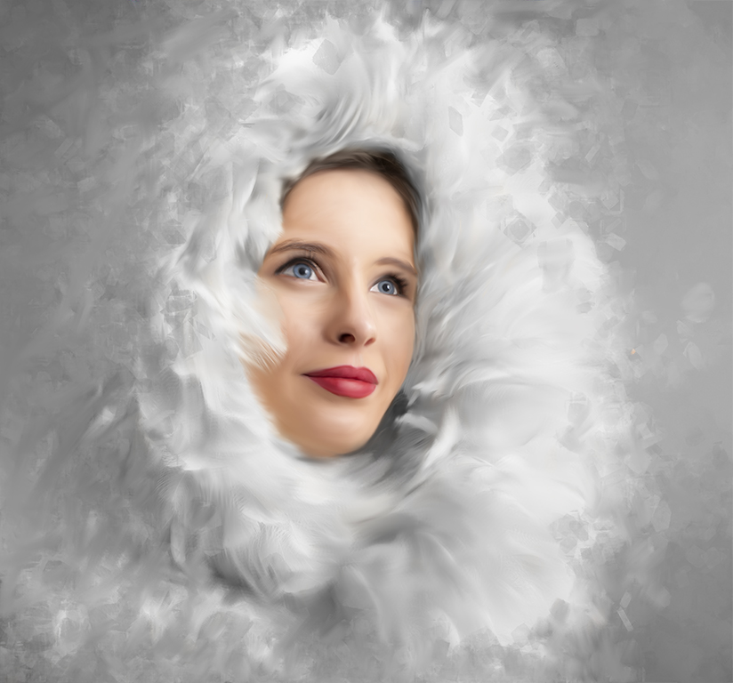
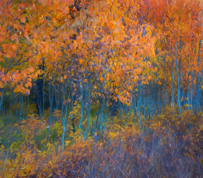
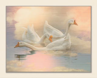
So attractive. Reducing the saturation was a great idea and makes this image more painterly. The emphasis on the warm tones in the whites adds to this painterly look too. However, the bright red touches really keep the eye interested. You may want to consider removing the shadow in the lower right corner but it isn't really a big distraction. Nice composition and attractive painting. |
Jul 9th |
5 comments - 0 replies for Group 56
|
5 comments - 0 replies Total
|