|
| Group |
Round |
C/R |
Comment |
Date |
Image |
| 56 |
Dec 20 |
Comment |
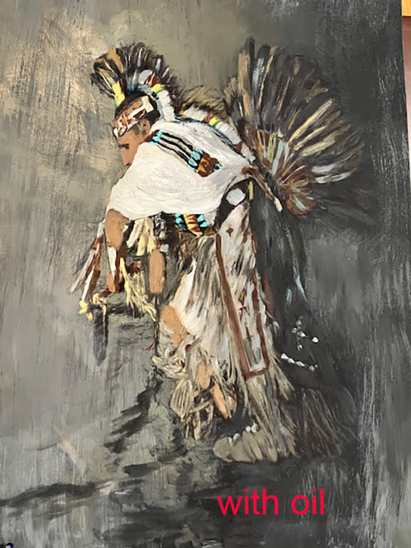
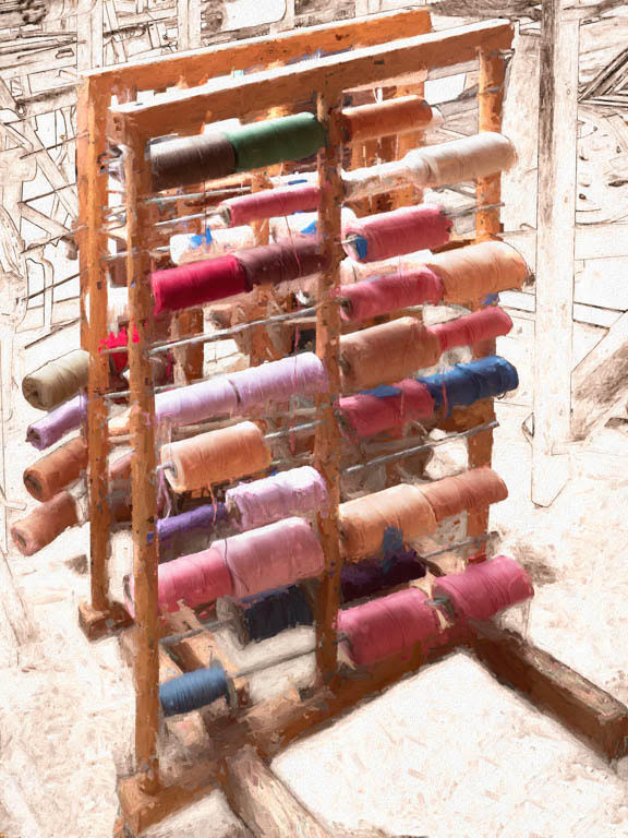
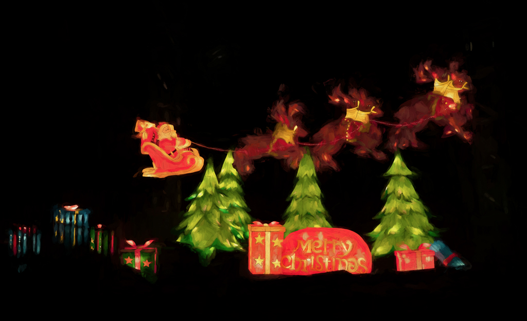
Thank you, Gerhard and Trey. I was pleased that I could get enough of an image to paint with a screen capture from facebook. |
Dec 20th |
| 56 |
Dec 20 |
Comment |
Thank you, Gerhard and Trey. I was pleased that I could get enough of an image to paint with a screen capture from facebook. |
Dec 20th |
| 56 |
Dec 20 |
Comment |
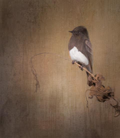
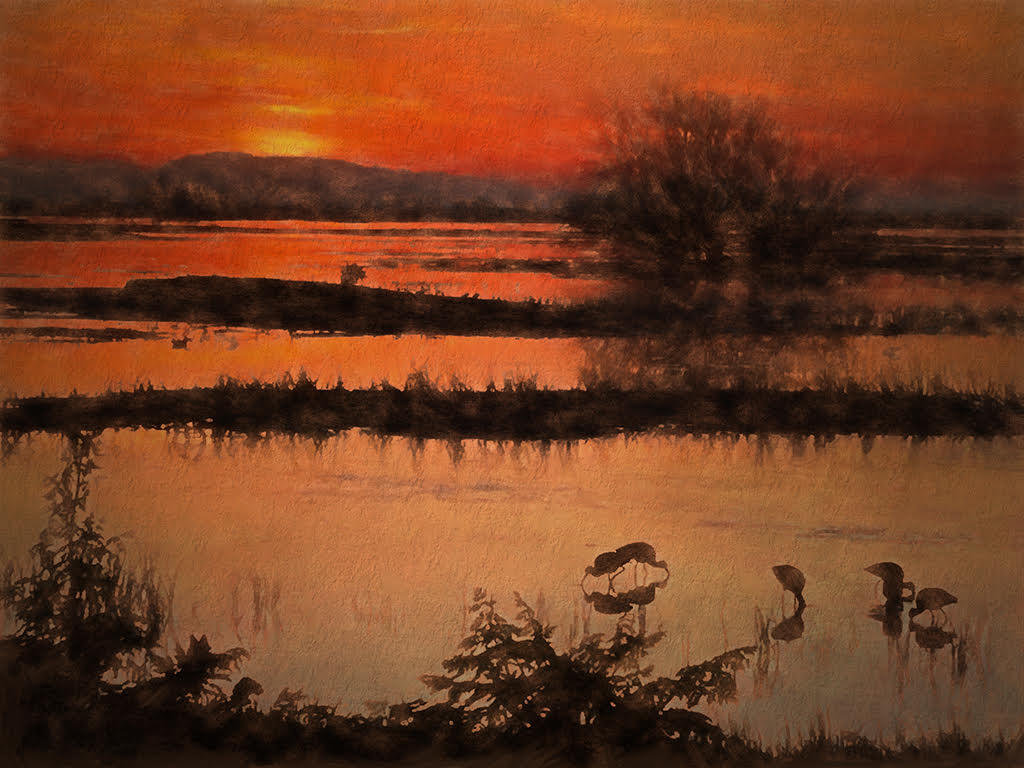
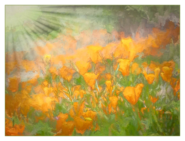
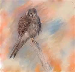
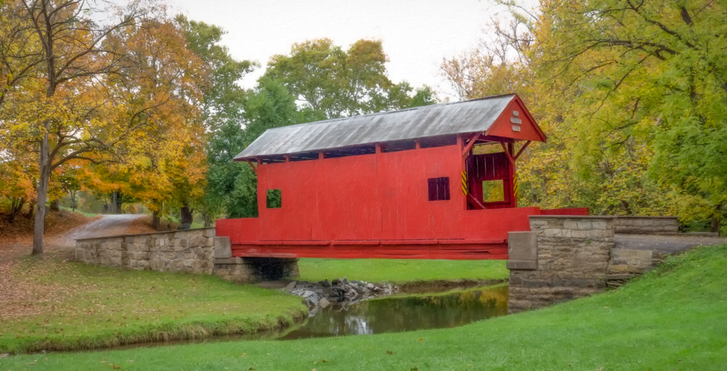
What a shame to lose this lovely view to housing. Progress, I guess. I really enjoy the rich colors in this painting. The red and purple hues really pop and add so much in the painted version. The tree and Crow are in the power points using rule of thirds and thus both give a strong impact to the composition . The upper part of the sky I feel is a bit light above and draws my eye there. A slight vignette might help. |
Dec 20th |
| 56 |
Dec 20 |
Comment |
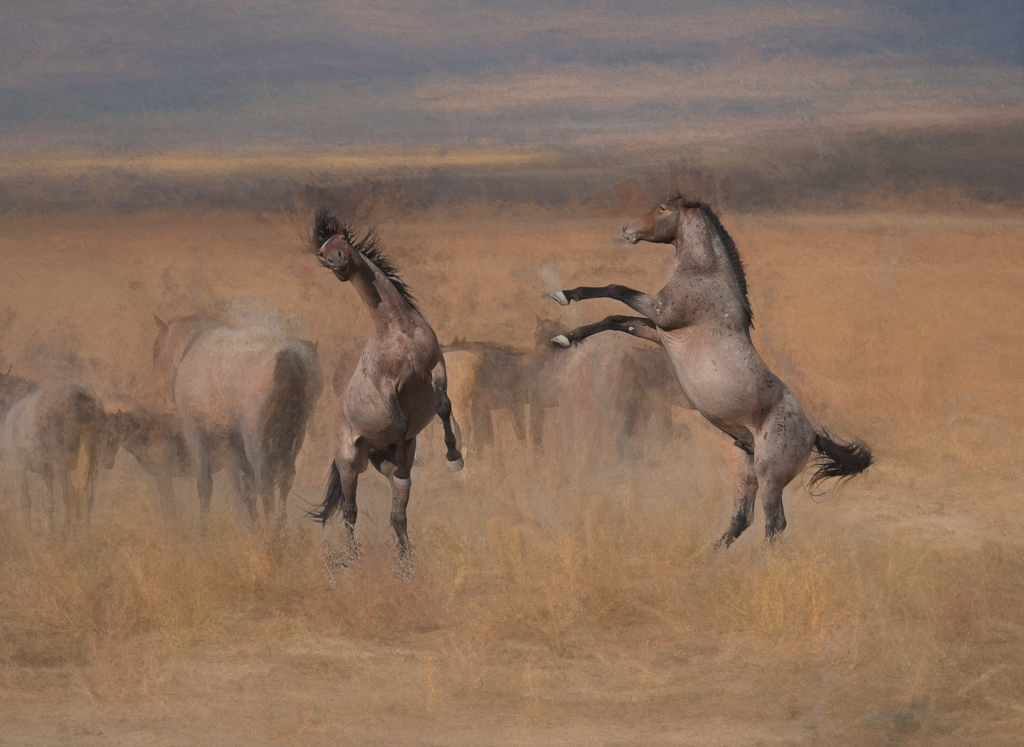
It has all been said. What a wonderful capture. I feel the animal gesture of the elephants' water spray is really highlighted in the painted version . Nice composition overall. You were in the perfect spot. |
Dec 20th |
| 56 |
Dec 20 |
Comment |
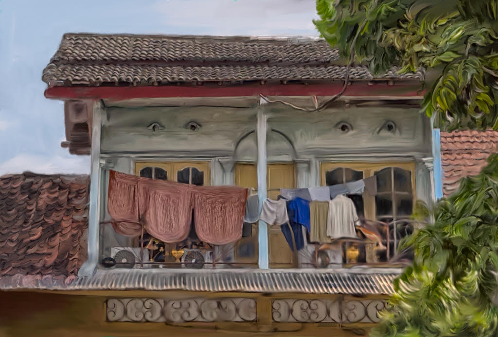
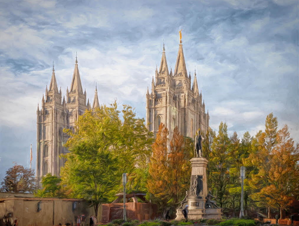
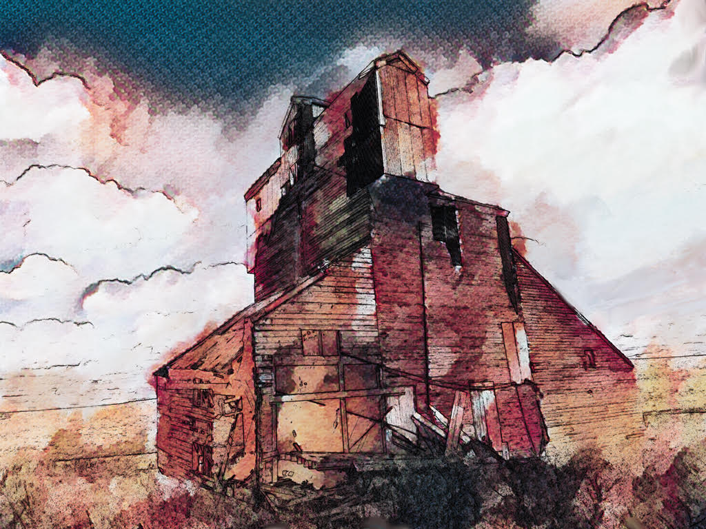
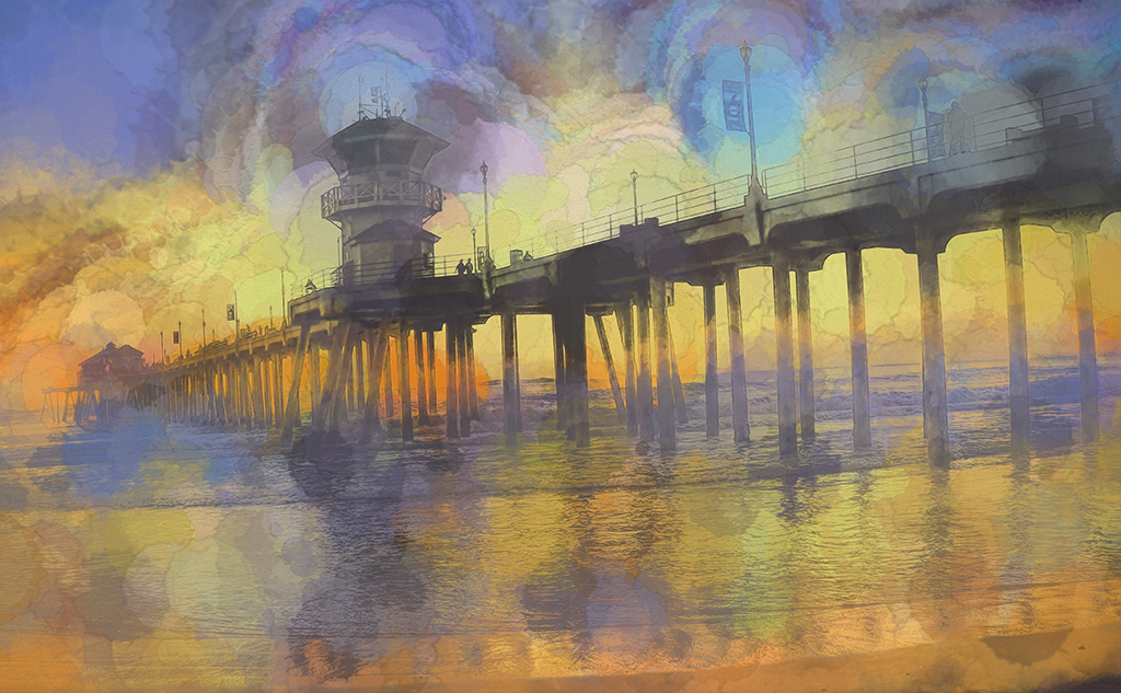
I agree with all of Cindy's suggestions. Your crop of the foreground building is a positive way to inject a good leading line. Something to consider is the distance between the foreground building and the ones on hillside. To my eye it is a bit of a stretch for them to connect and Cindy's crop might be the better way to go. Also, going with the crop, the horizon is now out of the middle. What fun to find such a lovely treasure in old files. Good work on finding a solution to the restoration problem with your conversion process. |
Dec 16th |
| 56 |
Dec 20 |
Comment |
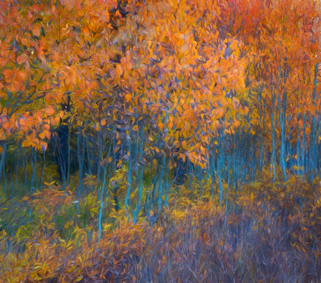
Your processing has a very realistic look. I enjoy the warmer tones that give your art piece a very nice Autumn feel. I also find the composition well done with the interest of the vegetation on the forest floor and its slight upward feel with the strong stop of the tree trunk. |
Dec 16th |
| 56 |
Dec 20 |
Reply |
Thank you Cindy. You are correct and I appreciate your careful eye.
|
Dec 16th |
| 56 |
Dec 20 |
Comment |
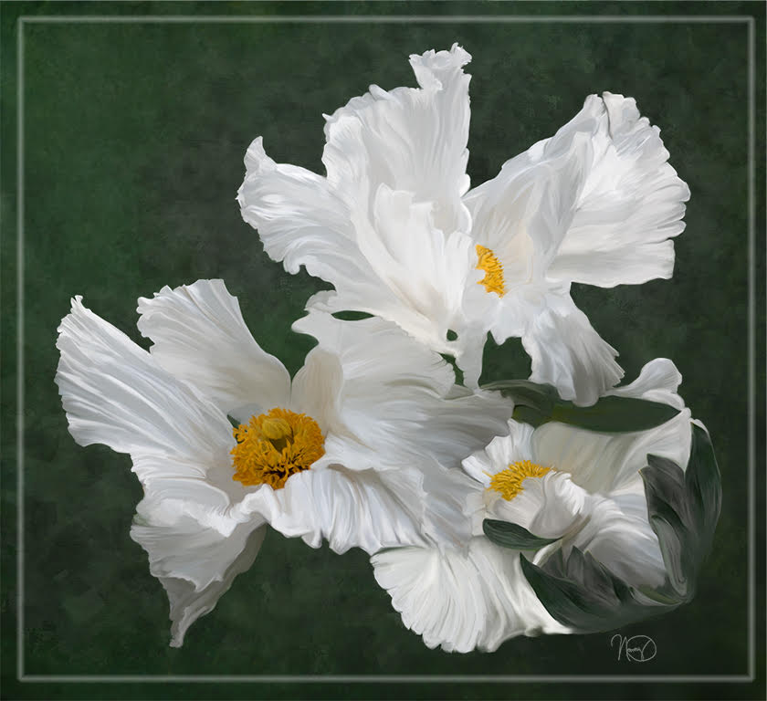
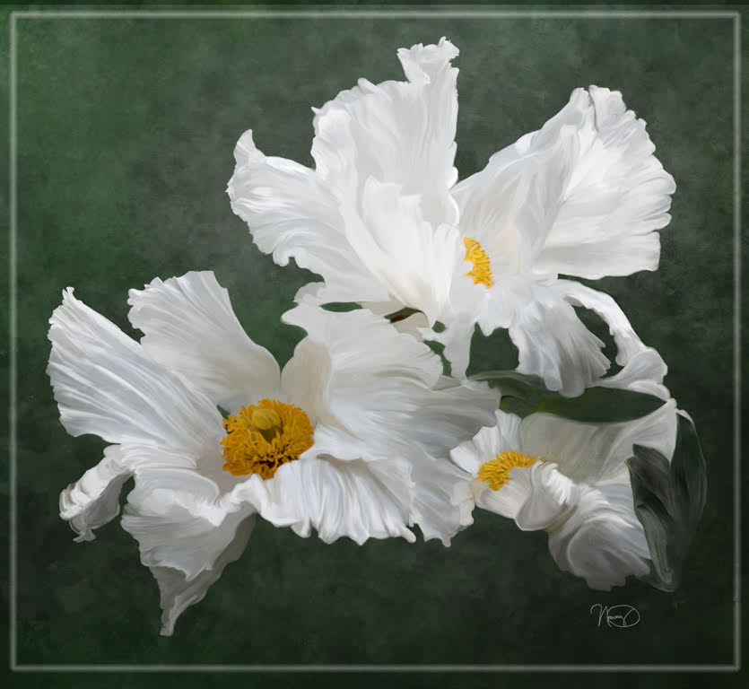
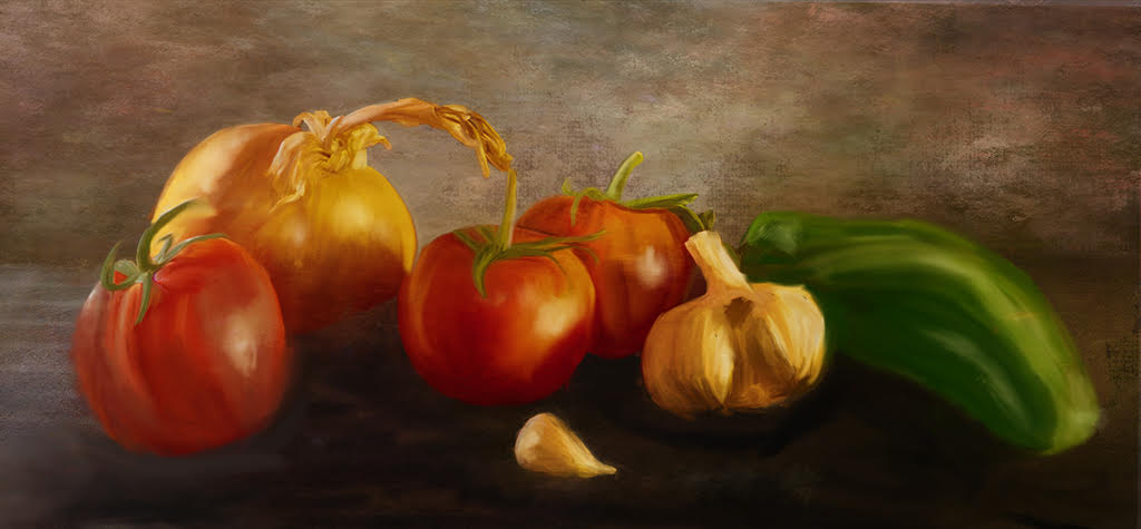
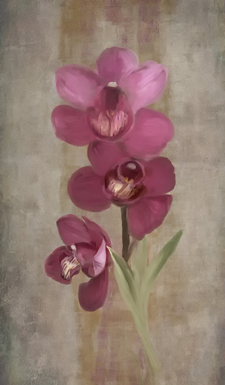
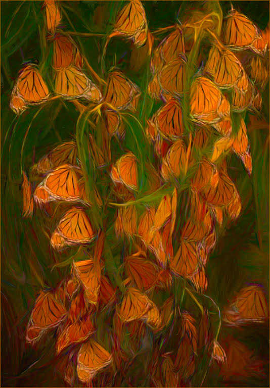
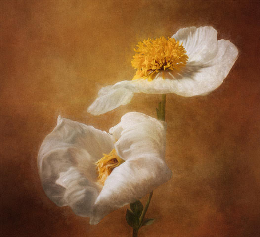
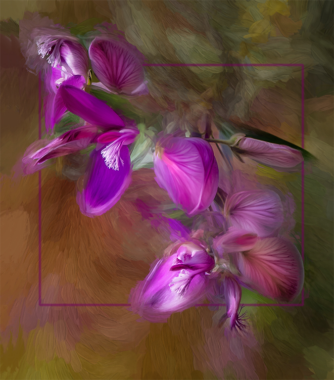
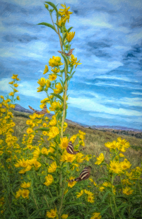
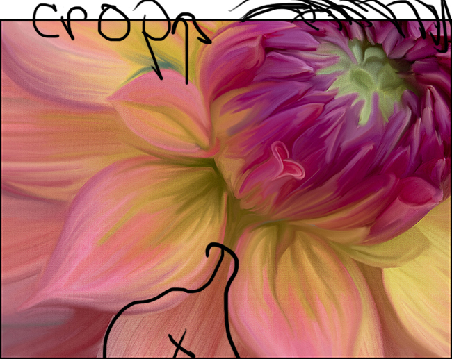
I will now look for the heart in Dahlias. I never realized that was possible. Just lovely colors and attractive image. My eye enjoys the less saturated colors. I agree with Terry on the suggestion to paint the right petal next to the edge. I also suggest adding some of the painting texture to the petal right below the center and maybe similar to the ones on the left. To my eye the one just below the center doesn't look as painted and draws my eye to it. You may also wish to extend the crop a bit on the upper left to give a bit more of the upper petals on the center. My eye wants to see just a bit more. See visual feedback |
Dec 16th |
 |
7 comments - 1 reply for Group 56
|
7 comments - 1 reply Total
|