|
| Group |
Round |
C/R |
Comment |
Date |
Image |
| 56 |
Apr 20 |
Reply |
Thank you Cindy. I really appreciate your insight. |
Apr 20th |
| 56 |
Apr 20 |
Reply |
Hi Sharon, I miss seeing your work, too. I was thrilled when I was judging Color in the Wilmington Exhibition, Feb 2020 and found that the Judge's choice I chose was your image. Your Beautiful Stairwell.
Thank you for your kind words. I am working on improving this current image and get many great tips from this group. |
Apr 20th |
| 56 |
Apr 20 |
Comment |
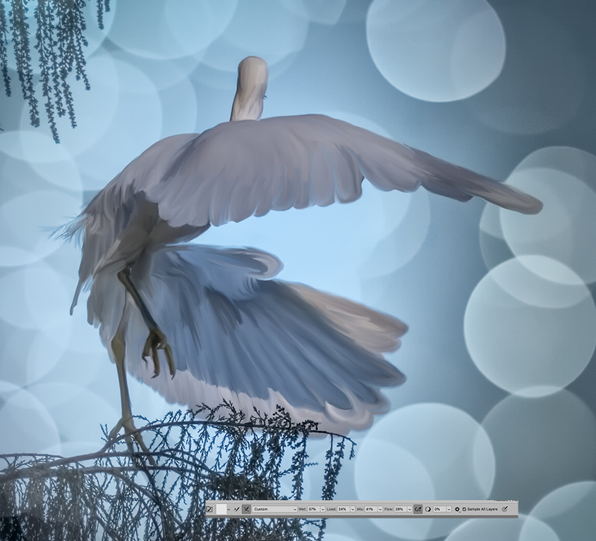
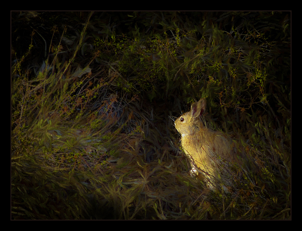
Hi Pat,
Your composition was well done in the camera and perfect for your art . I like your choice of shadows and light to bring out the center of interest with a nice path for your bunny to take. The brush work looks organic too. Nice preset and just lovely.
I agree with Cindy on the stroke. Part of the problem is you reduced the opacity of the stroke and image shows through. In some images it is best to choose a stroke full color in the hue and tone you want and use it rather than opacity. In many images this isn't a problem though. Also, you may want to think about using a color that is not so bright as light colors tend to draw one's eye to the stroke rather that the subject. Maybe something in the dark rust tones. |
Apr 20th |
 |
| 56 |
Apr 20 |
Reply |
Worked this but had so many layers that it was a bit time consuming. Left out the branches because I couldn't find the layer. Will add those later. So here is my redo |
Apr 10th |
 |
| 56 |
Apr 20 |
Reply |
Hi Cindy . Your skills are wonderful with animals, so maybe this is the time to do all those older animal images. It is hard to get people pictures in the home stay orders but maybe in a walk you might see someone and with 6feet distance take a picture � . We have been walking a lot but it has been raining the past two days in California. Paul and I are going to take a rain walk today just to see if we can get out a bit and exercise . Happy painting . I will work on my image this month and post again. |
Apr 8th |
| 56 |
Apr 20 |
Comment |
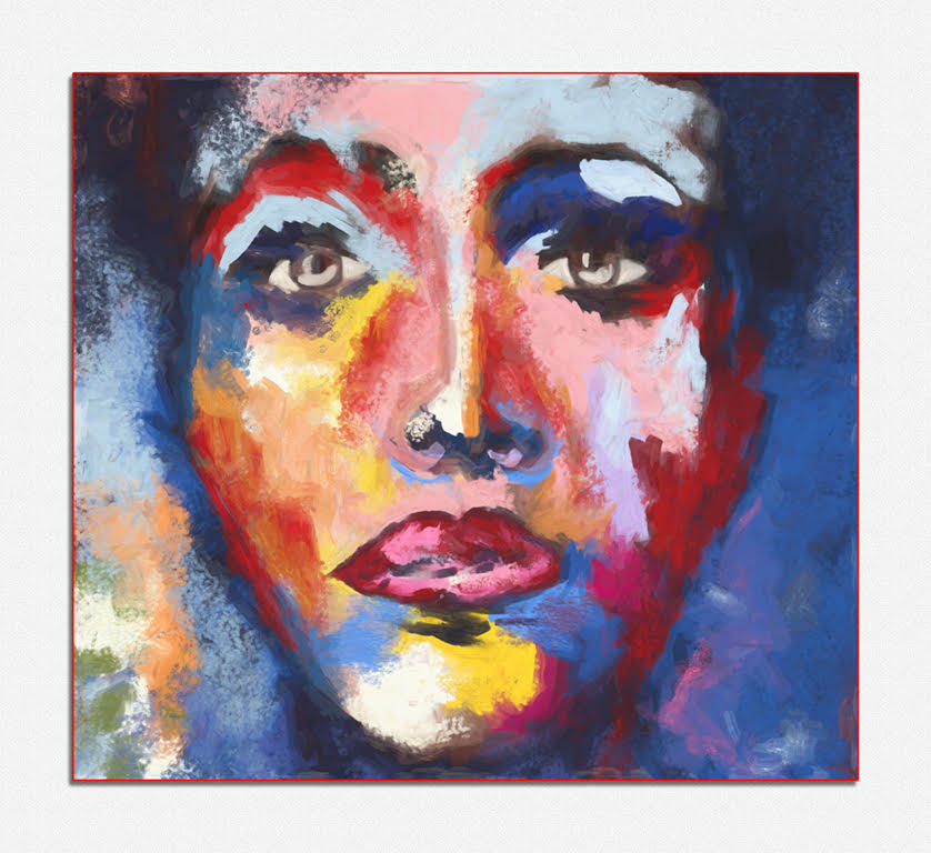
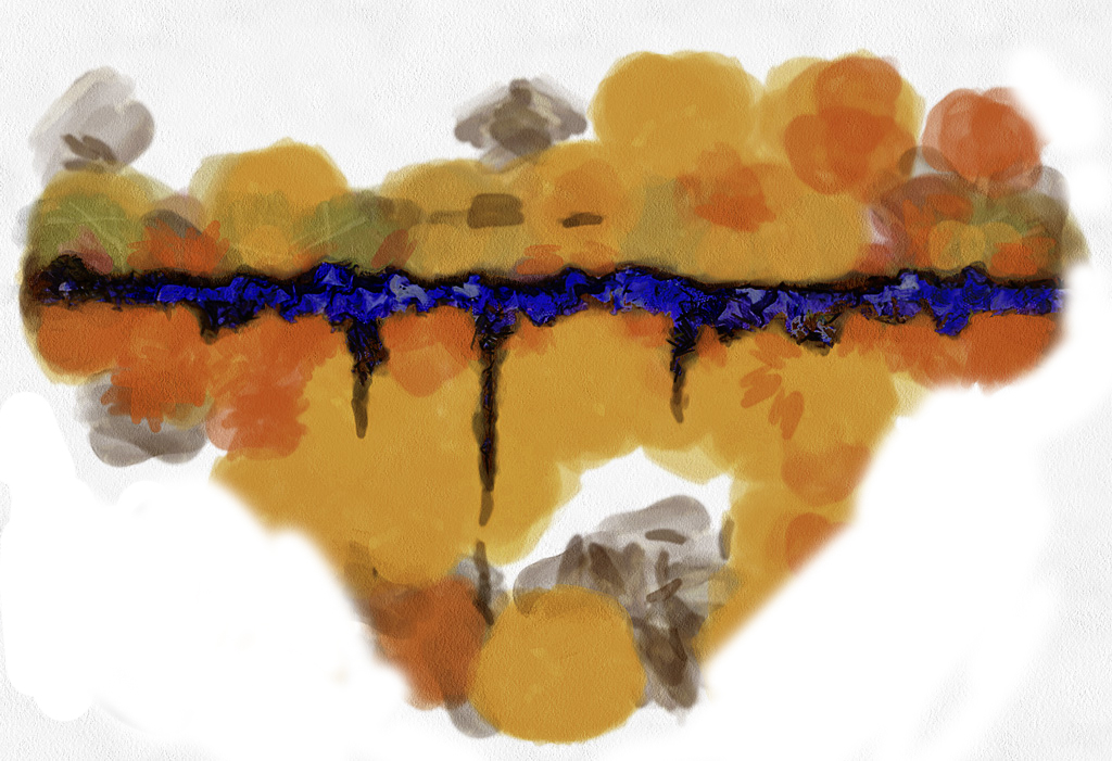
I too love the colors and shapes that this program selected and know this D.A.P. truly takes an engineer to figure it out but your results are unique. Very colorful creative image.
As an abstract it definitely has a strong wow factor with the complementary hues of orange and blue colors and their resultant shapes. Together they are truly striking. I think Elinor has something on the composition and I played around with it. I know in abstract it doesn't really need to have a center of interest, but compositional elements do play a part. Playing around with different compositions might be fun. |
Apr 7th |
 |
| 56 |
Apr 20 |
Comment |
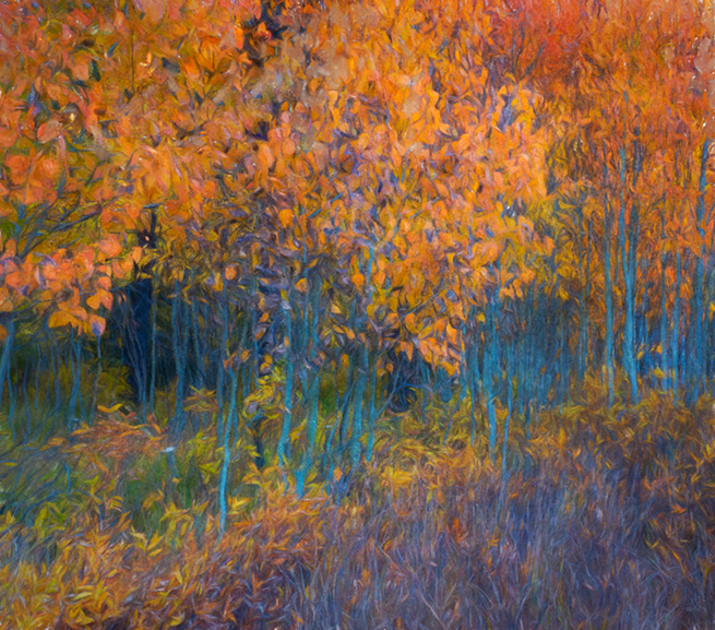
Your composition is well done with a slight diagonal feel and emphasis on the one larger tree. This really sets it apart. I love the warm tones you added to this image and it seems to bring it to life. Very nice art piece.
Leaving the sky out was a great compositional decision. You may want to work on bring the light from the sun into more of the center. You Currently have great light in the center but making a connection to the strong sun light in the upper left to the tree may a stronger connection. Having it in the upper left corner draws my eye to it rather than the tree. Just a suggestion. |
Apr 7th |
| 56 |
Apr 20 |
Comment |
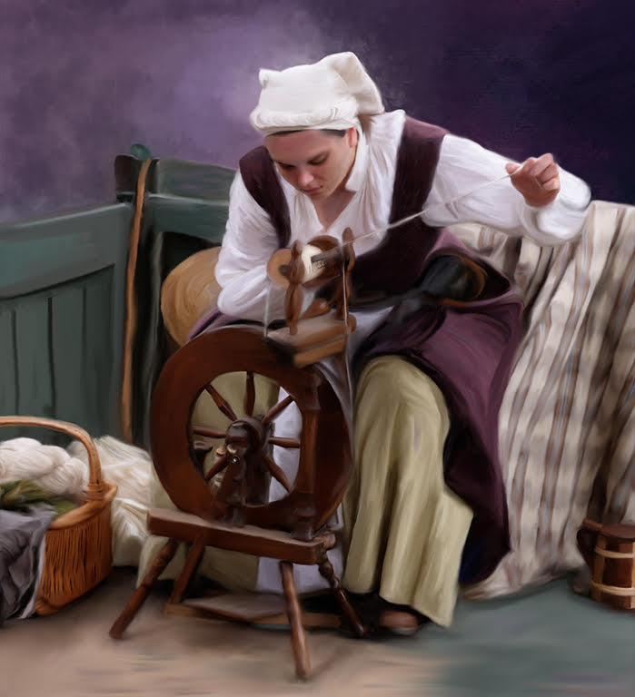
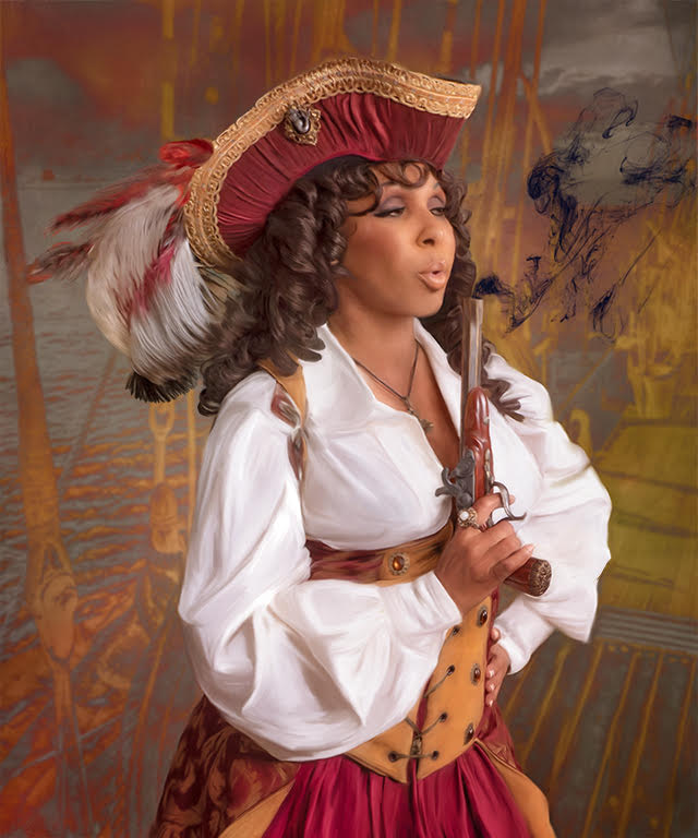
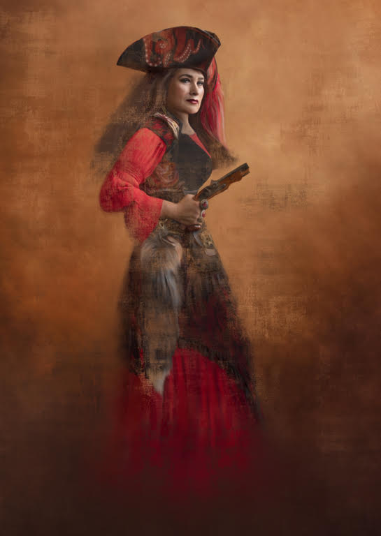
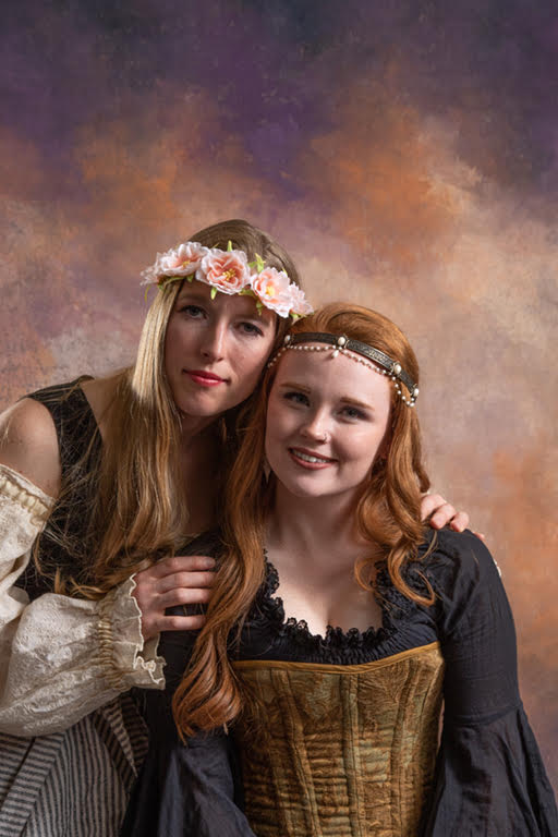
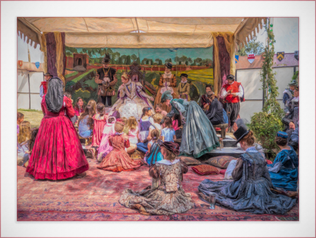
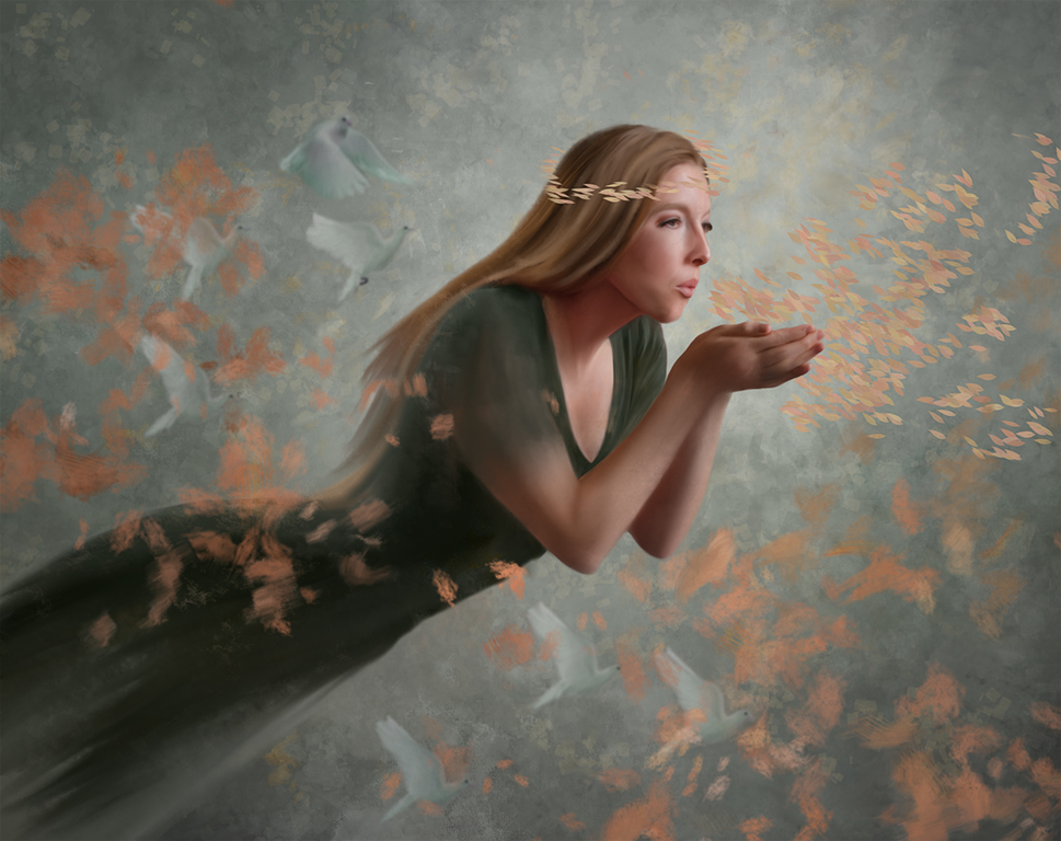
Cindy just a lovely painting. I like the Renaissance and festival Fairs, too. These participants always want their photograph taken.
The tones you used are so soft and complementary and the background is very well done with a nice softly painted texture. One I know Michelle would be very happy with. I really like the way you handled the fan with it lovely colors and nice blending and yet has nice detail on the inside brown edge.
These suggestions below are just little things. You have done an exception job and should do more people.
Here are a few suggestions.
The breaking of the edges on the hair: You may want to use the same texture brush and go in the same direction as the hair. Right now is appears to be just a stroke down and not as a painter would have painted it. One wants the hair to look like it blends into the background.
Added Texture: I really like the way you used this texture brush to add interest to the image. You took it off her face and chest but may want to do this to the hands too.
Edge: On the sleeve of the hand with the fan you have one sharp flesh tone brush stroke. I love the addition of the color, but you may want to soften the edges just a bit so their sharpness doesn't draw the eye to it.
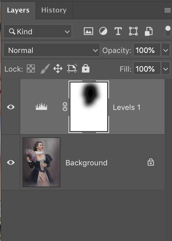
Lighting: One thing Michelle has been guiding me on, is to put light on the key elements and in this case her face and chest. This forces the eye to go to the main place you want the viewers' eye to go to. What I have been doing is putting a levels adjustment layer on the image and darkening to taste on the shadow side and with a brush in the mask bringing back the face and chest. I included a screen shot of what I am suggesting. I often feather the mask too.
|
Apr 7th |
 |
| 56 |
Apr 20 |
Reply |
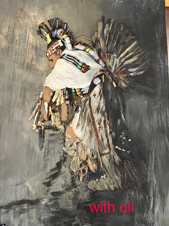
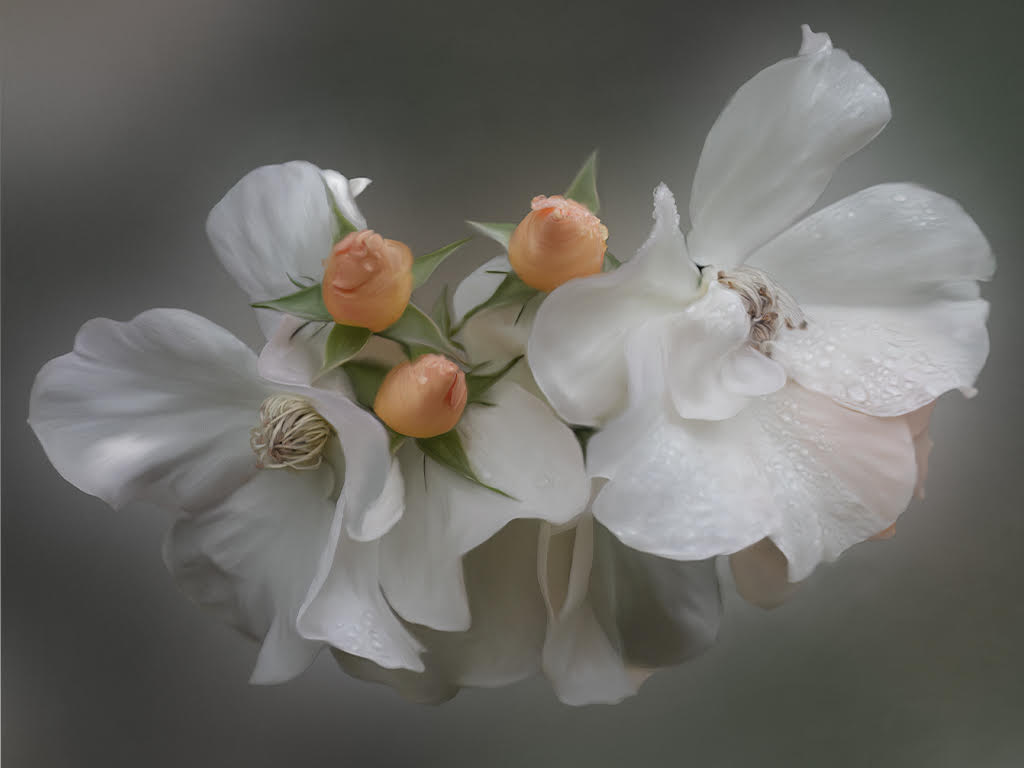
Thank you Elinor and Cindy. Cindy thank you for your insight to see the way to improve my wreath. I will work on that. The visual will help with the concept. |
Apr 7th |
4 comments - 5 replies for Group 56
|
4 comments - 5 replies Total
|