|
| Group |
Round |
C/R |
Comment |
Date |
Image |
| 56 |
Dec 19 |
Reply |
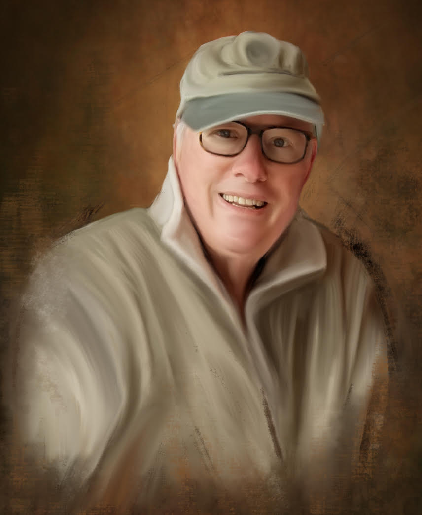
Thank you Gerhard
|
Dec 13th |
| 56 |
Dec 19 |
Comment |
Thank you Cindy and Elinor. |
Dec 11th |
| 56 |
Dec 19 |
Reply |
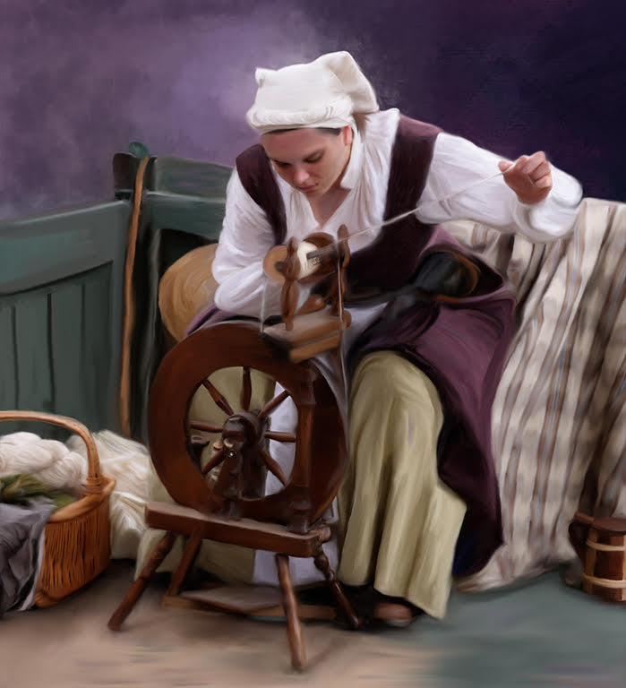
I so agree, Cindy. I am really enjoying Michelle' s program and learning so much. I have been stuck on practice images but each re do I learn more. I am finding the critiques very helpful.
I love your large one best, because of the beautiful soft background. I know Michelle would probably say chunk it up but I think the smooth look has its place. |
Dec 8th |
| 56 |
Dec 19 |
Comment |
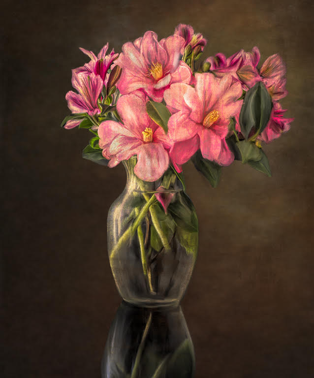
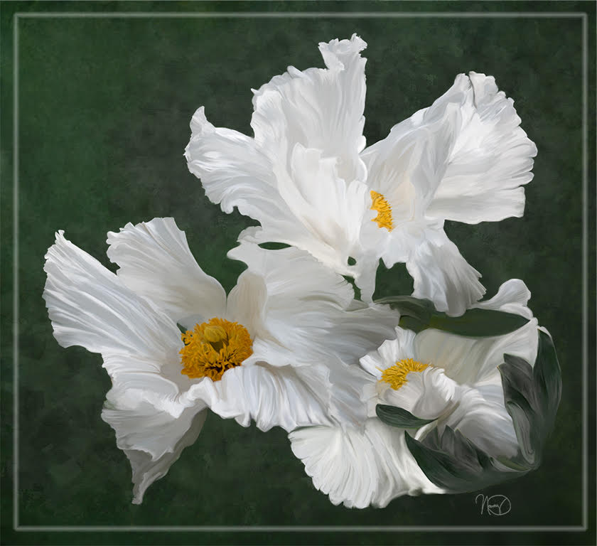
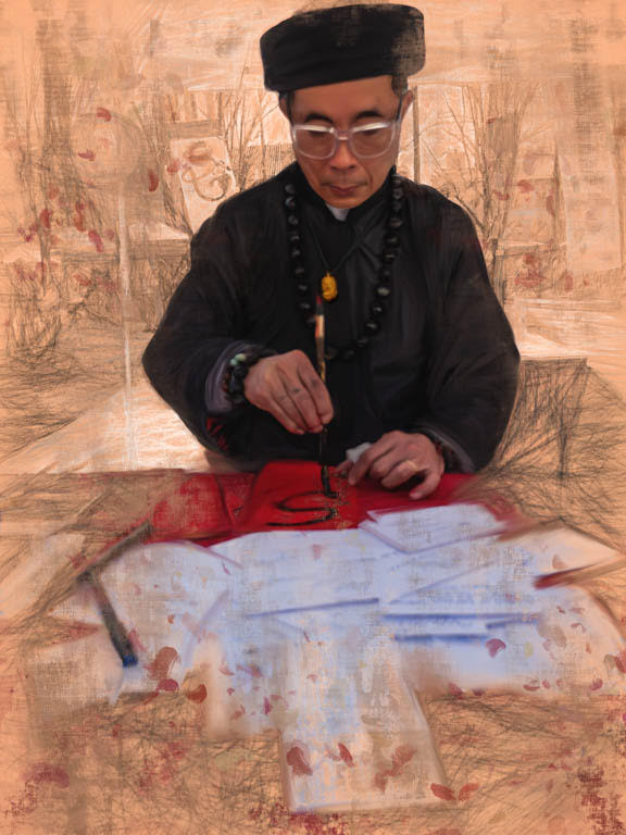
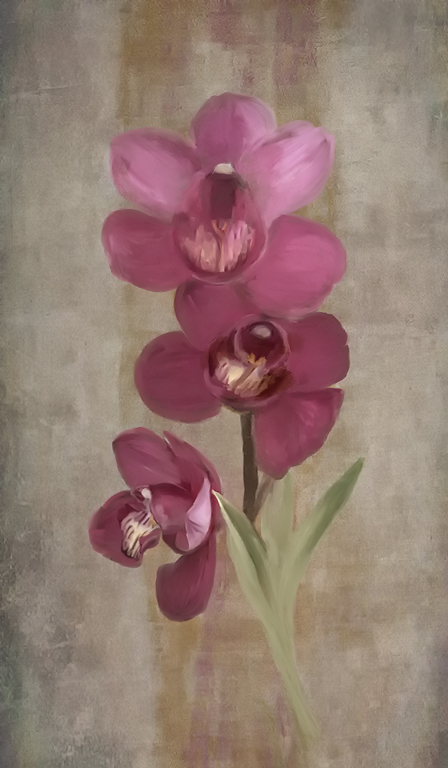
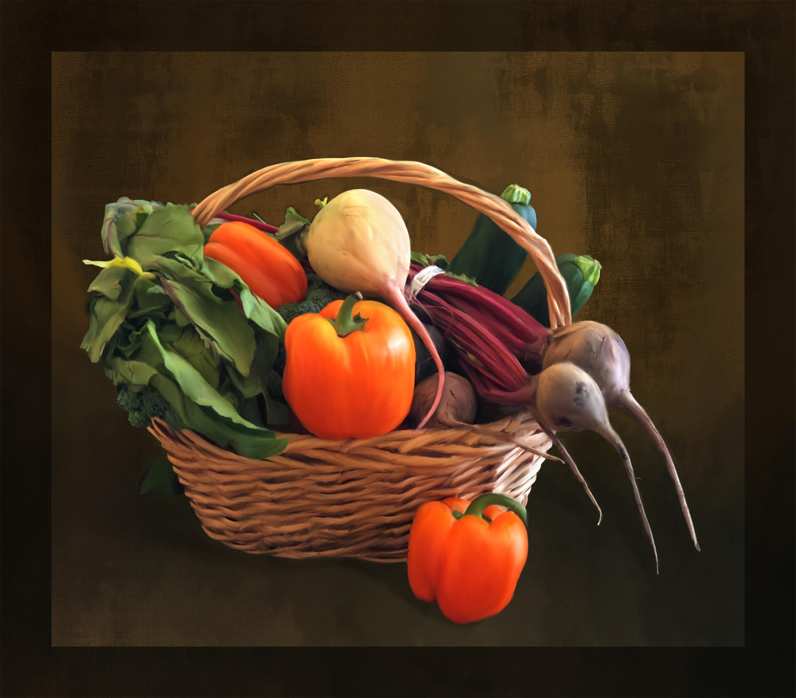
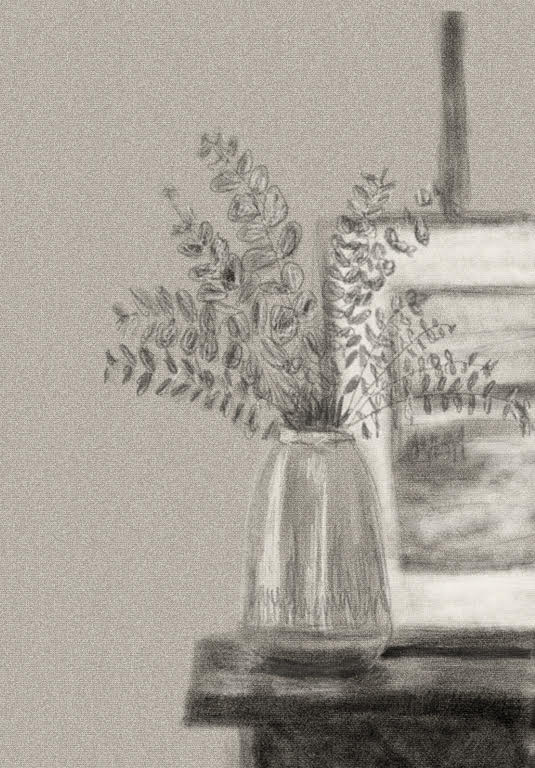
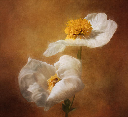
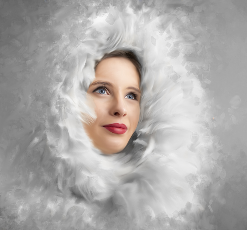
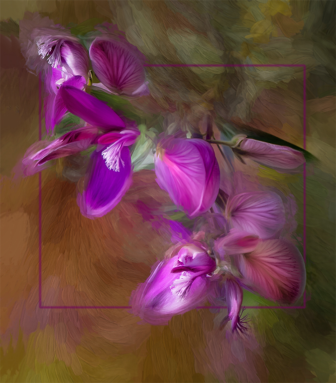
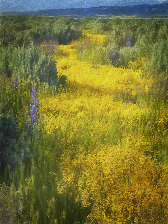
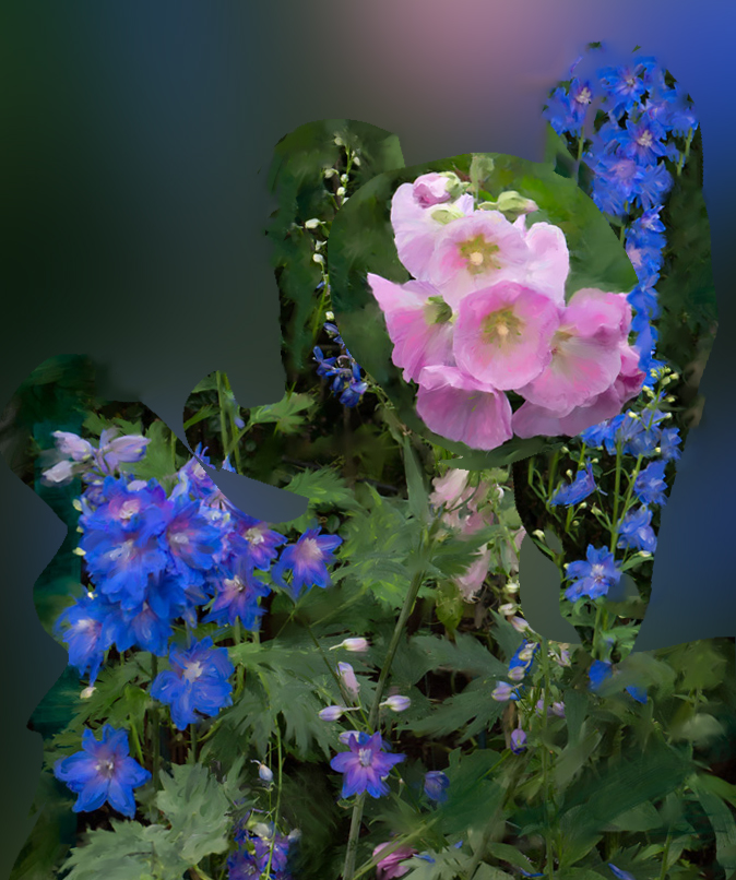
I really enjoy the beautiful paintings you produce with Corel. I have the program too and lately have just been doing PS Mixer Brush, but you get some truly impressive artwork with Painter which is the reason I get all the updates. The colors here are beautiful together. As an idea, you may want to consider using the elements and create a different cut and paste composition. To my eye, this composition jumps around a bit . The Delphinium on the right leads my eye out of the image and the pink one seems to have a great deal of space between them and feels a bit disjointed. In my visual feedback, I played around by combining the elements in photoshop. Just an idea. |
Dec 8th |
 |
| 56 |
Dec 19 |
Comment |
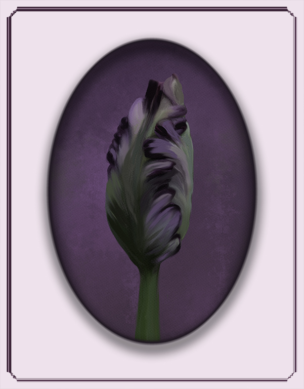
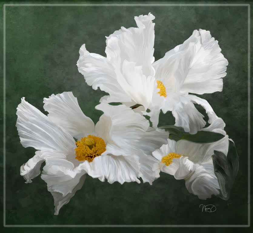
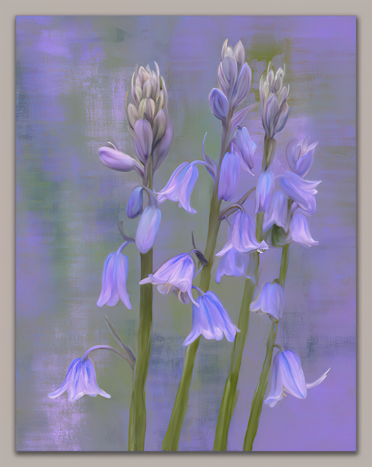
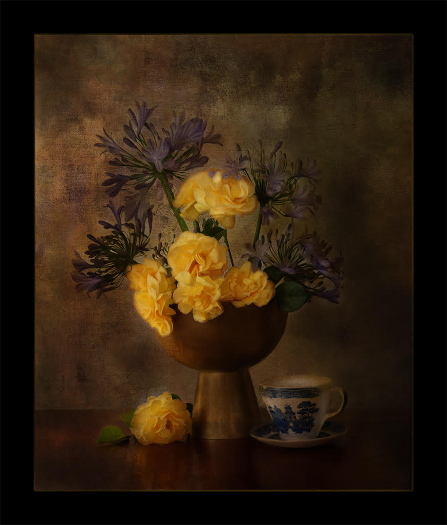
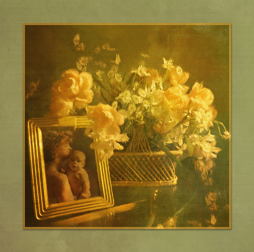
I just really enjoy this painted version and like the addition of the bloom to make the image a more interesting artistic composition. Clever idea.
Your painting is soft and dreamy and the tones of purple and green are always so restful to the eye and attractive. Nicely done. So if I understand. 1. you added the extra bloom, 2. added a texture . 3, then painted. |
Dec 8th |
| 56 |
Dec 19 |
Comment |
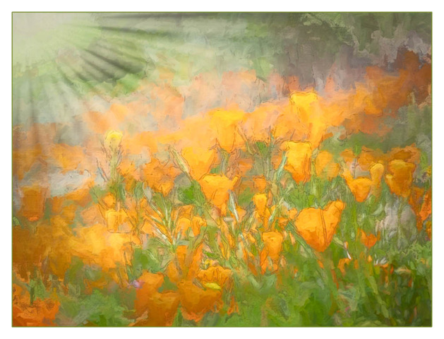
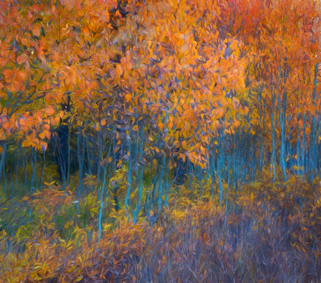
Your composition is well done and I like the slight upward tilt of the image. The complementary tones you ended up with really make the image pop with the blues and oranges. I agree with Cyril, the art texture is just enough to enjoy an artistic look and still enjoy realism. |
Dec 8th |
| 56 |
Dec 19 |
Comment |
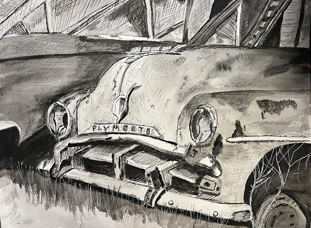
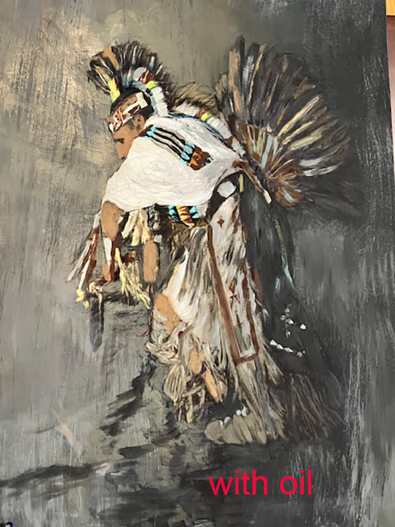
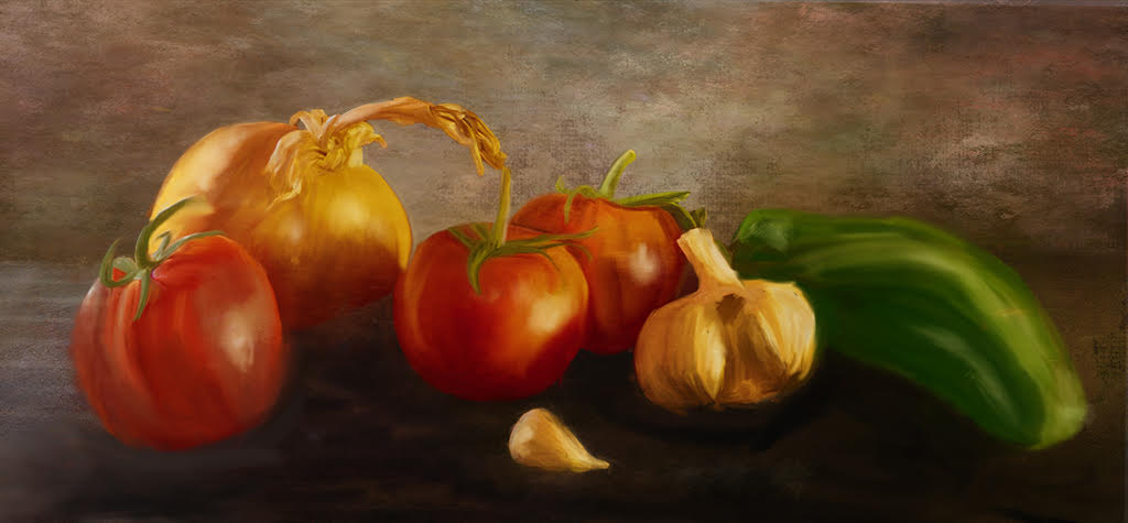
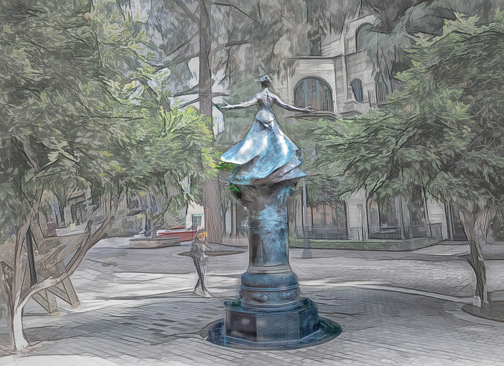
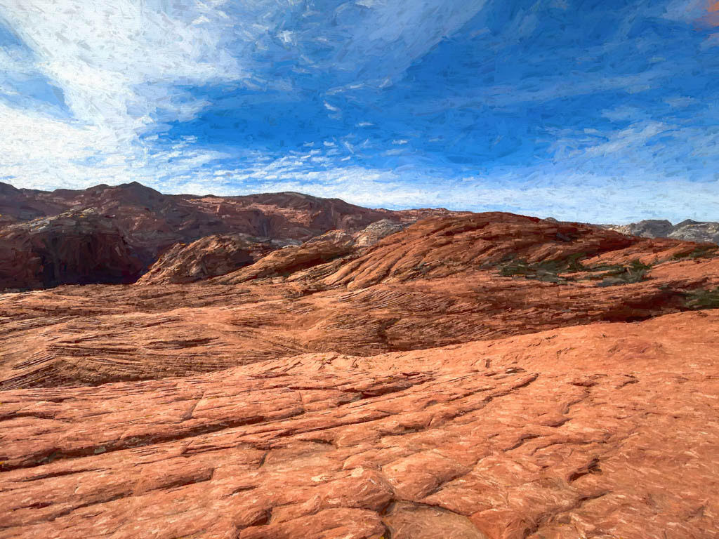
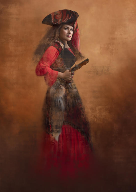
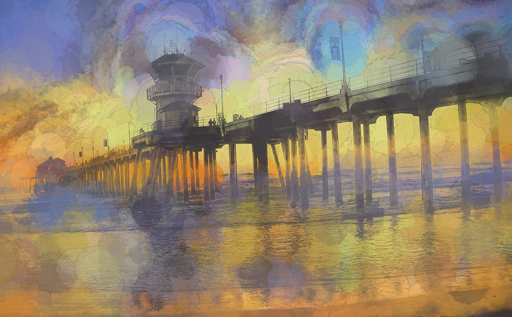
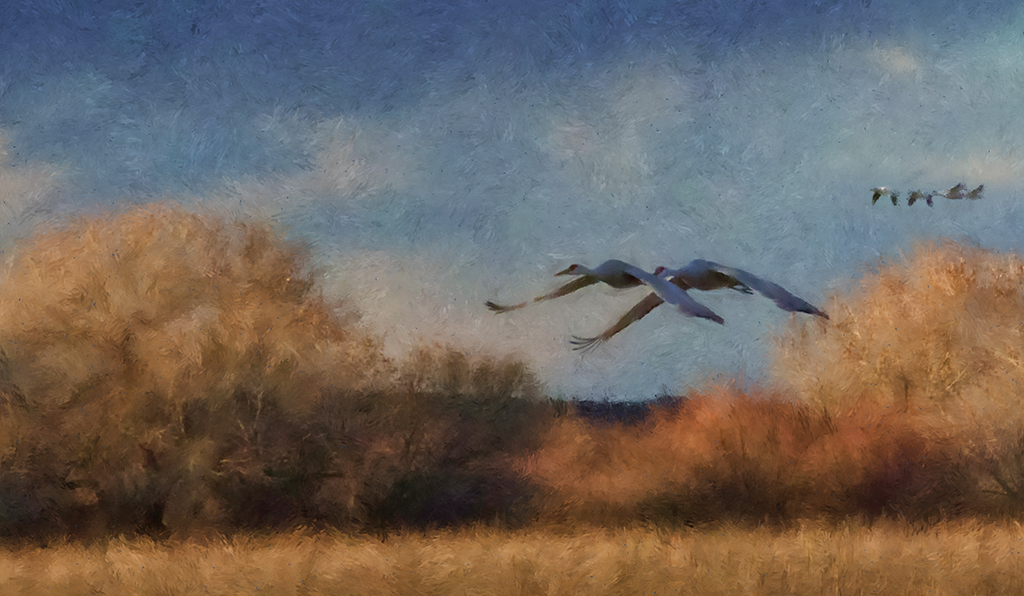
I really enjoy the results you get with the DAP program. It is very artistic and I think you should change the title to Impressions or Impressions We Leave. Love the symbolic narrative. This would do nicely in a series in an art gallery. Everything works here, your crop, the pop of color with your art program, the fork acting as leading lines with the rock to stop our eye from going out of the image. Nicely done |
Dec 8th |
| 56 |
Dec 19 |
Comment |
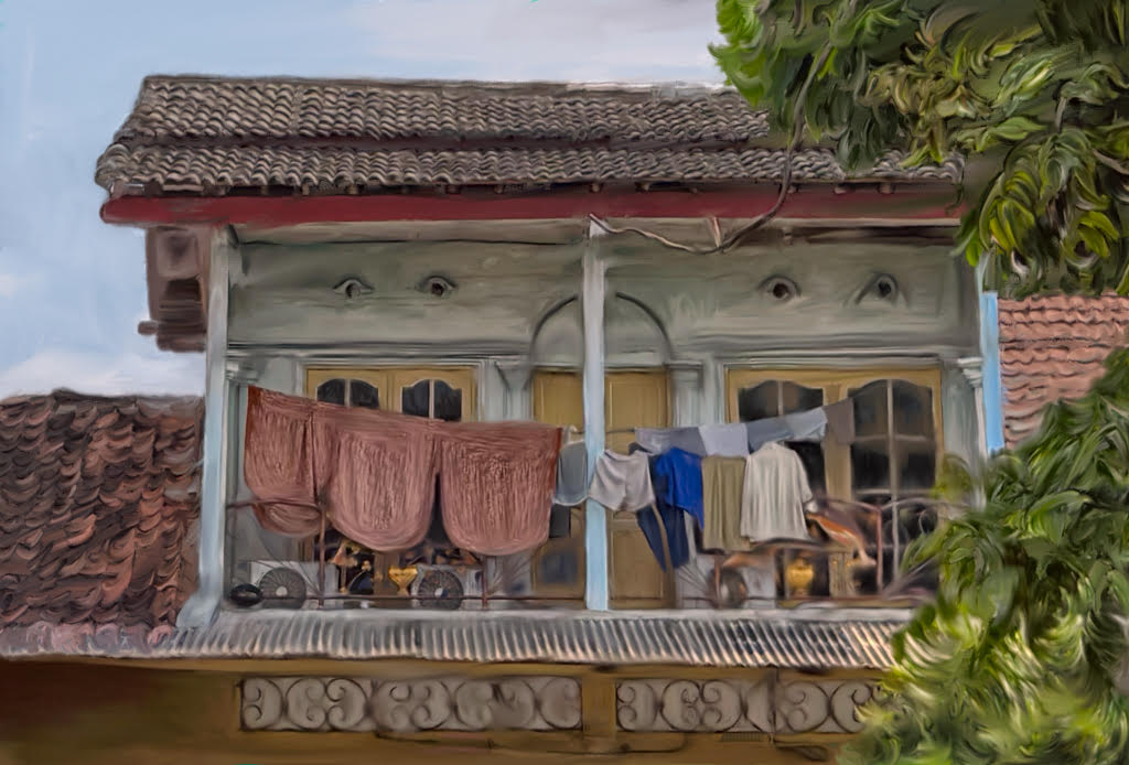
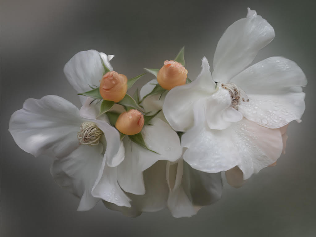
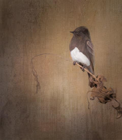
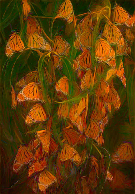
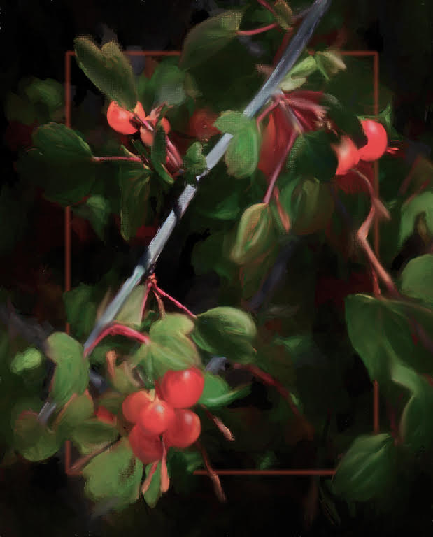
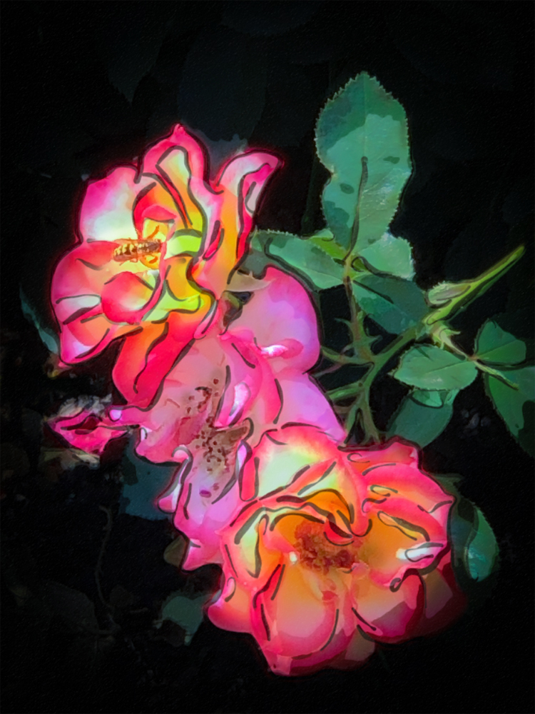
Your use of a diagonal positioning is really dramatic. The dark lines of your art technique really make this image pop along with the darkening of the background. You have done a nice job with the vegetation in the background but you might want to also darken just the leaves. My eye tends to go first to them instead of the rose centers. |
Dec 8th |
 |
| 56 |
Dec 19 |
Comment |
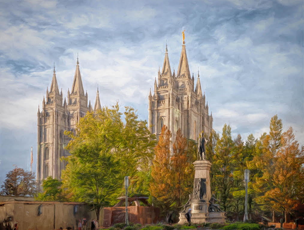
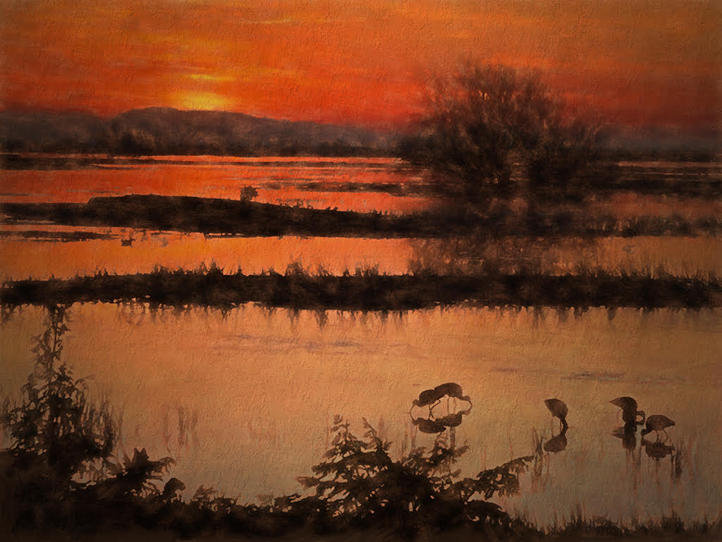
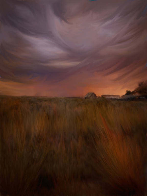
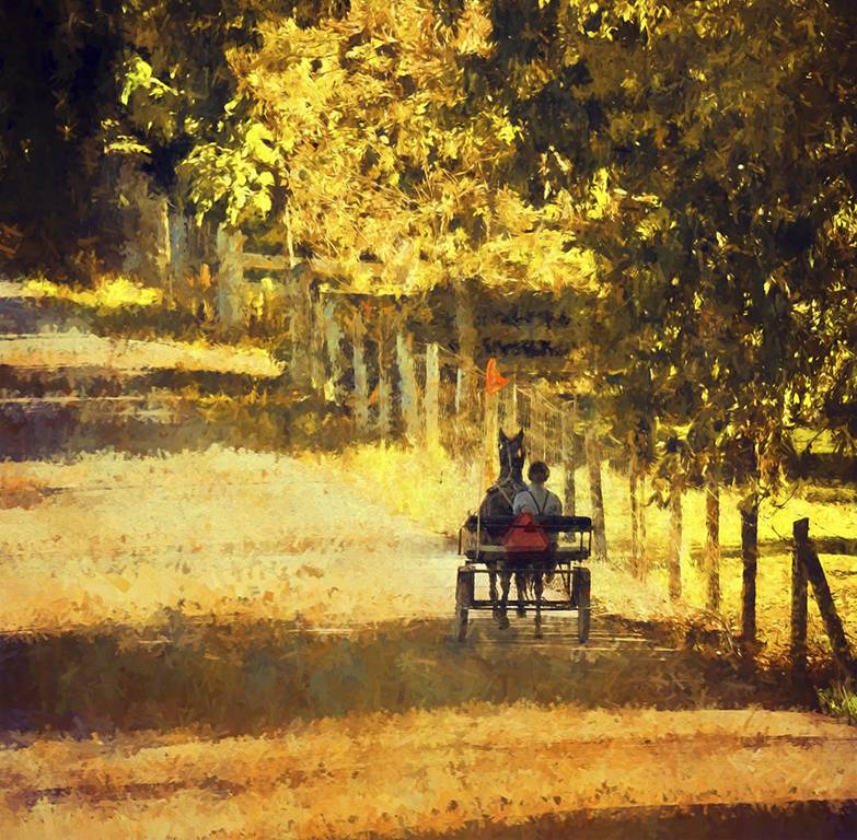
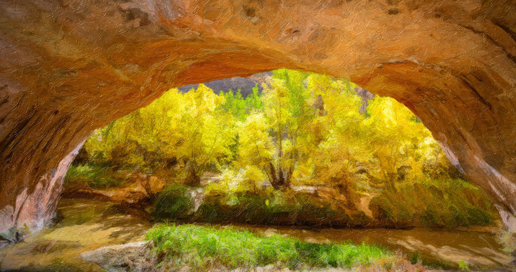
Lovely capture. I really like the view of the apparent 3 trees. There are really more but it appears as if 3 and that is nice for the eye. The capture of the land in front also gives us a nice place to rest. Your painting technique of the oil painting realistic module is lovely and is just a nice touch and not overpowering. You may want to consider a crop. I find the top of the arch really frames the image beautifully, but it is nearly 1/2 of the image and really only needs a hint of it. In my visual review, I cropped so it is only 1/3. |
Dec 8th |
 |
7 comments - 2 replies for Group 56
|
7 comments - 2 replies Total
|