|
| Group |
Round |
C/R |
Comment |
Date |
Image |
| 56 |
Sep 18 |
Comment |
i Was sorry Barbara Miller will be unable to attend again |
Sep 22nd |
| 56 |
Sep 18 |
Comment |
Thank you Pat, I hope I see you at the conference. Don't forget to attend the reception for study groups. |
Sep 21st |
| 56 |
Sep 18 |
Reply |
Thank you Jeanine. |
Sep 18th |
| 56 |
Sep 18 |
Comment |
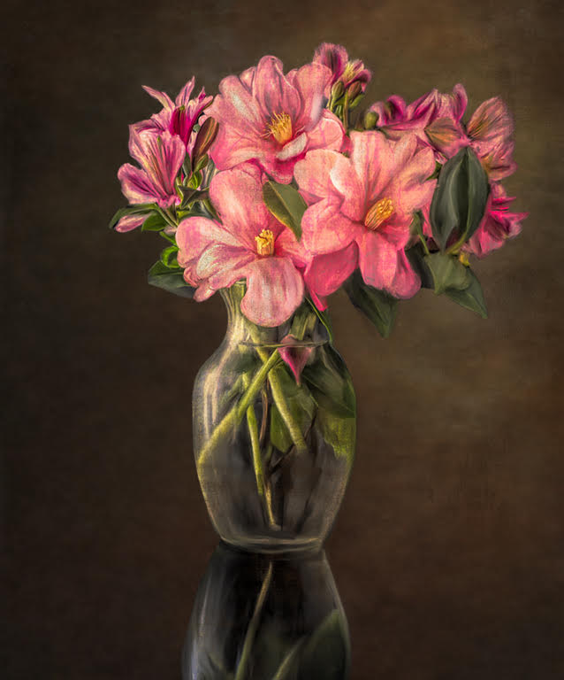
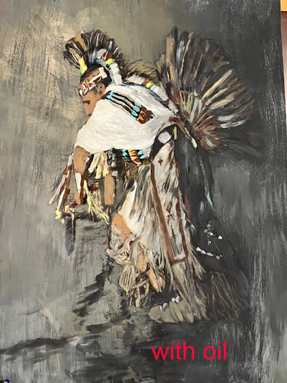
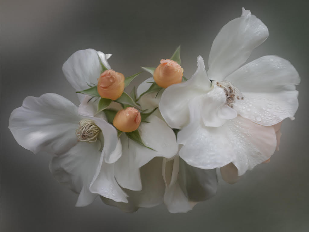
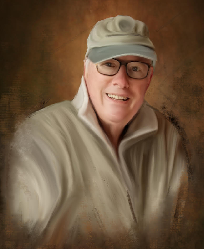
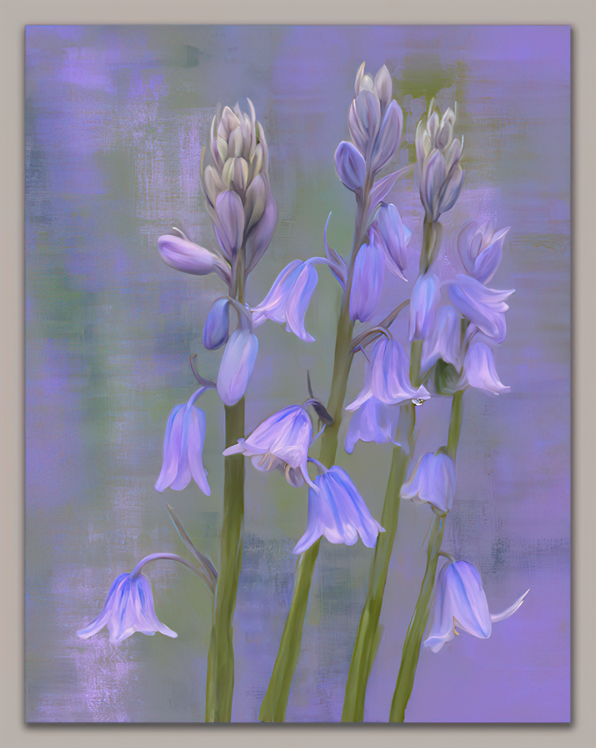
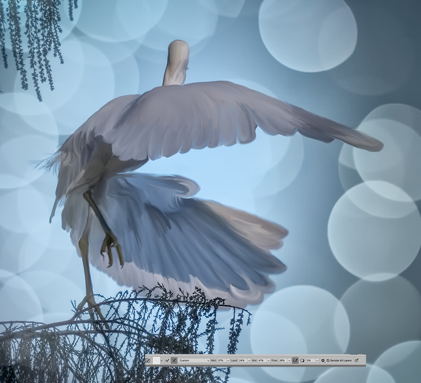
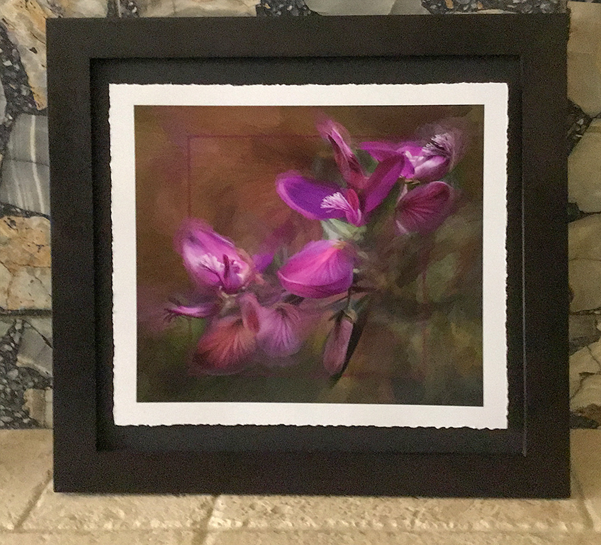
I thought you might like to see the final presentation. I sprayed the print so I didn't need to use glass . I added a white border and deckled the edges. Then raised in with mat board on a black mat board . The judges were very complimentary of this presentation. |
Sep 15th |
 |
| 56 |
Sep 18 |
Comment |
|
Sep 14th |
| 56 |
Sep 18 |
Comment |
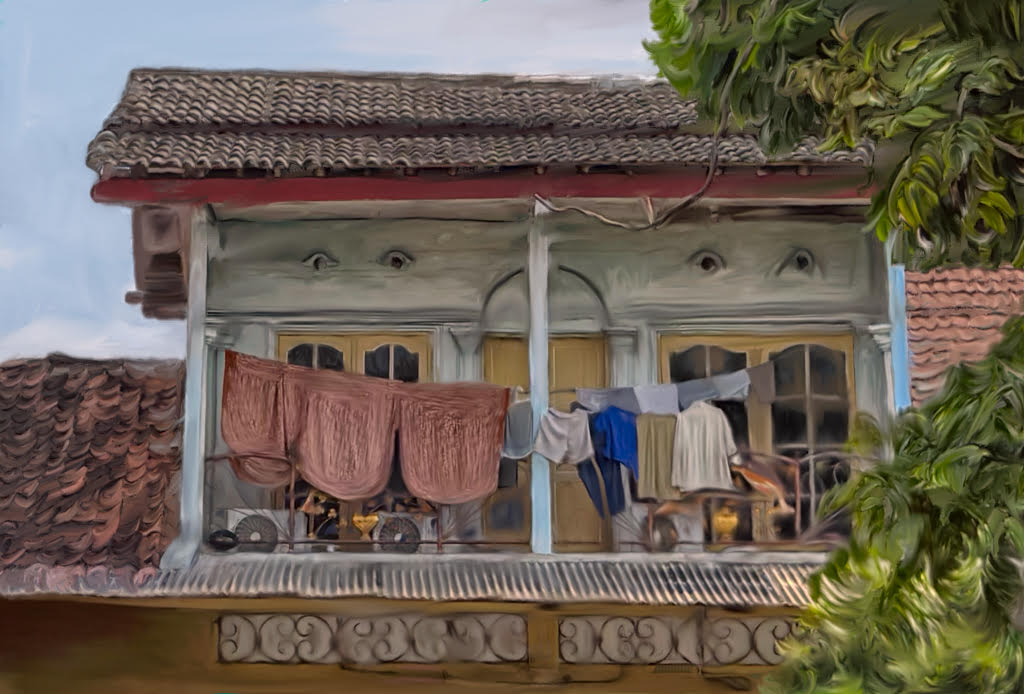
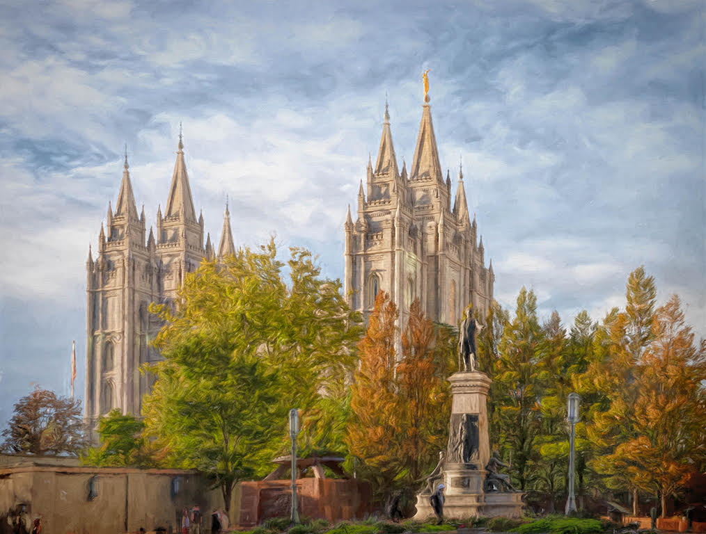
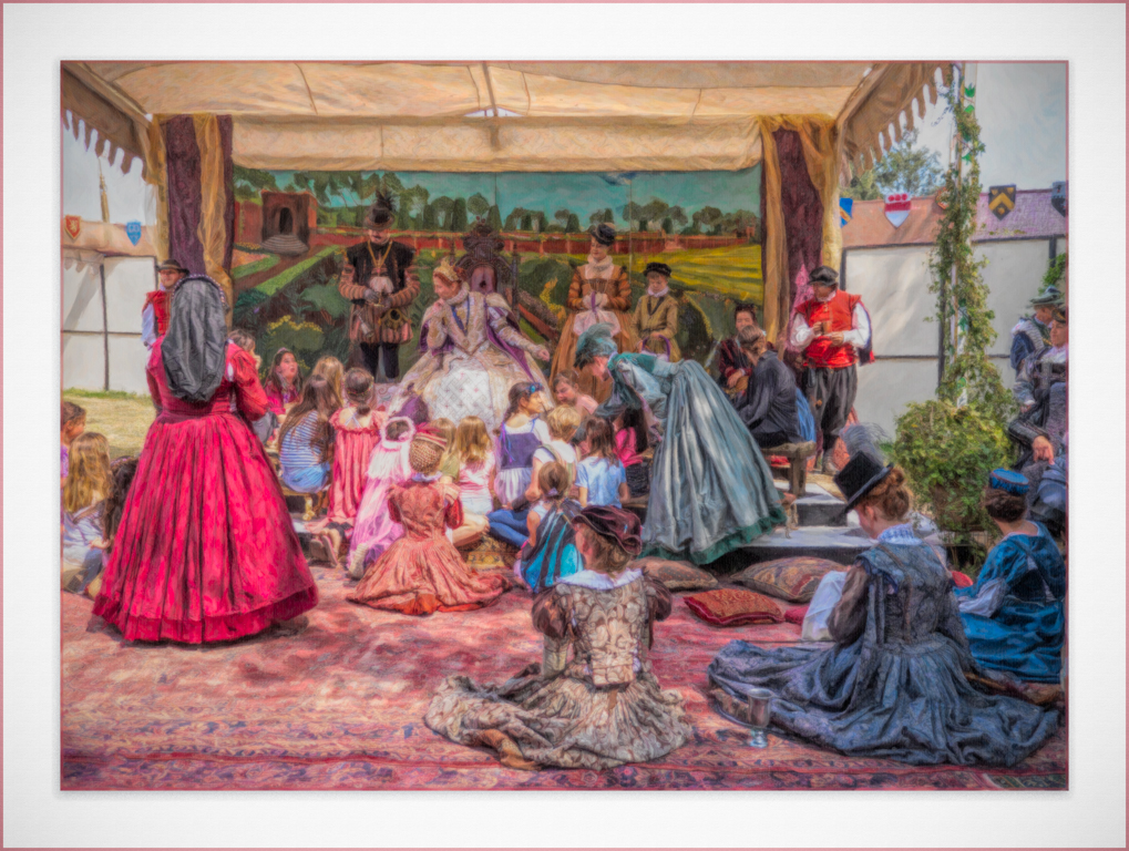
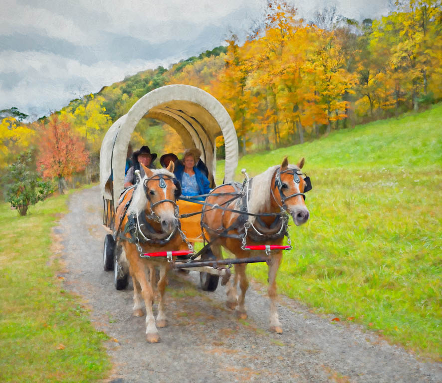
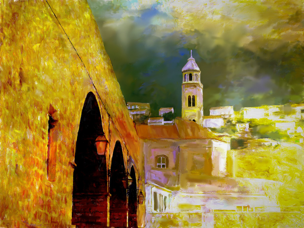
I enjoy your composition and the way you framed the buildings. The building on the left serves as a wonderful leading line into the image and into the right making the focus on the church- just lovely. The problem as I see is the right is too bright. I took it into PS and lowered the exposure to bring back the natural colors and detail . Then I put a mask on it and brought back the left building . |
Sep 12th |
 |
| 56 |
Sep 18 |
Comment |
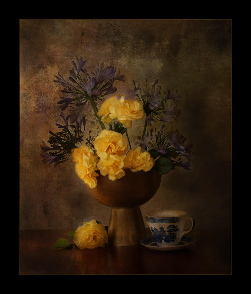
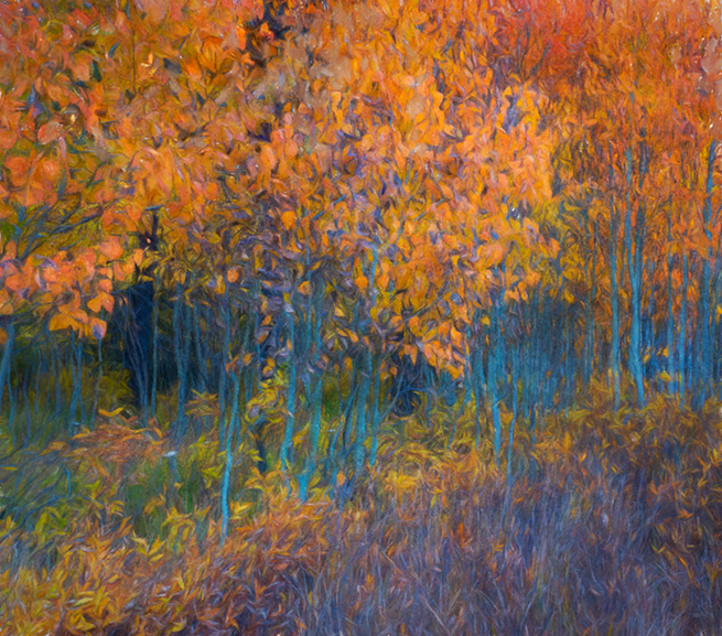
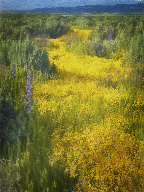
Your crop and use of color really enhances the image and forces our eyes to travel to the subject of the Mill and Aspens. I love the look of the sky, it really adds to the image with the darker sky making the aspens even stronger in color. |
Sep 12th |
| 56 |
Sep 18 |
Comment |
|
Sep 12th |
| 56 |
Sep 18 |
Comment |
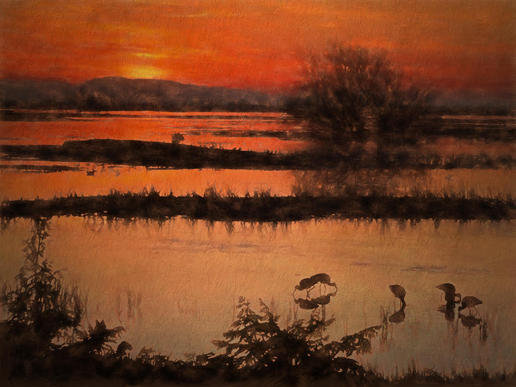
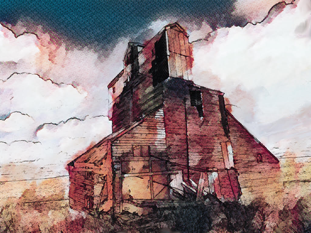
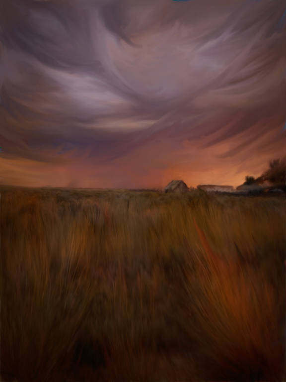
Your warmer colors really make it pop, Kathy. You may want to take it in to lower the shadows some more on the buildings, but I like the way you brought back the detail of the white building. The clouds are spectacular. The painting makes this image come to life. |
Sep 12th |
| 56 |
Sep 18 |
Comment |
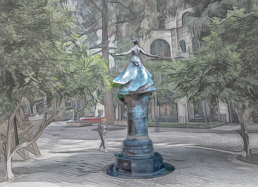
The symmetry is spectacular. The warm tones with the black and white is striking. Nicely done |
Sep 12th |
| 56 |
Sep 18 |
Reply |
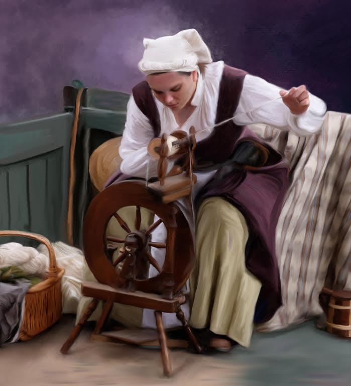
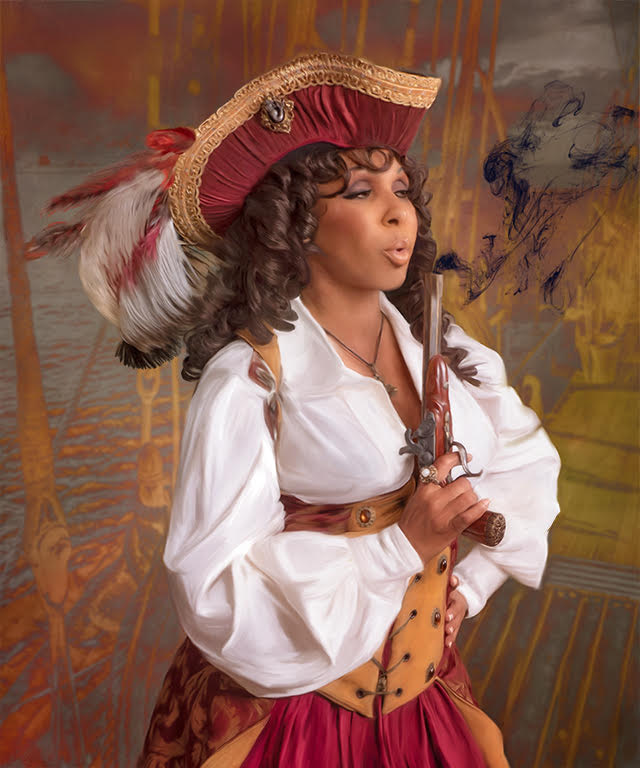
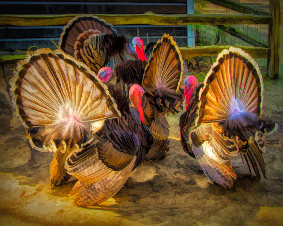
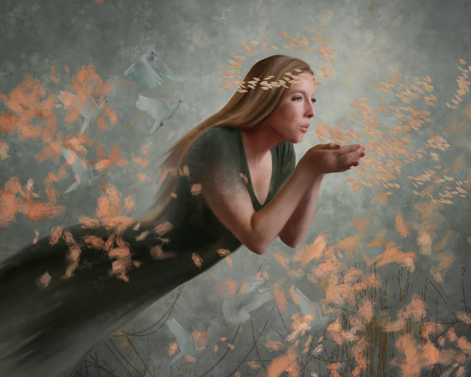
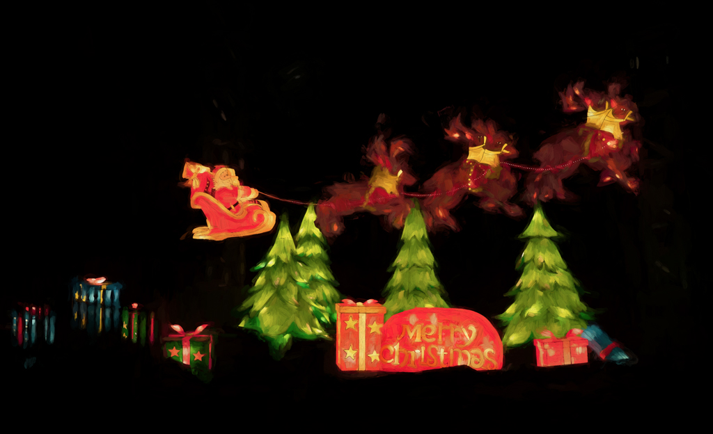
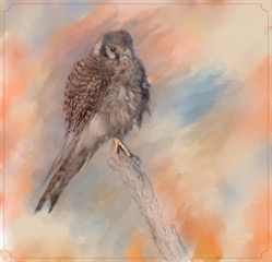
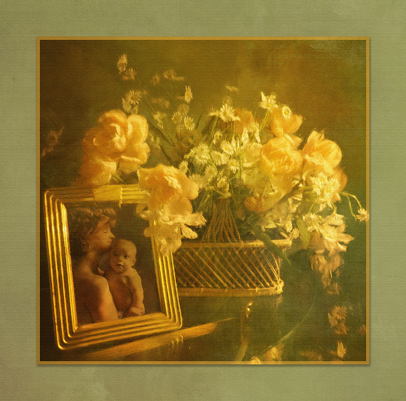
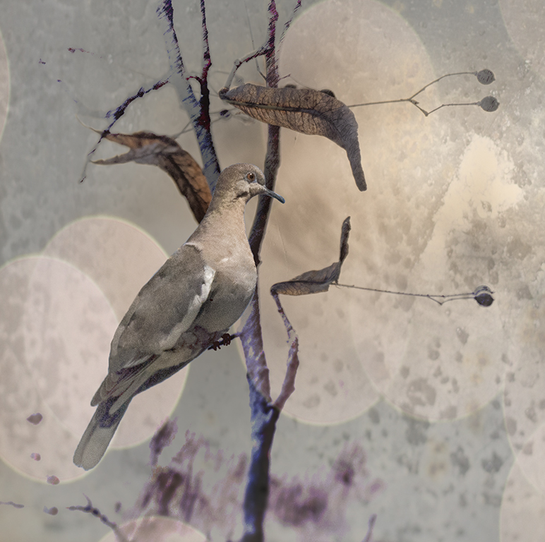
I entered 3 images and one got a 1st, one a 2nd and one an Hm. Here is the 1st. I am sharing with you here because it isn't painted but is a composite of 3 images. |
Sep 12th |
 |
| 56 |
Sep 18 |
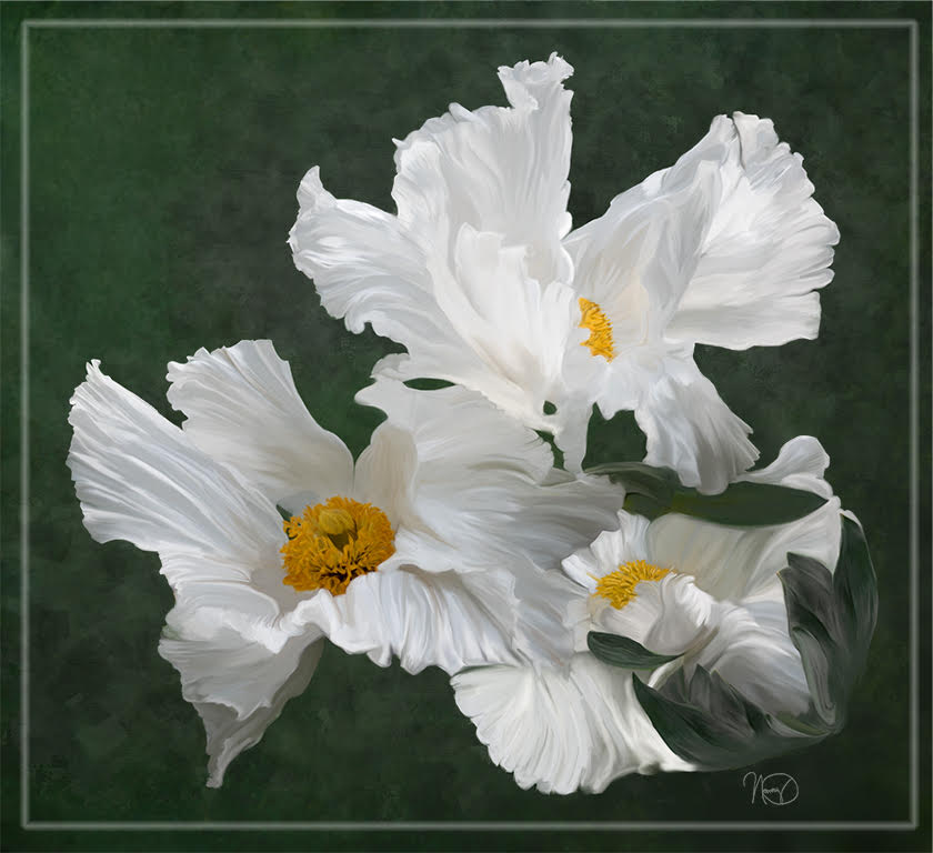
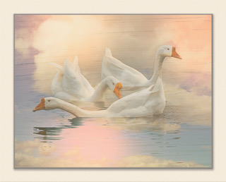
Reply |
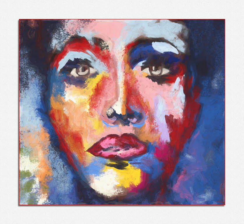
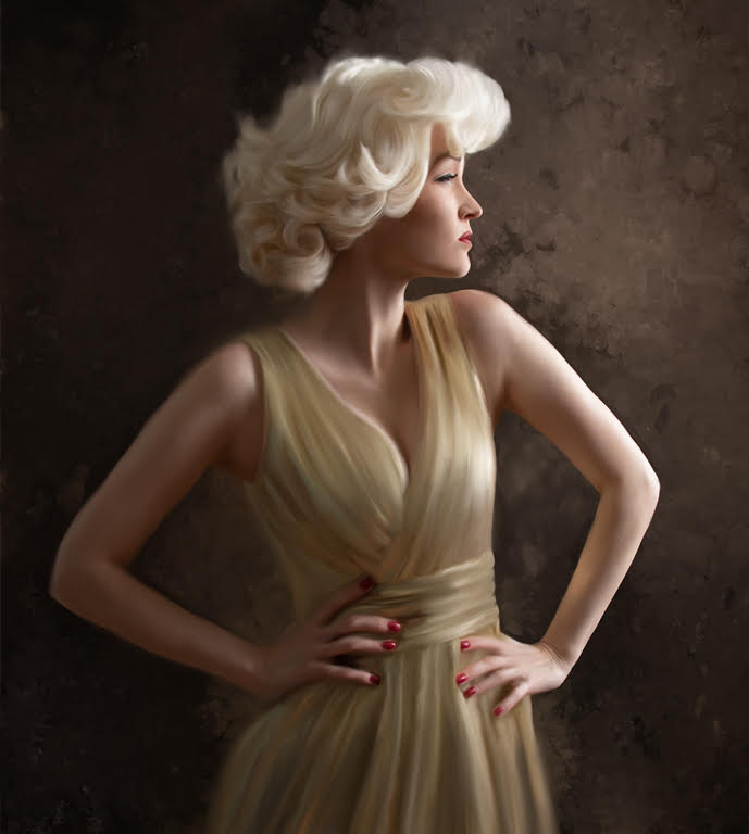
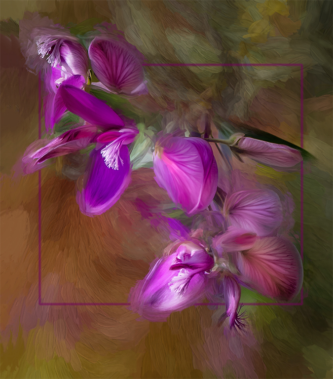
The square was a stroke to break up the background a bit. It is interesting that some like the stroke while others don't. It did get a 2nd place though.
|
Sep 12th |
| 56 |
Sep 18 |
Comment |
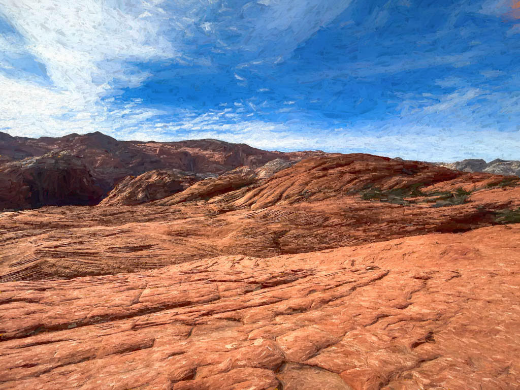
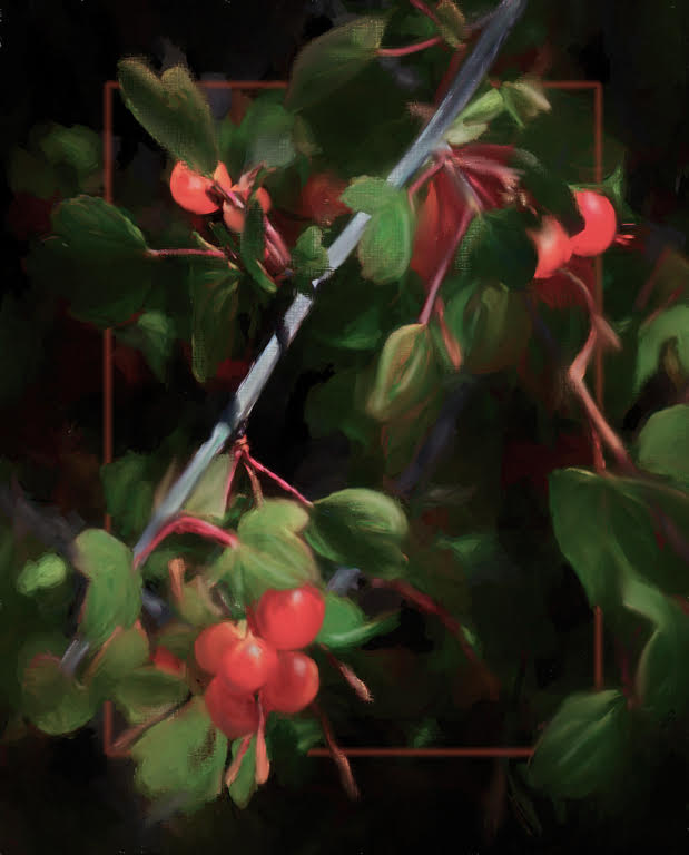
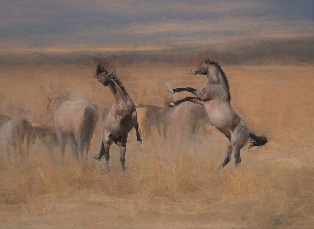
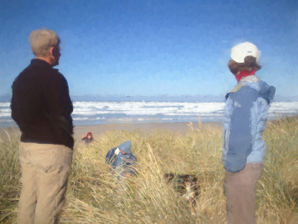
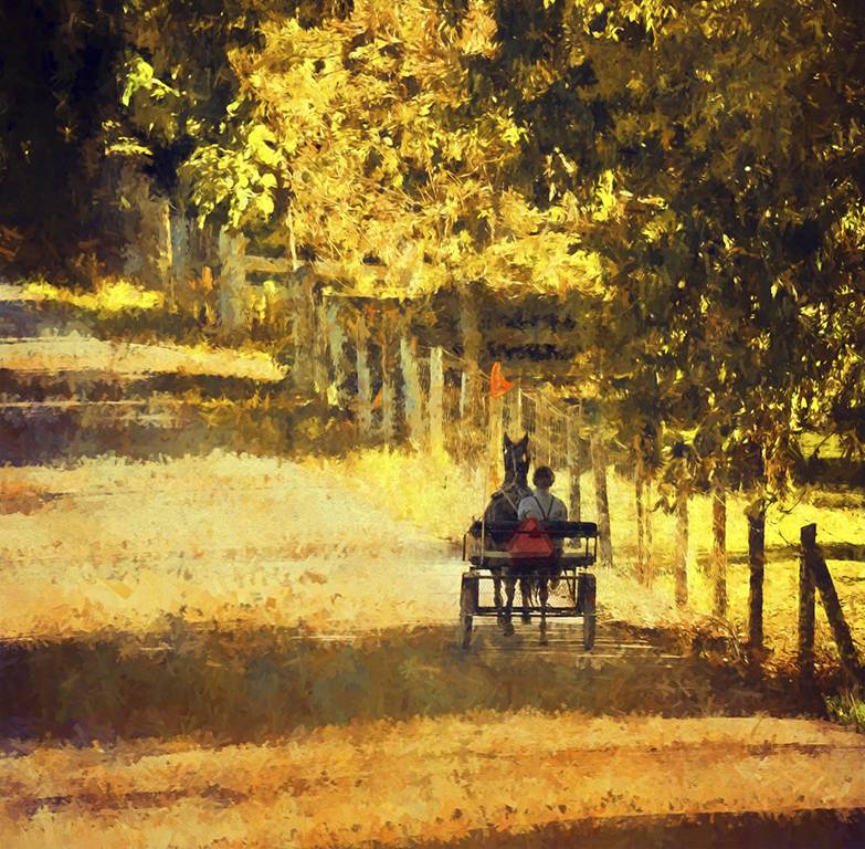
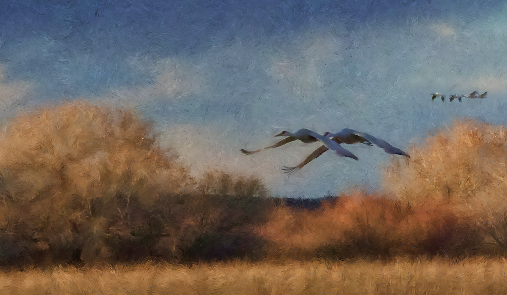
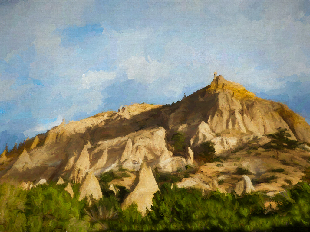
I have enjoyed photographing this area a couple of times and loved the climb to the top. This is a great view, too of the mountain range. I like the technique you used on the mountains. It is a nice texture. I agree with Cyril that the shadows on the right are a bit blocked up. I took your image into photoshop and used camera raw and opened the shadows and left the rest alone especially your great sky. |
Sep 12th |
 |
| 56 |
Sep 18 |
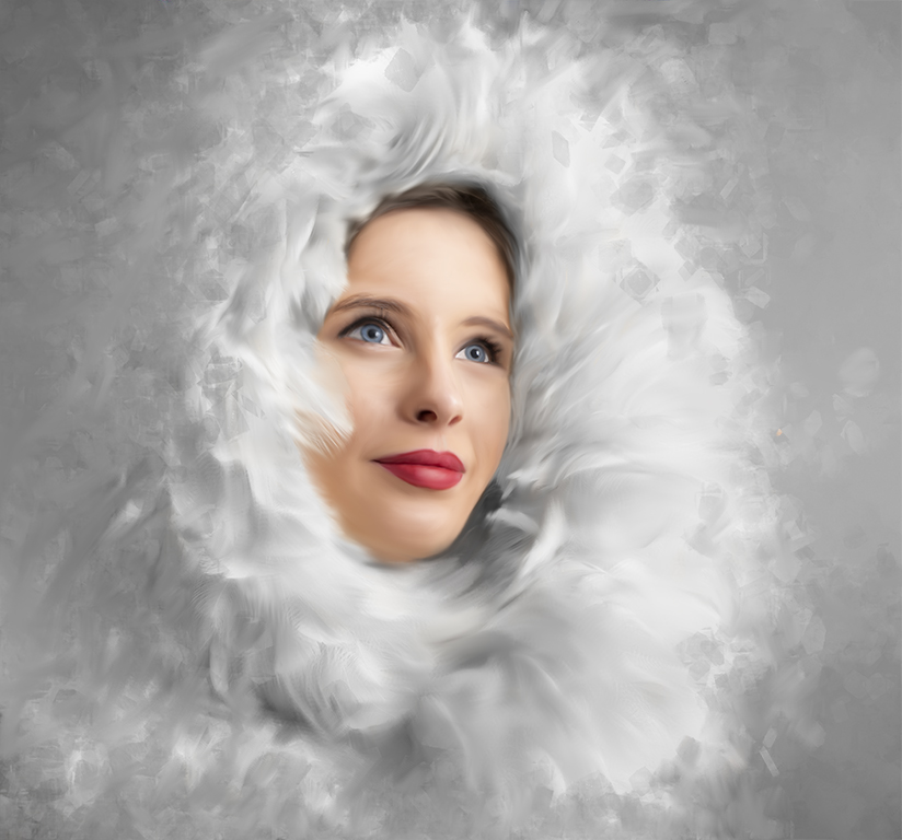
Comment |
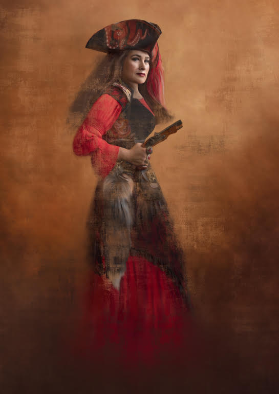
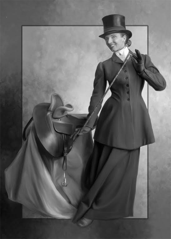
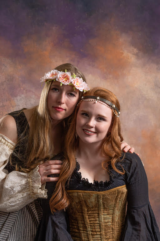
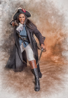
Cyril, I like the framing of the image and the model's pose. The colors are a nice warm tone which gives a nice contrast to snow conditions and picks up the warm tones in the background. |
Sep 12th |
11 comments - 3 replies for Group 56
|
11 comments - 3 replies Total
|