|
| Group |
Round |
C/R |
Comment |
Date |
Image |
| 56 |
Jun 18 |
Comment |
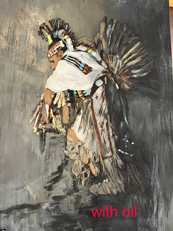
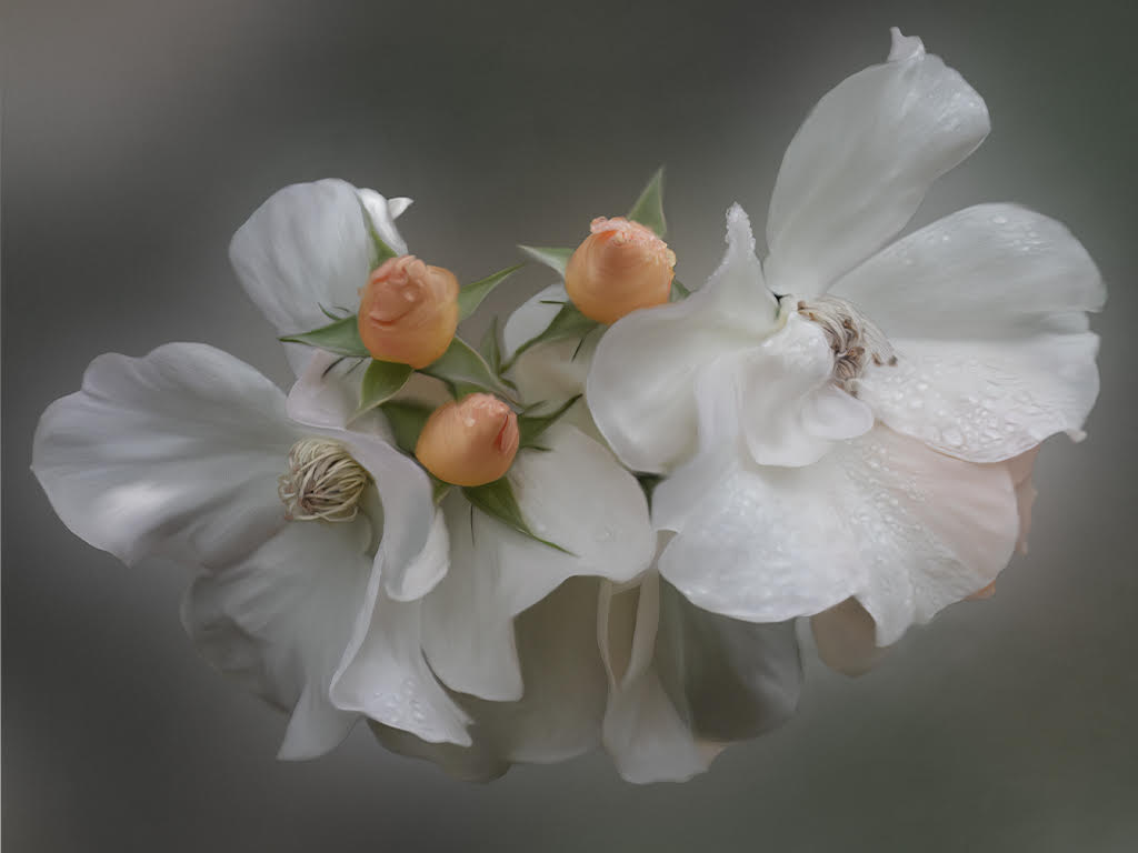
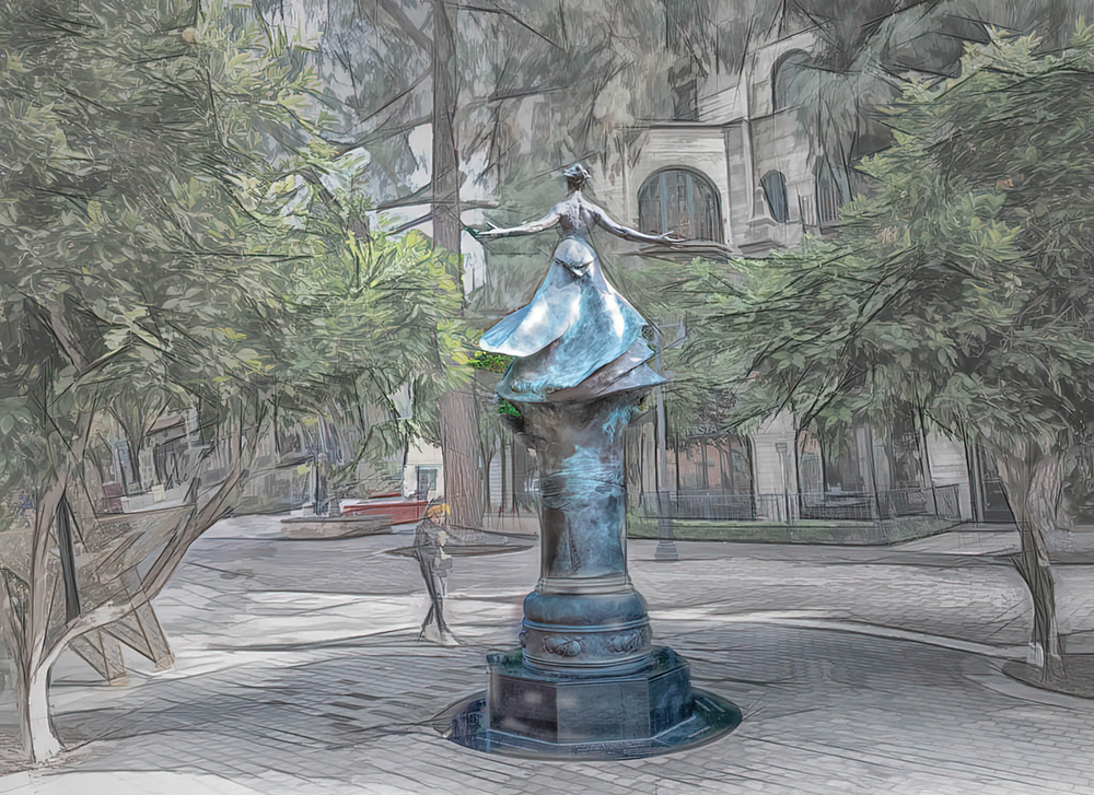
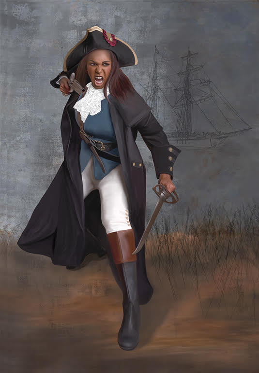
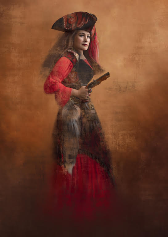
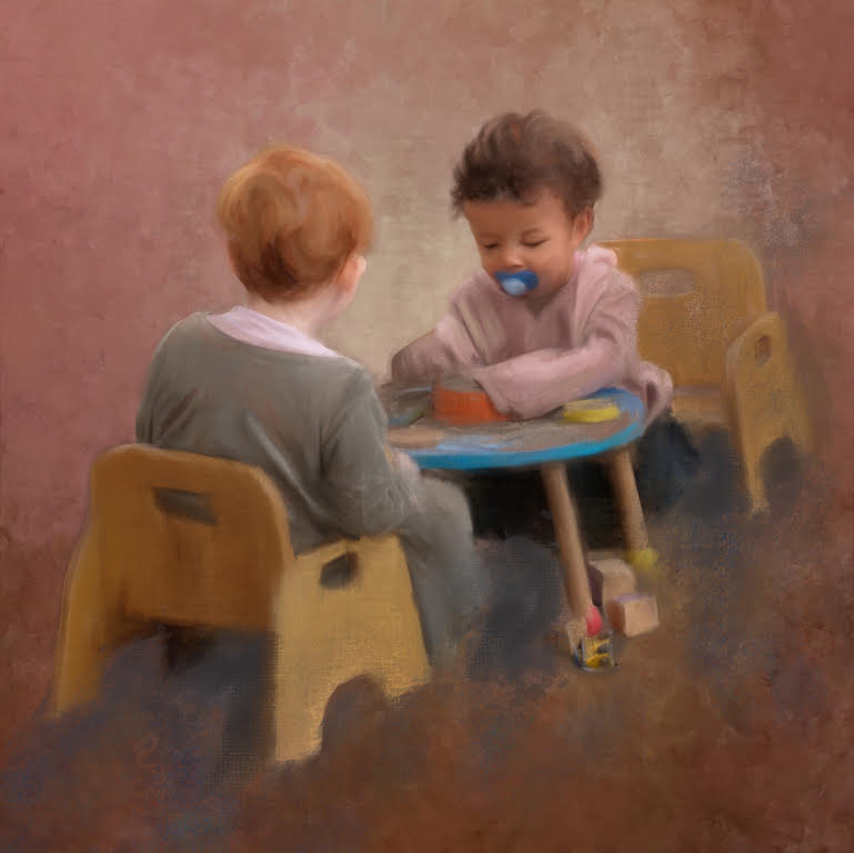
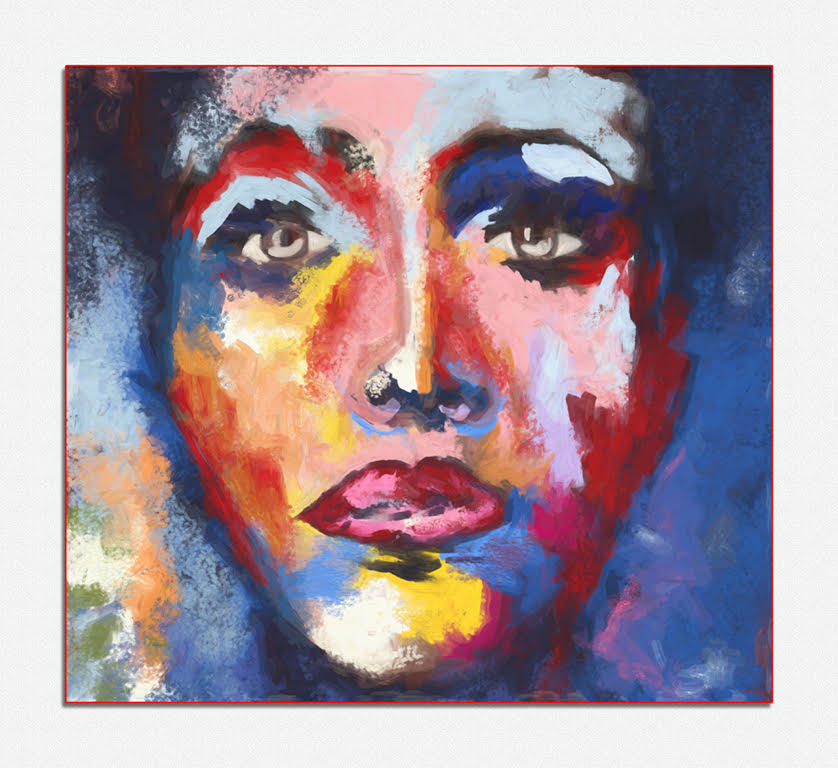
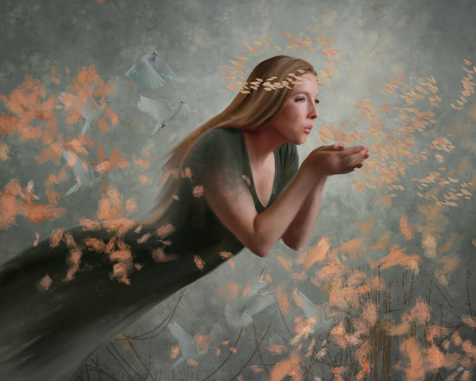
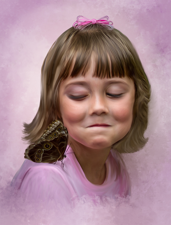
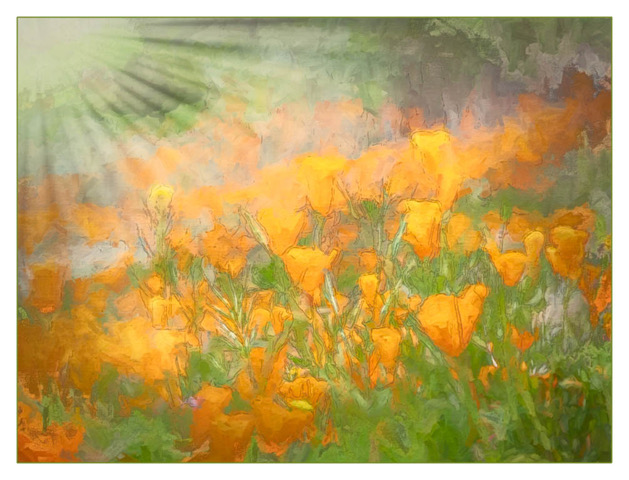
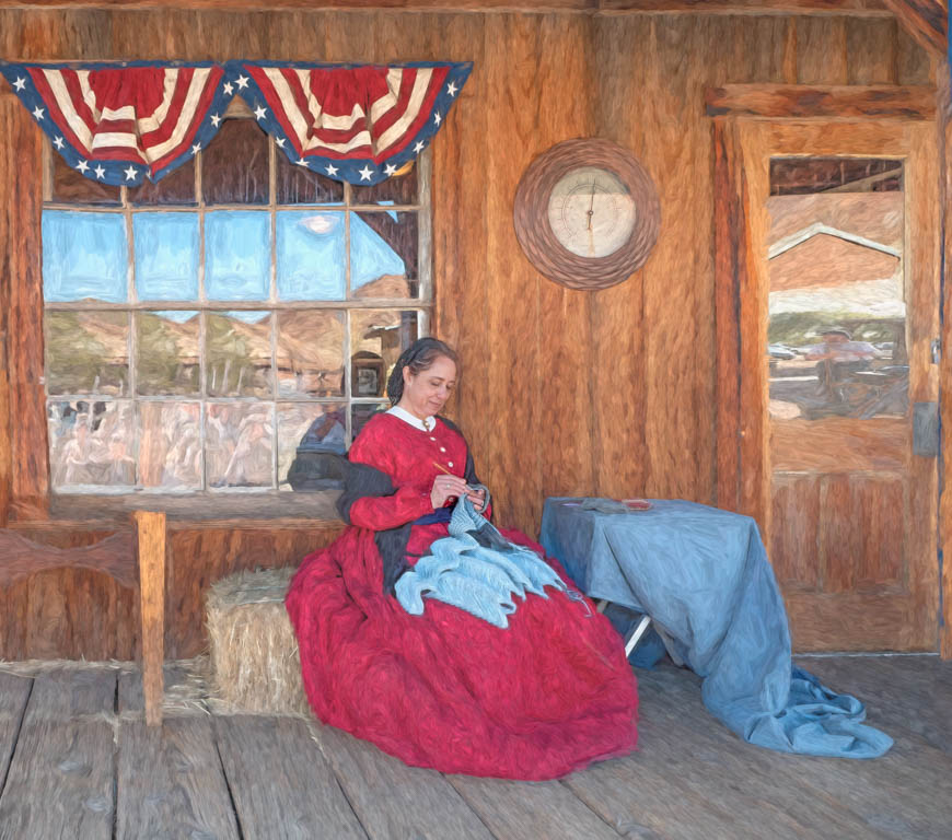
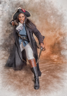
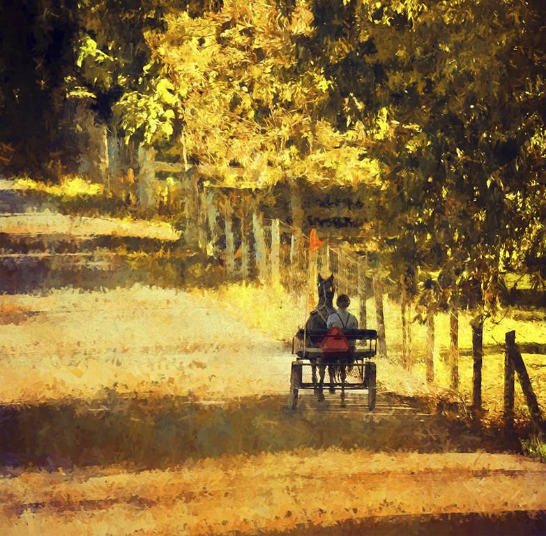
Just outstanding. I like the way you handled the background and your use of brushes and strokes in Painter. Simplifying the dress added an old historical look. Nice use of shadows and highlights in your paint strokes. The extra touch of the light shaft coming in adds to the quality and story telling of your work. |
Jun 27th |
| 56 |
Jun 18 |
Comment |
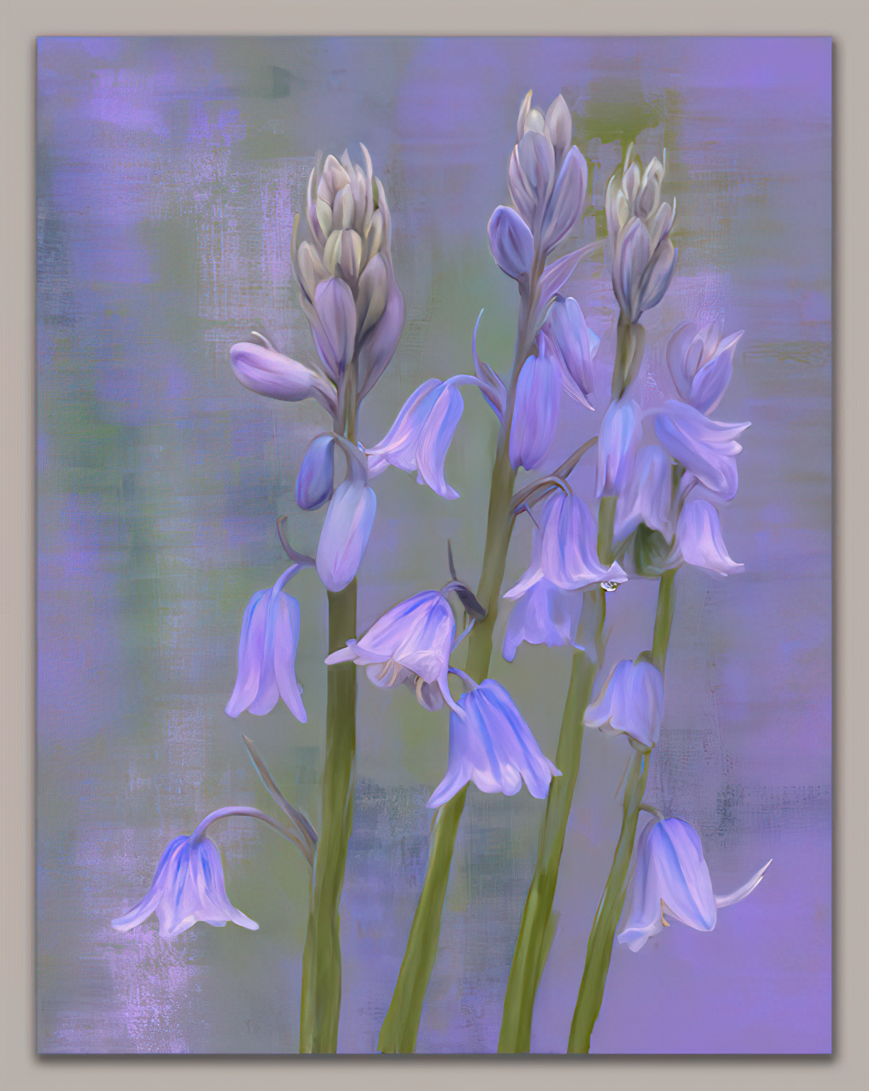
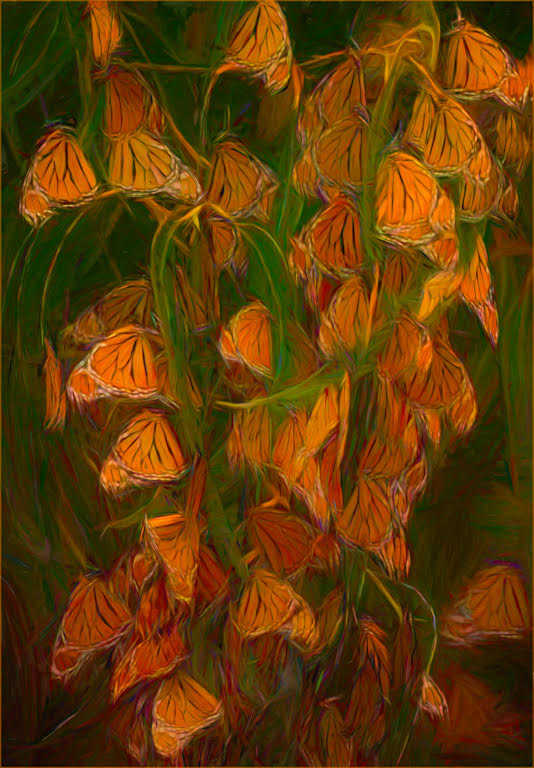
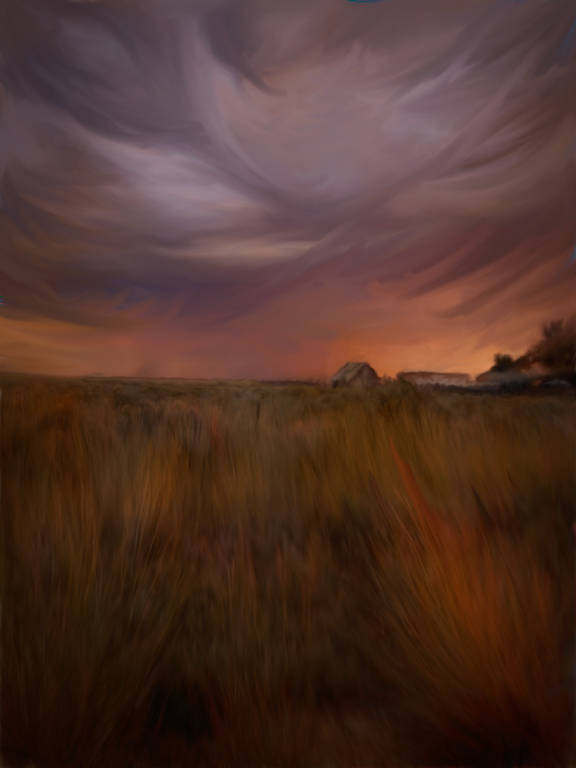
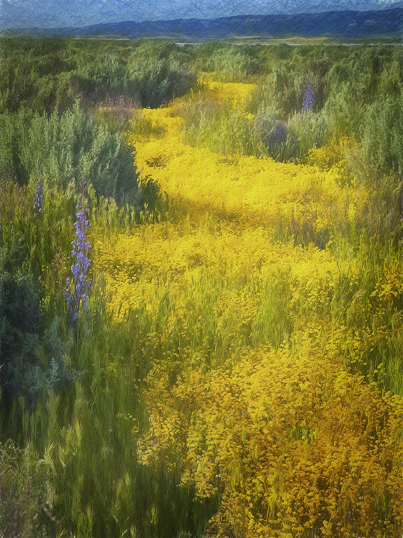
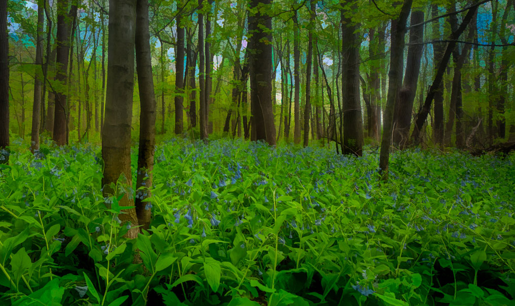
I like the bottom section and the subtle effect in the foreground. I too feel that the two techniques are not quite compatible. I cropped it a bit as I felt the subject was the bluebells and the light sky was drawing my eye away from it. While it does put it more half and half which is not the desired, I feel the attention is more on your subject with the crop. |
Jun 27th |
 |
| 56 |
Jun 18 |
Comment |
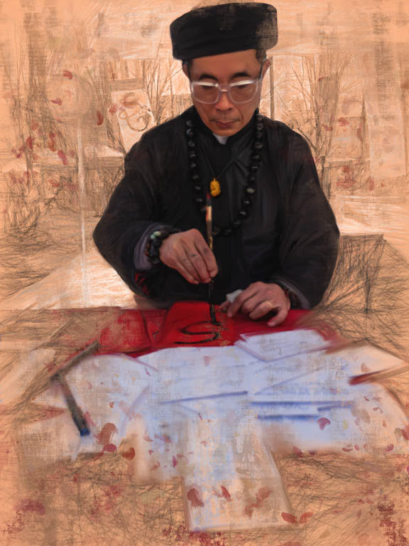
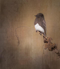
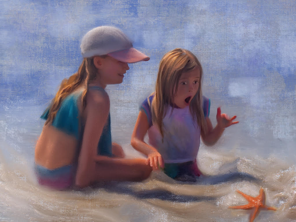
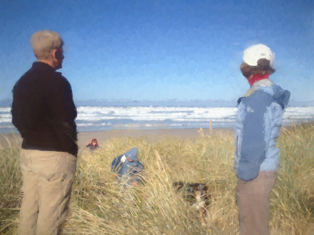
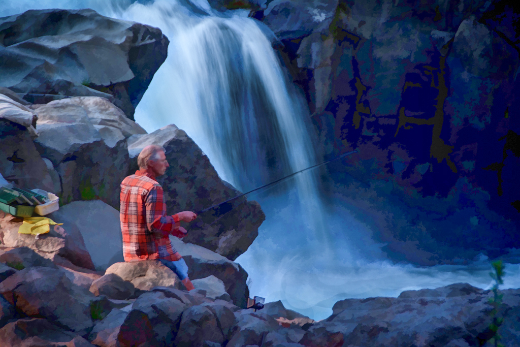
I enjoy the composition and yet the title said Afternoon Break. I agree taking it into o PS and upping the exposure and opening shadows really helped the image. Now we can see he is fishing. You can put a mask on the layer and bring back some of the darker tones around the edges and on the shirt. I did this too so here is my visual review. |
Jun 27th |
 |
| 56 |
Jun 18 |
Comment |
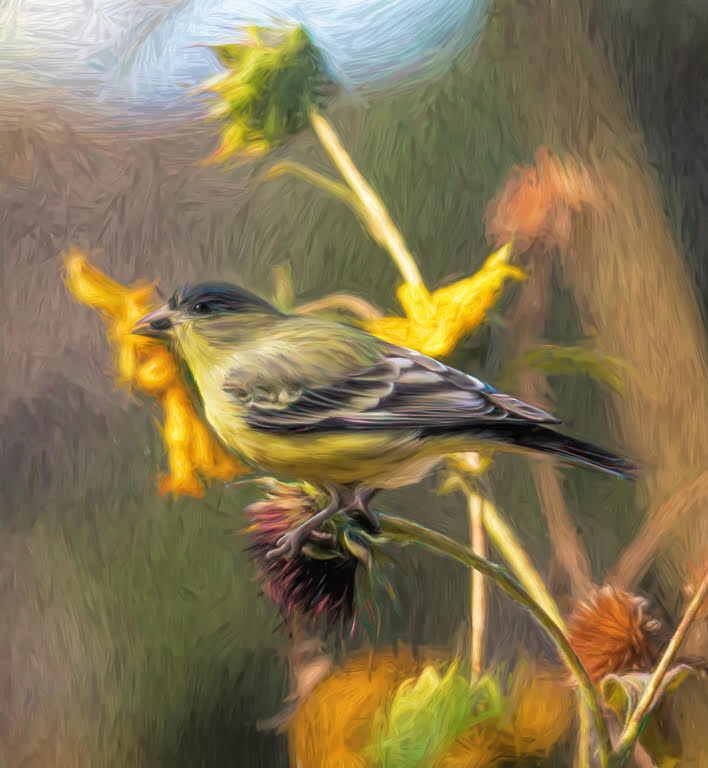
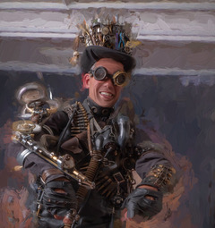
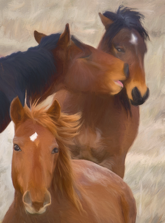
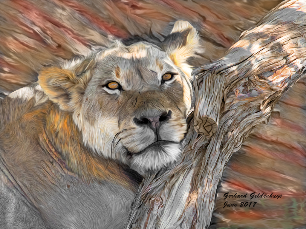
What a great capture and love the casual pose and eyes. I was glad to see others were bothered by the blue in the log. I took it into PS and used hue/saturation and reduced the cyan/blue. Then I used my brush and put the mode (at the top)to color and painted in the same tones as in the lion onto the log . Then to add to your image I went into filter> Stylize > oil filter and put a sight touch of this filter to enhance the fur and log. |
Jun 27th |
 |
| 56 |
Jun 18 |
Comment |
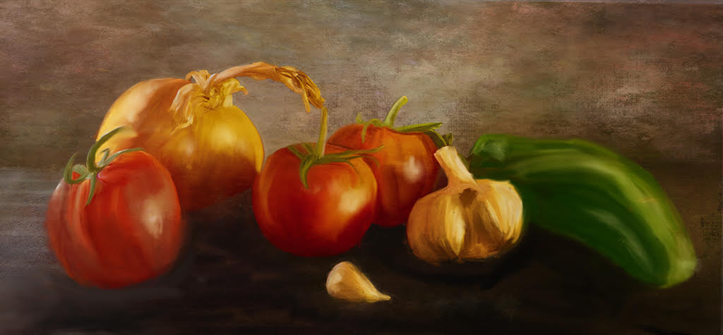
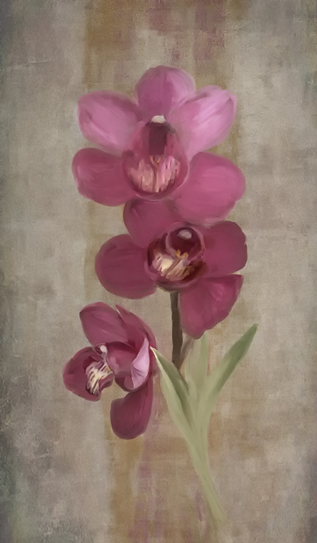
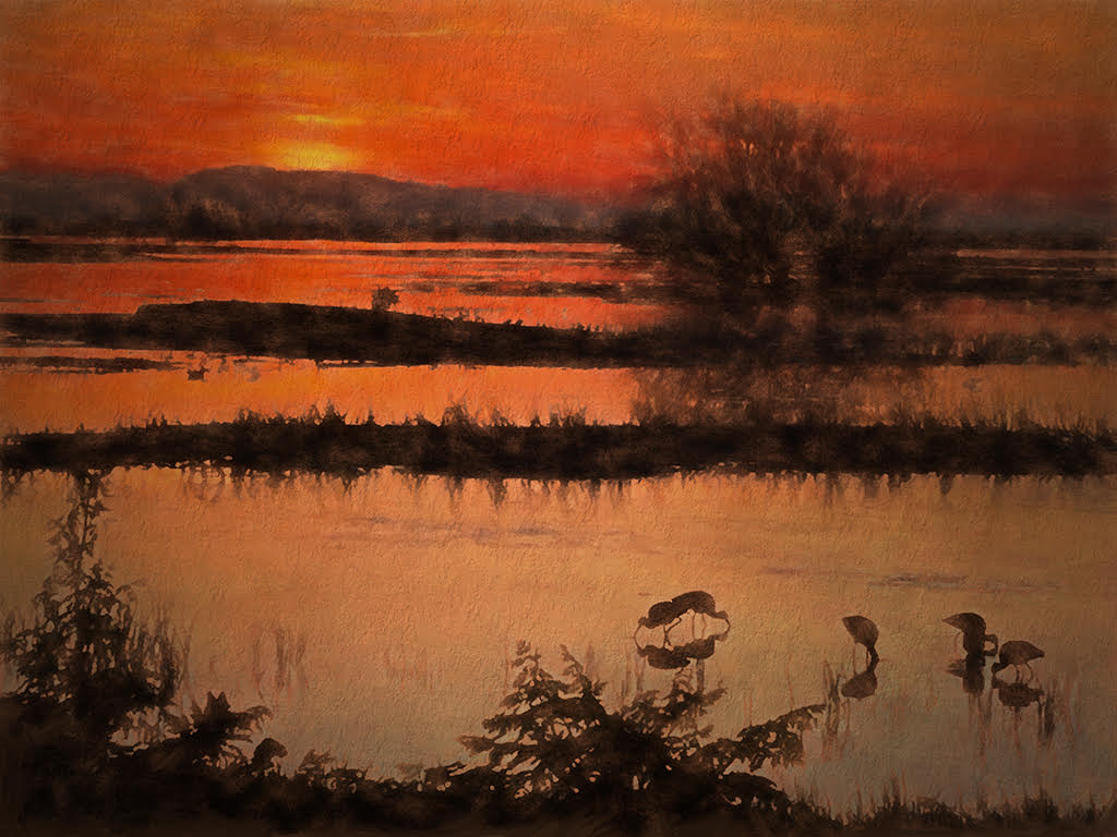
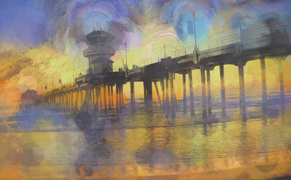
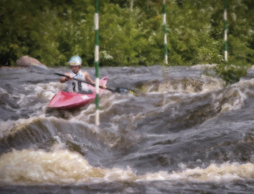
I enjoy this image and you definitely had the right spot. Your use of watercolor is nicely done. You may want to consider taking it into photoshop and reducing the purple hue. While I tend to like warmer tones, taking the blue out did bring back more of the rapid water look. I think you may want to play with a crop too. see my visual feedback |
Jun 27th |
 |
| 56 |
Jun 18 |
Comment |
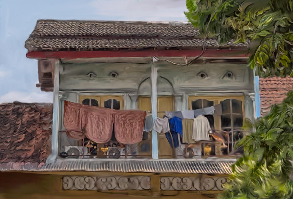
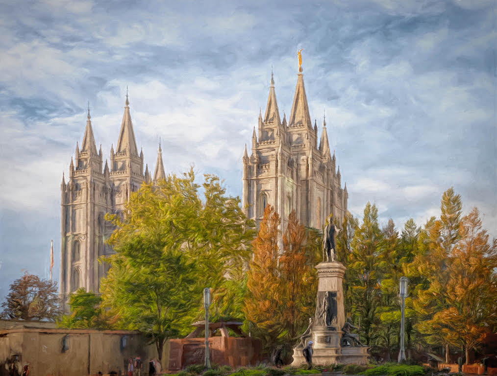
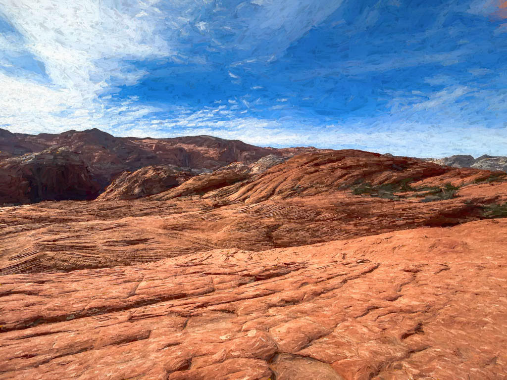
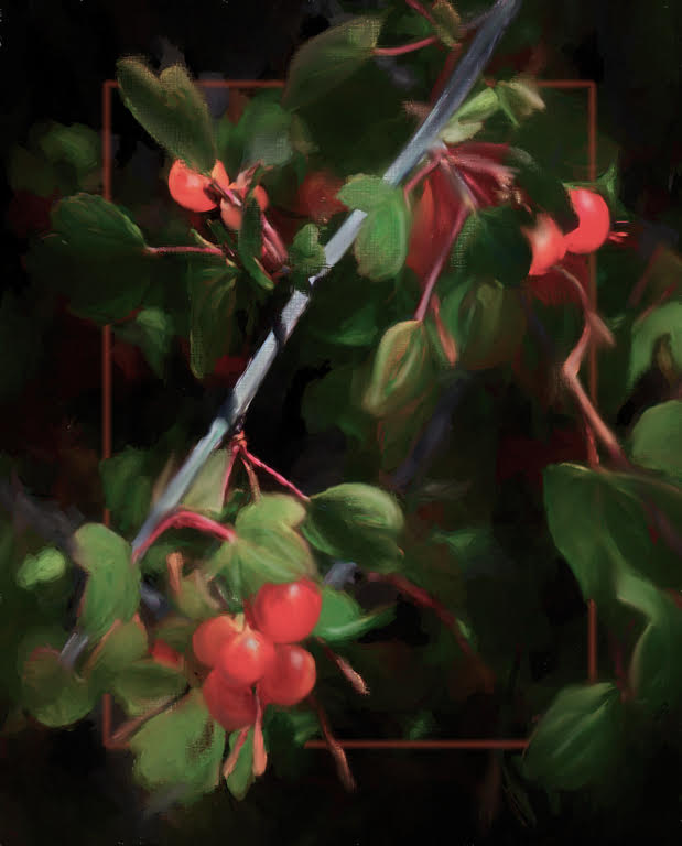
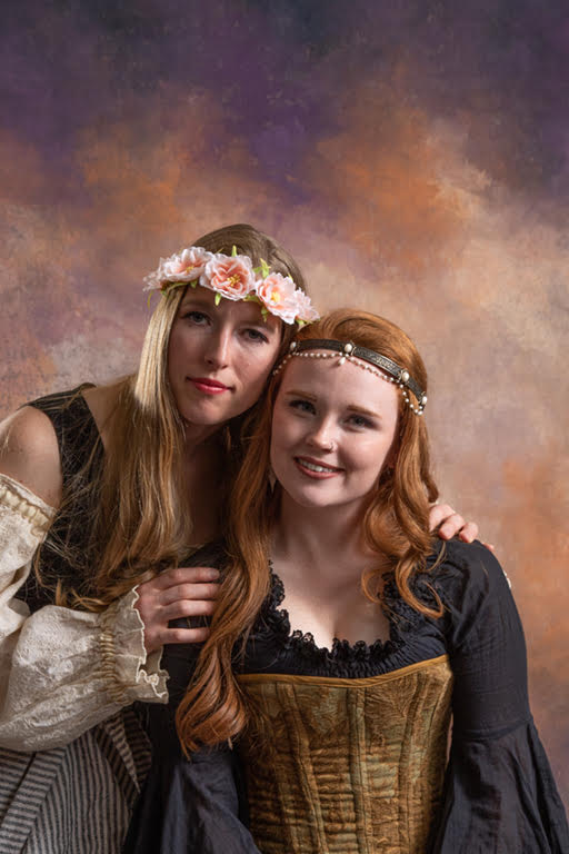
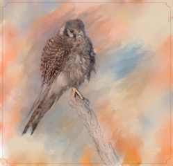
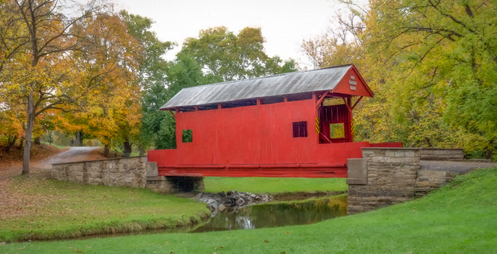
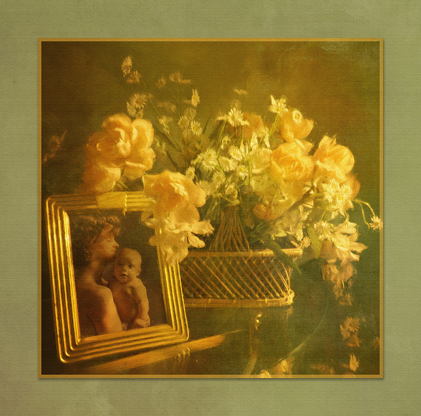
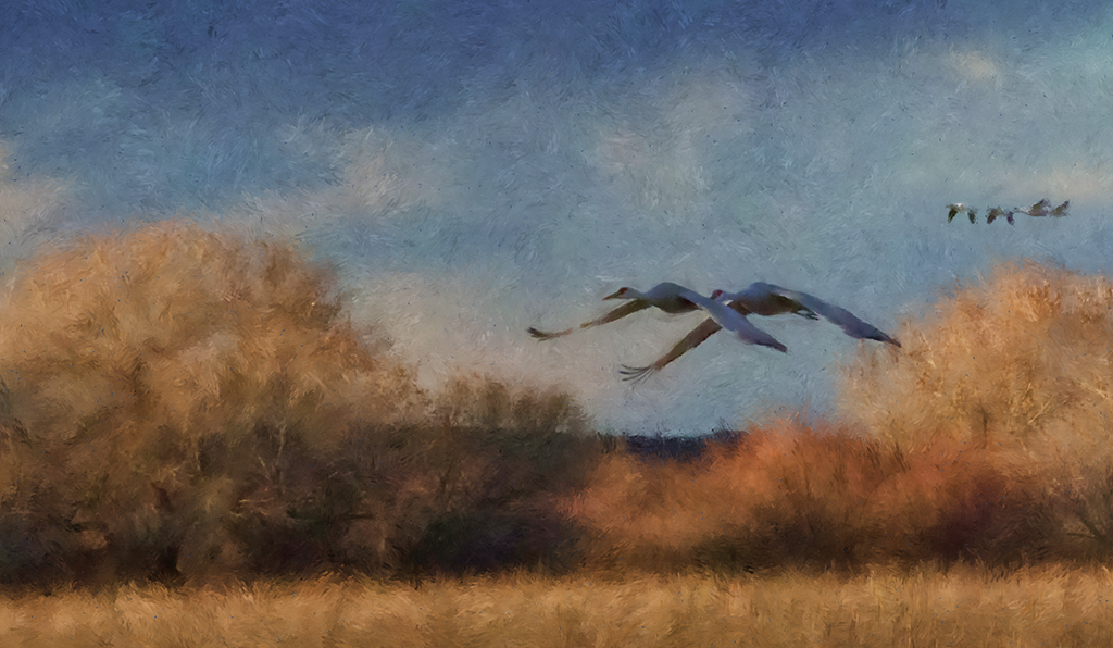
This is a lovely area that we visited it a few years ago and this is a lovely find. Red is such a difficult color and here it looks in the painting as artificial with the trees a light green. You may want to return to this and lower the exposure as you have lost some of the interesting striated detail in the cliff and the leaf texture in the tree. The grandeur can be the tall cliffs and yet I feel the tree is your subject. You might want to consider a crop. |
Jun 27th |
| 56 |
Jun 18 |
Reply |
Thank you. I was a bit upset at the background but it worked out okay. |
Jun 27th |
| 56 |
Jun 18 |
Reply |
Thank you Elinor |
Jun 27th |
| 56 |
Jun 18 |
Reply |
Thank you Kathy. |
Jun 27th |
| 56 |
Jun 18 |
Reply |
Thank you Jeanine |
Jun 27th |
6 comments - 4 replies for Group 56
|
6 comments - 4 replies Total
|