|
| Group |
Round |
C/R |
Comment |
Date |
Image |
| 71 |
Feb 19 |
Comment |
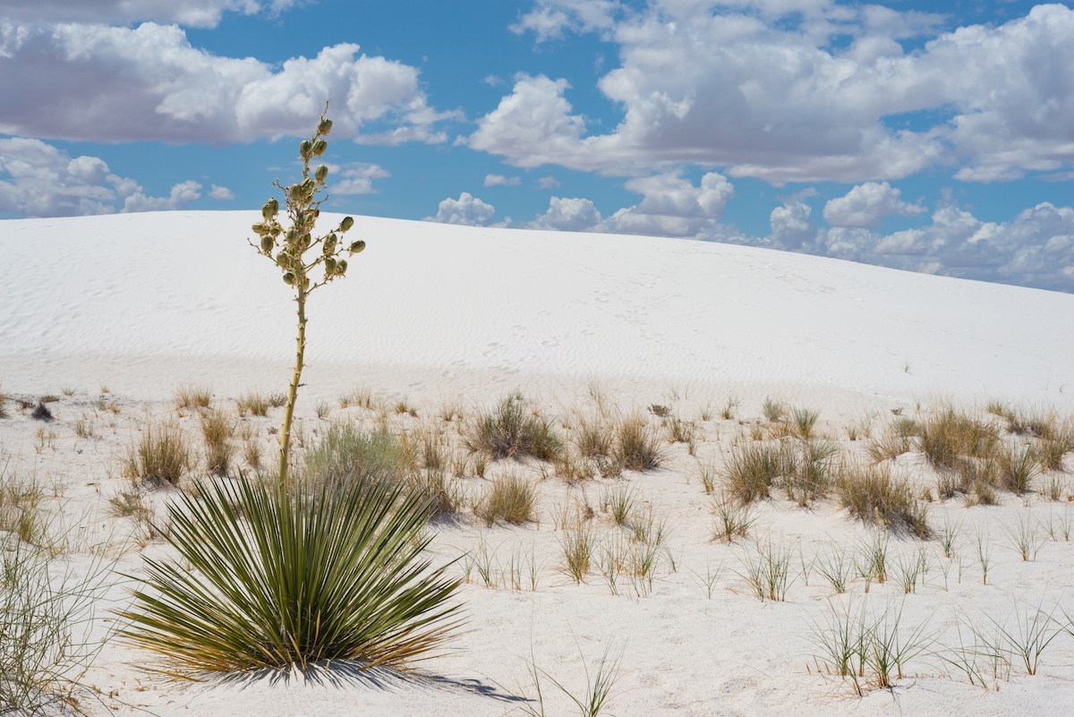
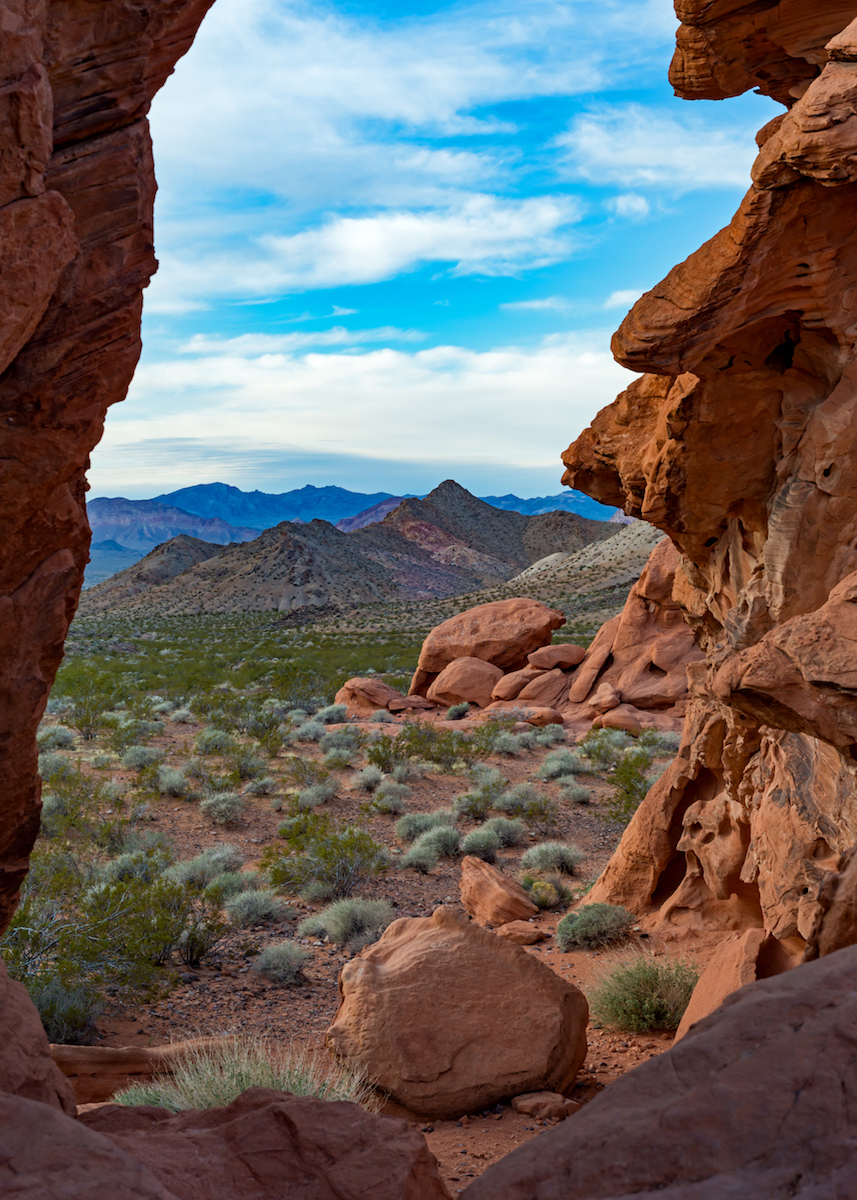
Wow! I missed this when I went to the Valley of Fire years ago. I think Marla's version makes it seem there is a bit more light across the wave. Rolling it up (on my monitor) and cropping out the sky, seems to make the wave pop more to me. The blue is a nice contrast, but I almost feel like it's a distraction. It does show the depth to the scene, so I understand keeping it. I think you framed it well and although disappointed by the light, it's a great photo of that area. I really like it and want to go back there now! |
Feb 26th |
| 71 |
Feb 19 |
Comment |
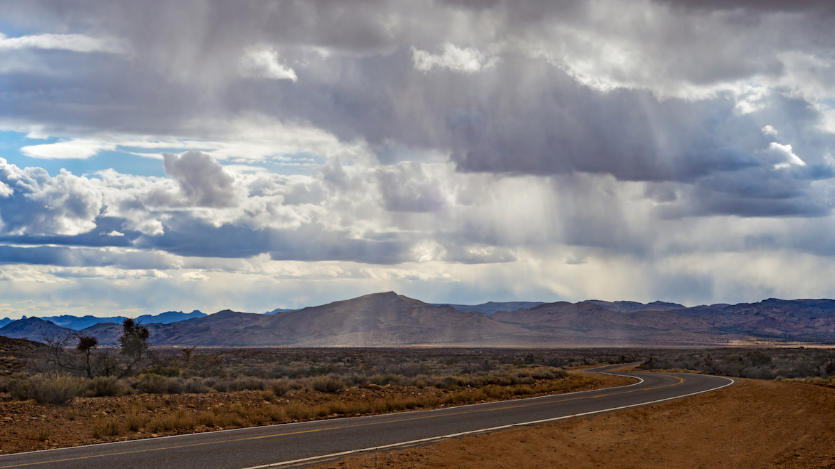
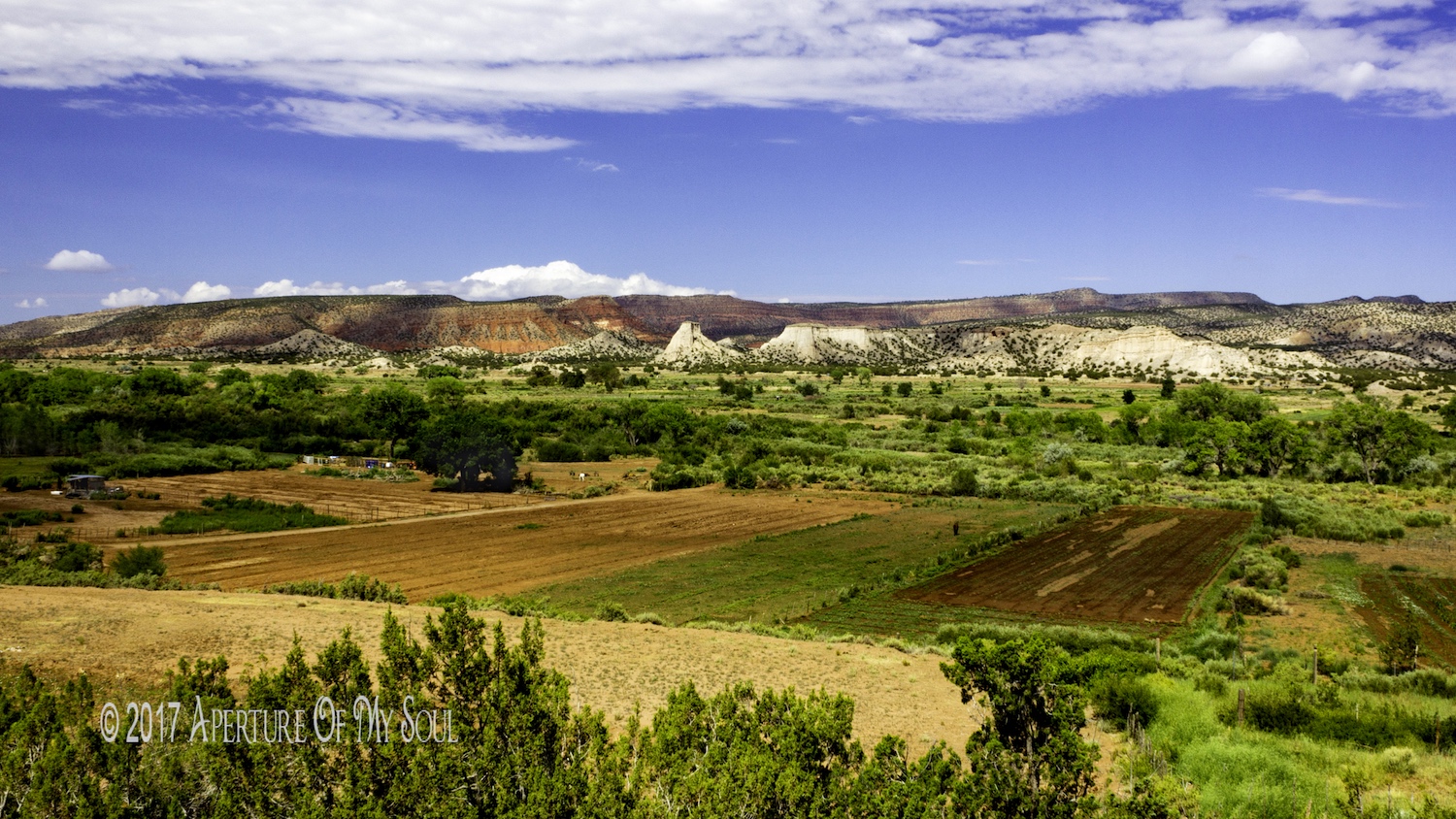
Beautiful shot! You are amazing with the moving car shots! The soft greens are so flowing. I like the oil painting feel of the clouds. I hate lines and poles, so I'm happy you removed them. haha I think the light playing across the scene is lovely. I don't have any suggestions. Wonderful! |
Feb 26th |
| 71 |
Feb 19 |
Comment |
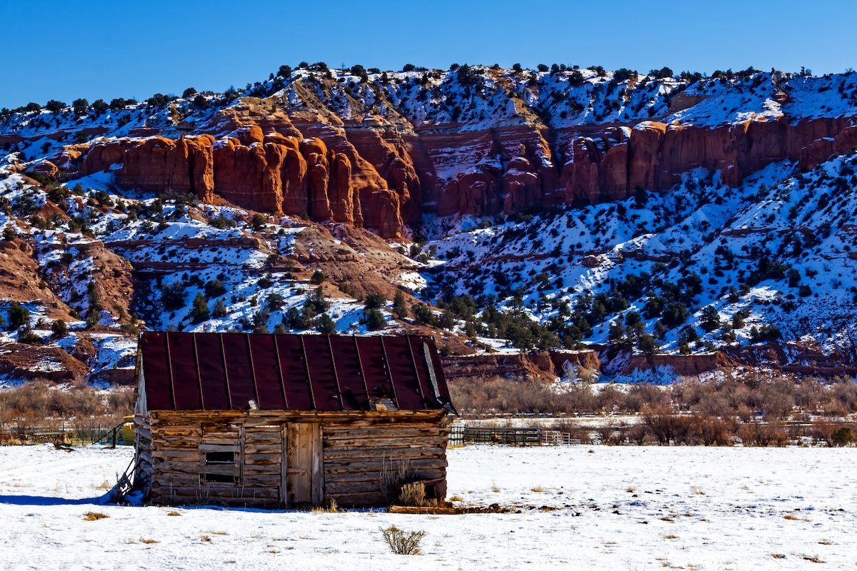
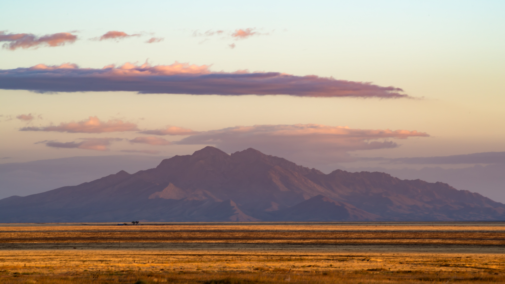
Wow, that is really amazing. I love the luminance of the rocks from the sun. The clarity is awesome too. The purple hue is really nice. I might try and lighten the back hoodoos a little. The light seems to be coming from inside the hoodoos. Very cool! Well worth getting up early!! |
Feb 26th |
| 71 |
Feb 19 |
Comment |
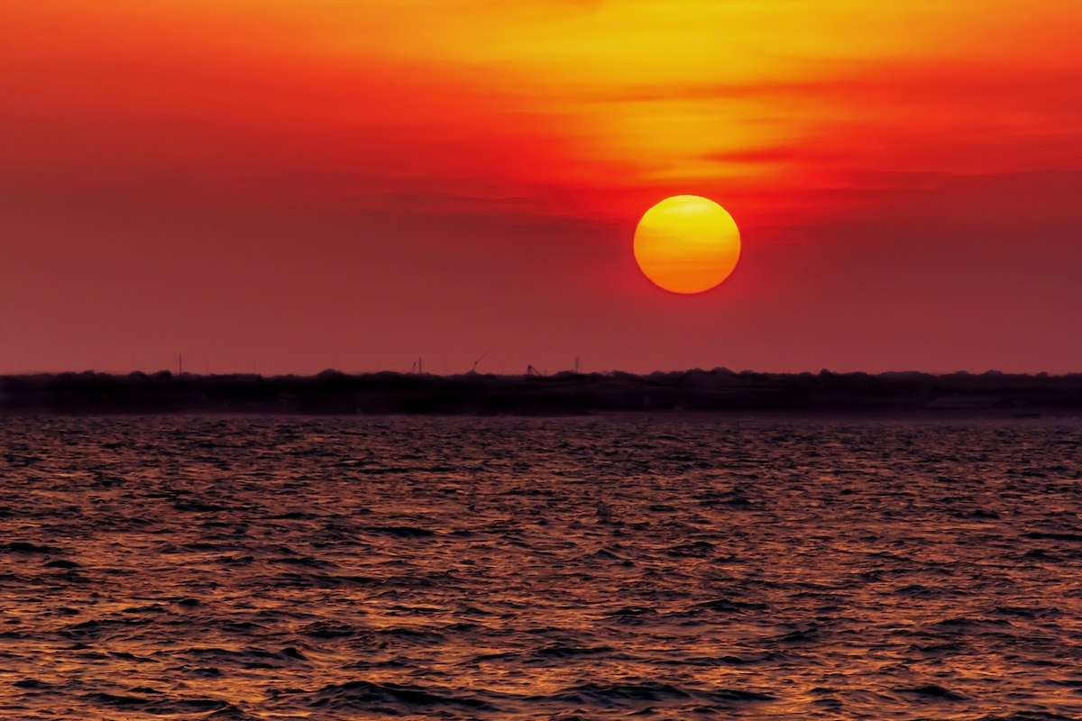
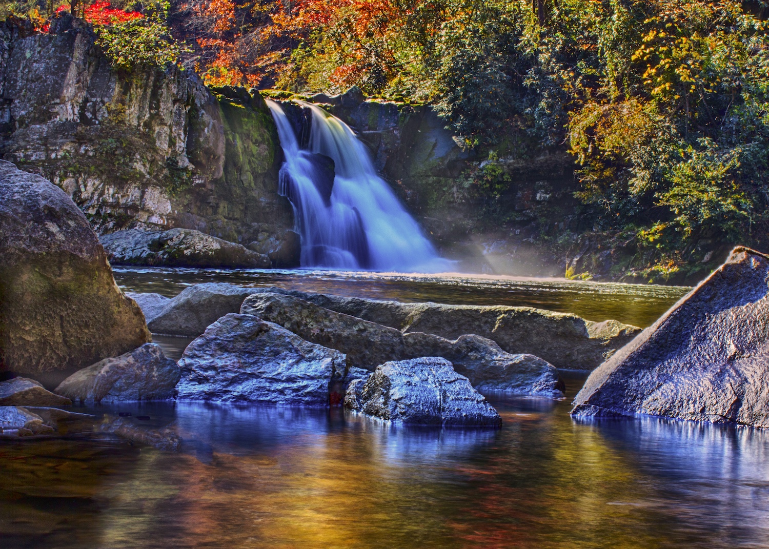
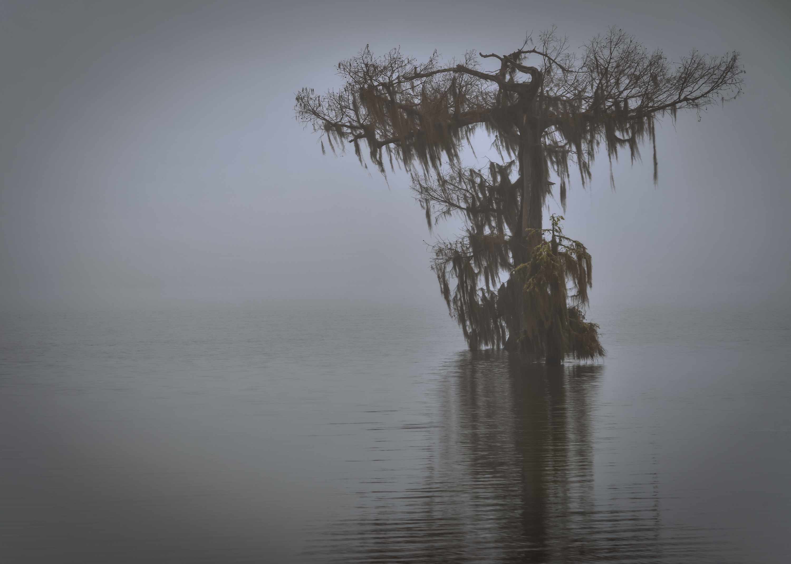
I love the black and white. I agree with removing the white spot. I like what Gordon did too. I like a little bit more light on the water. The circular of the tree to limbs to reflection to tree is nice. It's a lovely shot. You have me inspired to get out and use some ND filters I have! |
Feb 26th |
| 71 |
Feb 19 |
Comment |
You did fantastic work with this composite! I like the change of the color temp in the clouds and their smoothness. The water looks beautiful. I agree with the comments of the light spot in the grass seems too bright. I can understand wanting some light in the foreground. Could you bring the ground down and the trees up a bit to even it out? Looking at Original 2, the light across the ground is a bit more even.
It's an excellent image!! |
Feb 17th |
| 71 |
Feb 19 |
Comment |
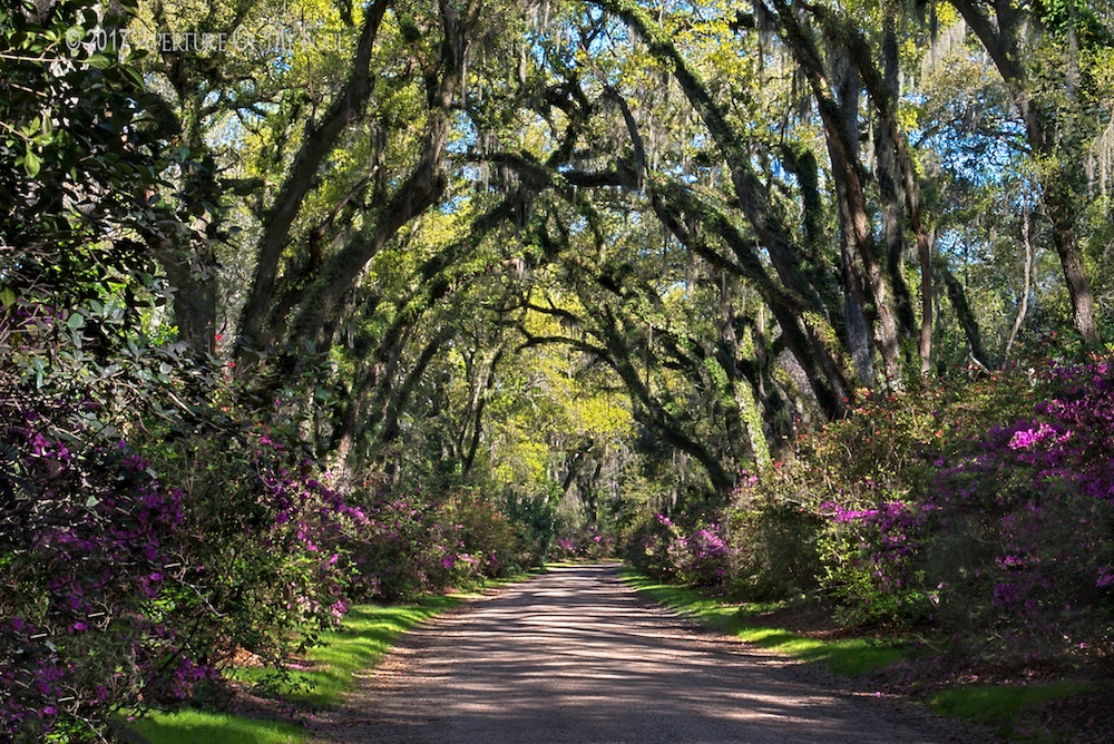
Everyone had great comments. I like removing the tree in the foreground. It made me feel less in the scene. Your crop pulls me into the bay area more. Increasing the color in the clouds looks good. I really love all the trees on the cliffs. it looks like an amazing area to hike! Beautiful work! |
Feb 17th |
6 comments - 0 replies for Group 71
|
6 comments - 0 replies Total
|