|
| Group |
Round |
C/R |
Comment |
Date |
Image |
| 71 |
Jan 19 |
Reply |
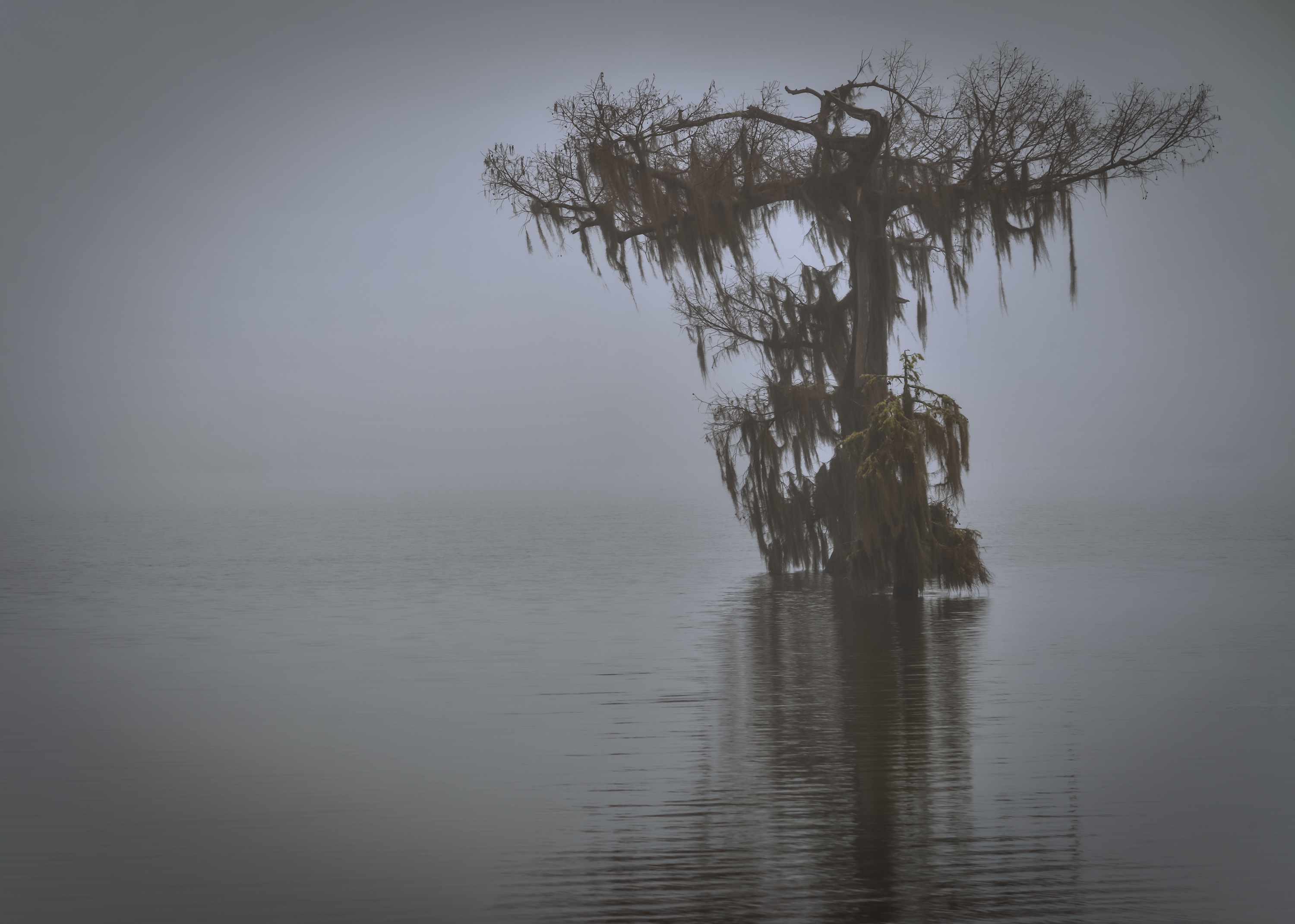
Thank you for the explanation. I haven't used a ND filter near enough. I should make that my New Resolution to get more familiar with it. |
Jan 31st |
| 71 |
Jan 19 |
Reply |
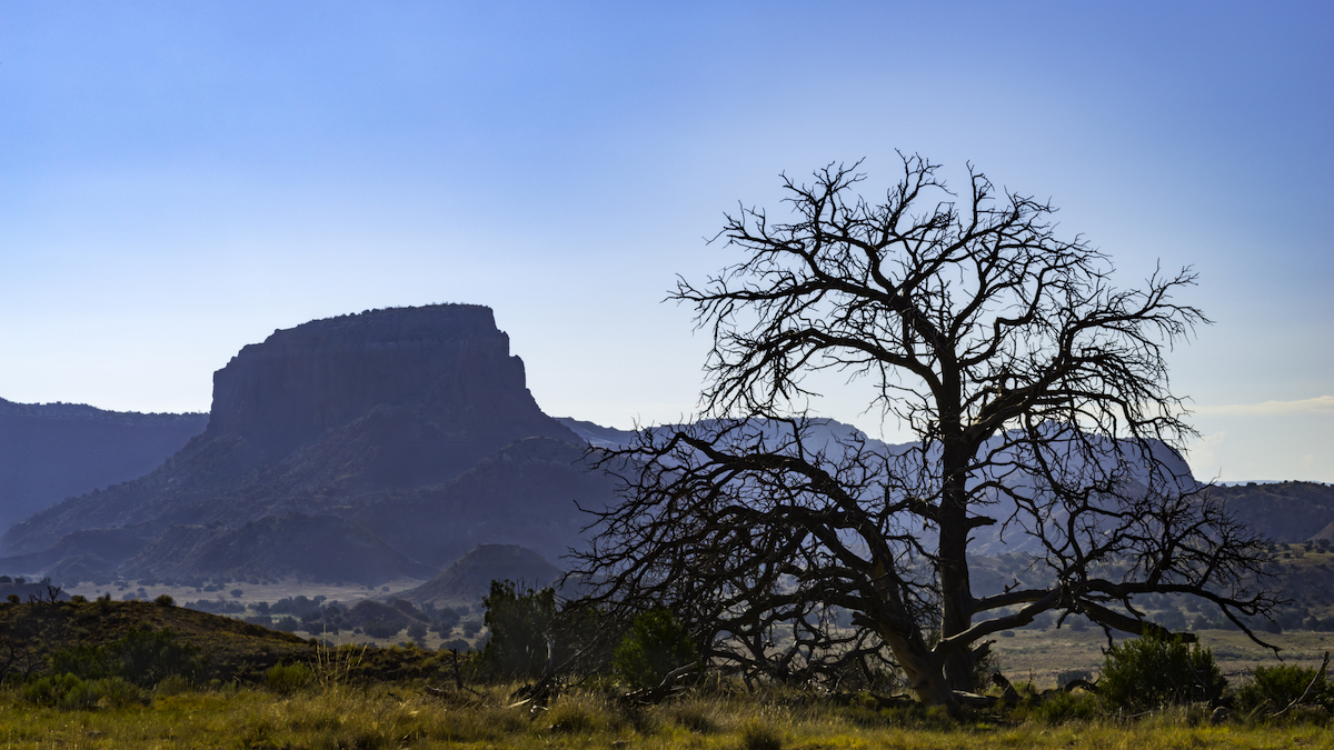
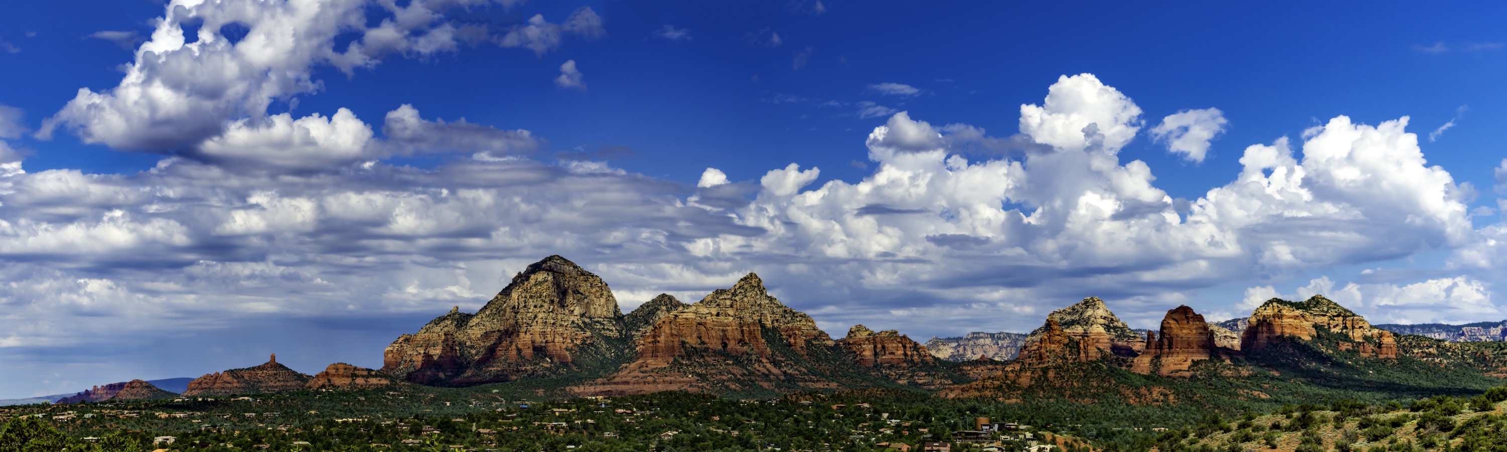
Thank you Trinda! I agree the middle to the right are the most interesting. I think I will have to crop all around to make it better. I at least have this wide one for my reference. haha Thanks! |
Jan 31st |
| 71 |
Jan 19 |
Reply |
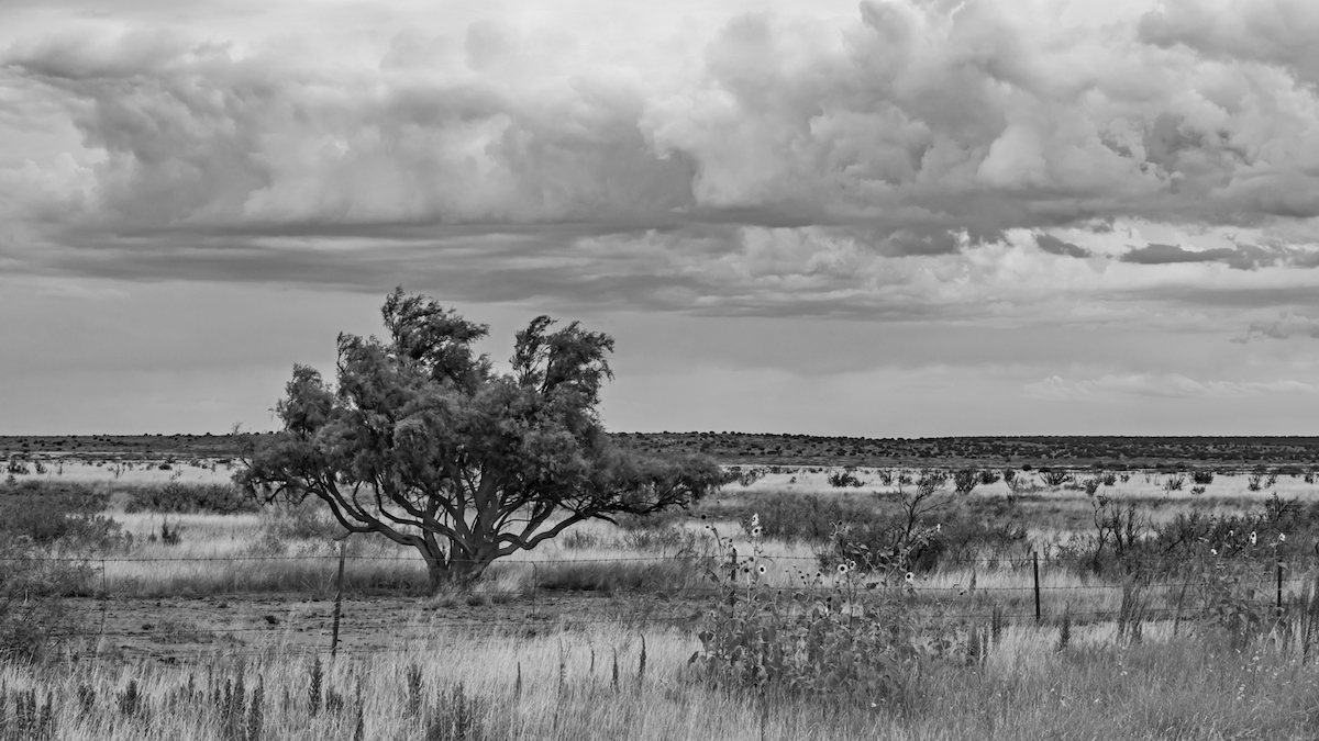
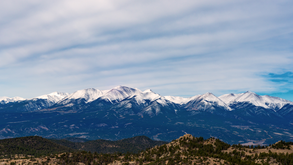
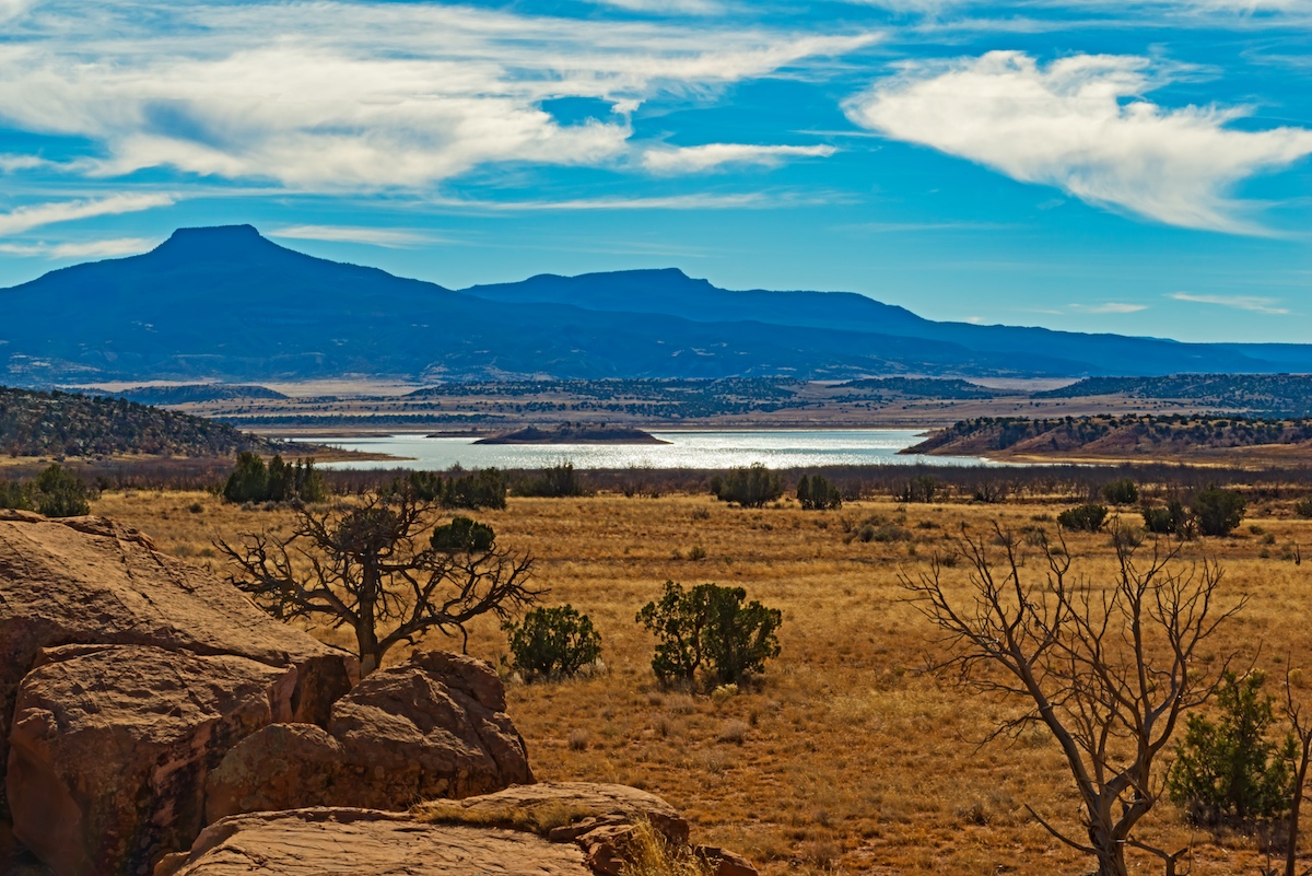
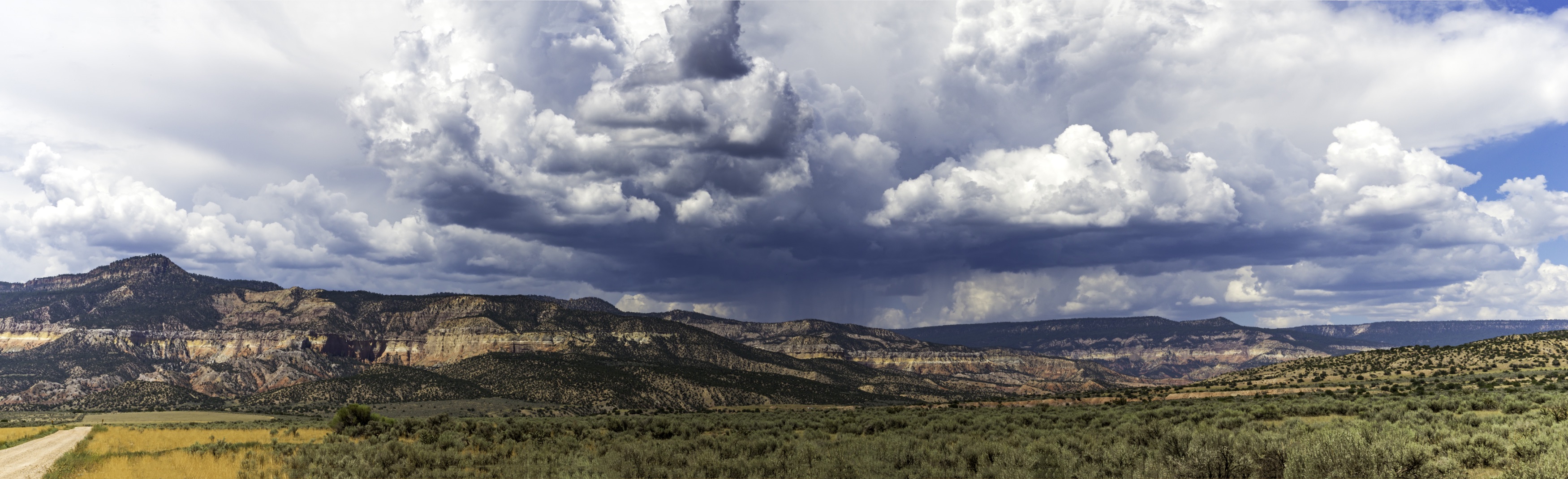
Thank you Theresa! I see what your saying about cropping from the left. I was trying to get any many peaks as possible, but the left is less dramatic. The layers are nice, but I think I don't like the brown foreground and blue haze mountains. I'm going to try monochrome to and see if I like it more. Thanks! |
Jan 26th |
| 71 |
Jan 19 |
Reply |
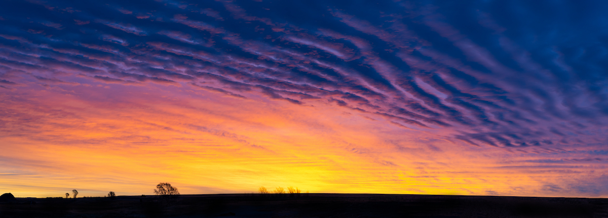
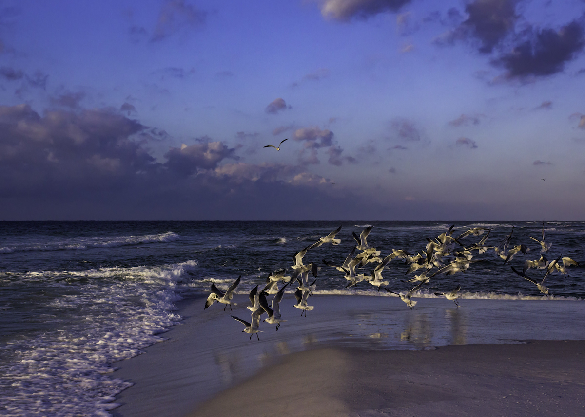
Thank you Marla! I agree the sky doesn't add anything. I like your crop. I think it is just one of those memory photos. |
Jan 26th |
| 71 |
Jan 19 |
Reply |
Thank you John! I appreciate your trying to do the crop. I will try adding the bottom and see if I can cut down the sky. I understand what you are saying about 1/3 rule. I think that is part of the problem. It looks off balance. Thanks for the suggestion! |
Jan 21st |
| 71 |
Jan 19 |
Reply |
Thank you Gordon! I haven't thought of monochrome with this one, but I will definitely give it s shot. I'm going to work on the crop. John says he tried and he didn't like the result. I'm going to see what I can do. |
Jan 21st |
| 71 |
Jan 19 |
Reply |
Thank you Mike! I will work on cropping the sky and see if I can create a more balanced feel. |
Jan 21st |
| 71 |
Jan 19 |
Comment |
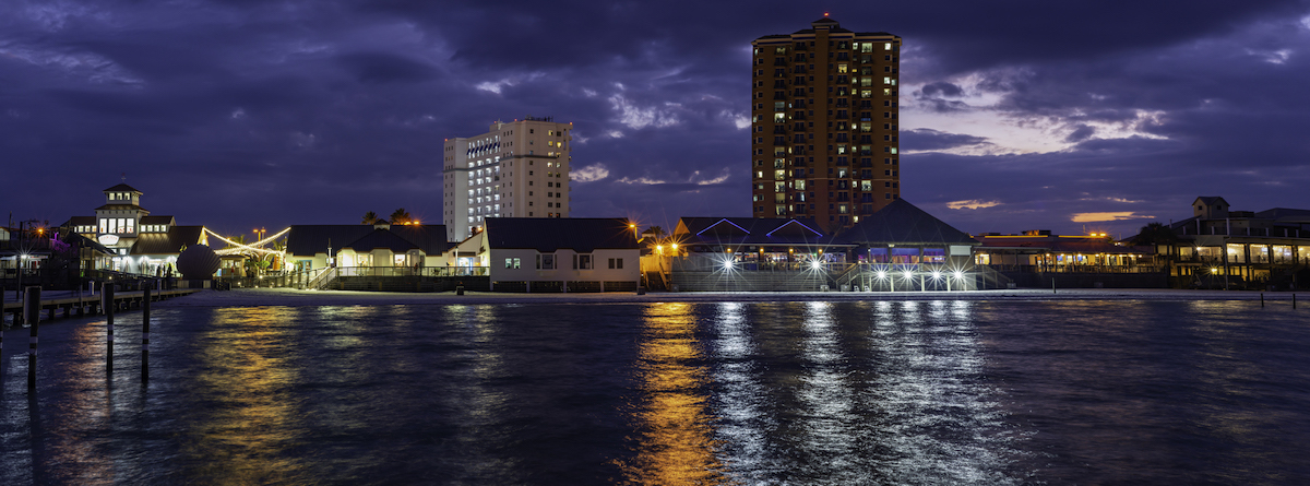
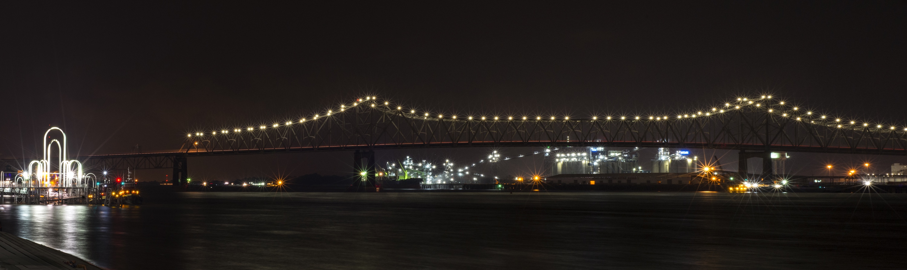
Beautiful night capture!! It looks very sharp and clean. I'm glad removing the left building works. It feels less crowded when I cover it with my hand. There is nothing else I would suggest. I've never used a tilt shift lens, but hope to one day. It's a great shot! |
Jan 20th |
| 71 |
Jan 19 |
Comment |
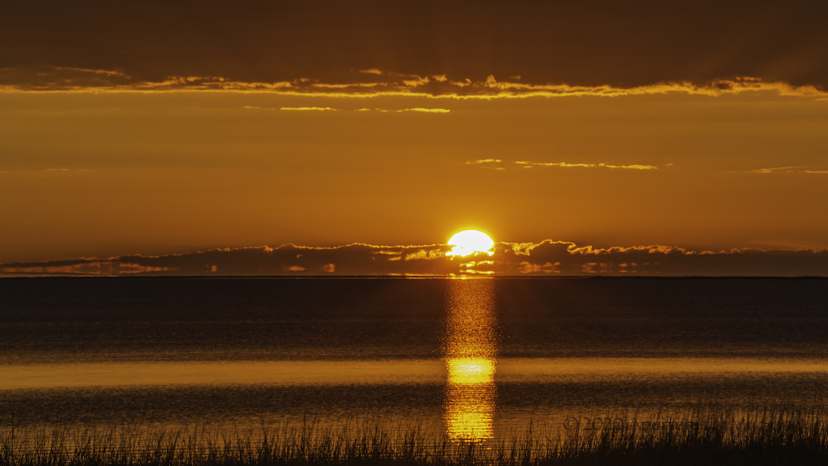
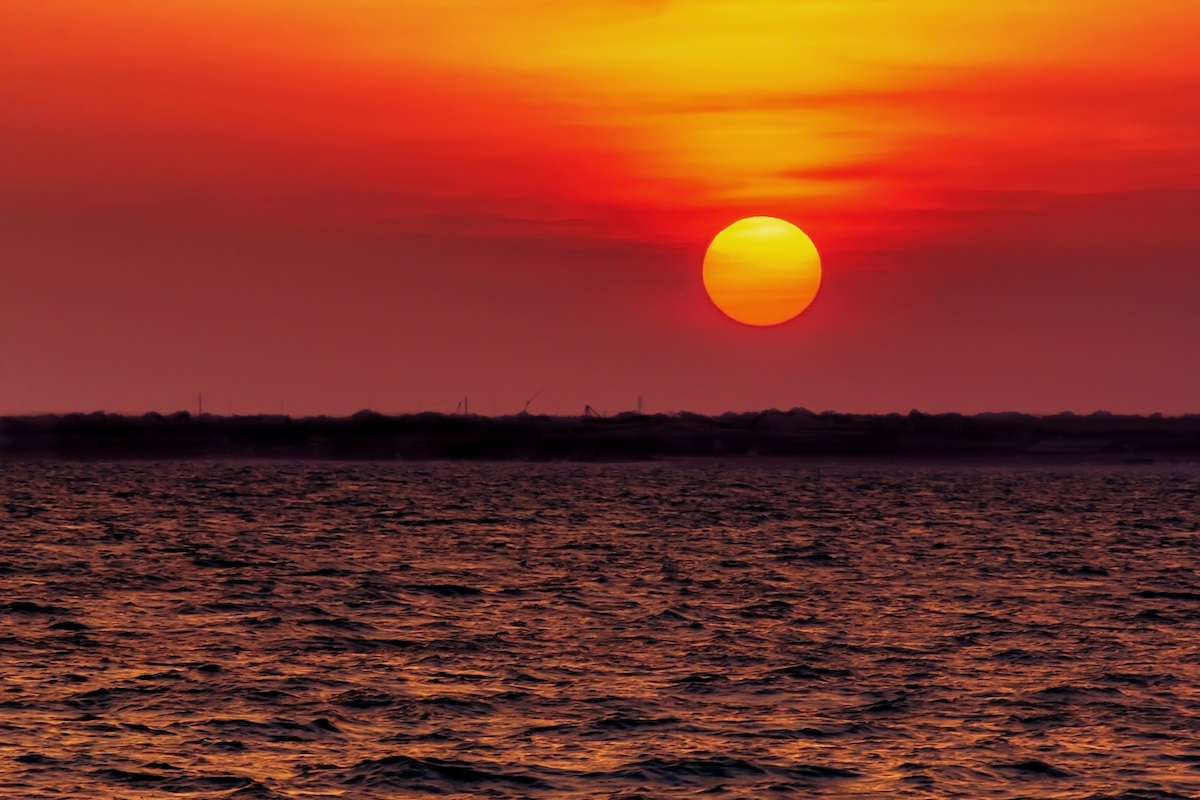
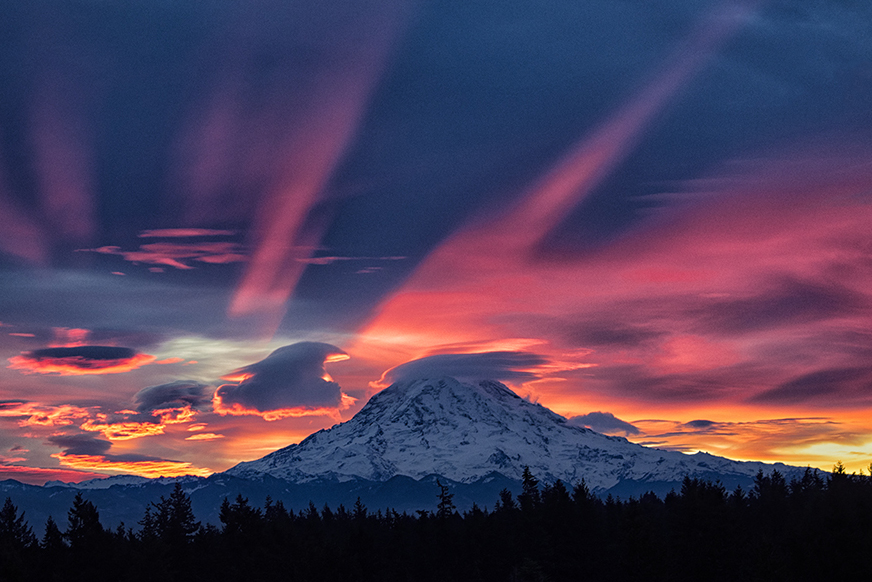
Oh my goodness! What a gorgeous sunrise! You did a beautiful job capturing such intense color.I live the silhouetted tree line.
For me, the white-ish clouds in the top right corner seem out of place. I wouldn't miss cropping out that top 4th right below the cloud whiteness. That leaves the pink rays running to the edge of the photo.
I played with it a bit to see what your think. I did bring the yellow down very slightly per Mike's suggestion. I dream of getting such a beautiful shot one day!! |
Jan 20th |
 |
| 71 |
Jan 19 |
Comment |
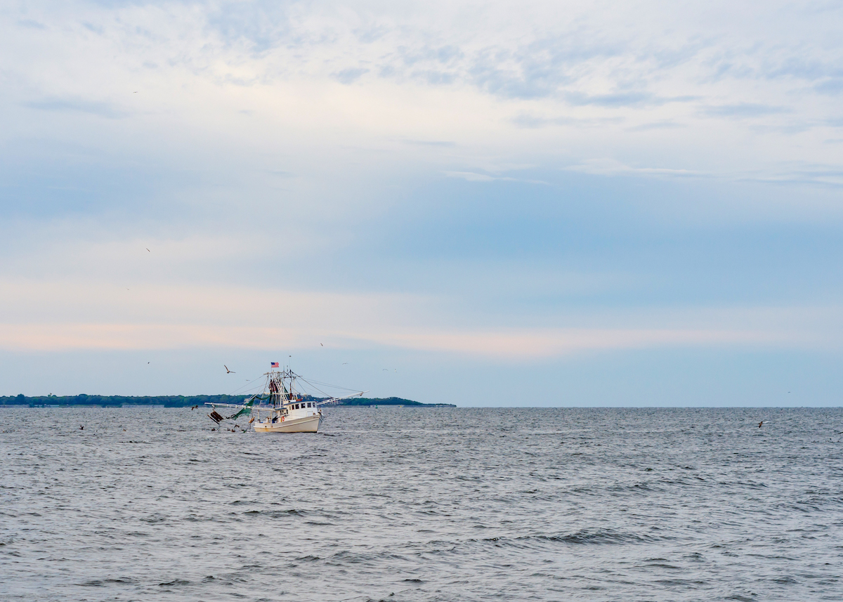
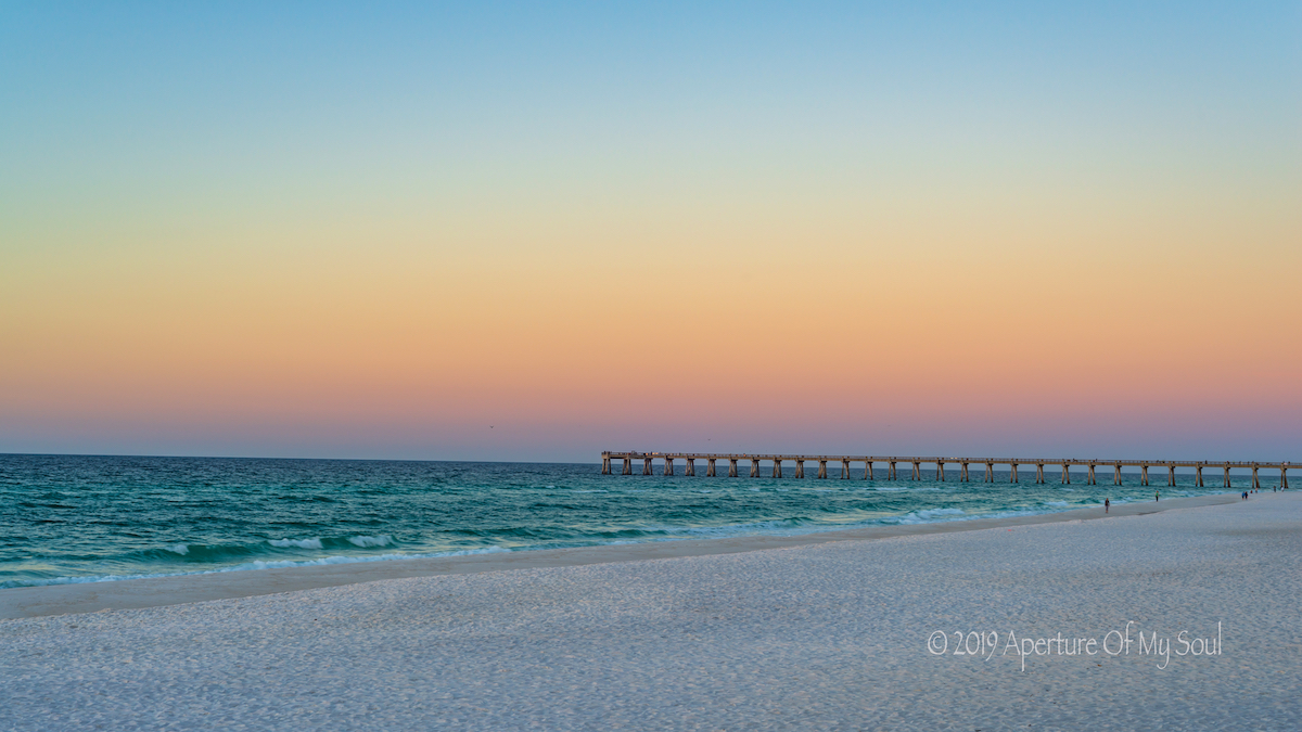
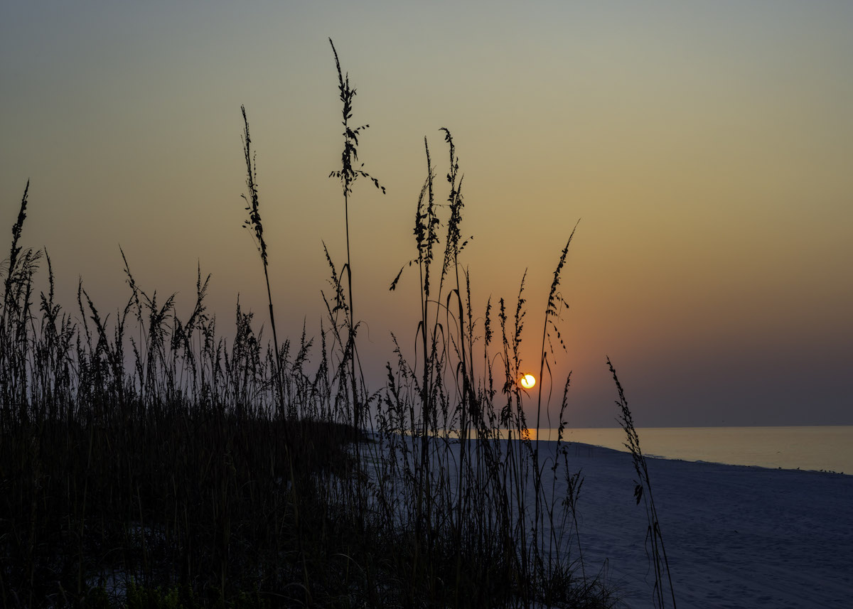
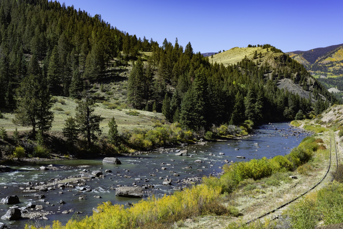
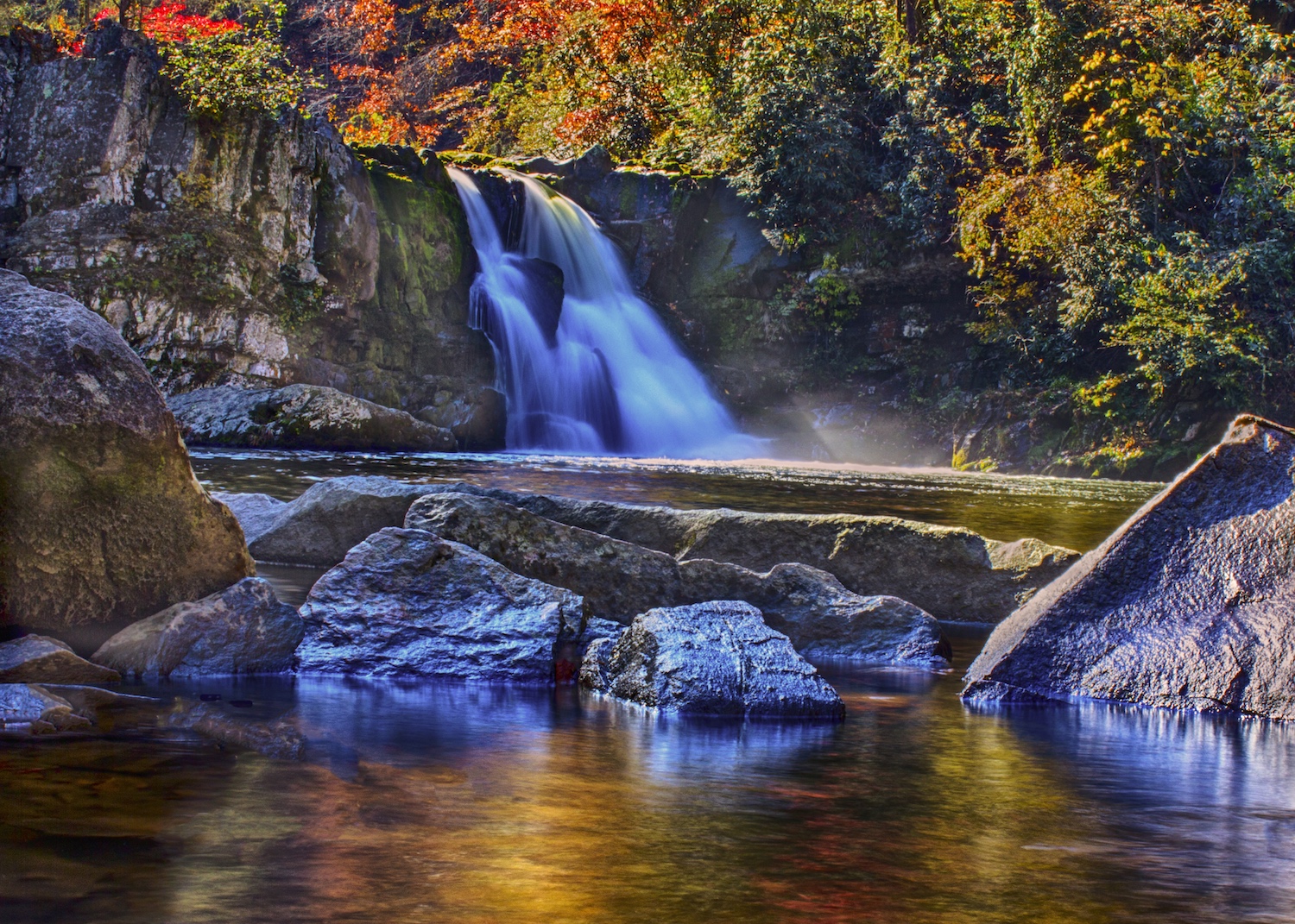
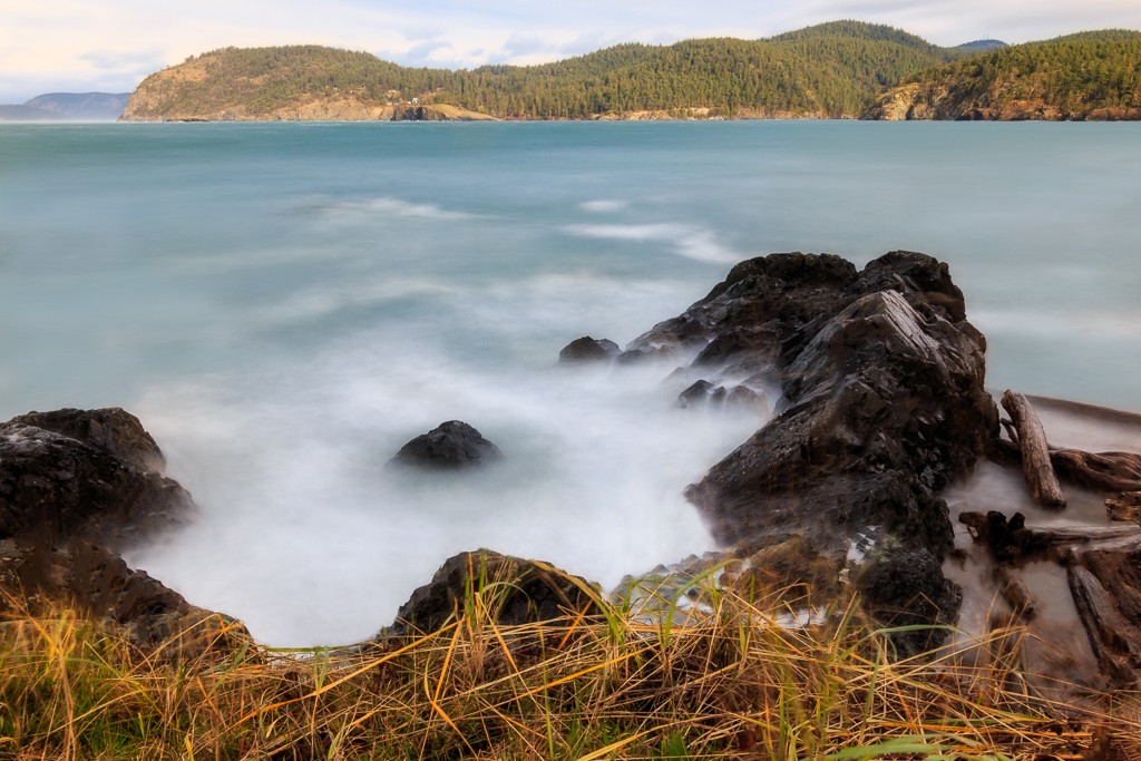
Very pretty shot! The water is wonderful! I love the soft look. I like John's idea of the graduation filter on the water. I tried to do it, but then tried doing color picker and brushed some different colors in. I think this was a bit above my PS ability. haha I removed some of the ghostly grasses too. The 2 tall ones on the right were the main ones that were a distraction to me.
I think it's a very beautiful shot and area. Was there a reason you chose the 10-stop ND filter and not a lesser one? (For my understanding.) |
Jan 20th |
 |
| 71 |
Jan 19 |
Comment |
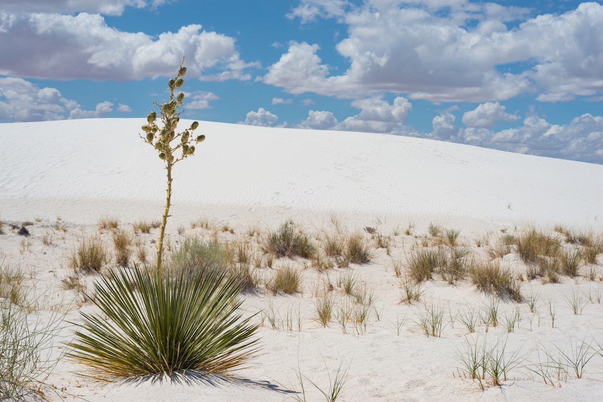
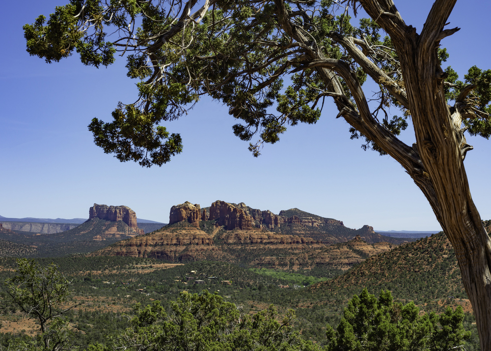
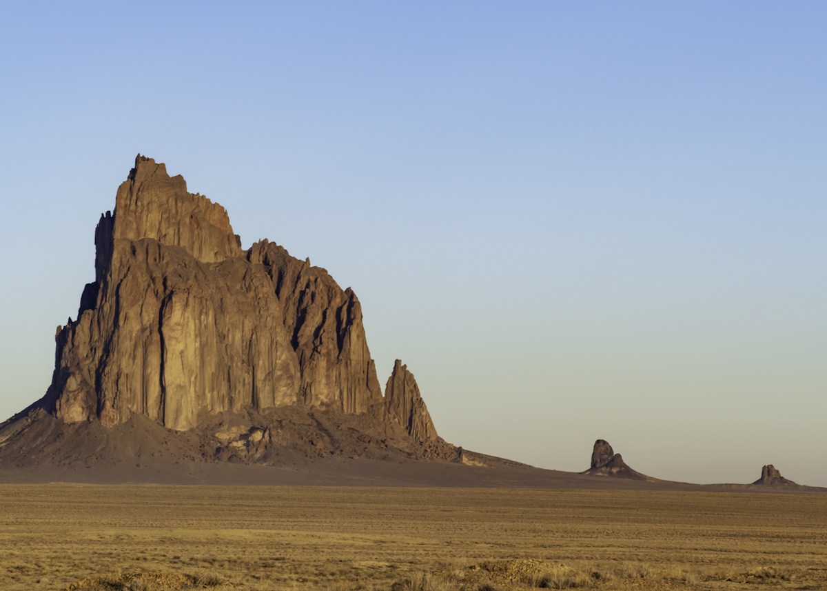
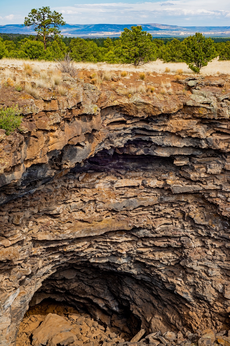
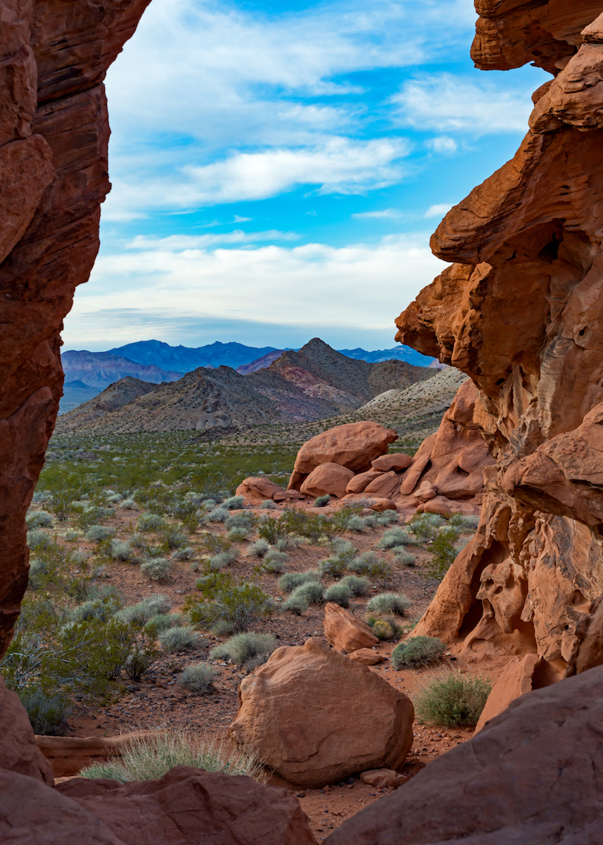
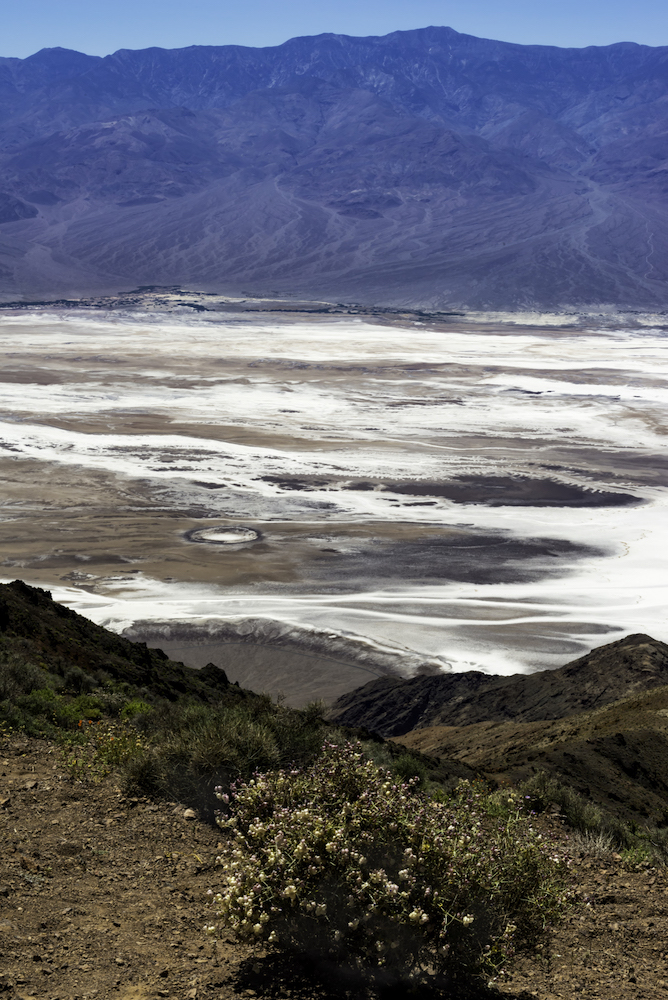
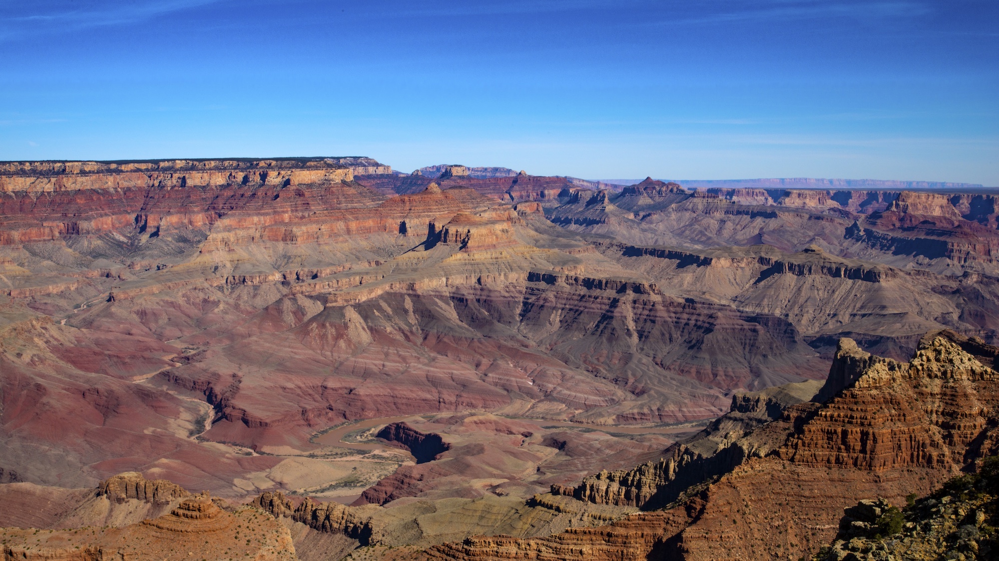
This is a beautiful shot. The contrast of the soft pastel sky to the hard rock landscape is stunning. The beams in the sky give a frame to the tallest peak. I don't see anything that I would change or adjust either. Very nice job! |
Jan 16th |
| 71 |
Jan 19 |
Comment |
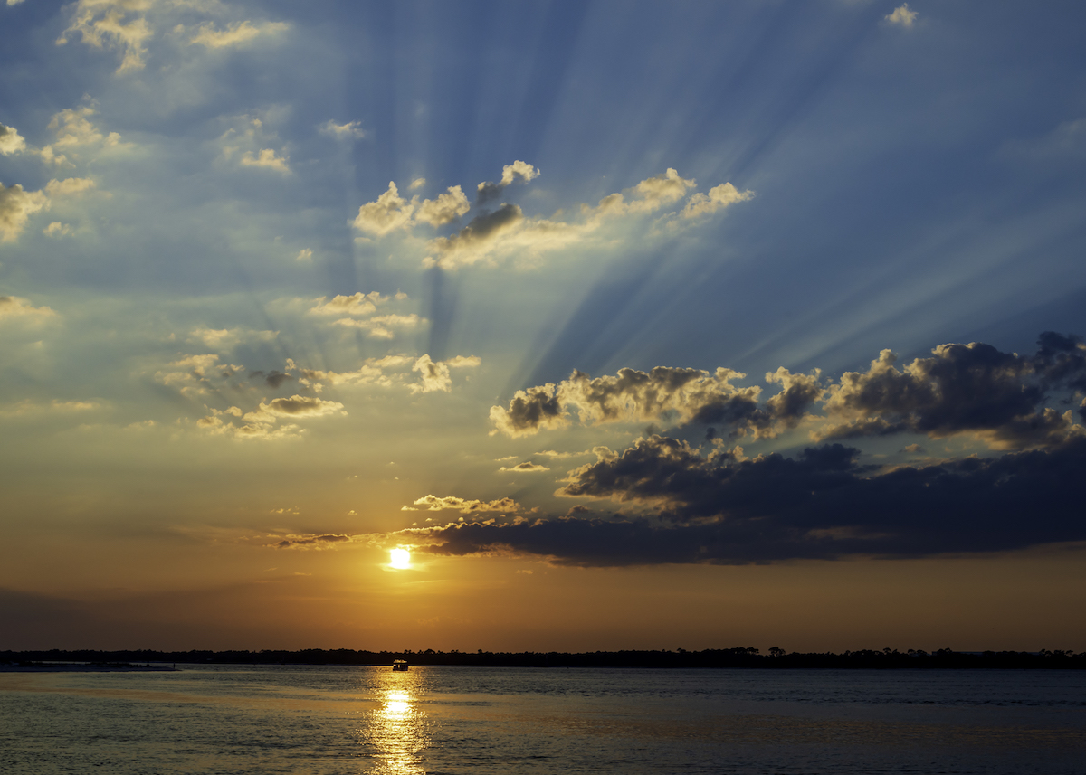
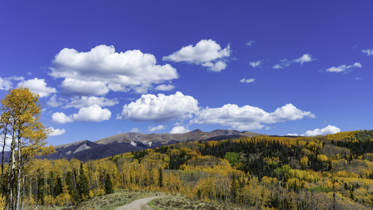
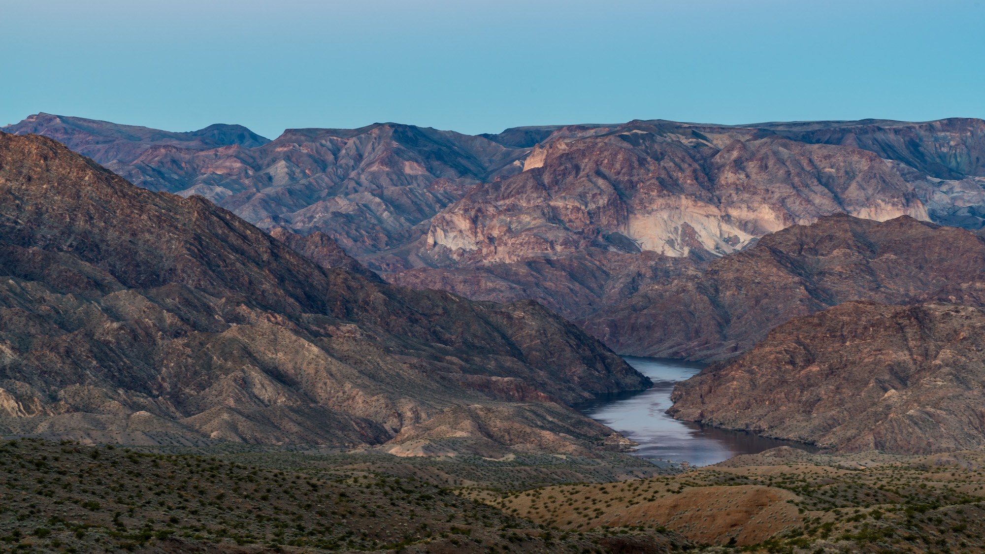
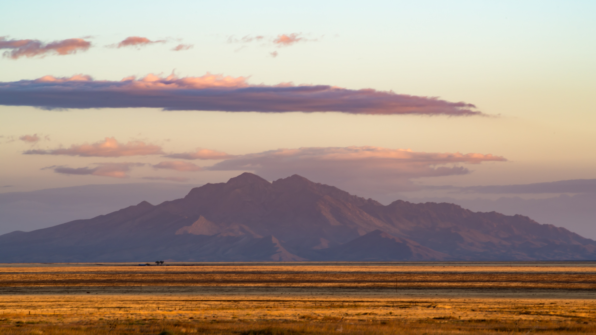
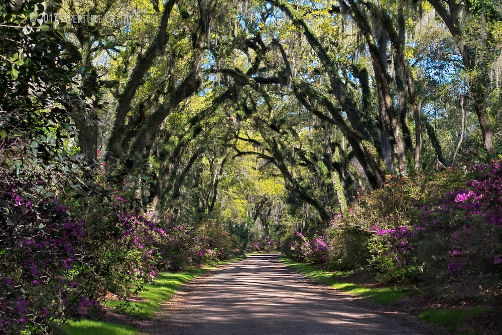
Wow! This looks like a painting. Fantastic color! I like the light on the mountain tops. And the low horizon, which makes the clouds seem alive. There's nothing I would add or change. I bet this would look great on a canvas! |
Jan 14th |
5 comments - 7 replies for Group 71
|
5 comments - 7 replies Total
|