|
| Group |
Round |
C/R |
Comment |
Date |
Image |
| 71 |
Sep 18 |
Reply |
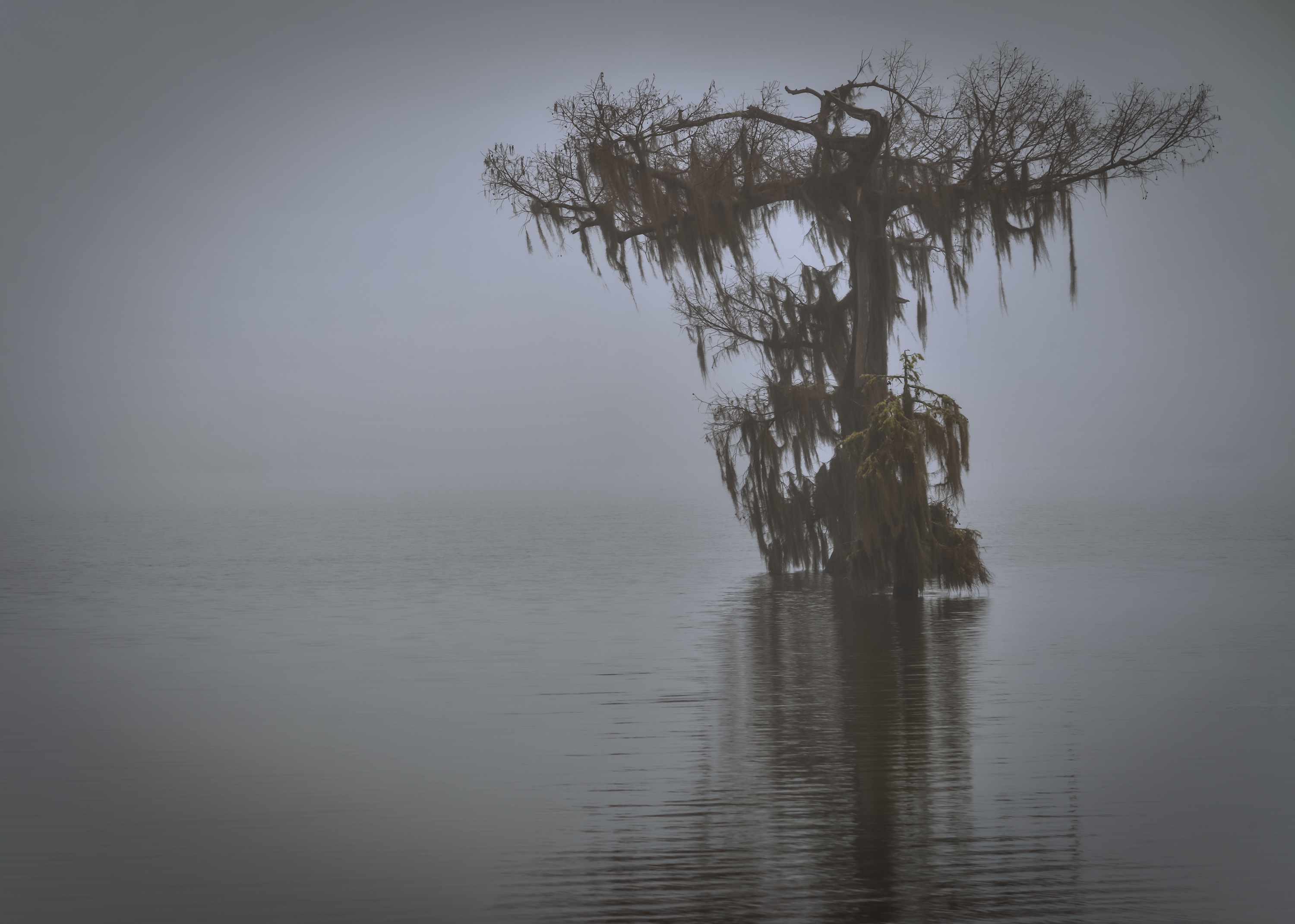
I agree. The viewing platform didn't allow me to go any further right, so adding the tree was the only option I saw. But, I like it without as well. Thanks so much! |
Sep 22nd |
| 71 |
Sep 18 |
Comment |
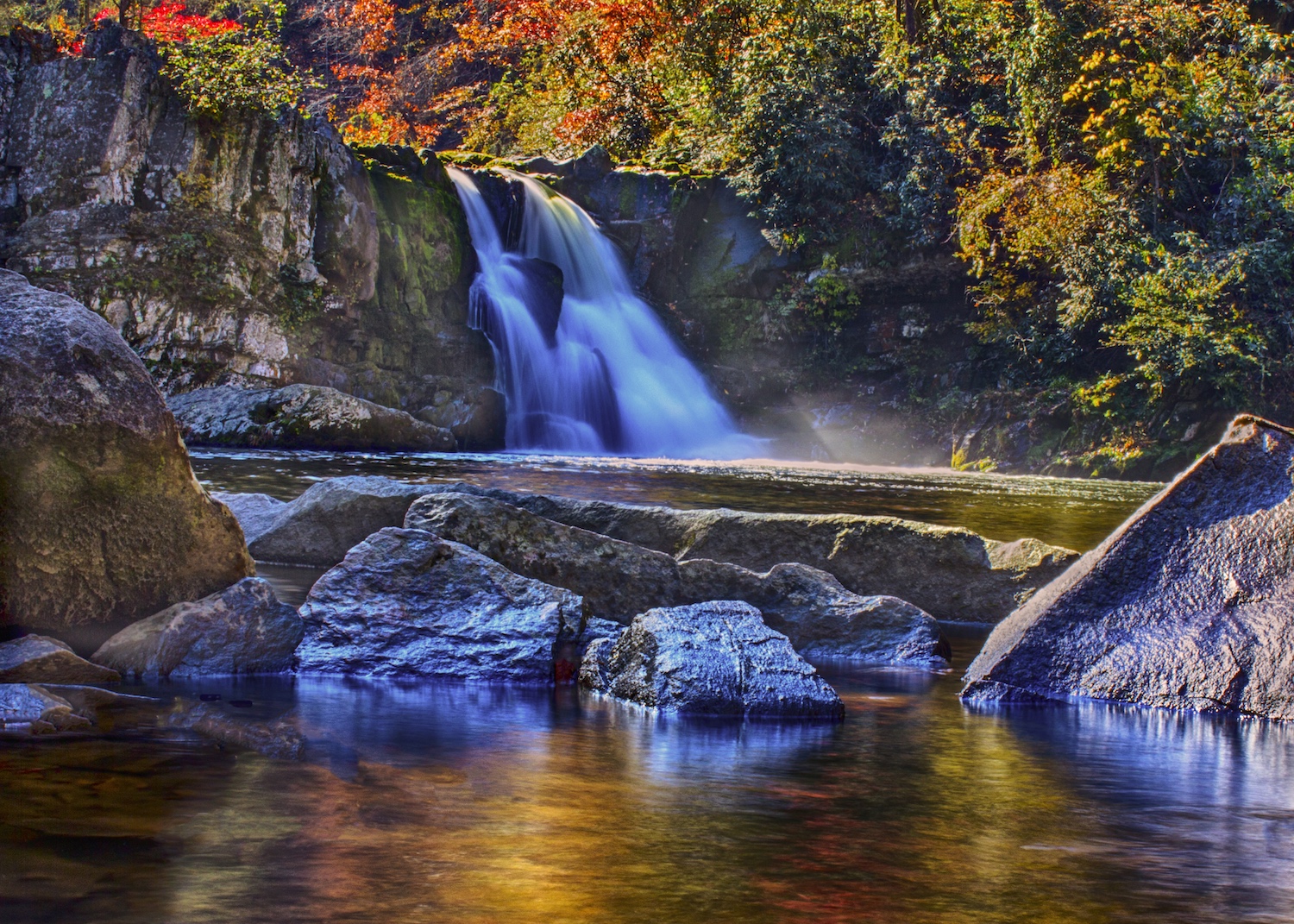
Wow, just wow!! You did a fantastic job! Did you put the tripod on a ledge? I know how heavy my D800 is and am trying to figure out how it held? More details please. ;-)
I've tried to straighten some iPhone panos, not stitched ones. Have you tried Adaptive Wide Angle or Lens Correction in PS. I don't mind the curve, it's a gorgeous shot! |
Sep 22nd |
| 71 |
Sep 18 |
Reply |
Thanks for stopping in and sharing Stephen!! I love black and white and look for photos I can also process in black and white. I appreciate your sharing your insights with our group! |
Sep 22nd |
| 71 |
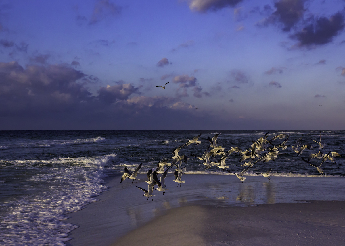
Sep 18 |
Comment |
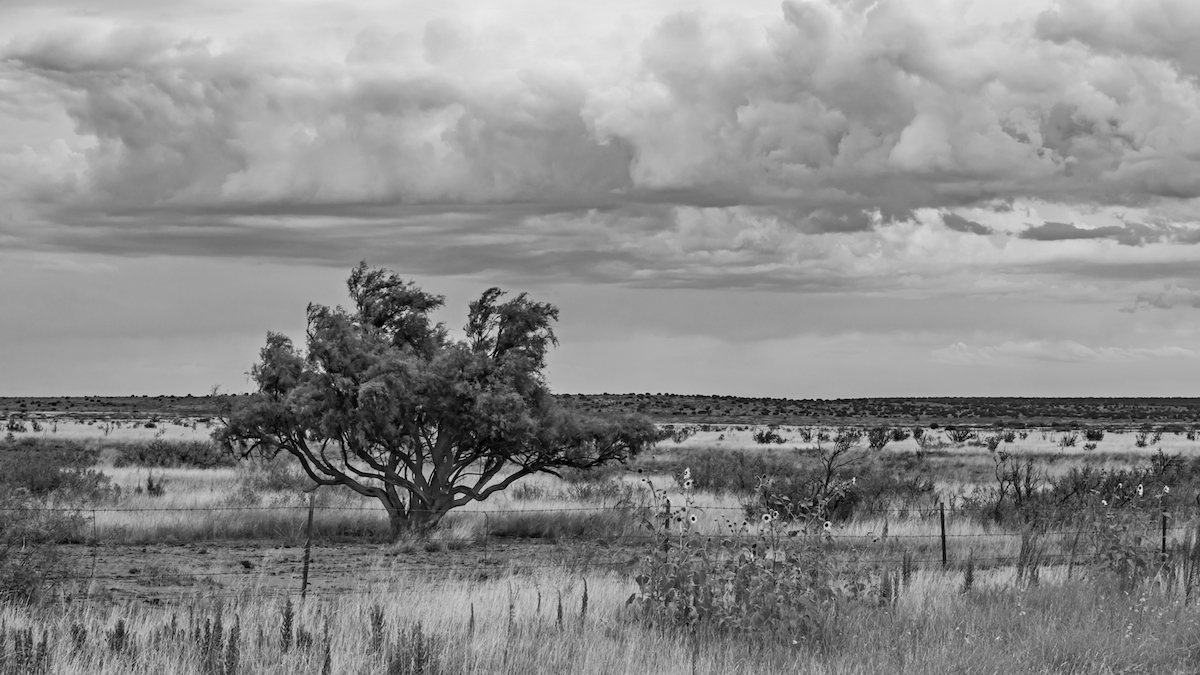
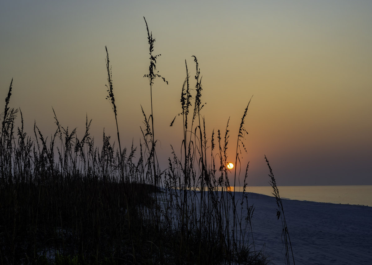
Beautiful! I love the lit tree and sharp stars. From the shoreline, you didn't have many options on where to place the tree, unless you brought your waders. haha I like John's cropping the left a a little to get it in the 1/3s, but hate losing the stars. The water is silky smooth. It's a great photo in so many ways!
I'm a black and white lover and I do like Stephen's take on it also. |
Sep 22nd |
| 71 |
Sep 18 |
Reply |
Weird. John, I thought I replied a couple days ago. I agree with removing the tree, now that I see what you did. I was trying to frame it bit, but it really brings out the clouds without it. Thanks for the suggestion! |
Sep 18th |
| 71 |
Sep 18 |
Comment |
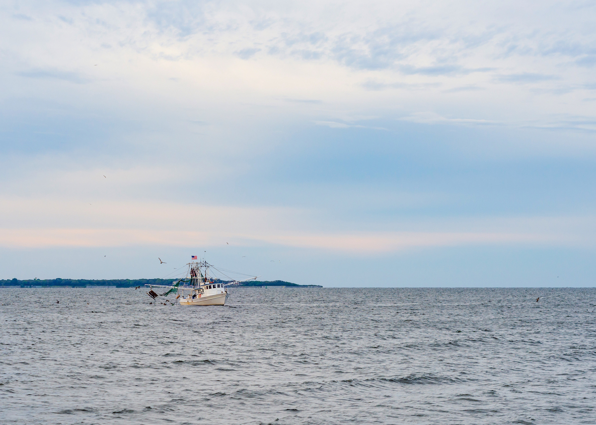
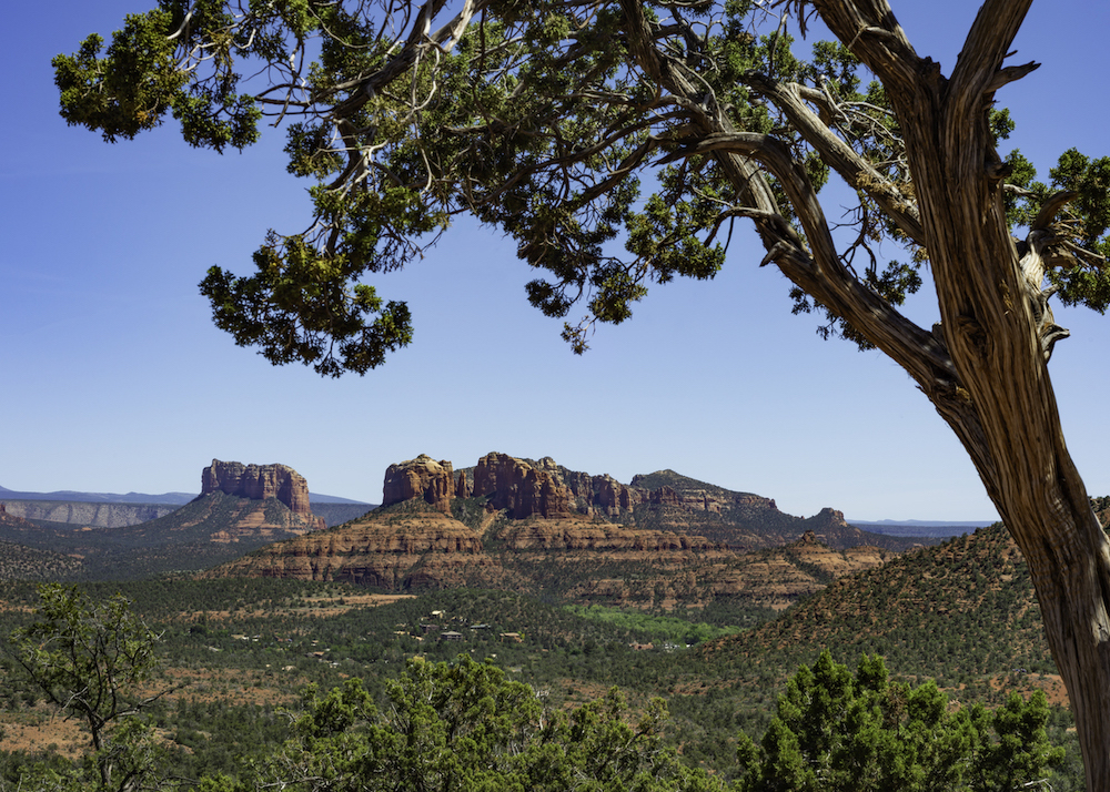
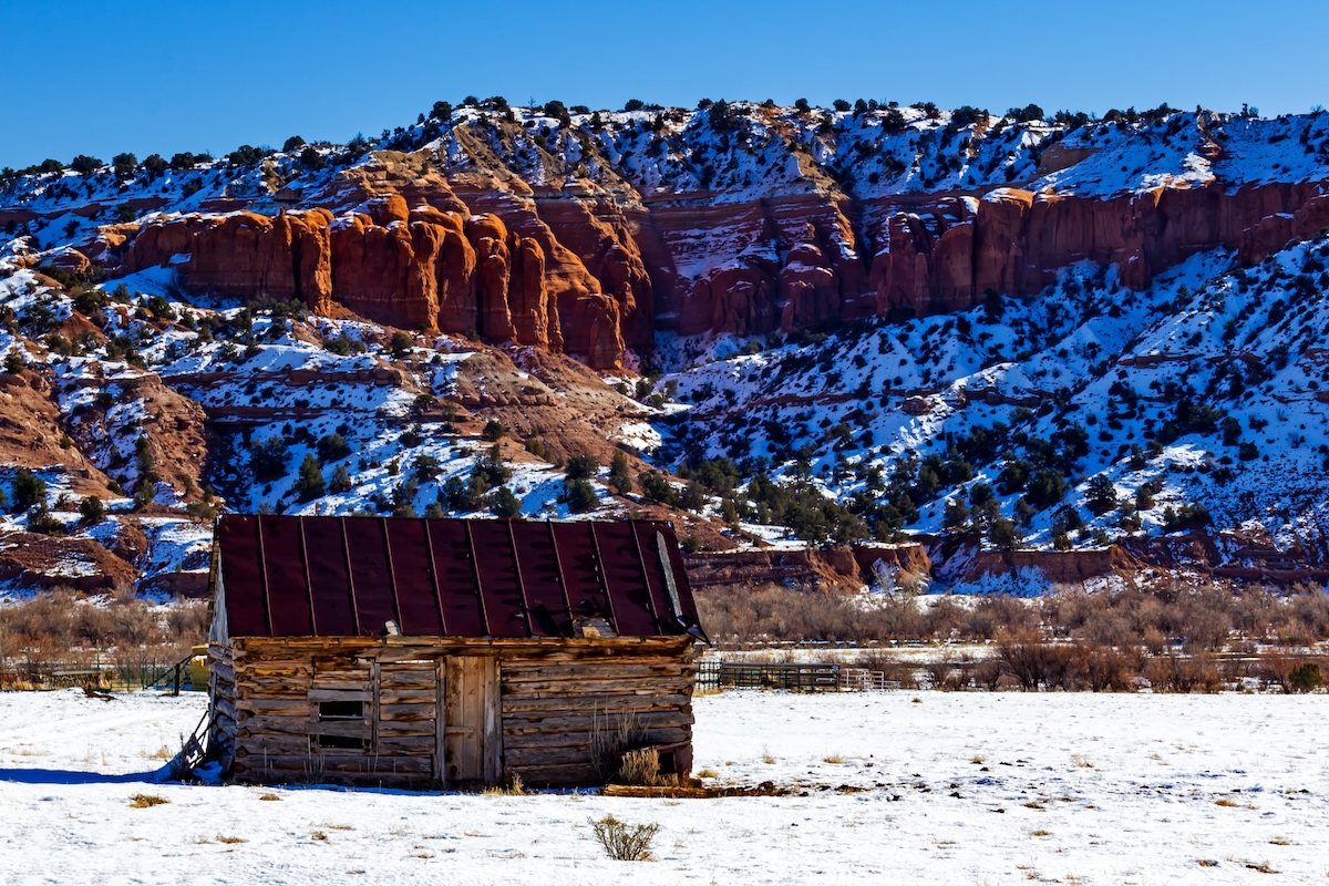
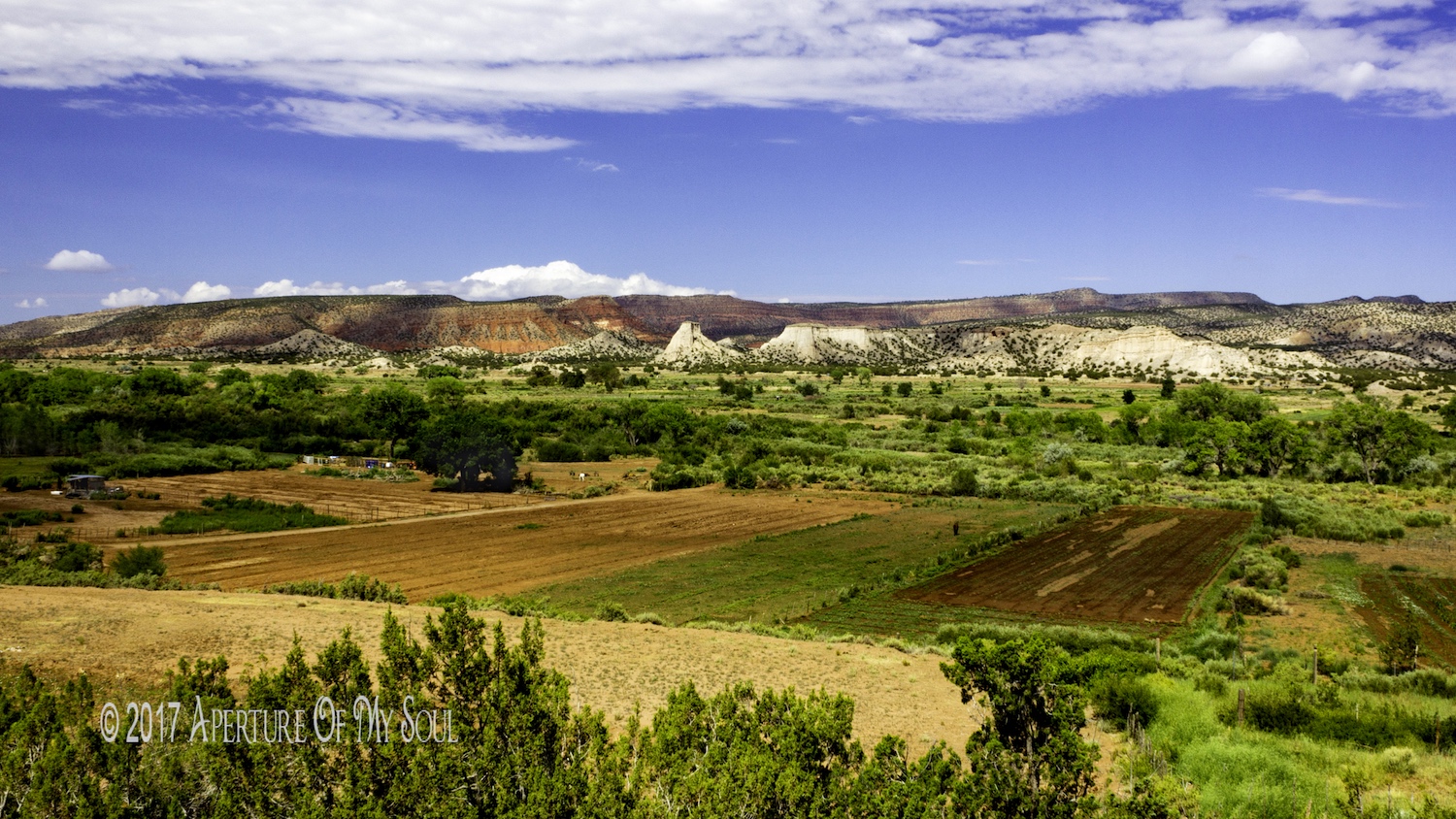
I love the island and the water! Did you use dehaze on it at all? Maybe it's just me, but I trying to figure out why the trees just to the right of the island are hazy, when they are at the similar distance away? Or did you want they lighter to make the island pop?
I like the ripples in the water leading you toward the island. And the slopes on the right. The blue is hypnotizing. It's a really pretty shot!!
Did you have to hike up the mile after the boat trip? Asking for a friend. LOL |
Sep 17th |
| 71 |
Sep 18 |
Comment |
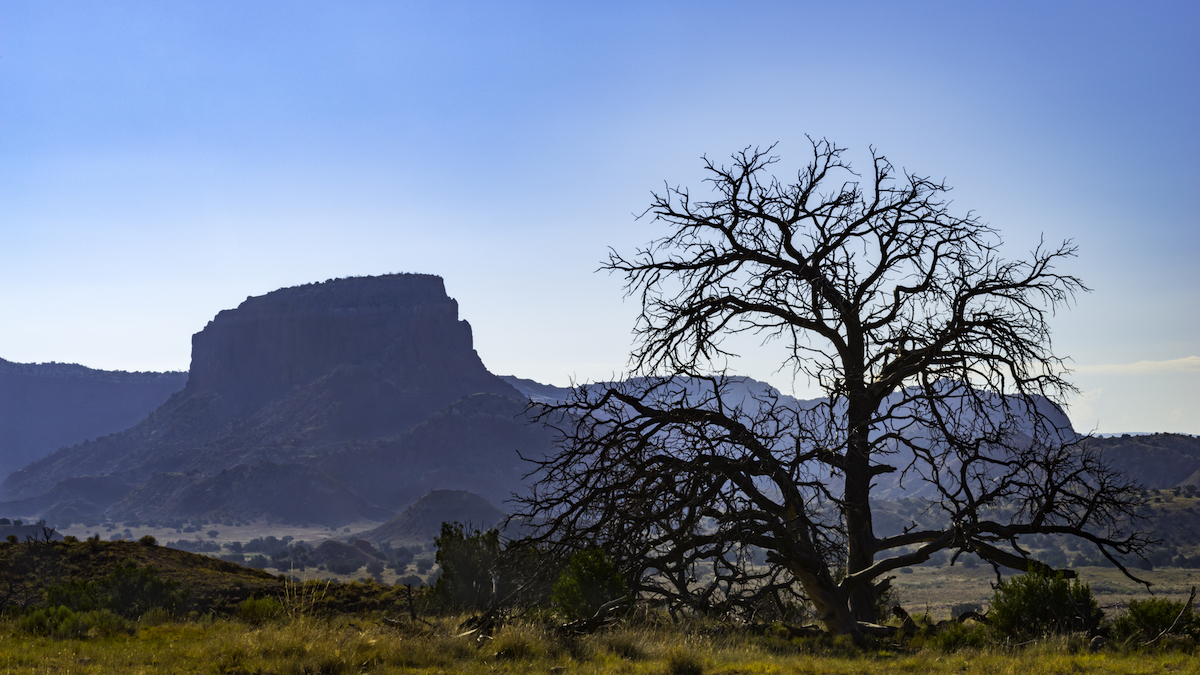
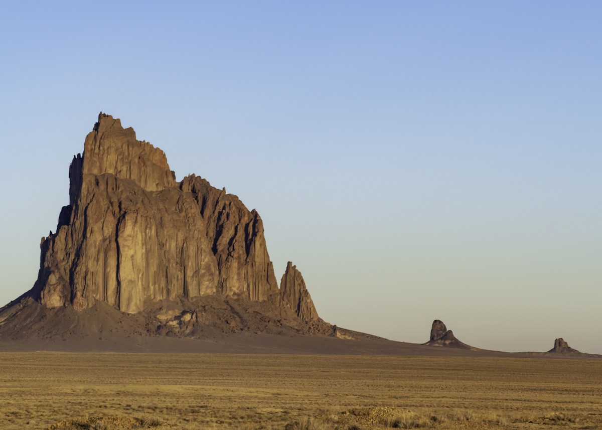
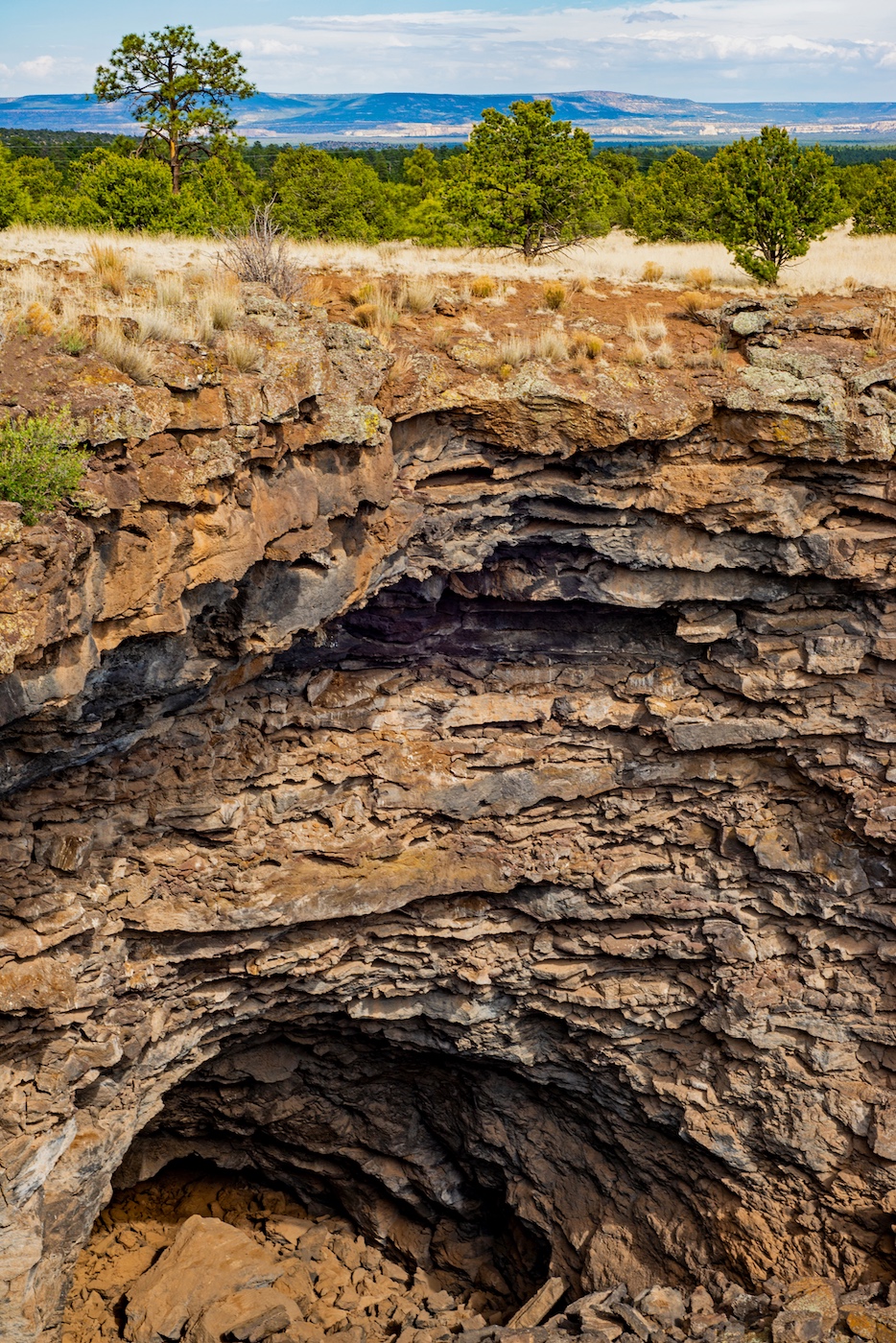
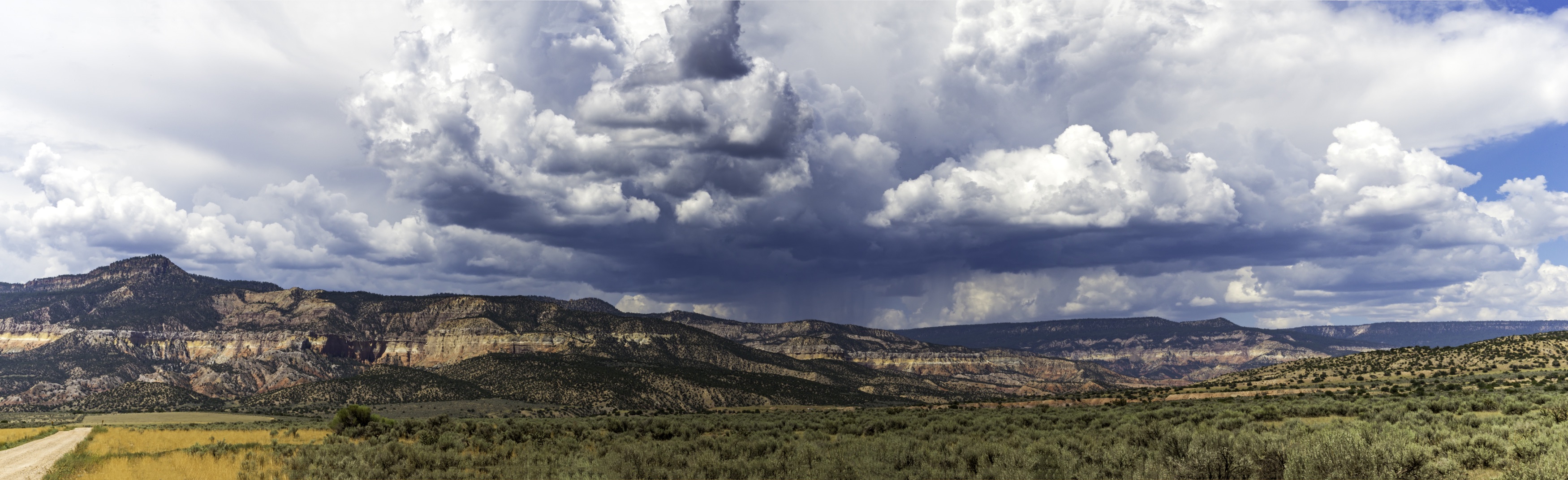
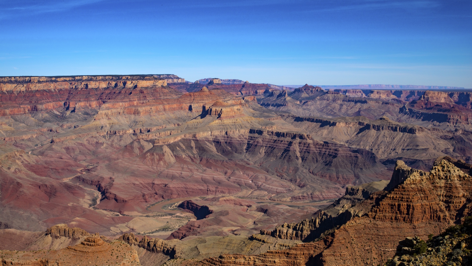
I think everyone's suggestions as the same as mine. I do love the texture of the clouds. It's a different lighthouse, as it doesn't seem so tall? Is there an interesting shot from the other side of the rocks as well? I like the shot with the changes mentioned. |
Sep 17th |
| 71 |
Sep 18 |
Reply |
Marla, yes I like what you did better! It looks more natural and not so green tinted. I think it still leaves the detail of the tall cloud. I will try just reducing the blue like you said. Thanks so much! |
Sep 12th |
| 71 |
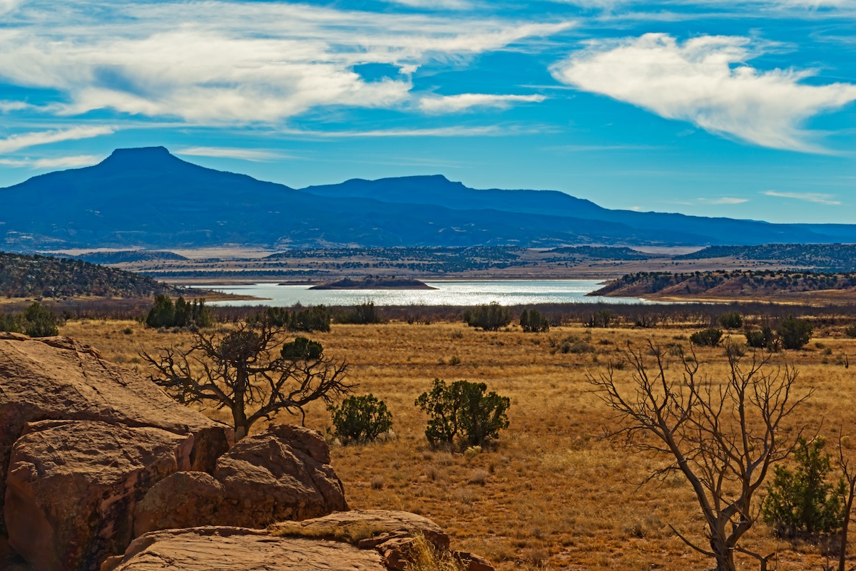
Sep 18 |
Reply |
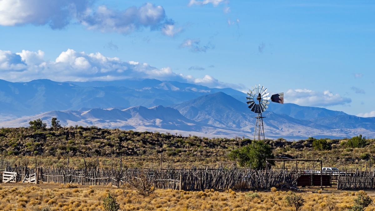
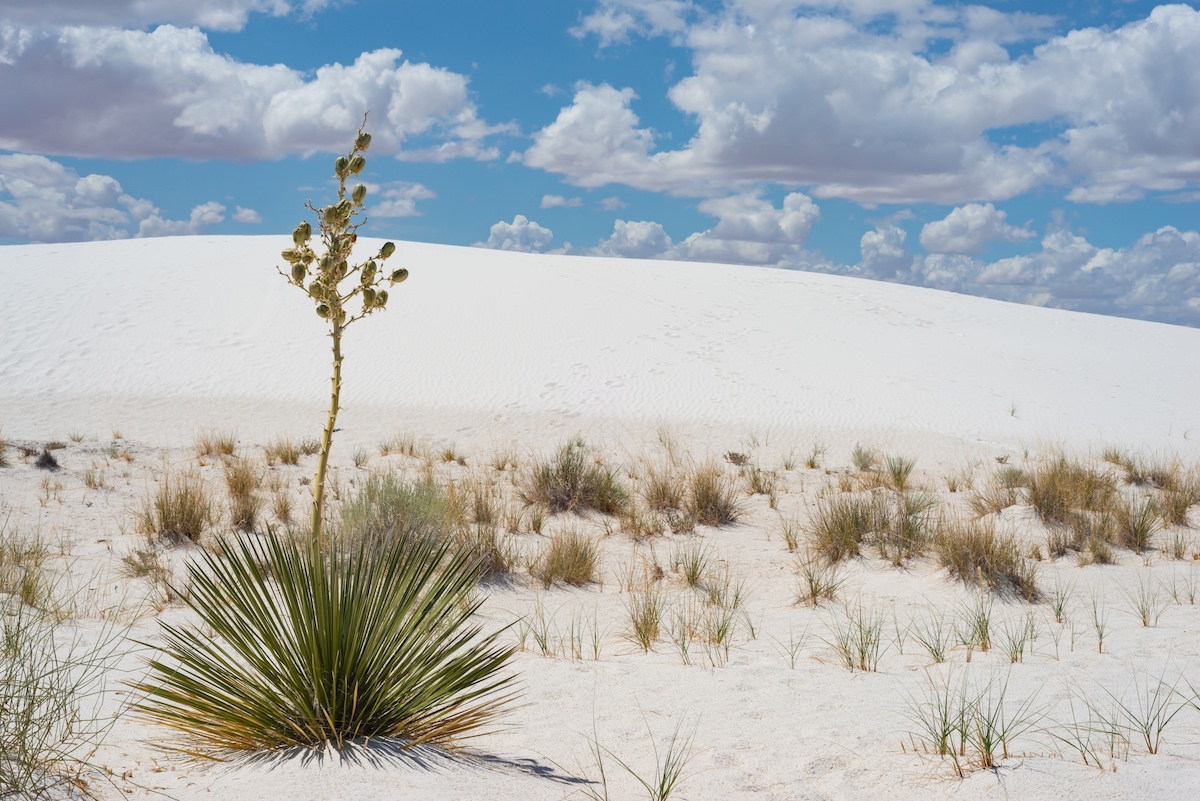
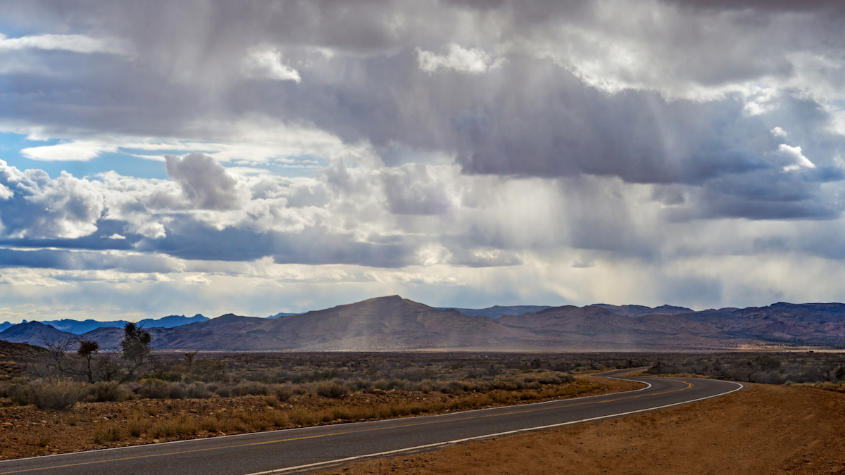
Theresa,
You would love New Mexico! I go crazy with the dramatic clouds. I'm glad you see the layers and your eye moves through them. It was such a full scene. I think Marla got the blues a better shade. I'll have to work on it, although I like Mike's black and white a lot. Thank you so much! |
Sep 12th |
| 71 |
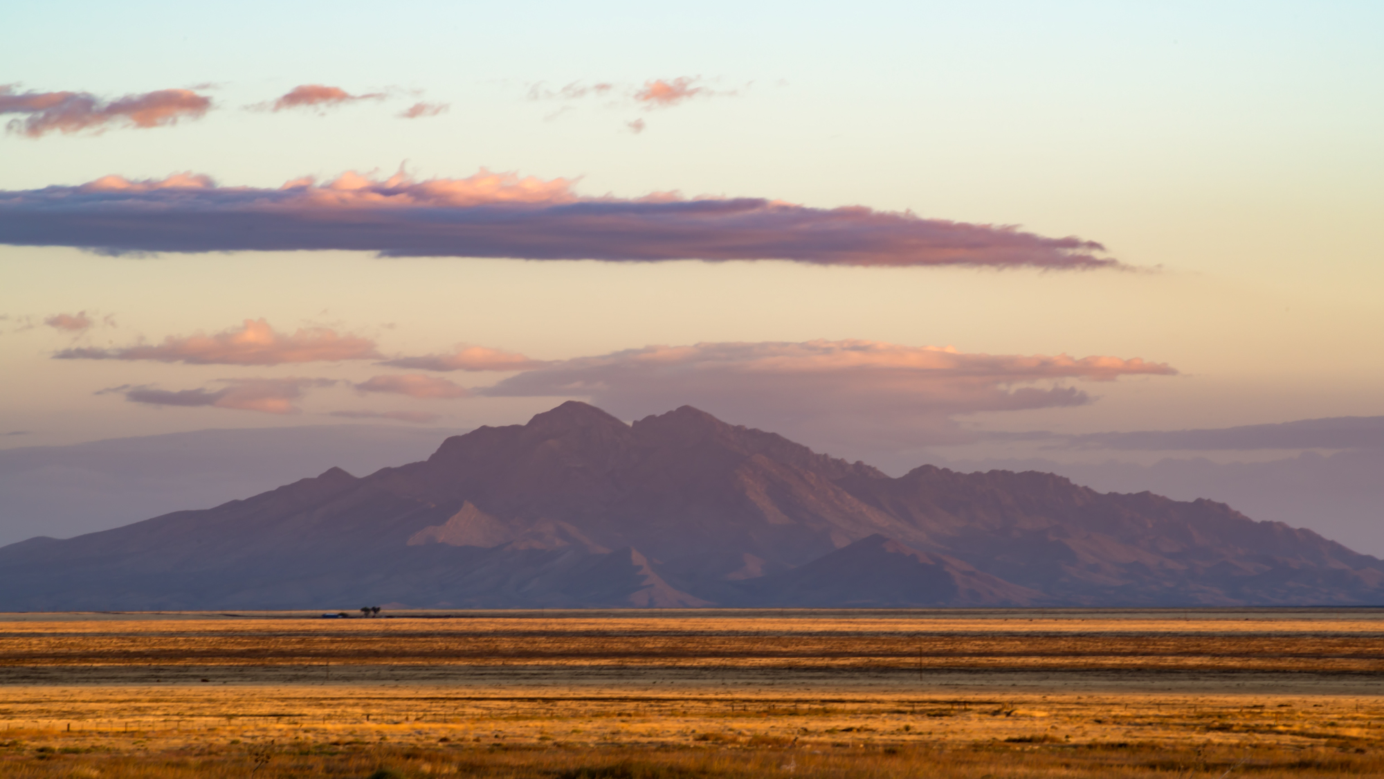
Sep 18 |
Reply |
I tend to like black and white better in many shots. I do like what you did! I think the cloud really stands out. The color does have a more natural tone to it. I think I agree on Marla's blues also. A little more subtle. Thank you! |
Sep 12th |
| 71 |
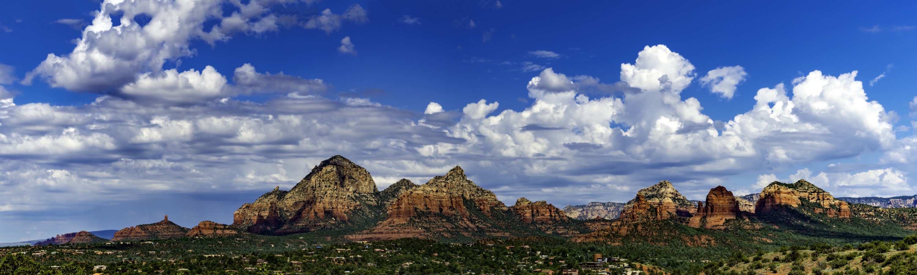
Sep 18 |
Comment |
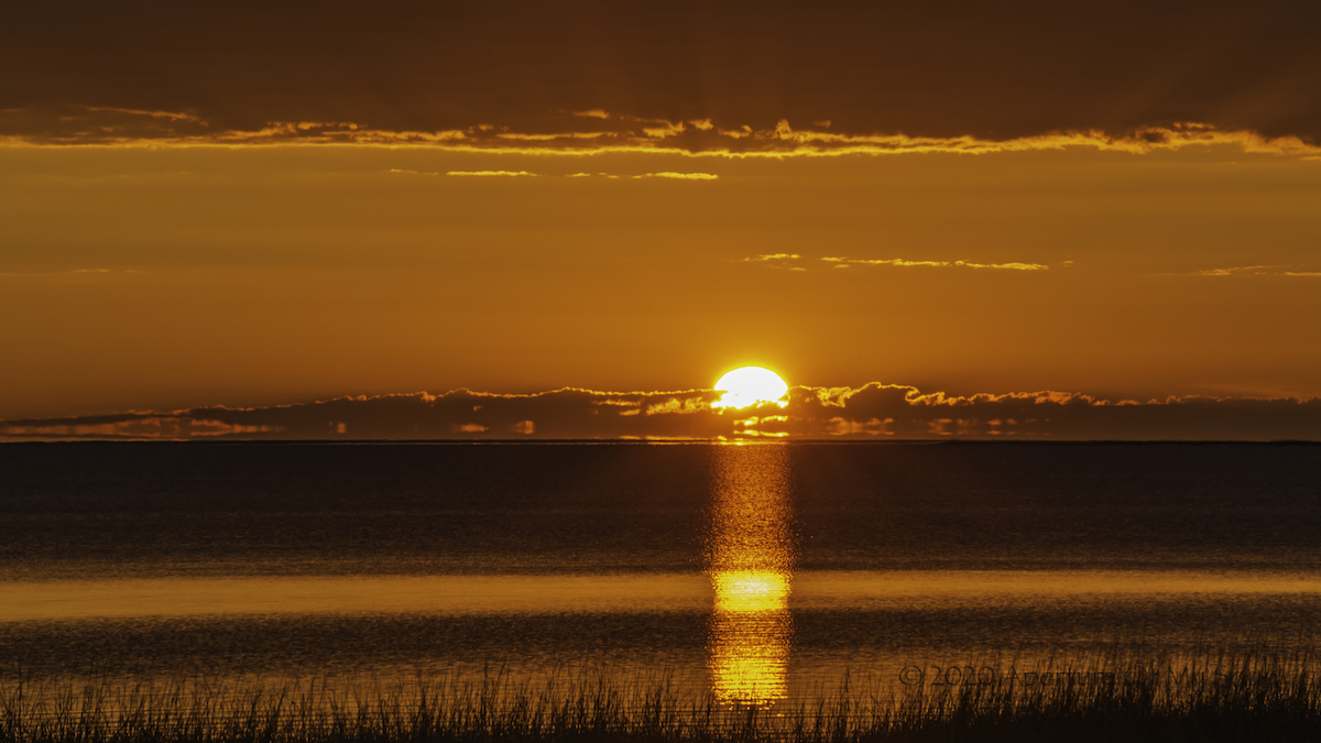
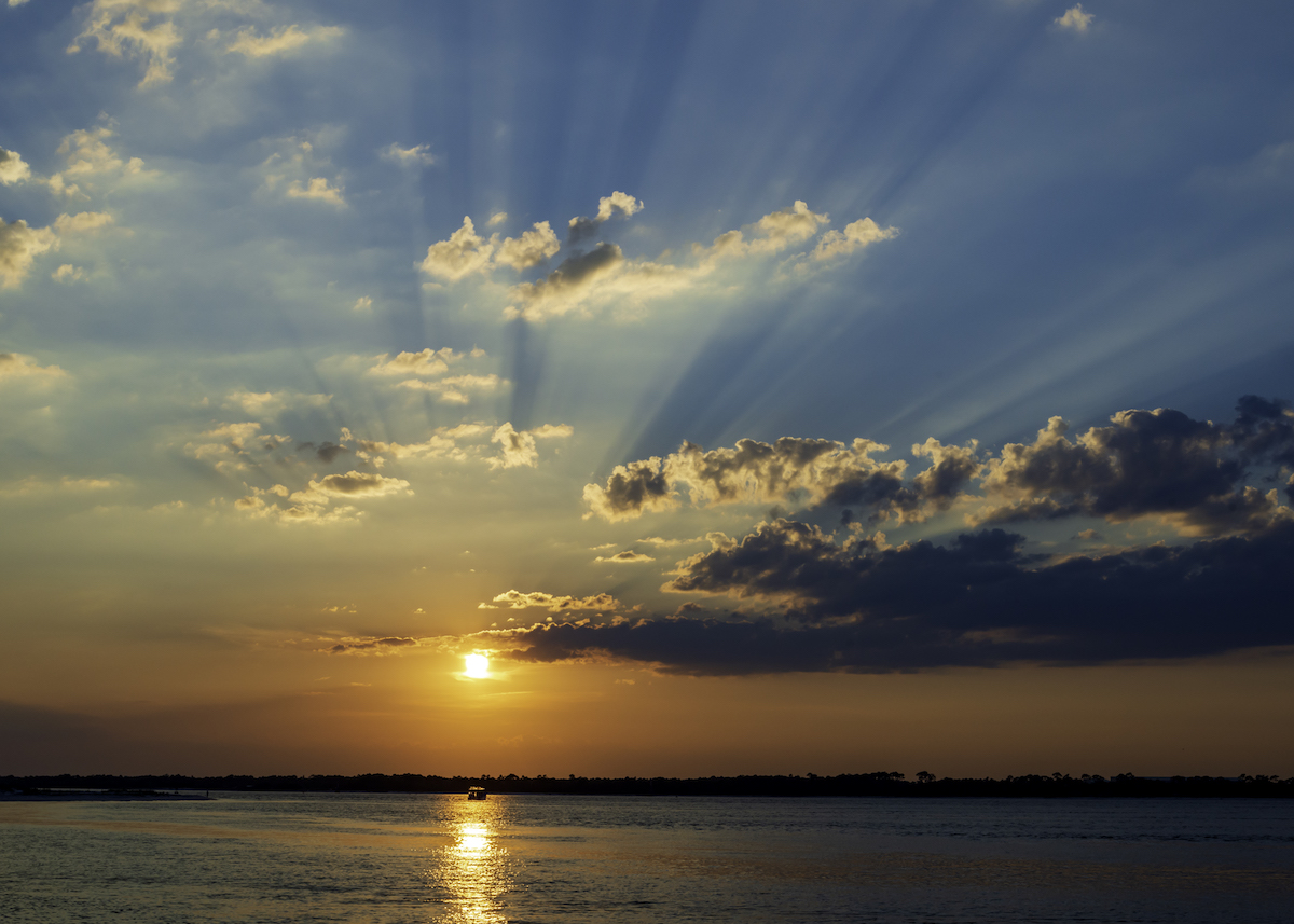
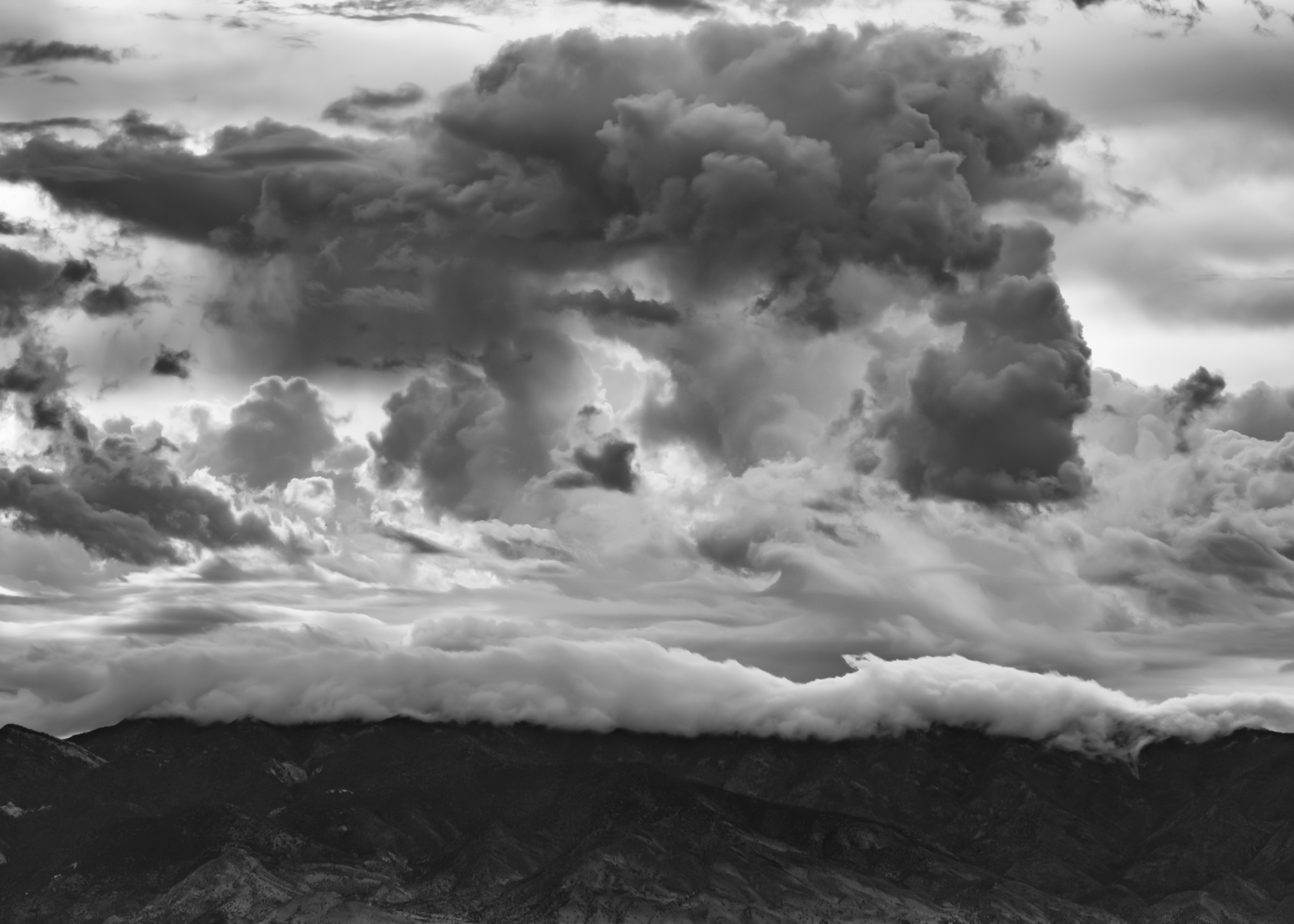
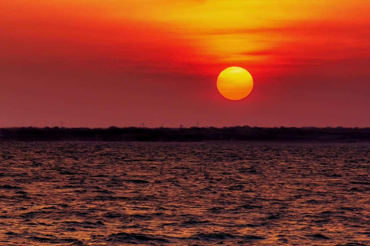
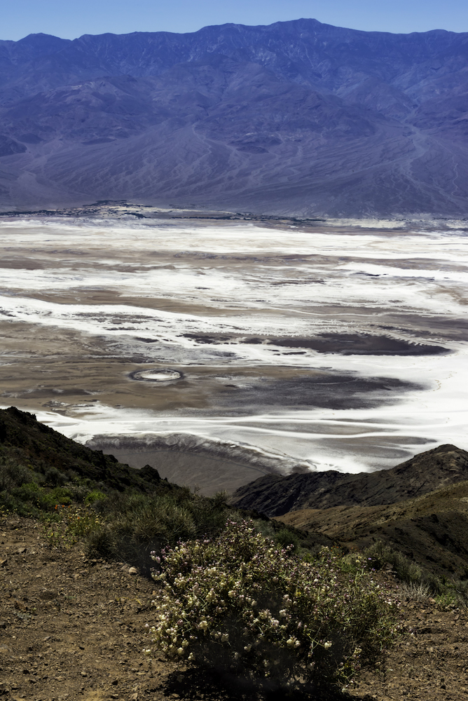
Wow! Stunning shot! I think it looks fantastic! All rules are meant to be broken sometimes. I think the diamond effect feels balanced and is very pleasing to the eye. The colors are beautiful.
The only thing I see to question is the streaks in the sky and less so in the water (the blues). I've had this happen to me too. Is this from shrinking it down for here? Or did you do a lot of post processing on it? You might try Noise reduction in Lightroom. It's only in the blues from what I see.
Beautiful shot and well worth the getting up early! |
Sep 2nd |
5 comments - 6 replies for Group 71
|
5 comments - 6 replies Total
|