|
| Group |
Round |
C/R |
Comment |
Date |
Image |
| 71 |
Jun 18 |
Comment |
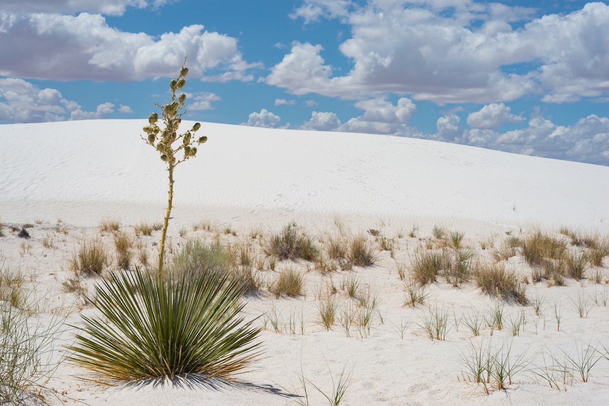
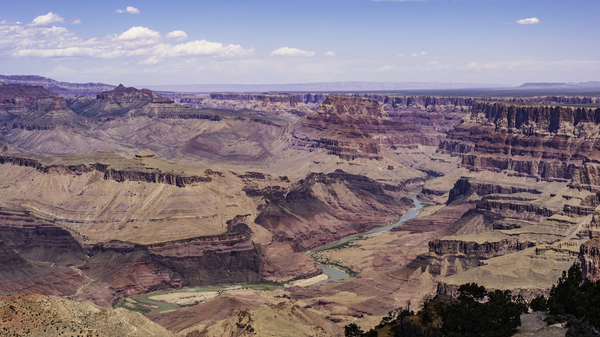
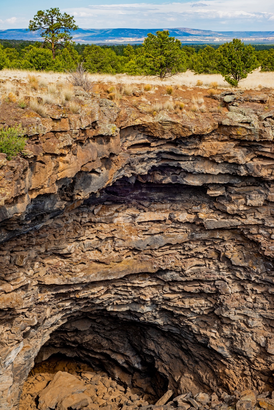
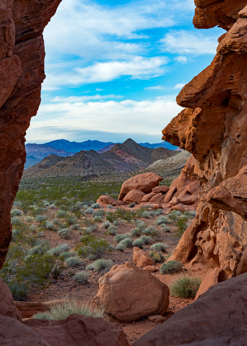
I love all the National Parks in Utah! I haven't been to Arches in many years. This is a great red rock shot. The red against the blue and white sky is a beautiful contrast. I love the textures in the rock. Have you tried converting this to black and white? Might be nice. Great job! |
Jun 24th |
| 71 |
Jun 18 |
Comment |
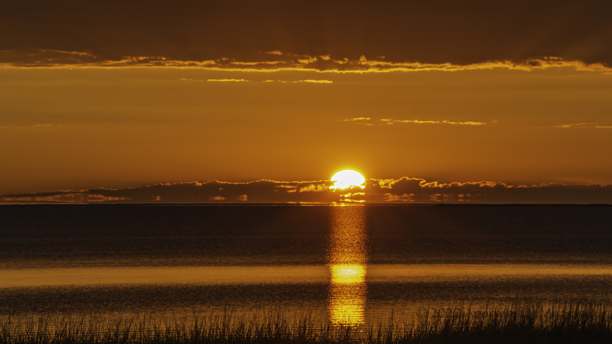
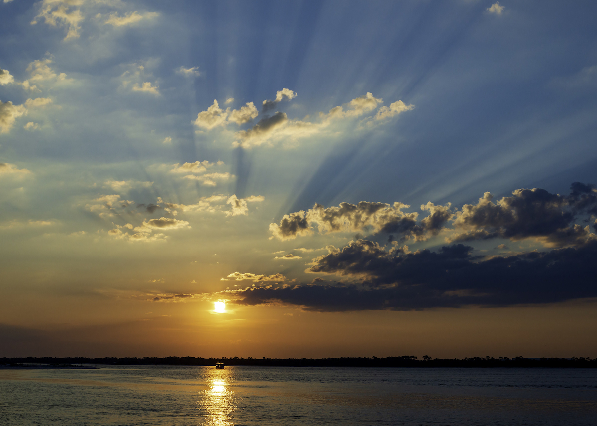
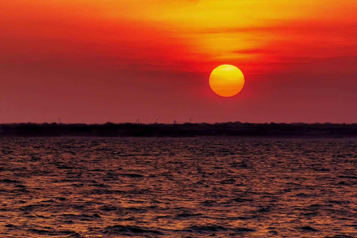
Marla, what a beautiful and colorful scenic! The glow in in the sky and reflections in the water are wonderful. Wouldn't change a thing! |
Jun 24th |
| 71 |
Jun 18 |
Comment |
Virginia, it's a beautiful shot! I don't feel it's over processed. I think you have a nice balance of light in the sky and the reflections. I don't think I would change anything. It's lovely and moving as is.
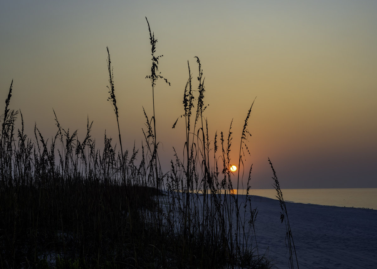
I went to St George Island and stopped to have lunch. Saw some dolphins in the water. I really wanted to go back and stay. Beautiful place!
|
Jun 20th |
| 71 |
Jun 18 |
Comment |
How fun! I love the shot! I agree, if you could lighten the people a bit it might make them more prominent. I don't think I have anything to add. I love the shimmering water and all the shades of blue. I thought maybe crop a little off the right, but I like it the way it is. it really gives you the view form the air. Great shot! |
Jun 16th |
| 71 |
Jun 18 |
Comment |
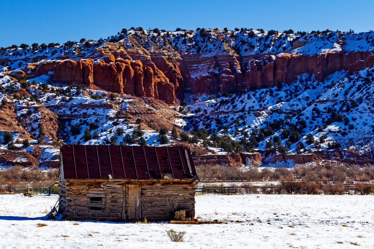
Thank you John! I may have another shot with the house smaller and more foreground. I loved the horizontal pattern of the wood house with the vertical of the roof, so I made it the focal point in this shot. Thanks so much! |
Jun 16th |
| 71 |
Jun 18 |
Comment |
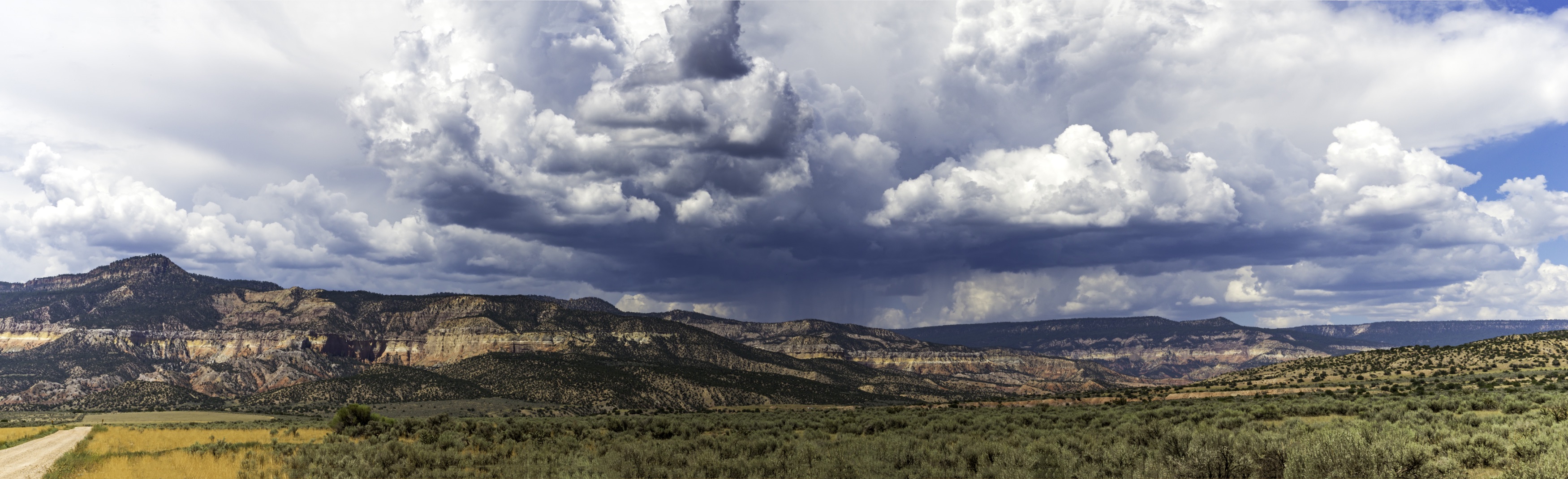
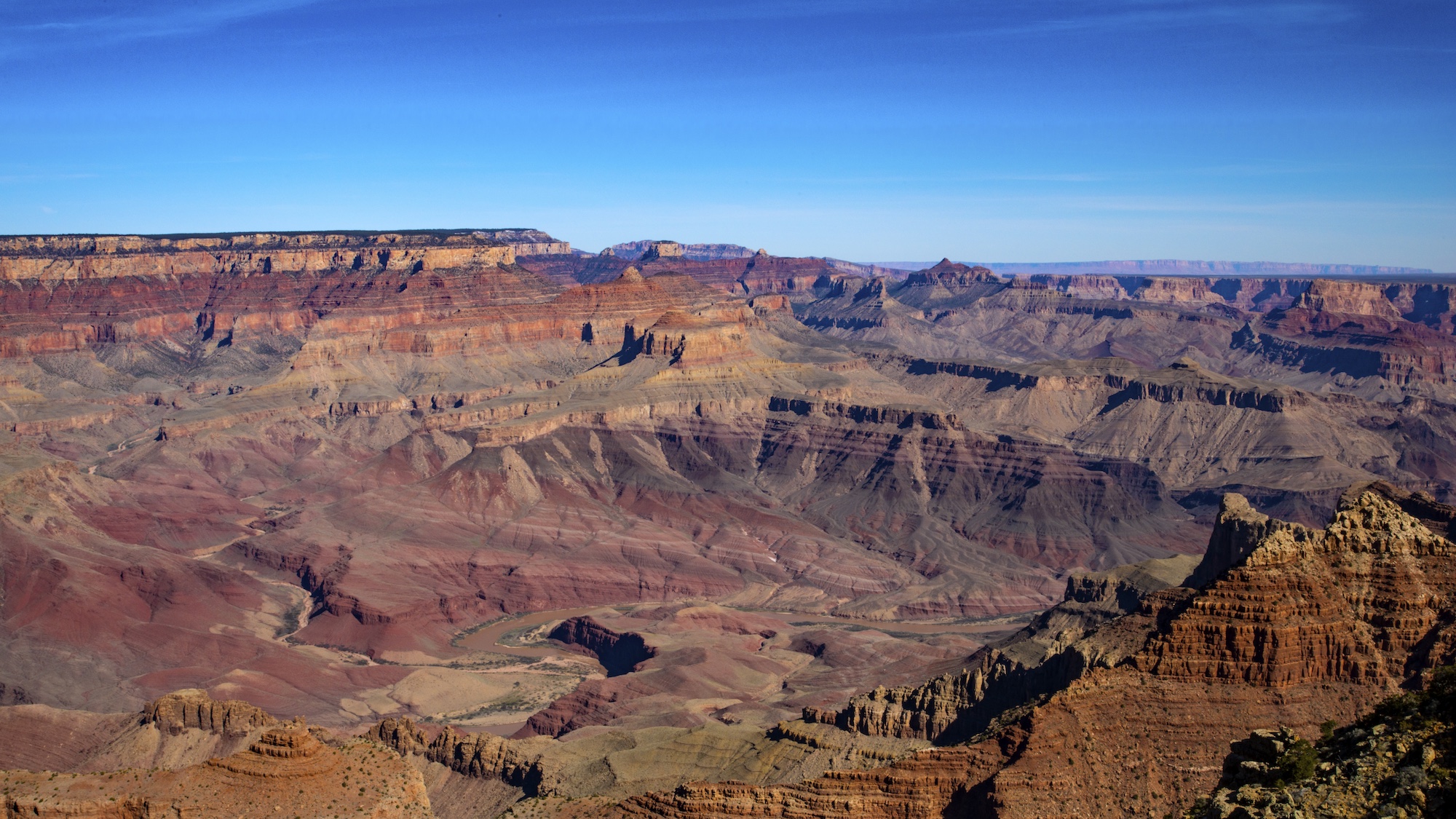
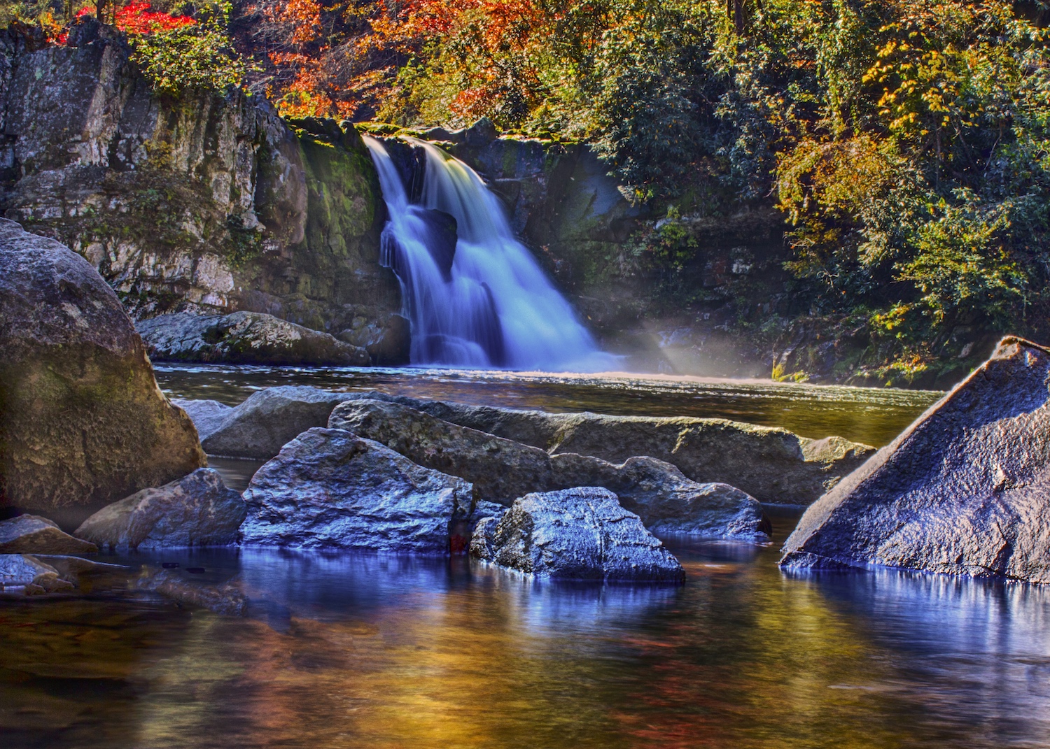
Beautiful shot Theresa! The water looks fantastic! I like the balance of the water with the rocks in the foreground on the left. My only slight suggestion would be is to crop the road/tan line off the top. My eye is drawn to the tan and it feels distracting. The black rock above the waterfall leads you eye down to the waterfall. I love the misting water at the bottom. You pulled out all the accessories (haha) and that made for a great shot!! |
Jun 12th |
| 71 |
Jun 18 |
Comment |
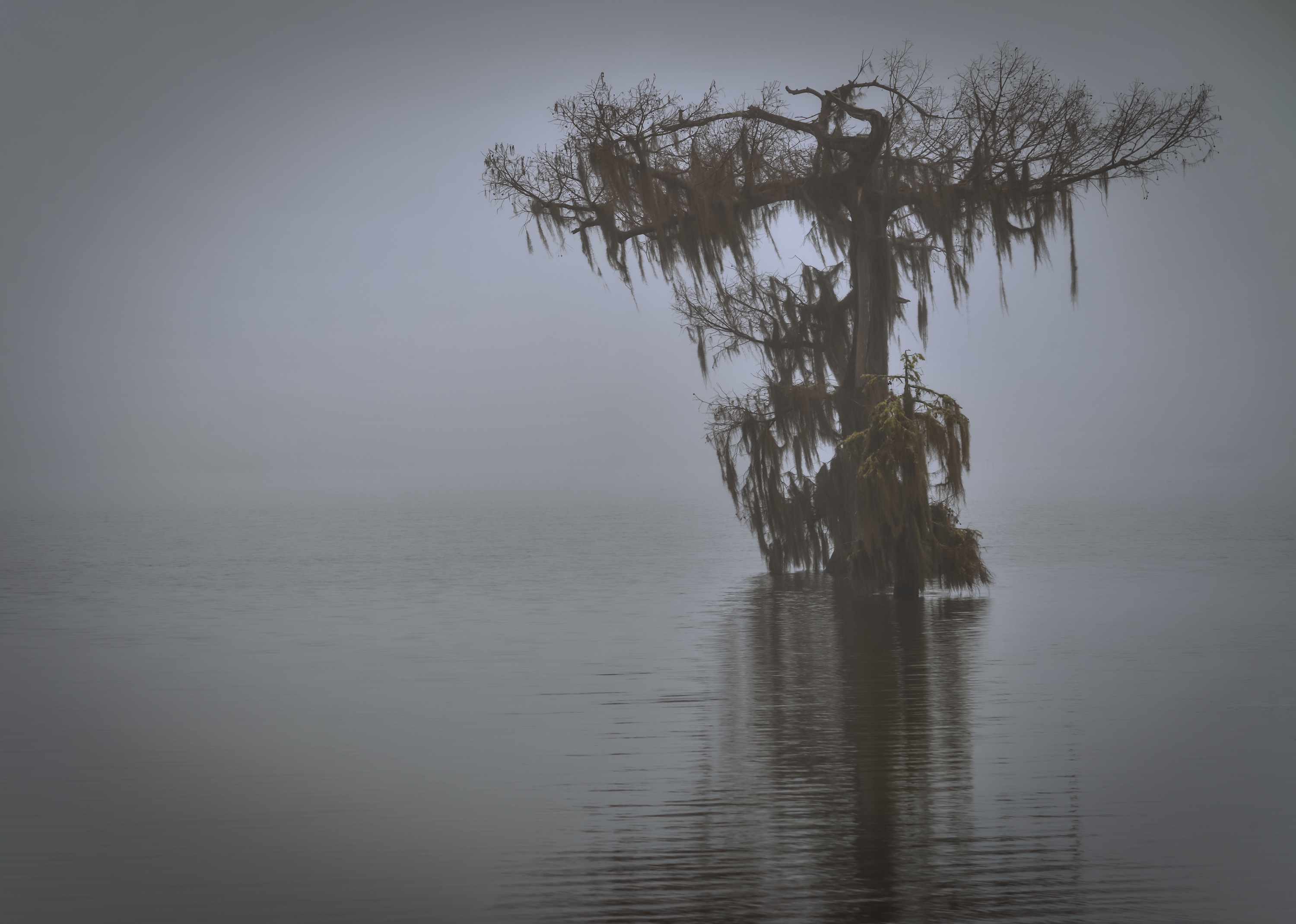
Very nice tranquil shot! I think you did a nice job balancing everything. I like that the whole pond isn't there and agree I might look too squished together without the sky. Did you use much contrast? I'm wondering if a little more would make the trees pop a bit? I like the peaceful feeling of the composition. Very nice!! |
Jun 12th |
| 71 |
Jun 18 |
Comment |
Thanks Mike! I actually was looking at the shadows and thinking that, but don't know how to fix it? I backed off on saturation. The house and brown trees, don't look too much. I can try and lasso and lower saturation on the rocks, but they are naturally pretty red. I just noticed a cloning repeat in the bottom left corner. Will have to fix that. |
Jun 12th |
8 comments - 0 replies for Group 71
|
8 comments - 0 replies Total
|