|
| Group |
Round |
C/R |
Comment |
Date |
Image |
| 36 |
Oct 18 |
Comment |
David, nicely done. I really like the detail and the way you brought out the color. Almost like HDR. Composition is excellent. You may need to do some adjustment to the building lines as they are not straight toward the back of the building, near the "Clock". |
Oct 26th |
| 36 |
Oct 18 |
Comment |
25 seconds really added to the softness of the water. I really liked the way the viewers eye is brought to the jutting rock in front and then leads to the rest of the cliffs. Very nice work in bring out the colors. |
Oct 26th |
| 36 |
Oct 18 |
Comment |
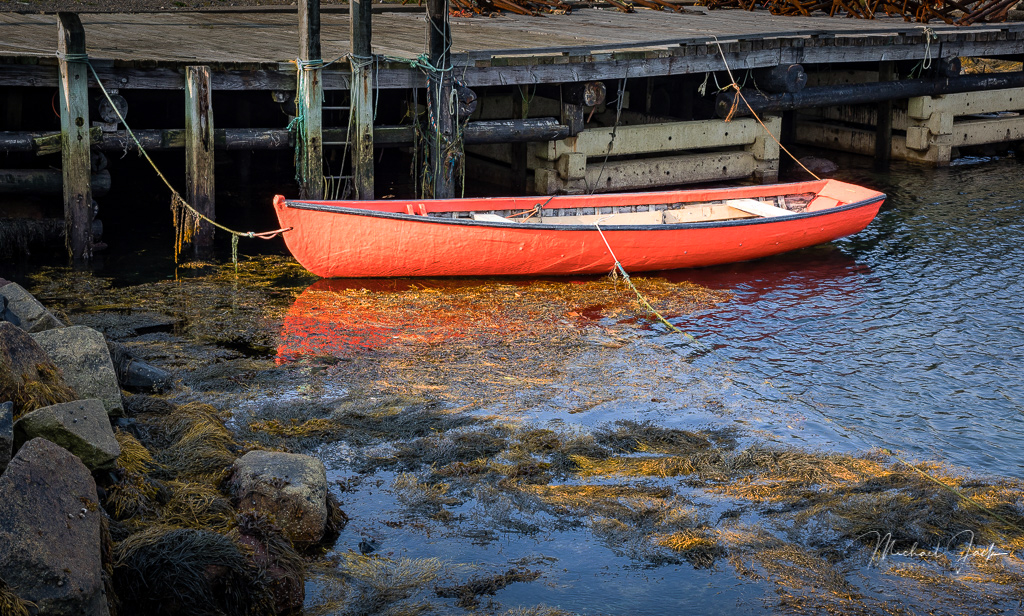
Michael, very nice composition, however....there's aways a "however", the object, the boat. is not greatly defined as the subject. I darken the background, and brought out the color of the boat so the viewers eye goes directly to the boat. |
Oct 26th |
 |
| 36 |
Oct 18 |
Comment |
Nice work Hattie, those early morning times are great for getting soft photos. The colors work nicely with the railings. Nice composition. |
Oct 26th |
| 36 |
Oct 18 |
Comment |
Le, nicely done. Very nice composition using the tree and the leaves to draw the viewers eye to the barn. Beautiful fall colors. I agree with Hattie and Michael that you might bring out more detail of the barn shadows by lightenng them. |
Oct 23rd |
5 comments - 0 replies for Group 36
|
| 46 |
Oct 18 |
Reply |
Stephen, thanks for your comments. I believe it does work in monochrome, thanks. |
Oct 27th |
| 46 |
Oct 18 |
Comment |
Trey, I liked the detail in the grill and the items behind the grill. Nice job of bringing out the sky on the hood. Nice composition. Have you thought of entering it in a contest on vehicles? |
Oct 27th |
| 46 |
Oct 18 |
Comment |
Wanda I agree with the group, you did a wonderful job of bringing out the colors and detail. I thought the photo lacked some depth so I adjusted it in curves. What do you think. |
Oct 27th |
 |
| 46 |
Oct 18 |
Comment |
Paul, I liked the muted photo best, these are OLD and it shows best when muted. Gary's adjustmet in straightening worked. Nice framing, using the columns to direct the viewers eye. Where was it taken and when? |
Oct 27th |
| 46 |
Oct 18 |
Comment |
Way to good Don! Very nicely done with the composition and the lighting. I agree with Wanda that you lower the saturation of the yellows/red, just a small bit. |
Oct 27th |
| 46 |
Oct 18 |
Comment |
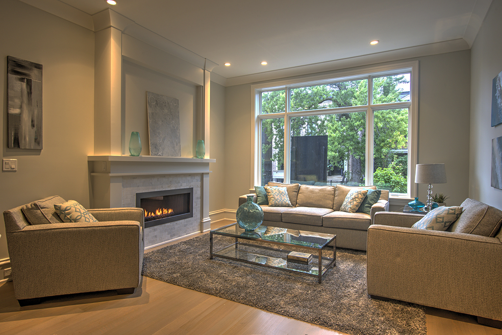
Don, I use to be a developer in Houston. The composition is very good. I agree the forsale sign should have been removed. I darken the photo a little and used more contast to bring out the lights in the room, which, I believe, make it softer and more inviting. |
Oct 26th |
 |
5 comments - 1 reply for Group 46
|
10 comments - 1 reply Total
|