|
| Group |
Round |
C/R |
Comment |
Date |
Image |
| 36 |
May 18 |
Comment |
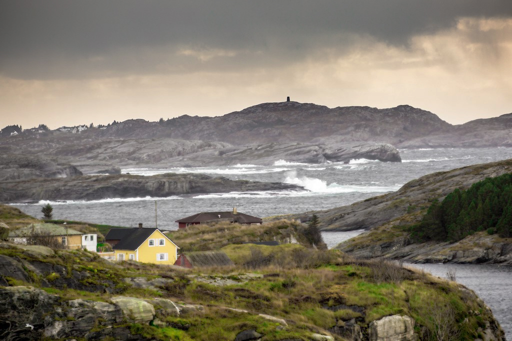
Arne, I like this photo. I made some small adjustments using curves, selected color - Yellow and a little sharpening. I darken the clouds to make the storm more pronounced, lighten up the foreground and the the house. Sharpen the foreground. I like the 1/3 area you had foreground with the house, water and the cliffs and finally the storm clouds. All-in-all a very nice photo
|
May 20th |
 |
| 36 |
May 18 |
Comment |
Hattie, I liked this shot. I agree with Bill that you could crop it more as he did. However, I disagree with removing the lily pads as I found my eyes going to them first and then following the reflection of the tower into the photo.
In your shot I found myself looking at the tower in the background first and then following to the reflection. In Bill's modified shot I found myself looking at the lily's first and then moving into the photo. |
May 4th |
| 36 |
May 18 |
Comment |
Bill, Speed was 1/8 |
May 4th |
| 36 |
May 18 |
Comment |
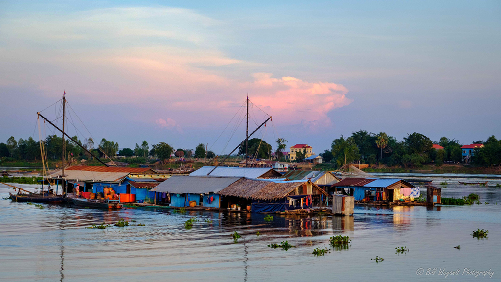
Bill, I really liked this shot. I've made some minor adjustments. Brighten slightly the floating houses and slightly adjusted the clouds to bring out the color. Hope you had a good trip. |
May 4th |
 |
| 36 |
May 18 |
Comment |
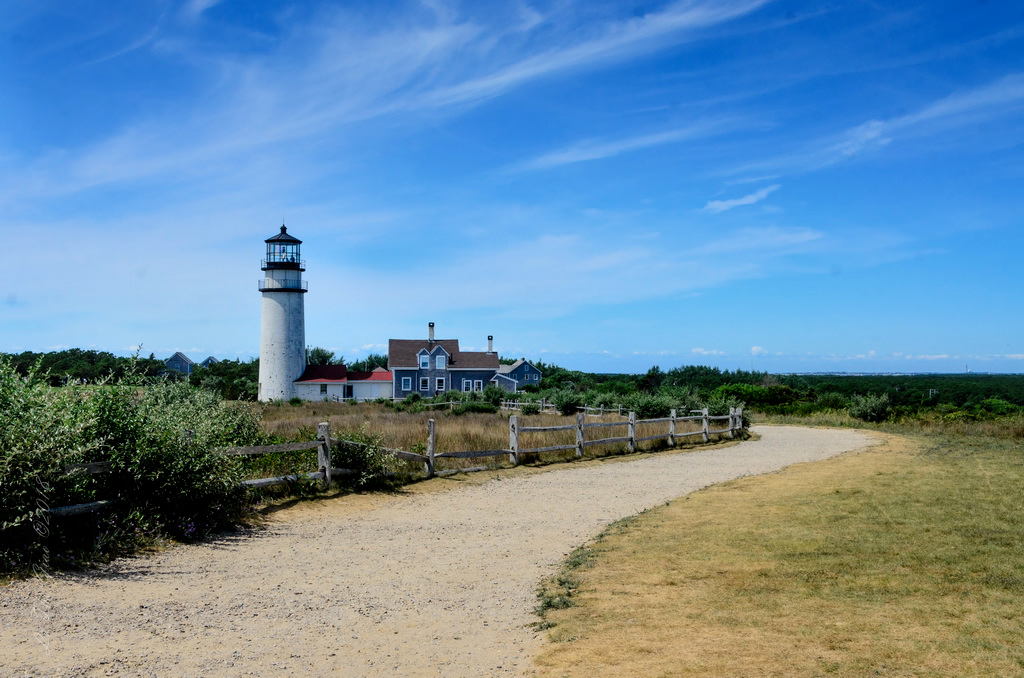
What a nice photo . I liked the way you used the road to lead the viewers eyes toward the lighthouse. I adjusted the blues to bring out the clouds, and darken the front to bring out the shadows in the lighthouse, adjusted the red roof to pull the viewers eye to the lighthouse. I noticed some dust spots in the sky. Over all a very nice composition. |
May 2nd |
 |
| 36 |
May 18 |
Comment |
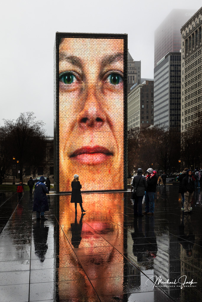
Micheal, I lighten up the people on both sides of the sign. I lighten the person standing in front of the sign to draw the viewers eyes toward her. I liked this photo of a cold winter wet day in Chicago. |
May 2nd |
 |
6 comments - 0 replies for Group 36
|
| 46 |
May 18 |
Comment |
Don, welcome on board! I enjoyed this photo, nicely done. I would agee with Gary to remove a portion of the trees on the bottom left. Leave the tree with the reflection in it. Only the suggestion is to clone out the tree and building on the bottom of the photo. It's very distracting and my eye tended to stay on it trying to figure out what was on top of the building. Again, nice composition. |
May 9th |
| 46 |
May 18 |
Comment |
Speed was 1/8, I didn't shoot a longer exposure |
May 9th |
| 46 |
May 18 |
Comment |
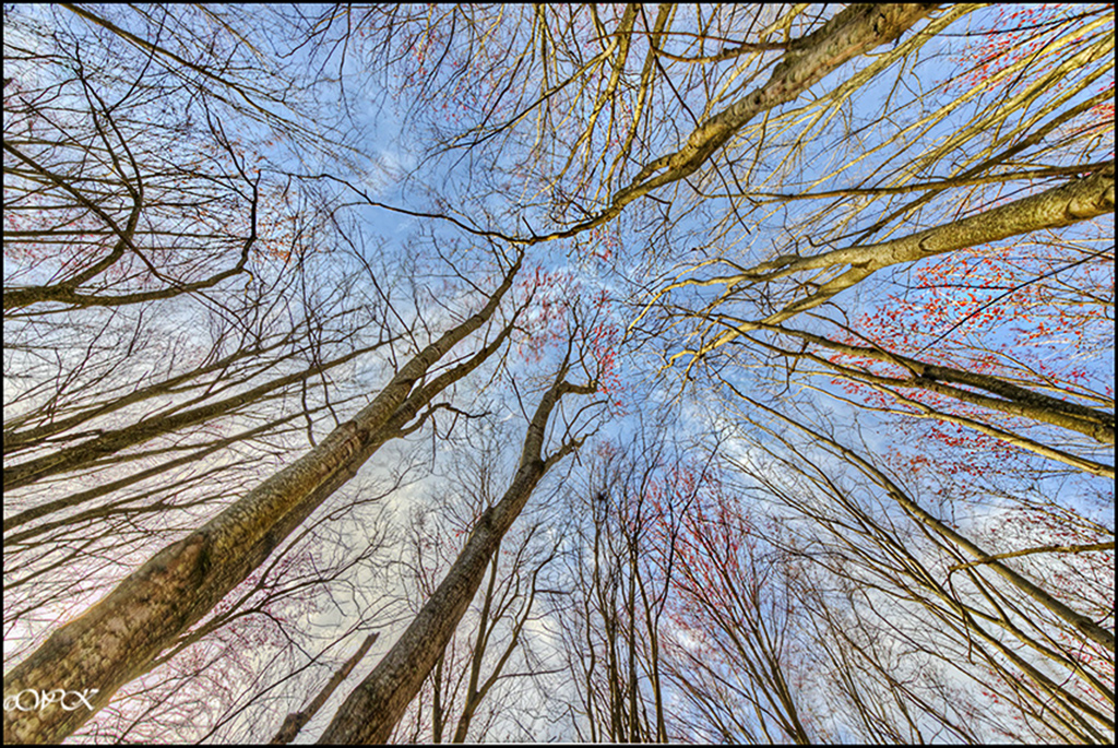
Wanda, I enjoy these shots looking straight up. You've done a nice job of pulling the three together. I liked the way you brought the colors into the photo.
I sharpen a little bit on the trees, darken the sky to bring out the clouds, which help pull the viewers eyes to the sky and center of the photo.
I've got to look straight up more often. |
May 4th |
 |
| 46 |
May 18 |
Comment |
Paul, what a nice composition using a fisheye. Very well done. Only thing I might have done is to use the window in number 3 to bring out the detail of the window. |
May 2nd |
| 46 |
May 18 |
Comment |
Nice. Very nice work of pulling the various aspects of each photo together. |
May 2nd |
| 46 |
May 18 |
Comment |
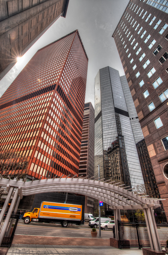
Nice composition, I enjoyed the star effect against the building. Only change I would suggest is to remove the sign in front bottom. It is a distraction. Really liked the way you got the moving truck in the arch. Nice work. |
May 2nd |
 |
6 comments - 0 replies for Group 46
|
12 comments - 0 replies Total
|