|
| Group |
Round |
C/R |
Comment |
Date |
Image |
| 2 |
Apr 22 |
Reply |
I like your sky best! Thanks. |
Apr 28th |
| 2 |
Apr 22 |
Reply |
Please see my edit under Jacqueline's post. |
Apr 20th |
| 2 |
Apr 22 |
Reply |
Please see my edit under Jacqueline's post. |
Apr 20th |
| 2 |
Apr 22 |
Reply |
Please see my edit under Jacqueline's post. |
Apr 20th |
| 2 |
Apr 22 |
Reply |
Please see my edit under Jacqueline's post. |
Apr 20th |
| 2 |
Apr 22 |
Reply |
Please see my edit under Jacqueline's post. |
Apr 20th |
| 2 |
Apr 22 |
Reply |
Please see my edit under Jacqueline's post. |
Apr 20th |
| 2 |
Apr 22 |
Reply |
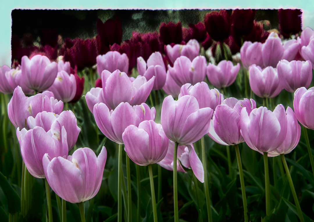
I appreciate all the comments, and I tried working with that upper edge. Here's my far out edit. I see that blue should probably be a different color, but if you open the image, you can get a better idea. What do you think? |
Apr 20th |
 |
| 2 |
Apr 22 |
Comment |
Whatever editing you did, Martin, you did an excellent edit of bringing those snow covered mountains closer. I believe it must have been a very windy day, and those grasses benefitted from that by giving real life to the scene. Beautiful contrasting colors. |
Apr 11th |
| 2 |
Apr 22 |
Comment |
Jacqueline, love the lighthouse and would like to know more about it--location and year. My first thought was that there was not enough space on the left even before seeing Martin's edit. I like the added side section, but I prefer your original tones. Beautiful!! |
Apr 11th |
| 2 |
Apr 22 |
Comment |
What a fun find! Your diagonal perspective draws me all the way in--to the point of wondering what that is on the end. Piers thinks its a platform with a canopy. I thought it was a boat! I like the grunge effect, but my eye is drawn to the sky when I think you would want the viewer drawn to the building. I agree with Piers that the sky might be more appealing if you reduced the opacity. |
Apr 11th |
| 2 |
Apr 22 |
Comment |
Piers, I like how you chose to crop the image to put the lily in a very striking position. It is sharp, beautiful contrast with the leaves--and great clean-up of the trash. Although there is a little more that could have been cleaned, I like it natural looking. Nice shot! |
Apr 11th |
| 2 |
Apr 22 |
Comment |
A beautiful design, and I like the perspective. If it's not too much of a change from the original art, I would agree that Jim's change in shades helps to make it stand out more. |
Apr 11th |
5 comments - 8 replies for Group 2
|
5 comments - 8 replies Total
|