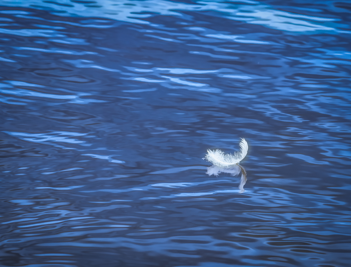
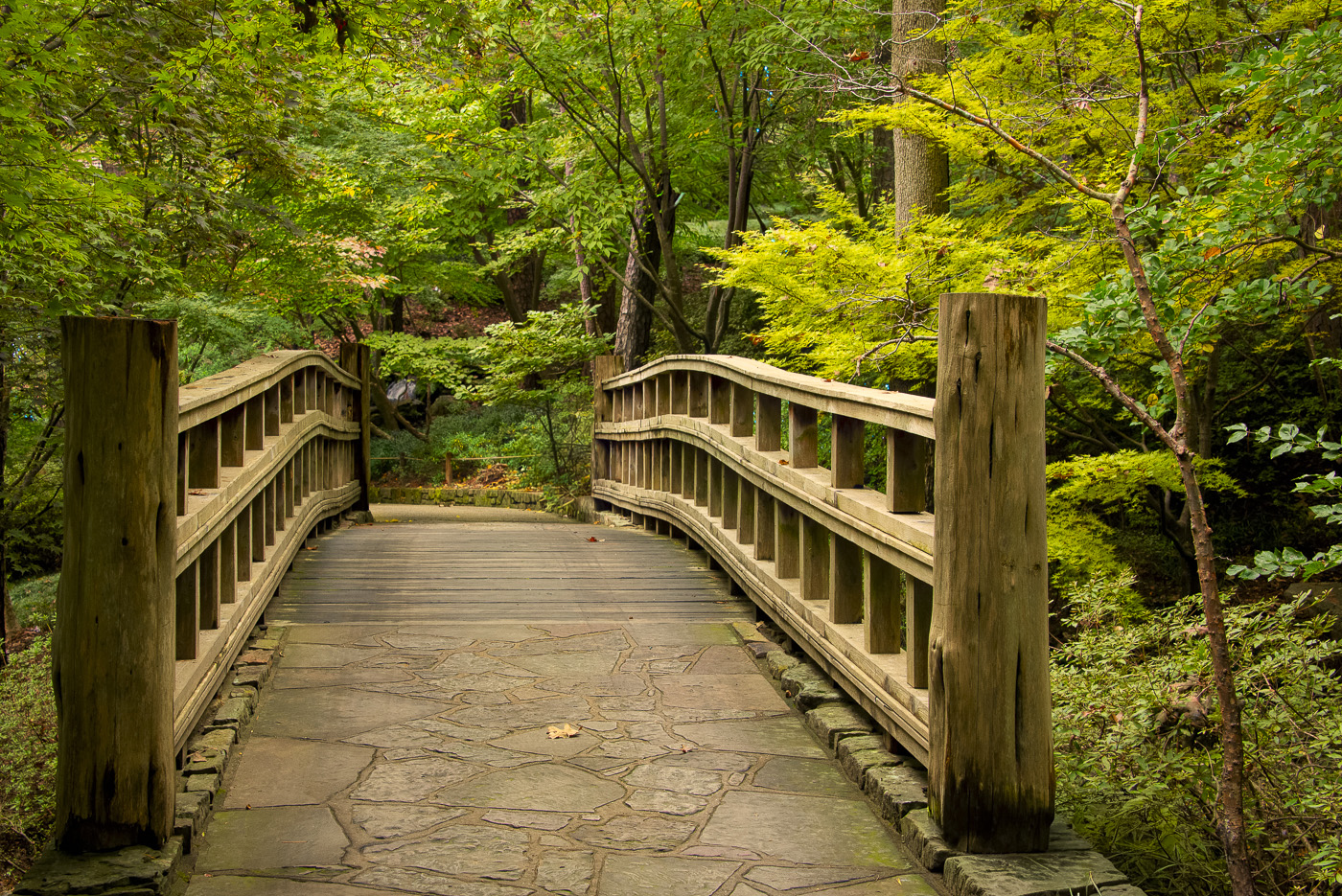
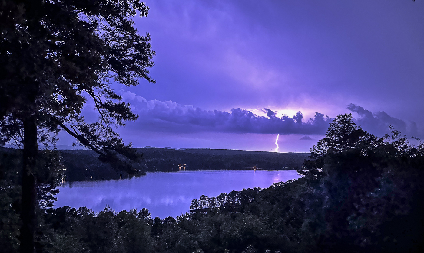
|
| Group |
Round |
C/R |
Comment |
Date |
Image |
| 2 |
Oct 21 |
Comment |
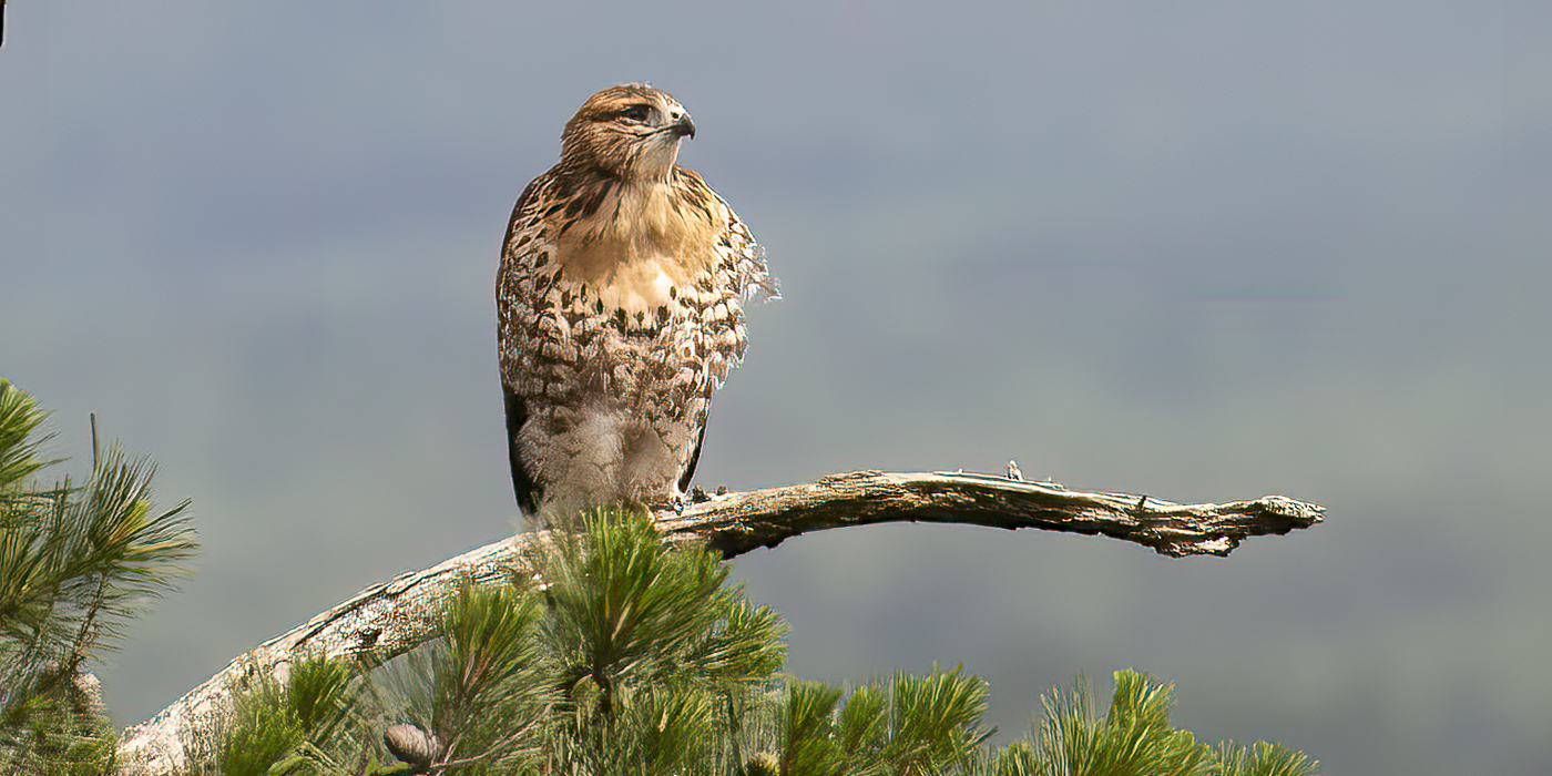
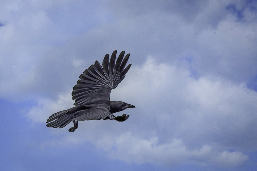
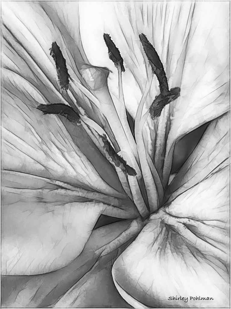
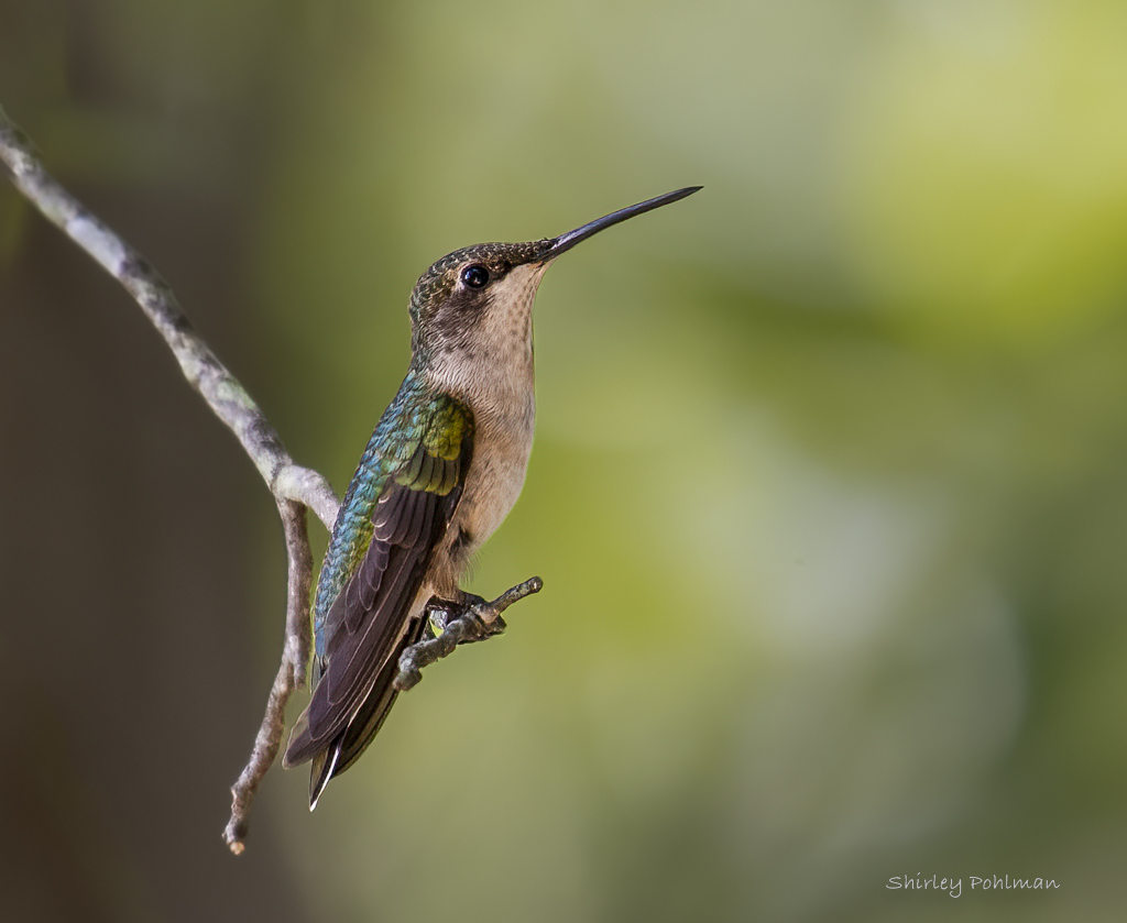
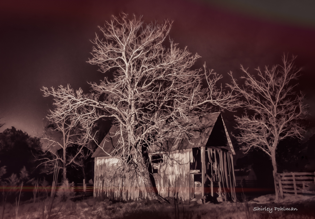
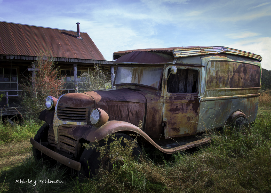
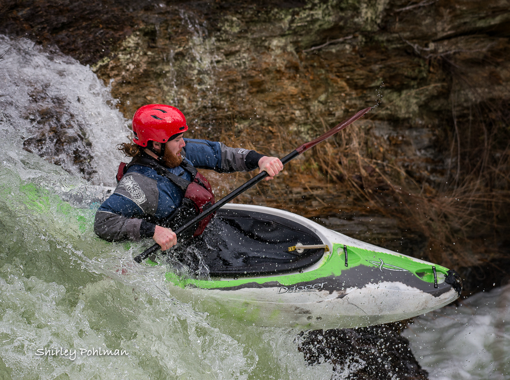
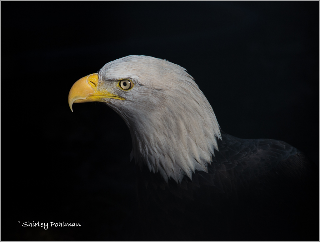
In this game a bit late. I intentionally waited to see what others had to say because I just didn't know what to say other than I like the authentic appearance. If you were doing it again in your couple of minutes that you have, I would suggest that his head not be in such an upright position because I feel that appears to be more posed. But I don't really know what I am talking about! I like the way Martin darkened the background some more, which resulted in removing the look of a loading dock. I love it and admire you for taking on these challenges. I am not brave enough but like your suggestion of starting with festivals. |
Oct 22nd |
| 2 |
Oct 21 |
Comment |
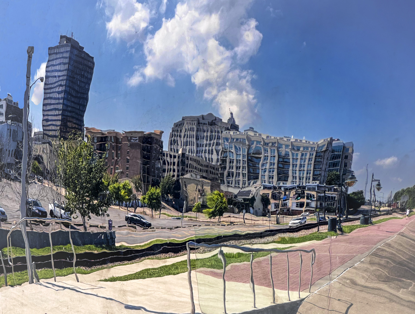
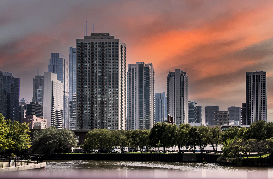
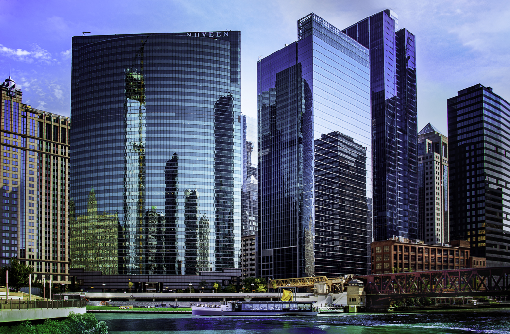
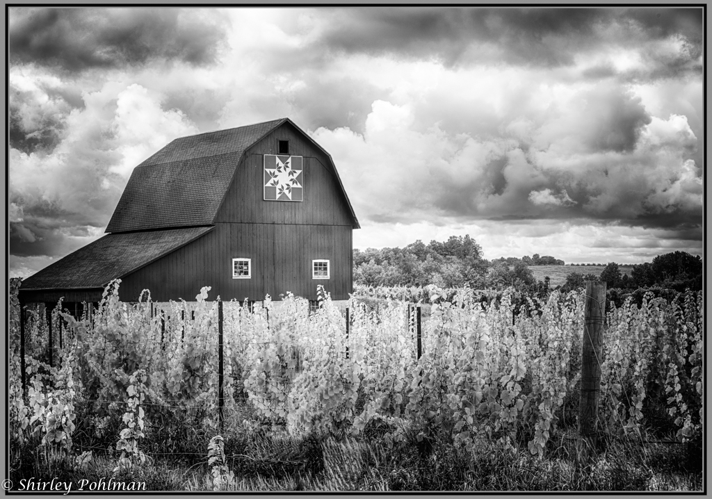
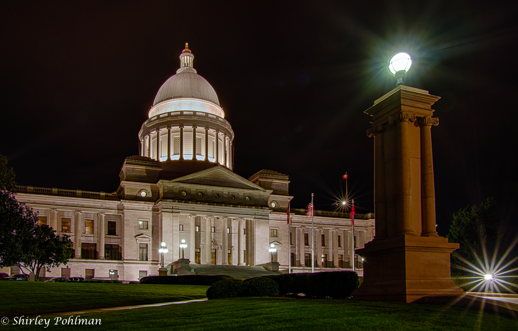
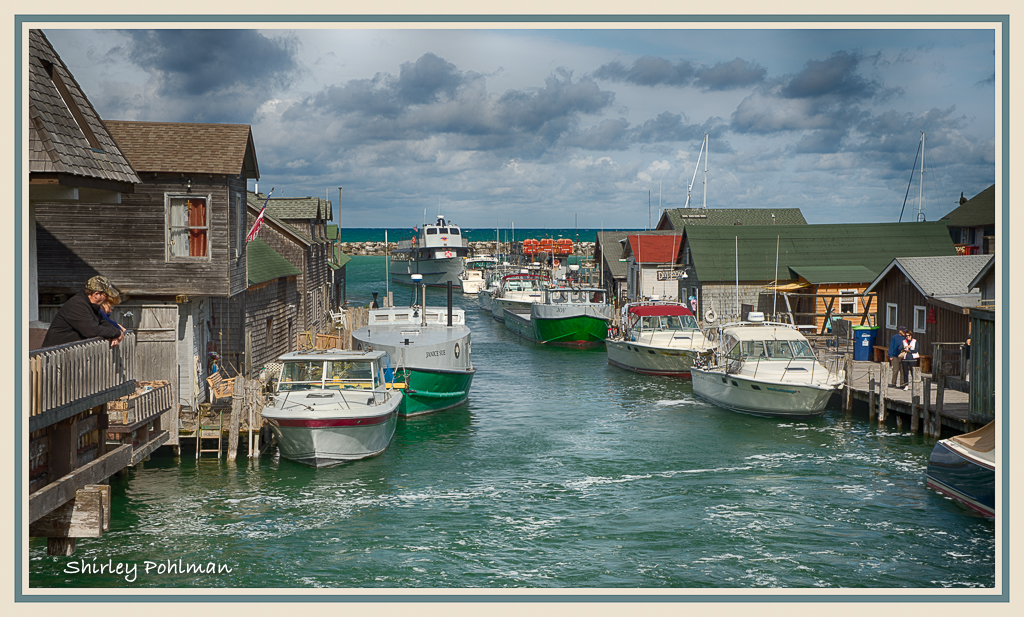
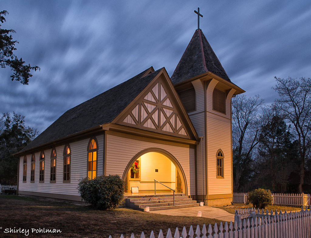
I'm getting in this a bit late because I hadn't previously noticed you had submitted your image. I wish that we got notice every time an image is submitted.
I love your capture and like Martin's crop. I feel the dramatic sky is not lost while having the home pop more. I think the tilt of the building gives it a wonderful precarious feeling! I just purchased Topaz DeNoise and am looking forward to using it since some in our Club have had great success with it. |
Oct 22nd |
| 2 |
Oct 21 |
Reply |
Thanks, Martin. See edit by Jacqueline's comments. |
Oct 22nd |
| 2 |
Oct 21 |
Reply |
Thanks, Jim. See edit by Jacqueline's comments. |
Oct 22nd |
| 2 |
Oct 21 |
Reply |
Thanks Piers. See edit by Jacqueline's comments. |
Oct 22nd |
| 2 |
Oct 21 |
Reply |
Thanks, Karen. See edit by Jacqueline's comments. |
Oct 22nd |
| 2 |
Oct 21 |
Reply |
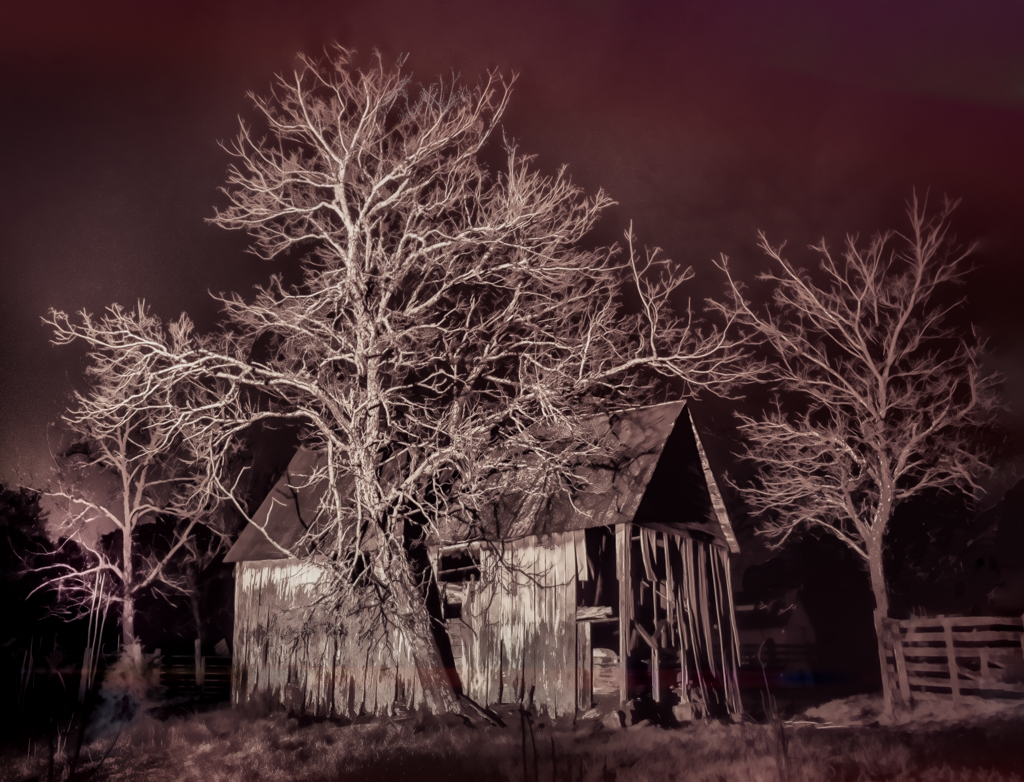
Made edits according to suggestions. Got rid of grayish area in upper right thru Photoshop, cropped left, tried to get rid of red lines and glow at top of left trees through Lightroom. |
Oct 22nd |
 |
| 2 |
Oct 21 |
Reply |
Thank you, Jacqueline. Silver Effex Pro is part of the Nik collection. I chose it because I didn't wanted to keep some of the red tones, and it does give you more ability to work, especially in being able to work more in specific areas. I'm going to attempt to edit according to some of the suggestions above. |
Oct 22nd |
| 2 |
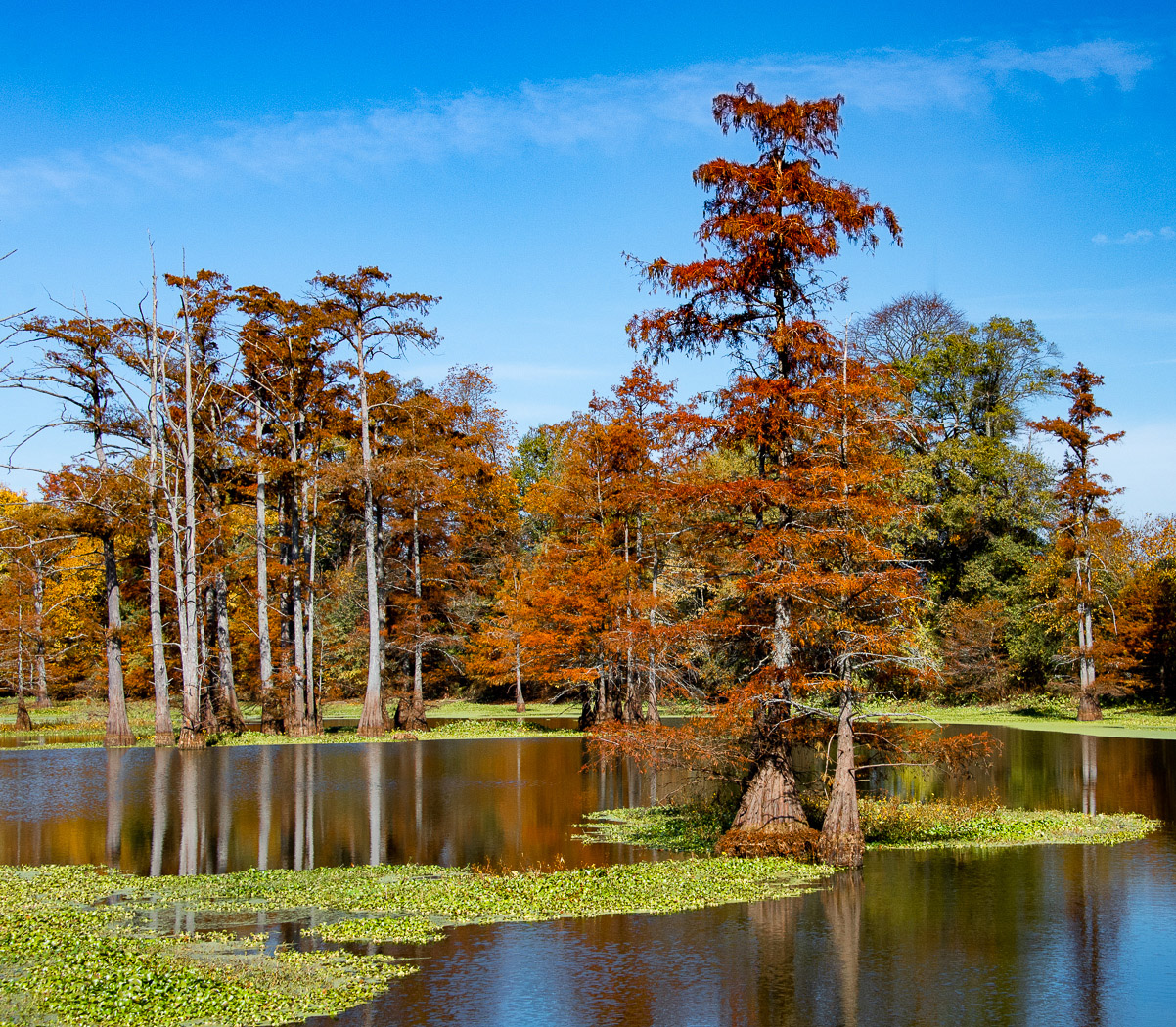
Oct 21 |
Comment |
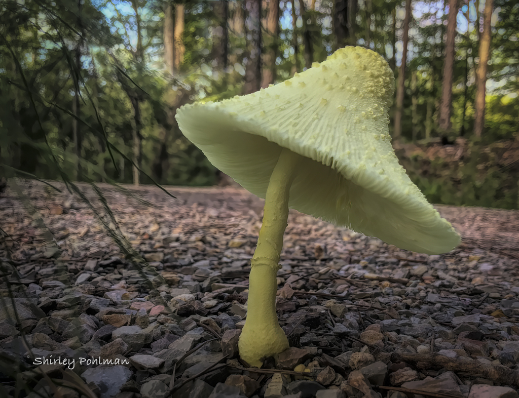
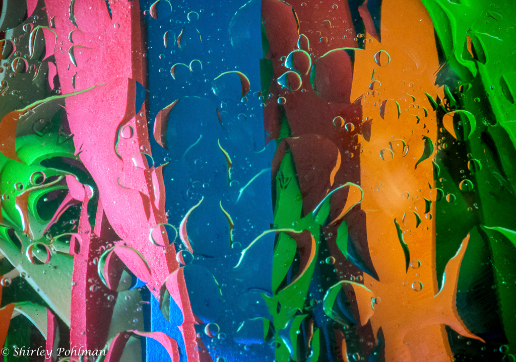
There are no prettier colors than Bryce Canyon, and you have captured them well. I wonder if you cropped some of the top of the picture after taking it. I have the feeling I want to see more at the top since it appears that you clipped off some of those small peaks. If you can't recover them, I feel it might be better if you cropped a little more instead. Hope you were able to avoid the smoke on your trip. |
Oct 6th |
| 2 |
Oct 21 |
Comment |
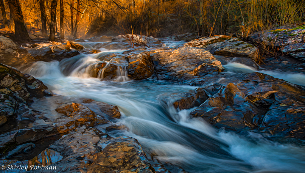
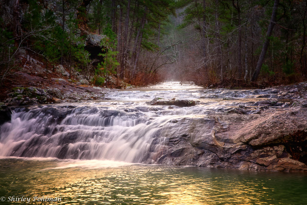
Karen, I believe each of your images will work. On the landscape, I would suggest you crop about half from above the falls and a good portion off the left. That, I feel, will make the two sets of falls appear to be closer together and result in one center of interest. Of course, work on the brightness on the rocks and add some dimension to the greenery on the right by changing some of the tones. I would crop some off the top on the portrait falls. I do like the angle on that for the lower falls. We all have our own opinions of how the water should look. My personal opinion would be to have a little softer than you have by longer exposure. Would suggest that you use polarizer or neutral density filter to help with the brightness. Have fun! |
Oct 6th |
| 2 |
Oct 21 |
Comment |
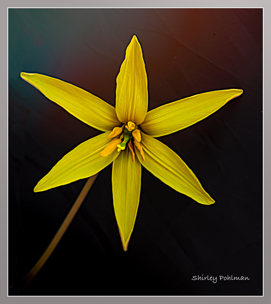
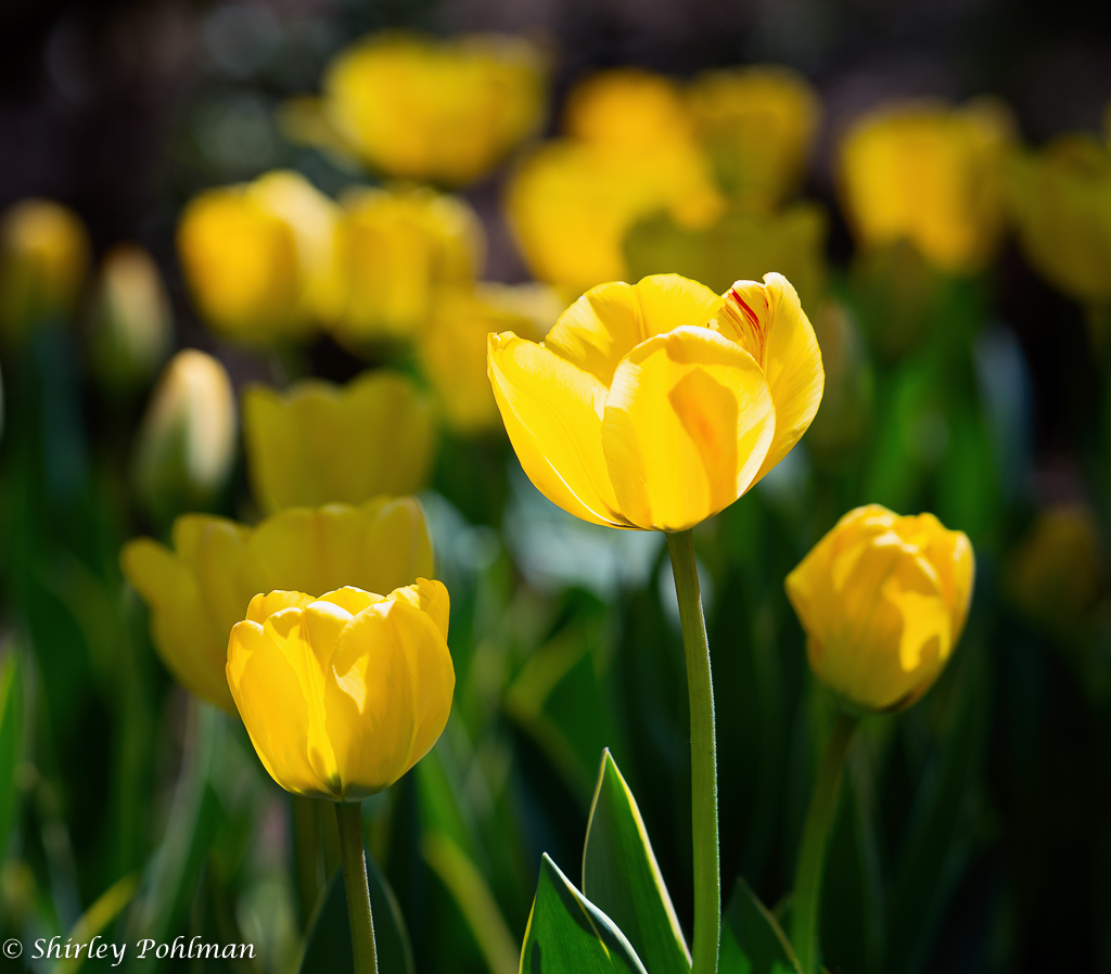
Very impressed with your editing, especially with denoise. I think it really made the image pop by rotating it. As mentioned by the others, I do feel the yellow is a bit bright. Wonder if you could use the radial filter or graduated filter in Lightroom to tone in down. |
Oct 6th |
| 2 |
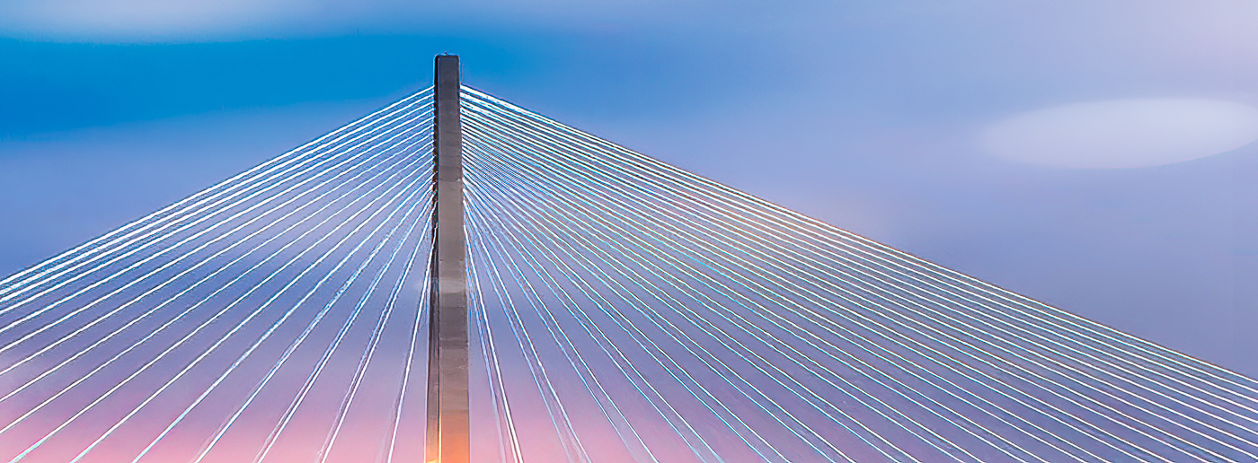
Oct 21 |
Comment |
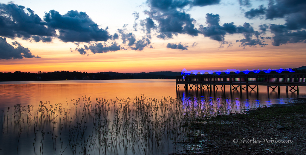
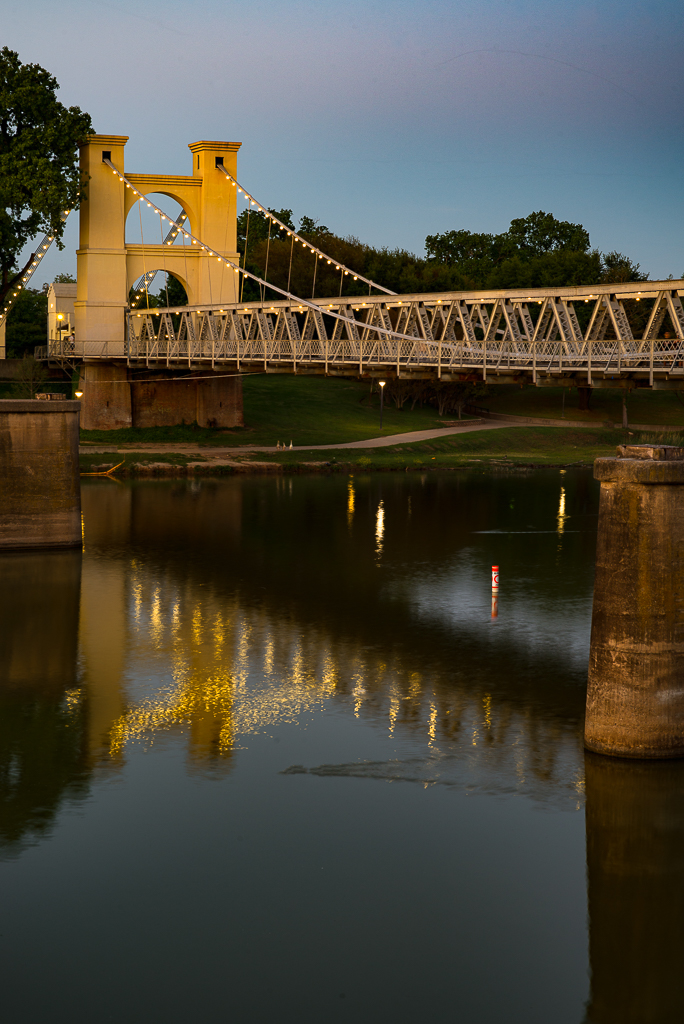
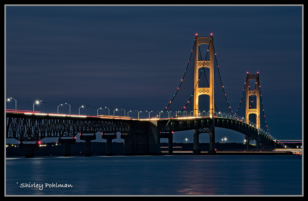
Jim, I like how the image draws me through the bridge and down the road. I'm wondering if you used a long lens that resulted in the compressed appearance of the road. What impresses me most is the contrasting colors, not only between the bridge and the landscape but also within the landscape itself. I do have the feeling that the bridge is out of balance. It appears you might have attempted to straighten, resulting in losing some of the image on lower left and upper right hand corners. Love the story that could have come with this bridge. Do you know what year it was built? |
Oct 6th |
6 comments - 6 replies for Group 2
|
6 comments - 6 replies Total
|