|
| Group |
Round |
C/R |
Comment |
Date |
Image |
| 2 |
Sep 21 |
Reply |
Thanks, Kurtis. I made lots of mistakes on this one and hope to have another try. |
Sep 8th |
| 2 |
Sep 21 |
Reply |
Thanks for the detail information on your editing. Most of that is beyond my knowledge but hoping to gain a little at a time. Unfortunately, the next time I go to use something in layers, I forget how I previously did it. Such is the process of age!
|
Sep 7th |
| 2 |
Sep 21 |
Reply |
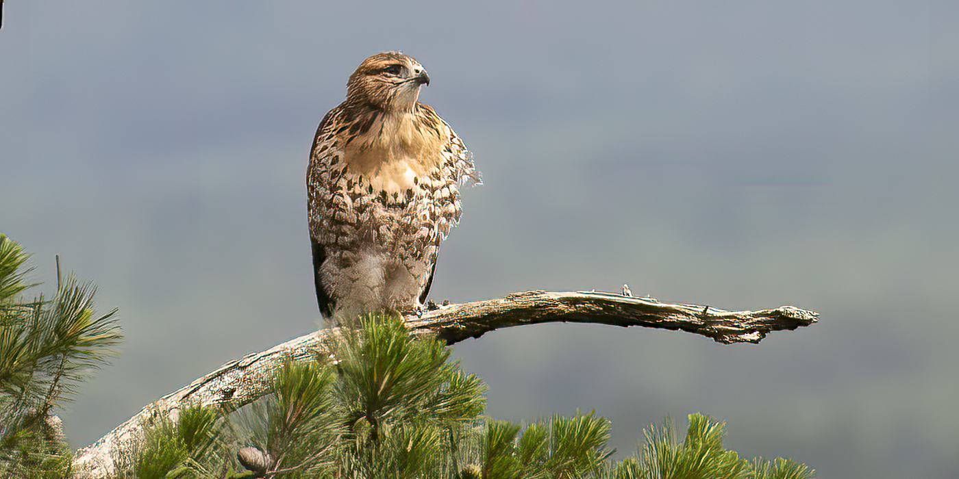
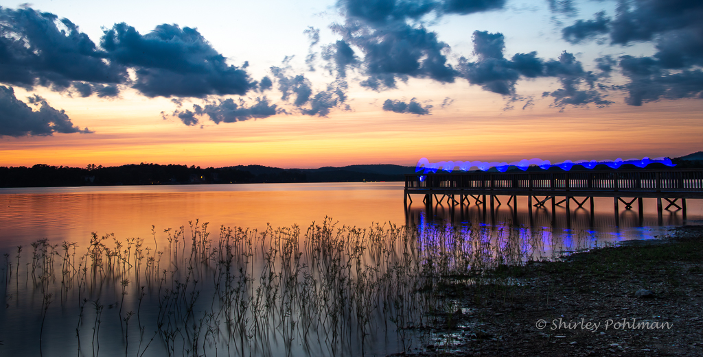
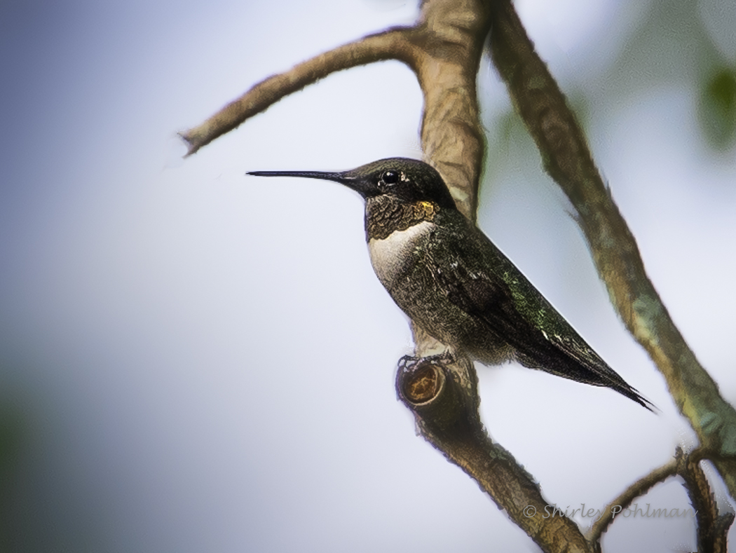
Simple as that! The osprey has migrated! |
Sep 7th |
| 2 |
Sep 21 |
Reply |
See my edits above |
Sep 7th |
| 2 |
Sep 21 |
Reply |
See my edits above |
Sep 7th |
| 2 |
Sep 21 |
Reply |
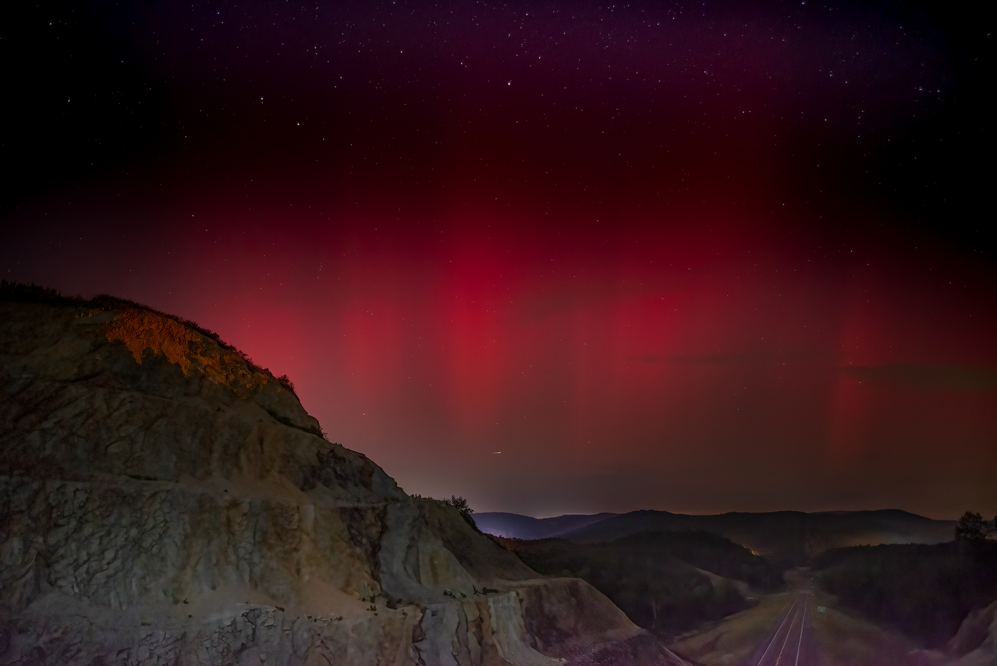
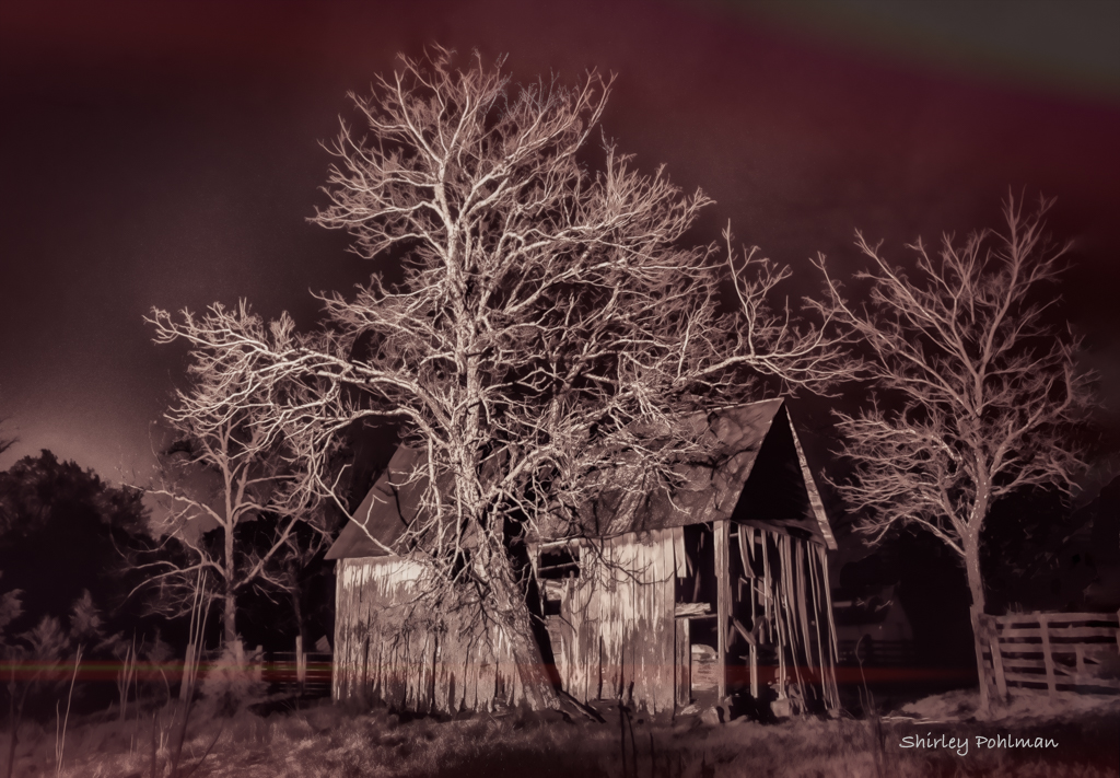
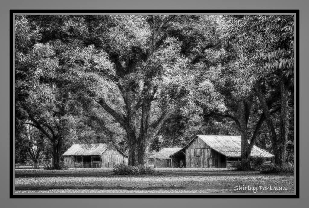
I have tried to fix the image according to the suggestions. I didn't realize that I did such a poor job of cloning leaves on tree to the left. Added a little more to the center tree. Added a little more smoke. Cropped bottom a little more. Does this help in your opinion? |
Sep 7th |
 |
| 2 |
Sep 21 |
Comment |
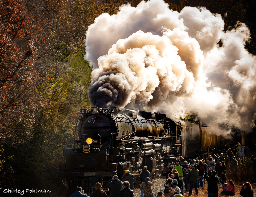
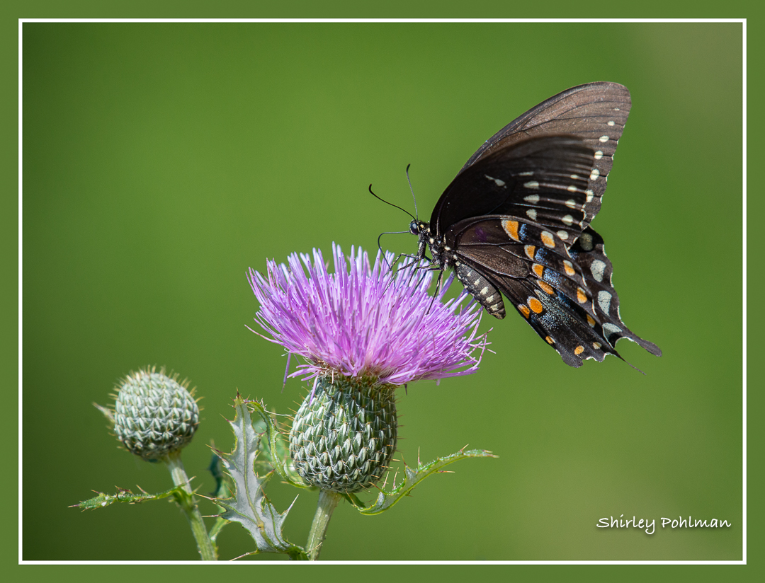
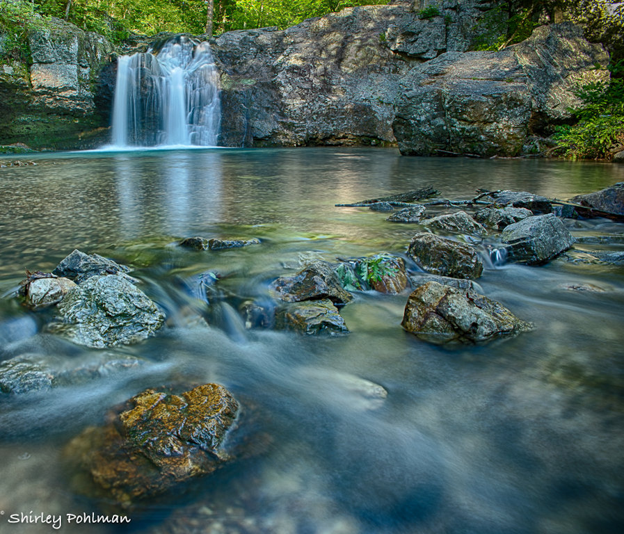
Martin, I pretty much use PS for cloning, and I wonder what tools you used for this, or was it actually Camera Raw that works a lot like Lightroom. Your editing, I feel, really gives it a dramatic feel. We have a nuclear power plant about 90 miles from us that continually has that steam billowing. Thanks for the inspiration for a photo!
|
Sep 4th |
| 2 |
Sep 21 |
Comment |
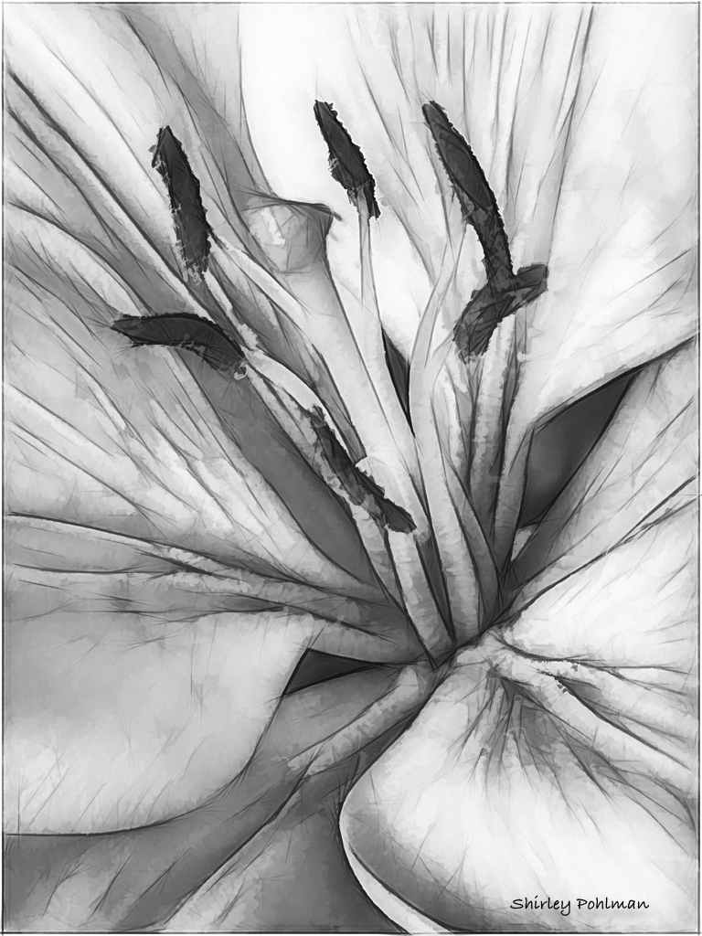
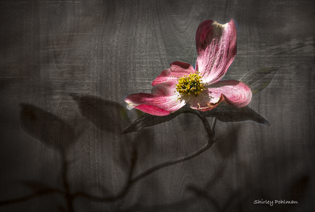
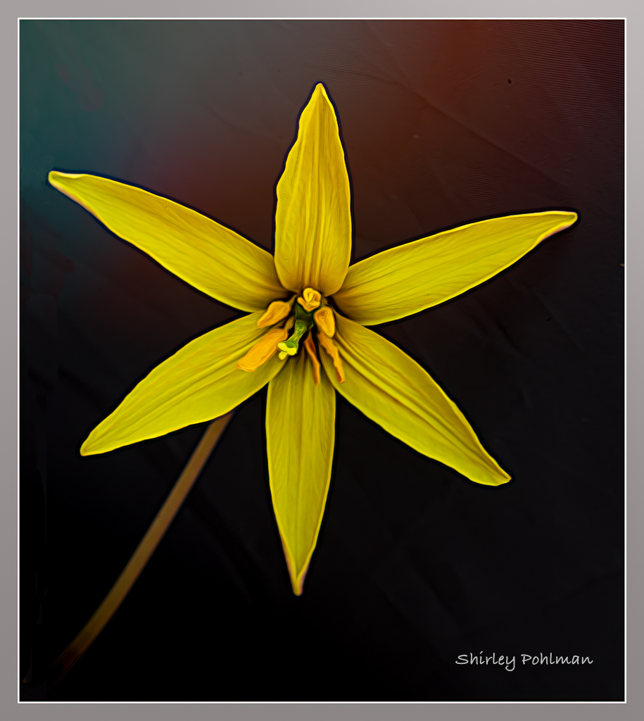
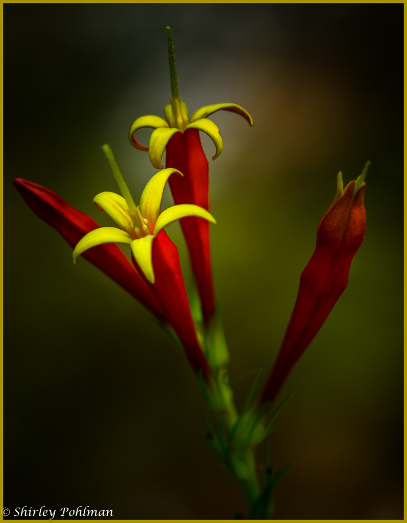
I love the editing. I believe the original had so many busy things in it that took away from the dominance of the lily. I especially like the Topaz filter you selected that leaves the lily with no doubt of it being the most important. I would also like to see another version without the green veggie on the left because I feel it is fighting for attention--perhaps changing to a square format. Lovely image. |
Sep 4th |
| 2 |
Sep 21 |
Comment |
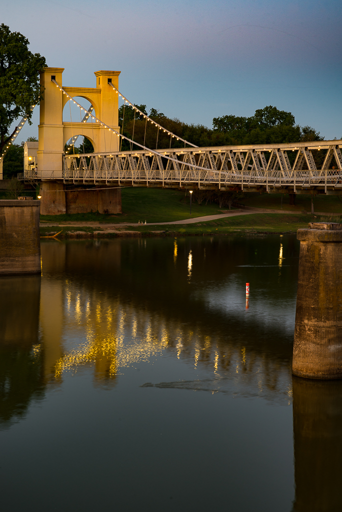
Karen, I really like the composition of this shot, and I feel your cropping brought that bridge within reach of the viewer. I like your sky replacement that gives a nice contrast to the bridge and mountain in the background. Beautiful. |
Sep 4th |
| 2 |
Sep 21 |
Comment |
Another nice piece of photo journalism. I agree with Piers' recommendation for the crop. I believe that would result in the red and blue complementing each other to give more pop. Wonder if that middle man was supposed to be in sync with the other two...maybe he couldn't kick that high! |
Sep 4th |
| 2 |
Sep 21 |
Comment |
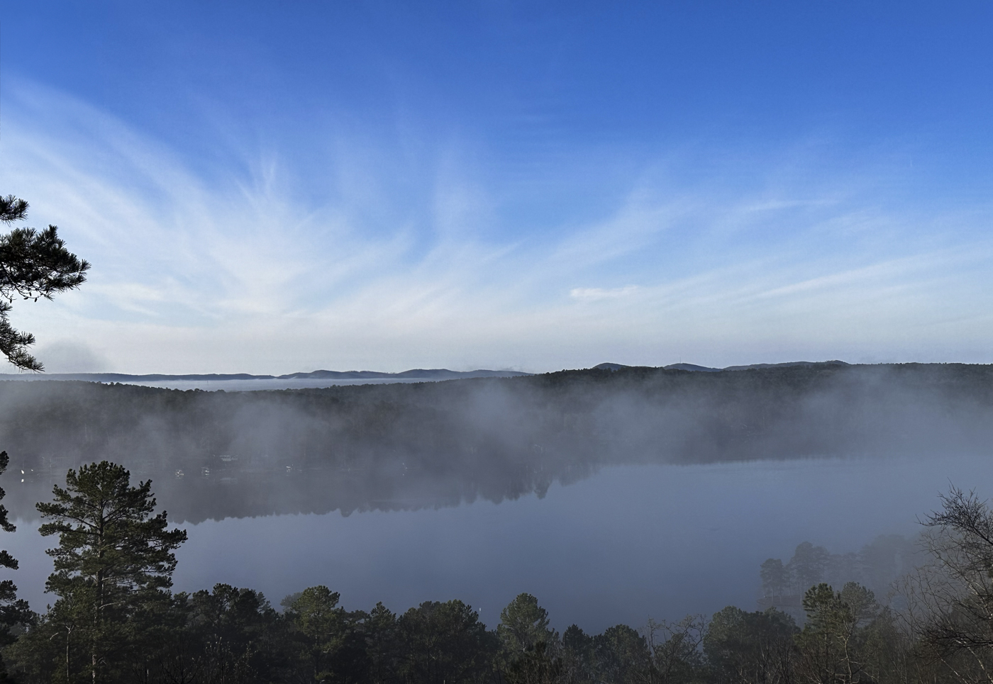
Amazing patience with your editing work. Without your original I would have thought that was all natural including the sky. Nice job. |
Sep 4th |
| 2 |
Sep 21 |
Comment |
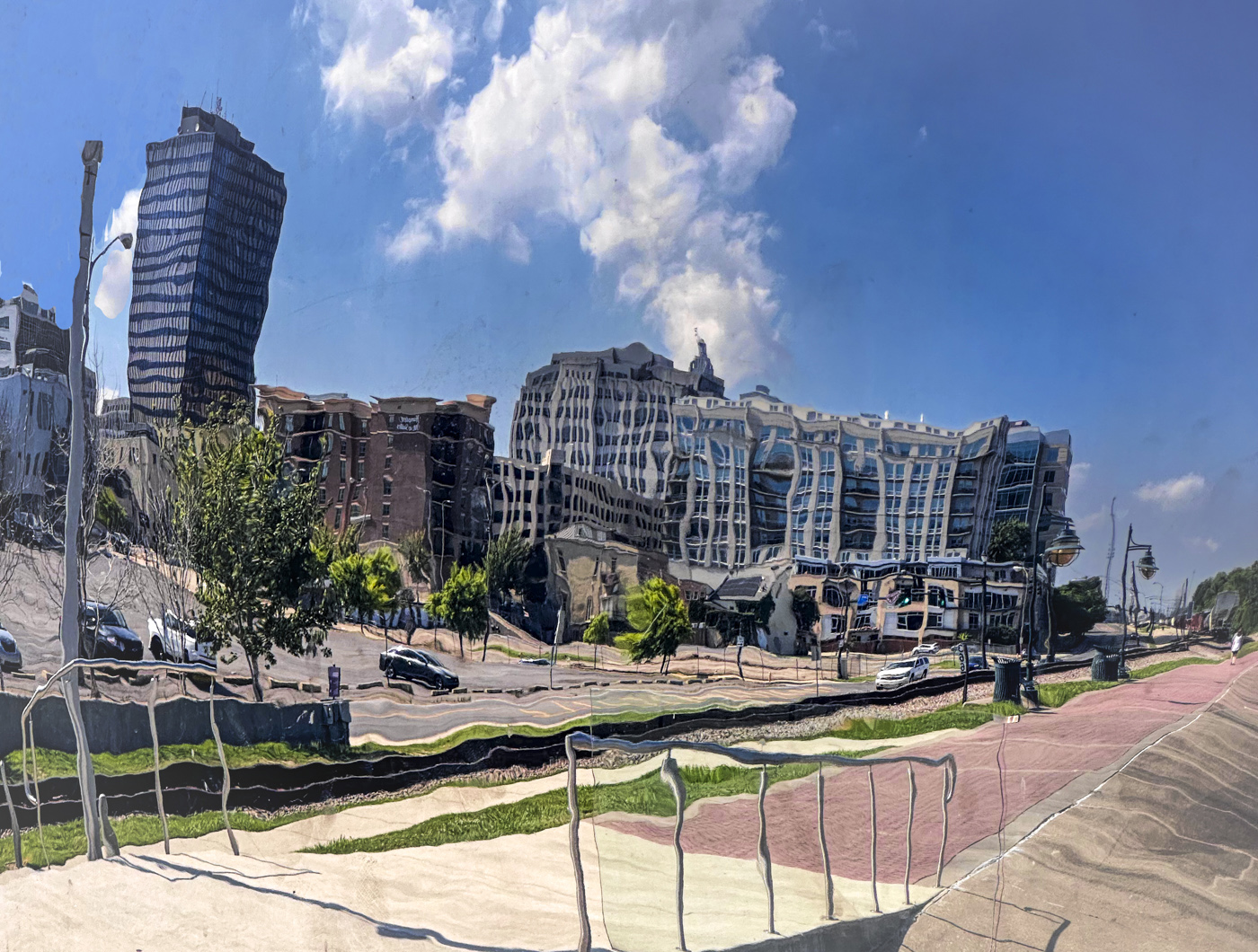
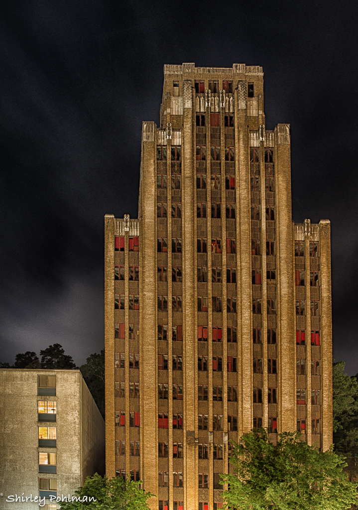
Jim, I like the way the colors pop compared to your original. I think that sometimes it is difficult to see the true effect of an oil painting texture on a smaller computer monitor because it seems to make certain areas stand out more. For instance, the sky doesn't appear to have the same texture as the building, but that is just because it shows more drastically. Thus, I would suggest toning down the sky texture some. I'd also send a letter to the historic society group there and ask them to remove that pole!! Would love to visit St. Augustine. Lived in Gainesville for five years many moons ago and only went to the beach in St. Augustine. Perhaps back in the sixties they didn't claim it as historic! |
Sep 4th |
6 comments - 6 replies for Group 2
|
| 35 |
Sep 21 |
Comment |
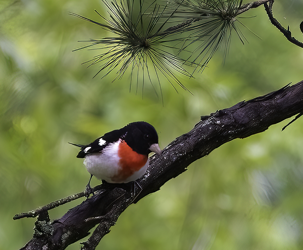
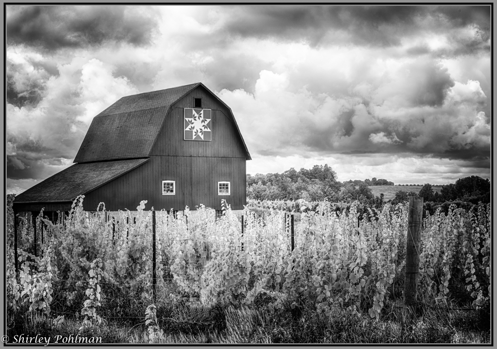
Sharon, this is one of my favorite IR works of yours. I wish I had been on that ride with you! |
Sep 7th |
1 comment - 0 replies for Group 35
|
| 38 |
Sep 21 |
Comment |
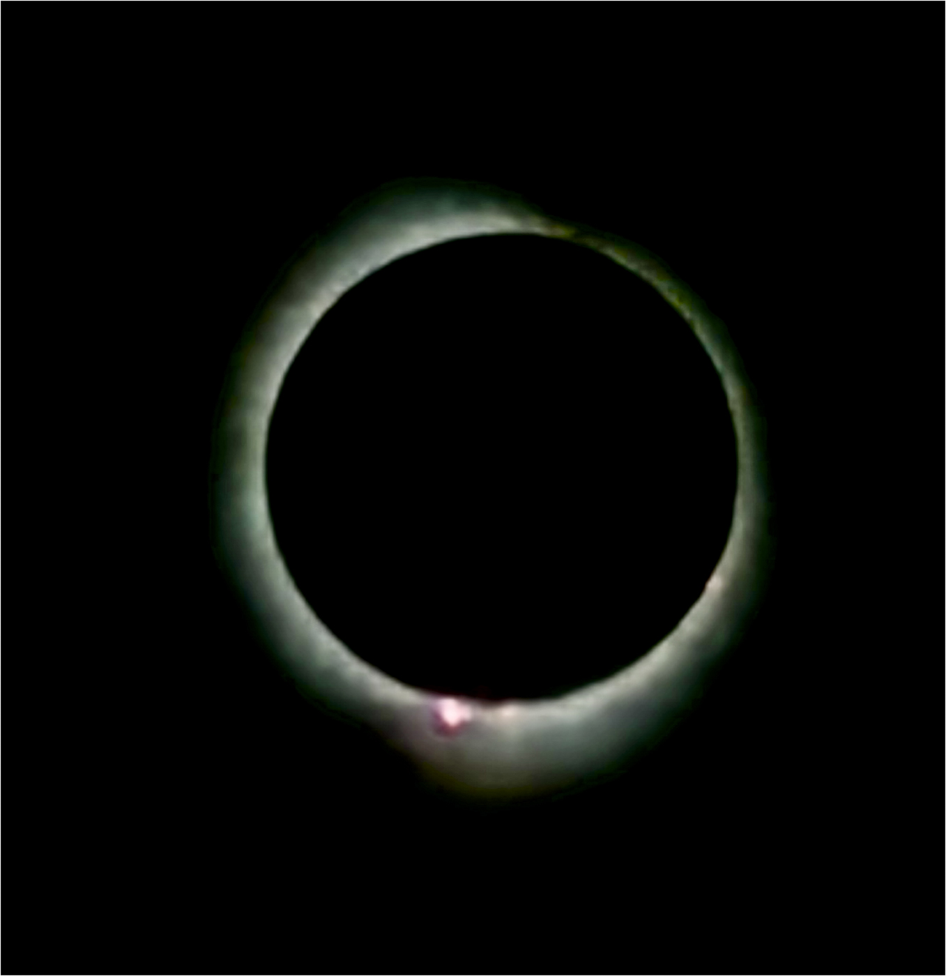
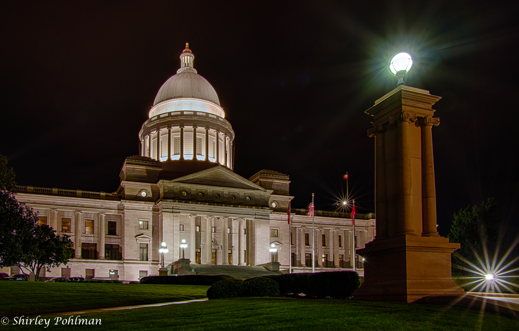
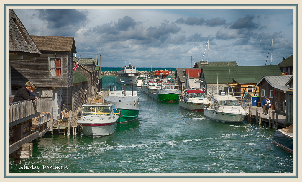
Kurtis, you definitely are a good planner. If I were one of you guys, I would have been out there with you the middle of the night. This is, in my opinion, the best, but you have also posted some other great shots. Take a look at mine in Group 2 to see what editing I had to do because of my poorly planned shot! I hope it'll come through again. |
Sep 7th |
1 comment - 0 replies for Group 38
|
8 comments - 6 replies Total
|