|
| Group |
Round |
C/R |
Comment |
Date |
Image |
| 2 |
Jan 21 |
Reply |
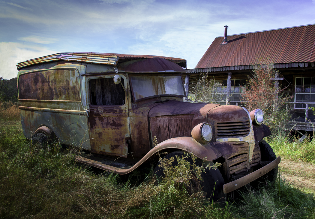
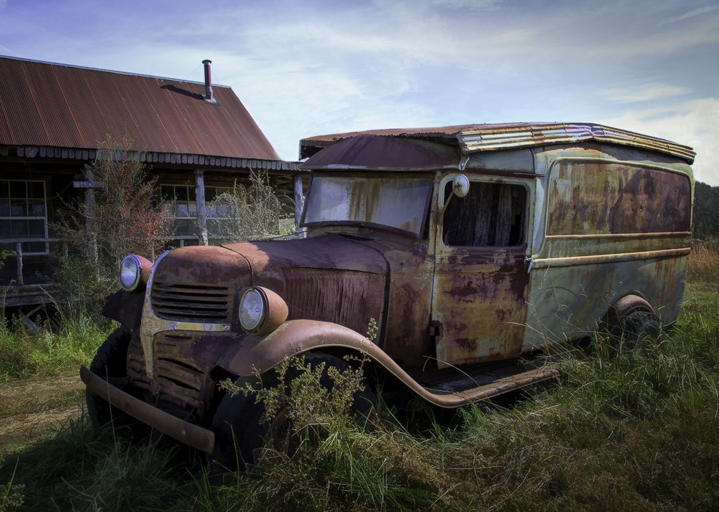
Thanks, Beverly. I debated bringing out the vibrancy more but didn't know if it would take away from the authentic look. But I like what you did. |
Jan 22nd |
| 2 |
Jan 21 |
Reply |
Thank you, Jim, and welcome to our group. I look forward to seeing your images--especially from all your travels. But you might rather work with an old truck! |
Jan 17th |
| 2 |
Jan 21 |
Reply |
How's this? Used gradient tool and flipped! |
Jan 11th |
 |
| 2 |
Jan 21 |
Reply |
Thanks! See my edit above. |
Jan 10th |
| 2 |
Jan 21 |
Reply |
Thanks for suggestion for the sky. I desaturated the sky. Do you think this helps? |
Jan 10th |
 |
| 2 |
Jan 21 |
Reply |
I think your re-edit really makes the mill pop! |
Jan 10th |
| 2 |
Jan 21 |
Reply |
Great!! Thanks for taking my suggestions. |
Jan 10th |
| 2 |
Jan 21 |
Comment |
Jacqueline, I like how you were able to isolate the two slippers and the color that you used for the background. The magnetic wand (that I've not really used much) does take practice, and I know there are ways that you can clean up the edges. But let's not talk about that. I did copy your image and played with it in Lightroom. I used the gradient tool on each corner of the background decreasing exposure while going to center. Then I did some highlighting on parts of the flowers. The result was that it gave it a more 3-D effect taking away the flatness. I don't like re-posting someone's picture because I would rather see what you could do with the suggestions. Good luck in experimenting. |
Jan 9th |
| 2 |
Jan 21 |
Comment |
Had plans to see that mill a few years ago but a hurricane hit the east coast that sent us to the west instead. I feel this is a lovely image with good detail and color in the mill itself. My eyes fight for a center of interest, which was probably unavoidable for you because of where you could stand. I think it would be difficult to do any cropping. I wonder how it would look in a square format, cropping some of the trees on the right (and toning them down), take out some of those beautiful flowers. That might not work unless you totally cloned out what was remaining, as well as cropping the growth at bottom. As an alternative, perhaps you could use the gradient tool to tone down the trees and bring more light on the mill. I love it even if you left as is. |
Jan 9th |
| 2 |
Jan 21 |
Comment |
Beautiful image of the flowers, especially with the composition of the different angles of each flower. I feel the image is sharp and the contrasting colors in each petal is a beauty of its own. I do think that your texture has gotten too busy and takes away from the central interest of the flowers themselves. Perhaps if you could smooth out the texture some, it would not distract from the flowers as much. |
Jan 9th |
| 2 |
Jan 21 |
Comment |
Piers, excellent timing to wait until those lights came on! The lights accent the bridge so well, especially with the darker colors of the trees behind it, and the reflections in the water. I think you have done a great job in editing to bring out the sunset colors. My only suggestion would to perhaps crop out some water just below the lowest light reflection. I feel the reflection of the lights then would bring me into the picture more. |
Jan 9th |
4 comments - 7 replies for Group 2
|
4 comments - 7 replies Total
|