|
| Group |
Round |
C/R |
Comment |
Date |
Image |
| 2 |
Nov 20 |
Reply |
Thanks. I kind of like it better also unless it were an extreme tilt--one that looks intentional. |
Nov 15th |
| 2 |
Nov 20 |
Reply |
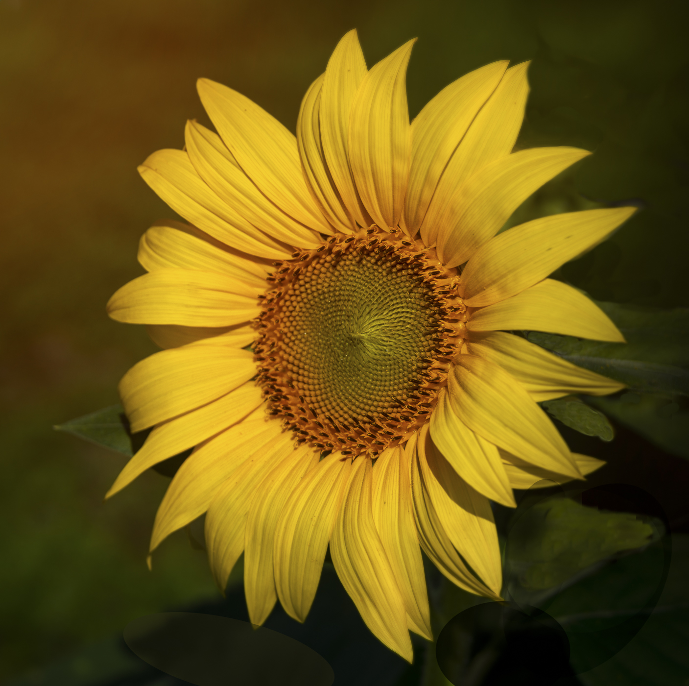
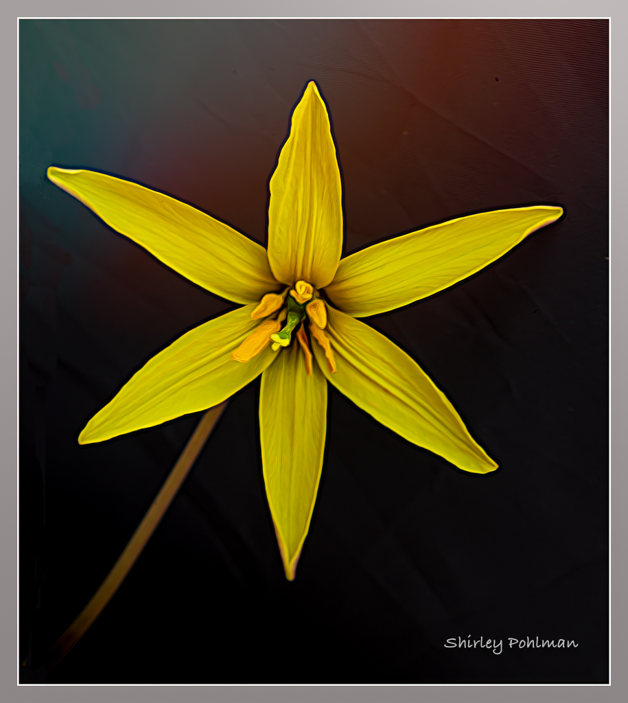
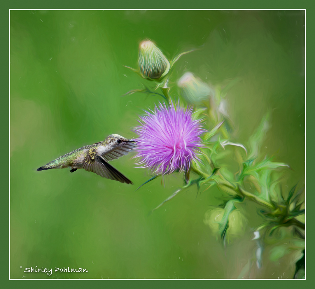
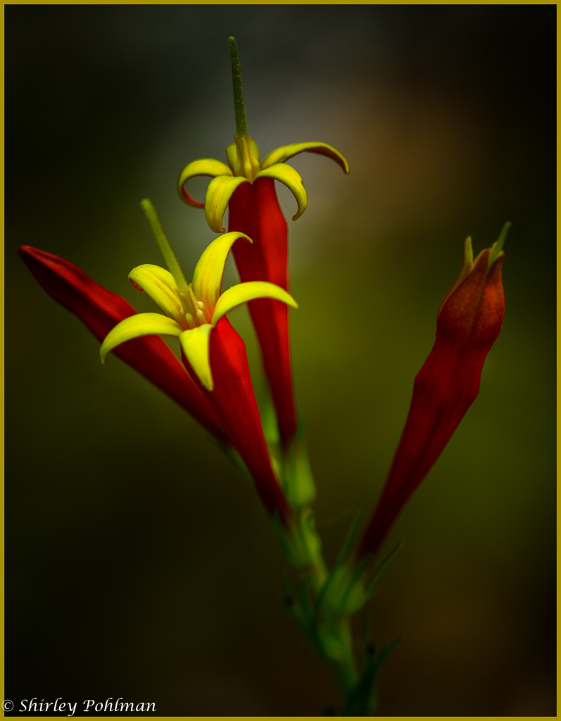
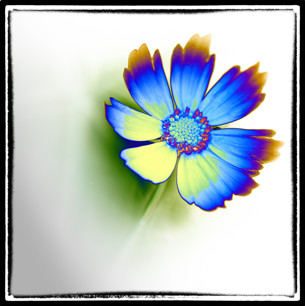
I believe it is a little better. I think the part that stands out as being out of focus is the white(yellow) in the center. I am not the one to tell you about sharpening, and maybe some of the others might be able to make some suggestion. I find that for an isolated area like that sometimes using the radial filter in Lightroom works using dehaze and clarity. I will be watching for other comments. |
Nov 12th |
| 2 |
Nov 20 |
Comment |
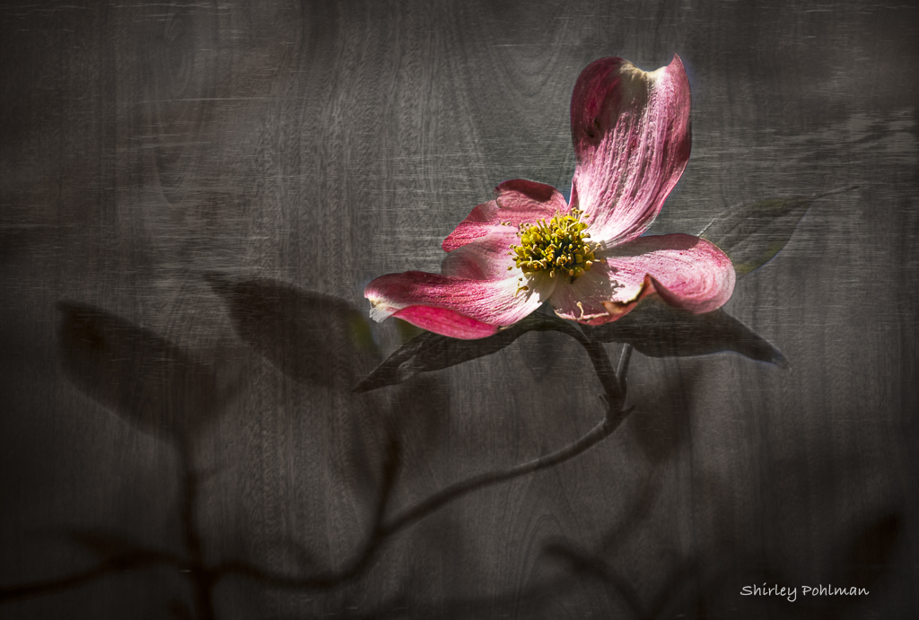
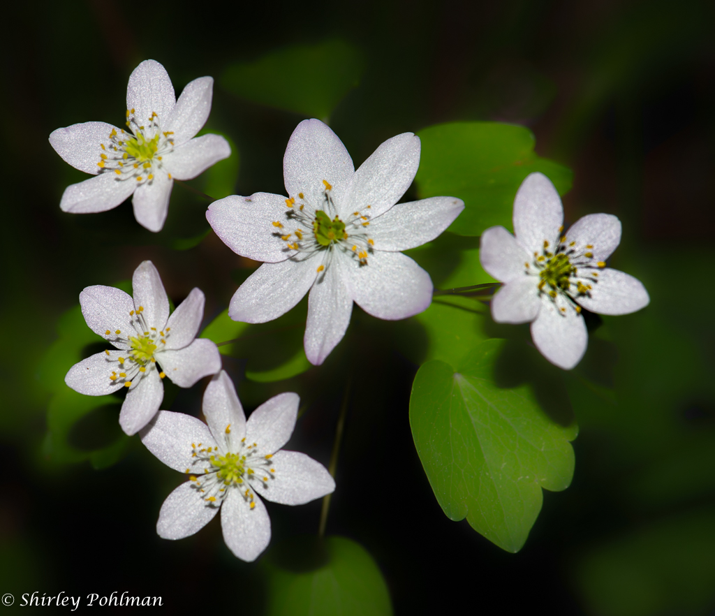
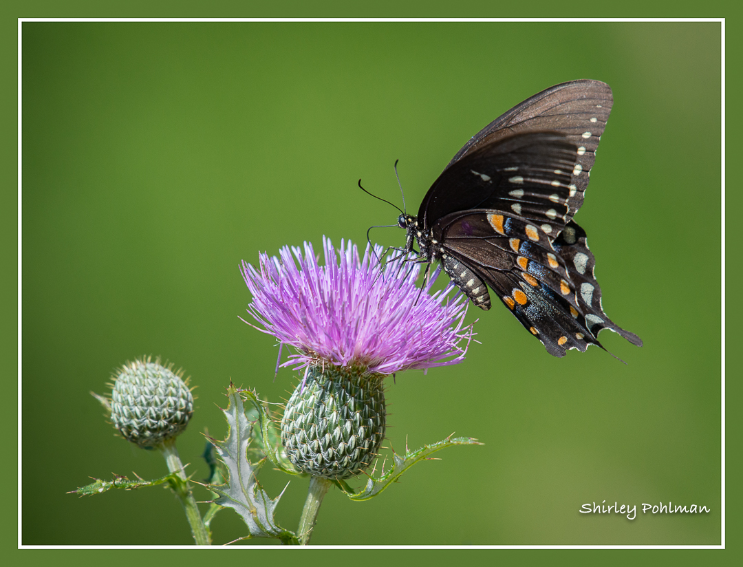
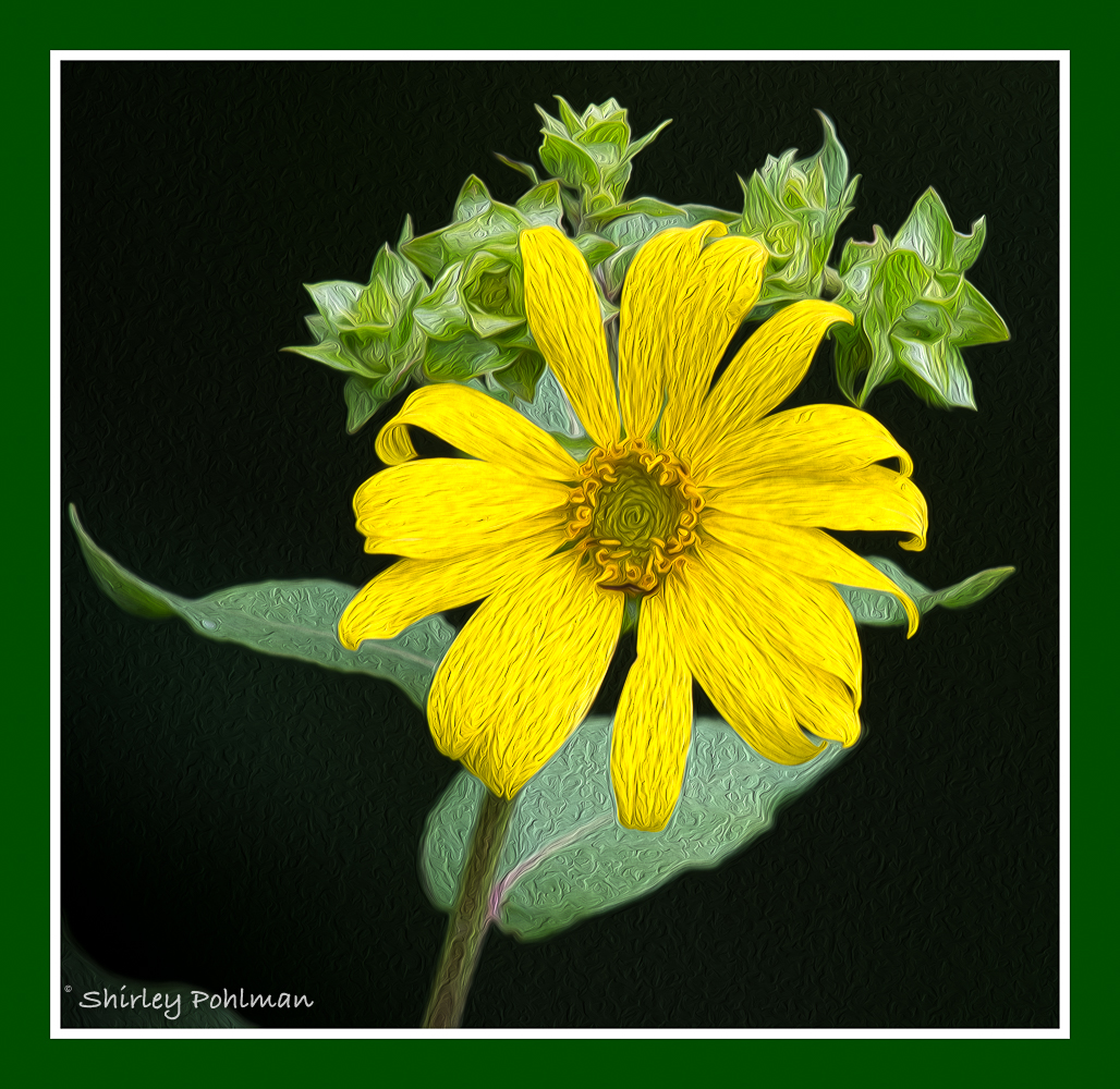
I love the composition of your image and the added line border. I feel the color balance between the flower and the background is beautiful. My one suggestion would be to see if you can sharpen the very center since my eye keeps wanting to look at that. Nice shot! |
Nov 11th |
| 2 |
Nov 20 |
Comment |
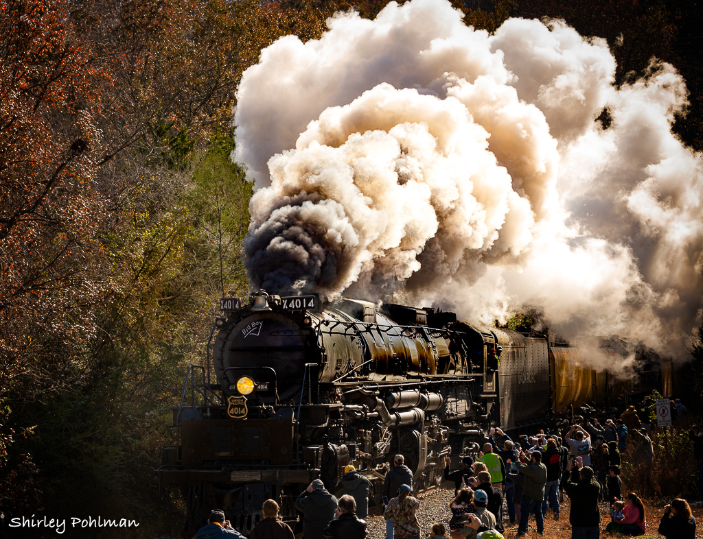
There is no doubt how my eyes are leading from the bottom with the wider section of smoke and narrowing to the top to the plane. I feel your color contrasts are right on! Nice shot. |
Nov 11th |
| 2 |
Nov 20 |
Comment |
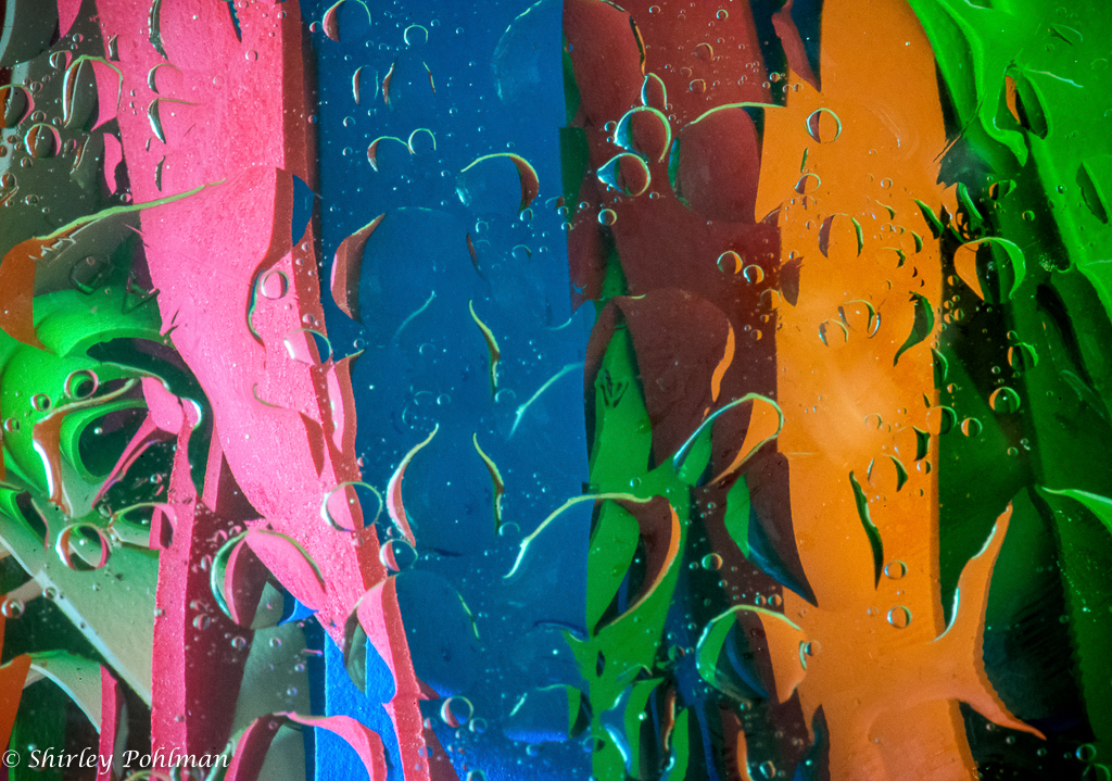
What a surprise to me. Before reading your description, my thought was that it was a broken Christmas light. I have no idea what a 3D backing sheet does, but I feel that your experiment worked well. I like how the center is surrounded by the small circle of colors and how you enhanced the lighting in the lower section. My eyes start there for the center of interest and then going around the entire image. My suggestion for its title: "Christmas Explosion" |
Nov 11th |
| 2 |
Nov 20 |
Comment |
Jacqueline, I took your suggestion of cropping on left and do like this much better. |
Nov 8th |
| 2 |
Nov 20 |
Reply |
|
Nov 8th |
 |
| 2 |
Nov 20 |
Reply |
Thanks, Jacqueline. Appreciate the suggestion. |
Nov 7th |
| 2 |
Nov 20 |
Comment |
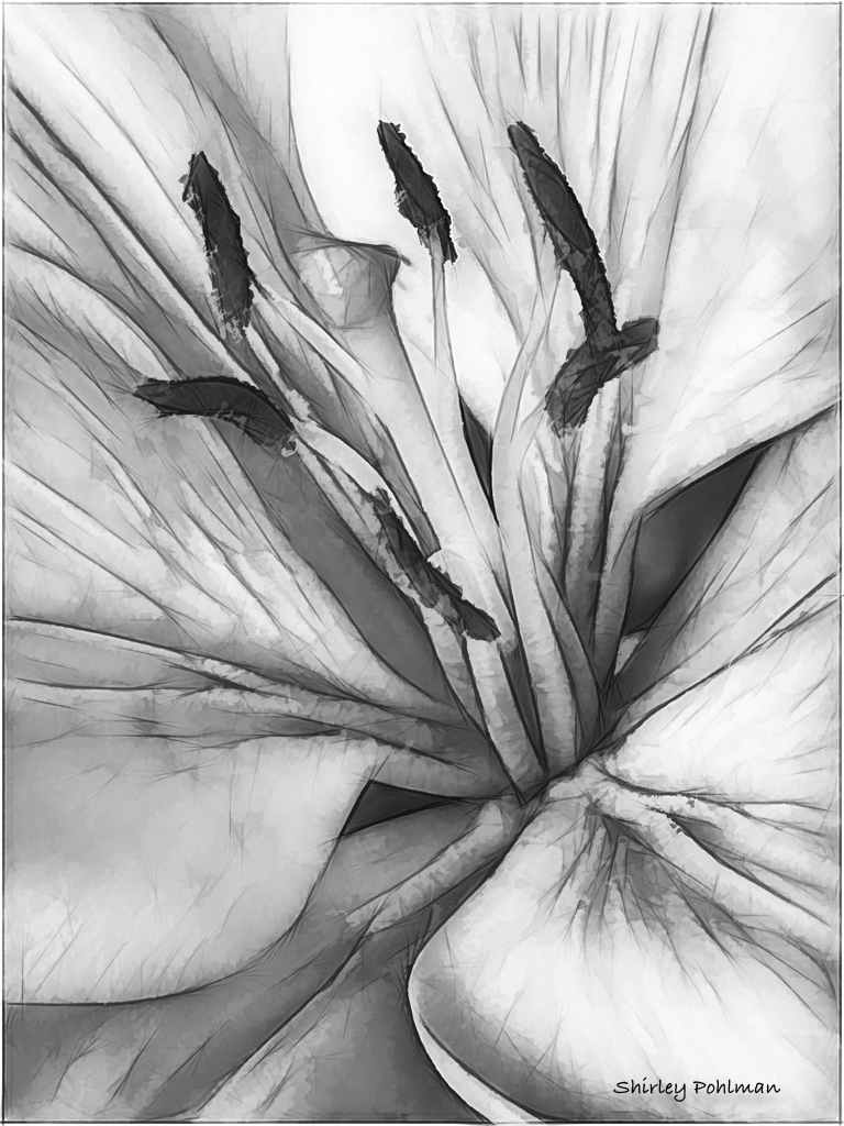
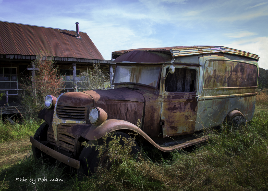
I am impressed with your eye to be able to see the beauty to photograph. I feel your background is perfect, and I like the way you have enhanced the seed color for the focal point. Since my eye is drawn to the darker upper portion on the right, I would suggest cropping the upper portion about mid-way through the darker section. I think it will then give more emphasis to almost a shooting star appearance. If there is any way you can clone out the one wider white strand that shoots up from the center bottom, I feel it will isolate the main attraction better. That's picky, and I think it's a wonderful shot and edit! |
Nov 5th |
| 2 |
Nov 20 |
Reply |
All in the eyes of the beholder, I like your second one better except perhaps the background and hair could have been left as you originally had it. In my opinion he still has that ruggedness without looking overdone. |
Nov 5th |
| 2 |
Nov 20 |
Reply |
Thanks! It was a fun image to work with. Would like to have done the night tour, but this worked. |
Nov 5th |
| 2 |
Nov 20 |
Reply |
Thank you Stephen for your comments and suggested edit. I see that your edit shows a slight soaring effect, which I like. Thanks! |
Nov 5th |
| 2 |
Nov 20 |
Comment |
I feel that you have done so well in capturing the ruggedness of this gentleman. His eyes are looking right at me. Changing this to B&W, in my opinion, gives him that character you were seeking I believe it is sharp, even to the point of seeing that one hair sticking out the side of his face. I like the way you changed the background, and I would not have noticed the added on canvas if you hadn't said anything. I know that this high contrast style is used all the time, but I wonder what it would look like if the skin definition weren't quite as strong. Just curious to know if it would look more natural. I feel it is a great shot and wouldn't suggest changing it but just a tad. |
Nov 1st |
6 comments - 7 replies for Group 2
|
6 comments - 7 replies Total
|