|
| Group |
Round |
C/R |
Comment |
Date |
Image |
| 2 |
Dec 19 |
Reply |
I am not a purist and love the change! |
Dec 19th |
| 2 |
Dec 19 |
Reply |
Thanks. It was fun. |
Dec 19th |
| 2 |
Dec 19 |
Reply |
Thanks, Sharon. Yes, I hope to use it in PJ, which is why I didn't do much editing. |
Dec 19th |
| 2 |
Dec 19 |
Reply |
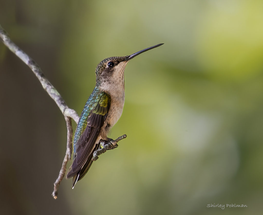
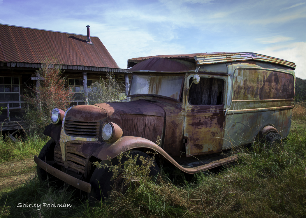
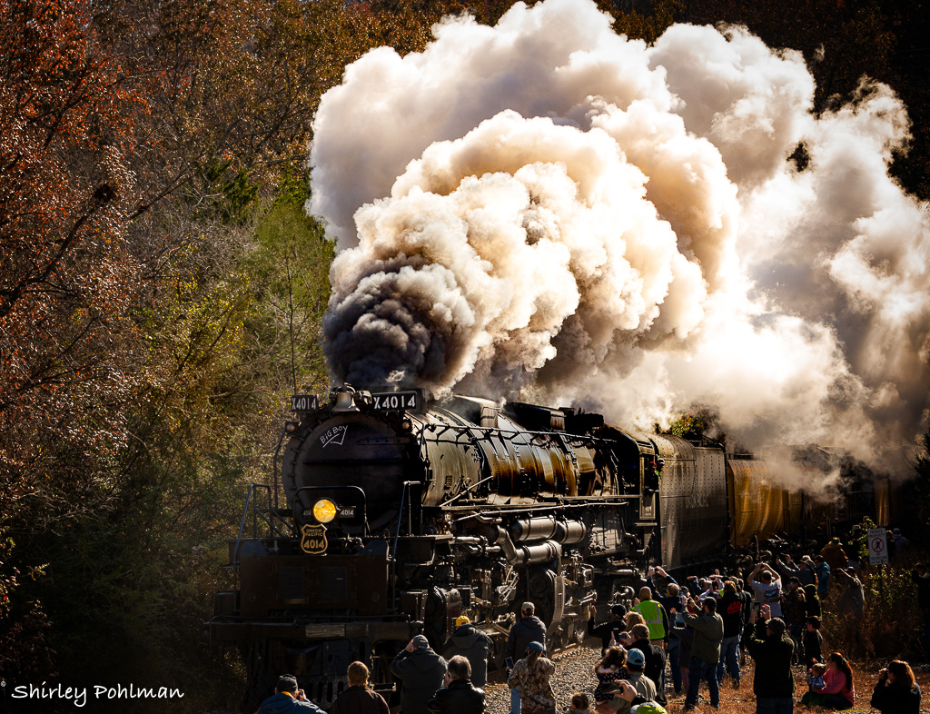
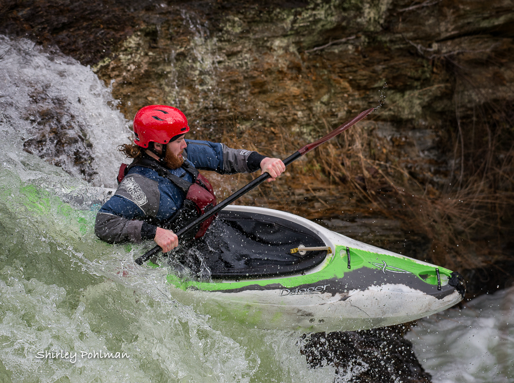
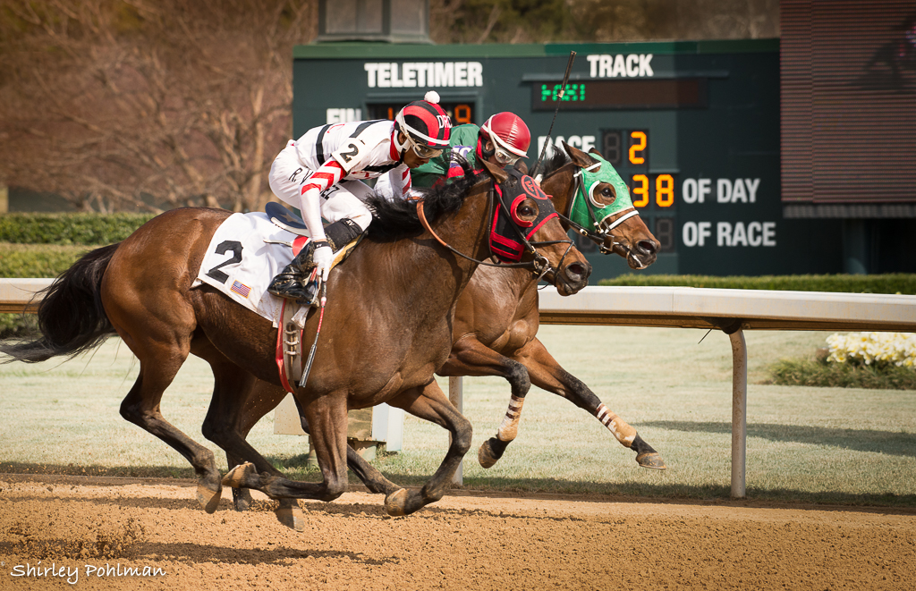
In looking back at some of the other photos, I see that is the car behind the engine that is yellow. So these are just shadows on it that make it look like rust. Thanks for your comments. Wish I had been able to chase it through the area. |
Dec 19th |
| 2 |
Dec 19 |
Comment |
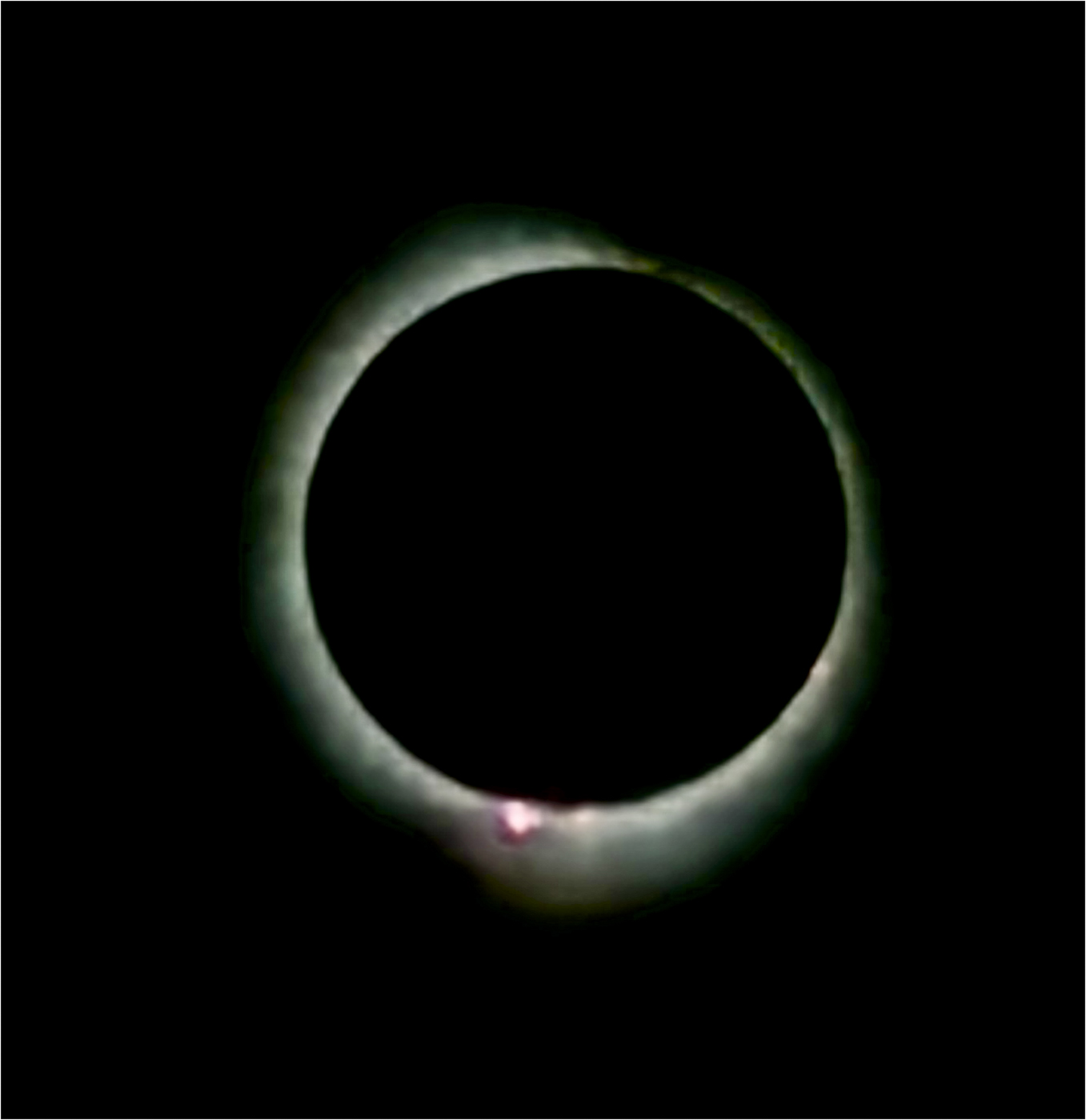
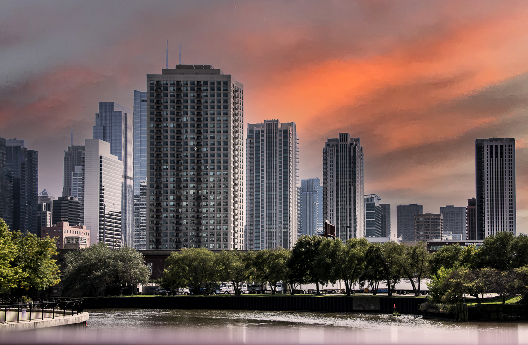
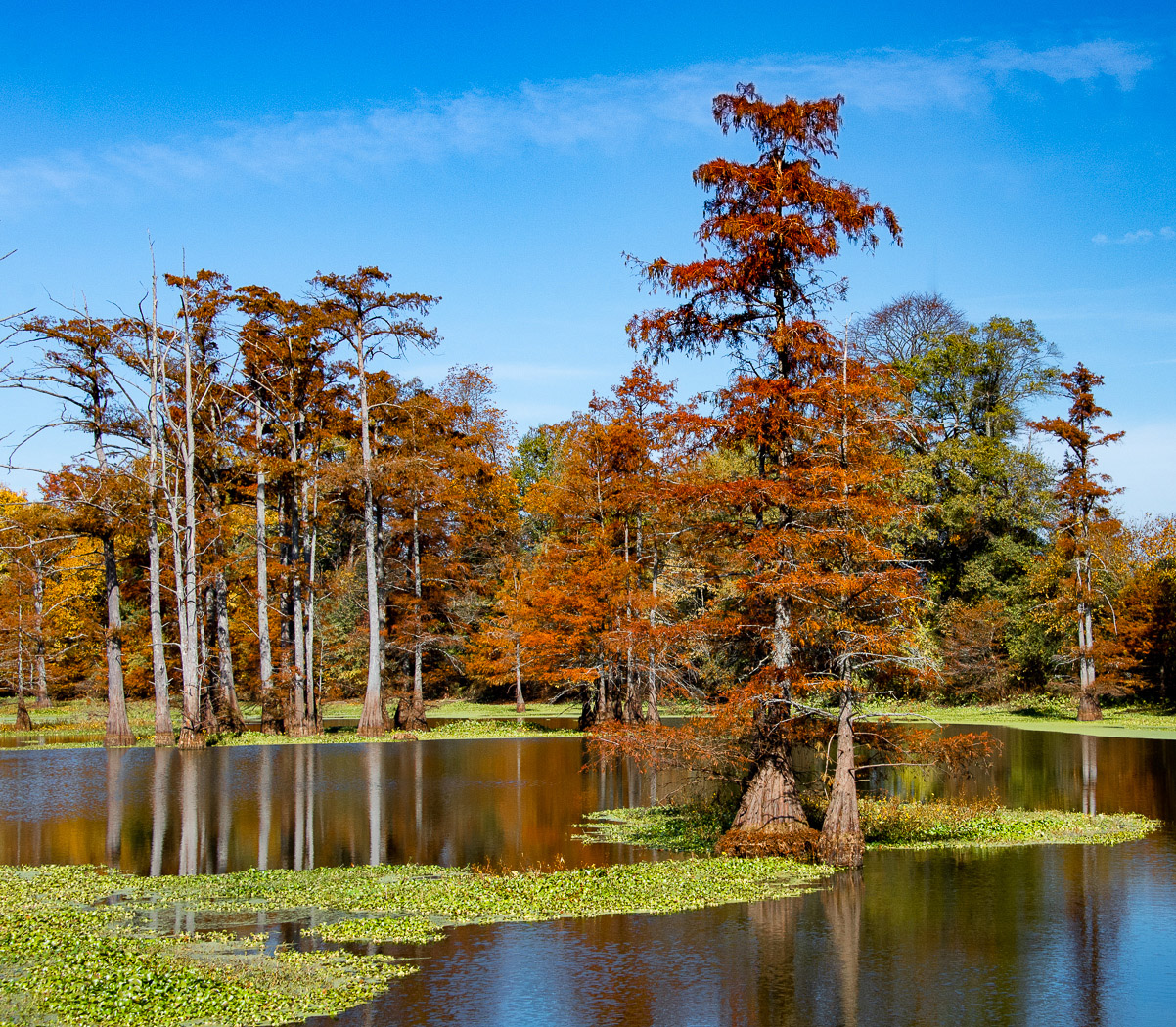
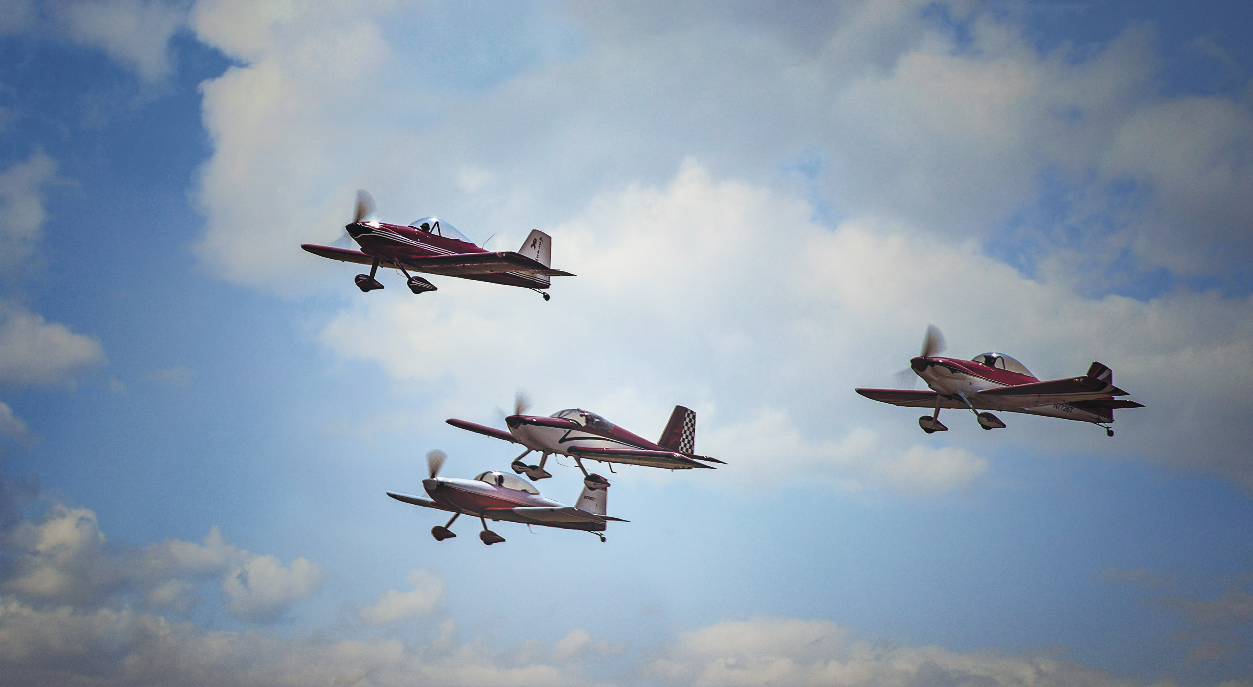
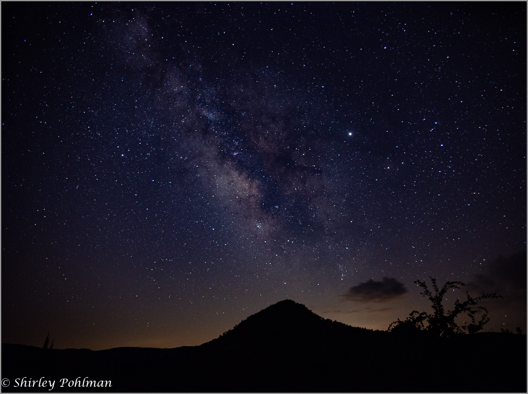
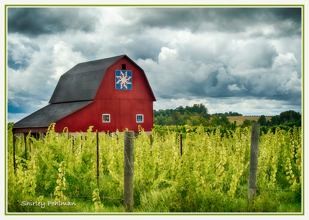
Dan, welcome to our group. I believe you have done well in editing this iconic image in pulling out the shadows and putting some sunlight onto the mountain that I feel is the center of focus. My eyes are drawn to all the natural curves that bring me through the entire image. I believe you could get even more dimension by working little areas at a time--such as using the brush in Lightroom to change the exposure, etc, of small groups of trees in the foreground, as well as the hill on the left. It may be my eyes, but I think the orange mountain in the center could be sharpened. I wonder if the dehaze tool might help that by brushing on it. I agree with Hung in cropping some sky--just above the white puff. You said you wanted some feedback--so hope I haven't given you too much because I really love this image. |
Dec 19th |
| 2 |
Dec 19 |
Comment |
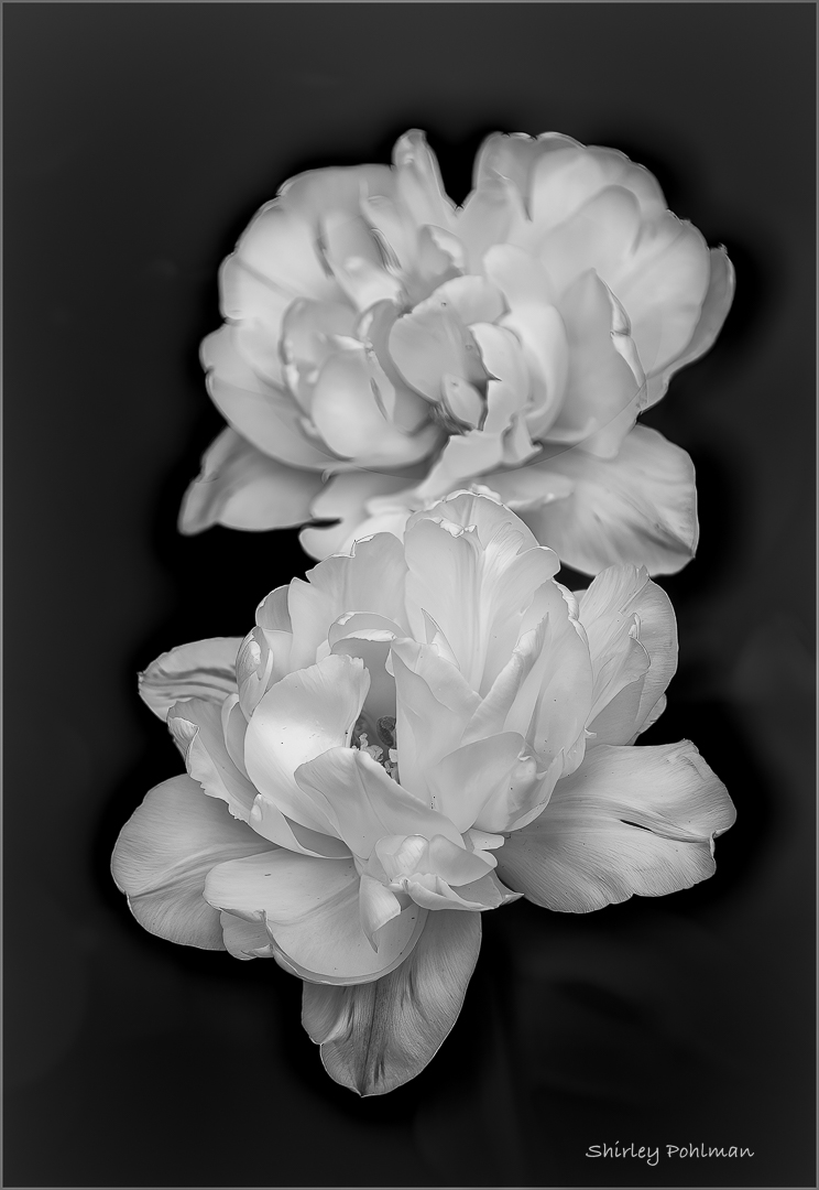
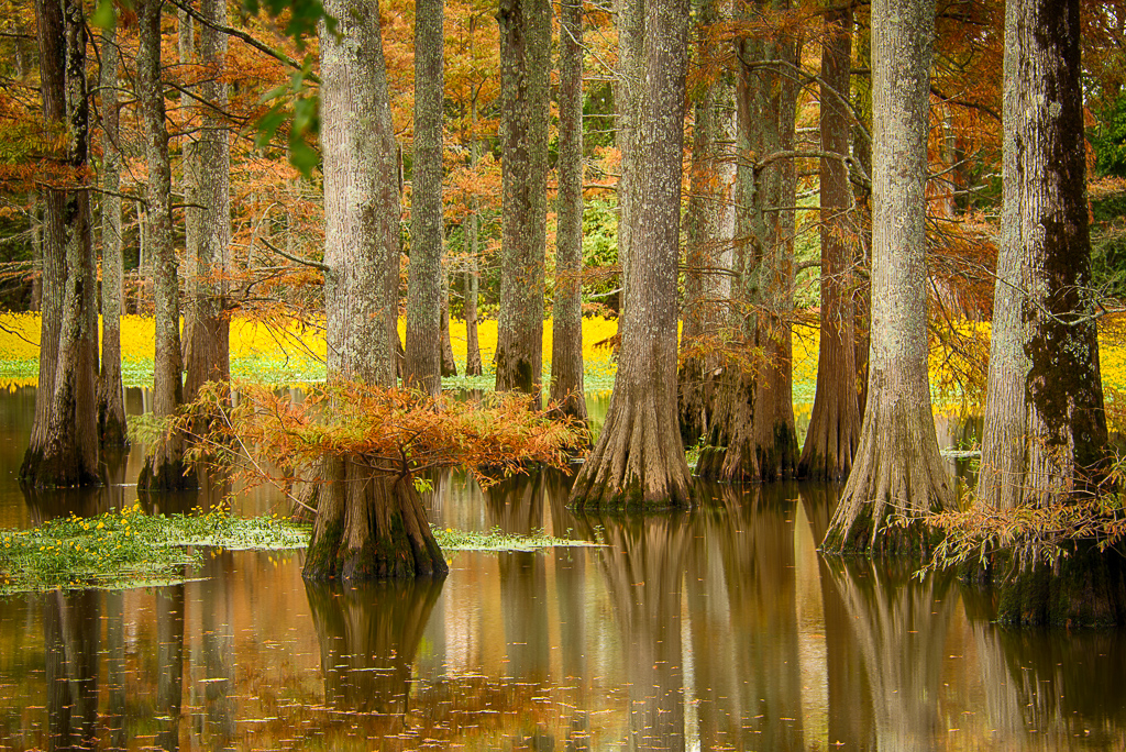
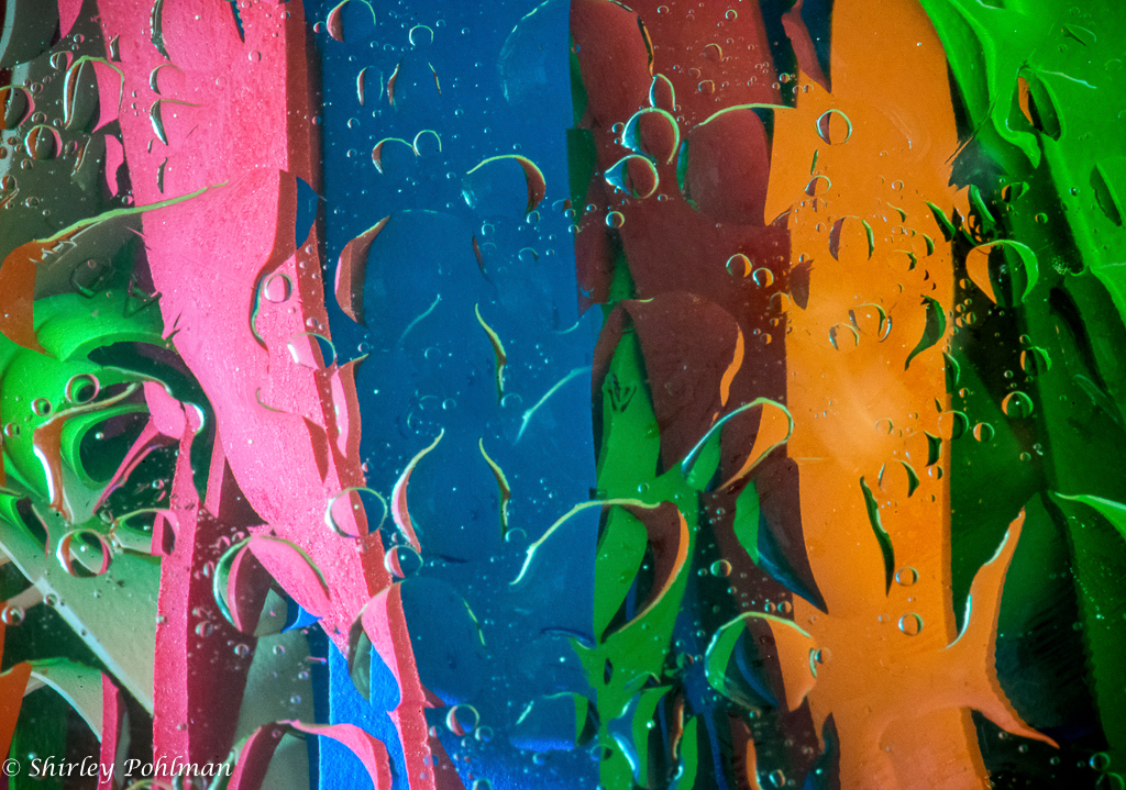
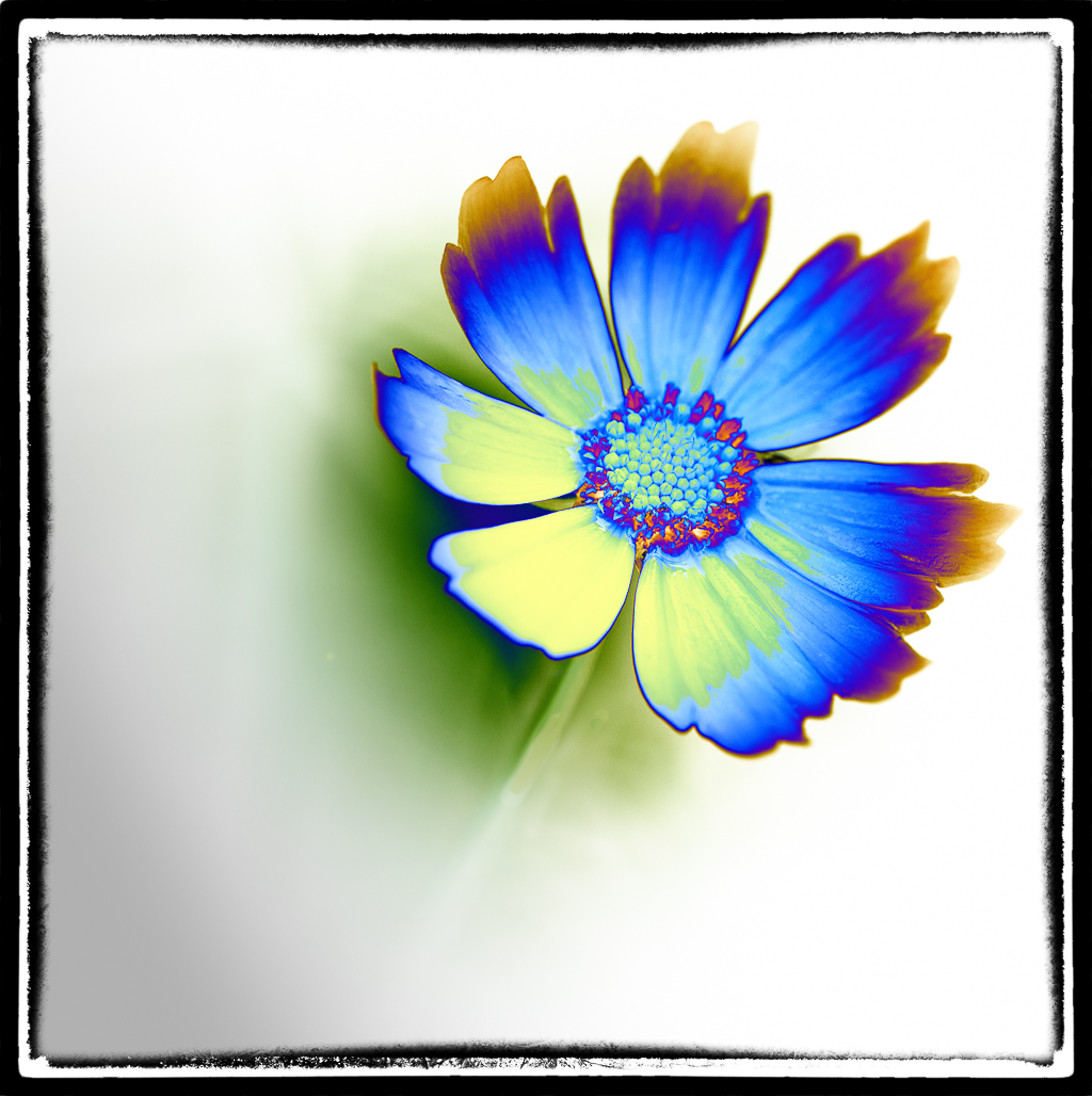
Brenda, another interesting shot. I like the repetitive curves that draw me through the image and the edit to change to monotone. The detail is really unique that gives it a look of carpeting or a sand structure. I feel the bright spot on the left and the one in the middle could be toned down some. Such a good idea to play around with a new lens! |
Dec 10th |
| 2 |
Dec 19 |
Comment |
Hung, I believe your shot certainly captures the mood of the musician. I like the way his right hand and the lower section of the saxophone, as well as a part of his trousers, are high lighted and sharper to bring my eye right to it. I believe it might look good to have just a little more in the frame on the left side and to crop about half the space from the bottom to his foot to give him an anchor and just a little off the top. I like how you always capture the arts! |
Dec 10th |
| 2 |
Dec 19 |
Comment |
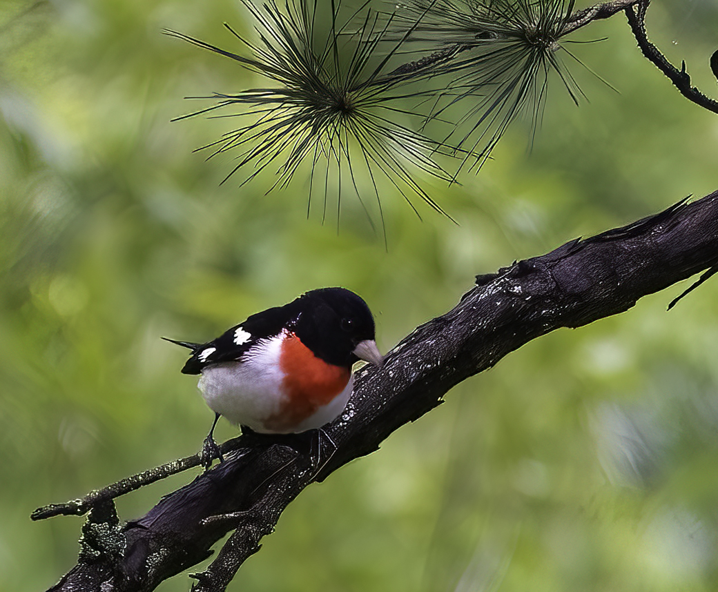
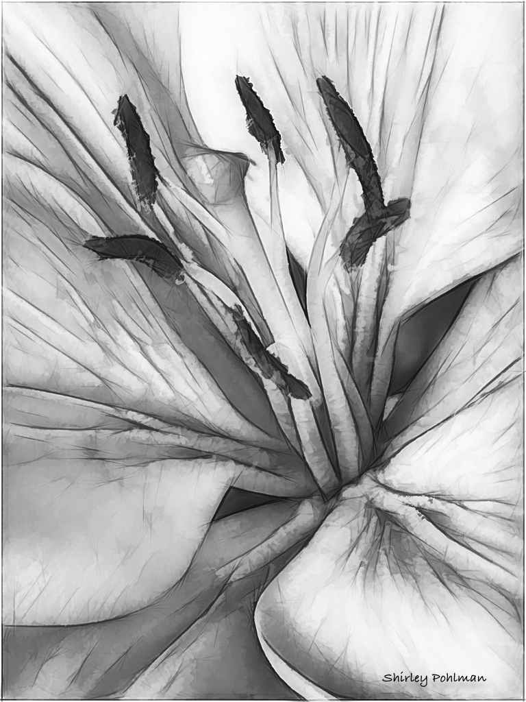
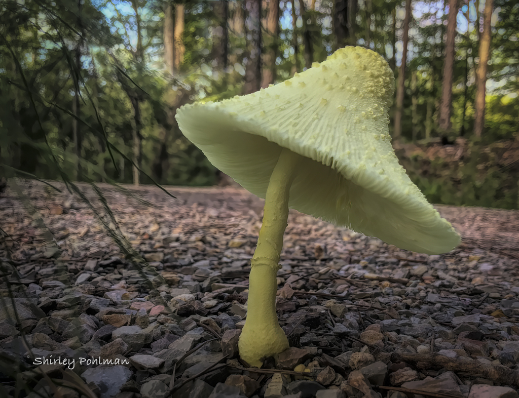
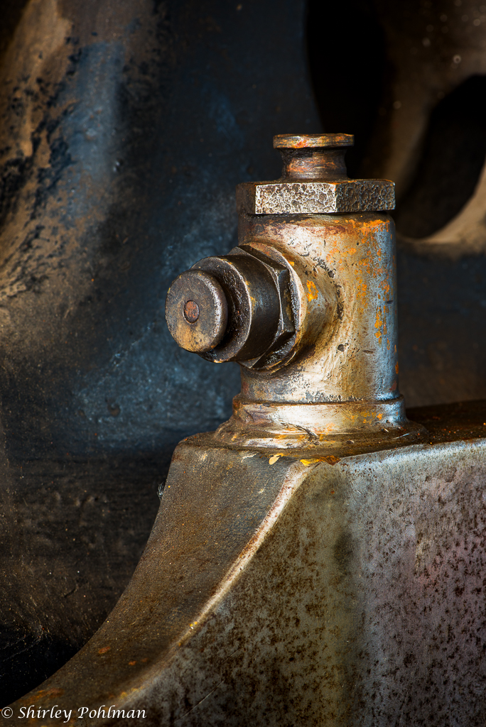
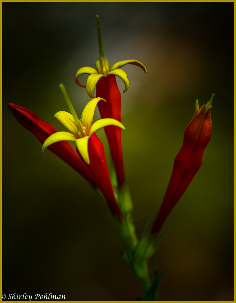
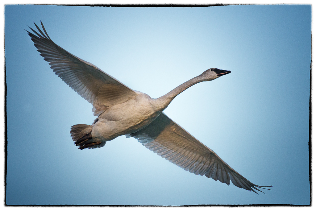
This is such a fun picture with beautiful colors and contrasts. The bark looks like puzzle pieces. Good eye to catch such a unique look. |
Dec 9th |
| 2 |
Dec 19 |
Comment |
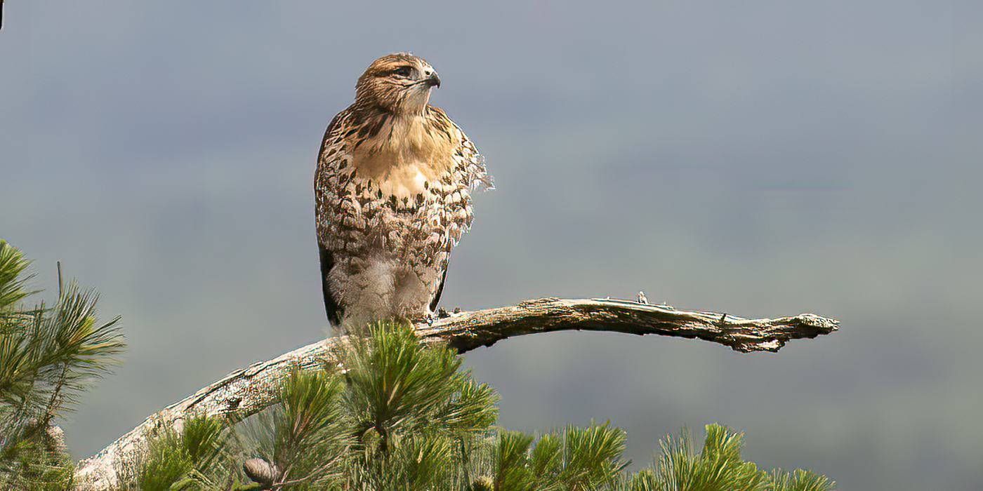
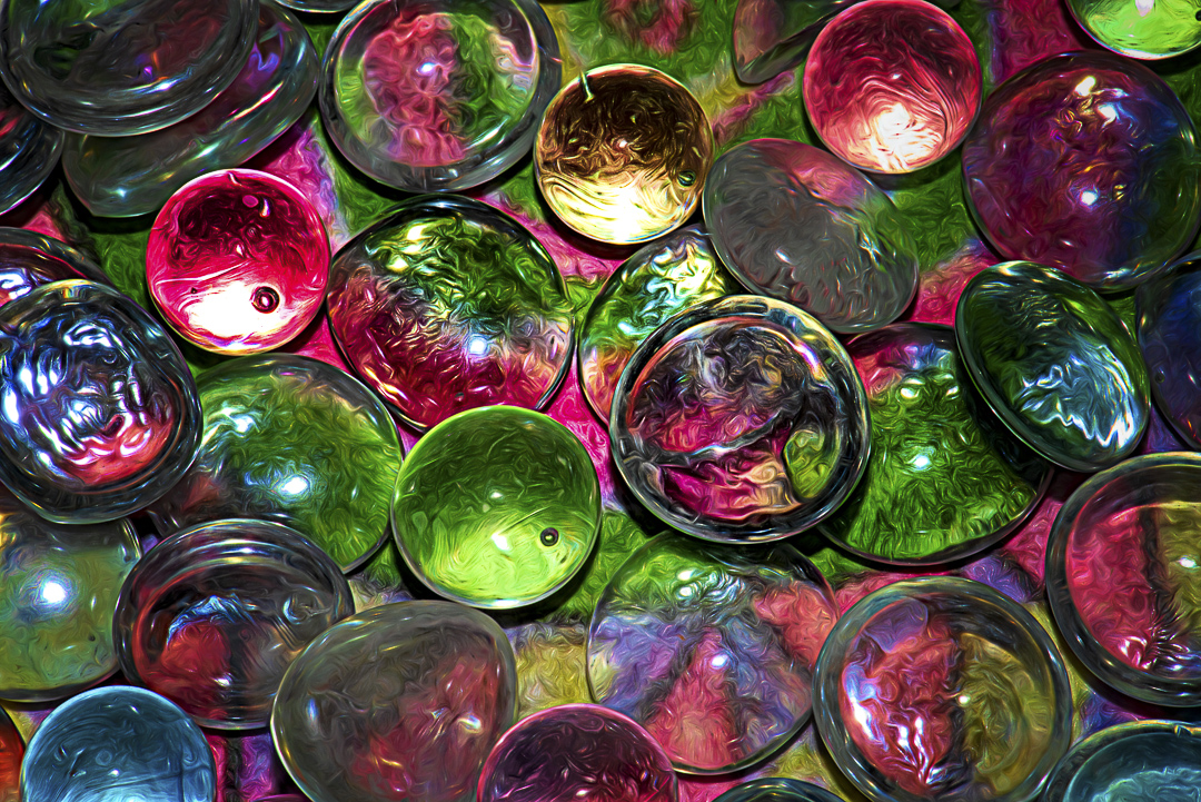
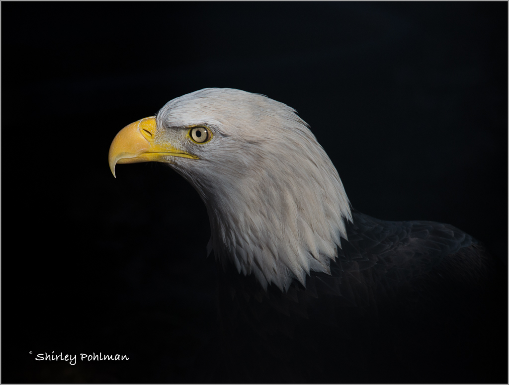
What a wonderful editing job! You did a lot of work to make this eagle look proud to represent the USA. I feel you brought out the detail of the feathers so well, nice replacement of the perch to a tree limb. And I do need to look into Luminar after seeing your beautiful sky replacement. Awesome job. |
Dec 9th |
| 2 |
Dec 19 |
Comment |
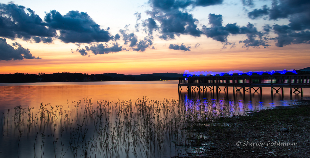
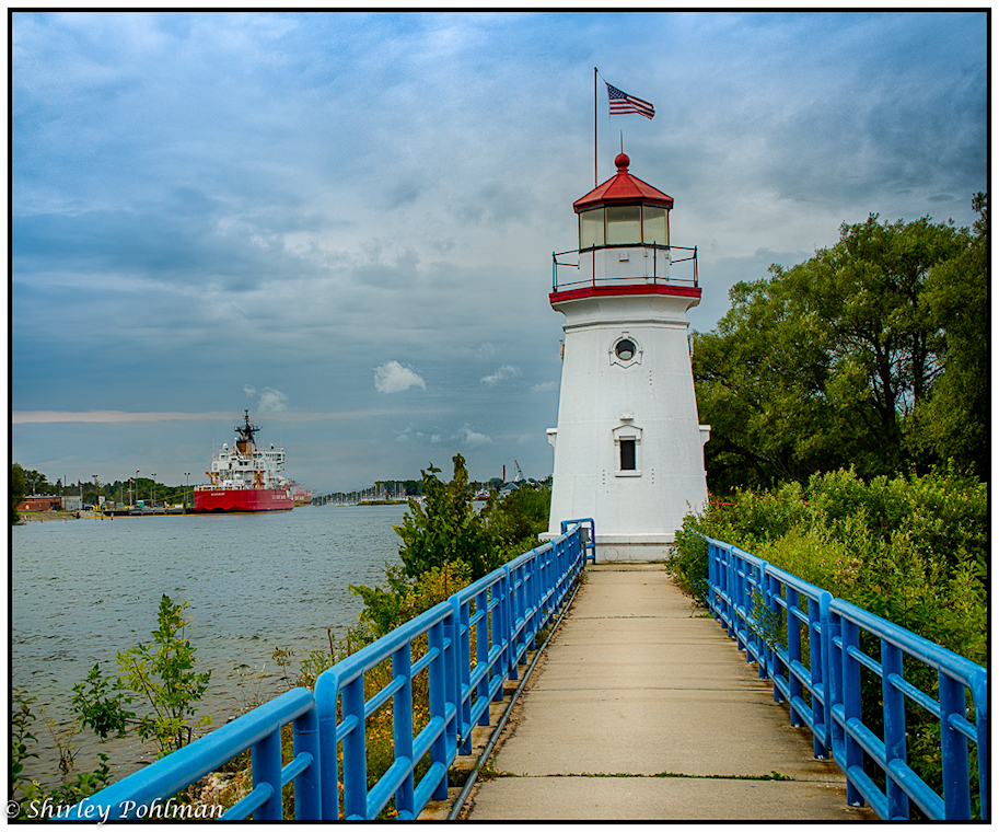
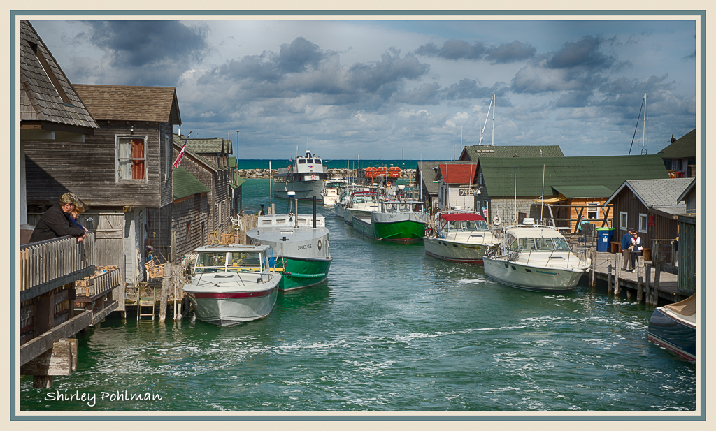
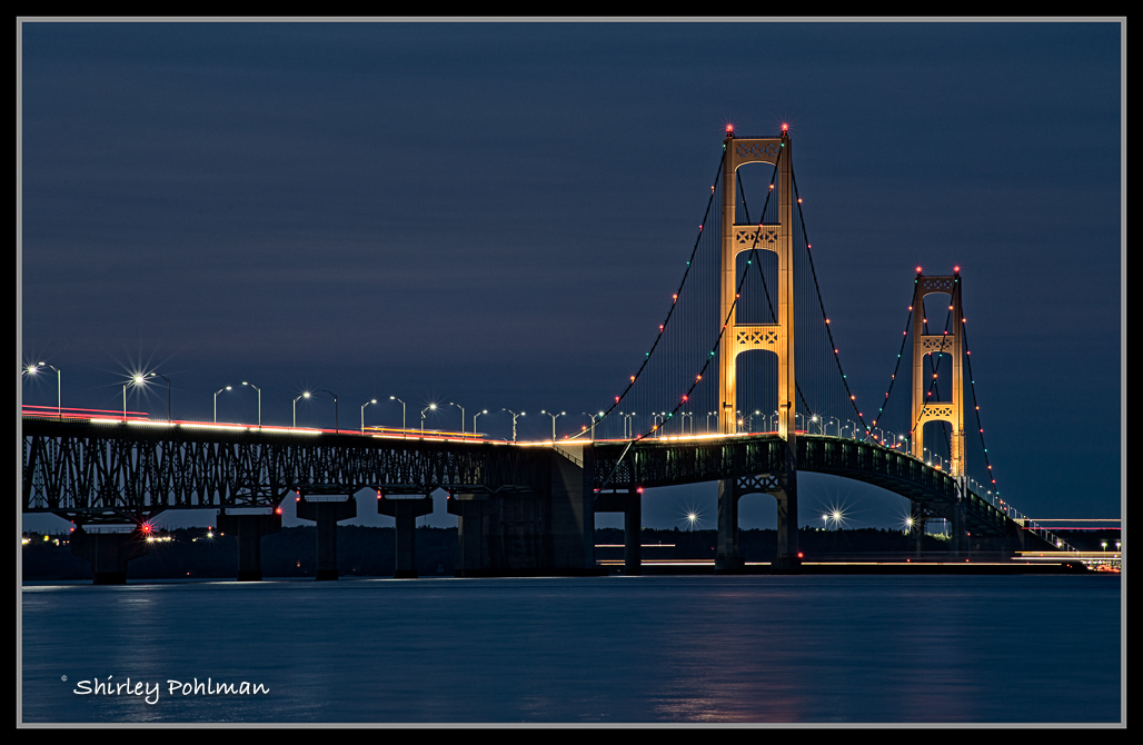
Piers, what impresses me most about this photo is changing it from color to B&W. I feel that the entire image flows so smoothly--the lines of the dock and boats, the path leading to the lighthouse, the lines in the water, the lines in the clouds, the far shoreline. I think the tonal contrasts are just perfect that would not have been as impressive if you had not converted it. I love it. |
Dec 9th |
6 comments - 4 replies for Group 2
|
| 48 |
Dec 19 |
Comment |
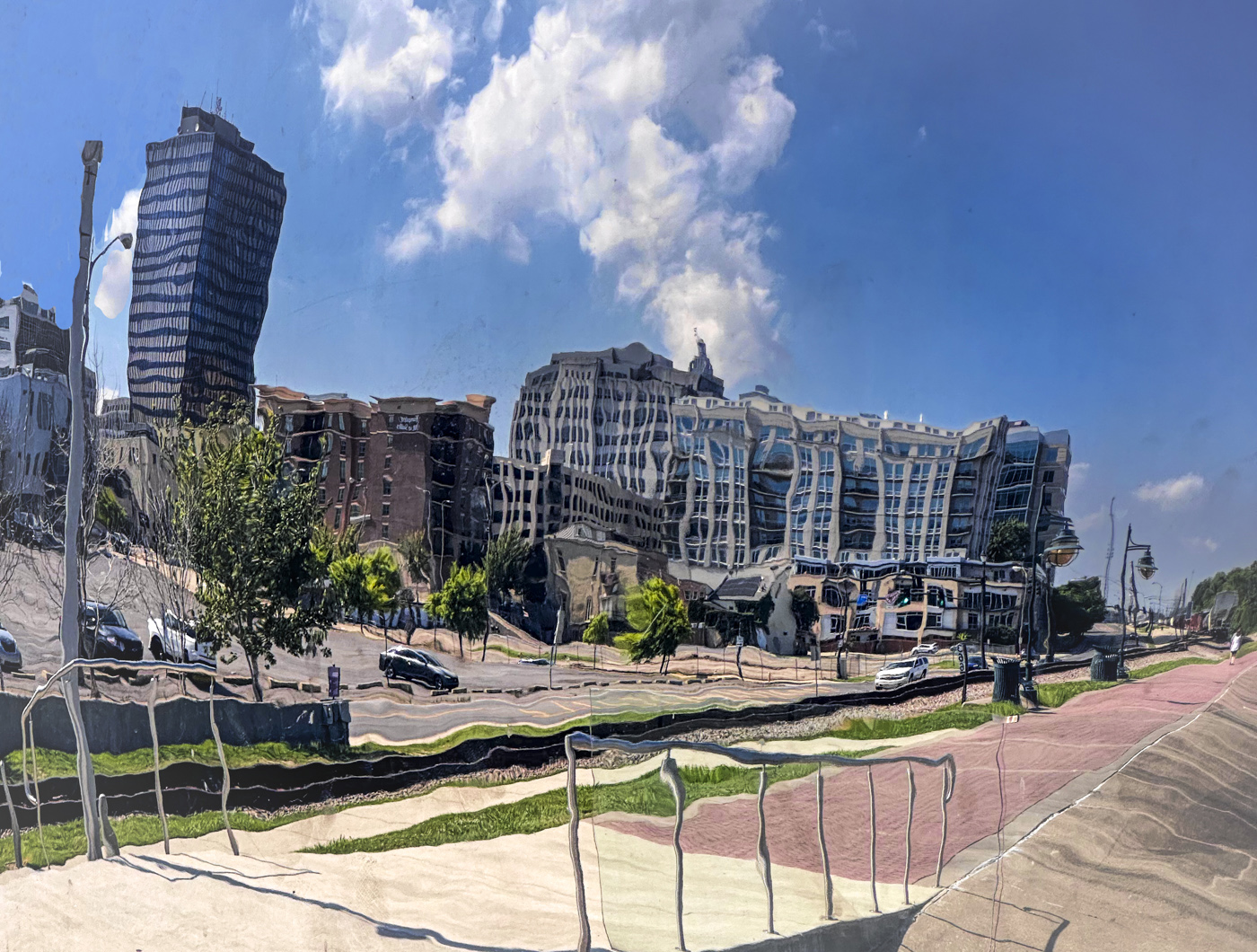
Jamie, I love this shot, and I would not have guessed that you took it with your phone--but then you are good with that phone. I believe you did a beautiful job of changing the background. |
Dec 12th |
1 comment - 0 replies for Group 48
|
7 comments - 4 replies Total
|