|
| Group |
Round |
C/R |
Comment |
Date |
Image |
| 2 |
Mar 17 |
Reply |
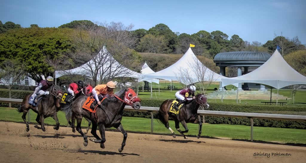
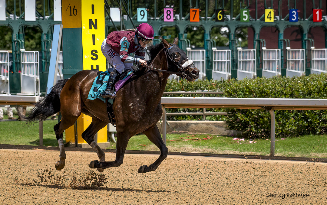
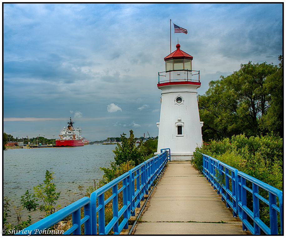
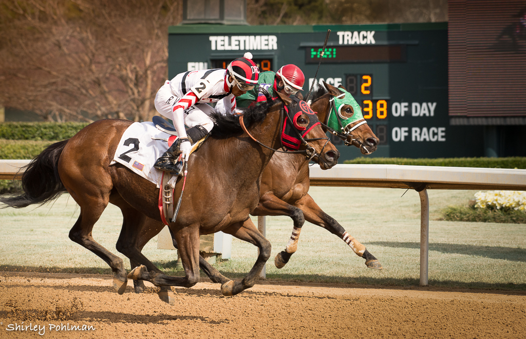
Thank you, Hung. This is at Oaklawn Race Track in Hot Springs, AR--great place to visit. No restrictions on cameras. In fact, our Camera Club once a year gets special privileges with the media manager to go down to the apron in front of other spectators. Come visit sometime but watch for racing season--probably about Feb to mid April. |
Mar 29th |
| 2 |
Mar 17 |
Reply |
I like the cropping because it leads me from the right into the space under the stalactites on the left. Makes me wonder what's in there. |
Mar 6th |
| 2 |
Mar 17 |
Reply |
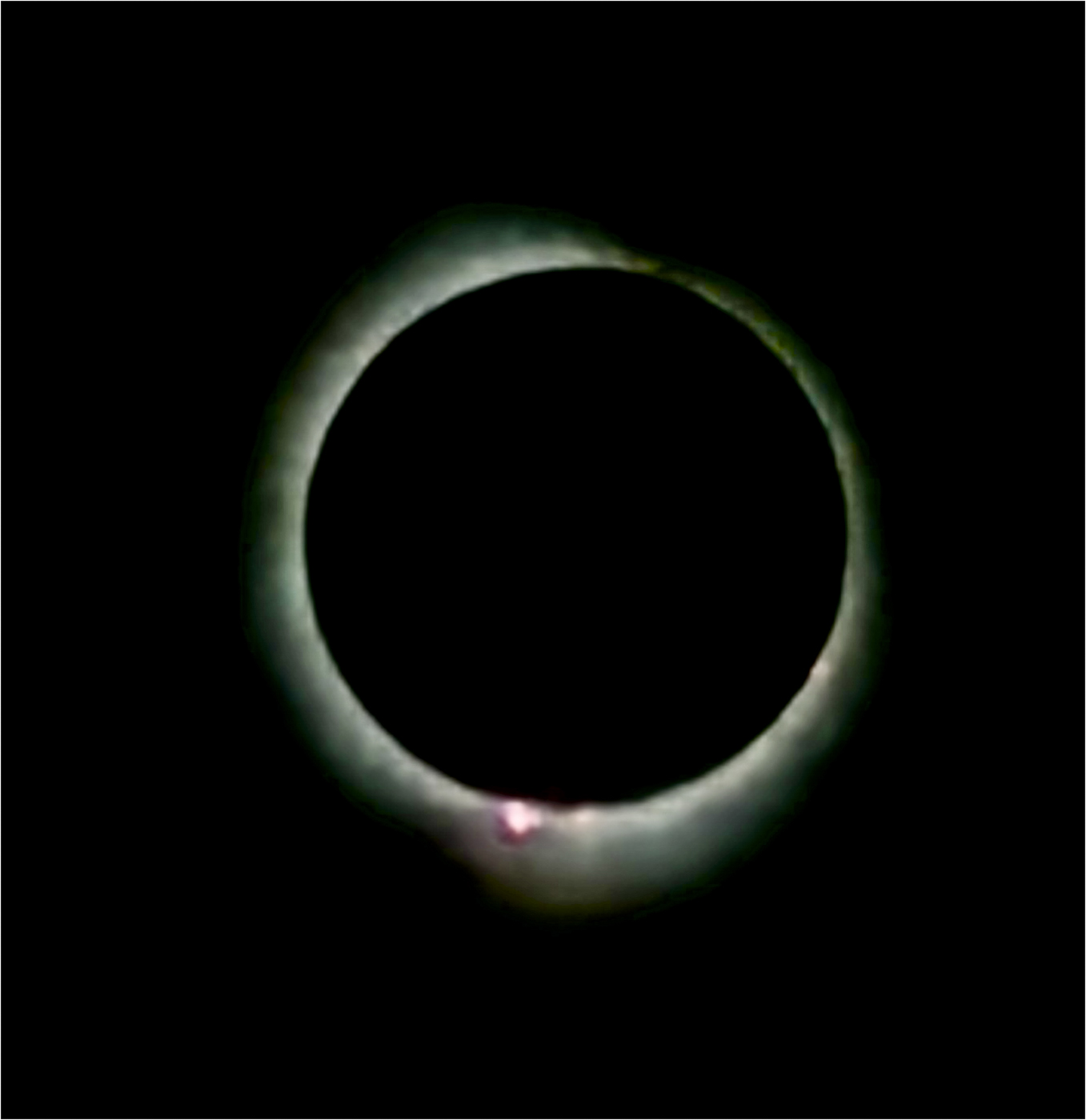
Thank you. A lucky shot out of the MANY taken. |
Mar 6th |
| 2 |
Mar 17 |
Comment |
Just had a thought.....Hung is very good at duplicating pixels to add on to an edge. Could you possibly add on to the left side--would be a challenge! |
Mar 4th |
| 2 |
Mar 17 |
Comment |
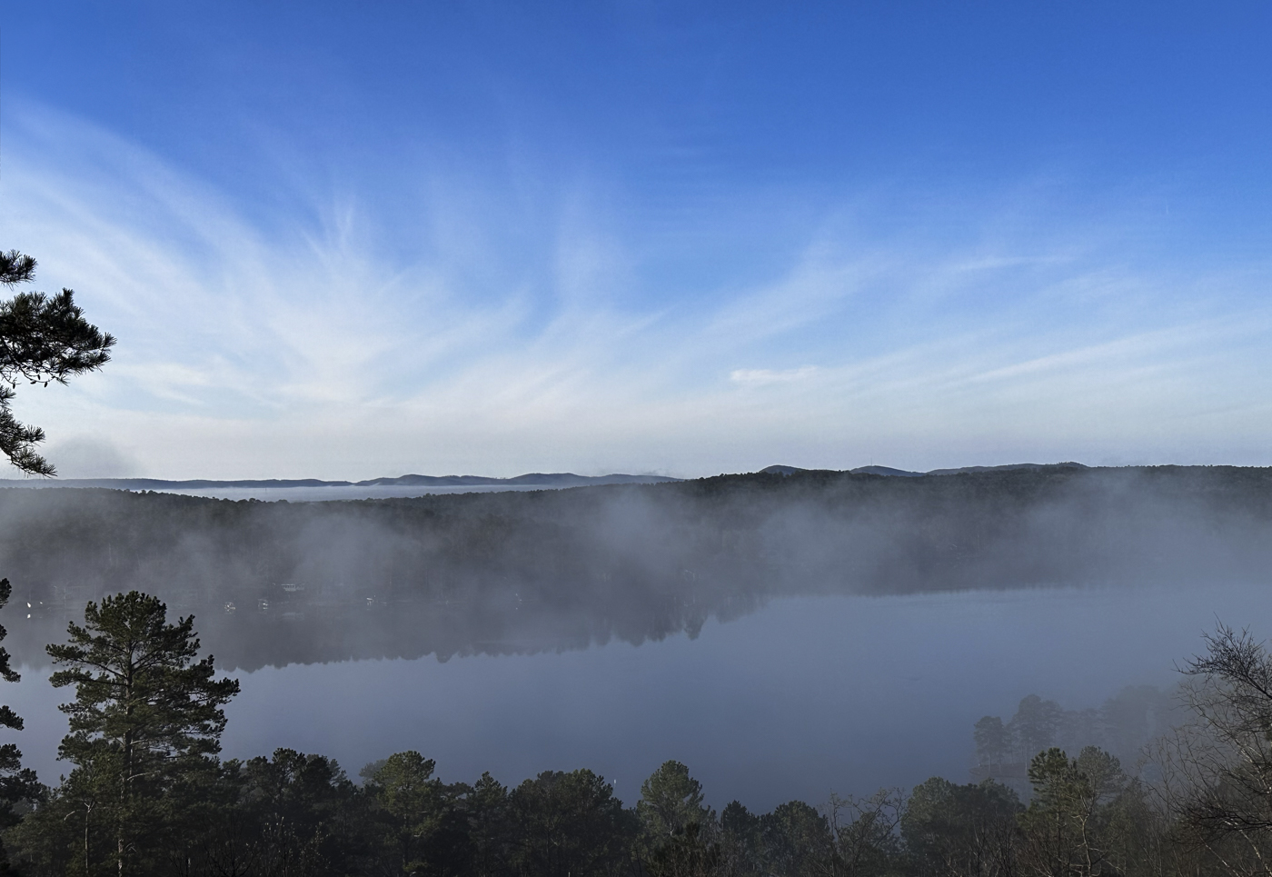
Gary, I love this image of the foggy morning. Fog is frequent at our home since we are on a ridge that looks down on water and mountains in the background. I always want to run out with the camera but never looks good in photo from above. I believe your capture is especially good being able to see a little of the light and fog through the leafless trees, assuming those are hardwoods. Your curved leading line on the left draws me into the image, stopping at the trees, and then back out again. I'm not sure whether the cropping on the right would improve because I do like the landscape view. But some may say that the extra trees on the right don't add anything to the image. I do think, though, you could crop just a little off the top of sky. You already have a start with the left tree being a little darker and sharper, and I believe that already sets the mood of being closer. Nice capture and isn't it great to catch an occasional easy shot--if you happen to have your camera! |
Mar 4th |
| 2 |
Mar 17 |
Reply |
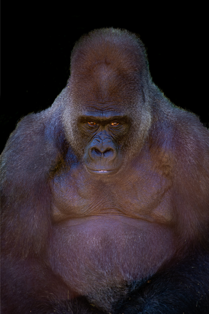
Ahh, how much better it looks with a clean face! Nice job. |
Mar 3rd |
| 2 |
Mar 17 |
Reply |
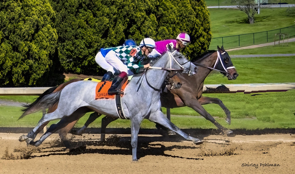
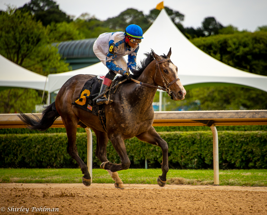
Thanks, Al. It's a real challenge for me getting them into the frame. |
Mar 3rd |
| 2 |
Mar 17 |
Comment |
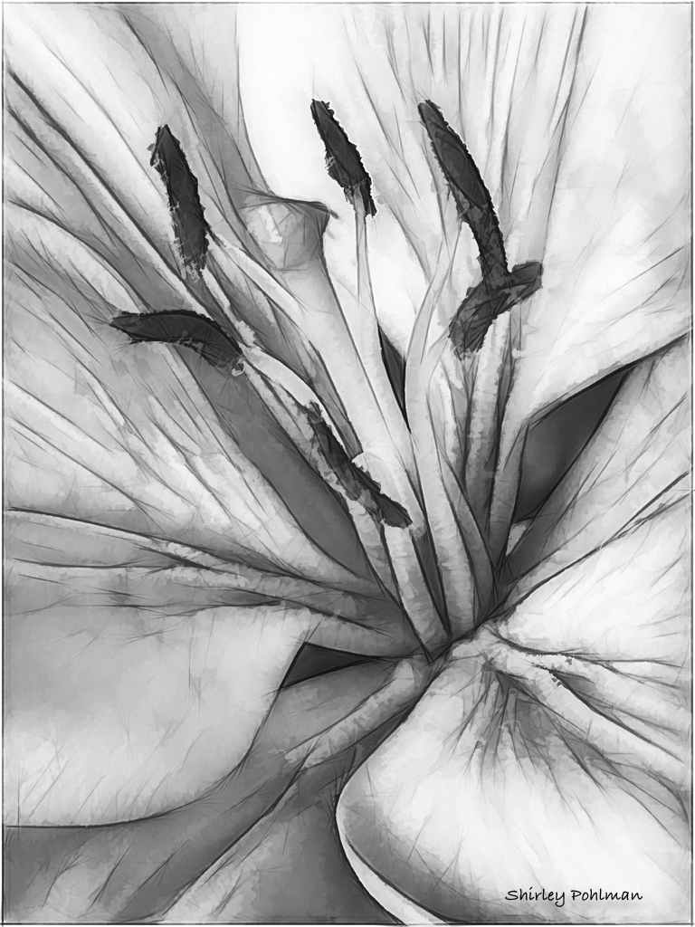
Malabika, I especially like the color tones in this image and the contrast between the stalactites and the water. I am drawn to the leading line of the formation on the right that brings me into the center of the picture. (Looks like a croc lurking under the water!) Our camera club was able to have a private tour of some caverns, thus being able to use tripods. Without a tripod or external flash I found it to be very difficult. I believe you have accomplished this well with a well focused result. Gary suggested cropping from the right. But while scrolling and not having the upper part of the image showing on the monitor, I believe the image really pops by cropping about 1/3 of the upper portion. This also will eliminate some of the lighter area that I feel is not as sharp. My eye is also drawn to the one brighter (probably from flash) stalactite on the right, and it might help to darken the exposure on it. Beautiful catch of one of the wonders underground. |
Mar 3rd |
| 2 |
Mar 17 |
Reply |
Thanks, Gary. Went to the track again yesterday and tried some panning but did not succeed in getting any good shots. You only have those few seconds to try it, and then you wait forever for the next race. |
Mar 3rd |
| 2 |
Mar 17 |
Reply |
Now why didn't I think of darkening it out! Much less distracting. |
Mar 3rd |
| 2 |
Mar 17 |
Comment |
Al, this image makes me want to take a walk on the dock. Lucky to have the fog that gives it a serene look. I like the "B&W" tone that you chose that fits the mood so well. Your center of interest on the boat is sharp with good contrast to the rest of the image and the reflections in the water. Old boat docks have lots of distractions, and I believe you can cut out one by cropping on the left at the walkway, which I think would then give a leading line into the image. Also, I would suggest cropping on the right perhaps between the last pole on right and middle one. This, I think, would eliminate some more of the clutter and utility pole on the right. Unless you want the appearance of the busy-ness of the area, I think you could tone done the buildings and cars behind the boat. Just a thought--depends on what you envision. |
Mar 2nd |
| 2 |
Mar 17 |
Comment |
Hung, I believe you have the ability to capture interesting portraiture, and this one certainly tells a story. I believe it is sharp and has good bold colors. I realize you only had a second to compose this, but I do believe the man is too close to the left side not leaving enough room as he walks "into" your frame. My suggestion would be to crop the image just to the right of the materials on his head and also crop a little off the top having the red fabric lead into the top of the frame. This would center him in the frame, which I believe will put more emphasis on him instead of the building on the right. I do love the the image and the lighting you caught on his face. |
Mar 2nd |
| 2 |
Mar 17 |
Comment |
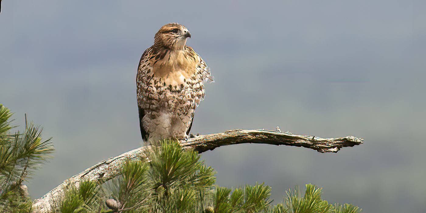
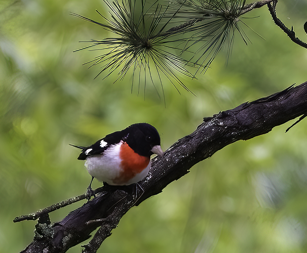
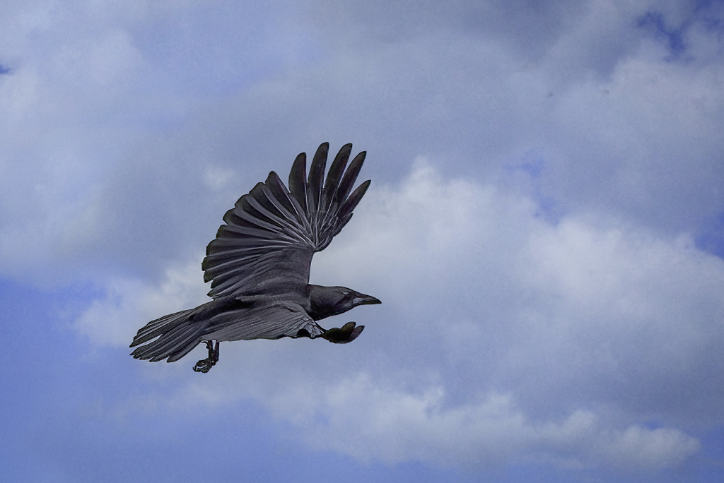
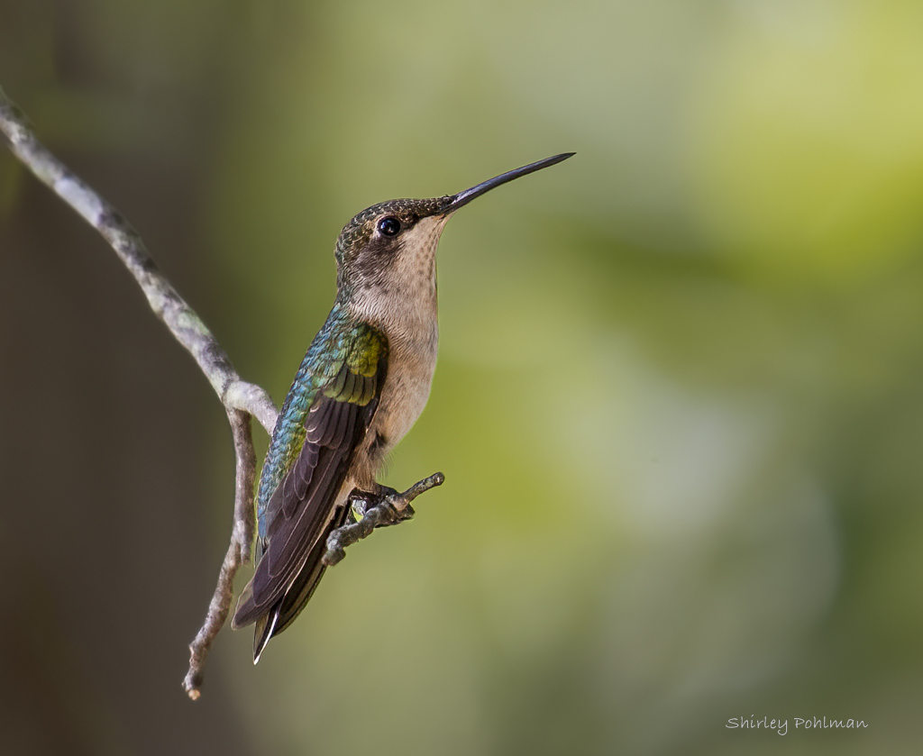
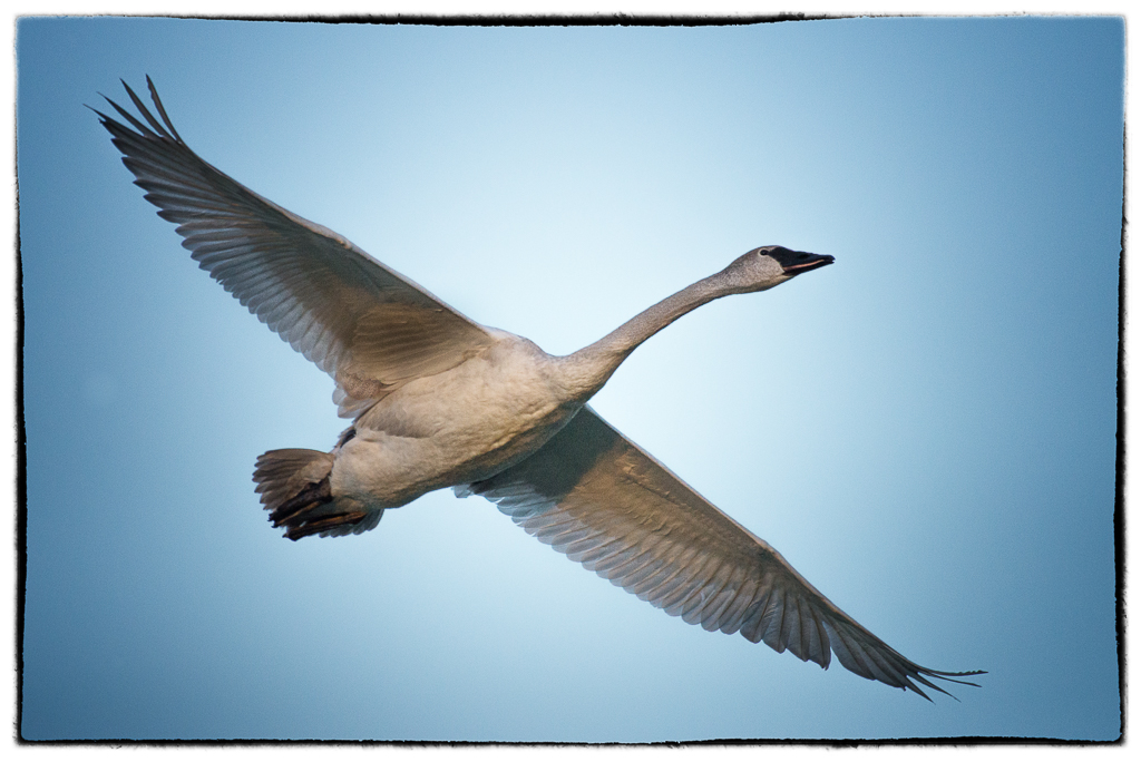
Harry, I believe you have captured a beautiful specimen. The many colors of birds are amazing. I like the entry line of its wing with the curve leading to the top of the image with the eye looking right at me. I believe that bird is double-jointed with the way it's hanging onto lunch--good catch. Is that a dimple on its cheek or a little lunch? My eye is drawn to it, and perhaps it could be cloned out-- unless it is natural to the species! I would like to see more of the bird, but that might not have been possible with other distractions. Also, I think if you darkened the background on the left (more to the tone next to the bird) there would be better contrast to the bird's beautiful light color. Nice image. |
Mar 2nd |
6 comments - 7 replies for Group 2
|
6 comments - 7 replies Total
|