|
| Group |
Round |
C/R |
Comment |
Date |
Image |
| 2 |
Feb 17 |
Comment |
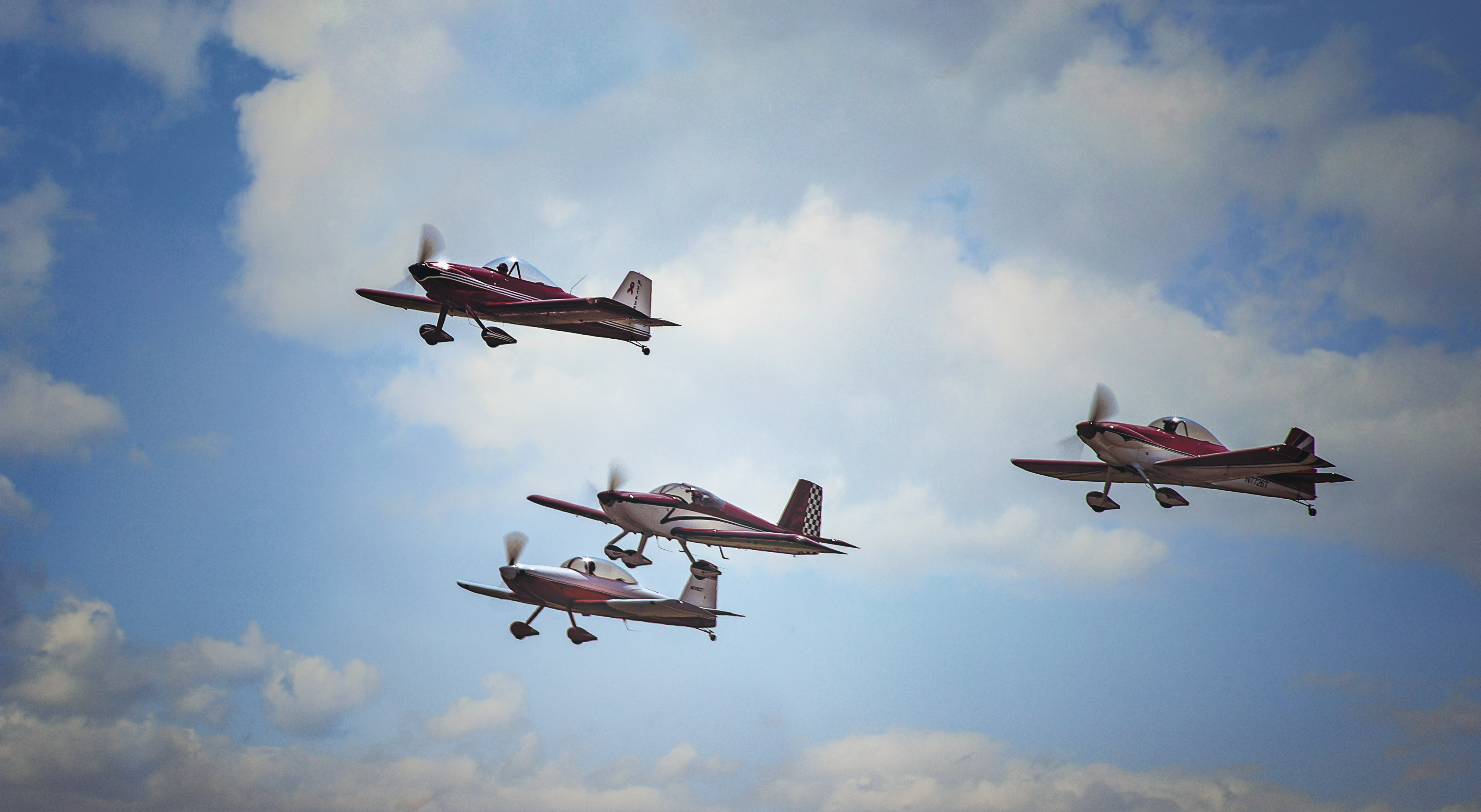
Denise, what strikes me most in this image is the texture. I feel like I can reach out and touch the sandy finish. I like the composition with the leading lines of the triangle stones and the "plane" exiting the frame. I know we are told that there should be more space for the center of interest leaving the frame, but I actually like your original image as opposed to the one edited by Hung. In my opinion your original displays action of the plane moving. I enjoyed reading the history of the home! |
Feb 27th |
| 2 |
Feb 17 |
Comment |
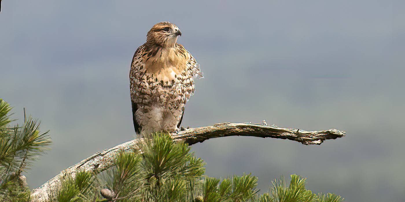
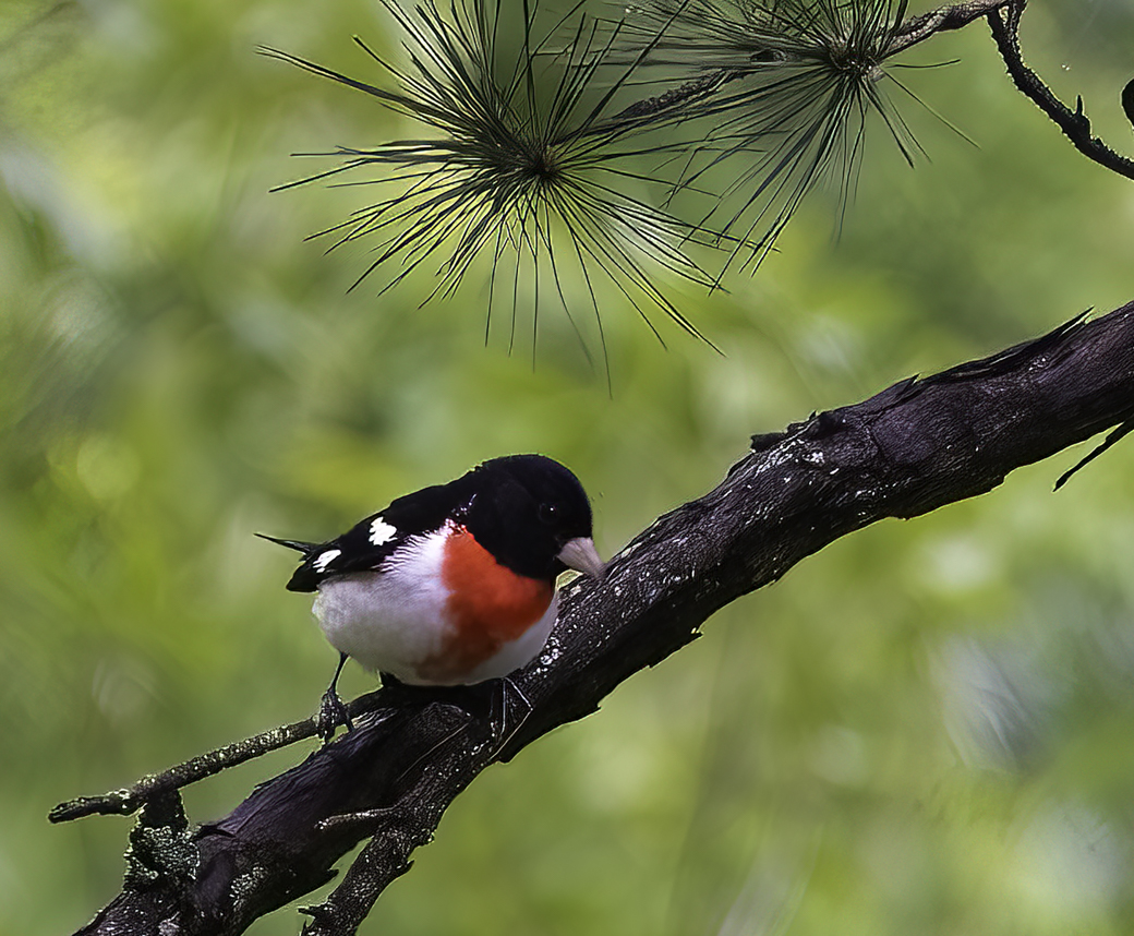
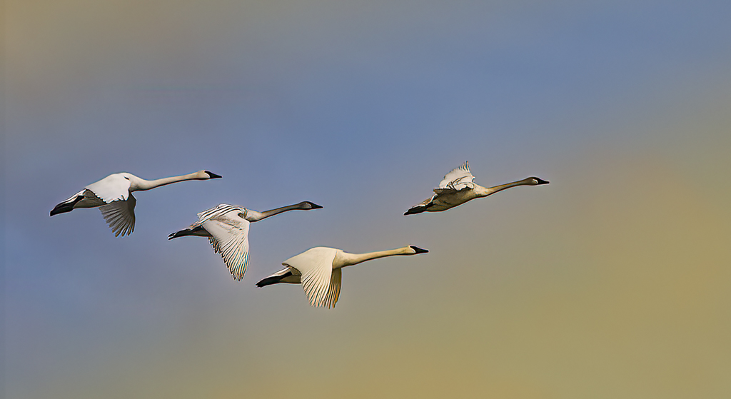
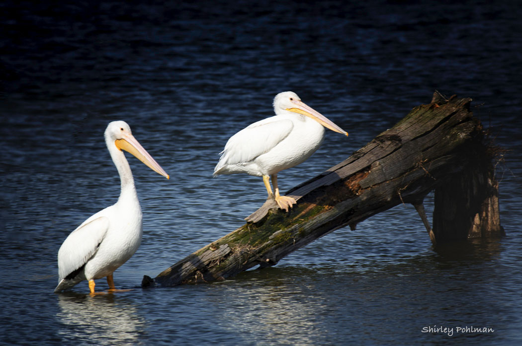
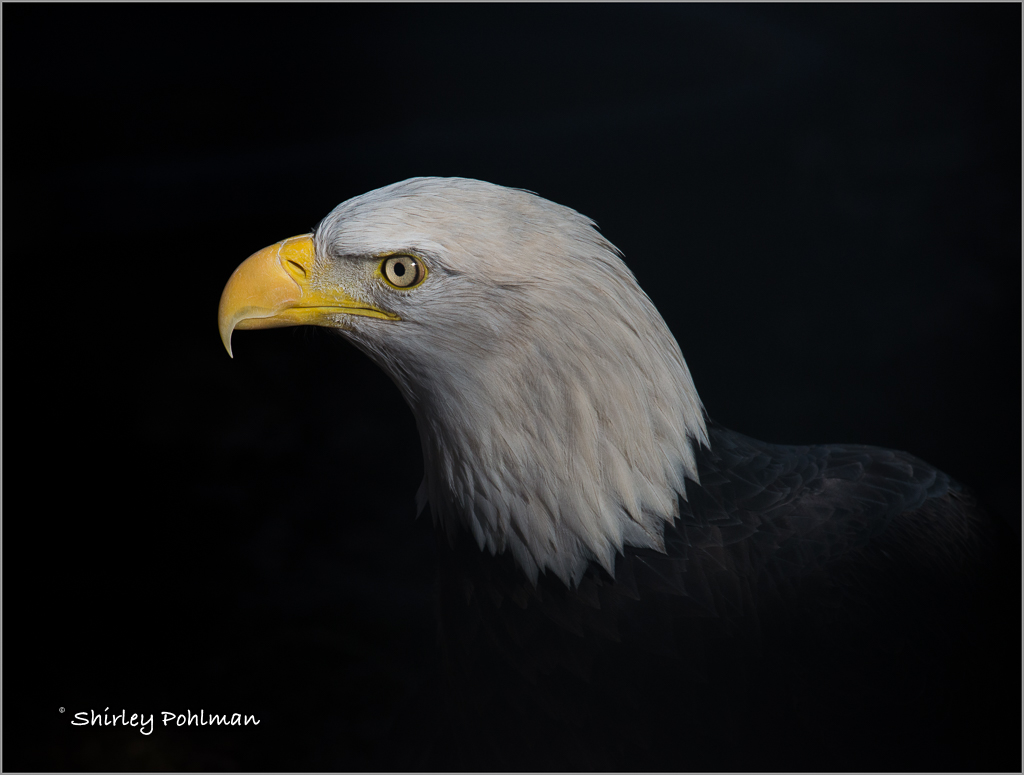
I am amazed at what a difference your last edit made. Although I liked the B&W, the birds now have real life to them with the fluff of their feathers and so sharp. I believe your color editing of sky is perfect and the removal of the two branches. I now vote for the color rendition! |
Feb 16th |
| 2 |
Feb 17 |
Comment |
Hung, your image really had me look twice to see if I was having an optical illusion! I believe you have caught a rare moment of the perfect light on the dancer's arm with the shadow of her own head. My eyes stop at the perfect lighting on the one side of her face and then drawn to the shadow of the other side of her face on her arm. Beautiful--can even see her eyelashes. I am also drawn into the image with the graceful flow of her body, with arms captured by the light and accented by the shadows. I am mesmerized by the image. Beautiful! Without flash, I am wondering what your ISO was. |
Feb 16th |
| 2 |
Feb 17 |
Comment |
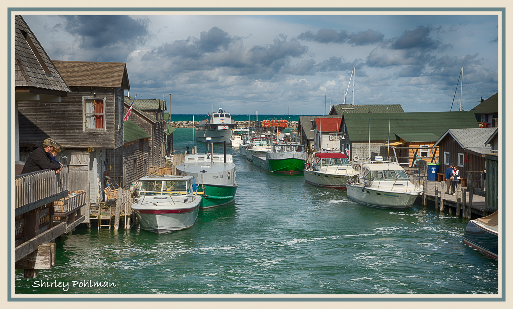
Gary, living in the middle of mountains in Arkansas, I don't have opportunities for shoreline images as this. I can understand your wanting to get another shot after seeing how much it changed in the two years, and you had quite a challenge in isolating the boat. Now the rest of you may laugh at this comment, but in my opinion the original has more character than the one cropped. Your edited image, I feel, has perhaps been over saturated in the blues and I think has been darkened too much in the editing. Very difficult, I think, to get the effect that you wanted of the boat being your center of interest since there just is so little without an obstructed view. But I do like the impact that it shows of the deteriorating fishing fleet of gone-by-days. |
Feb 13th |
| 2 |
Feb 17 |
Comment |
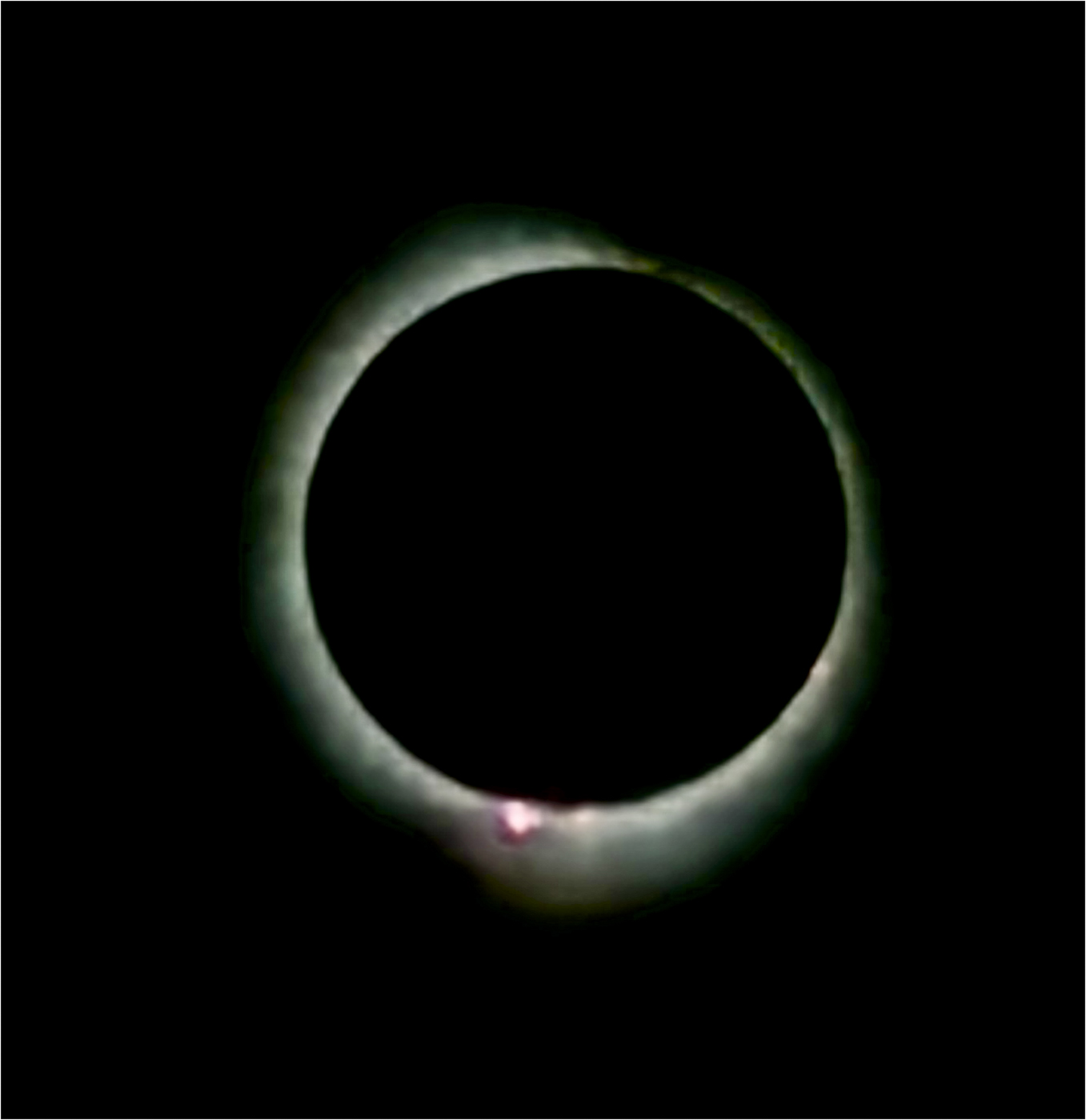
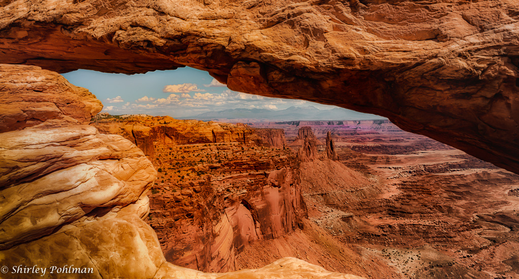
Al, I also have always wanted to visit the Canyon. I believe that you have captured the beauty of the Canyon with the contrasting colors and texture of the rocks. The darker corners in the lower right lead me to the center and out through the hole where the light is. It may be just the way they are in this view (or my eyes), but I feel the clarity of the rocks could be stronger or sharper. Although I like the darker section on the right that leads me into the image, I think it could be lightened somewhat with perhaps a gradient tool to lighten the shadows in upper right. Just a thought. Difficult to show this image when we have seen so many, but I love the capture. |
Feb 12th |
| 2 |
Feb 17 |
Comment |
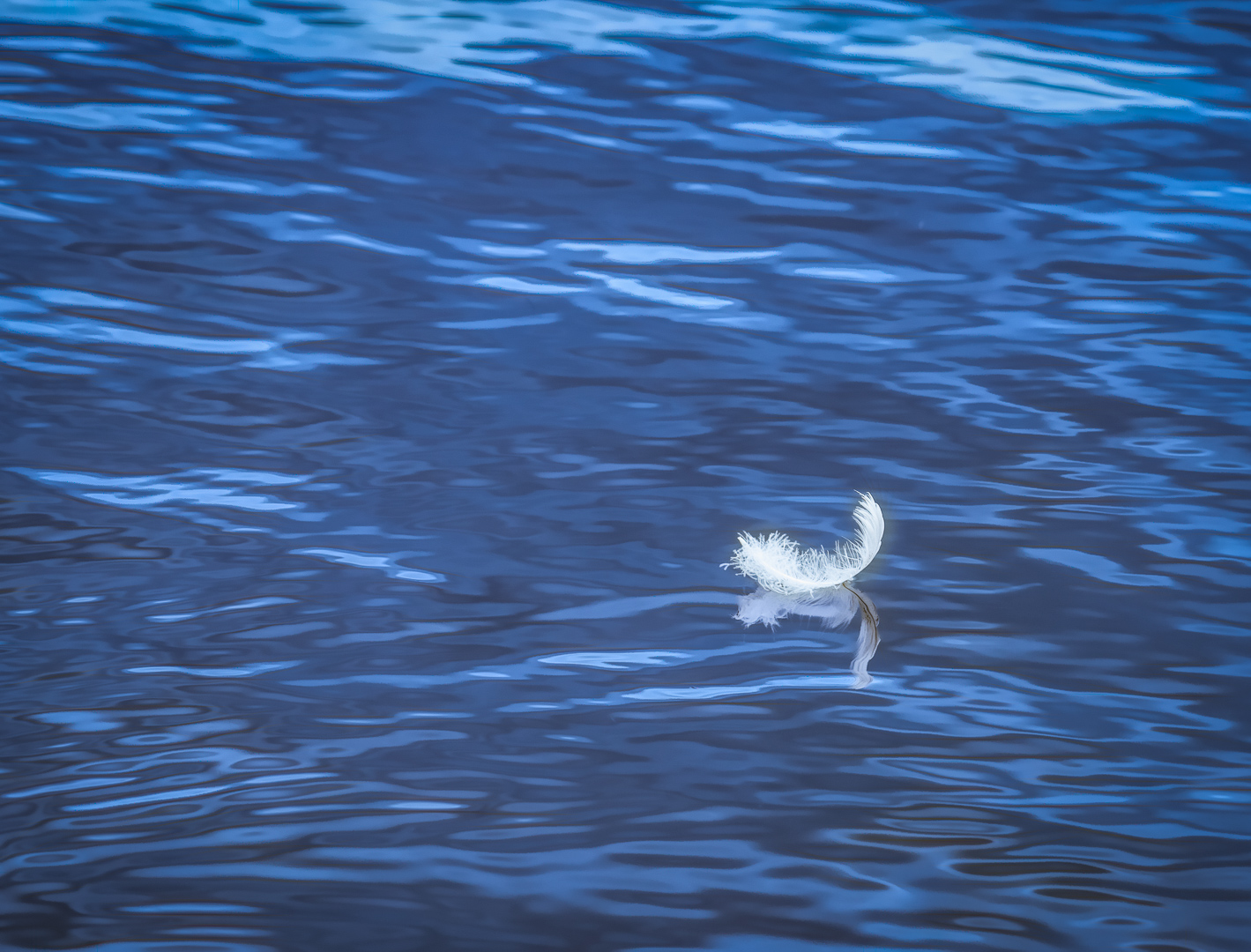
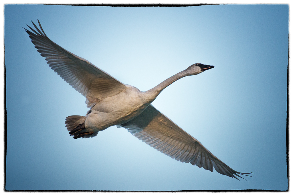
Malabika, I believe your choosing black and white gave the image a very artistic flare. Totally blue sky (like my swan) vs. gray sky are both challenges, but I like your decision. I think your image is well balanced, great contrasts of black and white with shades that make it look like a charcoal "painting." I am immediately drawn to the squawking birds and then to the calm one standing by who looks like she is saying, "Children, children." Beautiful! |
Feb 12th |
| 2 |
Feb 17 |
Comment |
Harry, first thanks for taking on the administrator's job.
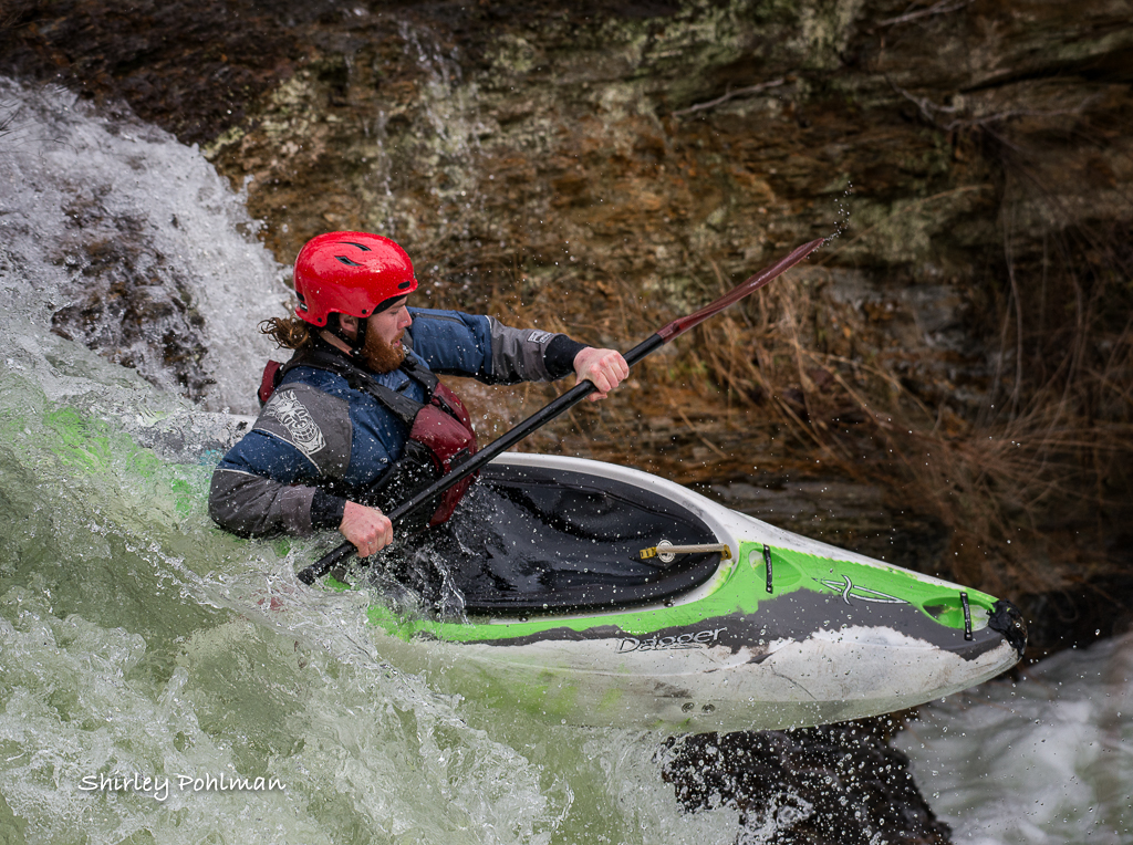
I love this image because he is looking right at me! I'm sure it was a challenge with the interference of distractions around the boat, and I believe you cropped him beautifully. Too often we feel we need the entire upper body in the frame, but I think where you cropped gave a good leading edge to the angle of his head and leading back out on the left diagonal of his arm. I think your image is very sharp, pleasing contrasts of color, and good lighting. The detail of his face, hair, and beard draws me into the image, as well as the position of his hand holding the pipe. I have no suggestions for improvement, other than the one little bright spot above his shirt sleeve I believe could be toned down, and I think maybe your burning went into his sleeve just a little in that same area. Nice capture!
|
Feb 12th |
7 comments - 0 replies for Group 2
|
7 comments - 0 replies Total
|