|
| Group |
Round |
C/R |
Comment |
Date |
Image |
| 66 |
Sep 21 |
Comment |
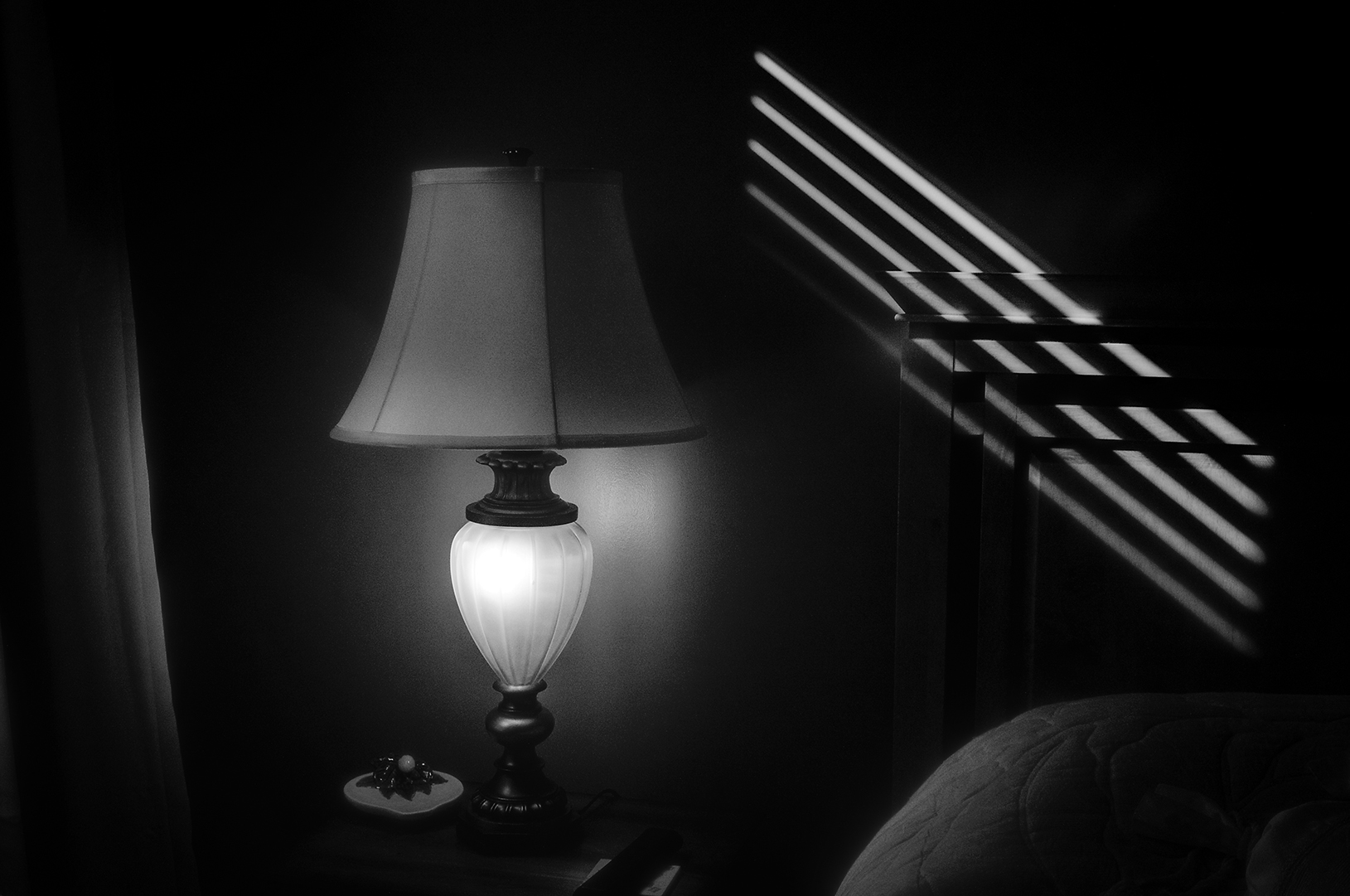
Hi Emil...better late than never, I finally got an image uploaded for September. I'd appreciate your views of it. Thanks. |
Sep 13th |
| 66 |
Sep 21 |
Reply |
Jack...better late than never...I have an image posted now. I'd welcome your comments. |
Sep 13th |
| 66 |
Sep 21 |
Comment |
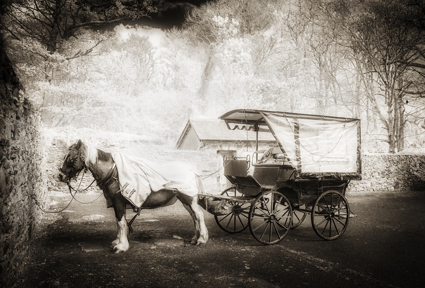
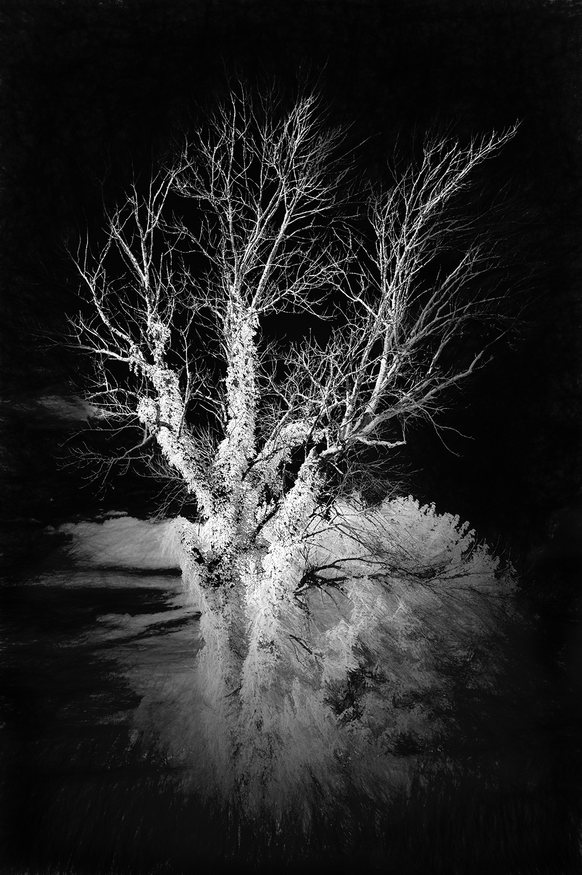
Jack...
I took a minute and went back to your image from this month. See attached. I noted you had a tone in it rather than a strict black/white. I went to all black and white, lightened the cloud slightly, sharpened the foreground slightly, and added darken corners from Color Efex. You and I tend to see contrast and blacks differently, but here's my attempt at Ansel-esque! |
Sep 13th |
 |
| 66 |
Sep 21 |
Comment |
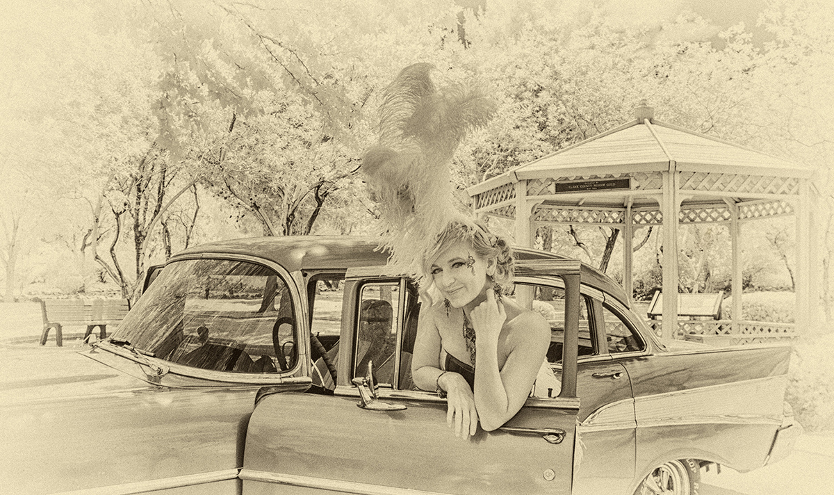
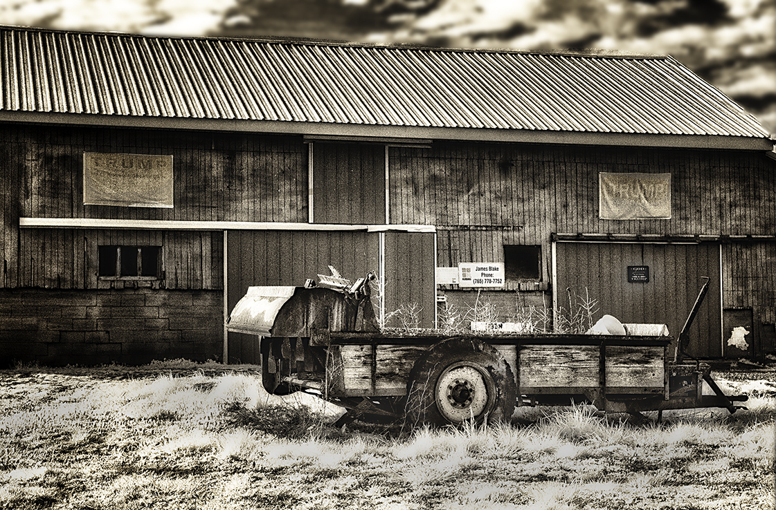
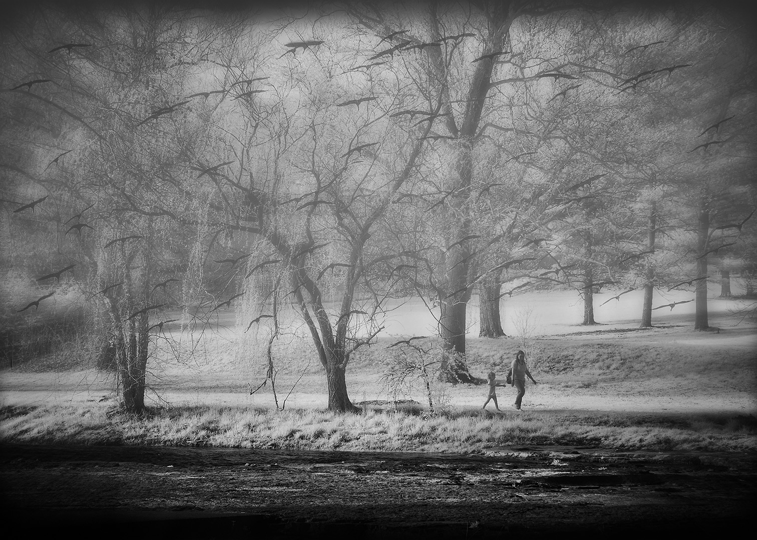
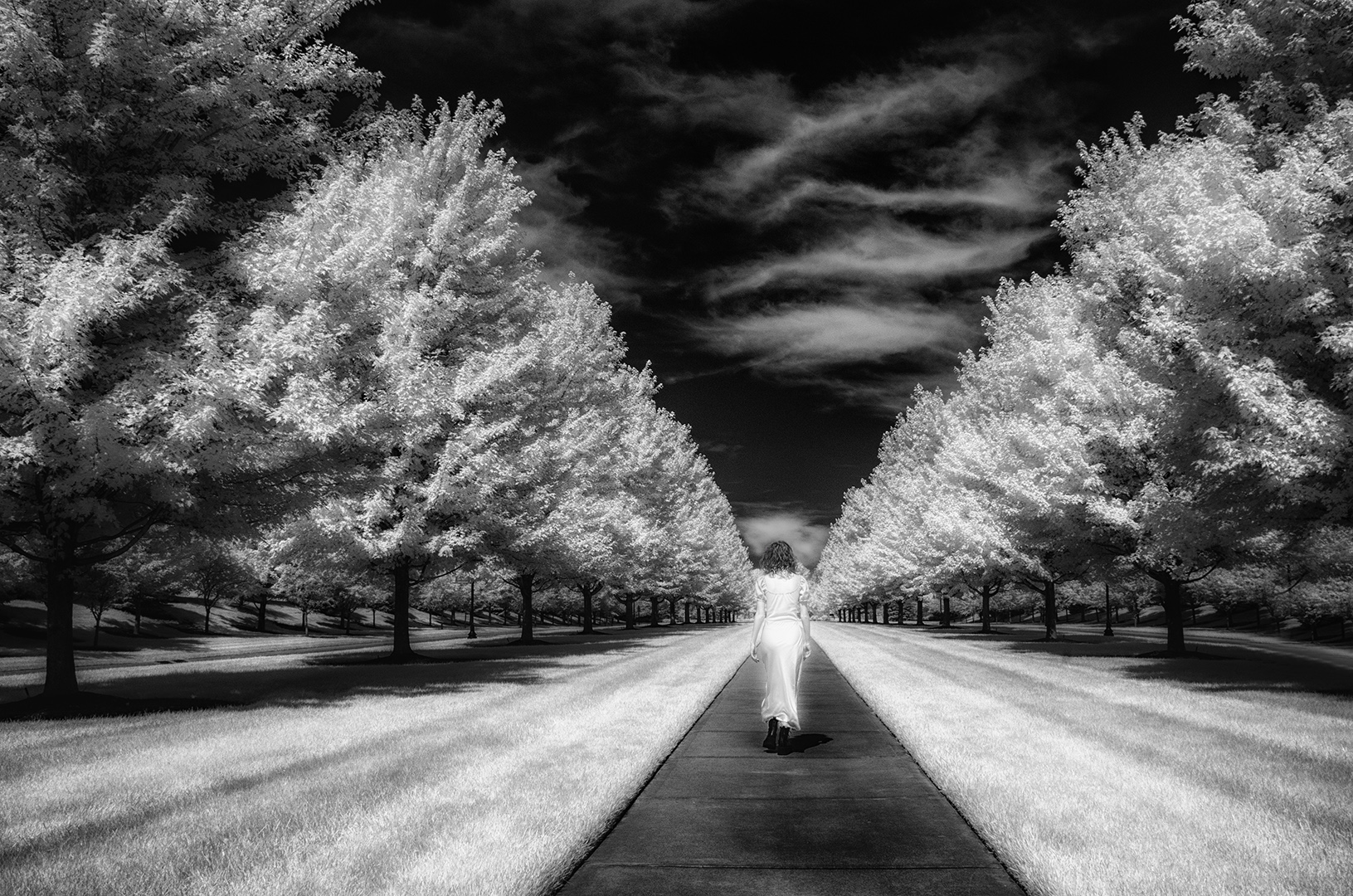
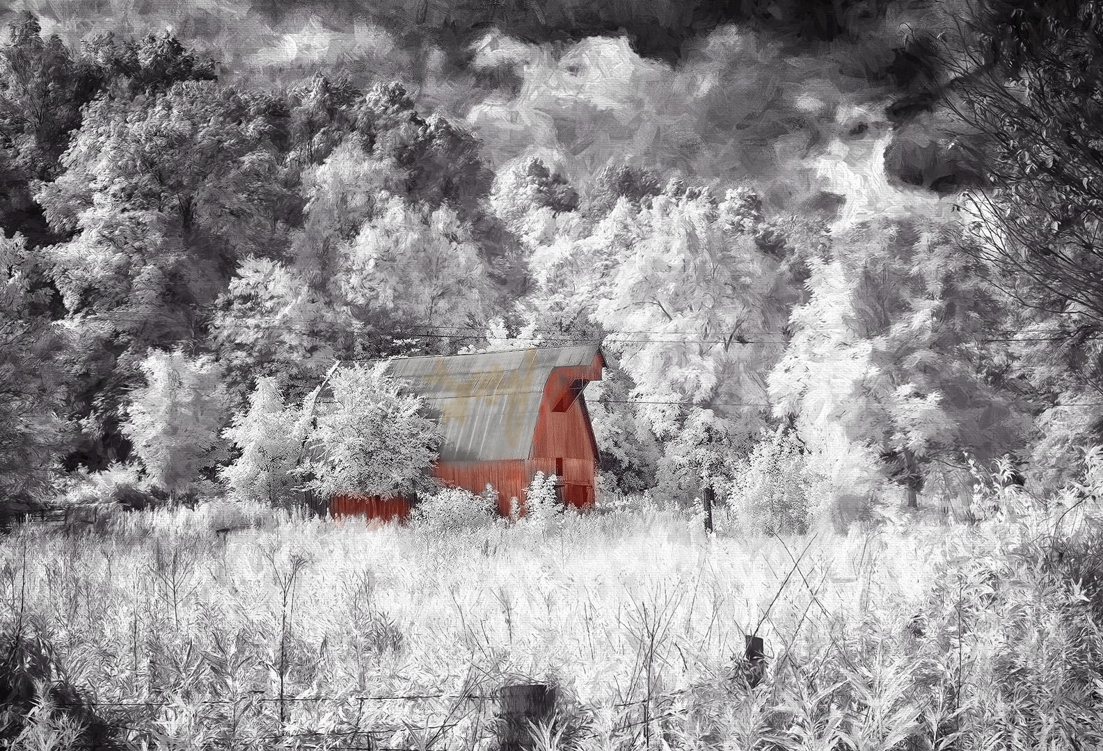
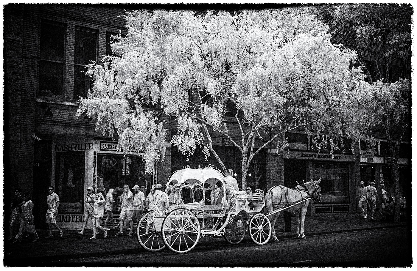
Thanks for both the feedback and the information on Luminar, Palli. This image was more whimsical than a serious attempt at a competitive image, but it was fun to just 'play'. The new computer is up and running now, so time to get back to the basics and get out and make some more images! All the best,
Gary |
Sep 13th |
| 66 |
Sep 21 |
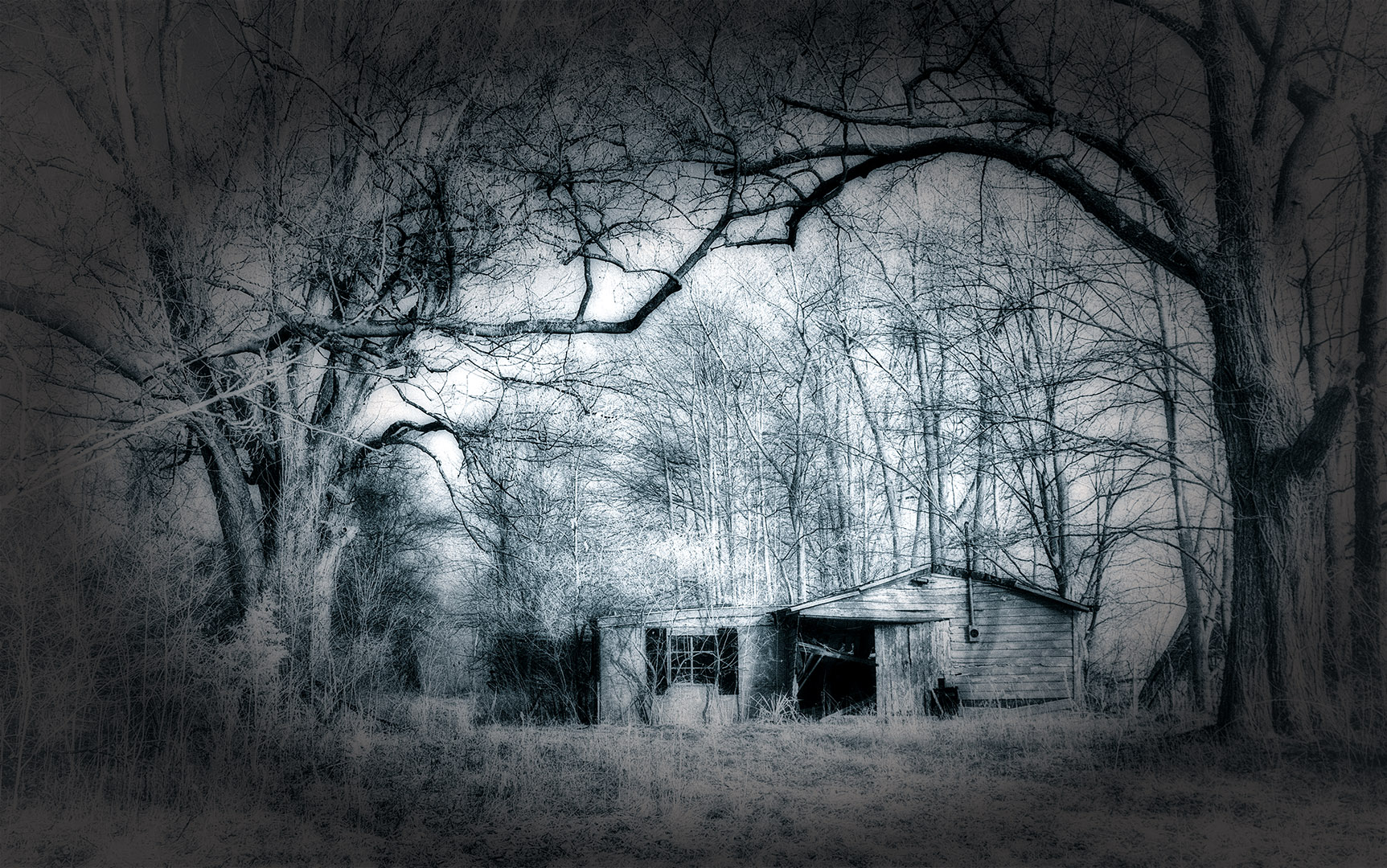
Reply |
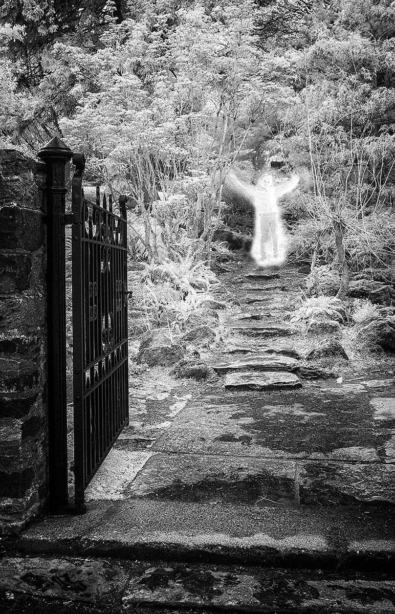
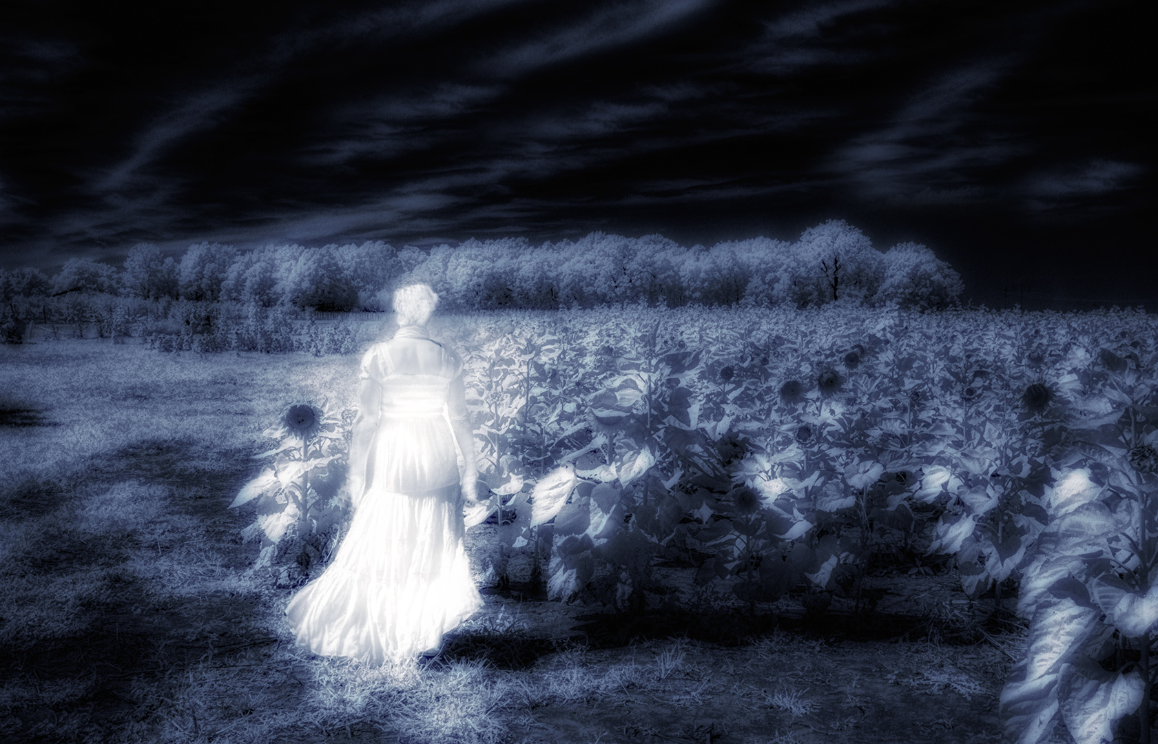
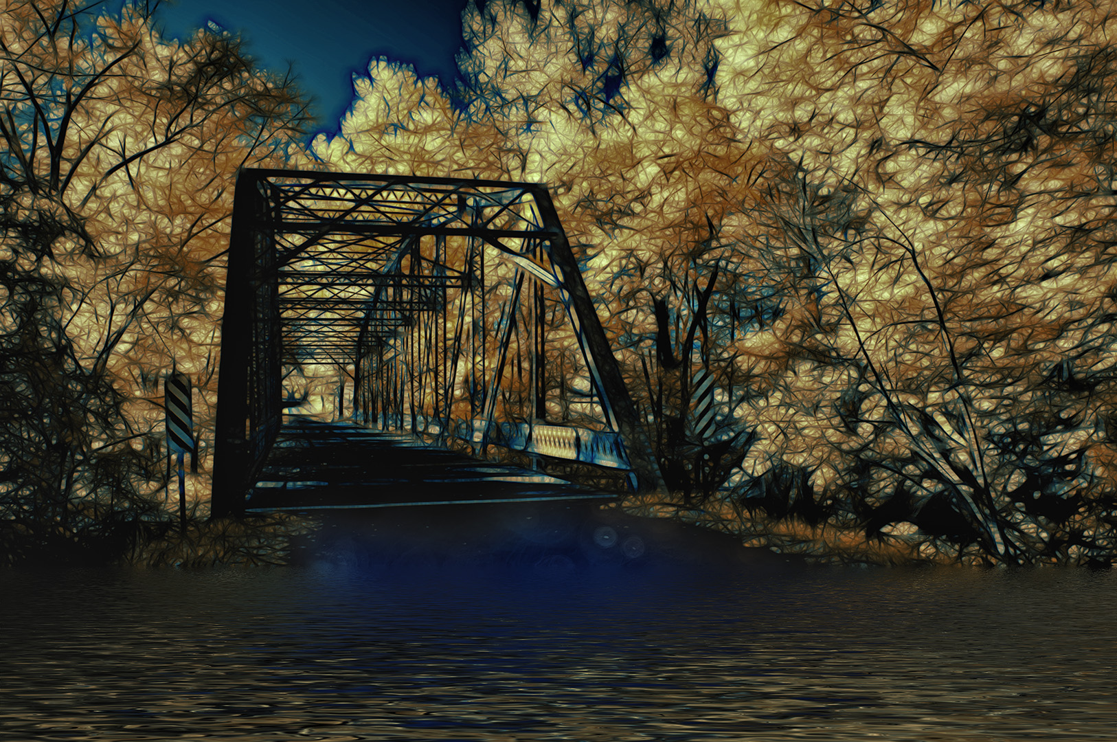
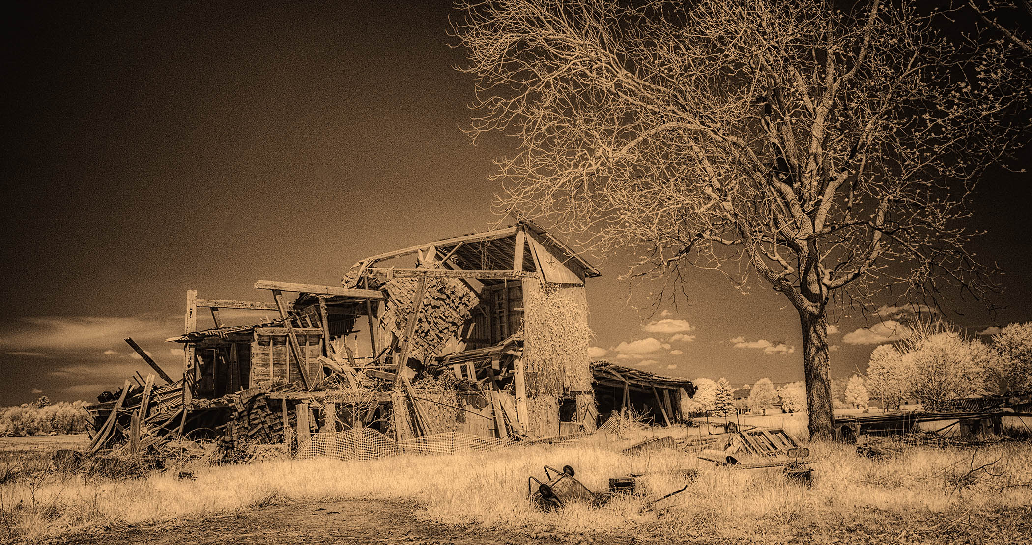
Thanks Melanie...appreciate your comments. I agree...and this month's image was more whimsical and experimental than a serious attempt at infrared fine art. I think the volume of leafless tree branches alone disqualify this one from making it into the international exhibition standards! |
Sep 13th |
| 66 |
Sep 21 |
Reply |
Thanks Charles...your comments are valuable and appreciated. This month's image was a bit whimsical...playing more than working on fine art. |
Sep 13th |
| 66 |
Sep 21 |
Comment |
Thanks Arik...I appreciate the critique and the wonderful information on software. I've used PS for so, so long that I fail to keep abreast of the 'all other' that is out there. Your comments were very helpful. As for my image this month, it was a bit whimsical in nature and sort of a hodge podge...the sunburst doesn't seem to add value in looking at it a second/third time!
Gary |
Sep 13th |
| 66 |
Sep 21 |
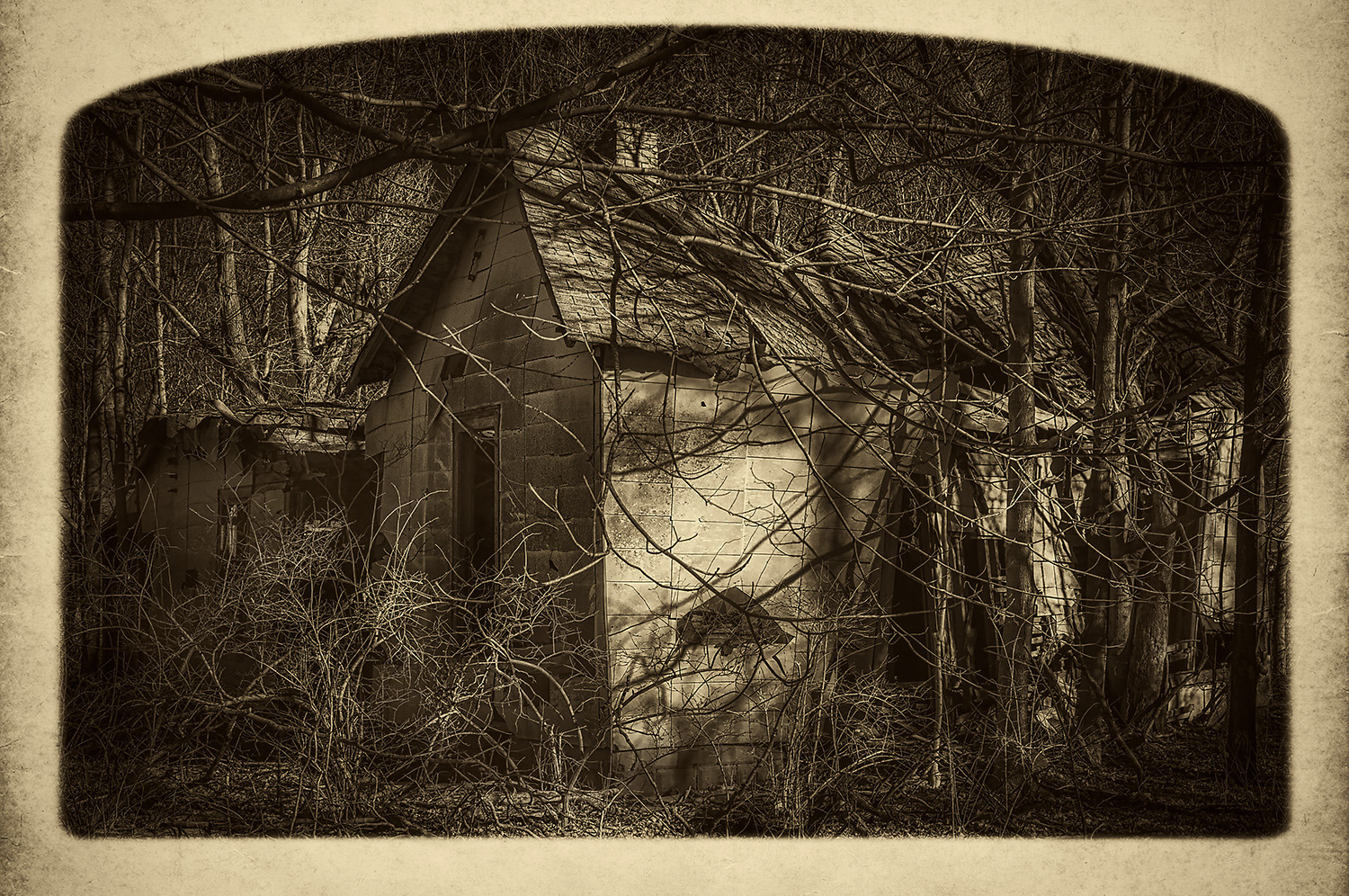
Comment |
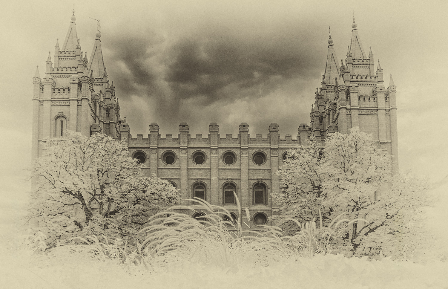
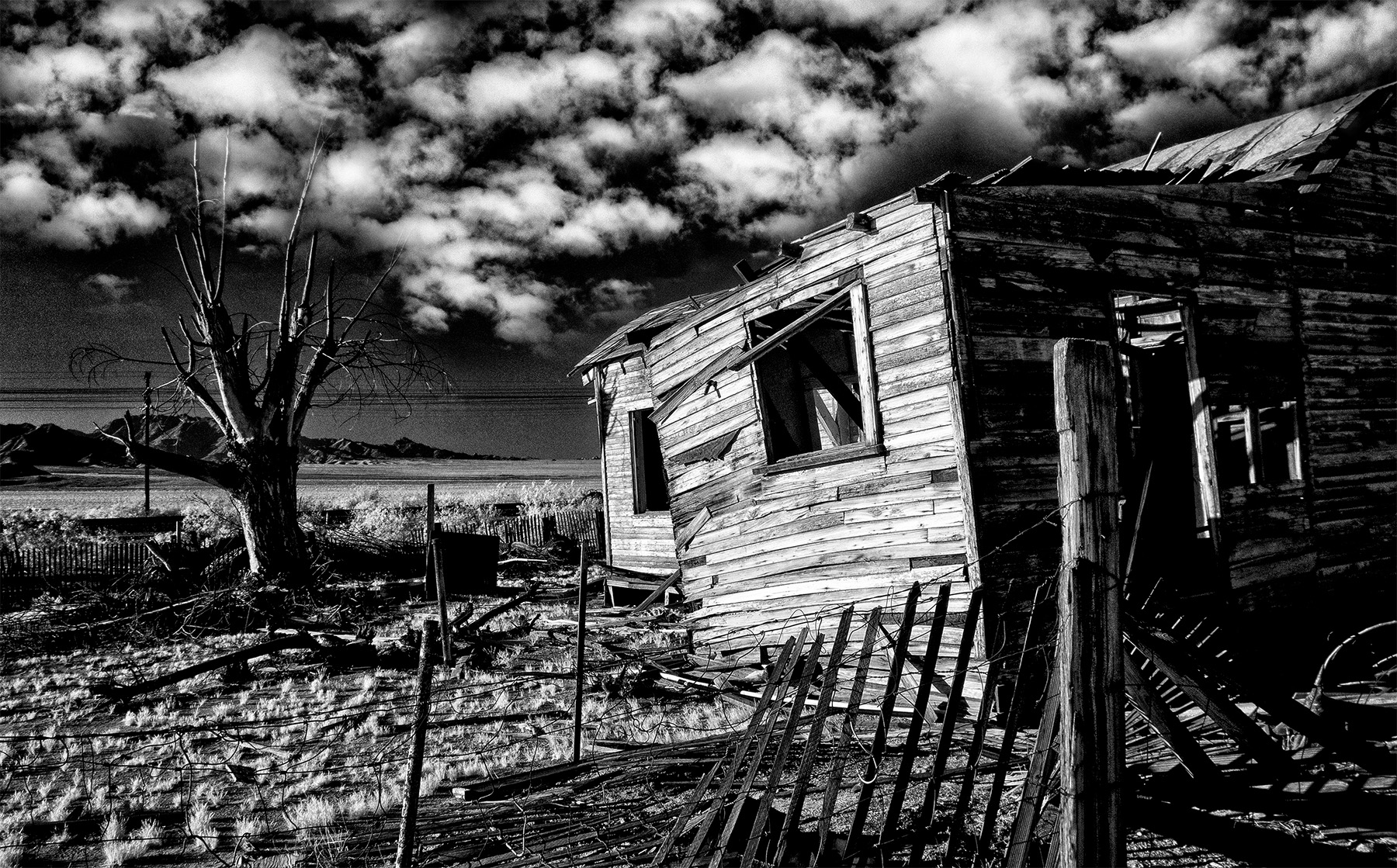
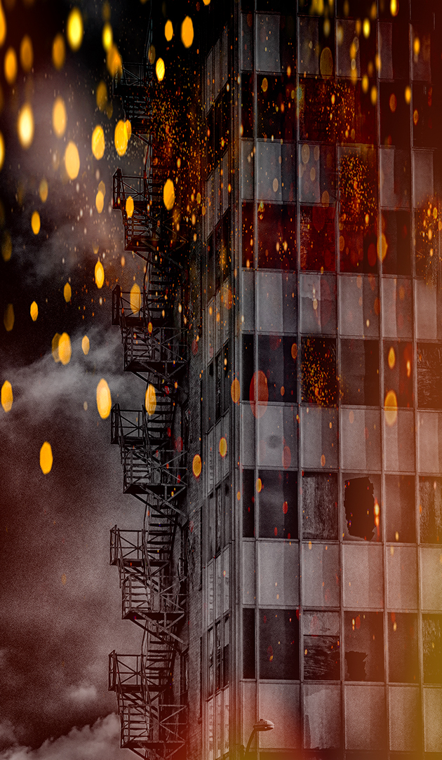
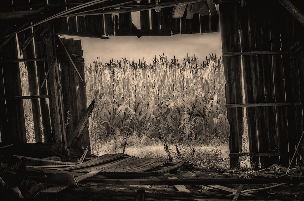
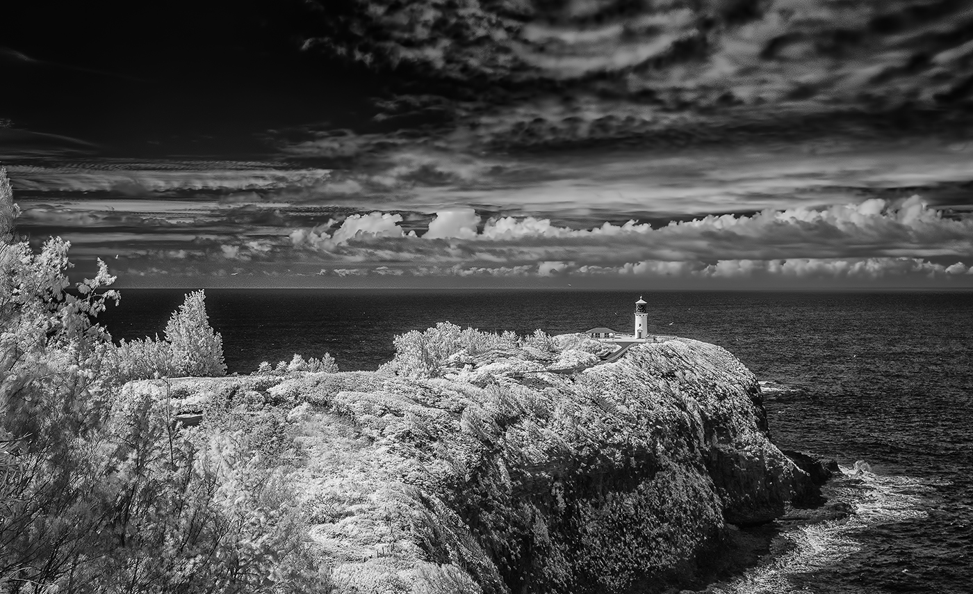
Hi Emil,
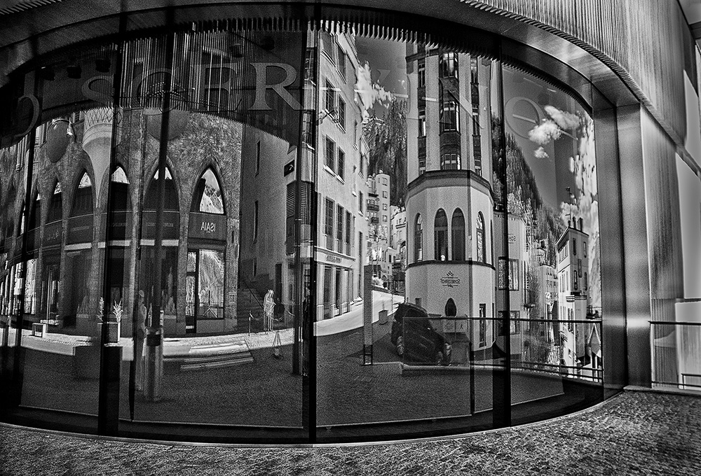
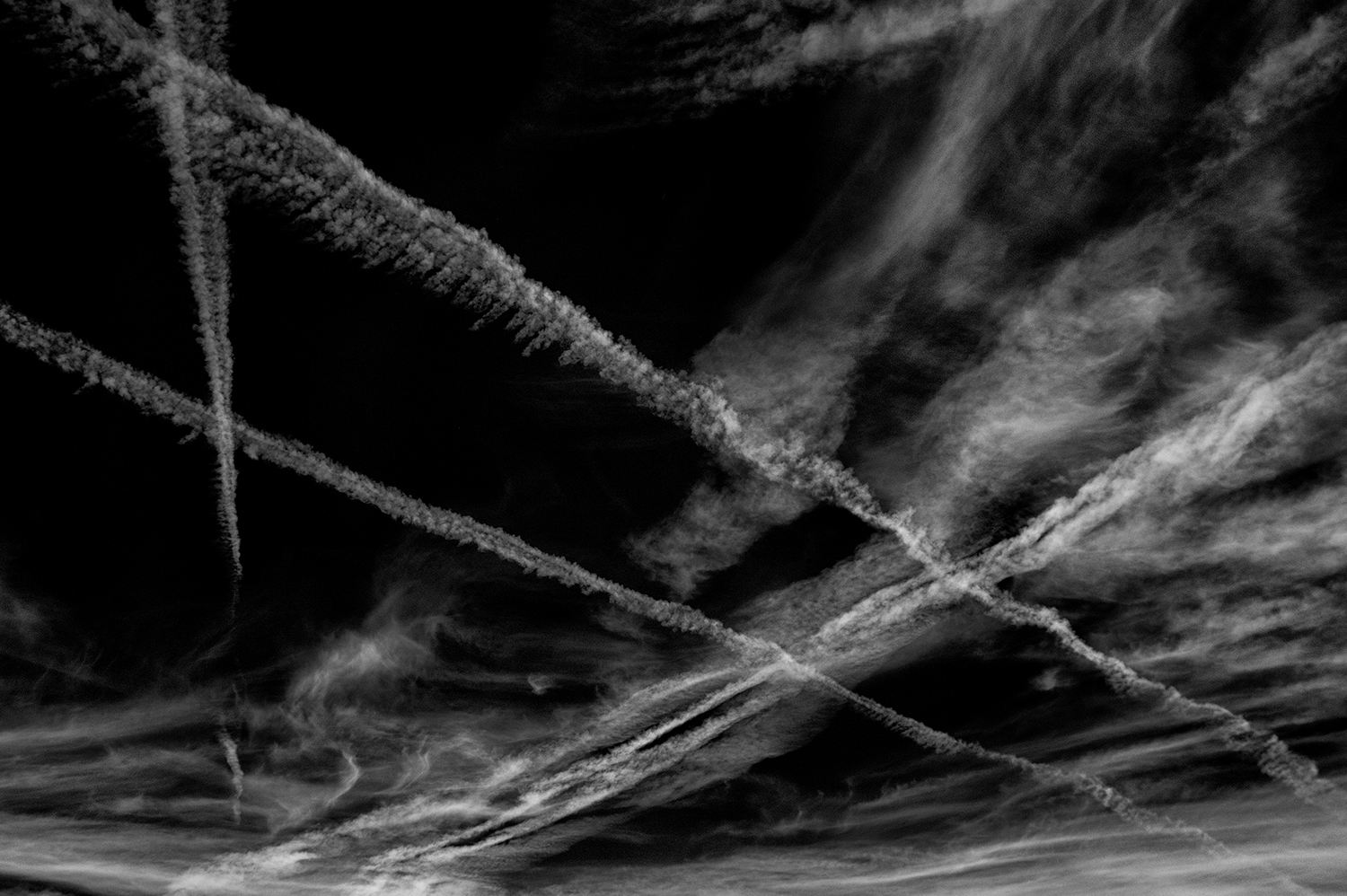
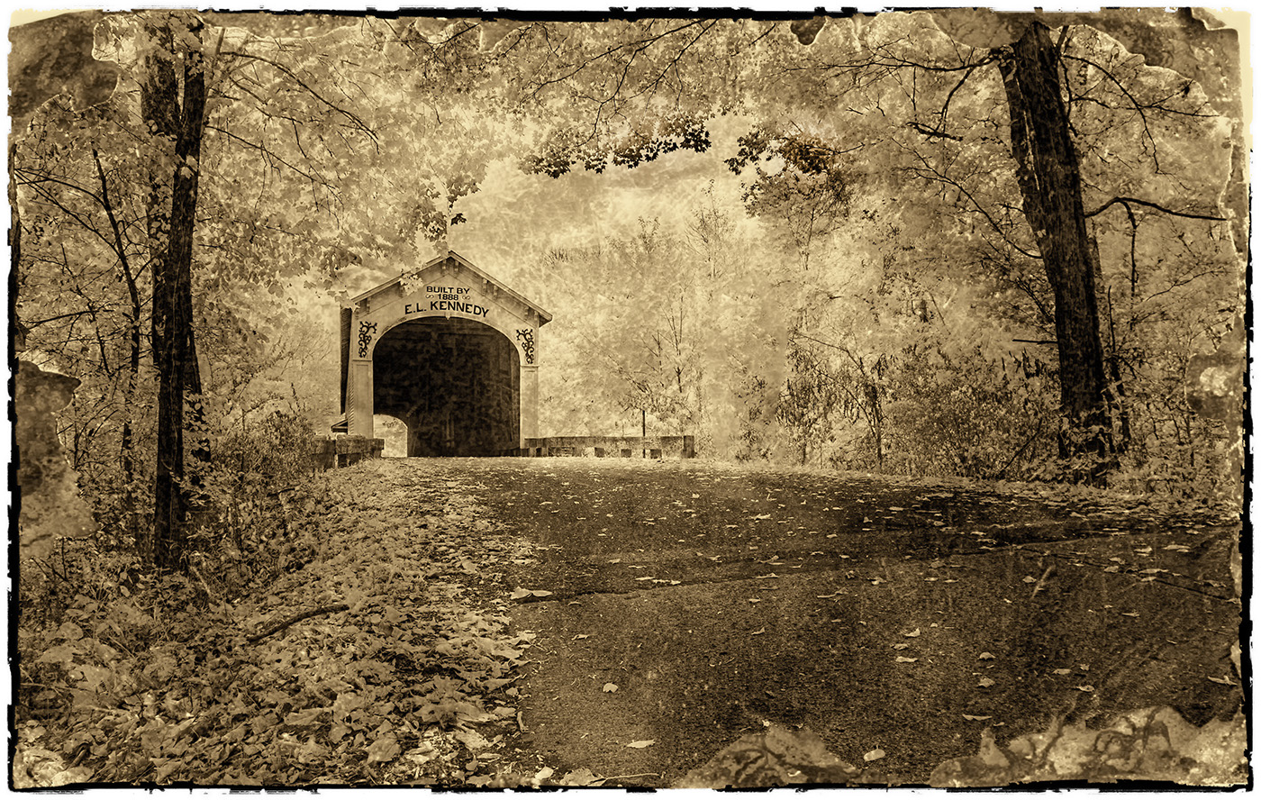
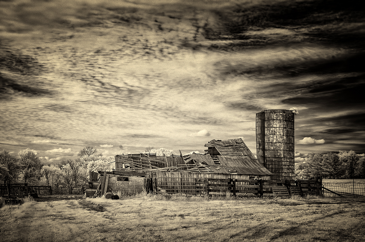
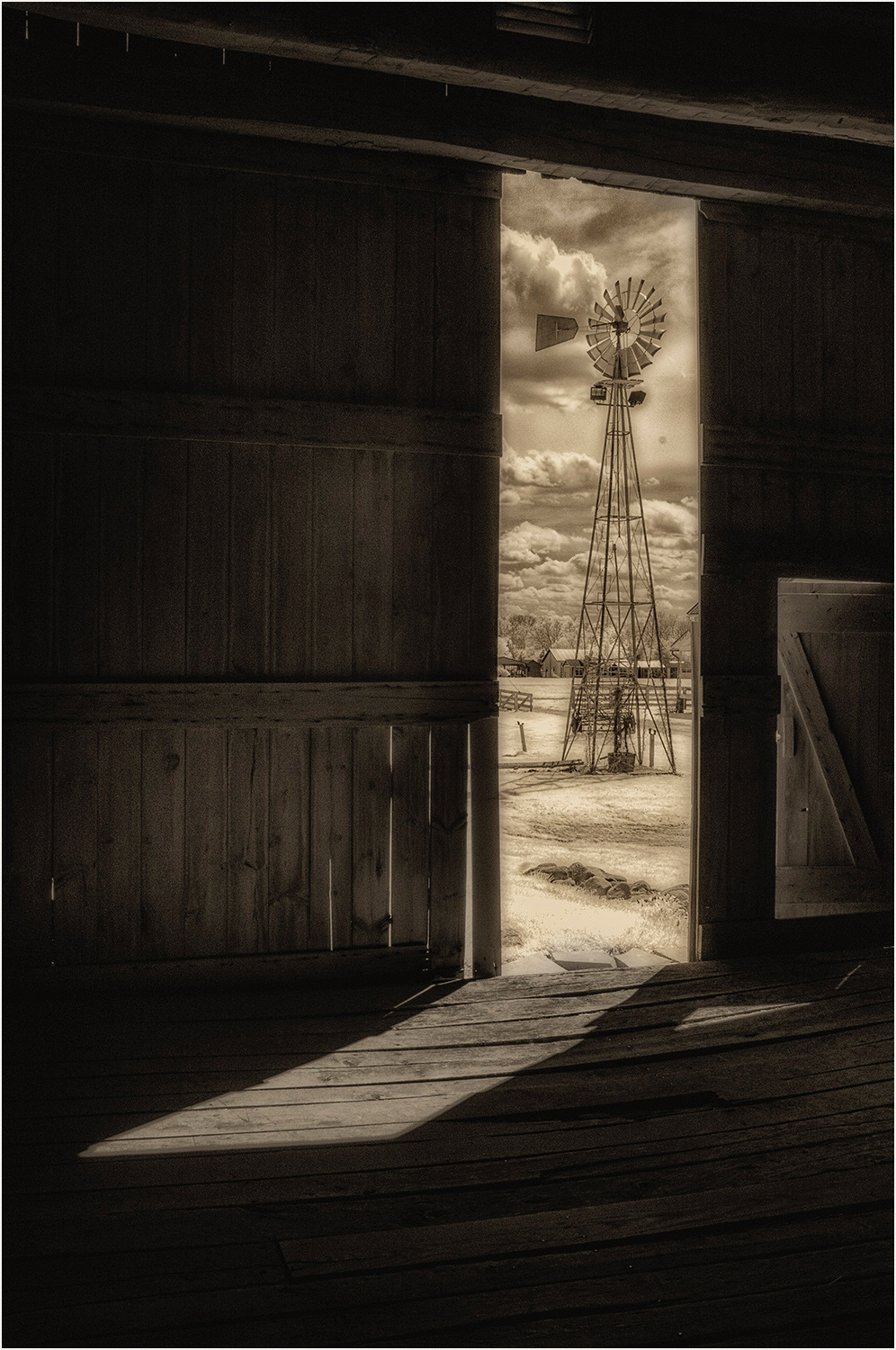
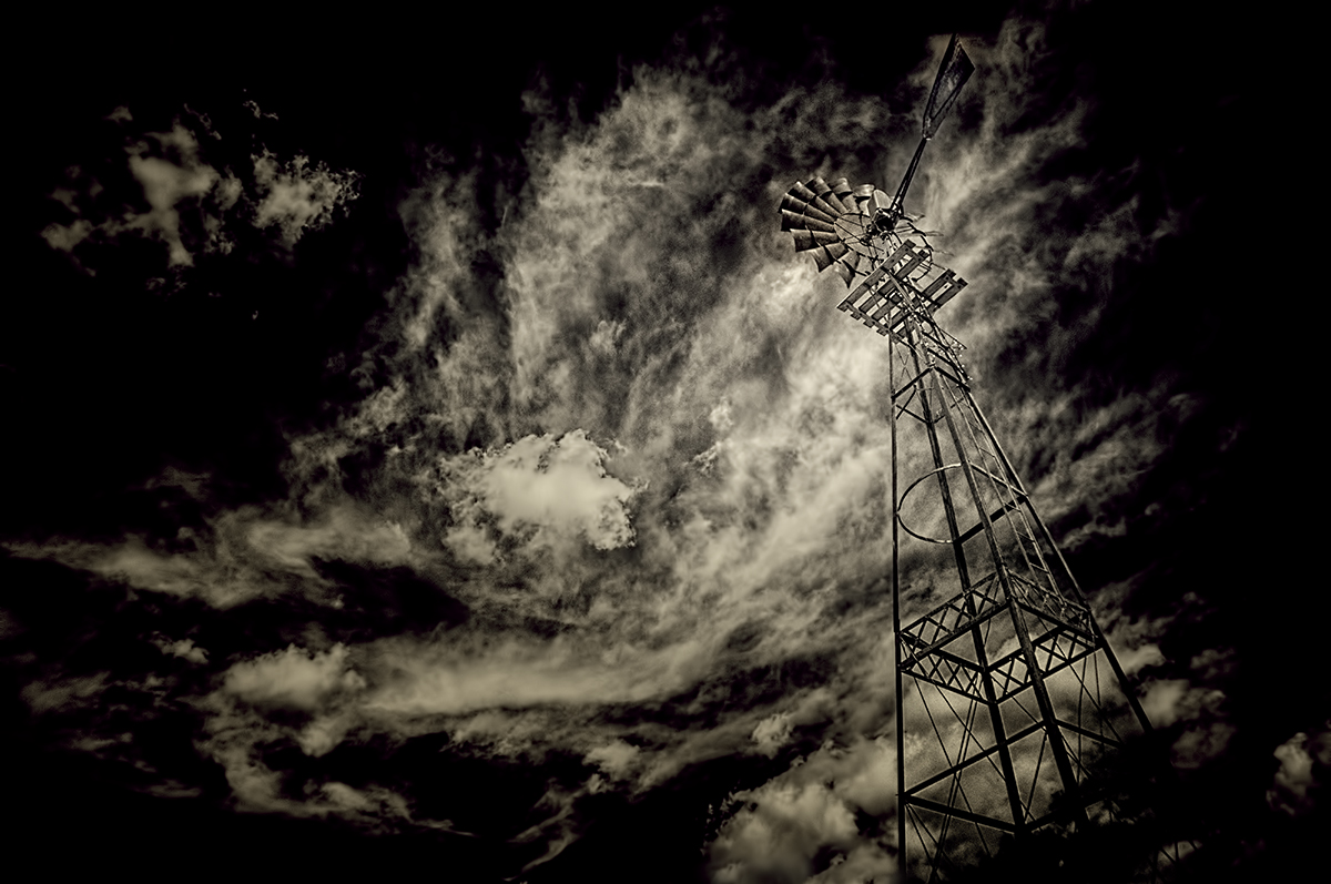
I like this very much, and for me, the addition of the clouds has created a dramatic and strong first impression. In other words, the image has a lot of impact. Two minor suggestions...tone down that very bright section of the building in the upper rh corner of it...second, there's some messy noise in one small section of the sky you could easily smooth with Gaussian Blur or another tool. |
Sep 5th |
| 66 |
Sep 21 |
Comment |
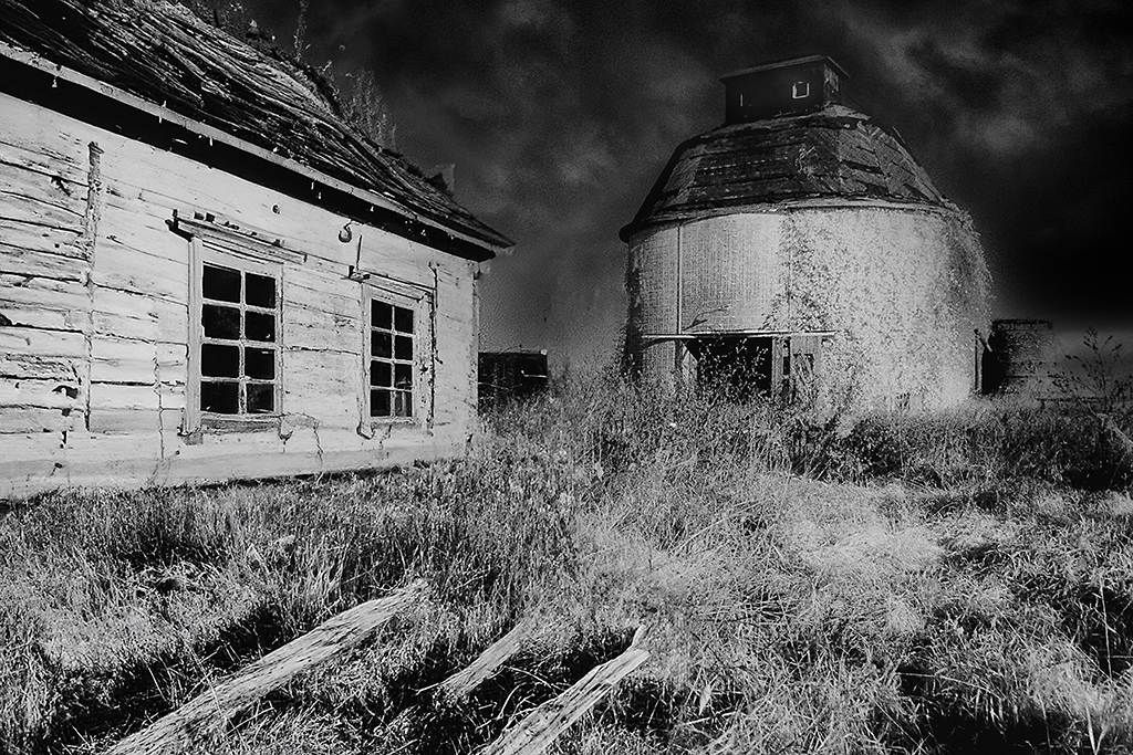
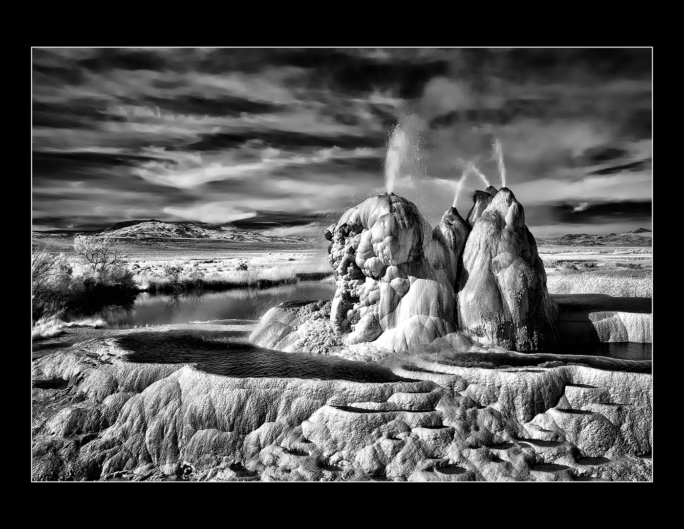
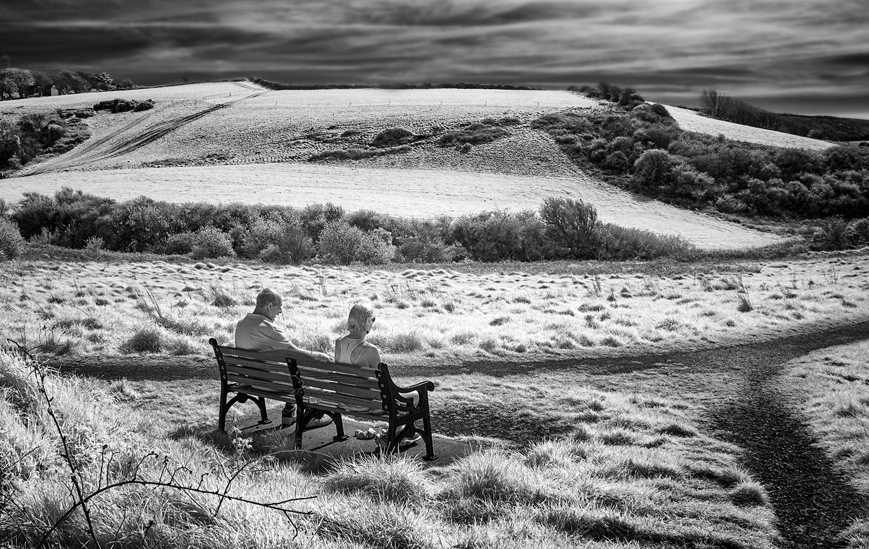
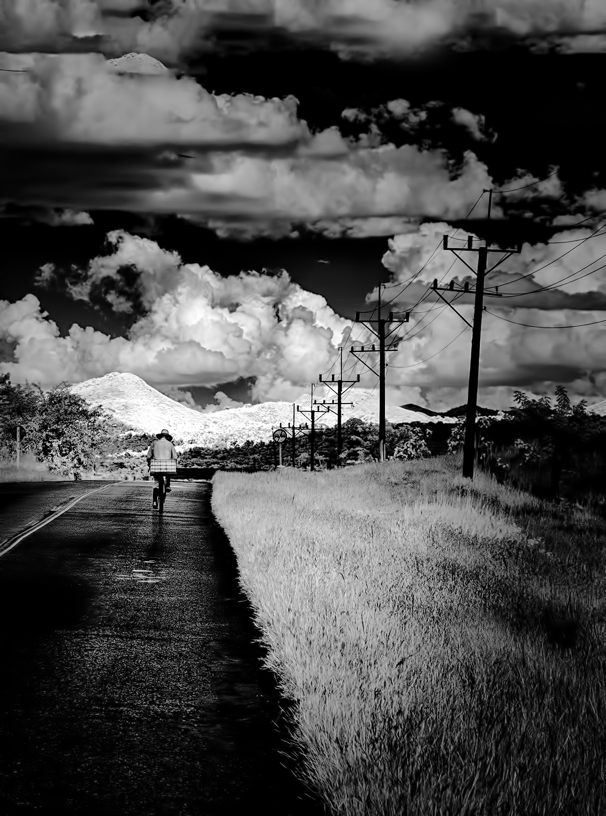
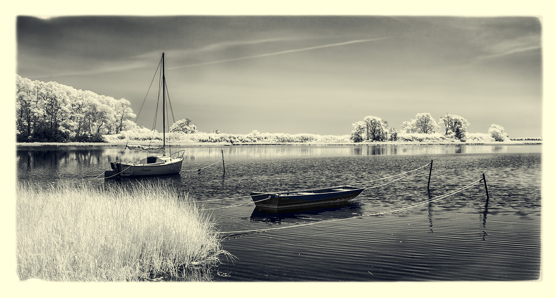
Hi Palli,
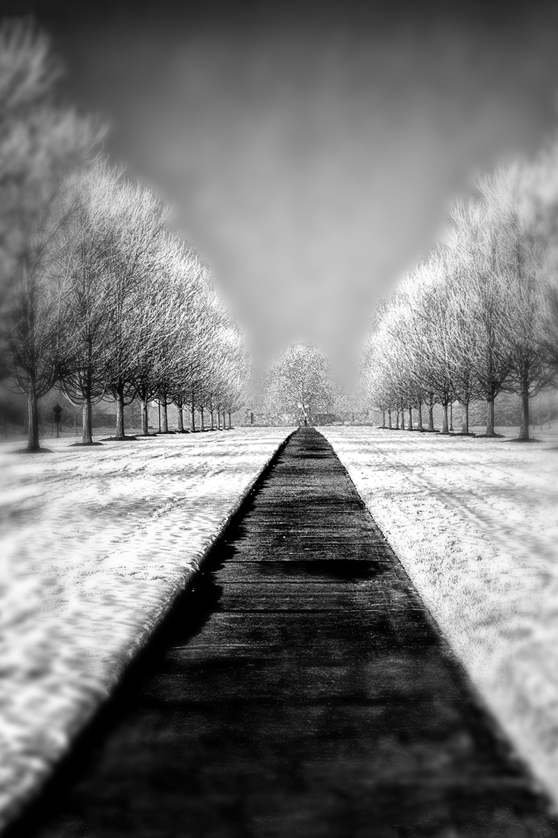
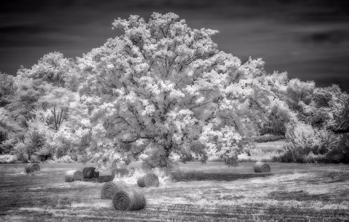
Great scene! Personally, I am troubled by the large mass of road, even as it leads to the bridge. I would have liked a composition with you more to the right and maybe onto the snow/grasses with little or no roadway. Also, it doesn't look completely sharp to my eye...but that could have been your intent? Standing right where you were but bending down to near the road surface might also have minimized the 'mass' of road that troubles me a bit. |
Sep 5th |
| 66 |
Sep 21 |
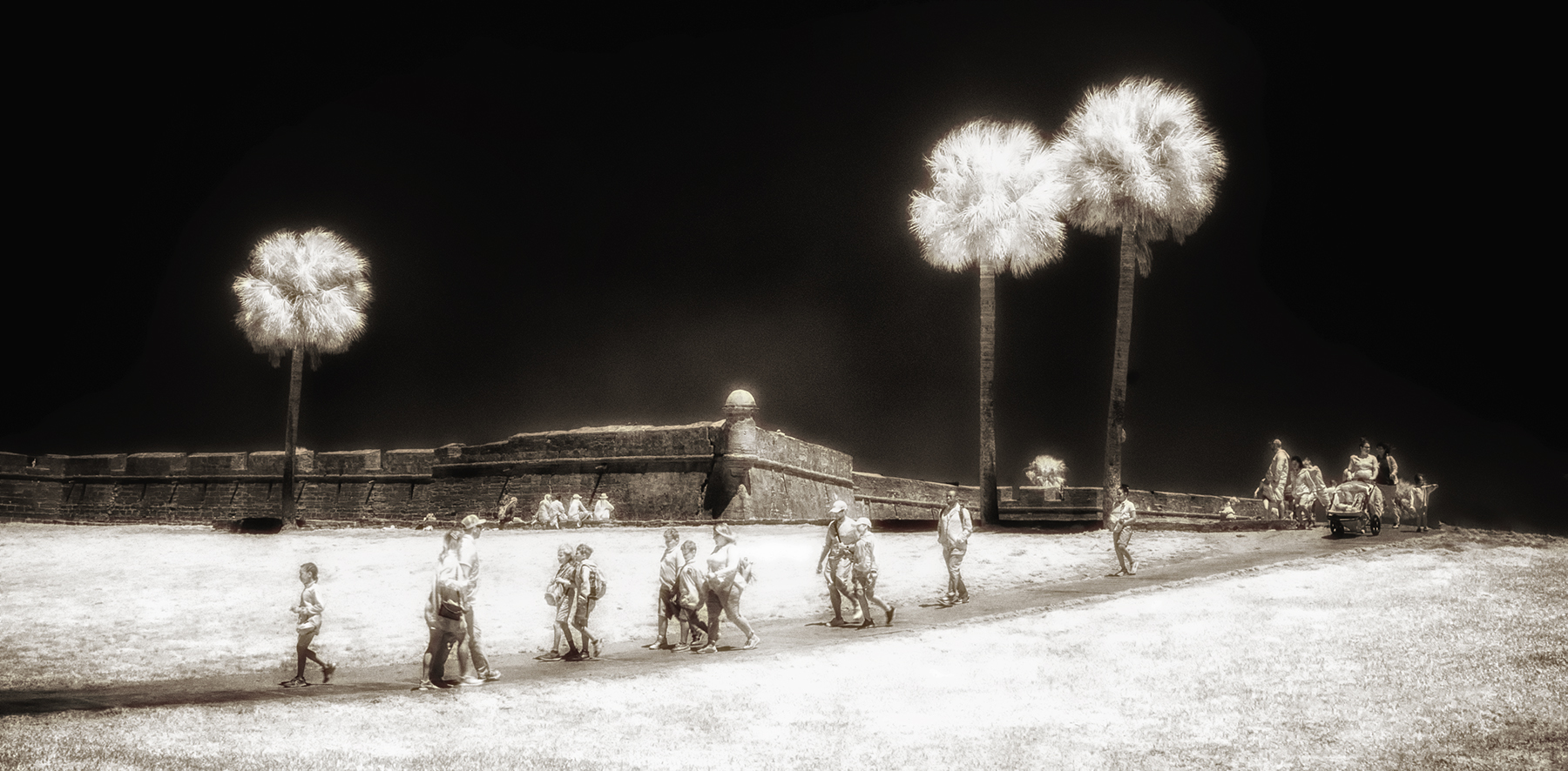
Comment |
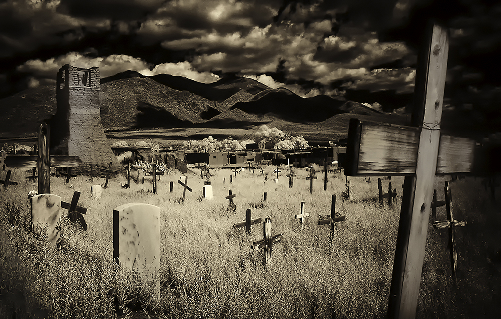
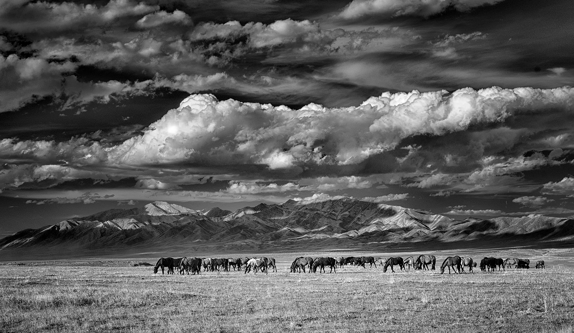
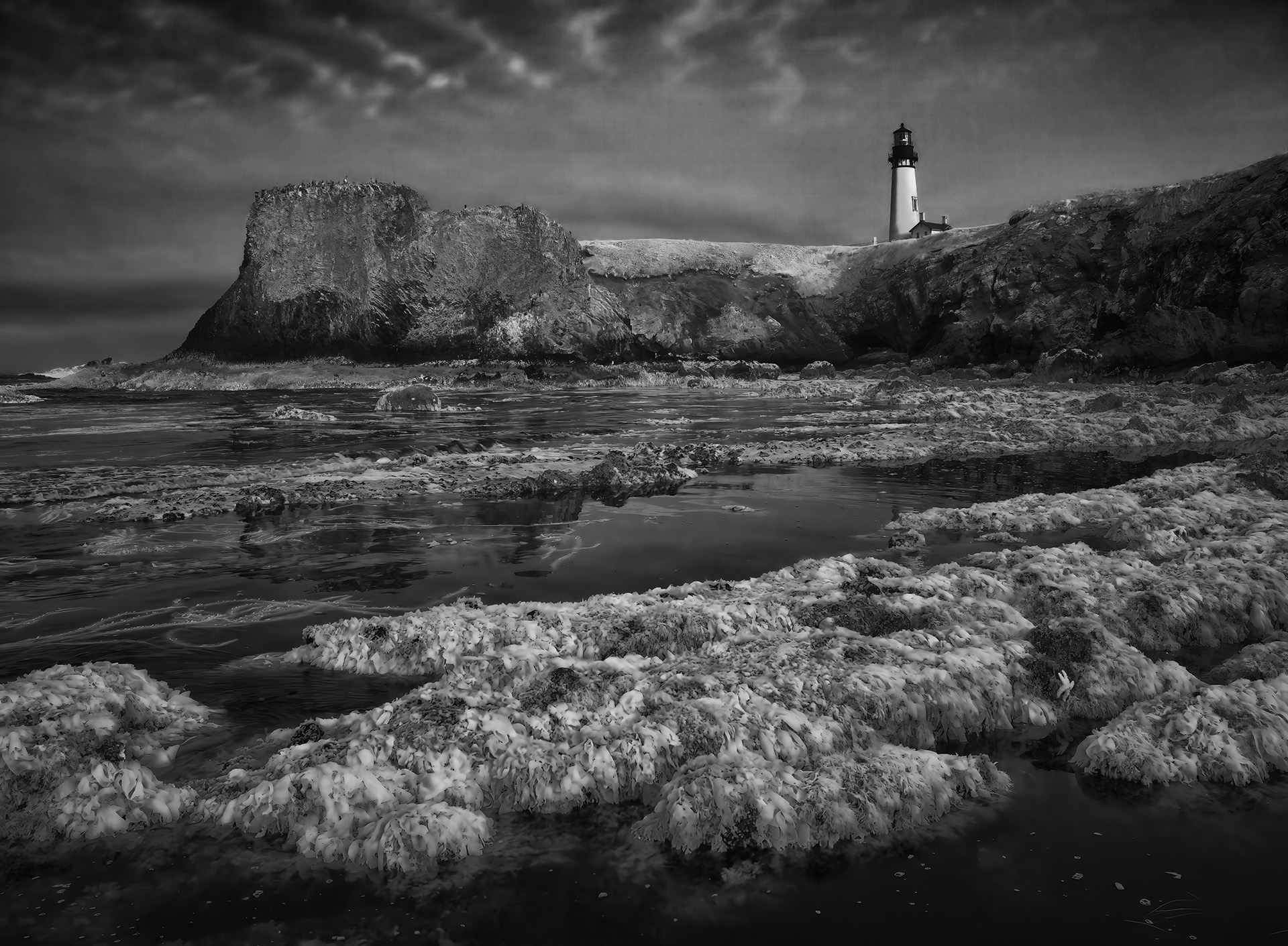
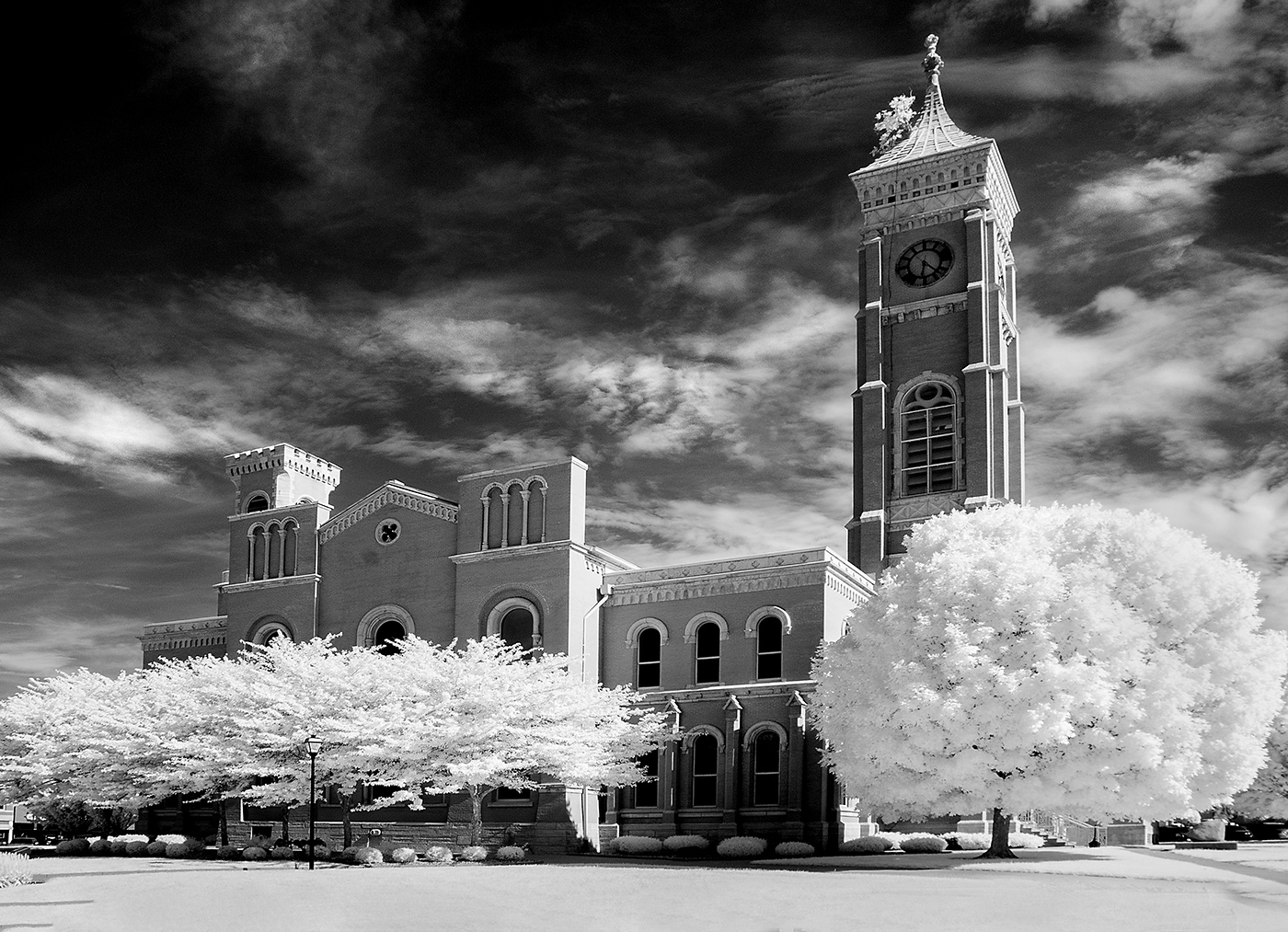
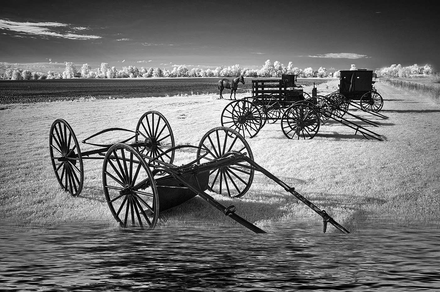
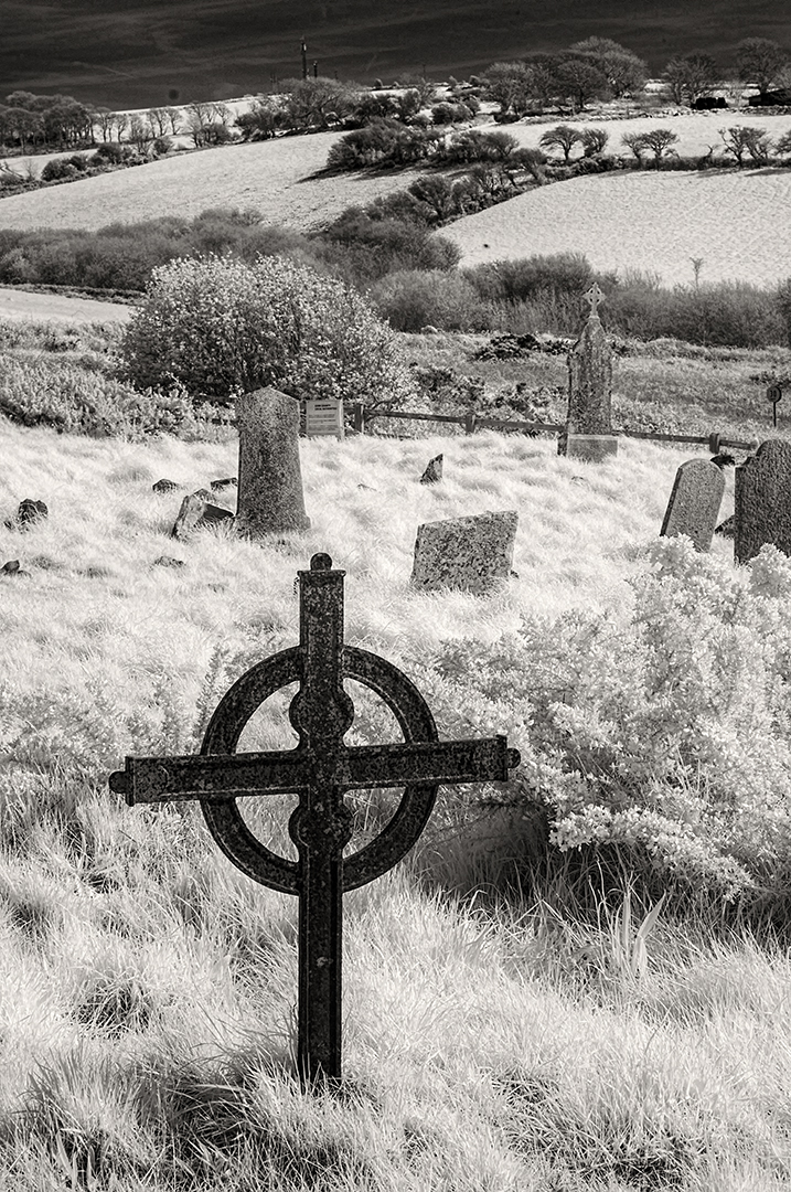
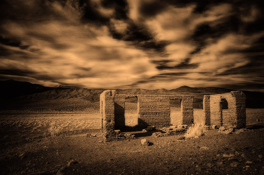
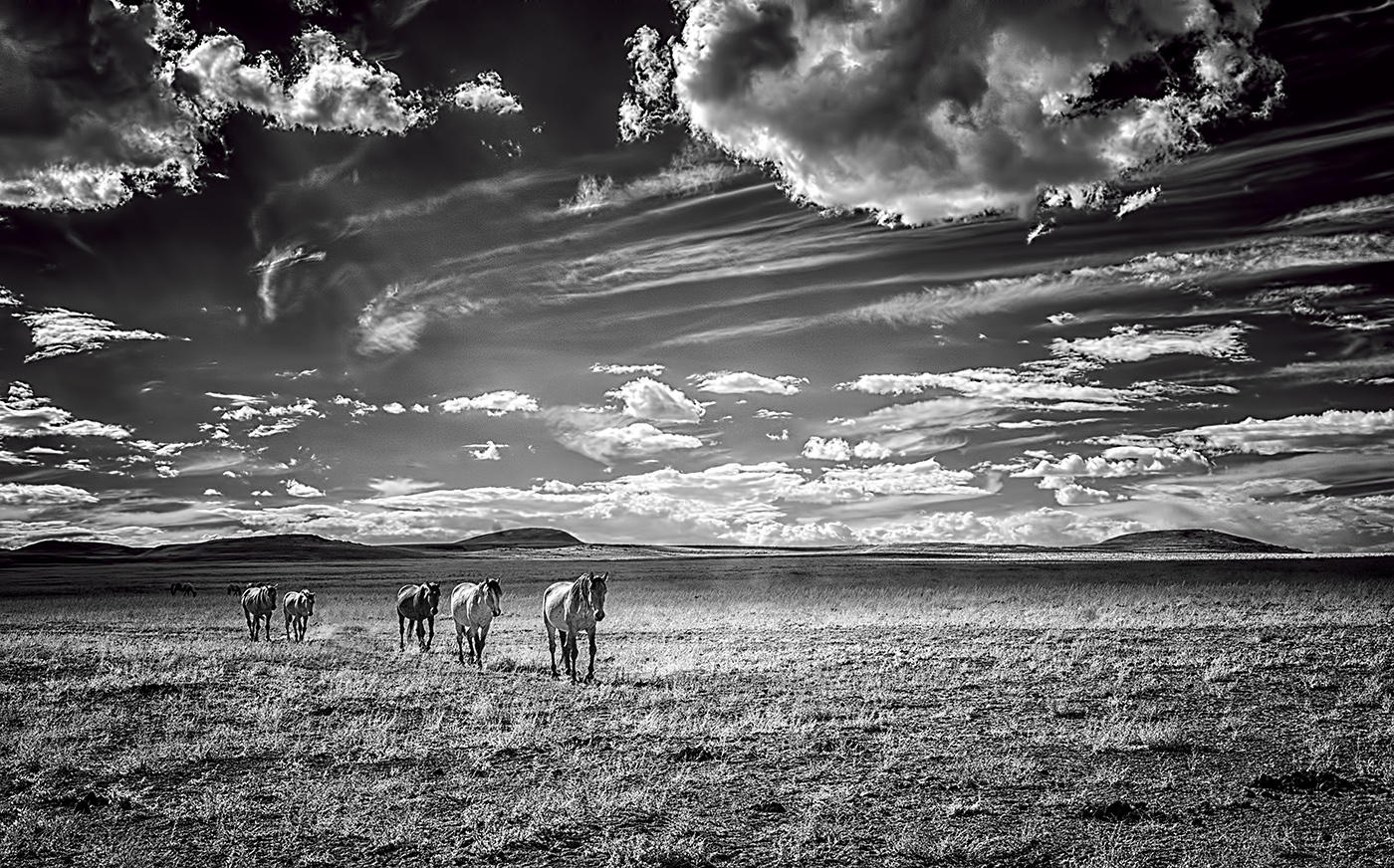
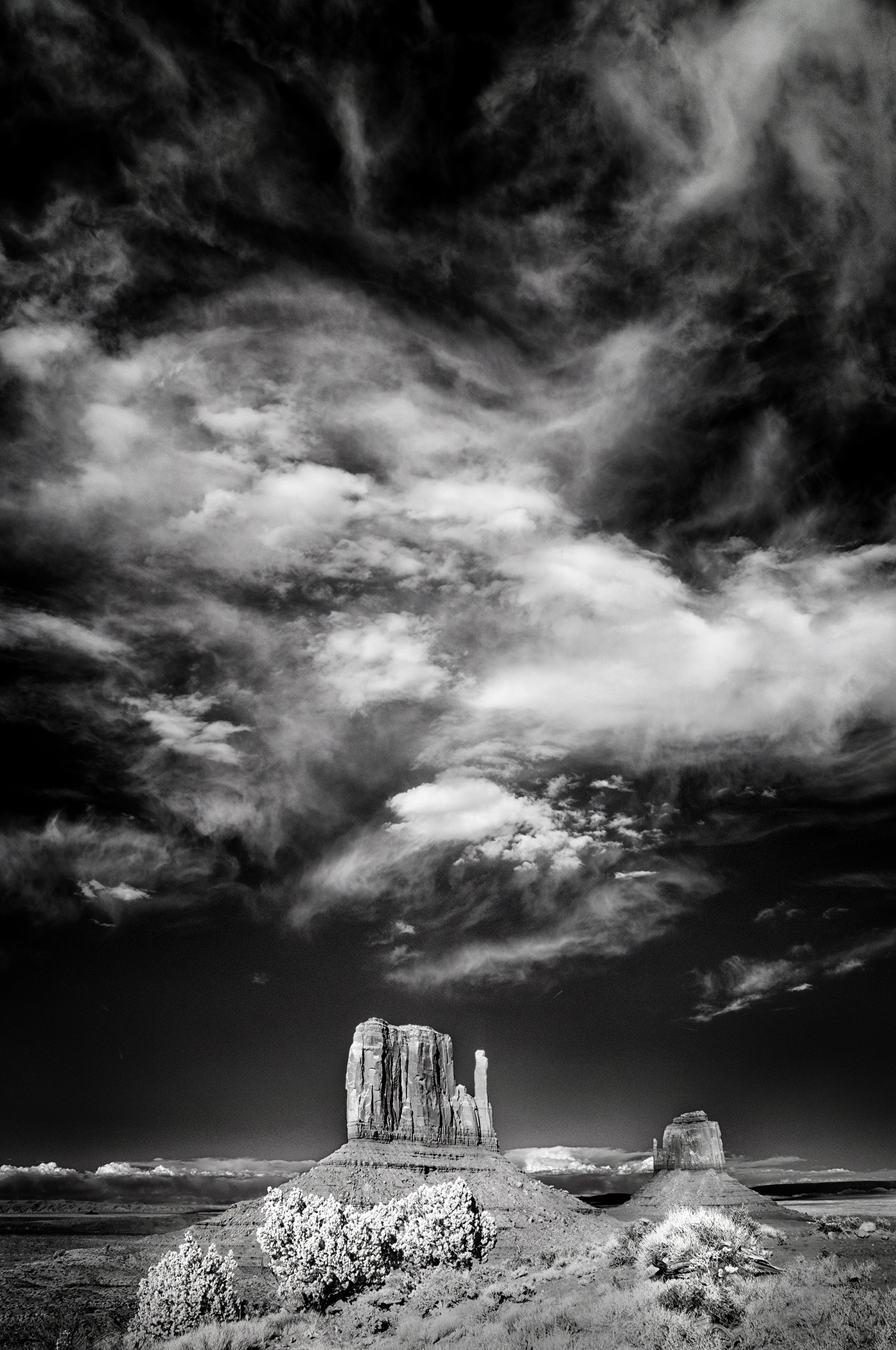
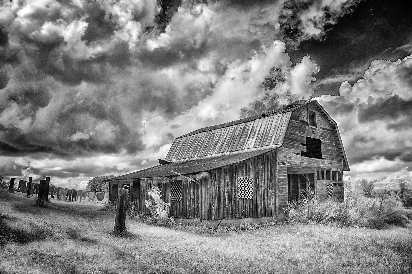
Hi Charles,
Magnificent. My only suggestion, and I noted this the second I opened your image, is that the foreground needs a whiter cloud reflection to give the image more balance. The foreground and mid-ground are quite dark. |
Sep 5th |
| 66 |
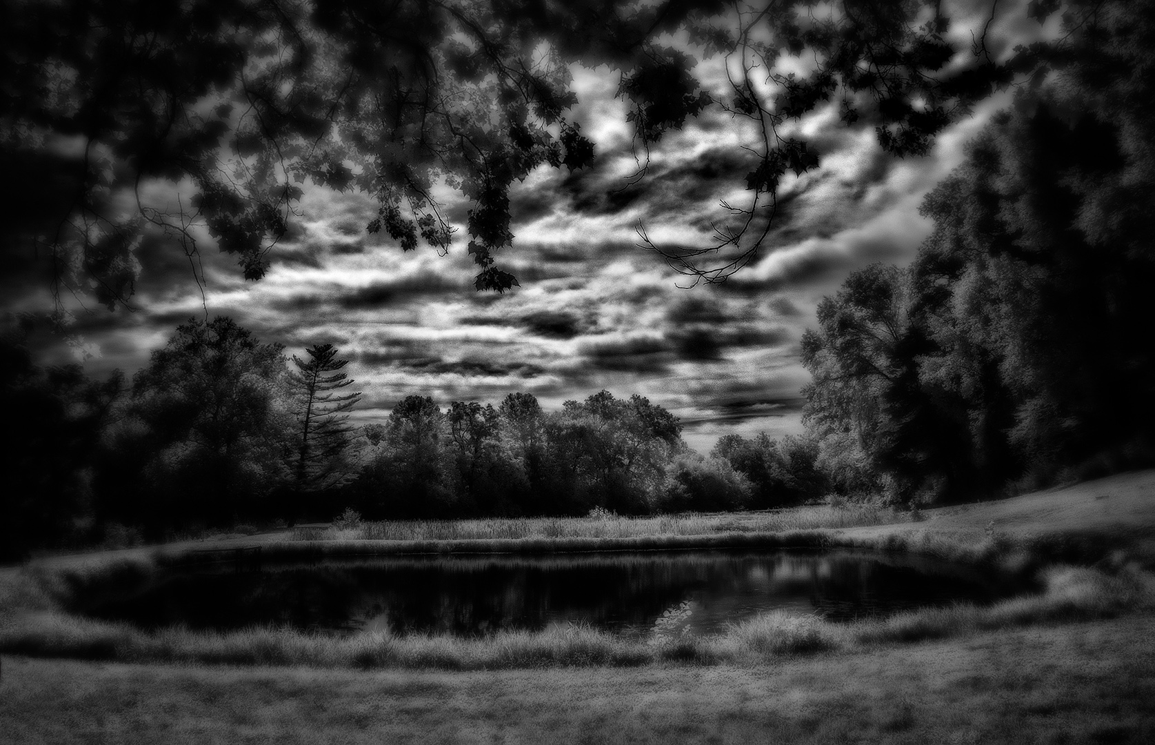
Sep 21 |
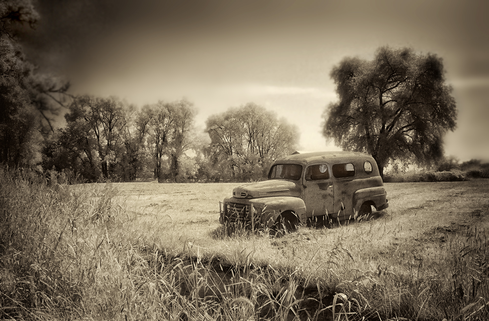
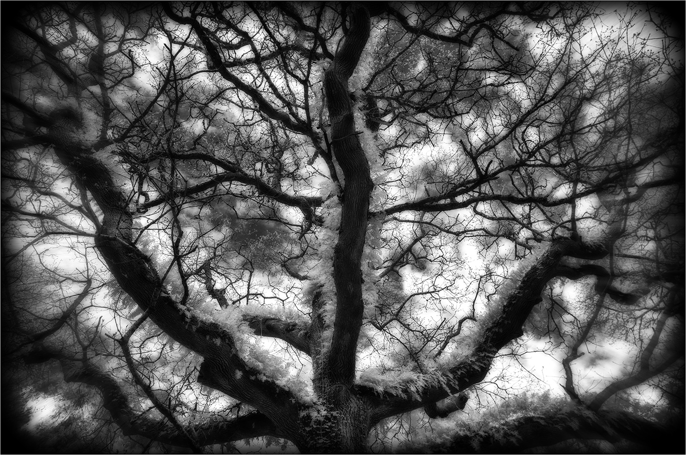
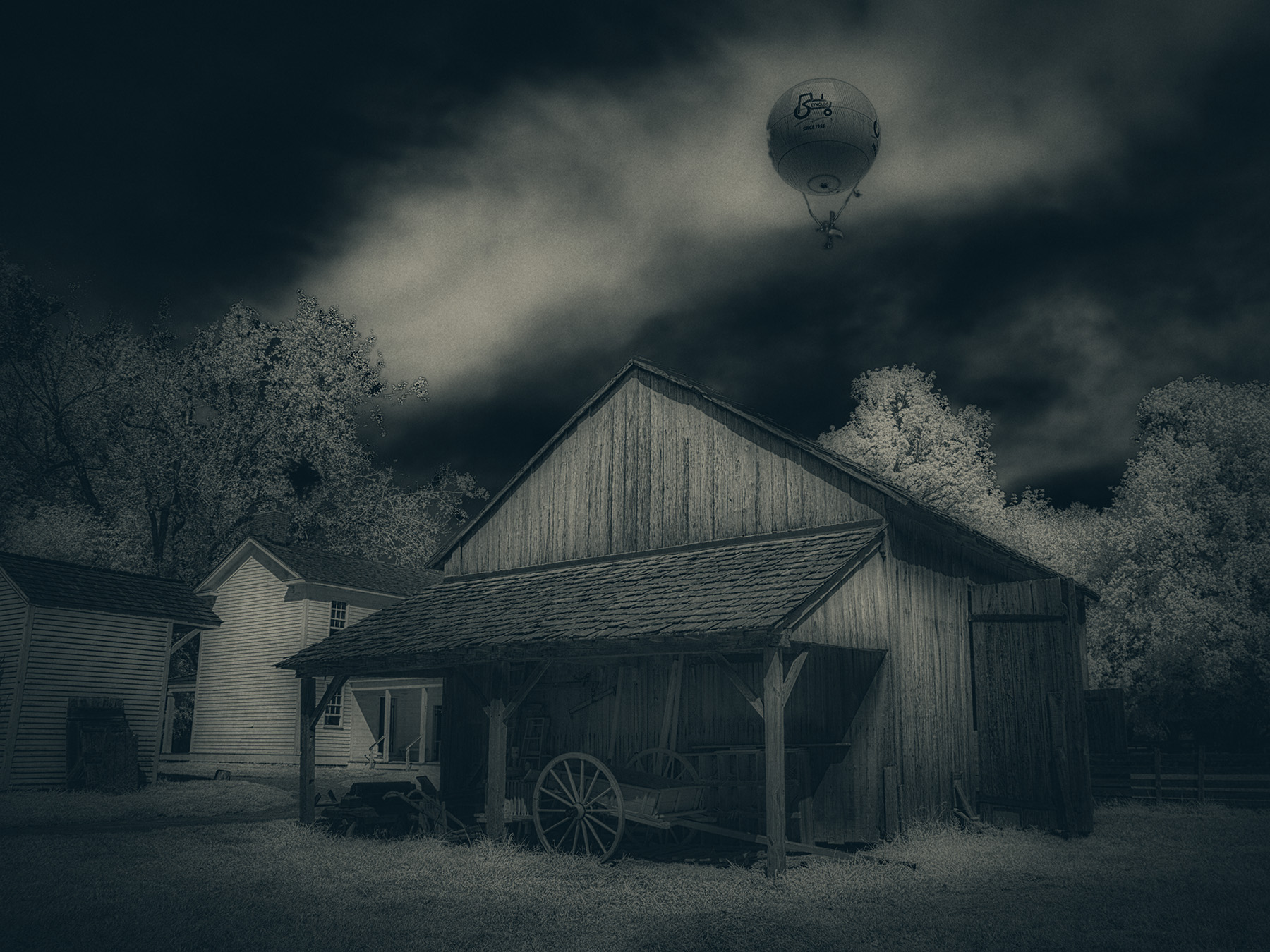
Comment |
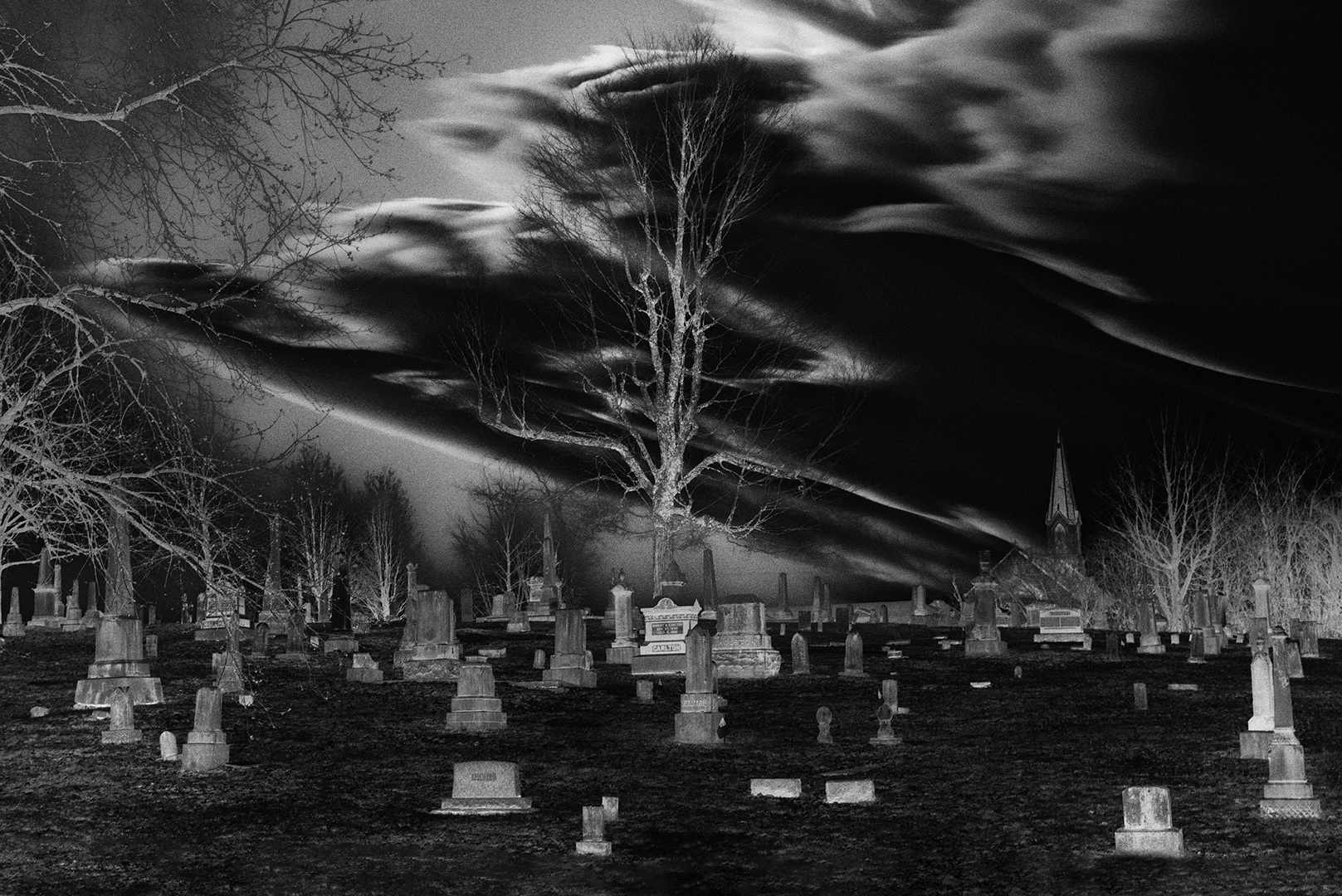
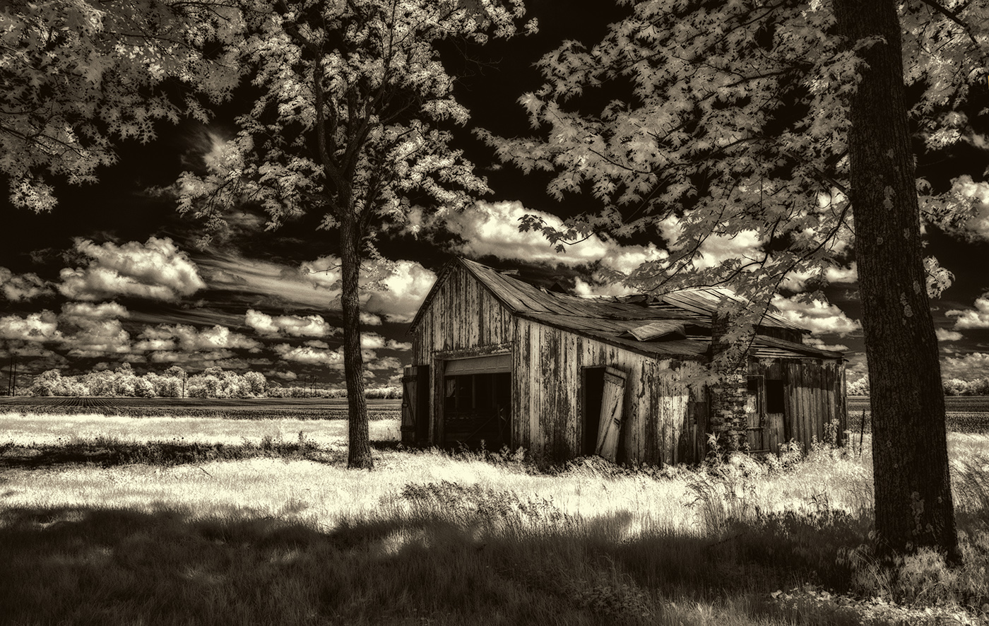
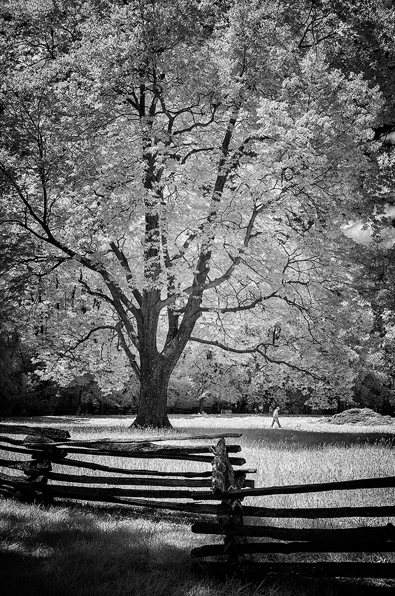
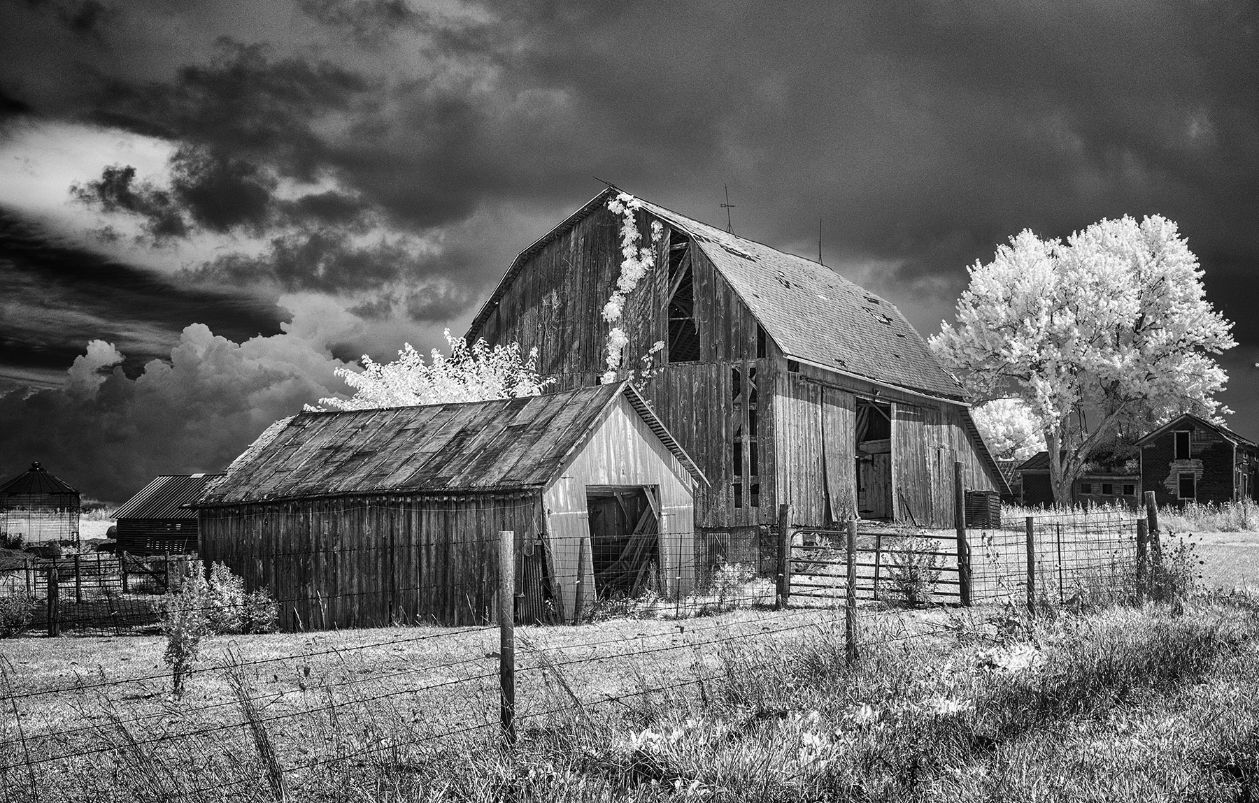
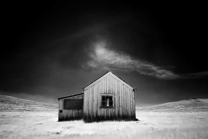
Fine art Jack...just magnificent in my view. I might select the foreground grasses and sharpen them ever so little, then darken them a tad, especially on the frame edges. |
Sep 5th |
| 66 |
Sep 21 |
Comment |
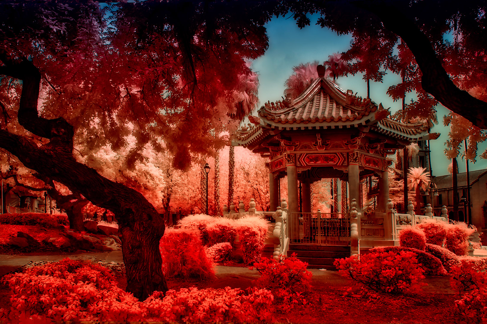
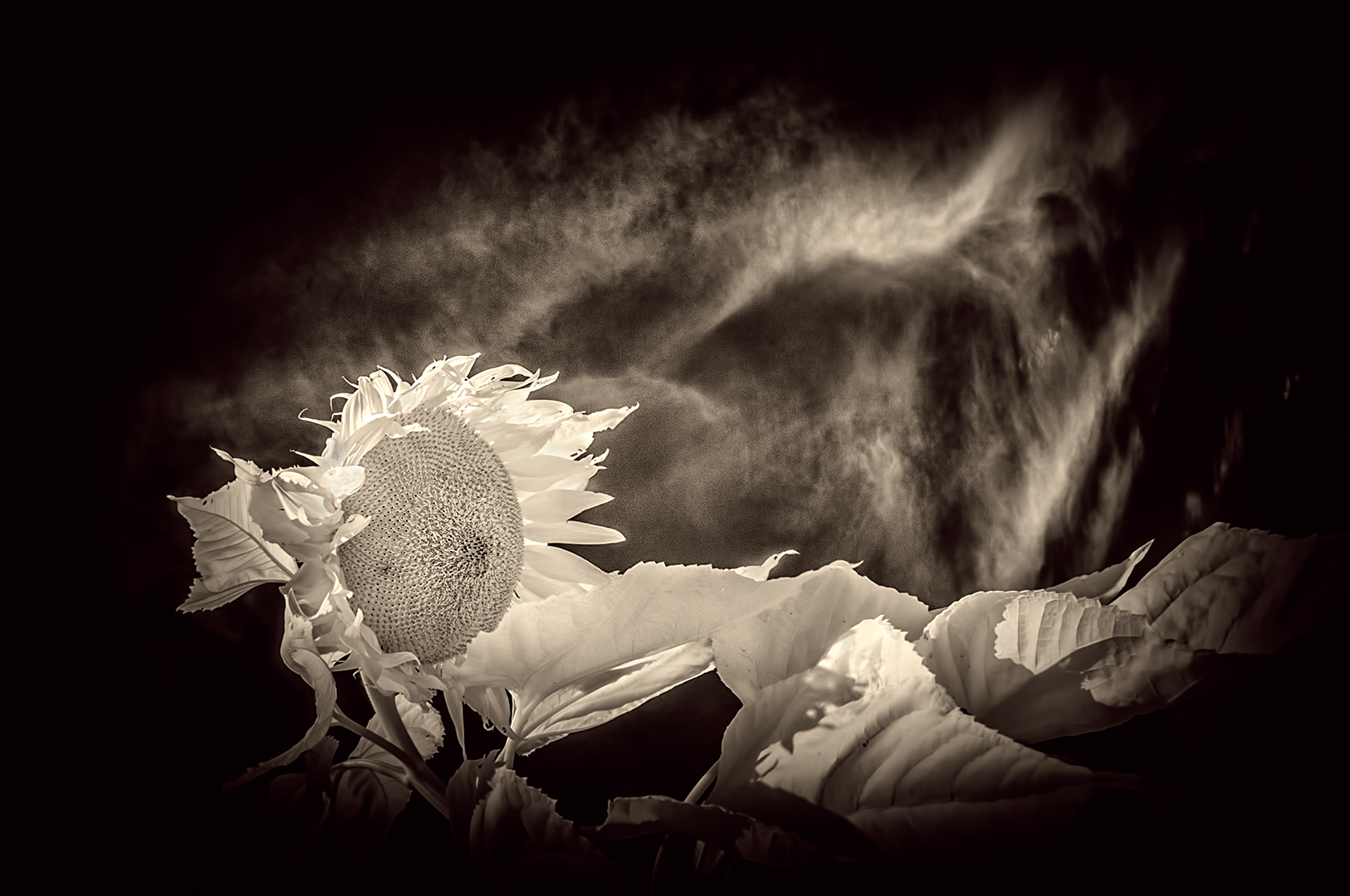
Arik...
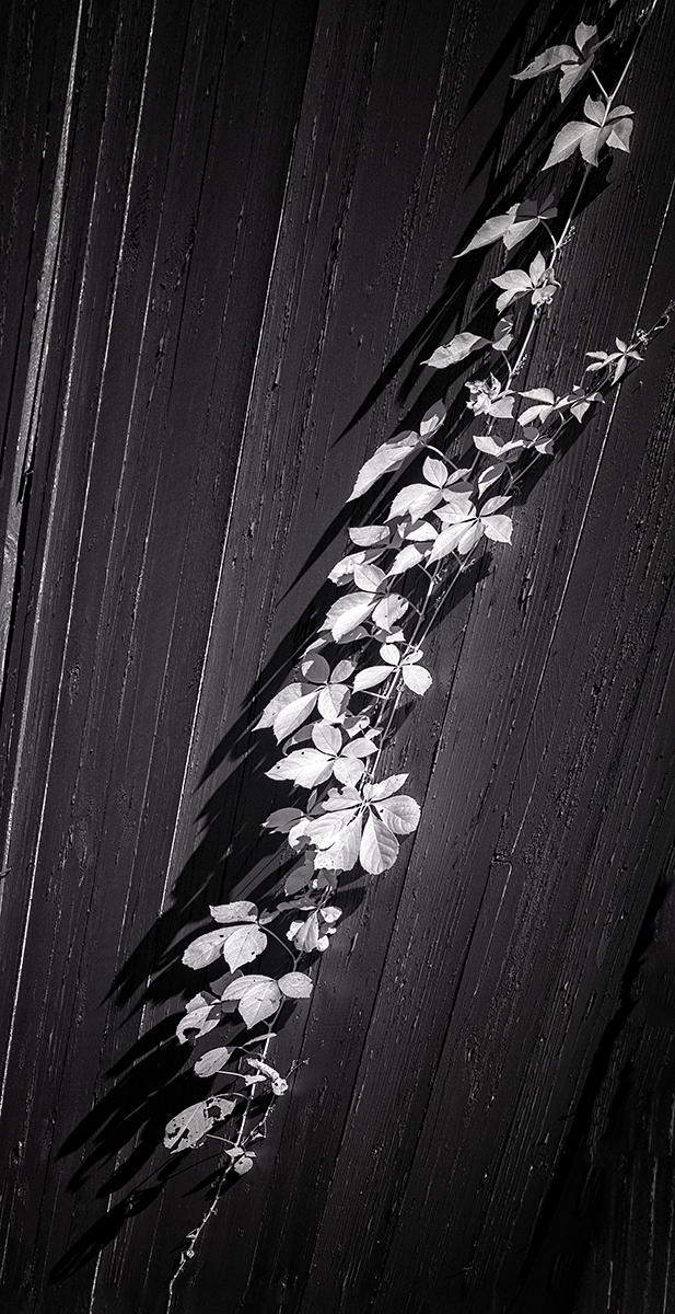
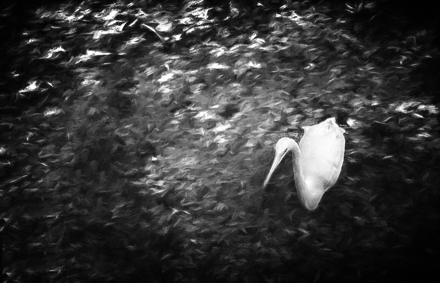
My very first impression of this...HOW DID ARIK manage two completely different tones of white in the flower versus the foliage all around it. It's almost as if the color temperatures were different on the bloom versus all the rest. It has immediate impact in my opinion and is strong due to its simplicity and stunning presentation. |
Sep 5th |
| 66 |
Sep 21 |
Comment |
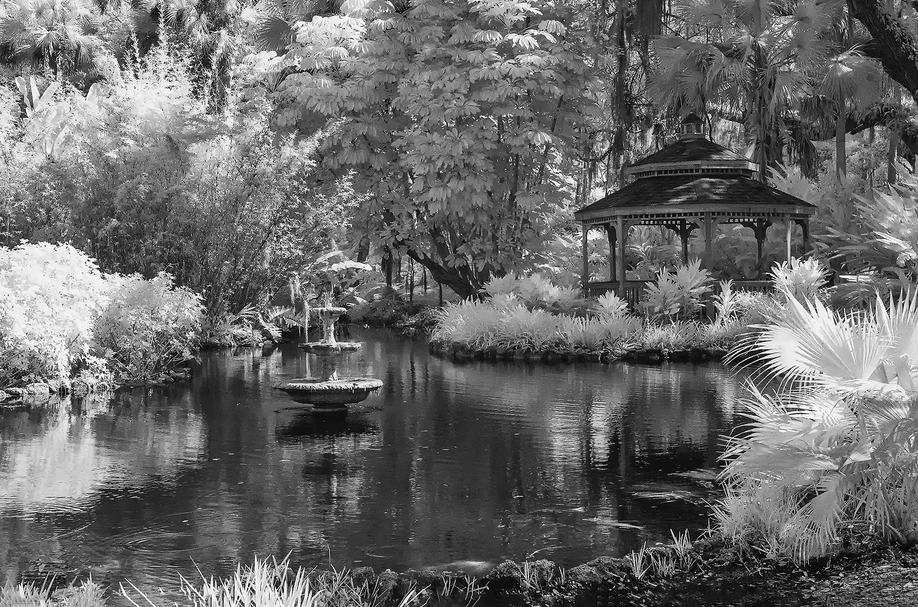
Melanie...
Having been here in June, I totally relate to this image. It's well done, and the work on it is obvious. Well done in my view. |
Sep 5th |
10 comments - 3 replies for Group 66
|
10 comments - 3 replies Total
|