|
| Group |
Round |
C/R |
Comment |
Date |
Image |
| 66 |
Jul 21 |
Comment |
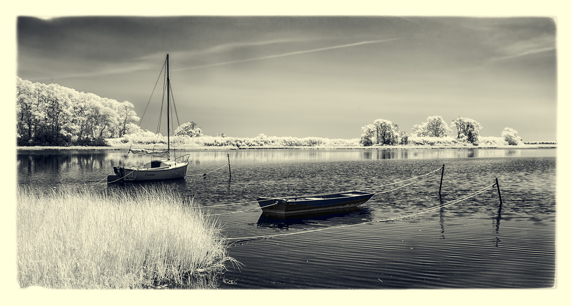
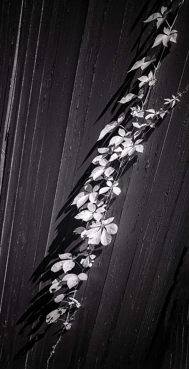
Hi Palli,
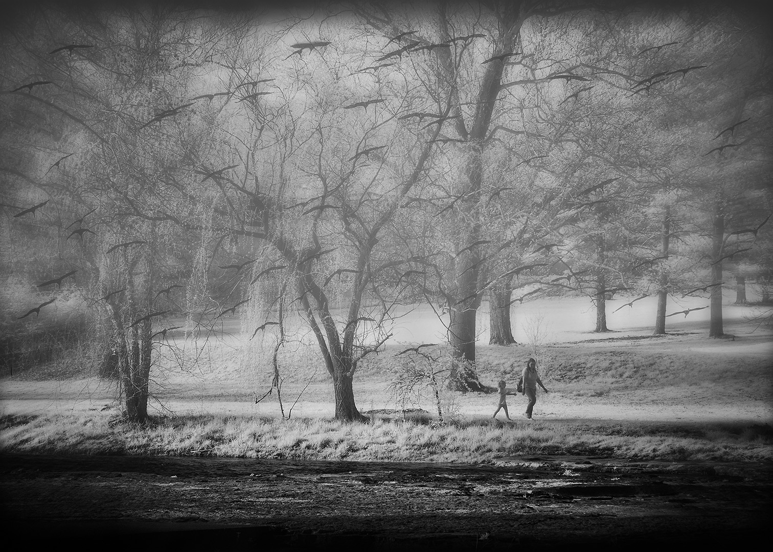
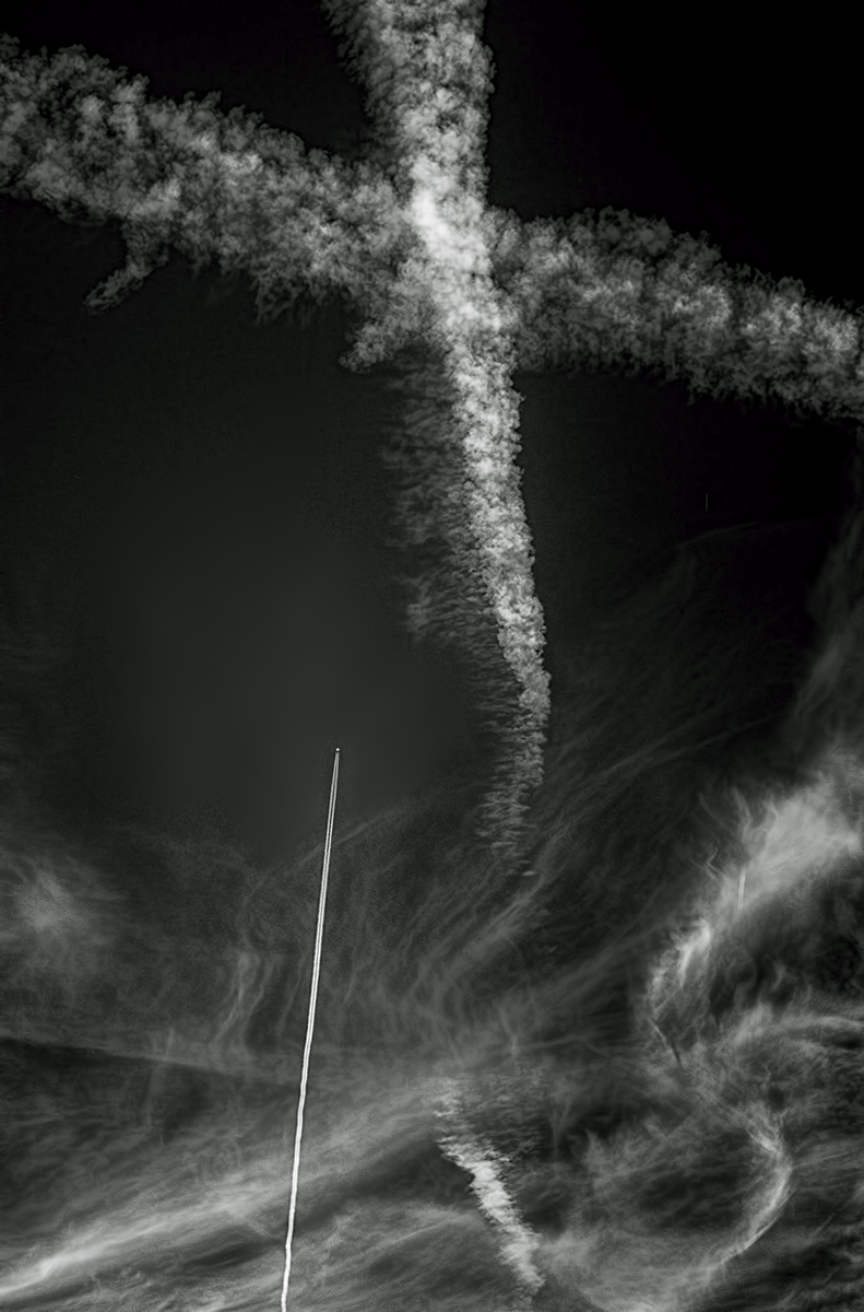
Wow...one of your strongest images imho. I really enjoy this scene and feel the impact of those taunt strings. Your post work is superb. Just for fun...totally for fun...I added more vignette to the edges all 'round...then in Color Efex, added a gold reflector coming out of the top right corner of the frame. My concept was the setting sun...using the strings to sort of simulate light rays! And...I haven't had any alcoholic beverages to drink. Here it is...NOT a suggested improvement, rather just another concept. Well done, Palli! |
Jul 5th |
 |
| 66 |
Jul 21 |
Comment |
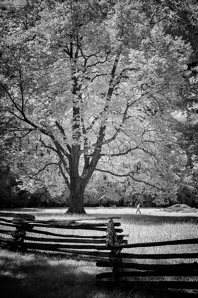
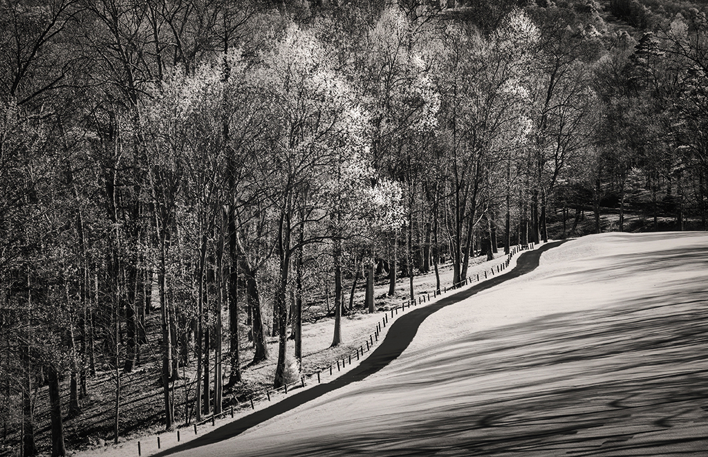
Charles,
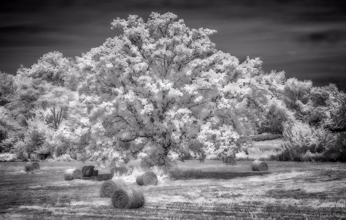
I like the composition just the way it is, but I thought a blacker black in the tree shadows and a dash of contrast might make the presentation a bit more dramatic. See what you think. This is a really strong image imho and indeed offers us the diagonal differences between forest and field! |
Jul 5th |
 |
| 66 |
Jul 21 |
Comment |
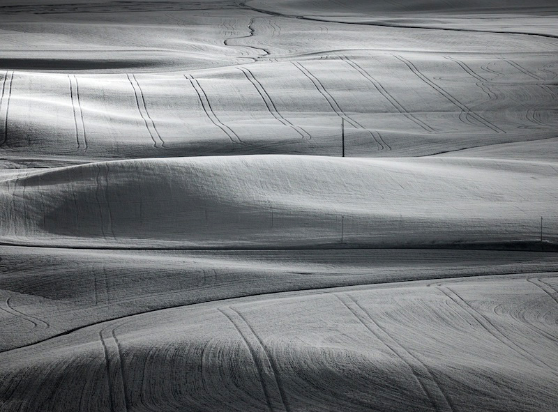
Hi Jack,
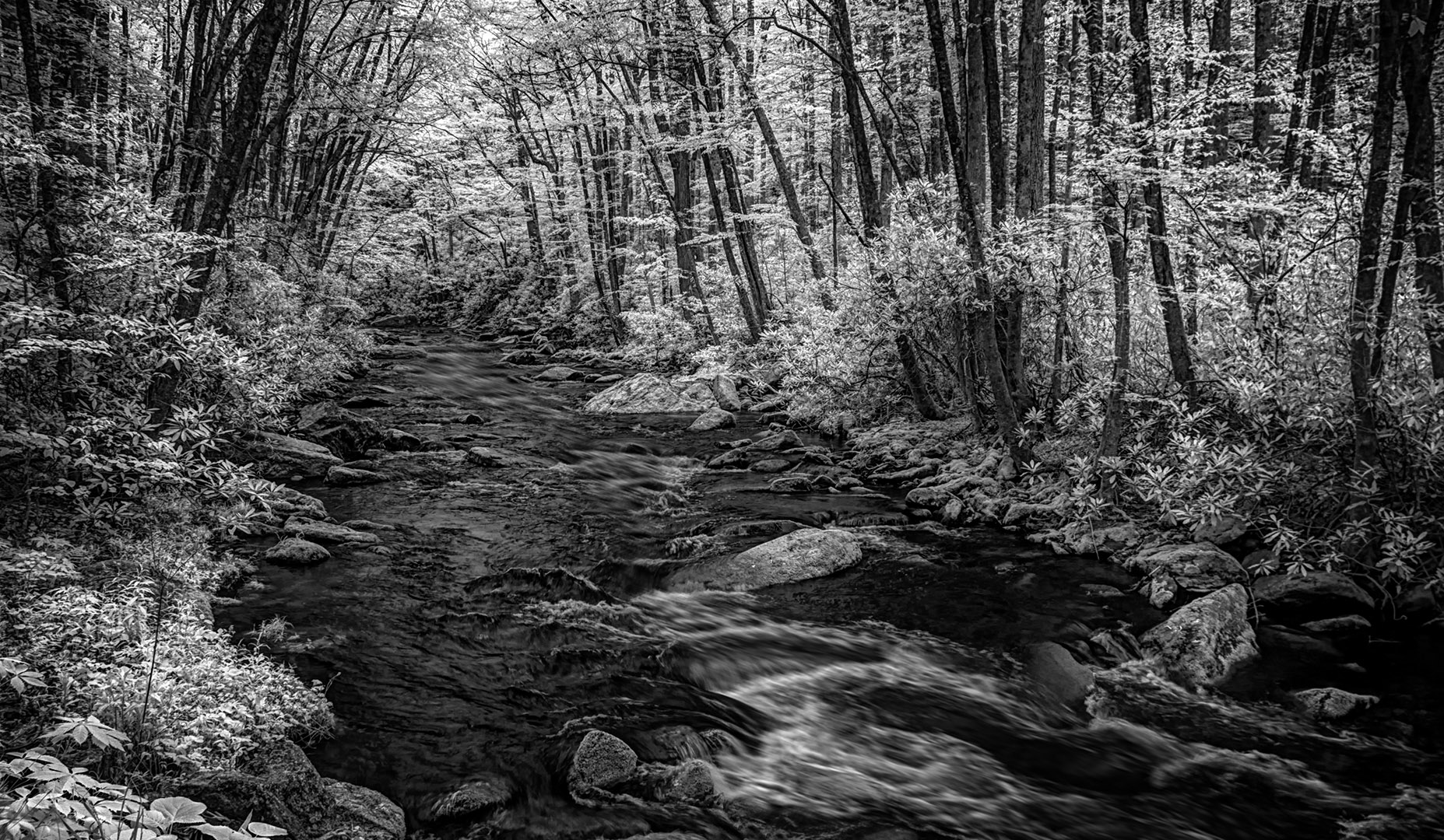
Another top notch image...the creek at the top can stay in my opinion...it adds another variable line to the composition. The subtle treatment of the tones is your style, and I sure like it. My one and only trip to the Palouse only made me yearn to be back another day! Jack, in the attached version, the ONLY thing I did was move the Levels slider over to the left until it just barely touched the Whites...and I like the very modest contrast difference a bit better. NO CONTRAST added...like I'd normally do for my own! |
Jul 5th |
 |
| 66 |
Jul 21 |
Comment |
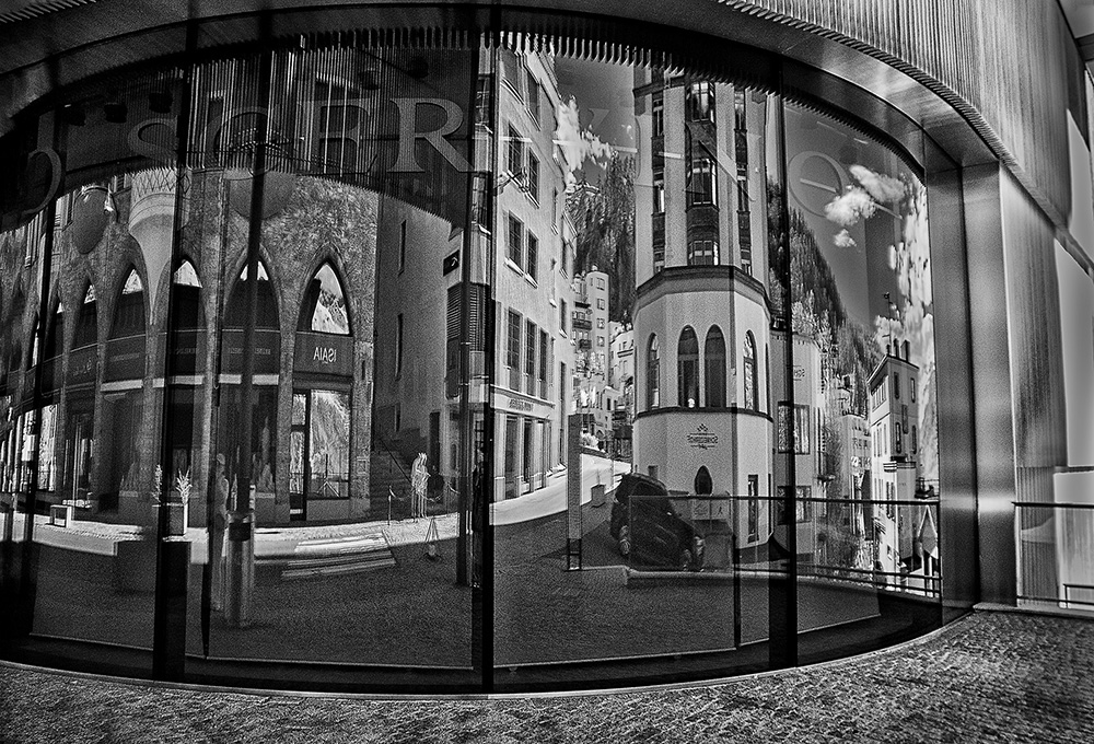
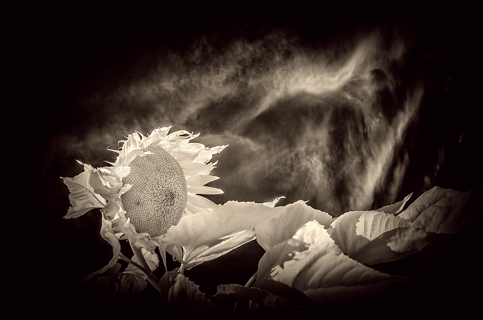
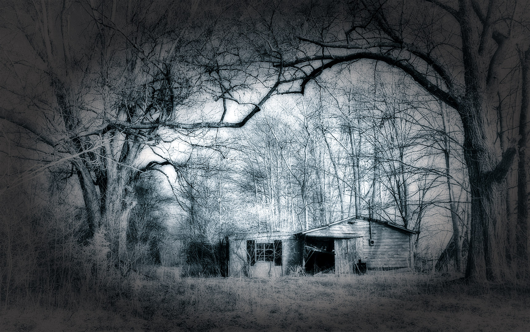
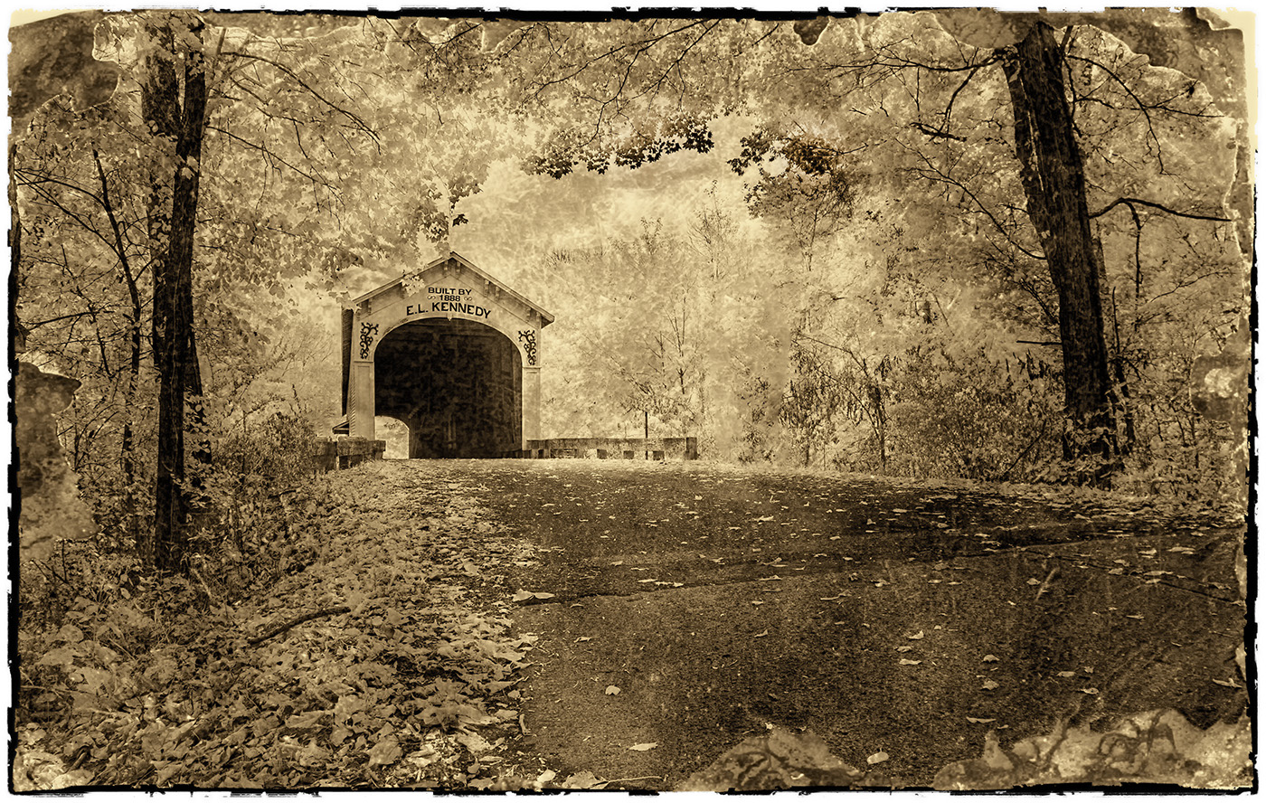
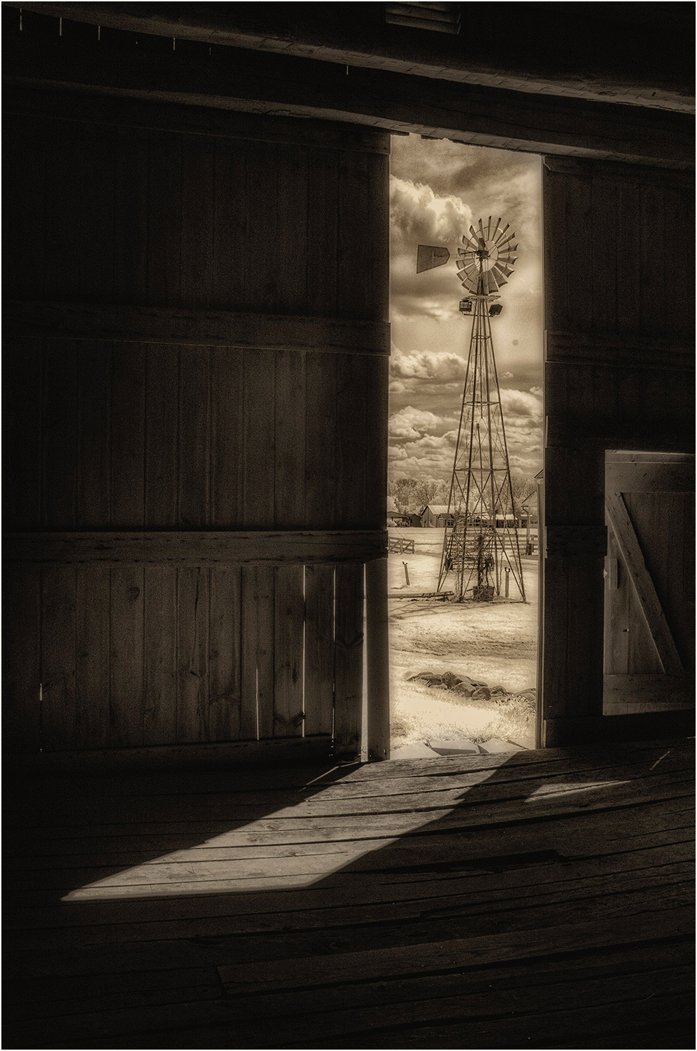
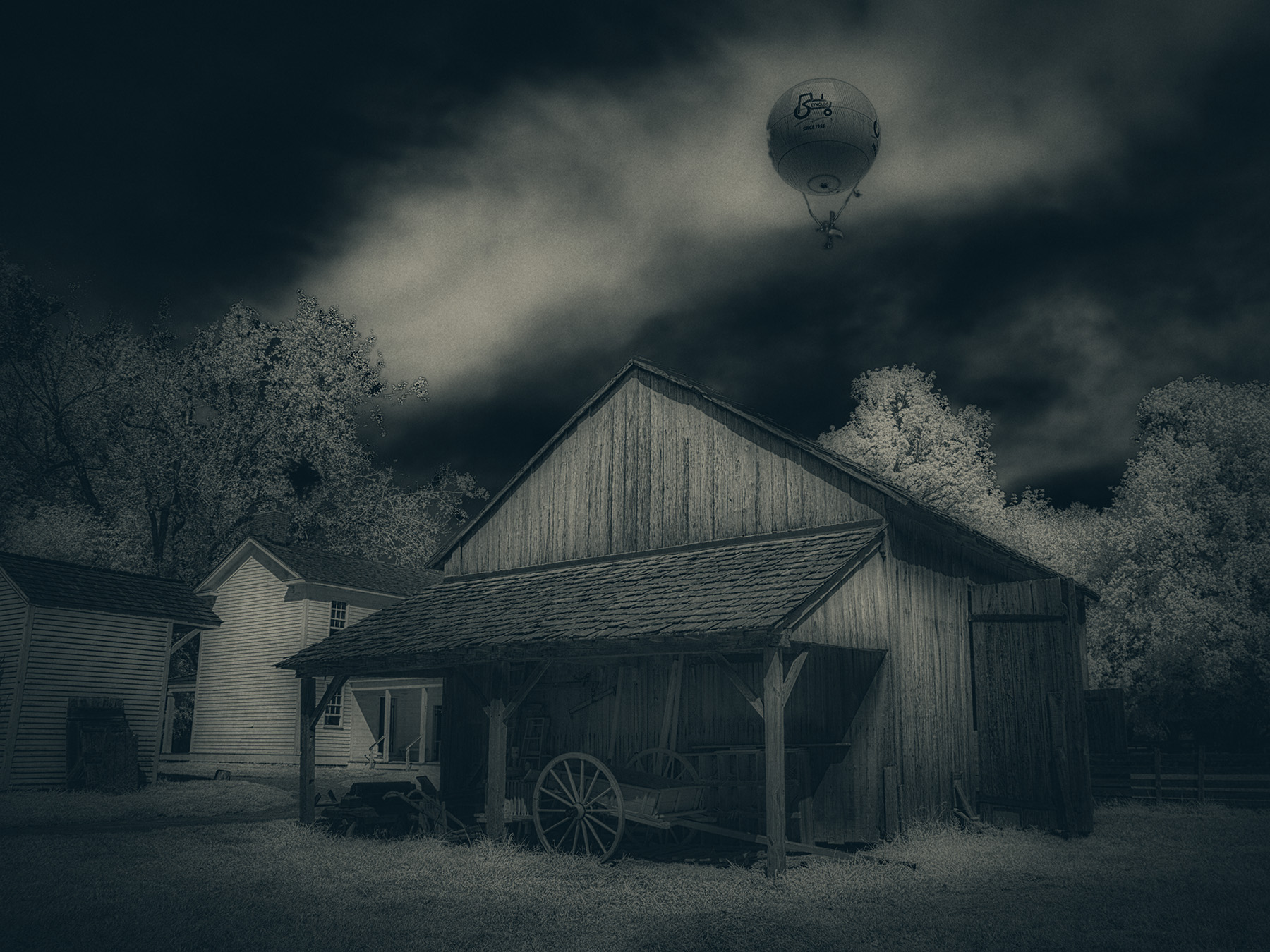
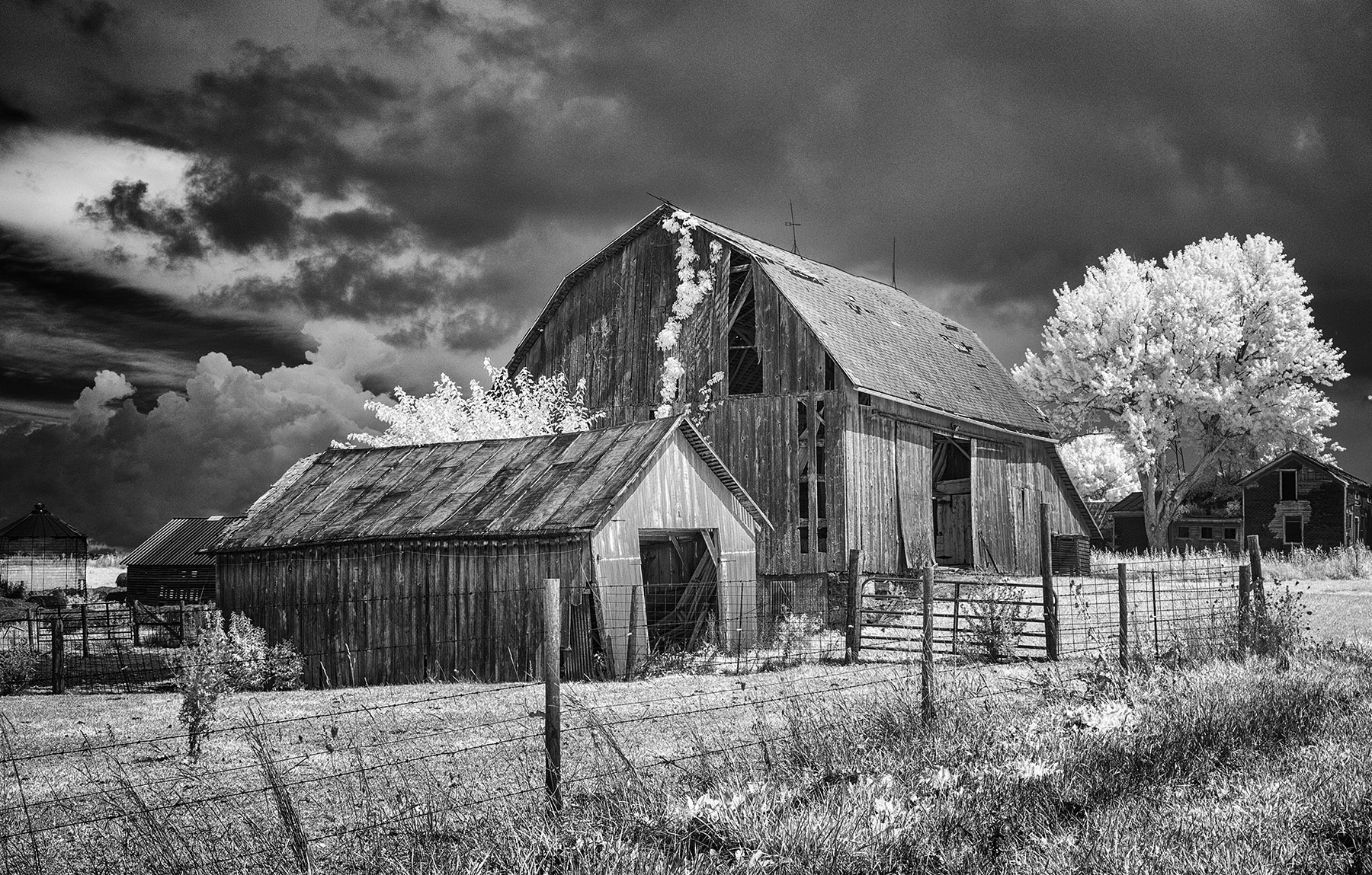
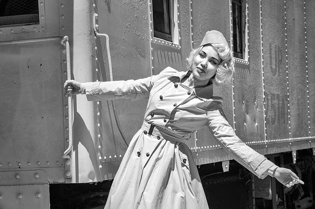
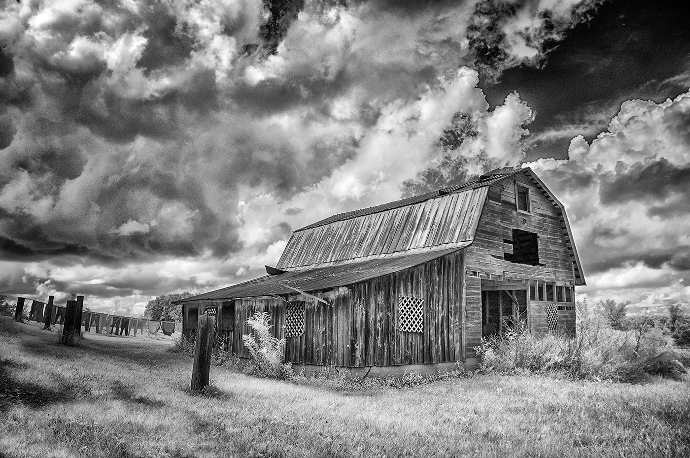
Hi Melanie,
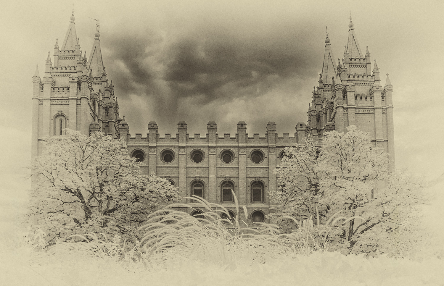
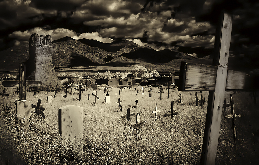
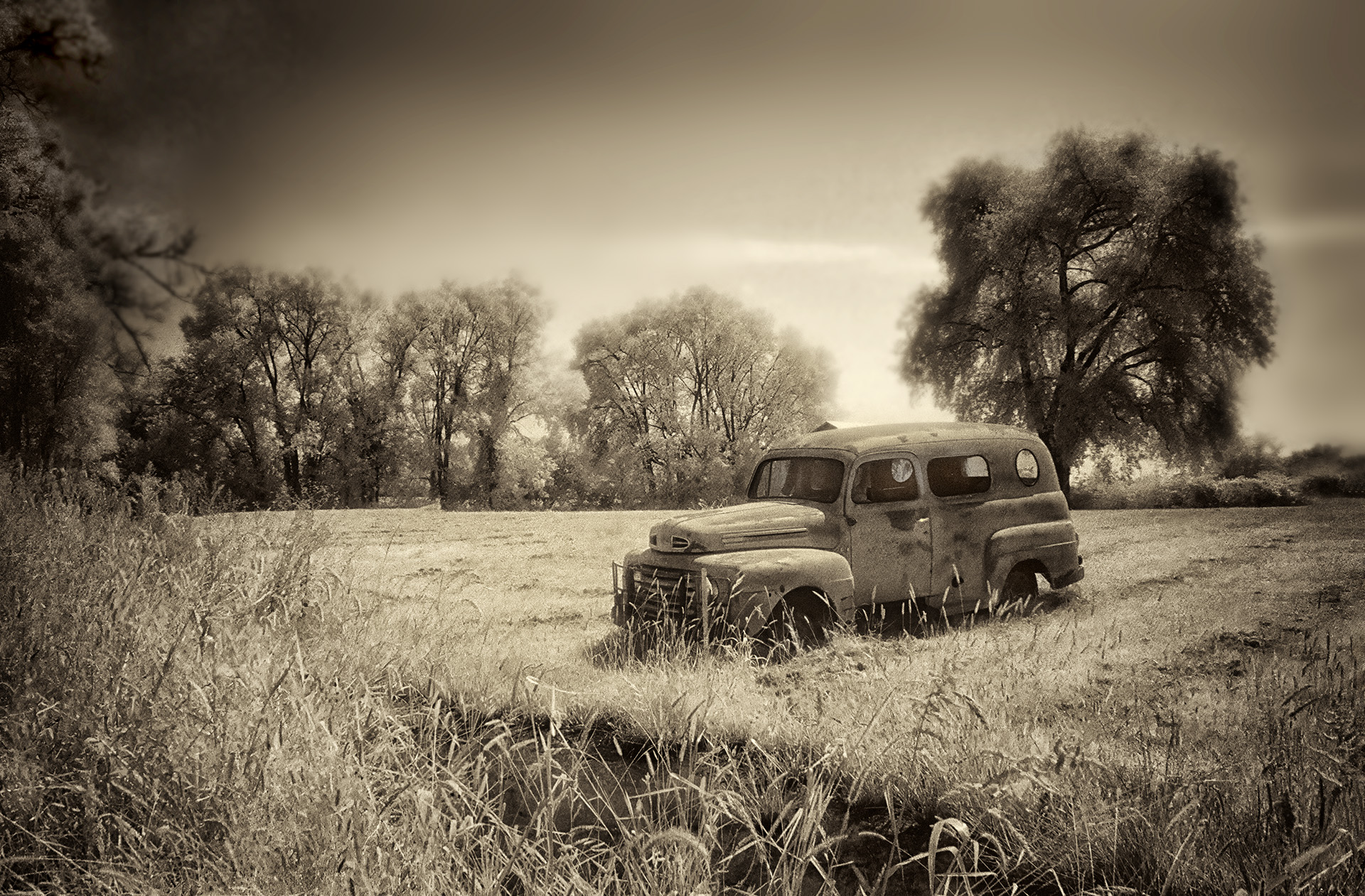
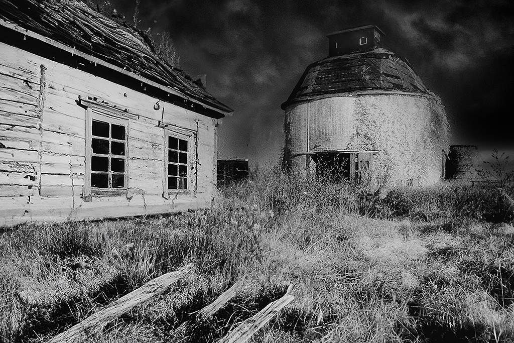
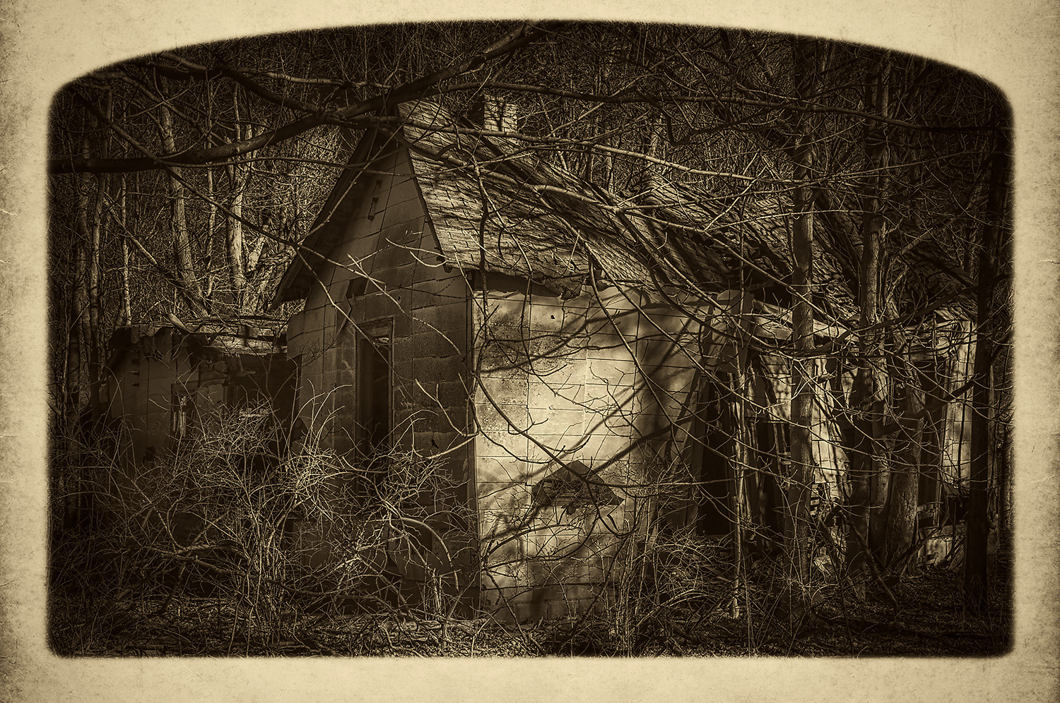
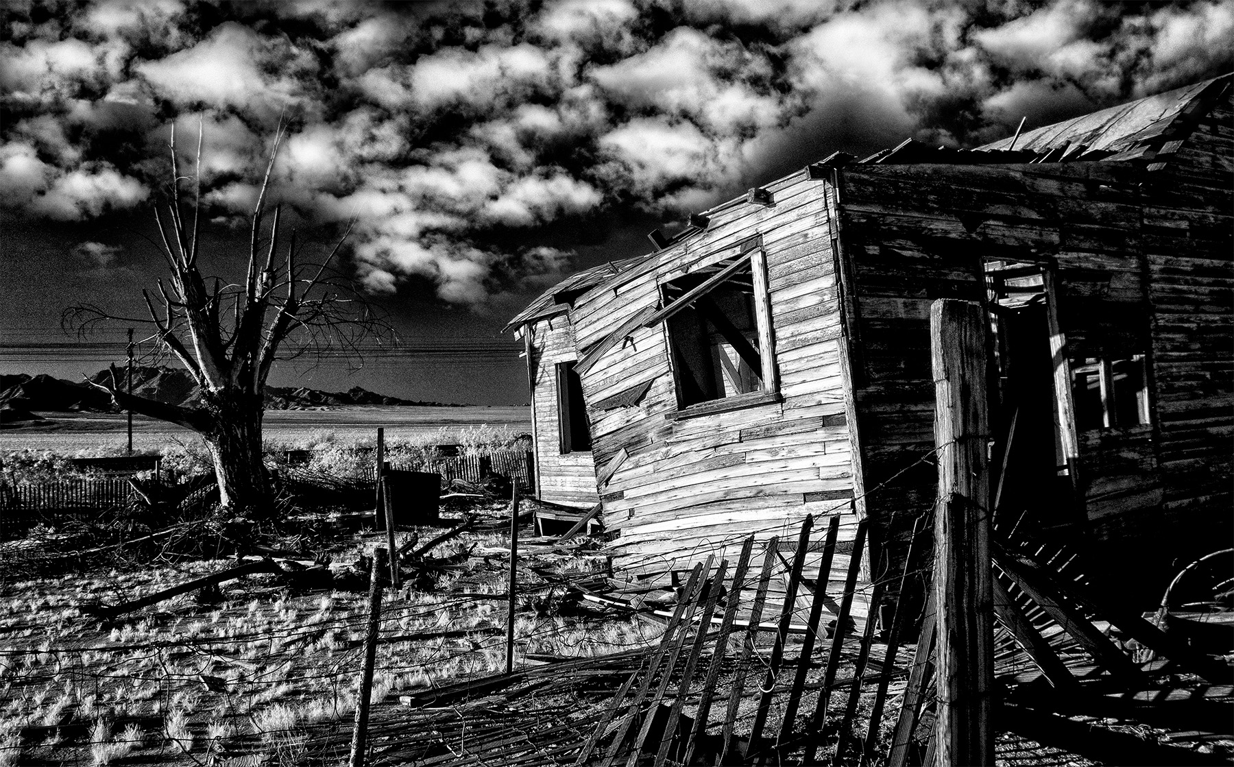
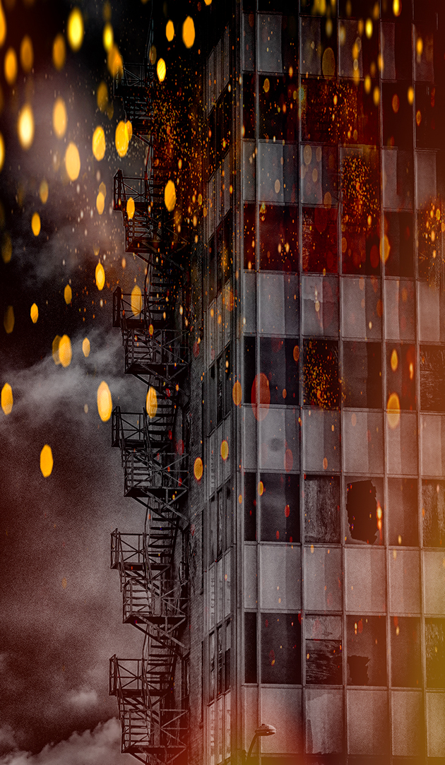
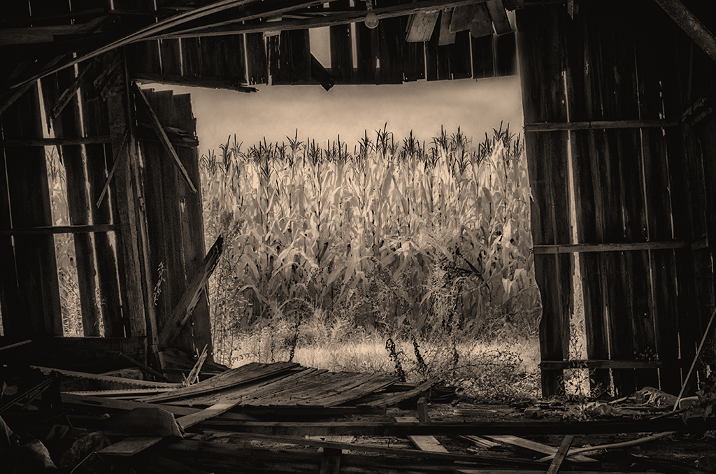
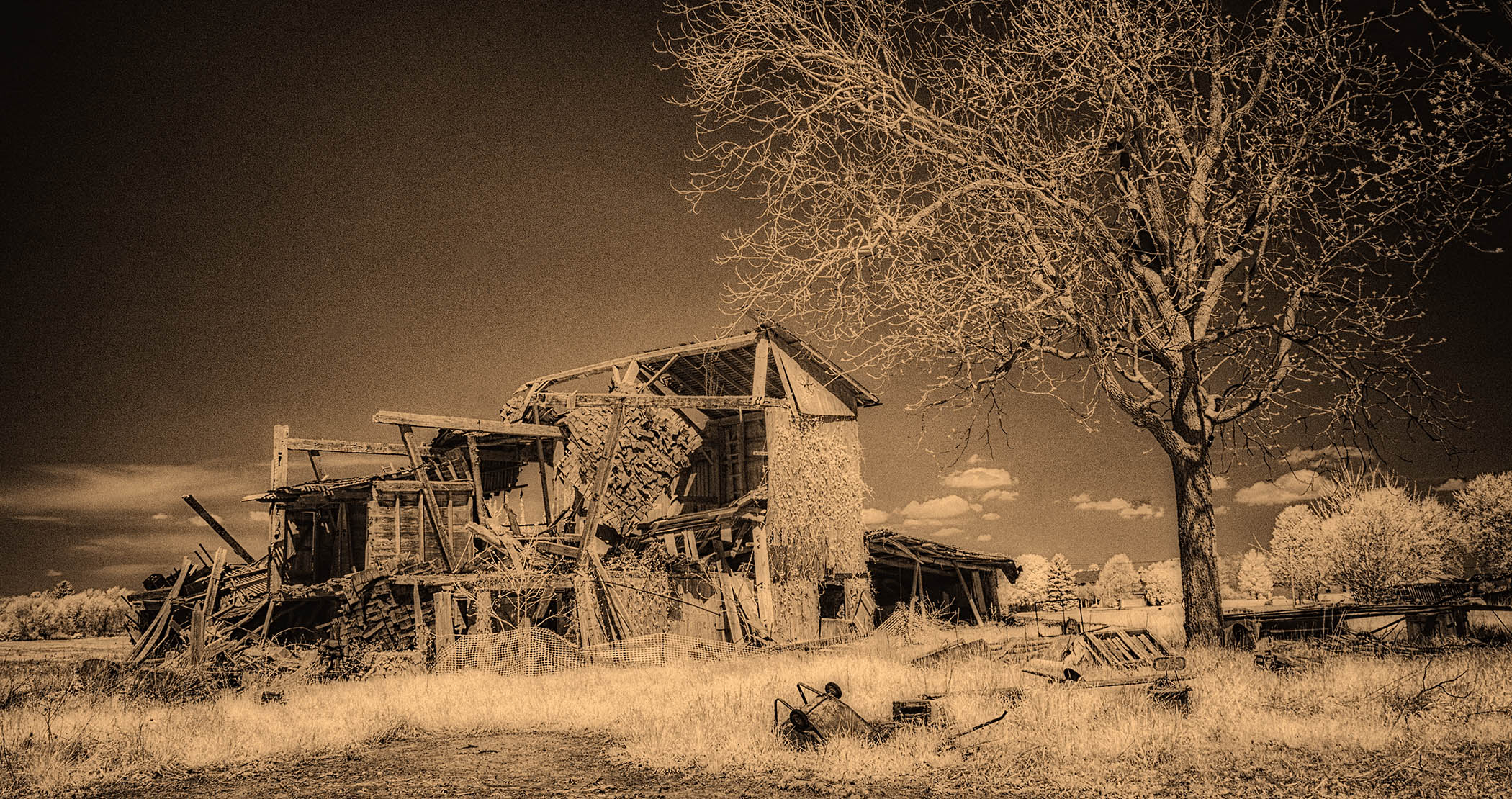
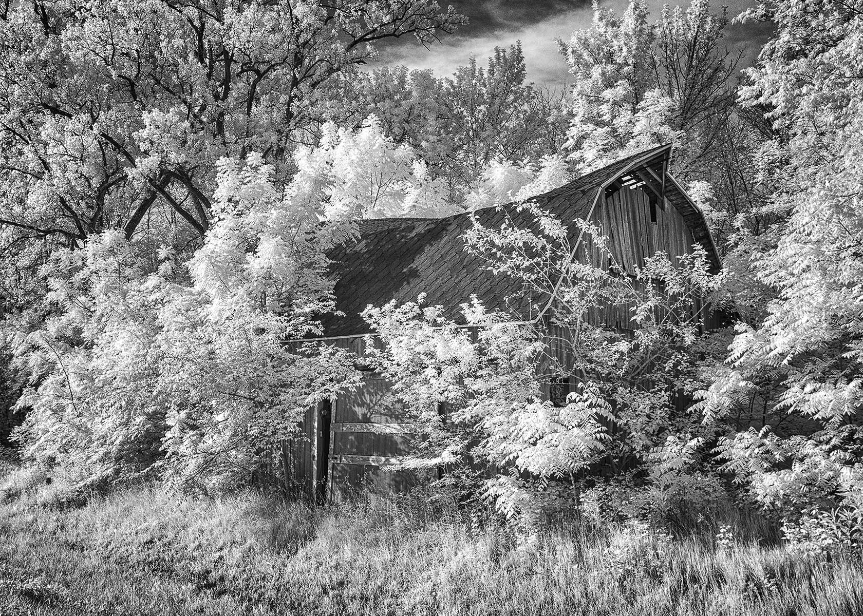
My kind of subject! There's nothing like old buildings and the past to bring out the best in infrared. I'm confused, however, about the tone in the sky? I'd suggest Fine Art in NIK Silver Efex. I did that on the attached, and I also cropped down from the top. I lightened the sign/front door area just a touch. To make it even more moody and abandoned, I added a vignette at only 45% opacity to the edges. See what you think. The sky is not a distraction in this one in my opinion. |
Jul 5th |
 |
| 66 |
Jul 21 |
Comment |
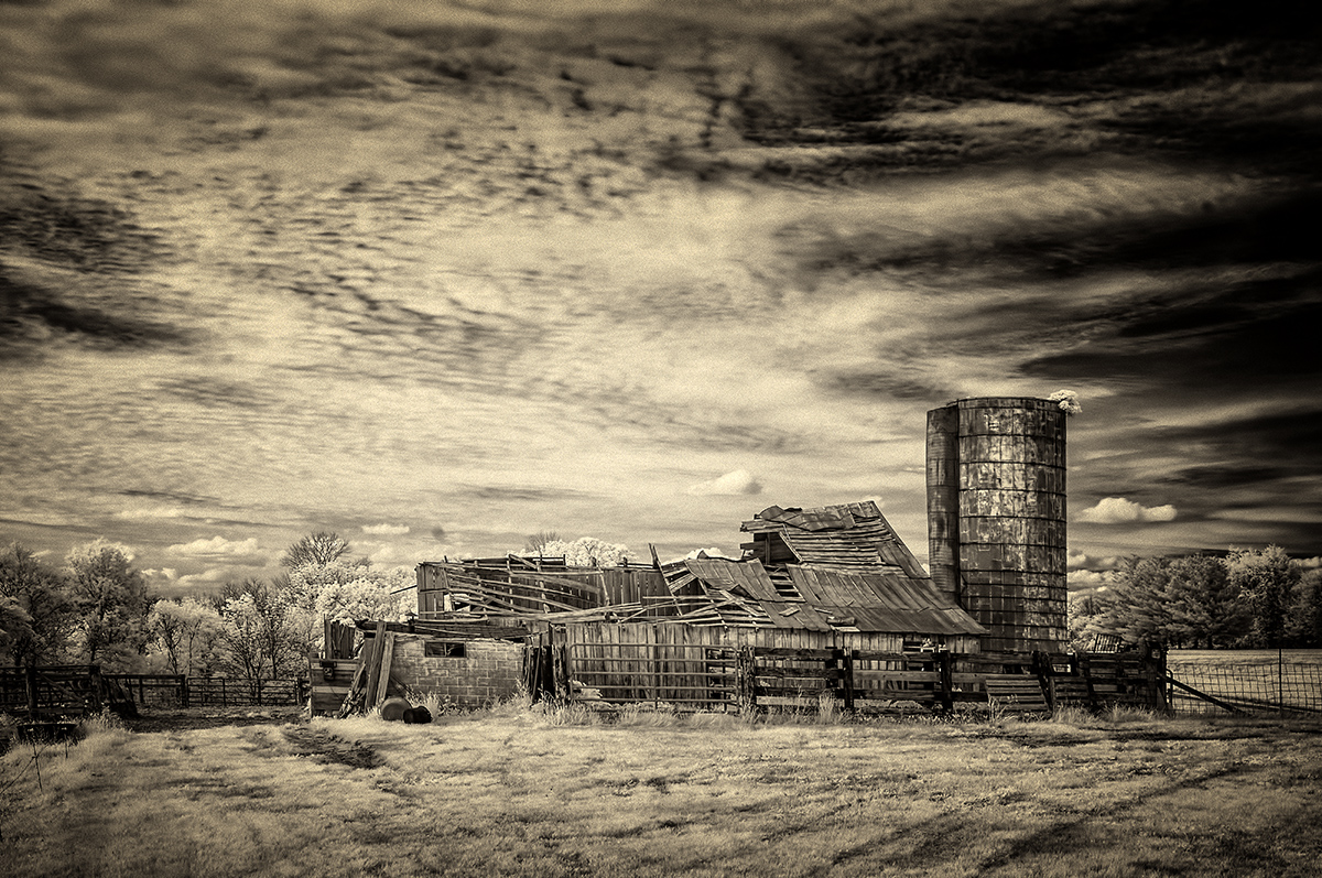
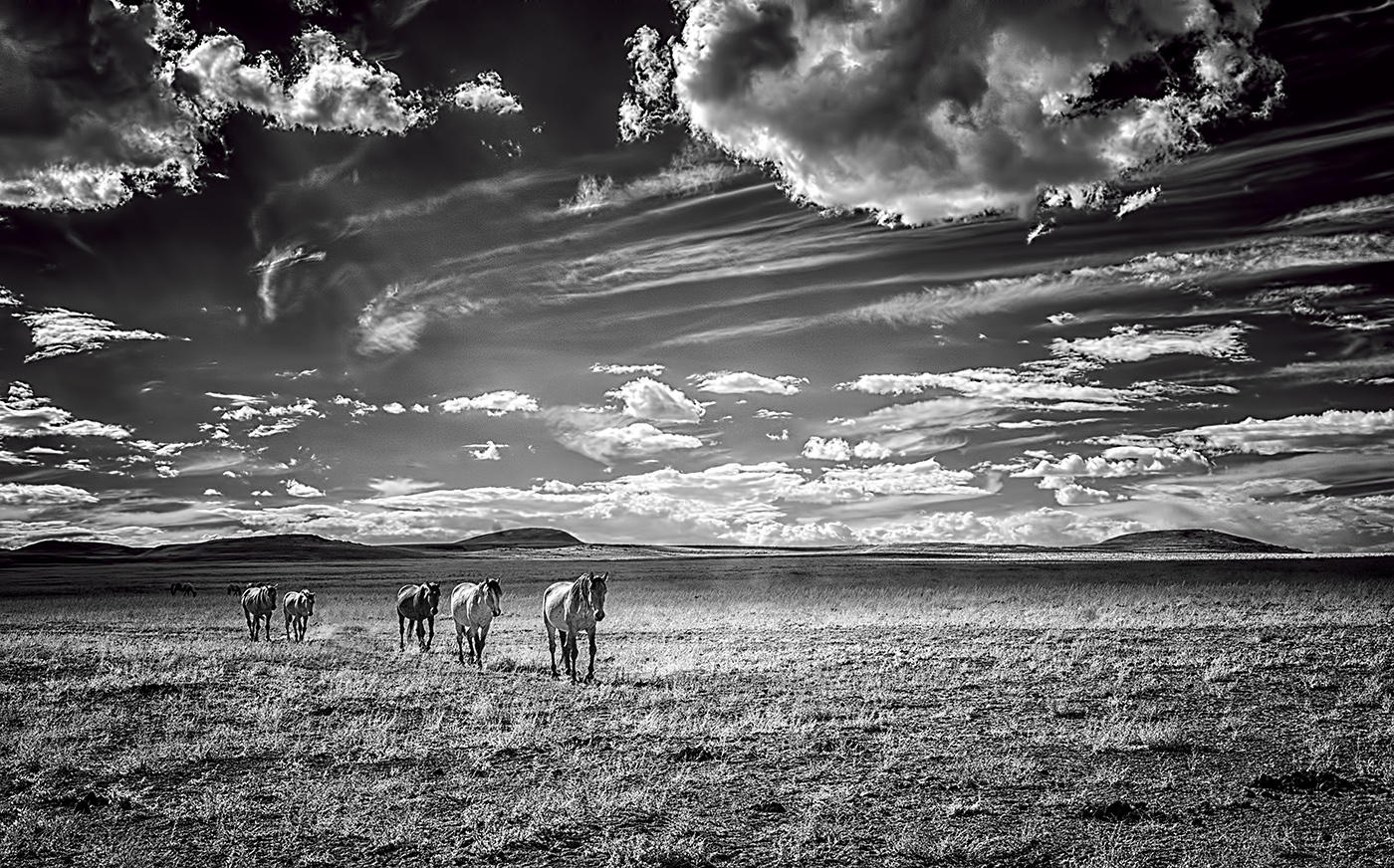
Arik...greetings...what can I say? I like this very much, especially with the 'corn curves' taking me right up to the farm and the silos. This is top notch in my view. Yes, were it mine, I'd add contrast and make the blacks a bit more bold...but everyone has their own opinion of the desired tonality. |
Jul 5th |
| 66 |
Jul 21 |
Comment |
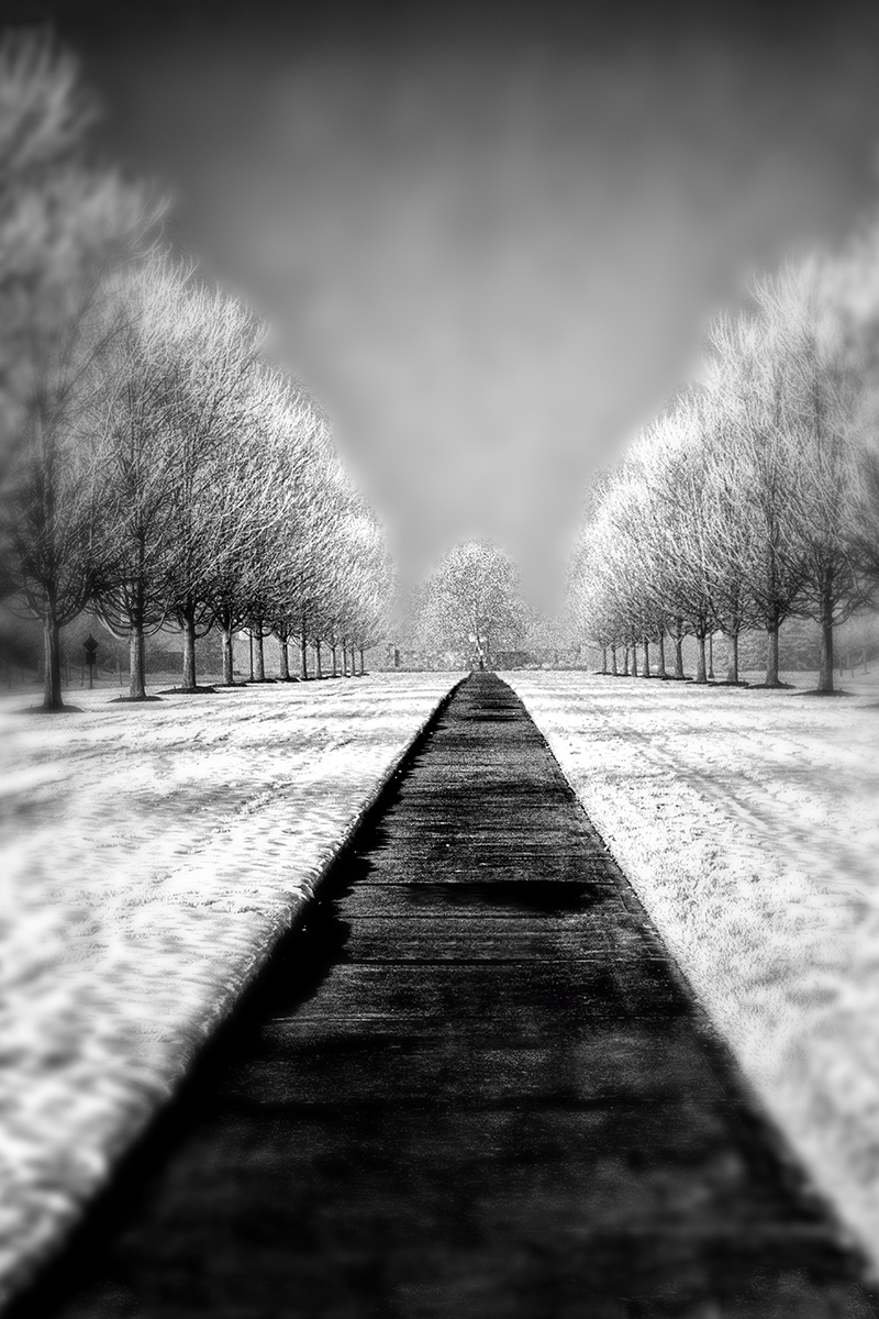
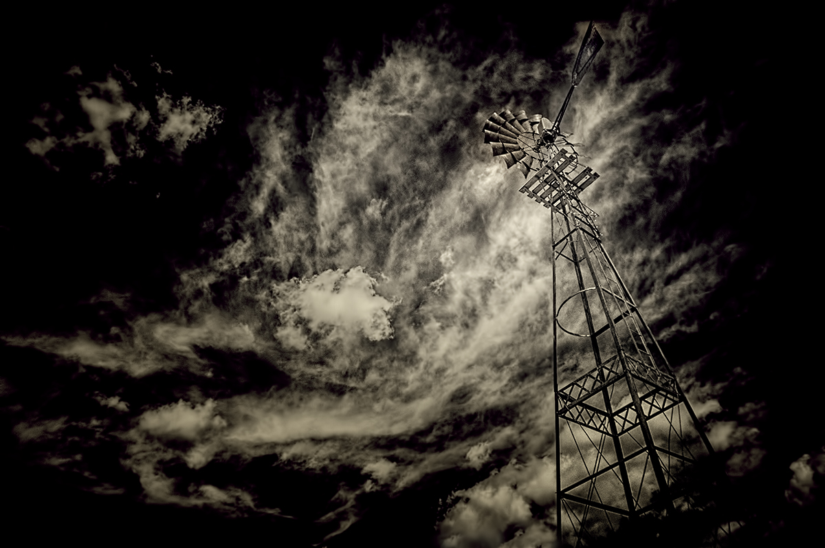
Greetings, Emil!
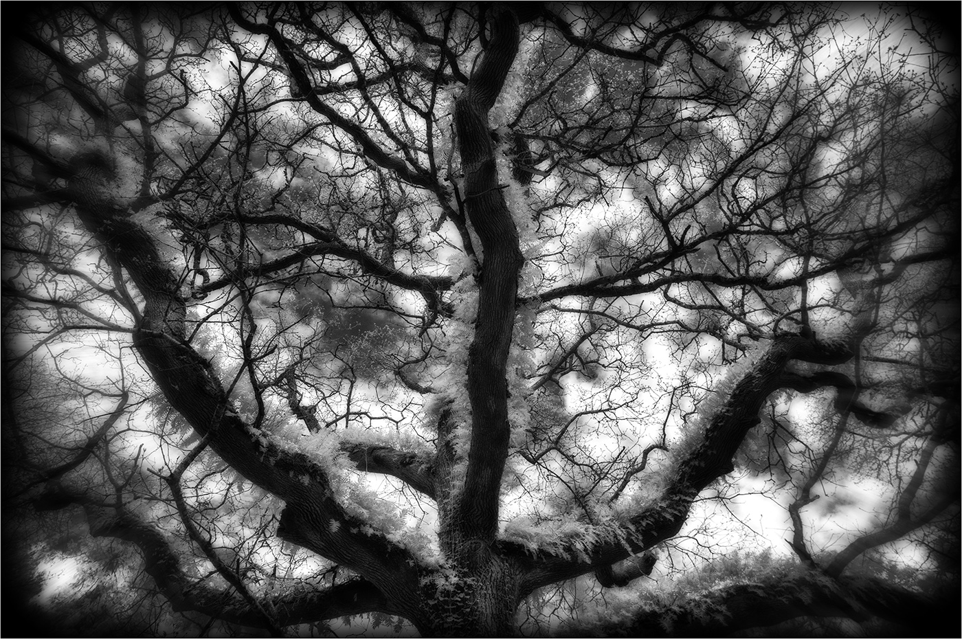
I really like this...the vanishing lines perspective, the blank sky, the simplicity...all aided by your use of infrared. My only critique comment for improvement is to enlarge this several times and clean up the sensor dust in your sky area...several little goobers there. |
Jul 5th |
| 66 |
Jul 21 |
Reply |
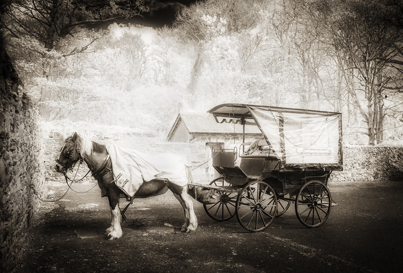
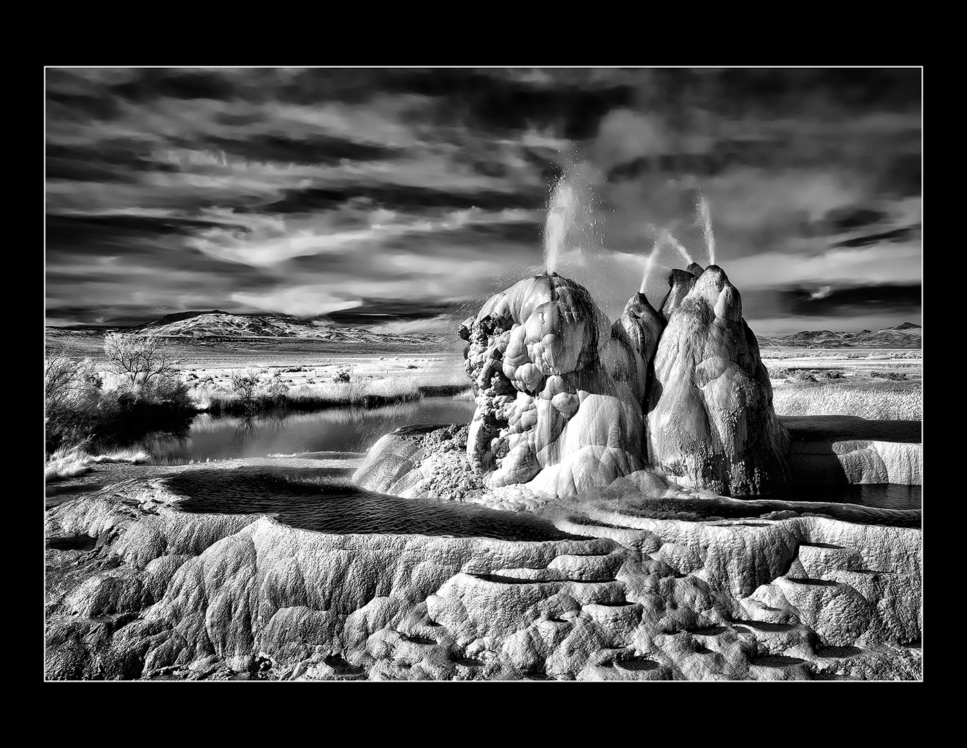
Very kind, Melanie...thank you. You will not be disappointed in OCC USA! Ask the owner where the OLDEST section is...we didn't get over that direction, but you might find it of highest interest. |
Jul 5th |
| 66 |
Jul 21 |
Reply |
Wow...didn't know so many people knew of it, but it HAS been on CBS Sunday Morning and in National Geographic! Thanks for your comments, and takes lots more in November, Emil! |
Jul 5th |
| 66 |
Jul 21 |
Reply |
Hi Arik,
Thanks very much for your feedback. Like I said, I tried multiple options and ended up here. I'll go back and implement your suggestions and see how it looks! |
Jul 5th |
| 66 |
Jul 21 |
Reply |
Thanks Palli...just when I seem to run short on good IR images, up comes another opportunity! |
Jul 5th |
6 comments - 4 replies for Group 66
|
6 comments - 4 replies Total
|