|
| Group |
Round |
C/R |
Comment |
Date |
Image |
| 66 |
Apr 21 |
Reply |
Thanks, Jack...missed your image this round! |
Apr 19th |
| 66 |
Apr 21 |
Reply |
Thank you Arik. Your feedback is greatly appreciated. |
Apr 19th |
| 66 |
Apr 21 |
Reply |
Much appreciate your comments, Emil. |
Apr 19th |
| 66 |
Apr 21 |
Reply |
Thanks Melanie...we'll see how it does in international exhibitions. |
Apr 19th |
| 66 |
Apr 21 |
Reply |
Thank you Charles. I have submitted it to a few PSA international exhibitions and will soon see how it may fare in competition. |
Apr 19th |
| 66 |
Apr 21 |
Comment |
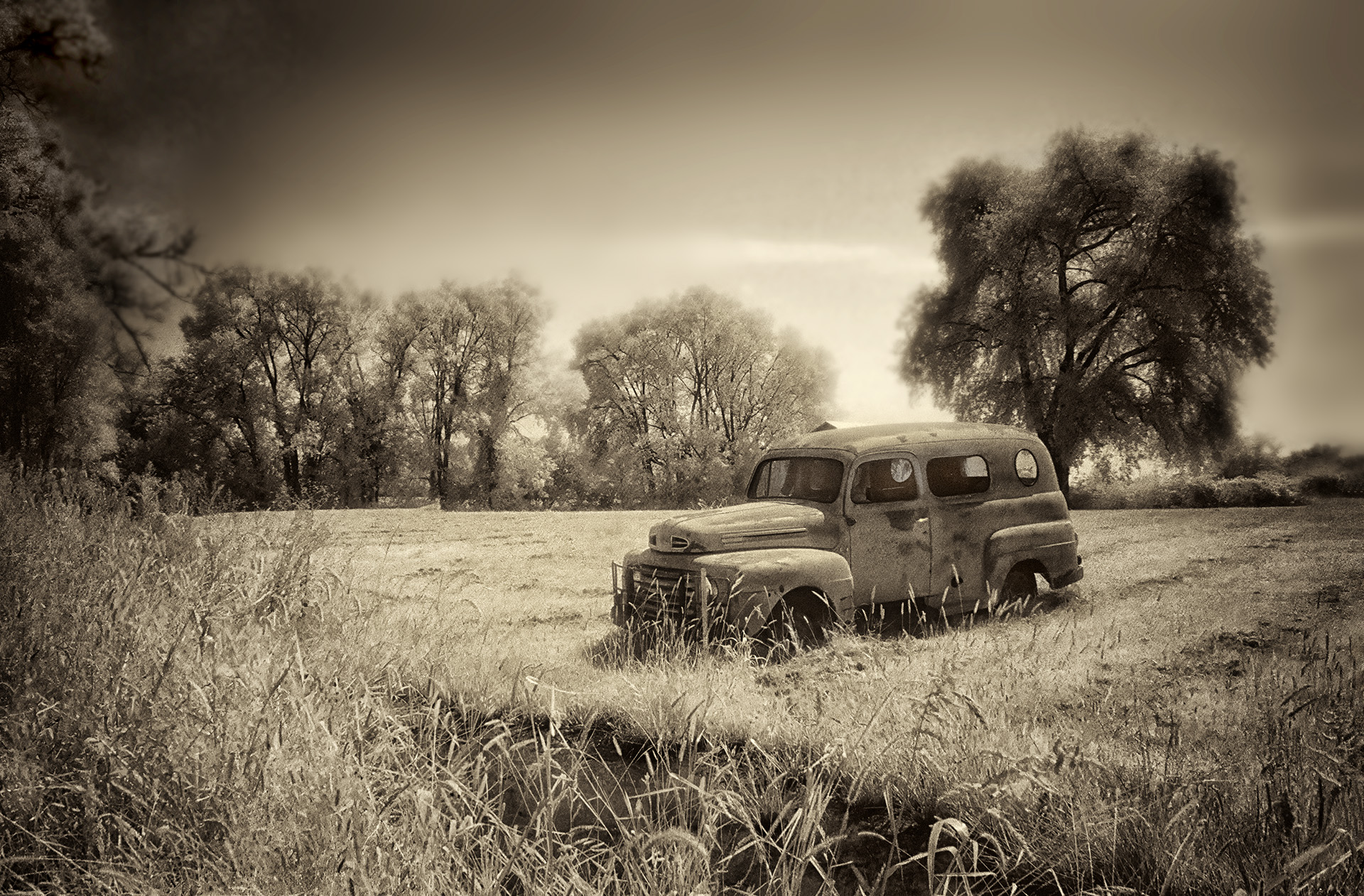
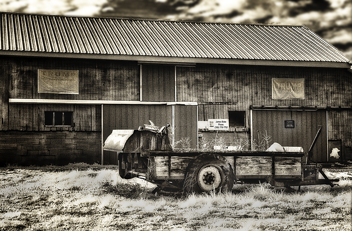
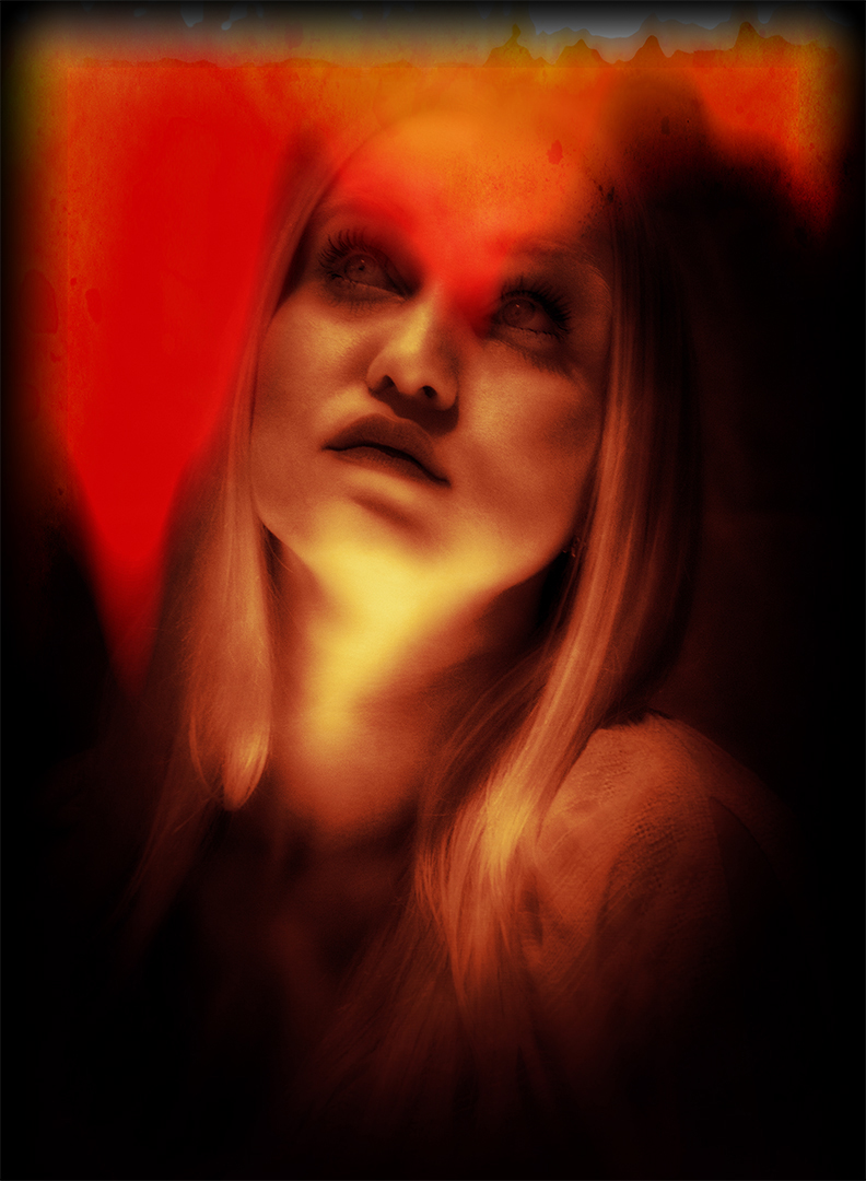
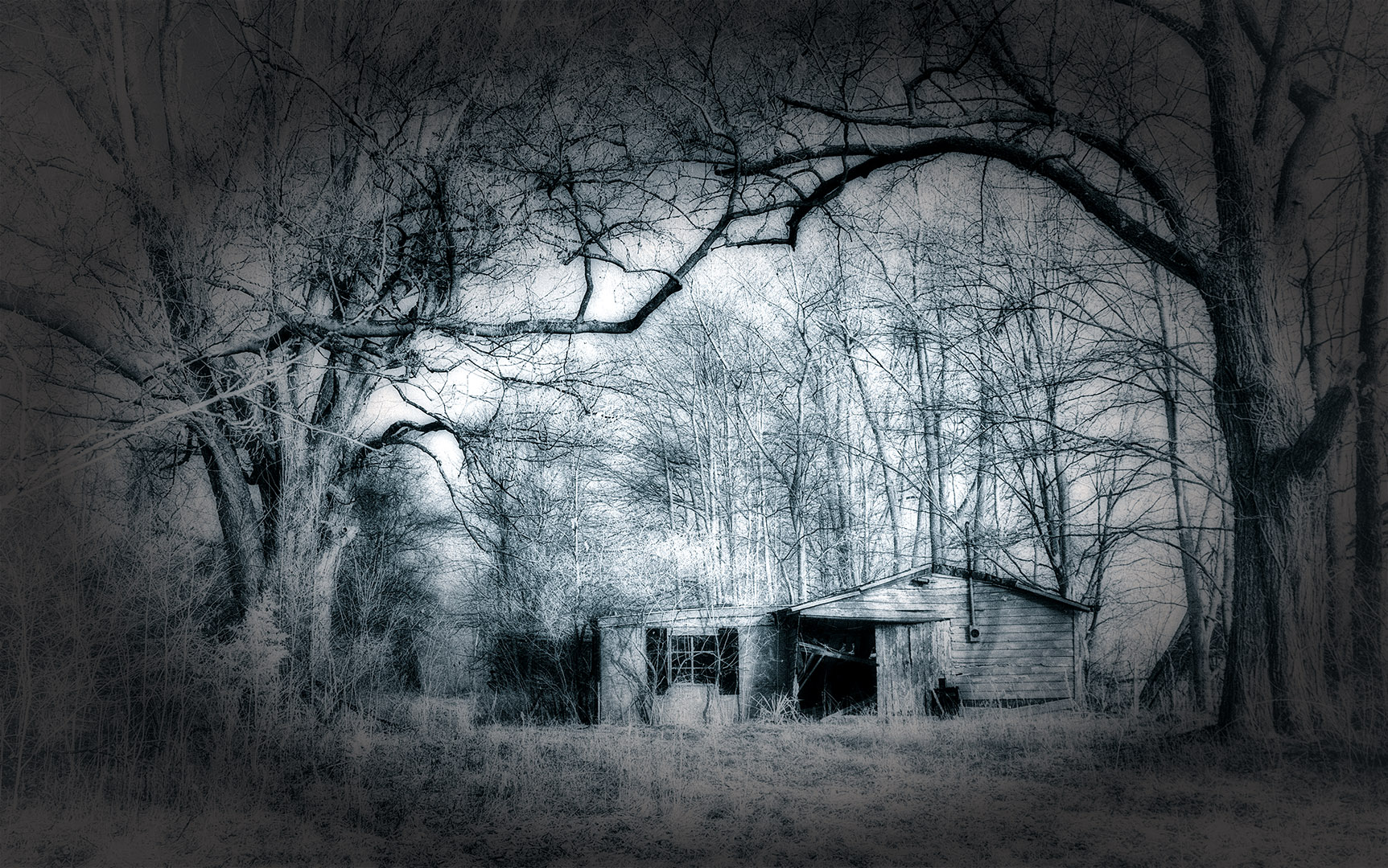
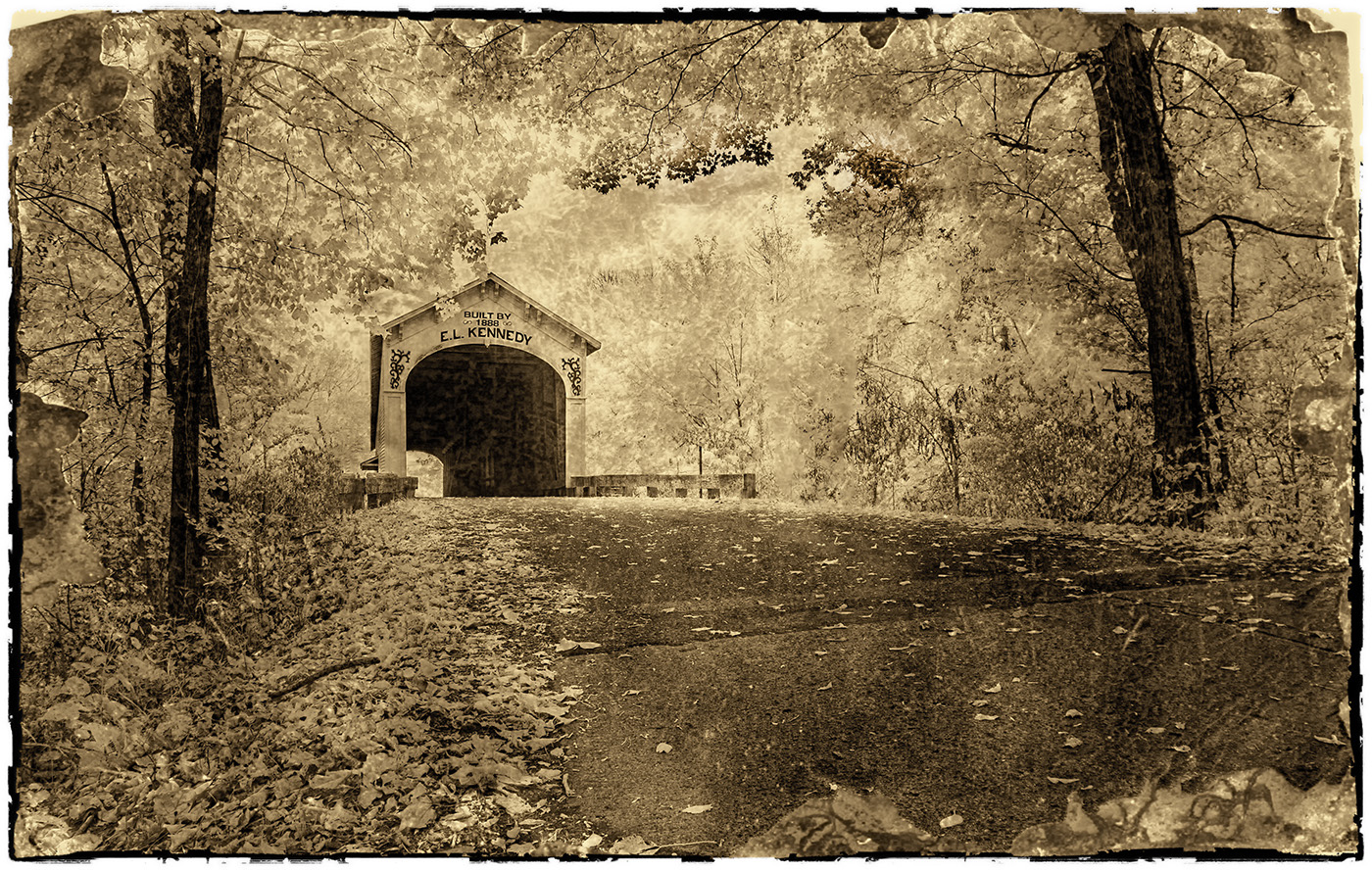
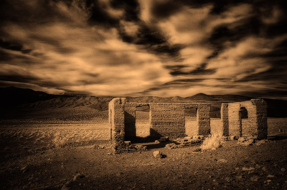
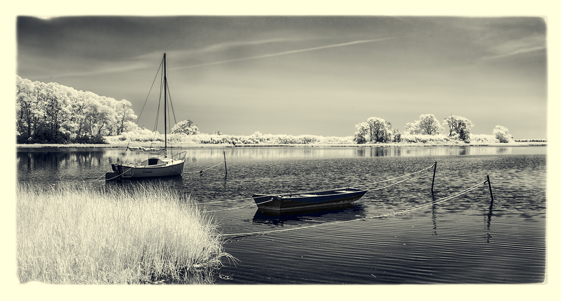
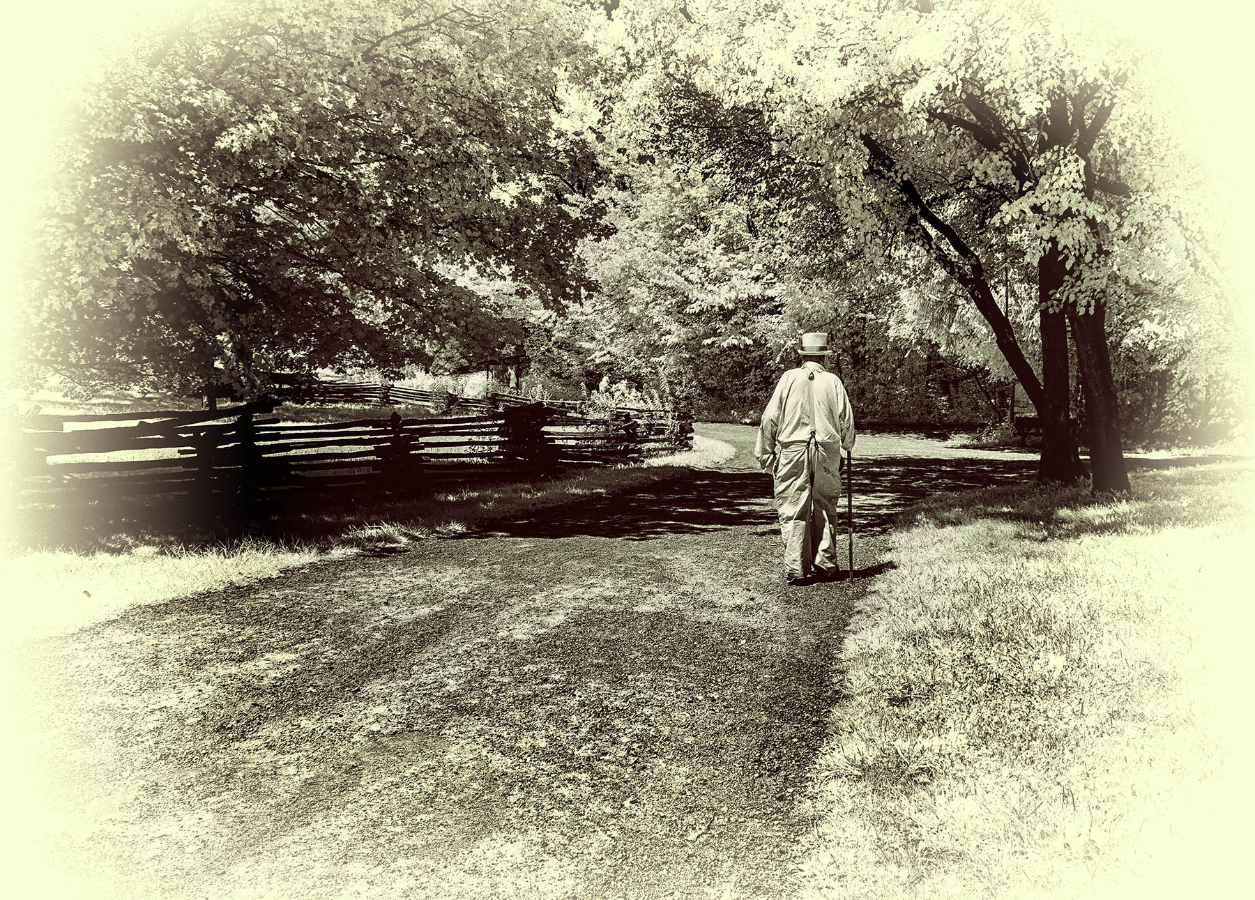
Taking Palli's feedback to heart, I went back to the RAW master file and tried again. Using various lightening, darkening, and Levels adjustments...plus a very mild sepia tone...I came up with this. What are your thoughts? |
Apr 2nd |
 |
| 66 |
Apr 21 |
Comment |
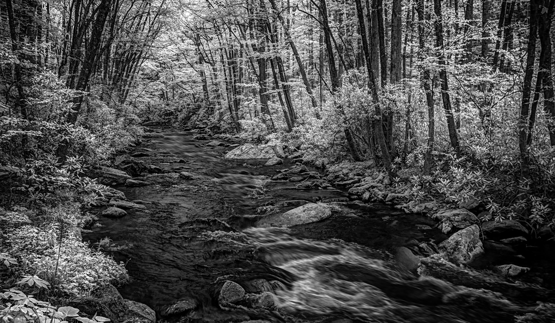
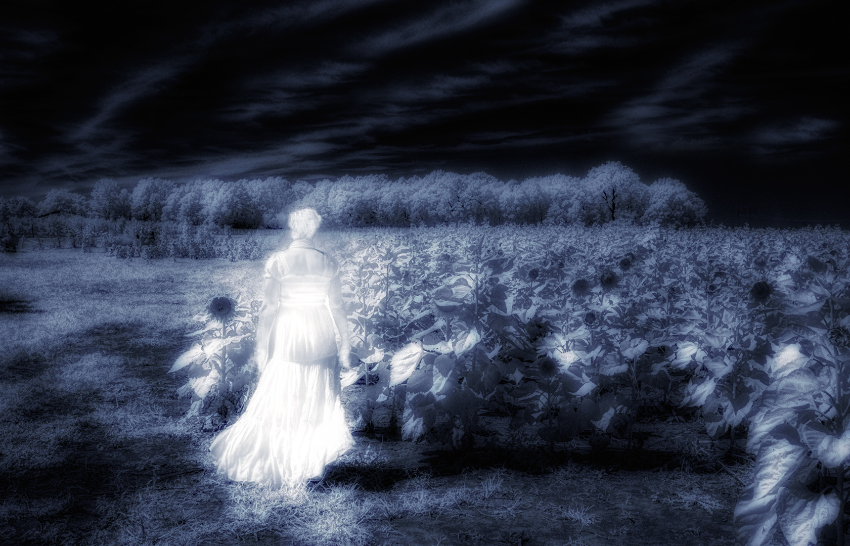
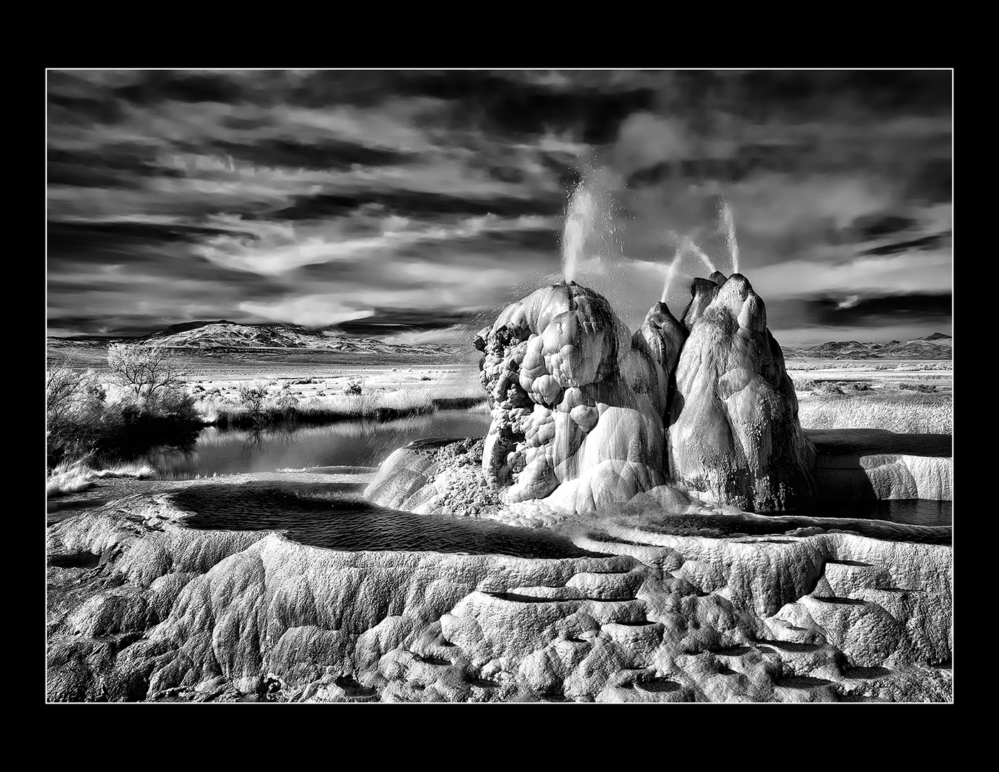
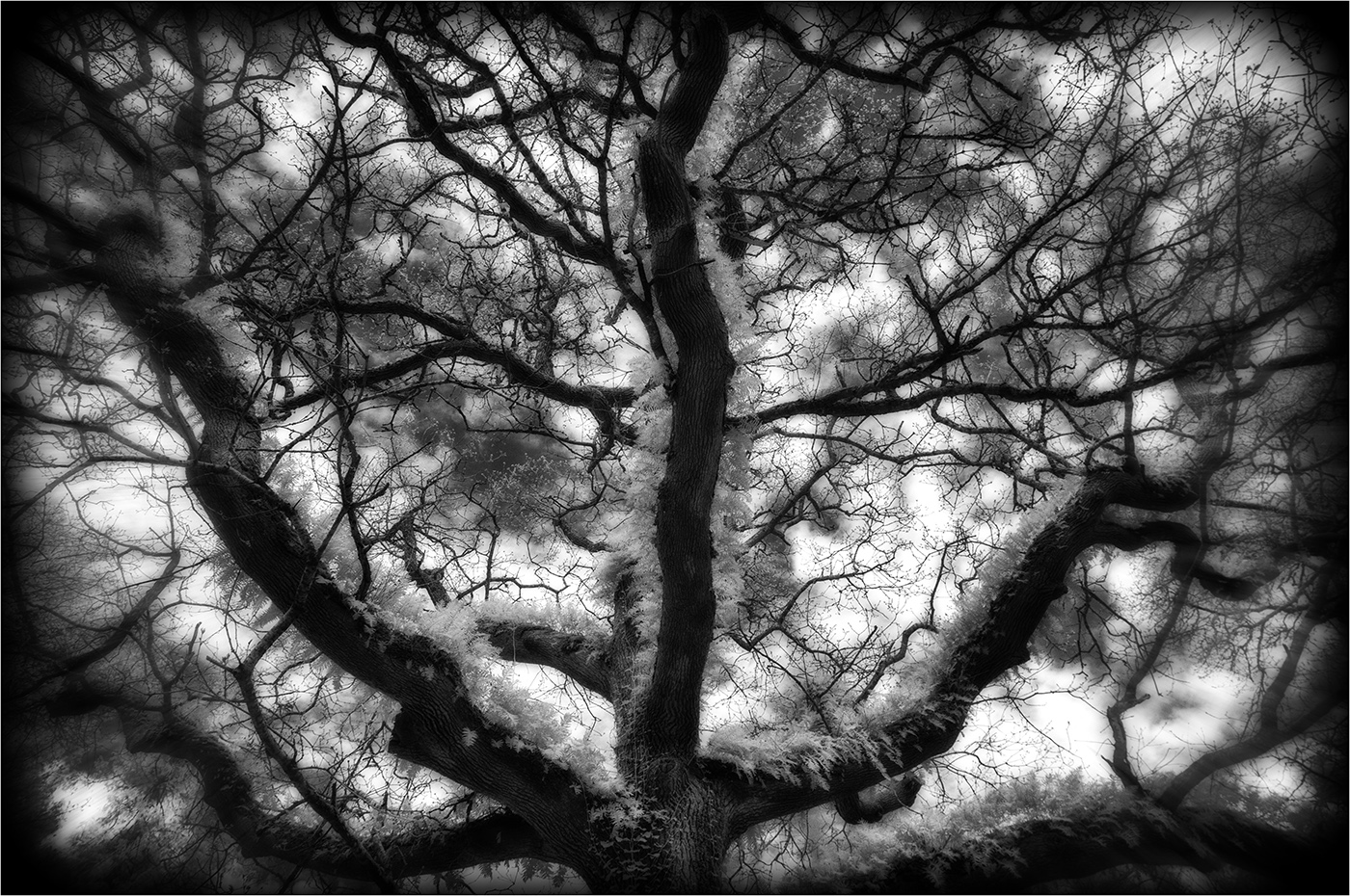
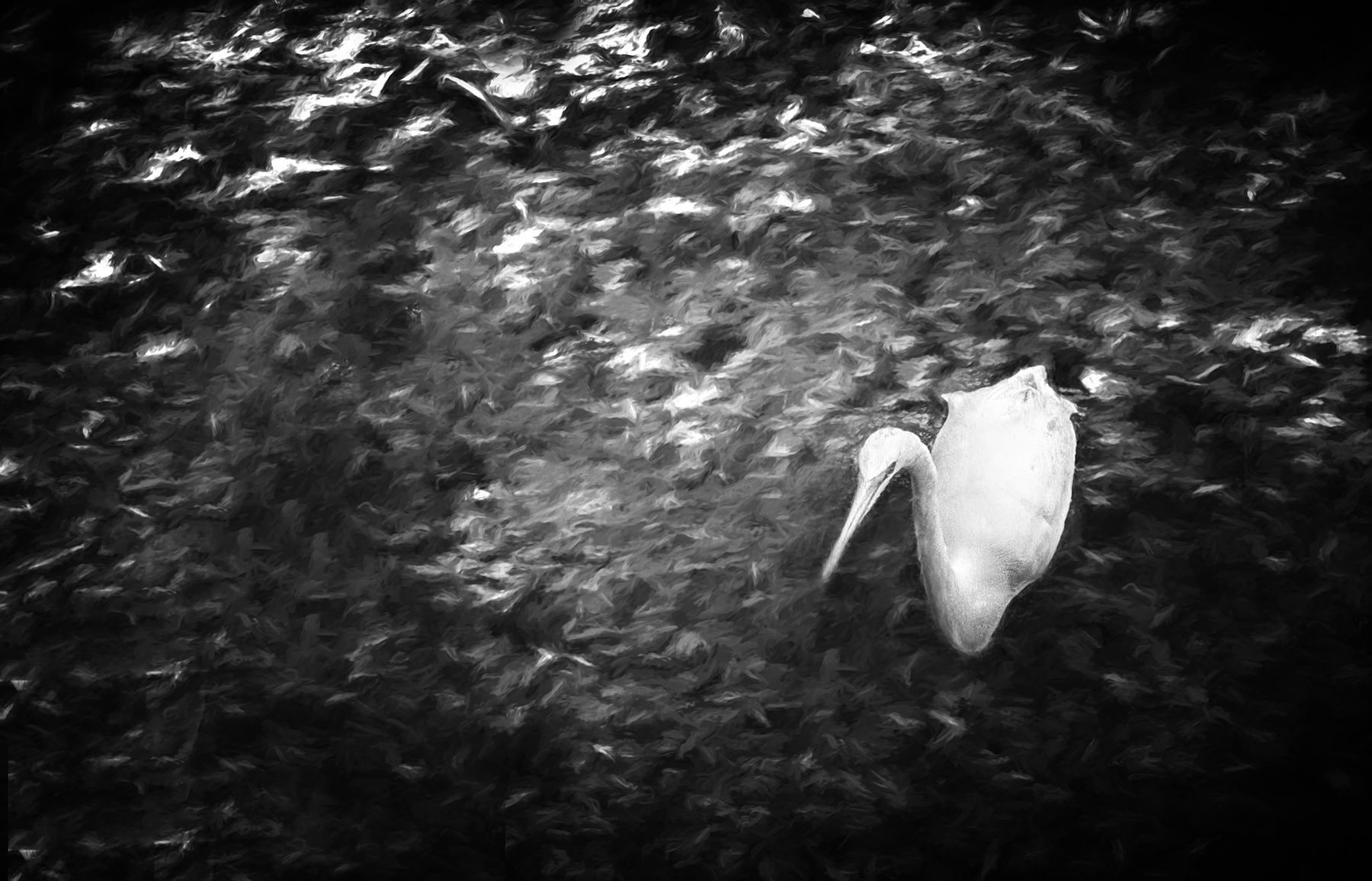
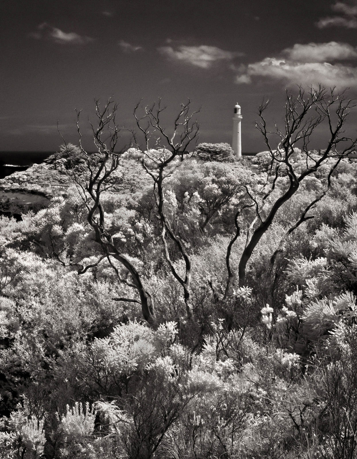
Great title, Emil! I like this a lot. I'd probably go for higher contrast and more white in the whites, but that's me with the dramatic blacks and whites. This is a wonderful application of IR. |
Apr 2nd |
| 66 |
Apr 21 |
Comment |
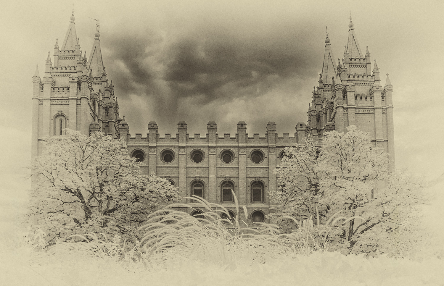
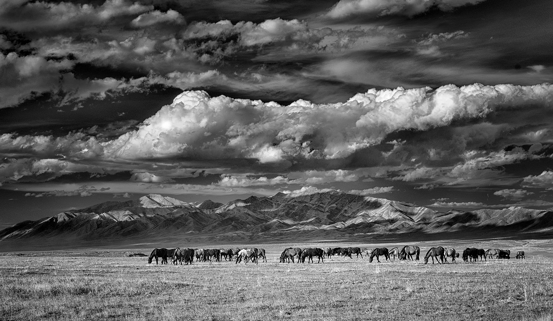
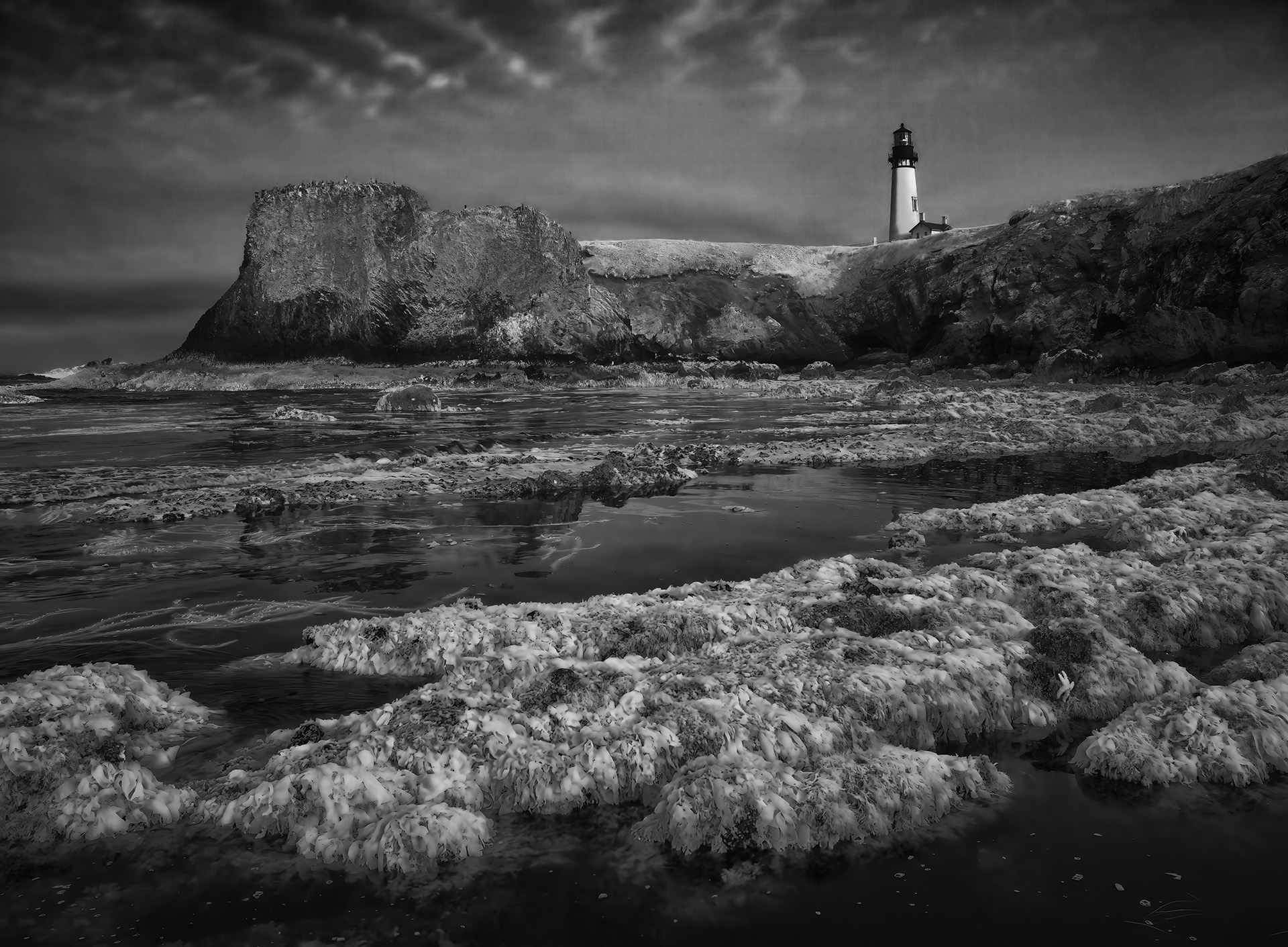
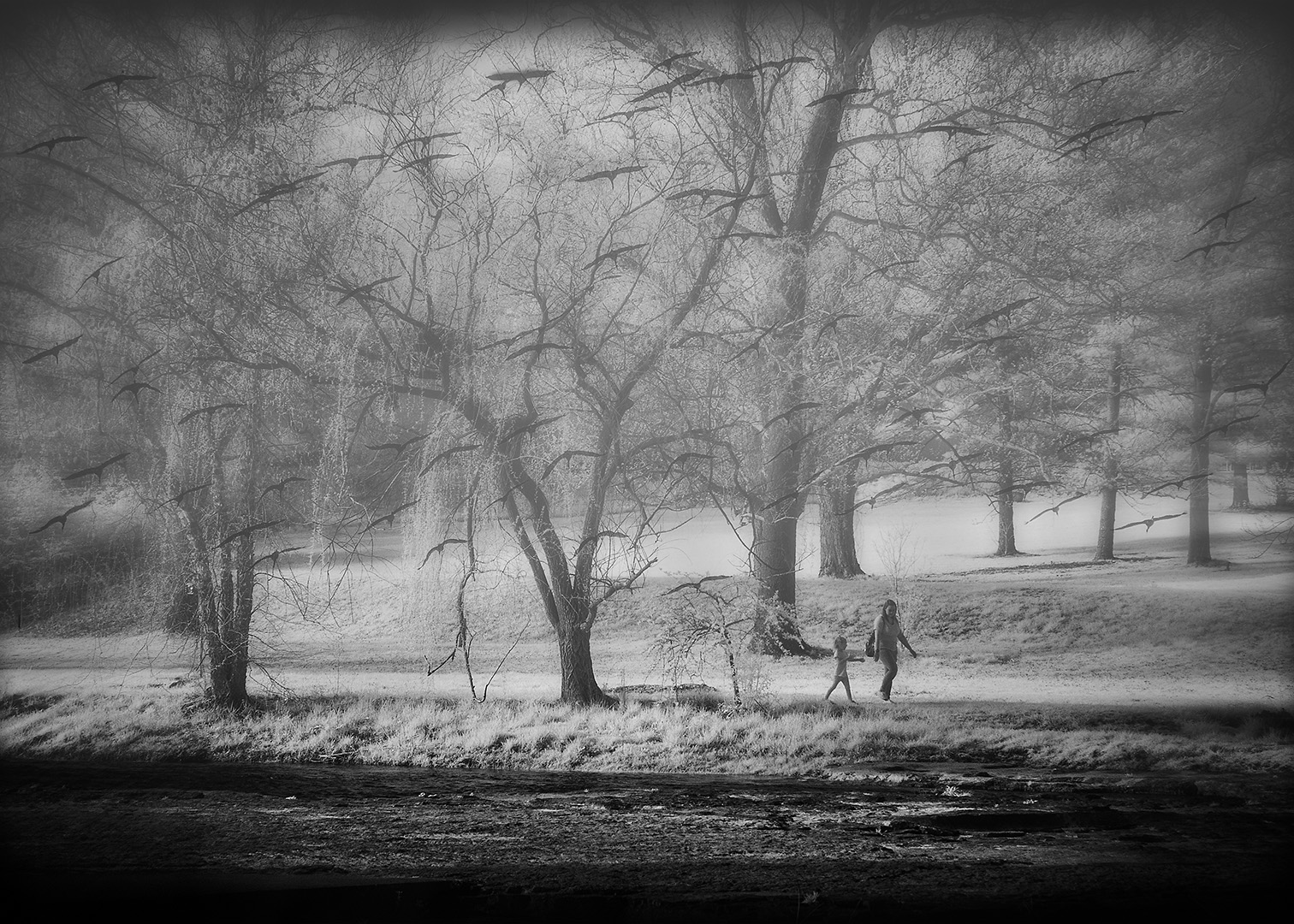
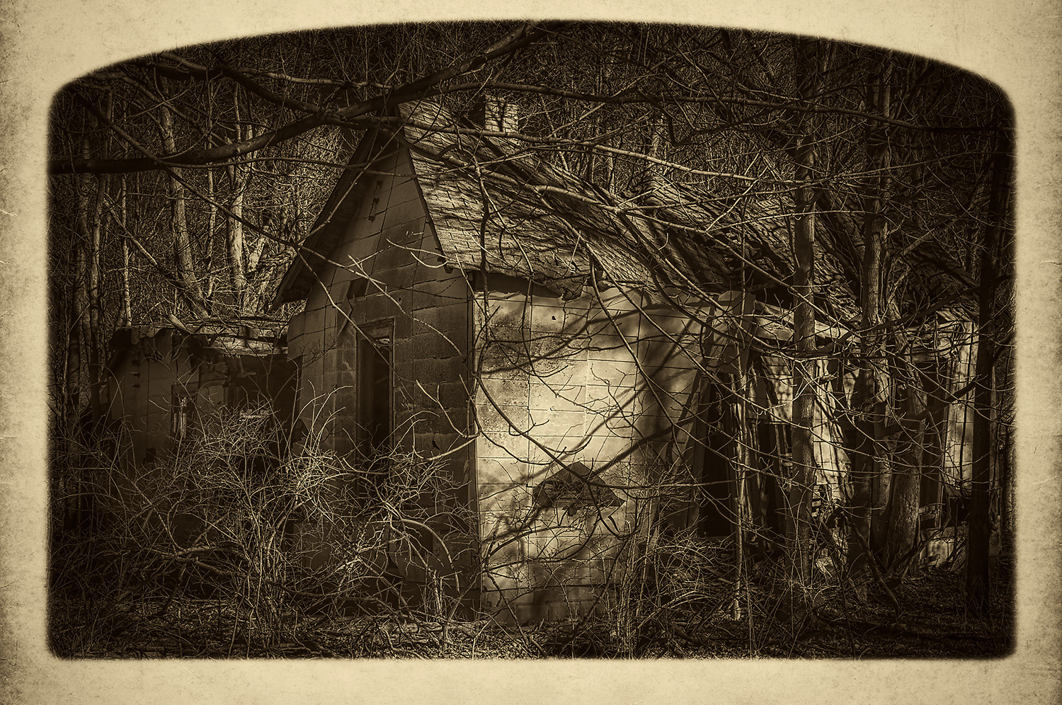
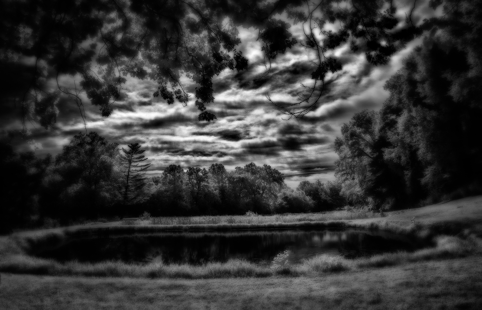
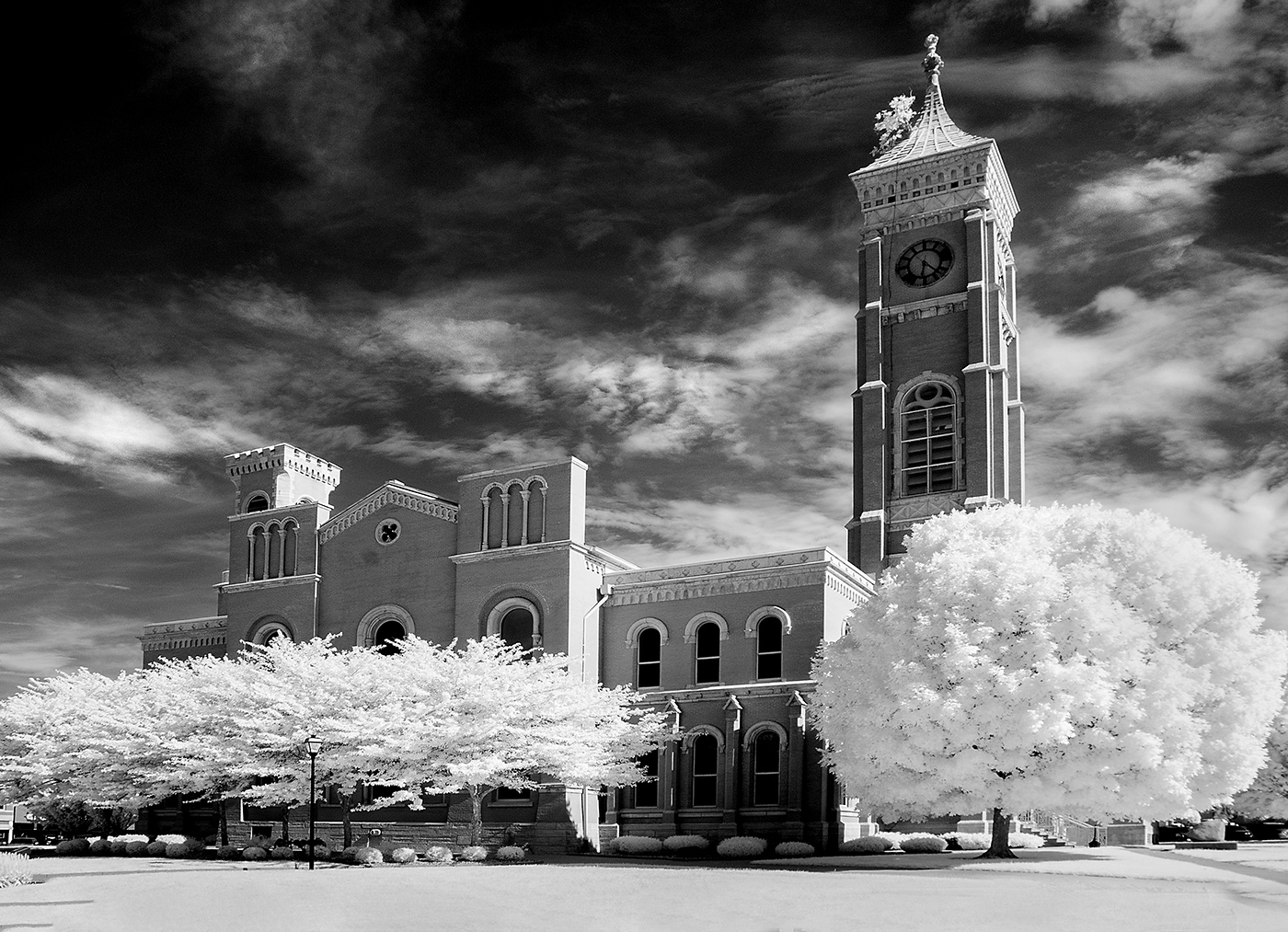
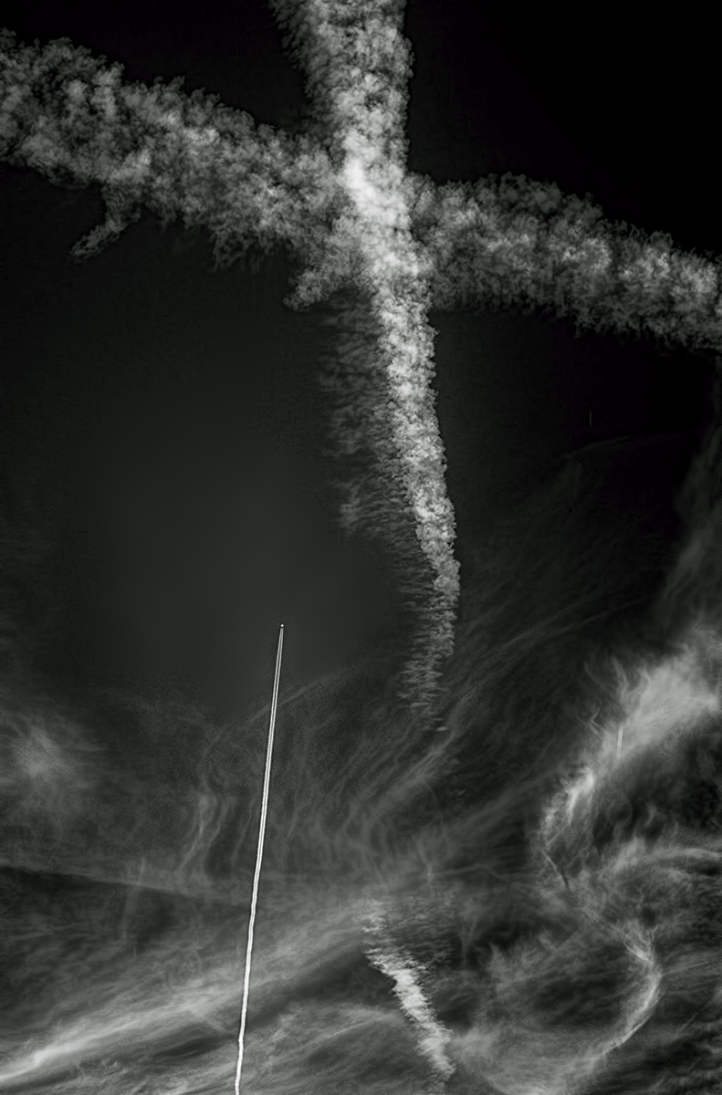
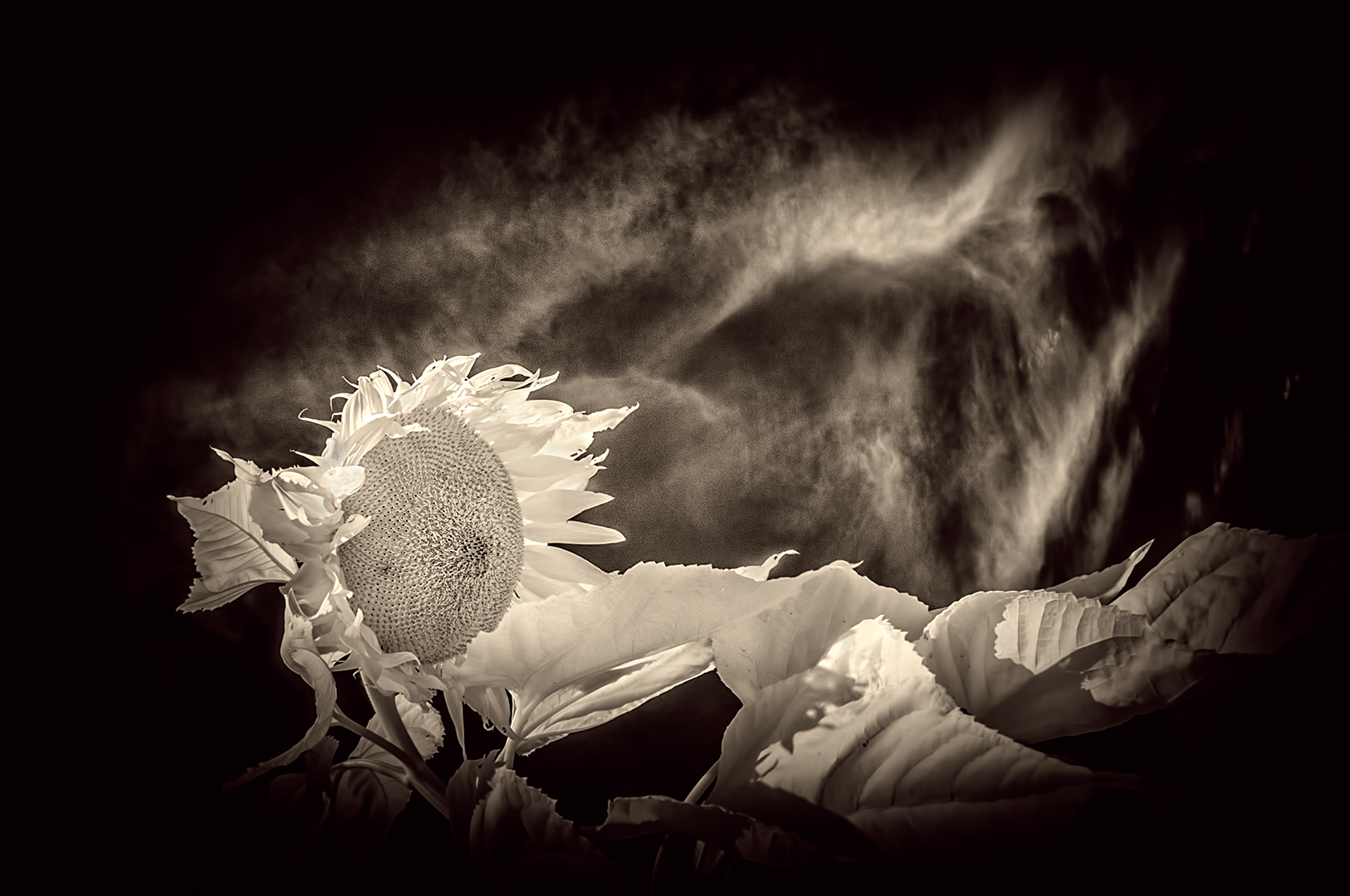
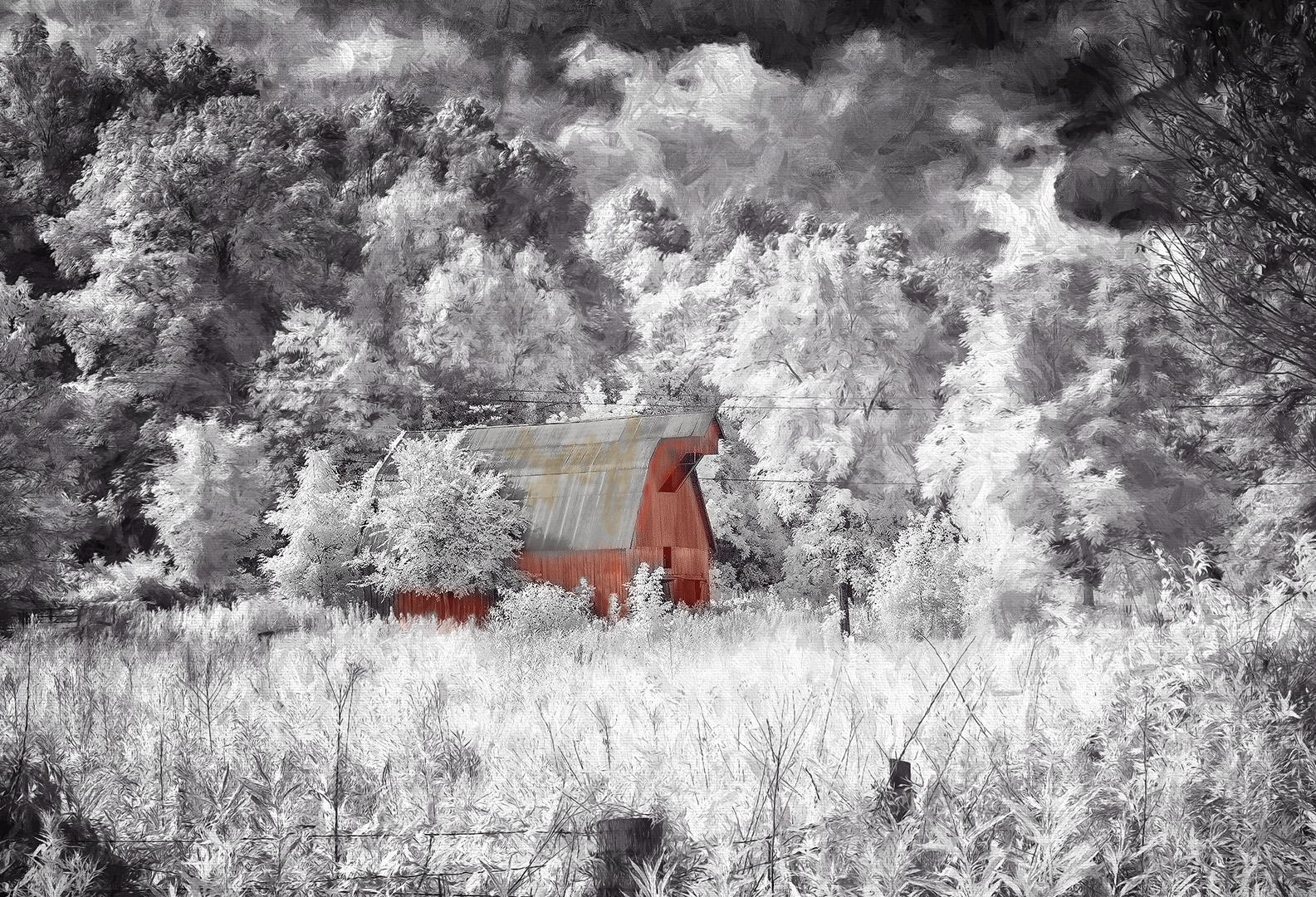
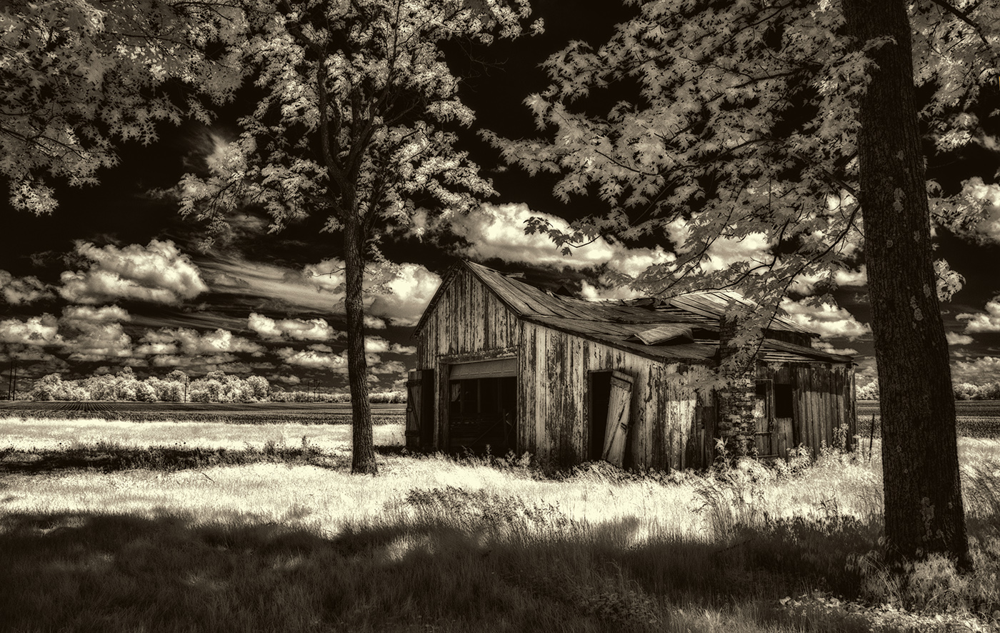
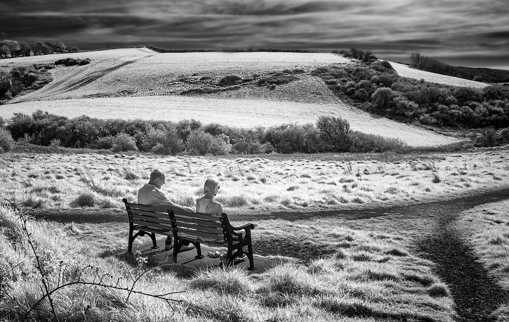
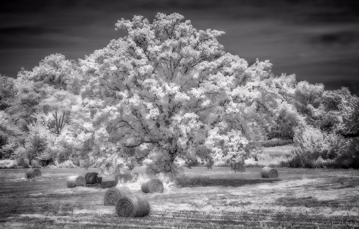
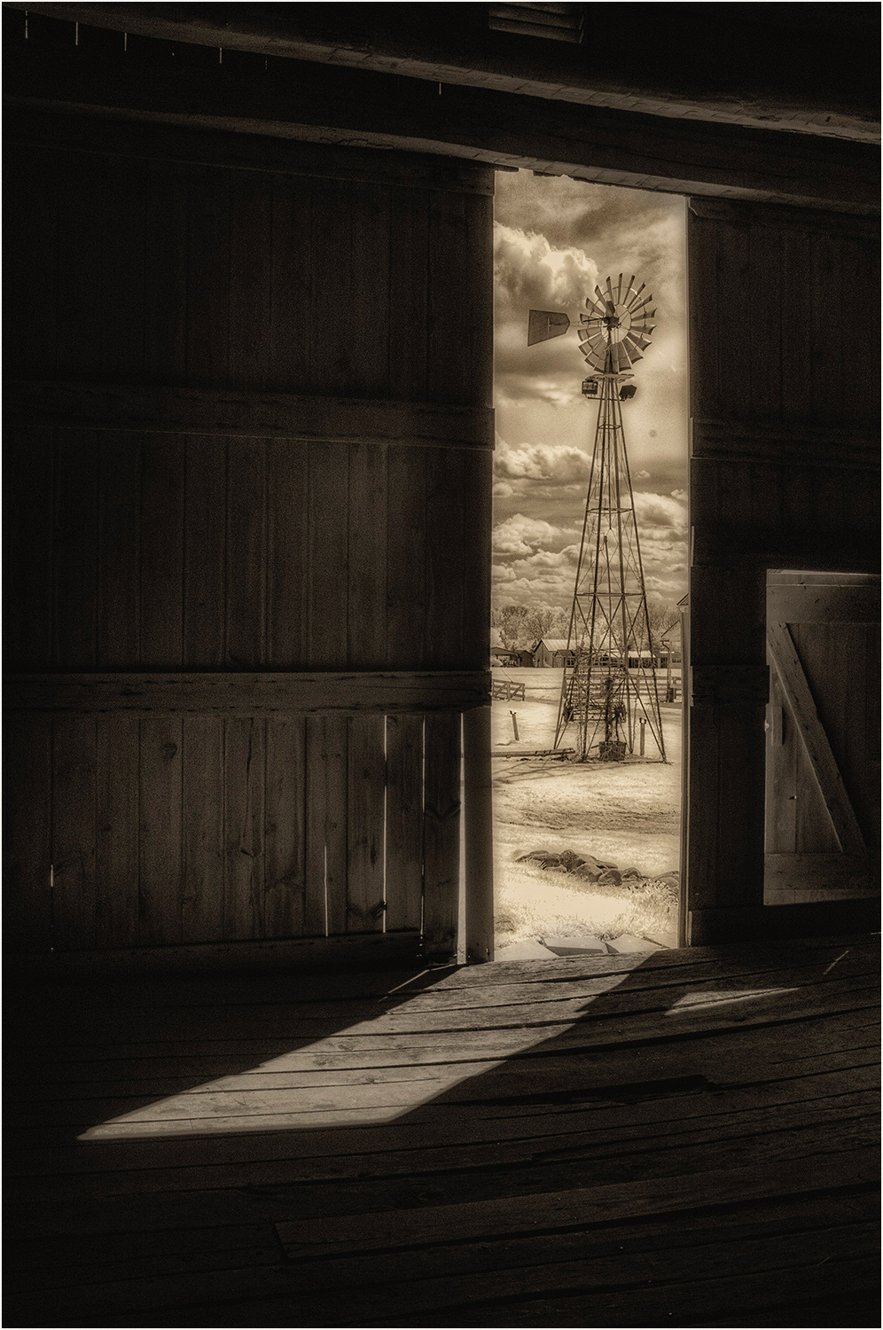
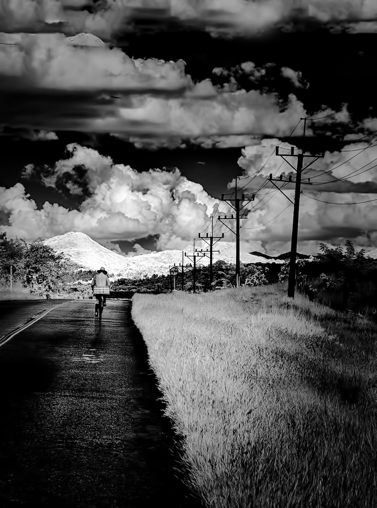
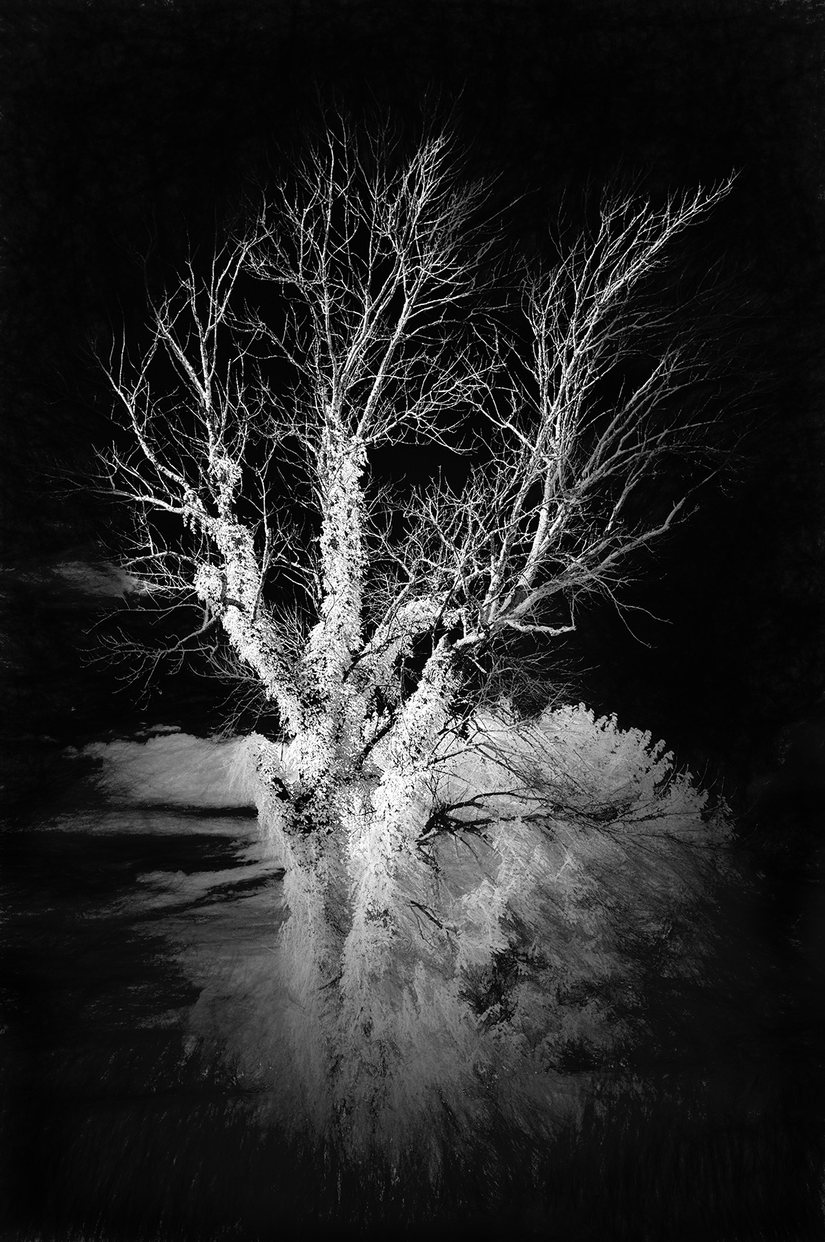
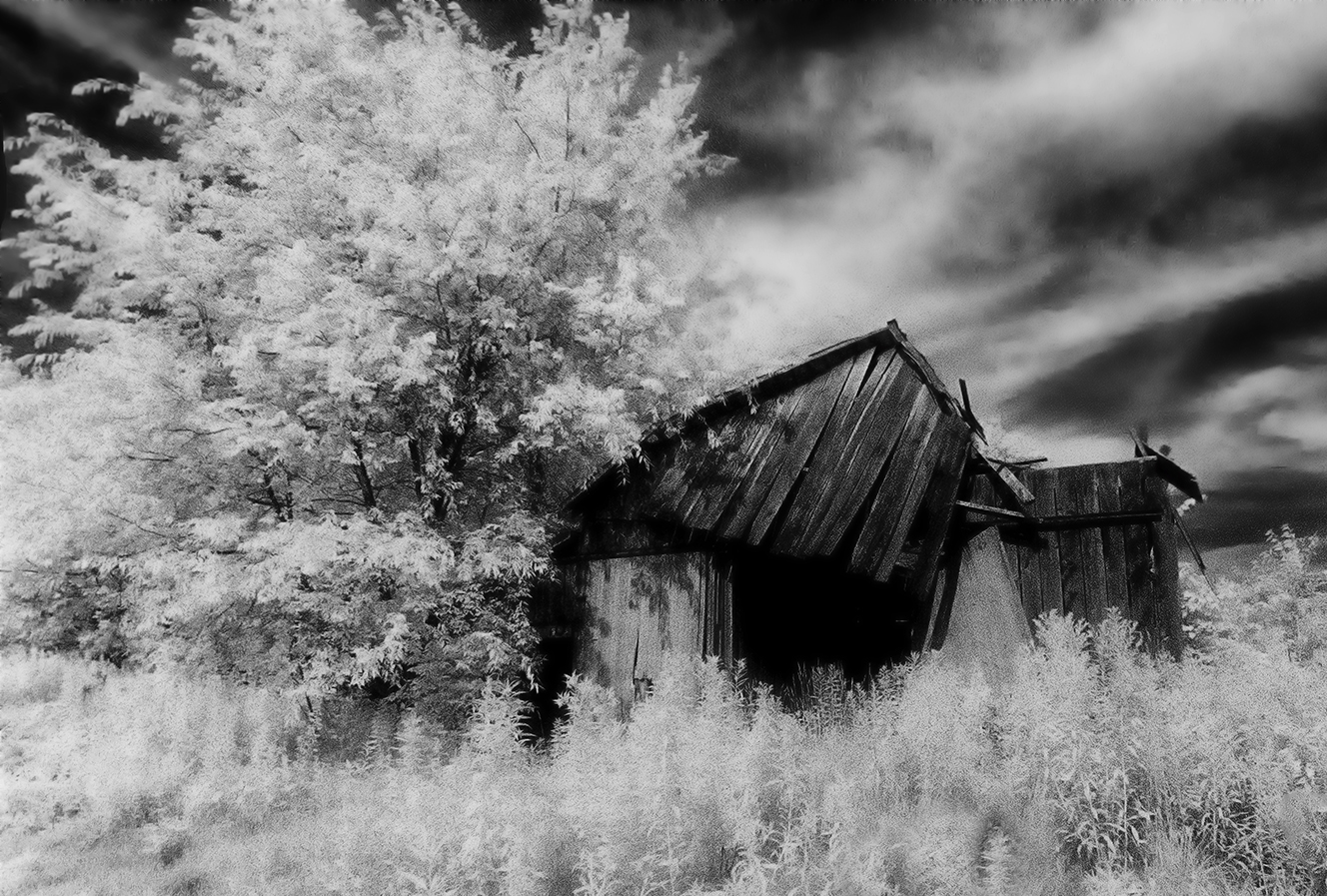
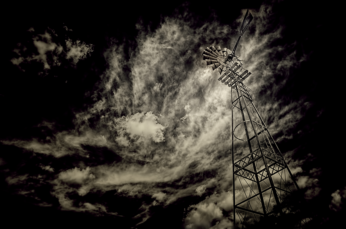
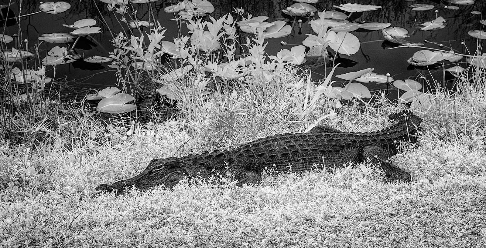
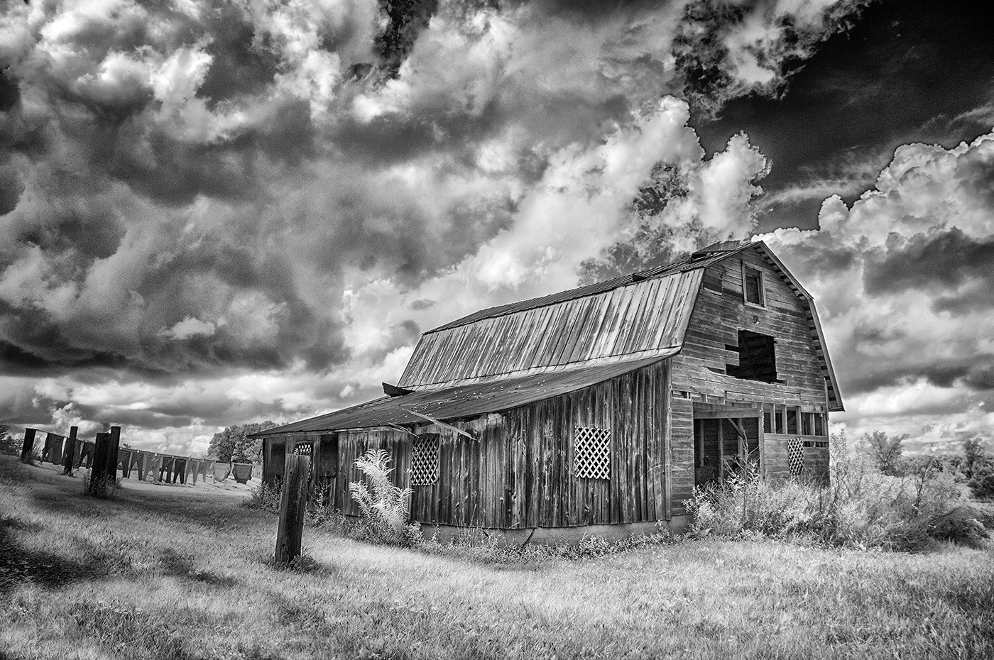
Very, very nice, Palli. I'd suggest just one thing...use the dodge tool and give some tonal lightening to those clouds. I think the sky a bit too somber for my tastes, but I know you didn't want them screaming out at you with the emphasis being on the bush. I lighten them slightly all the way across the frame and seemed to like the result a bit better. Also burnt in a few of the highlights on the bush to lower the spike of the overexposure in Levels. See if this adds value...or not! |
Apr 2nd |
 |
| 66 |
Apr 21 |
Comment |
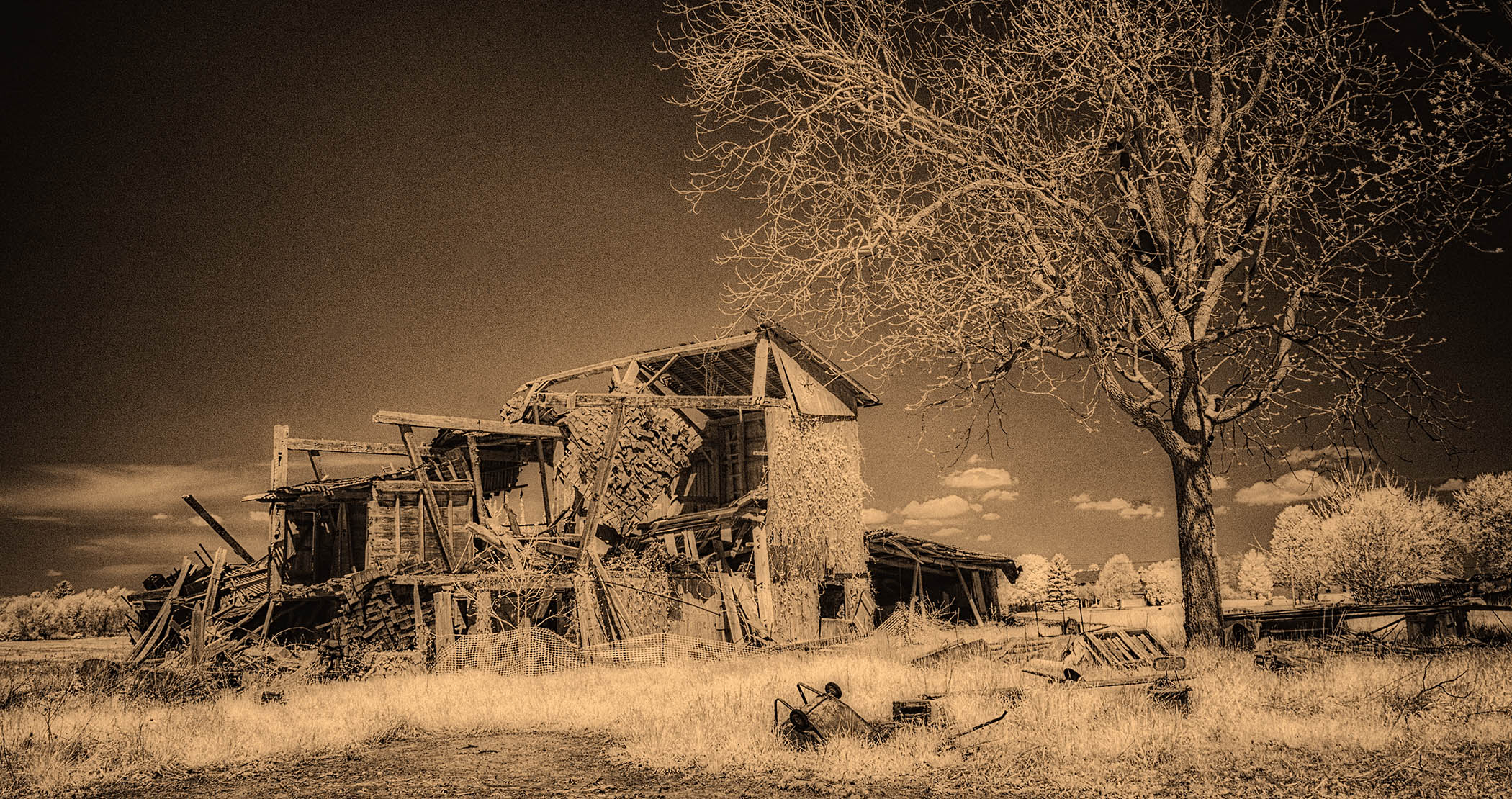
Hi Charles,
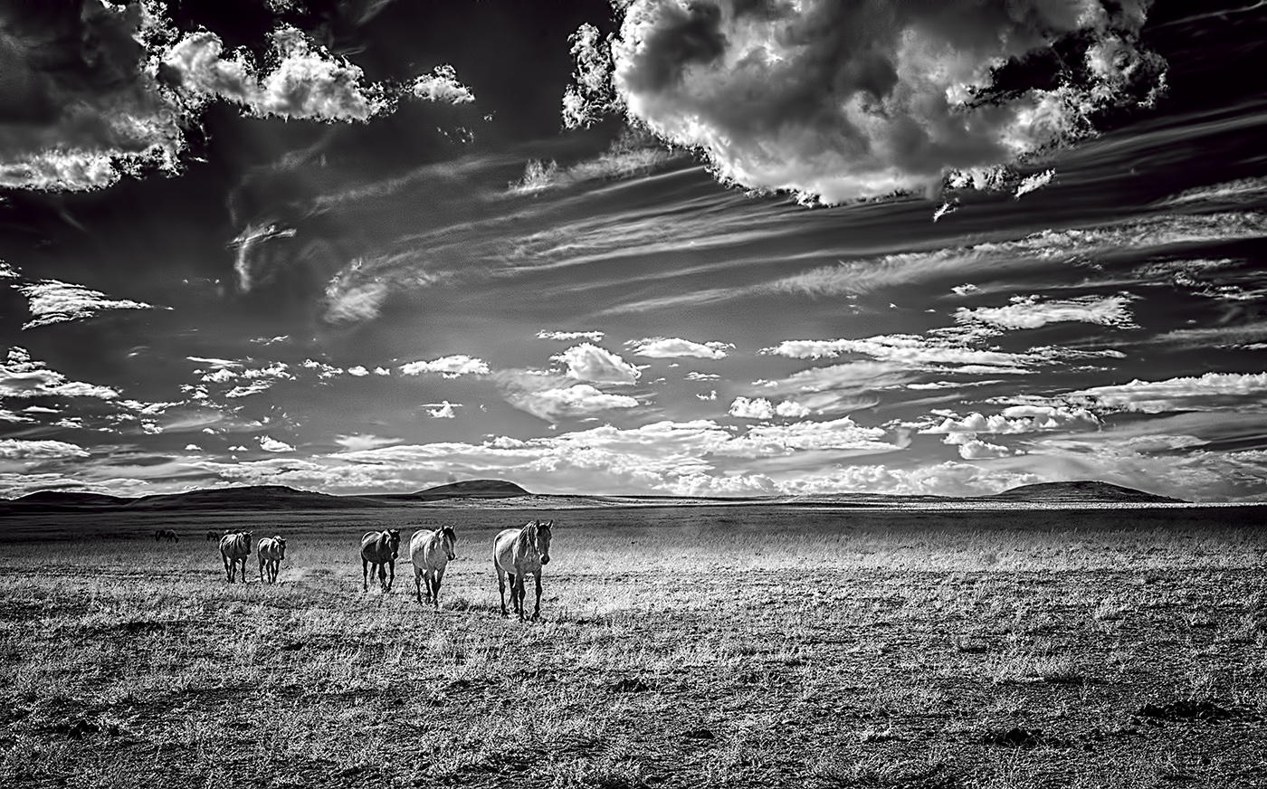
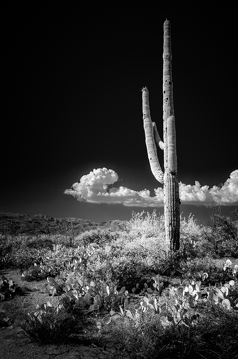
This is stunning. I played with options...and there are many...but I came back to this version and said "YES"! Strong composition and post-processing treatment in my view. You could go endless ways with this in lightening/darkening/toning...but why? This works very well. |
Apr 2nd |
| 66 |
Apr 21 |
Comment |
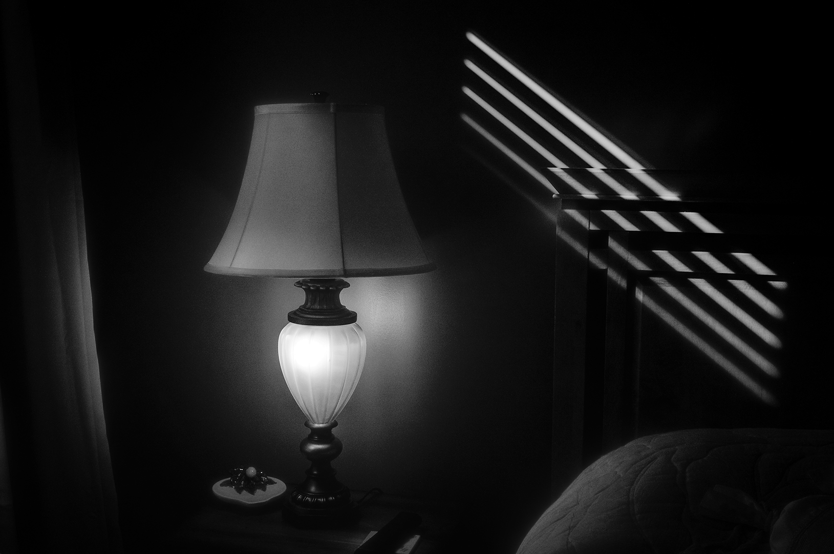
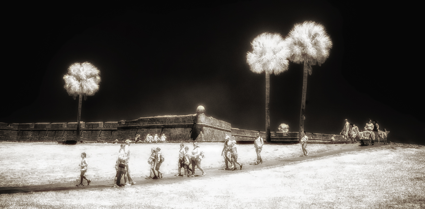
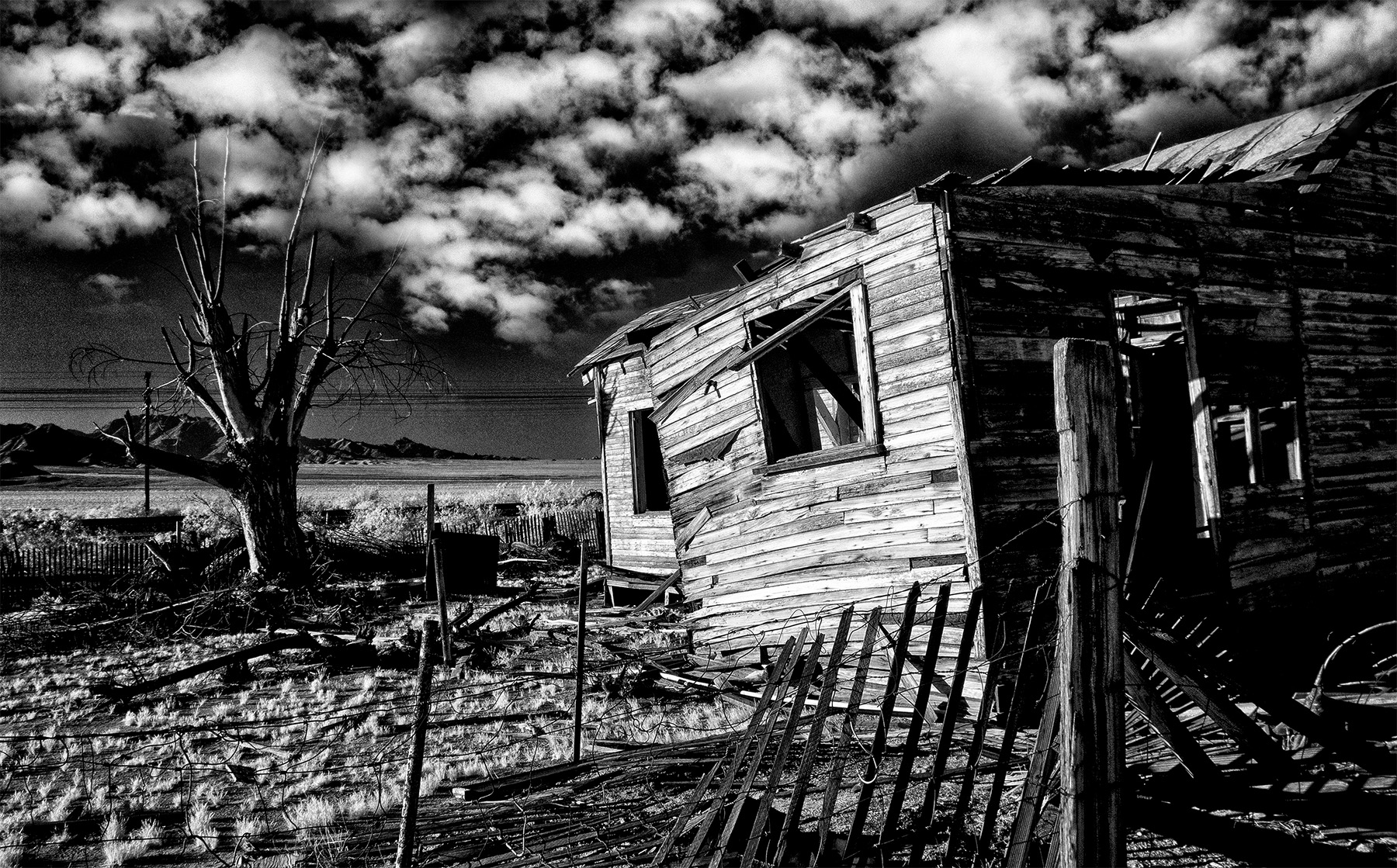
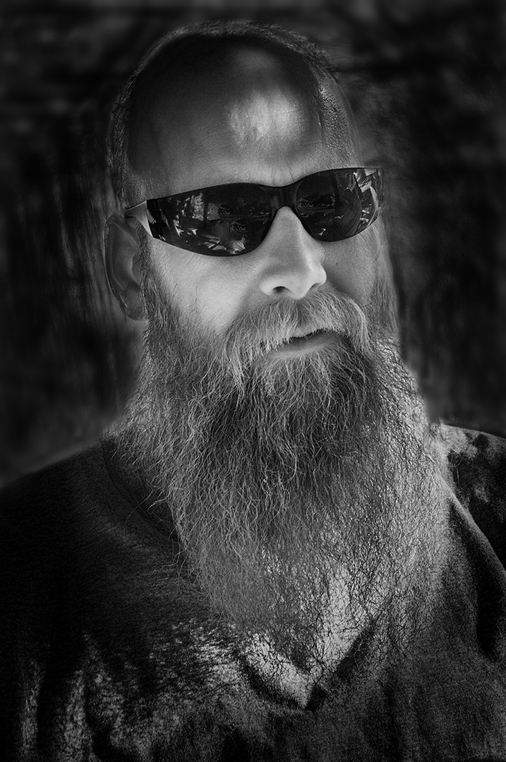
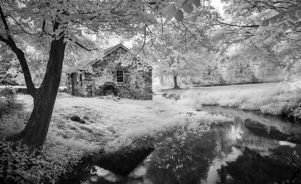
Hi Arik,
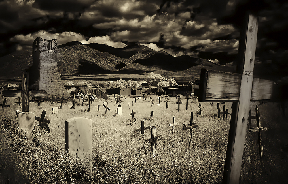
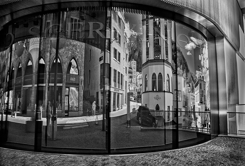
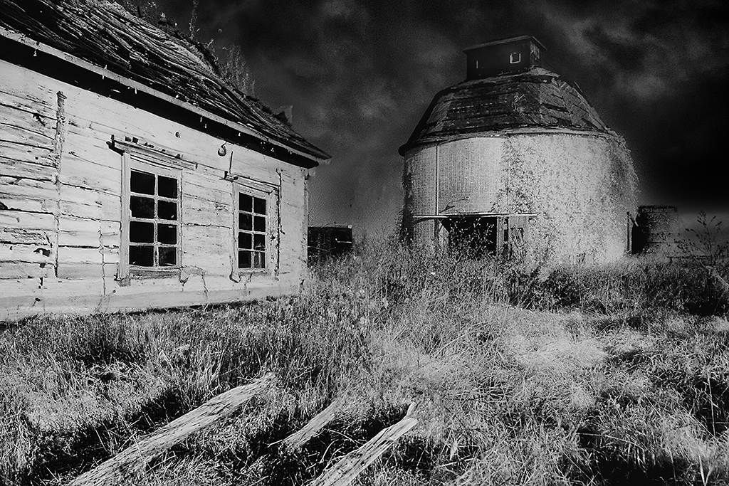
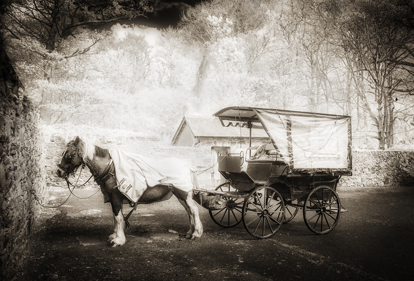
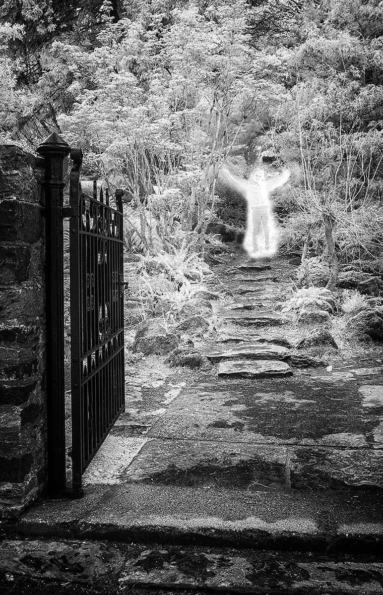
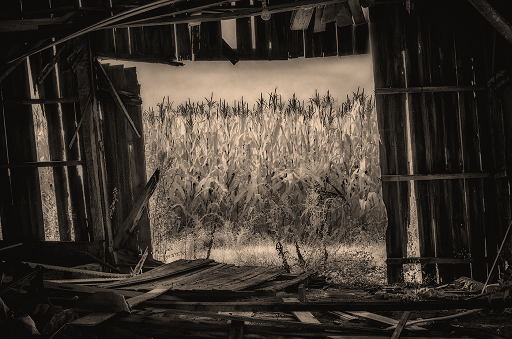
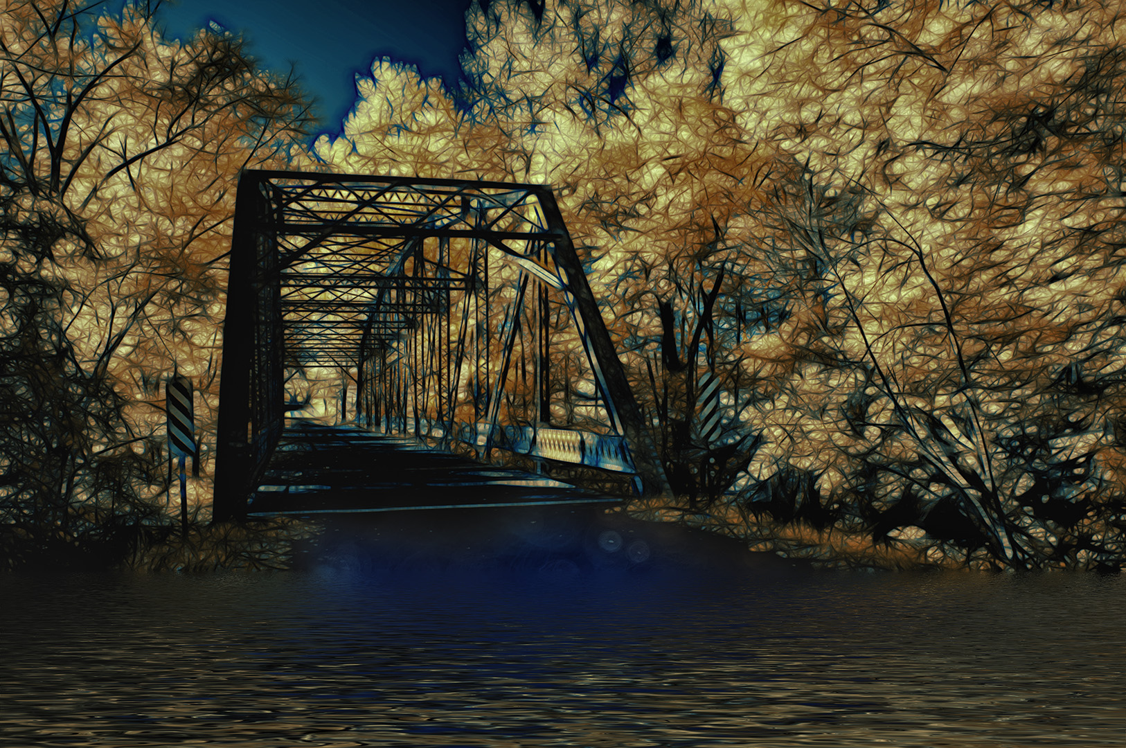
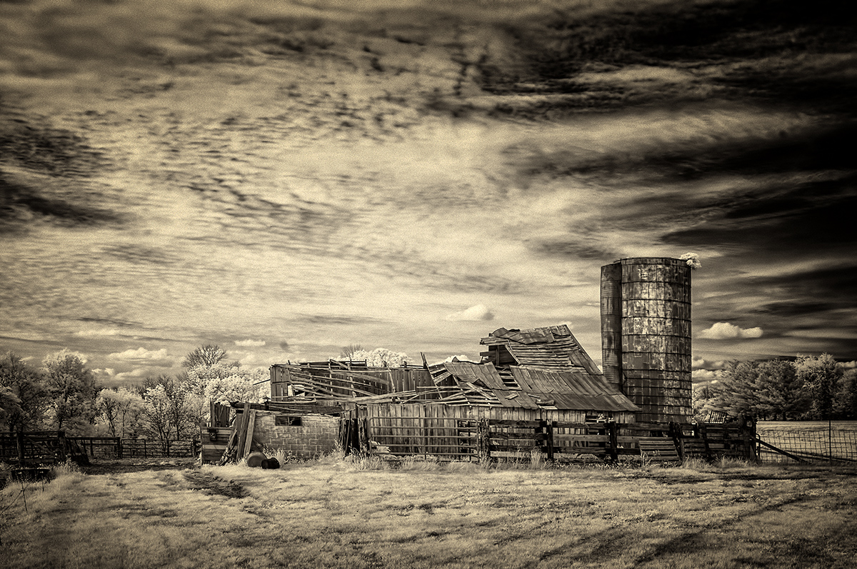
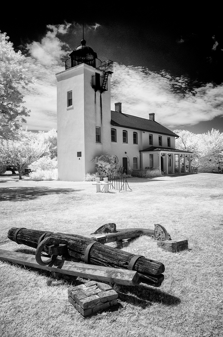
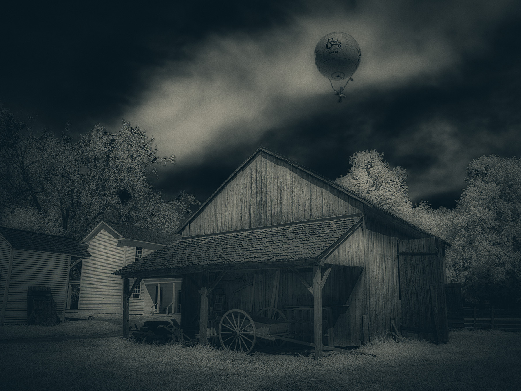
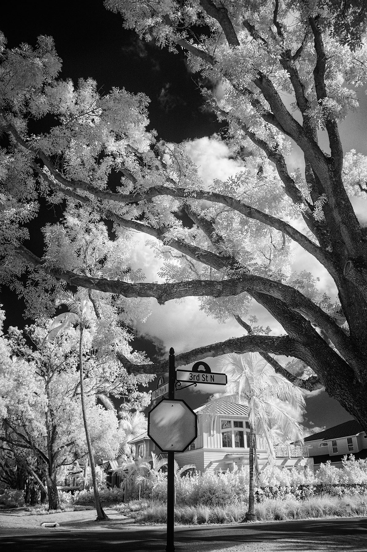
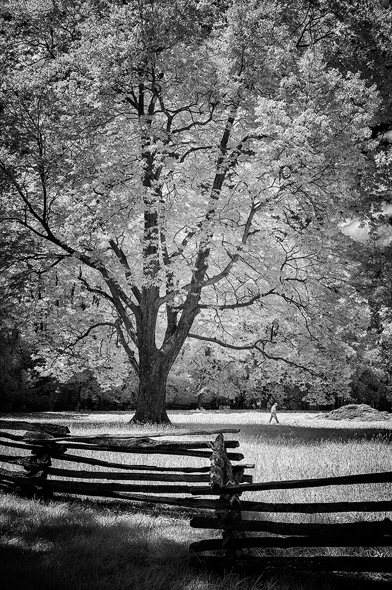
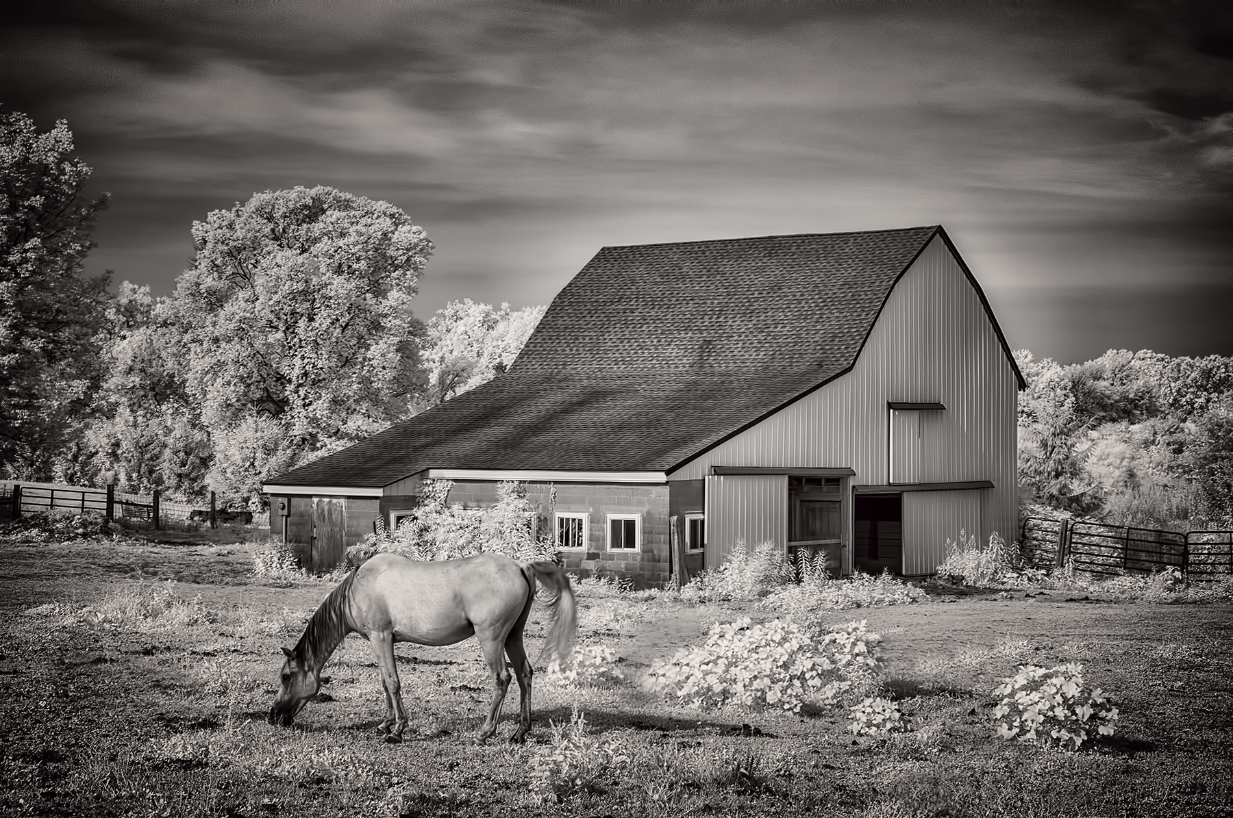
Again, a warm welcome to our merry band of IR photographers! Frequently, we submit 'our' version of your image with things we feel will make it display with greater impact. That's what I've done with the attached. I was slightly bothered by the other building (rh side), so it was removed with a (quick and dirty/crude) Content-Aware Fill and some cloning. I then used NIK Darken/Lighten Center for emphasis of the beautiful building, cropped just a smidge from the bottom and gave a mild burn to the creek side grasses. See what you think. By the way, as Jack and perhaps others will tell you, I am taken by bold blacks and whites and contrast...which may not be everyone's preference. |
Apr 2nd |
 |
| 66 |
Apr 21 |
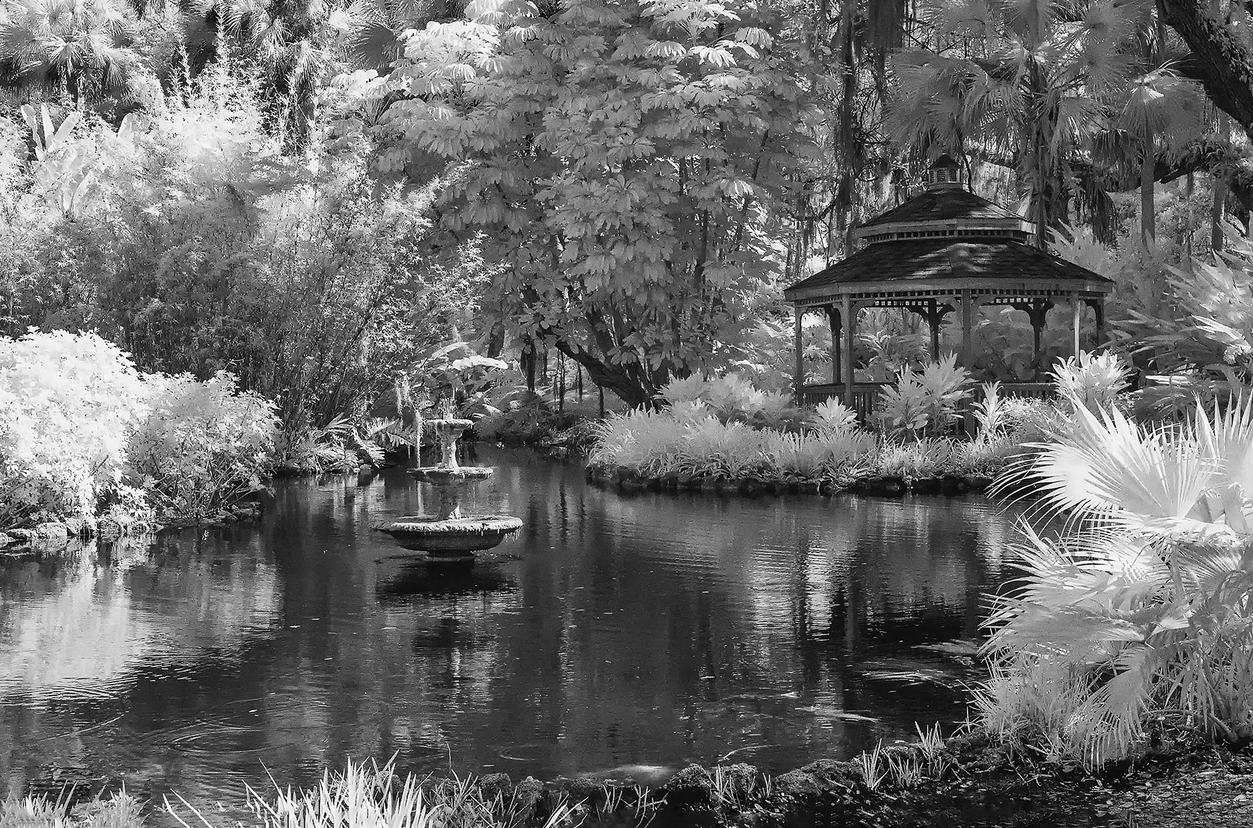
Comment |
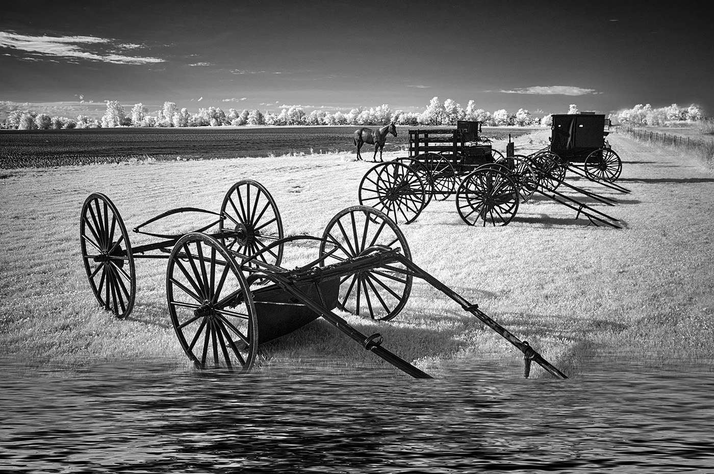
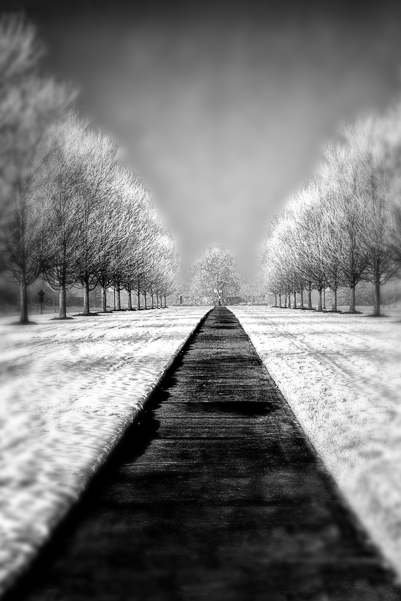
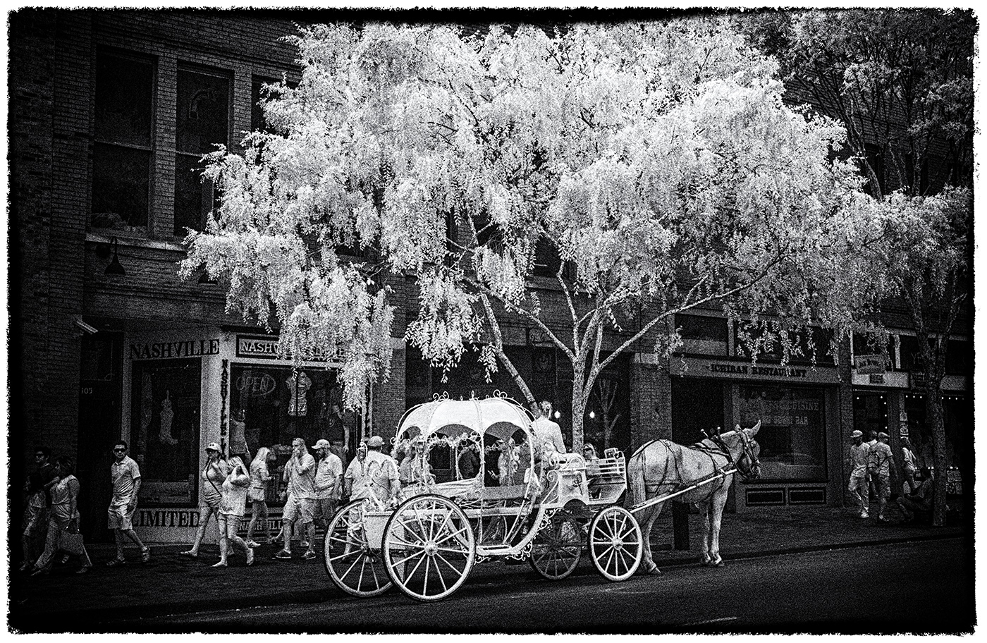
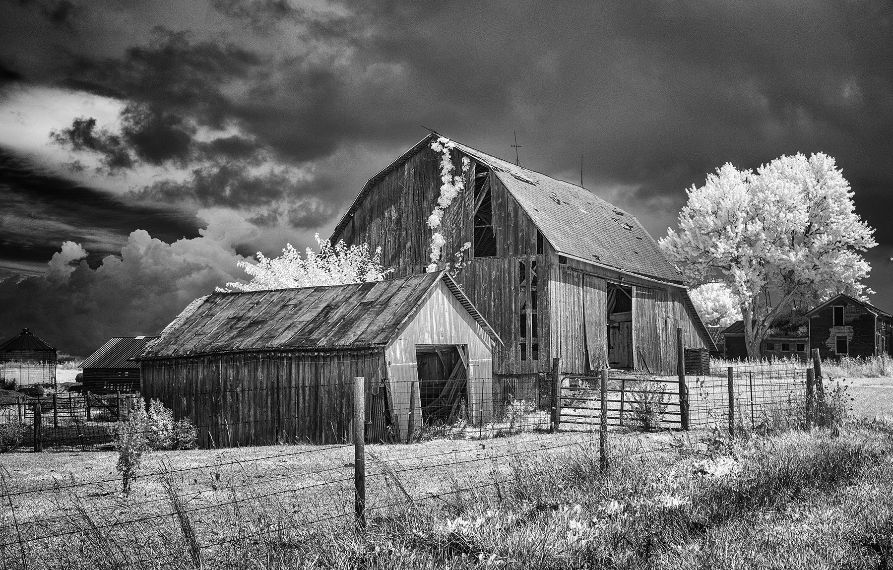
Well done, Melanie, well done. You've taken pains in post-processing to put forward a well executed image and it shows. I have no critique of this except to say BRAVO! |
Apr 2nd |
| 66 |
Apr 21 |
Comment |
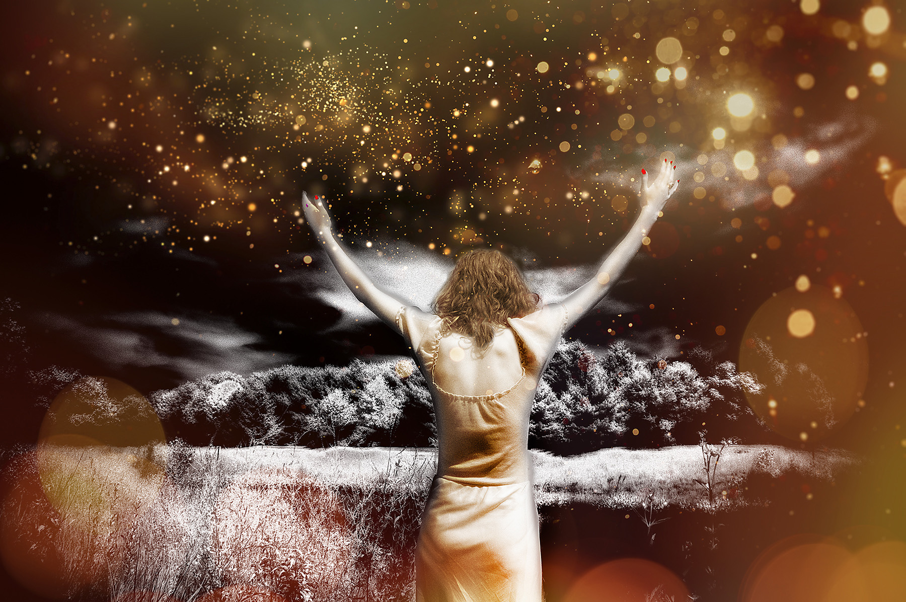
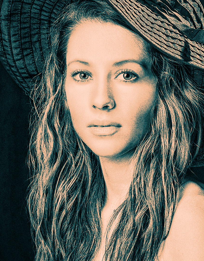
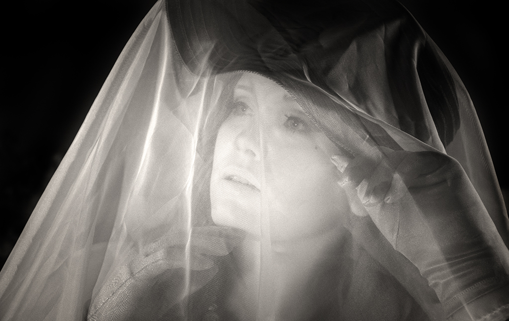
Hi Palli and all...
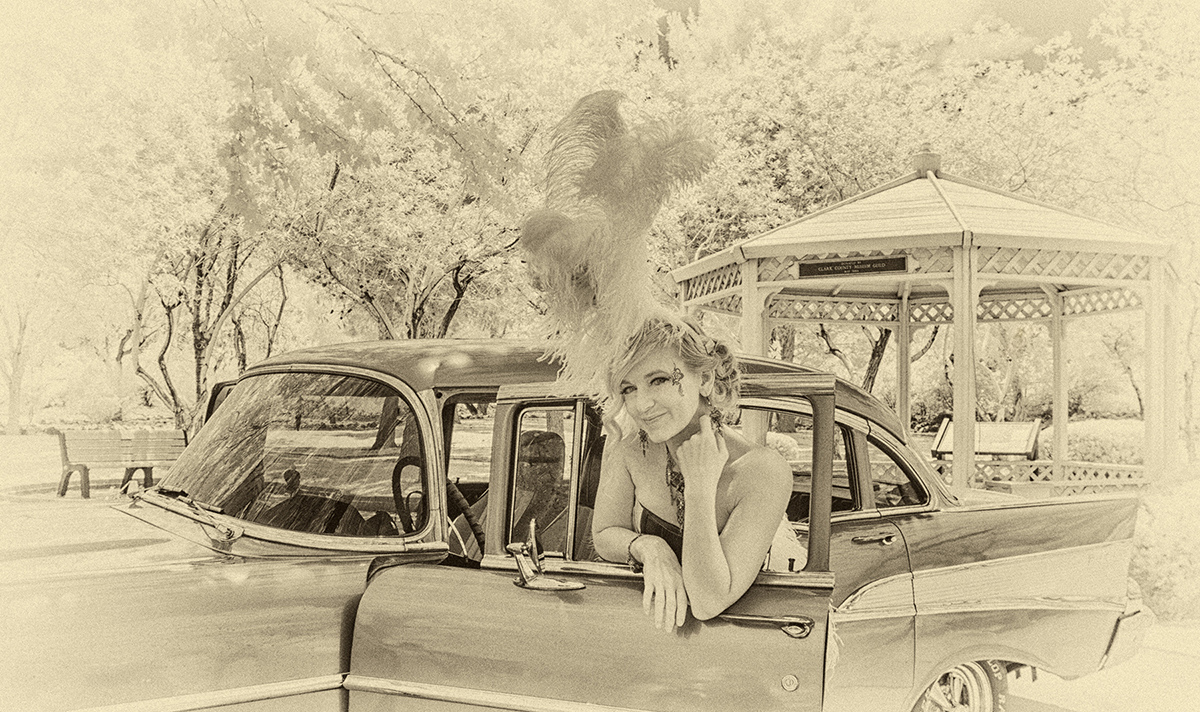
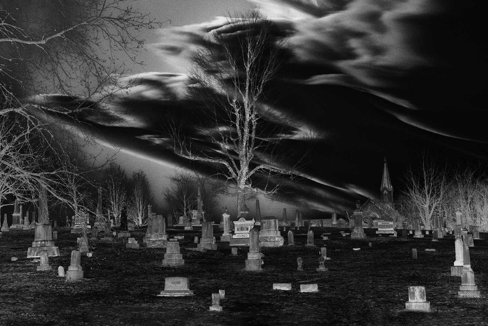
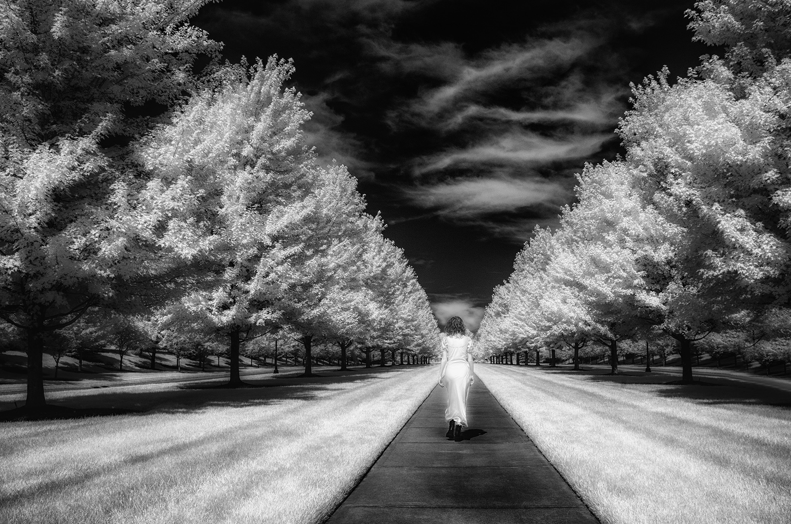
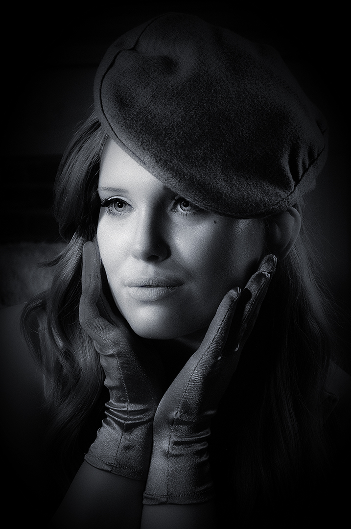
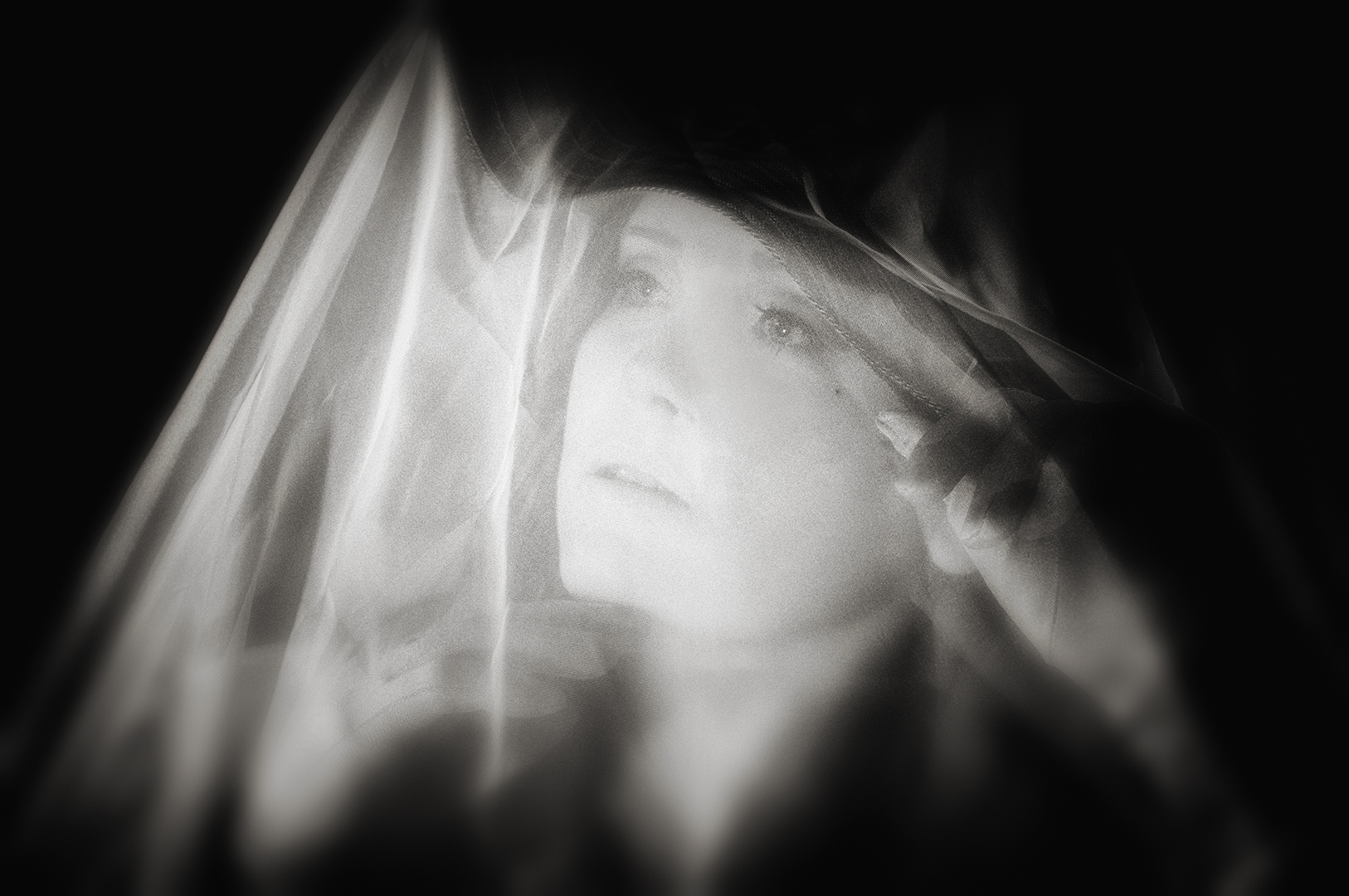
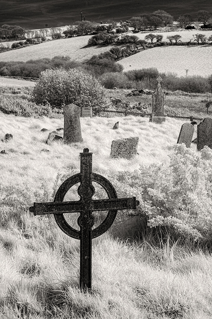
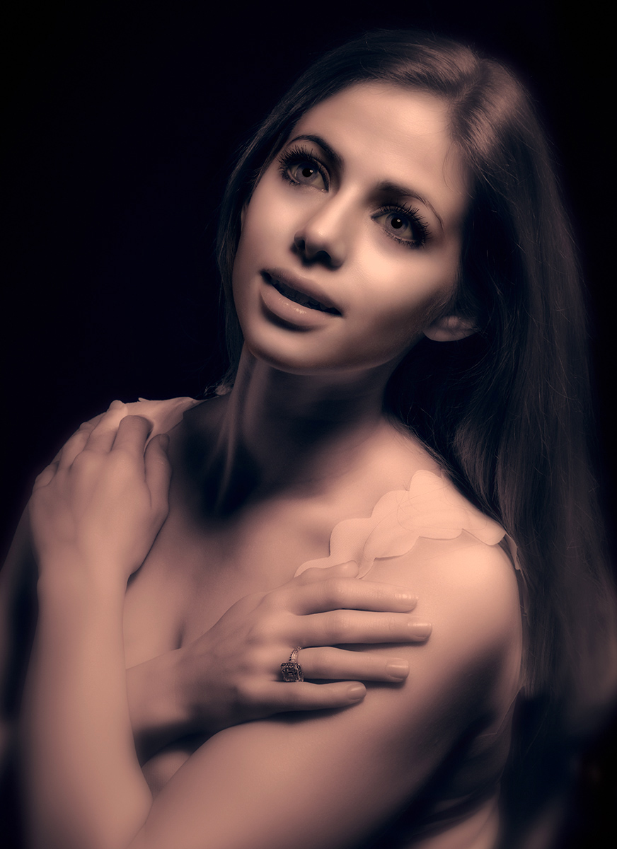
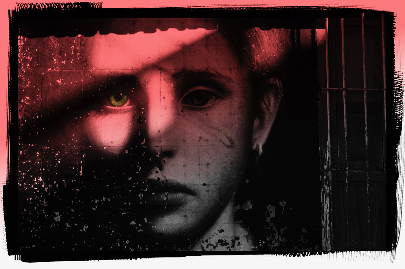
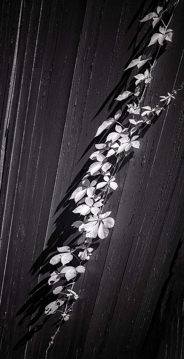
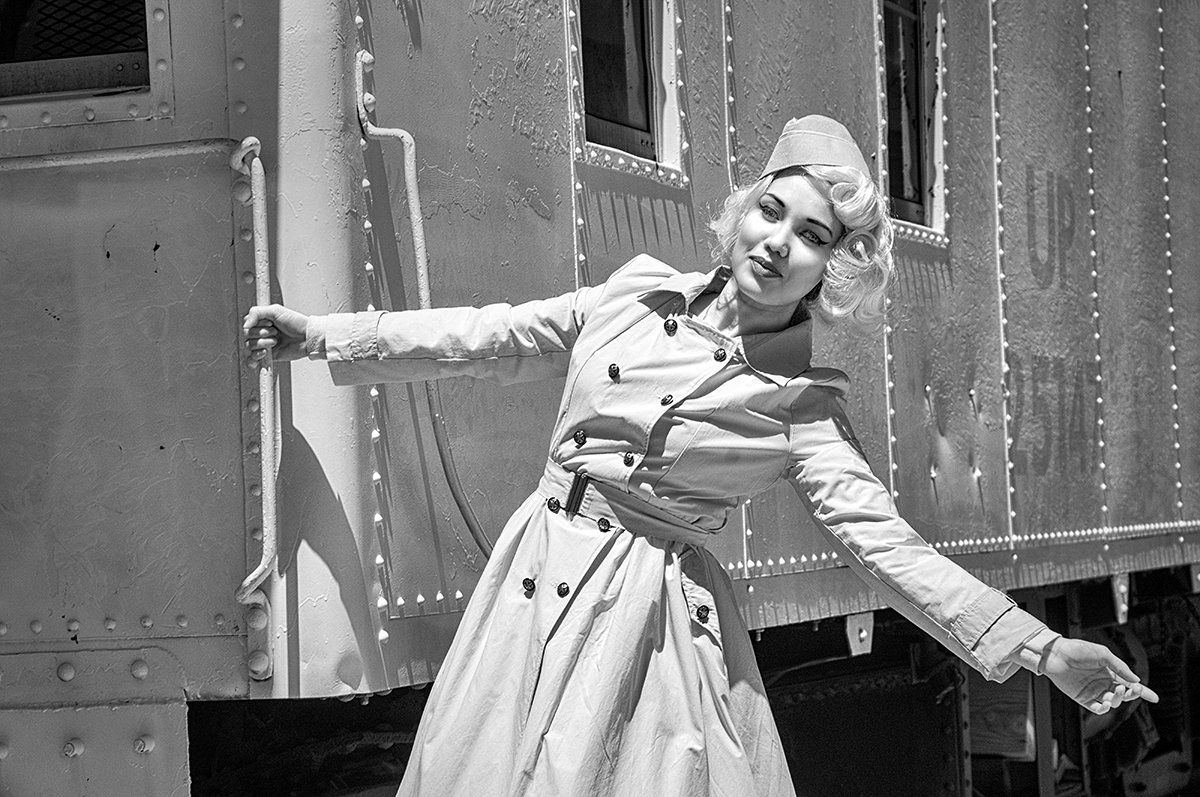
Palli's suggestion may well be a common theme to most of you. I will go back and take a look at the master file. Originally, due do the subtleties of IR, trying to add tone and dimension to the face resulted in a gradient line of lighter-left and darker-right down her head through the cheek area. You can so very slightly see it if your monitor is calibrated for the whole zonal range of tones. Palli is also very correct...the NIK Silver Efex Pro filter chosen for this one WAS the Pinhole Filter to provide the dramatic effect and cause the face to become very white. |
Apr 2nd |
7 comments - 5 replies for Group 66
|
7 comments - 5 replies Total
|