|
| Group |
Round |
C/R |
Comment |
Date |
Image |
| 66 |
Aug 20 |
Reply |
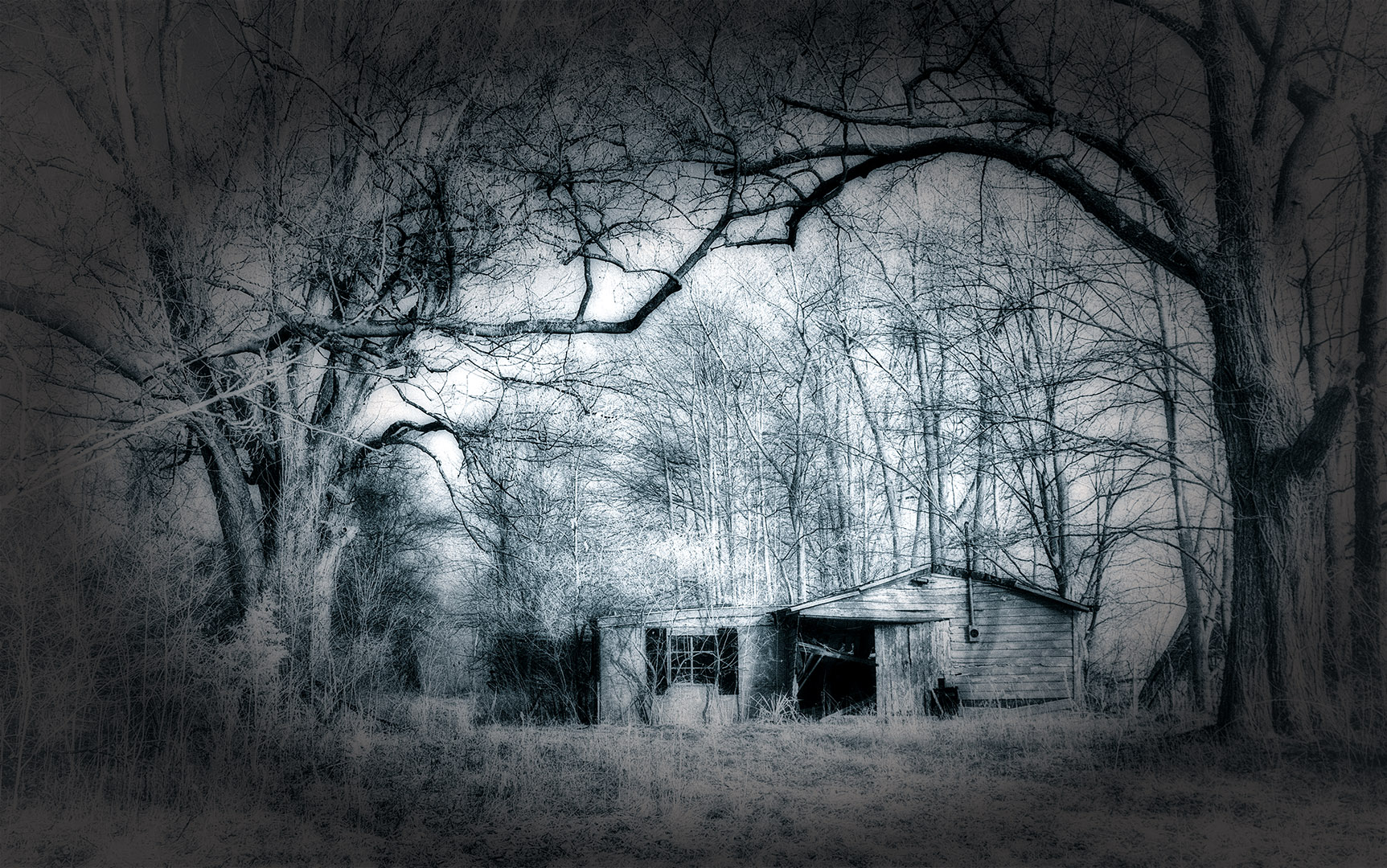
Hi John,
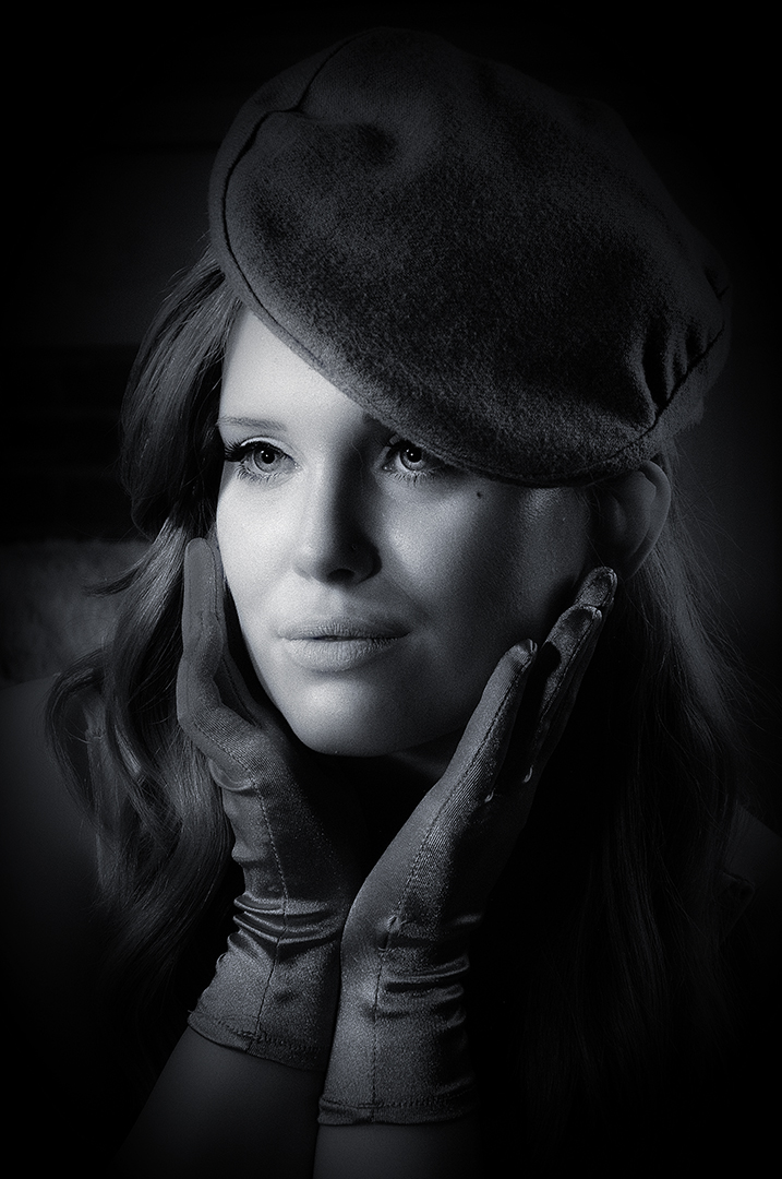
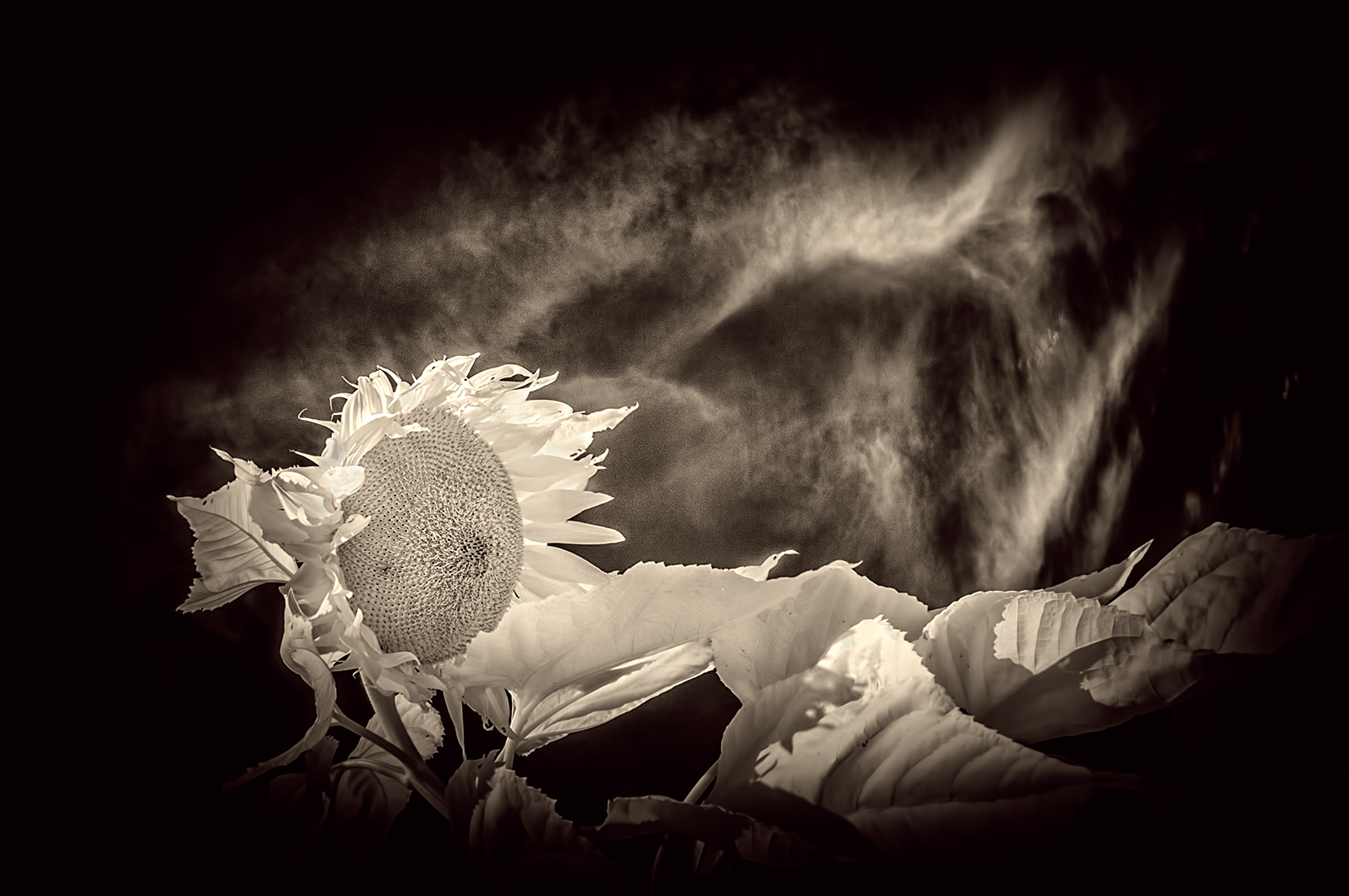
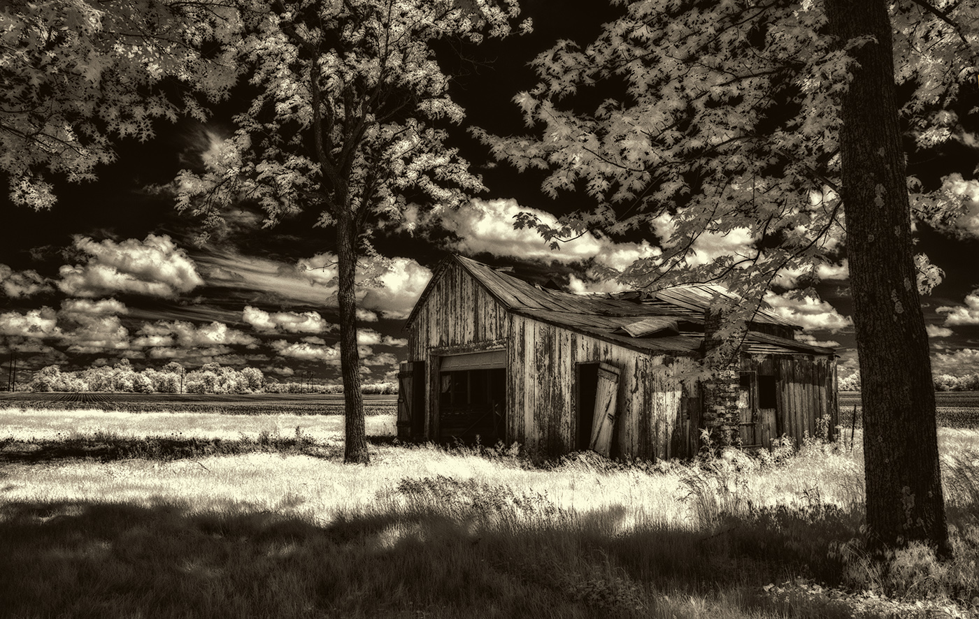
I realized I owe you a reply with an answer to your question about camera settings. This was taken on a bright day, sun was pretty high in the sky. So, I used NIK Silver Efex Pro and went with the Low Key plug-in with a few adjustments from there. Taken with a converted Nikon D300, 18-70mm lens at 18 mm. (27mm equivalent in 35mm), 1/45th second, f11, ISO 400. Look forward to seeing your September image. |
Aug 28th |
| 66 |
Aug 20 |
Reply |
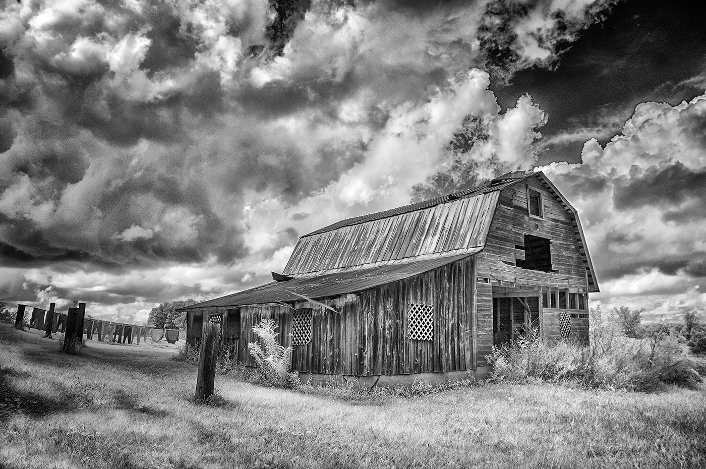
Thanks for the feedback, Emil...I went back to the original and reworked it. This is my compromise image of retaining some sunlight but reducing the contrast using a low-key filter in Silver Efex. I also changed the toning slightly. What's the verdict from your end? |
Aug 8th |
 |
| 66 |
Aug 20 |
Reply |
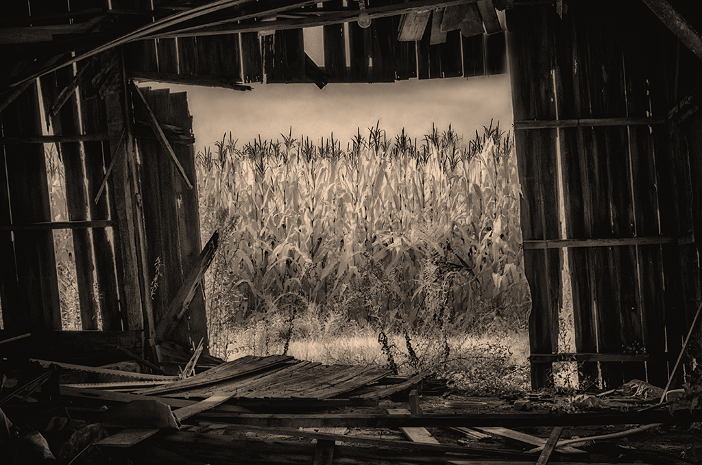
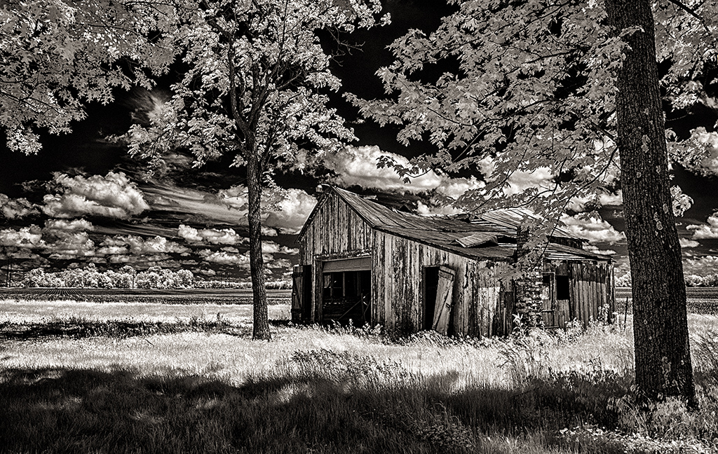
Hi Palli,
Much appreciate your comments. I went back to the proverbial 'drawing board' and eliminating the blurring using a different filter--Silver Efex Pro "Low Key 1". I also used a different value of sepia. Do you like the revised version better? |
Aug 8th |
|
| 66 |
Aug 20 |
Reply |
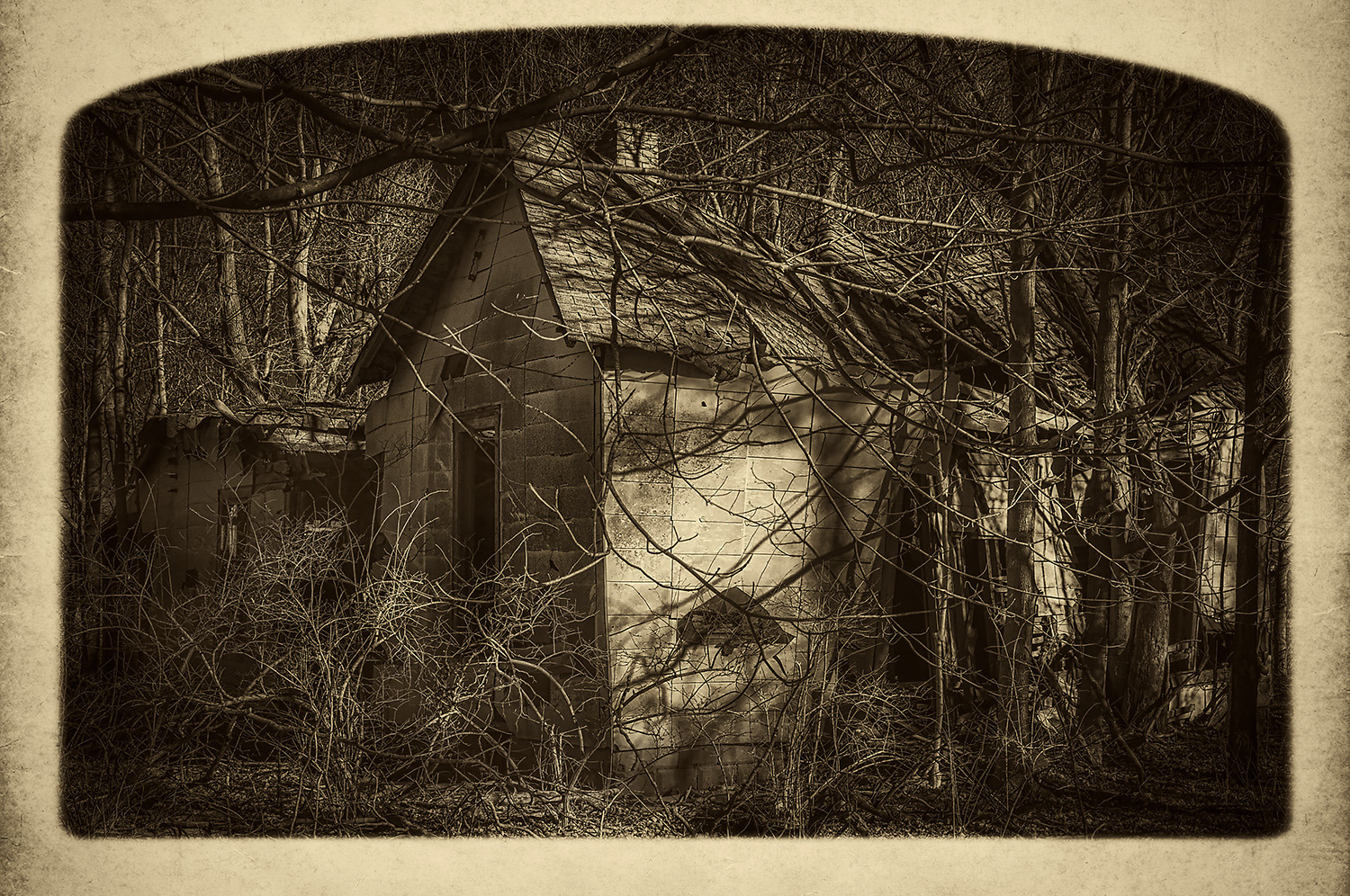
Thanks Charles,
I went back to the proverbial 'drawing board'. I used a low key approach without adding in the blurring inherent in the Nik Silver Efex 'midnight' filter. See if this version is improving the scene for you. |
Aug 8th |
|
| 66 |
Aug 20 |
Reply |
You've got it Melanie, thank you!
Not seeing yours yet, I reprocessed the image to respond to all the comments. See it attached...they look a lot alike!
The "midnight" filter in Color Efex, used to make it look darker and moodier, did indeed muddy it up with the blurring built into the filter. I switched to Low Key and got something very close to what you did. |
Aug 8th |
 |
| 66 |
Aug 20 |
Comment |
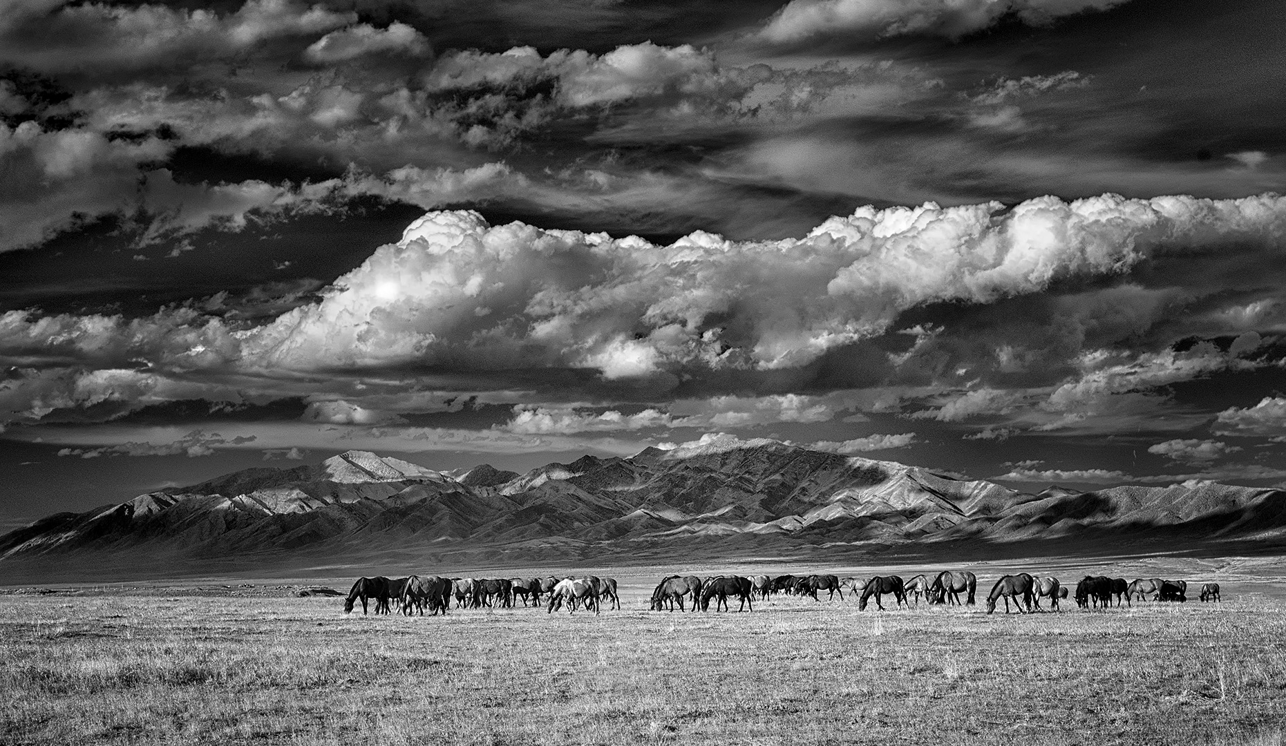
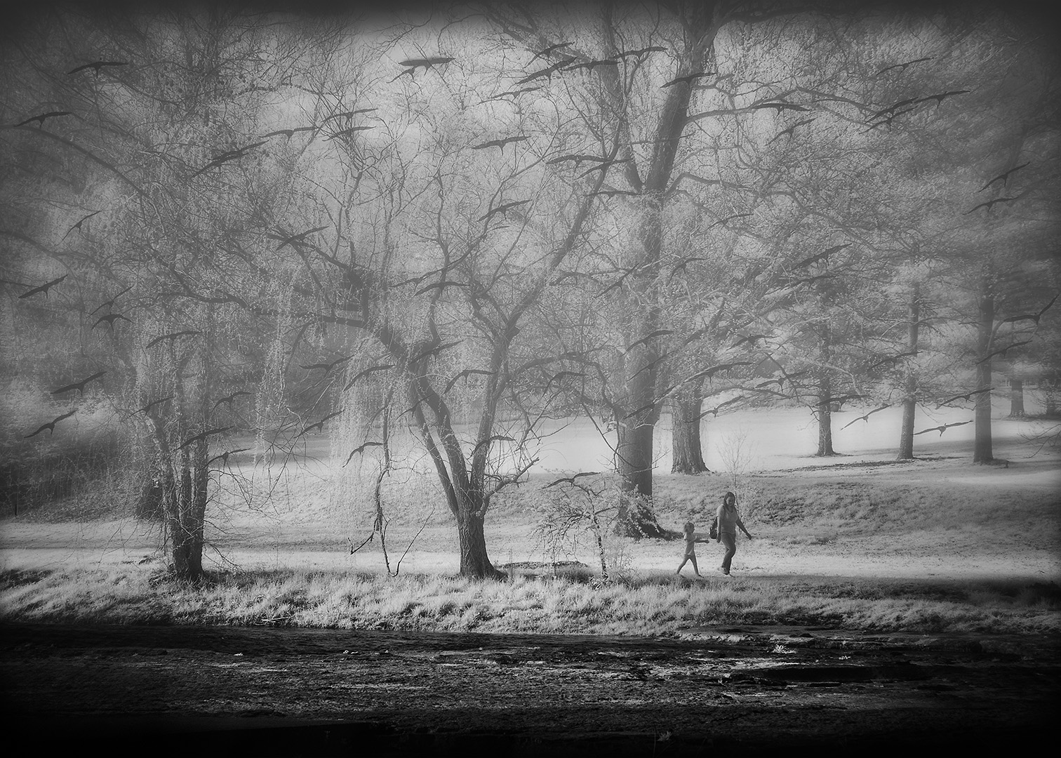
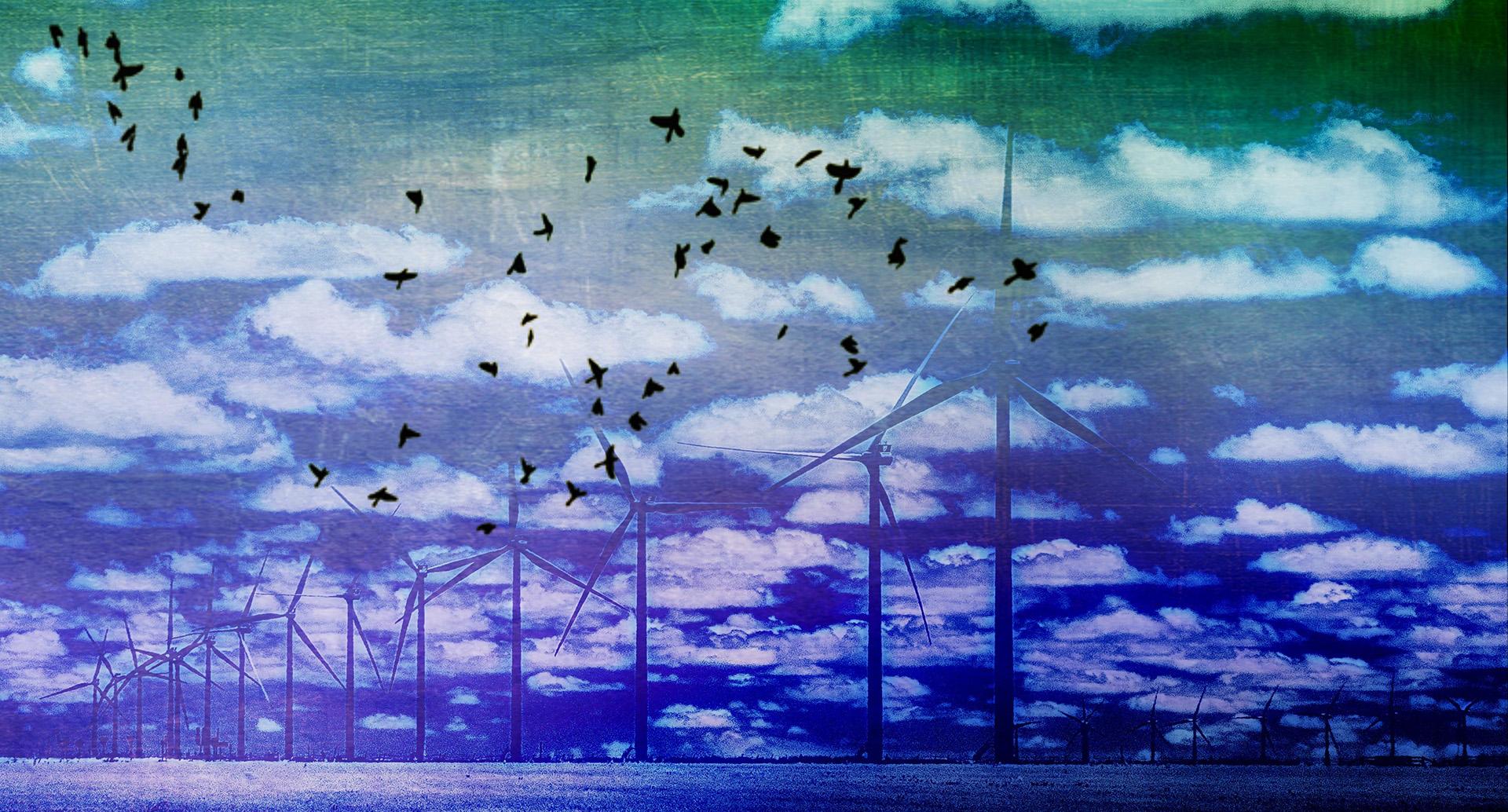
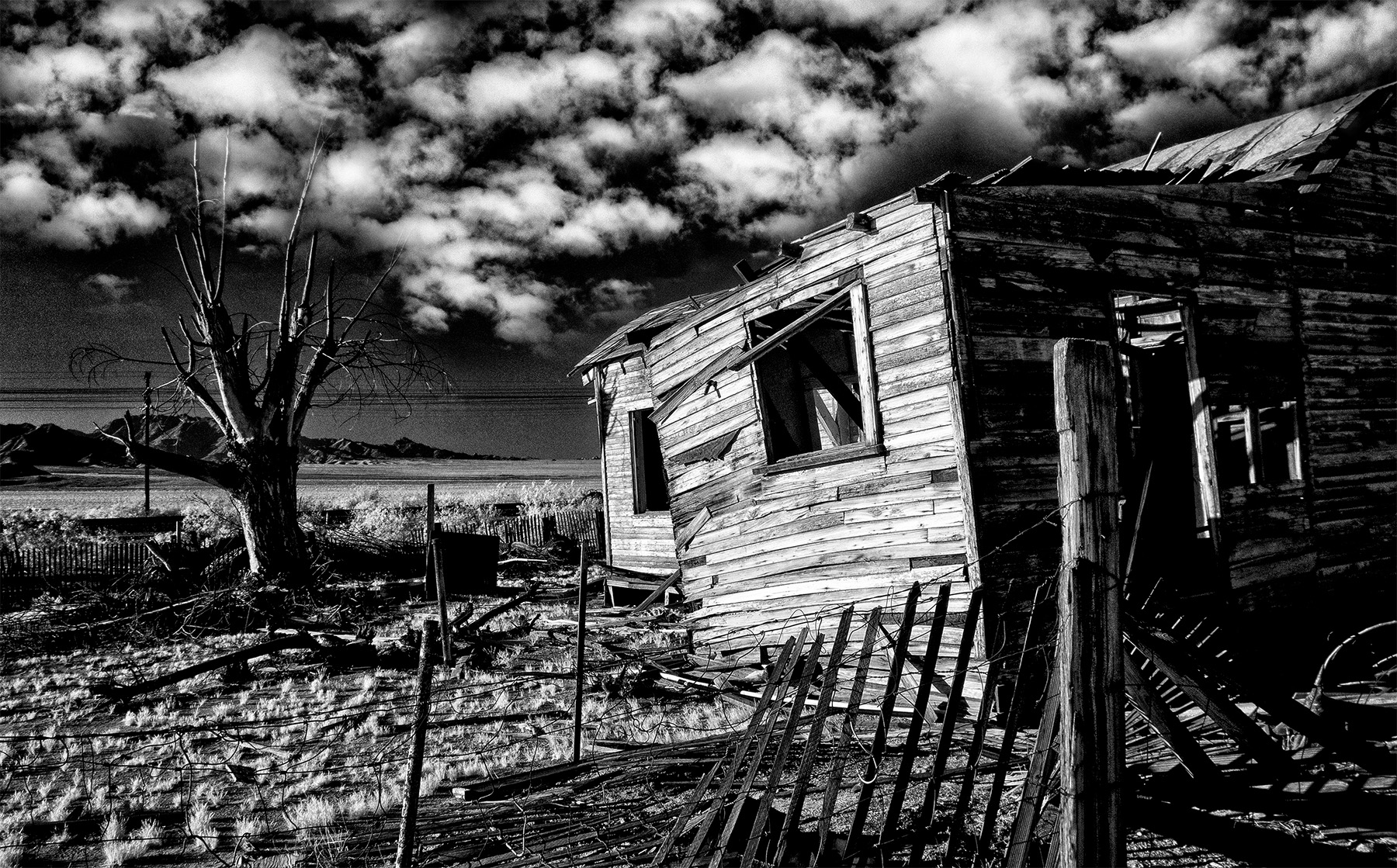
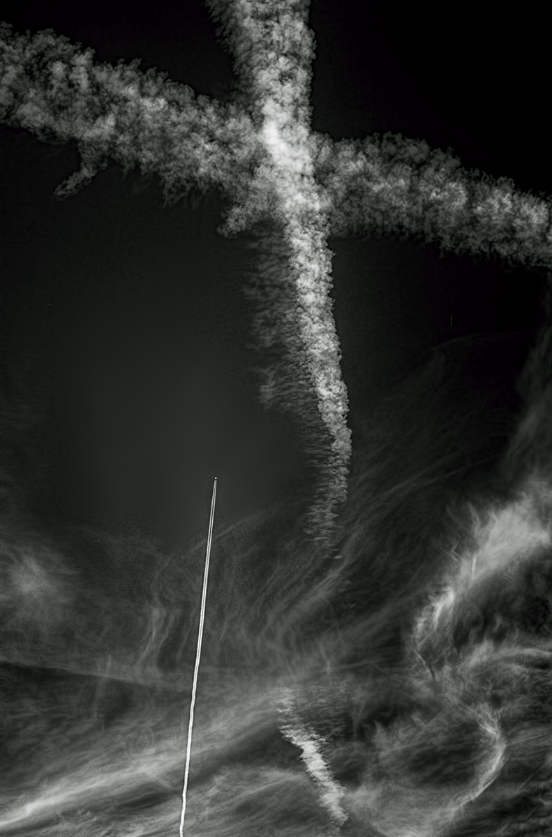
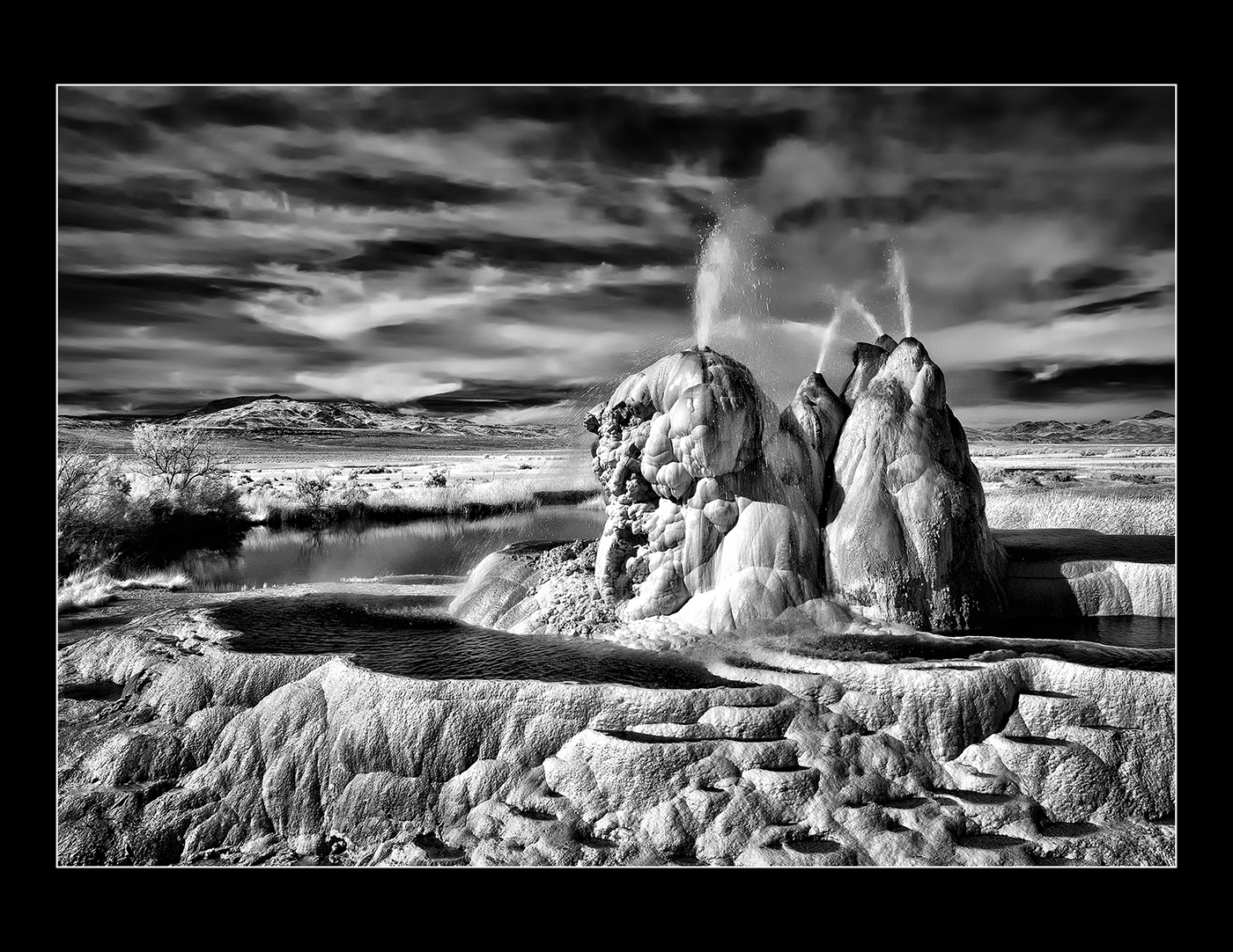
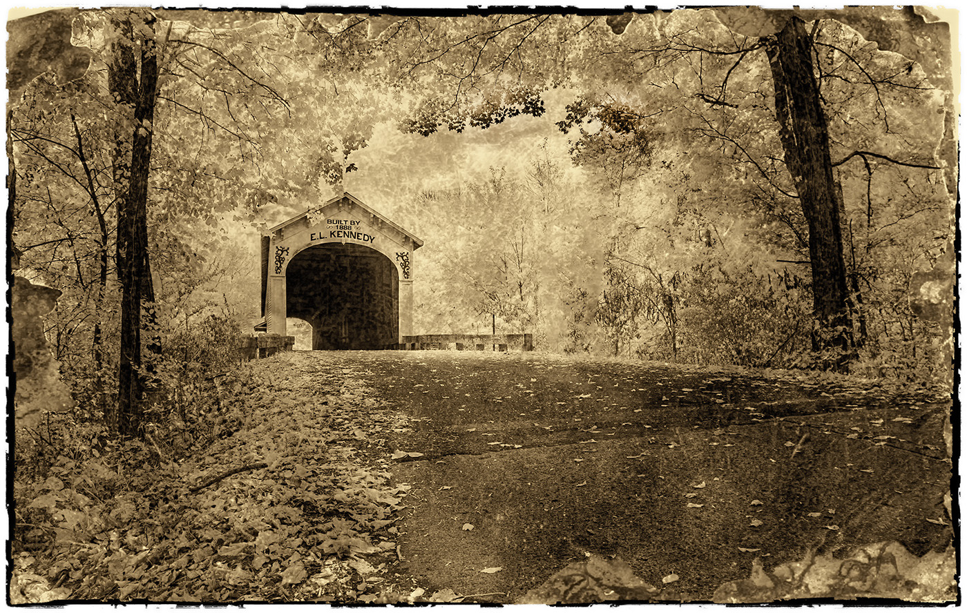
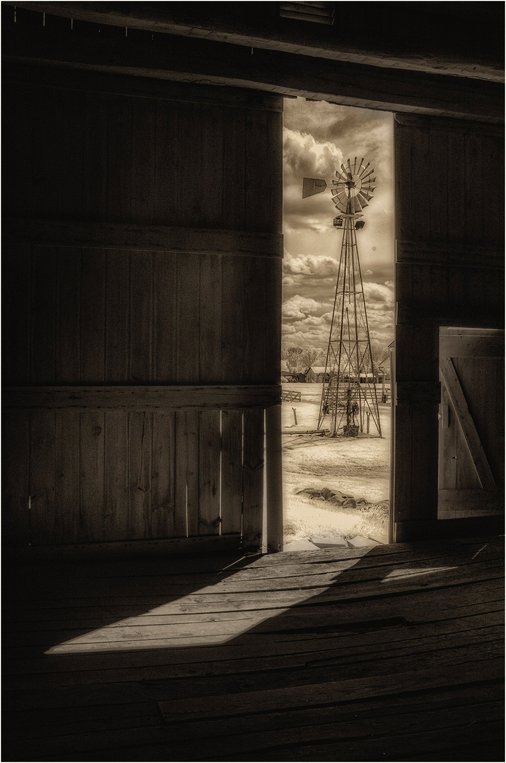
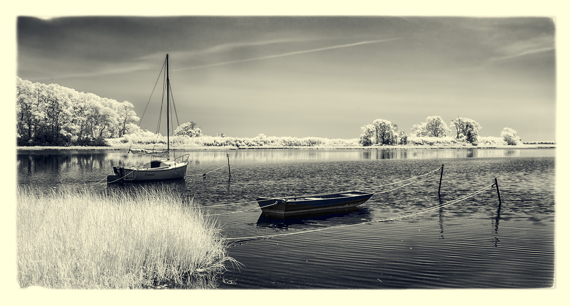
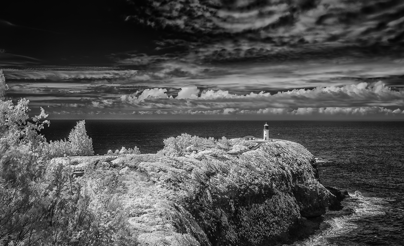
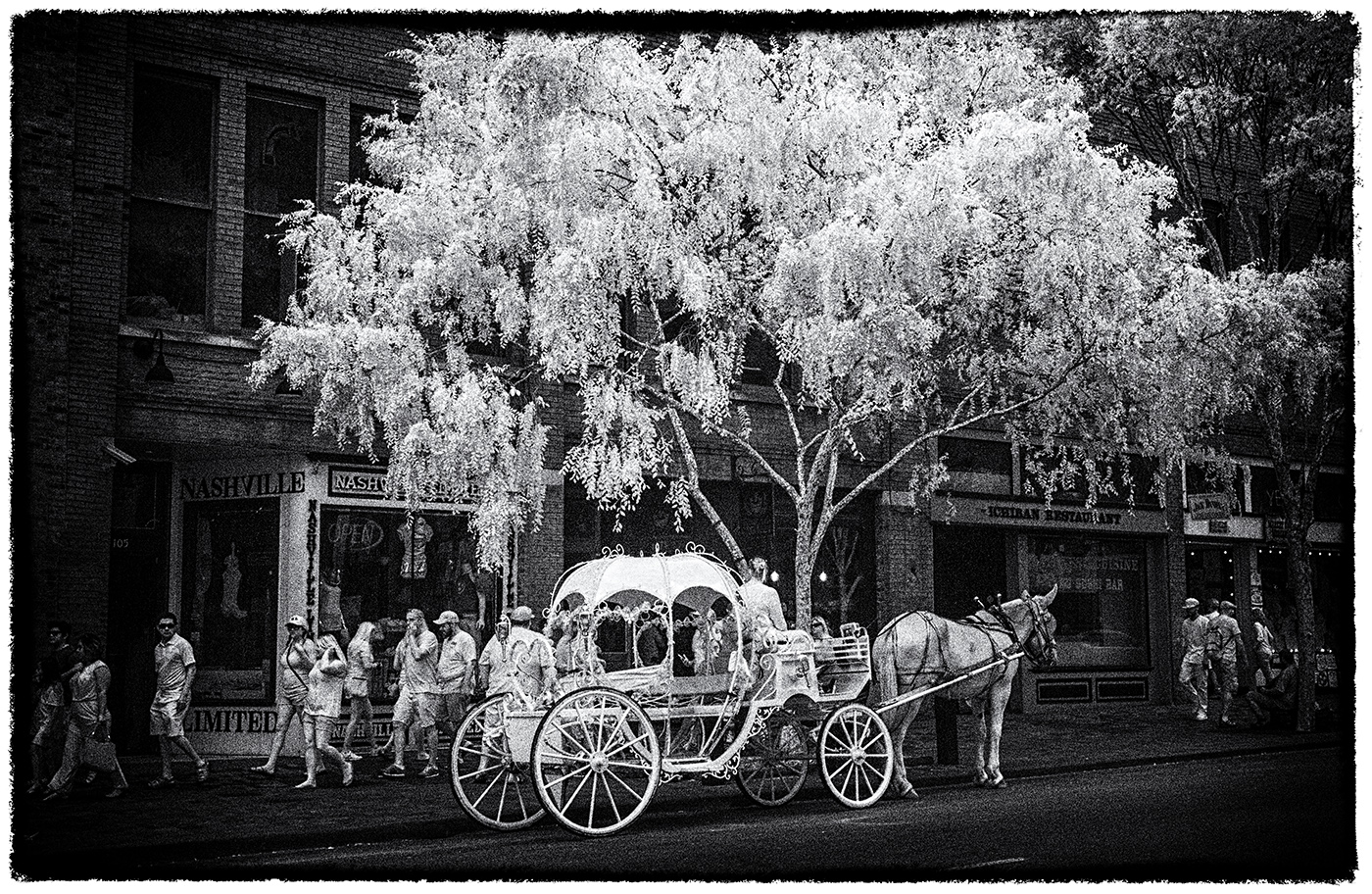
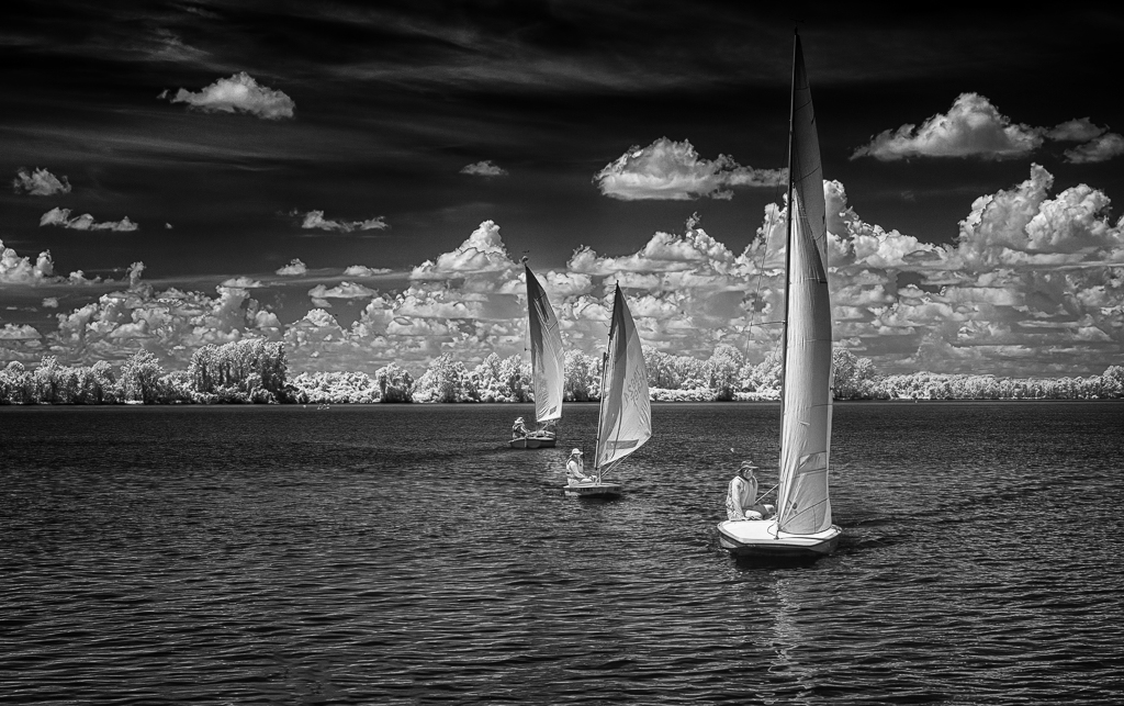
Wow Emil!
I love this...how'd you manage 3 boats and all aligned like this?! I see why you 'changed gears ASAP'. Really, really nice. I am attaching a version in which I simply added the Darken/Lighten Center filter from ColorEfex Pro to essentially 'burn' the corners and add further emphasis to the three boats. See what you think of a little added contrast and tone. |
Aug 1st |
 |
| 66 |
Aug 20 |
Comment |
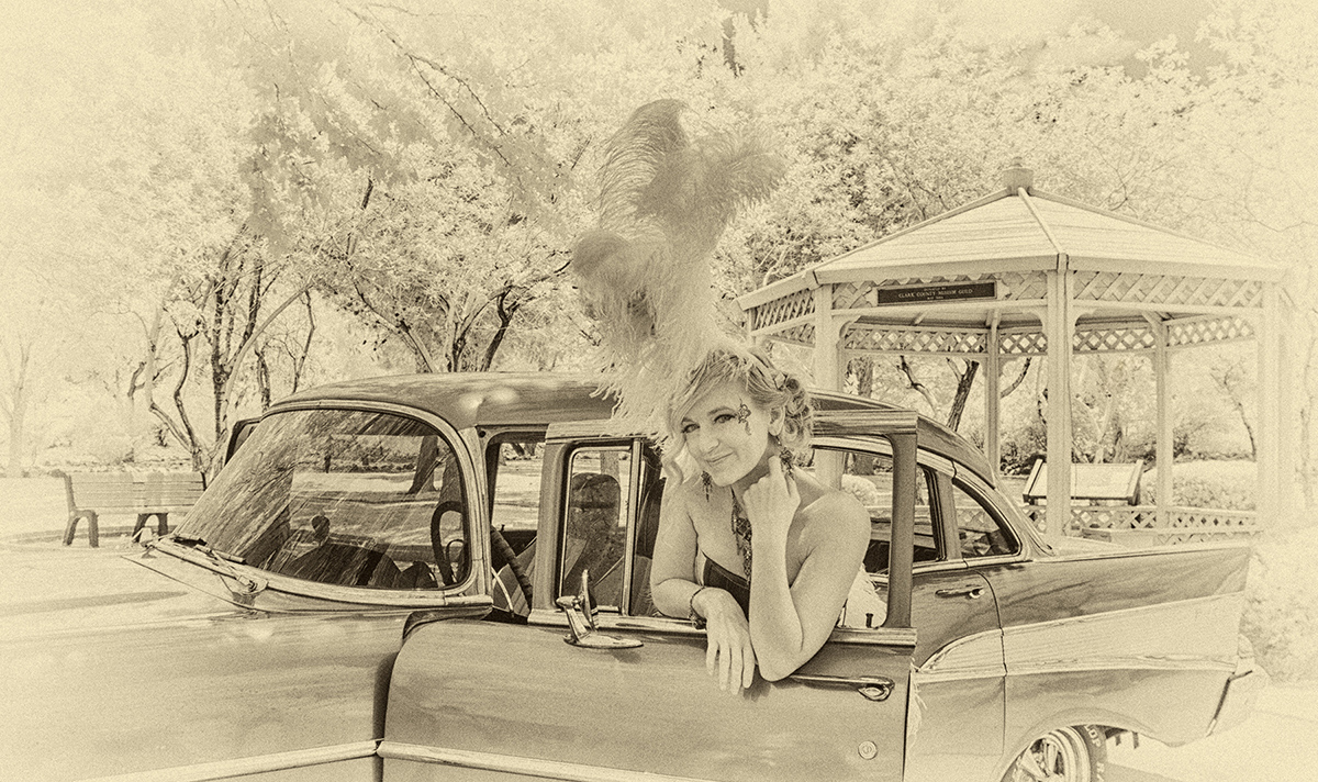
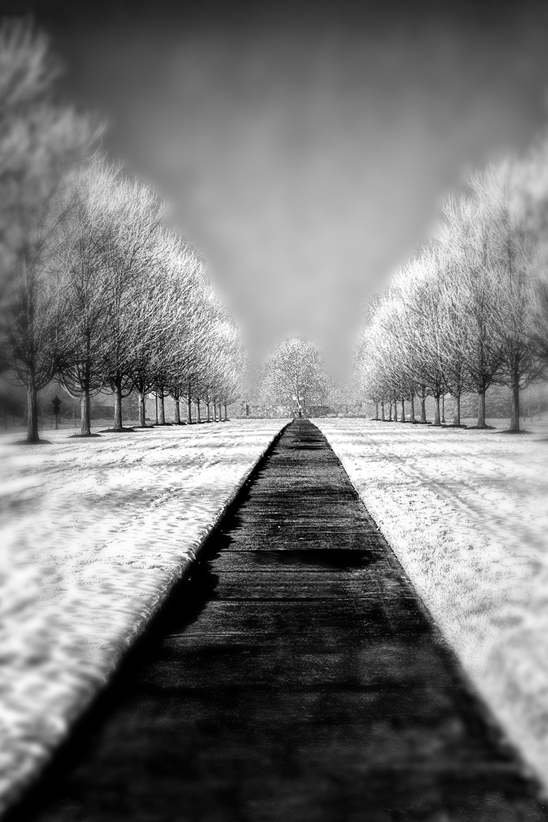
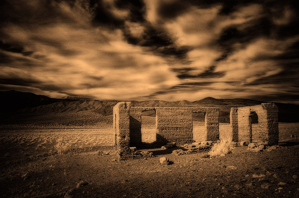
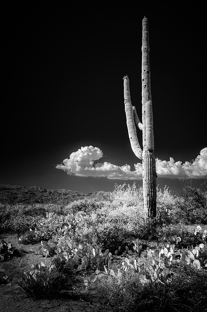
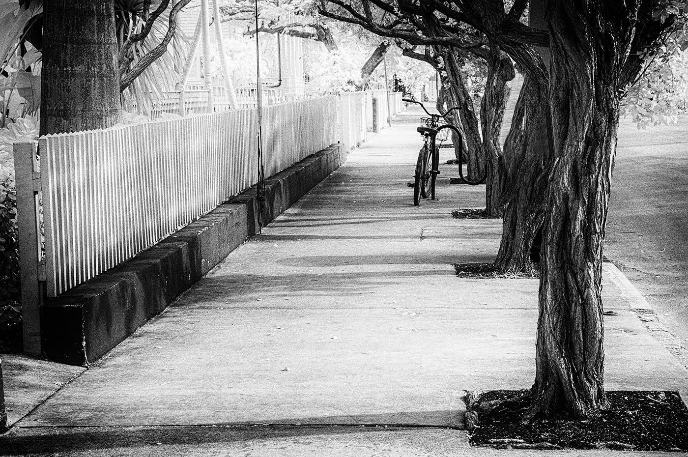
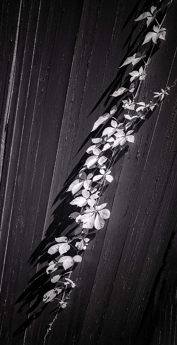
Hi Palli,
I'm a fan of this particular preset filter from ON1, and I think it works perfectly with the scene. It's tintype, but it's also helping with the mood of the scene. Your choice of toning I find particularly effective as well. I can't think of a thing to suggest you change. Well done! |
Aug 1st |
| 66 |
Aug 20 |
Comment |
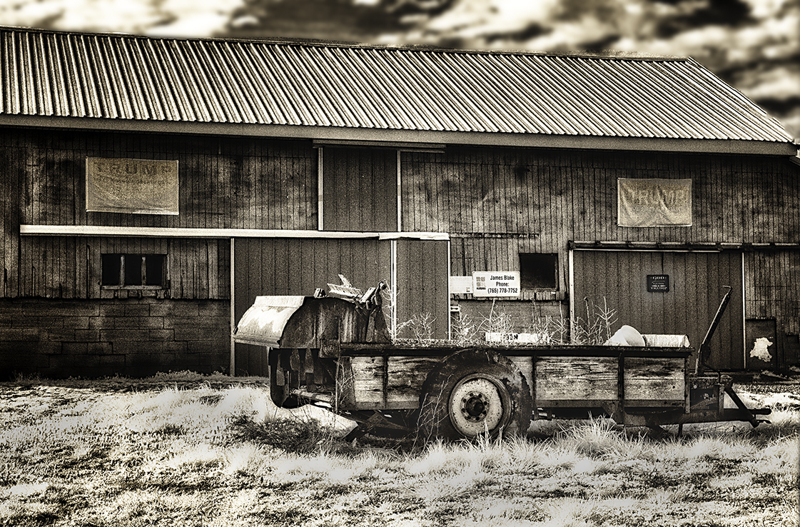
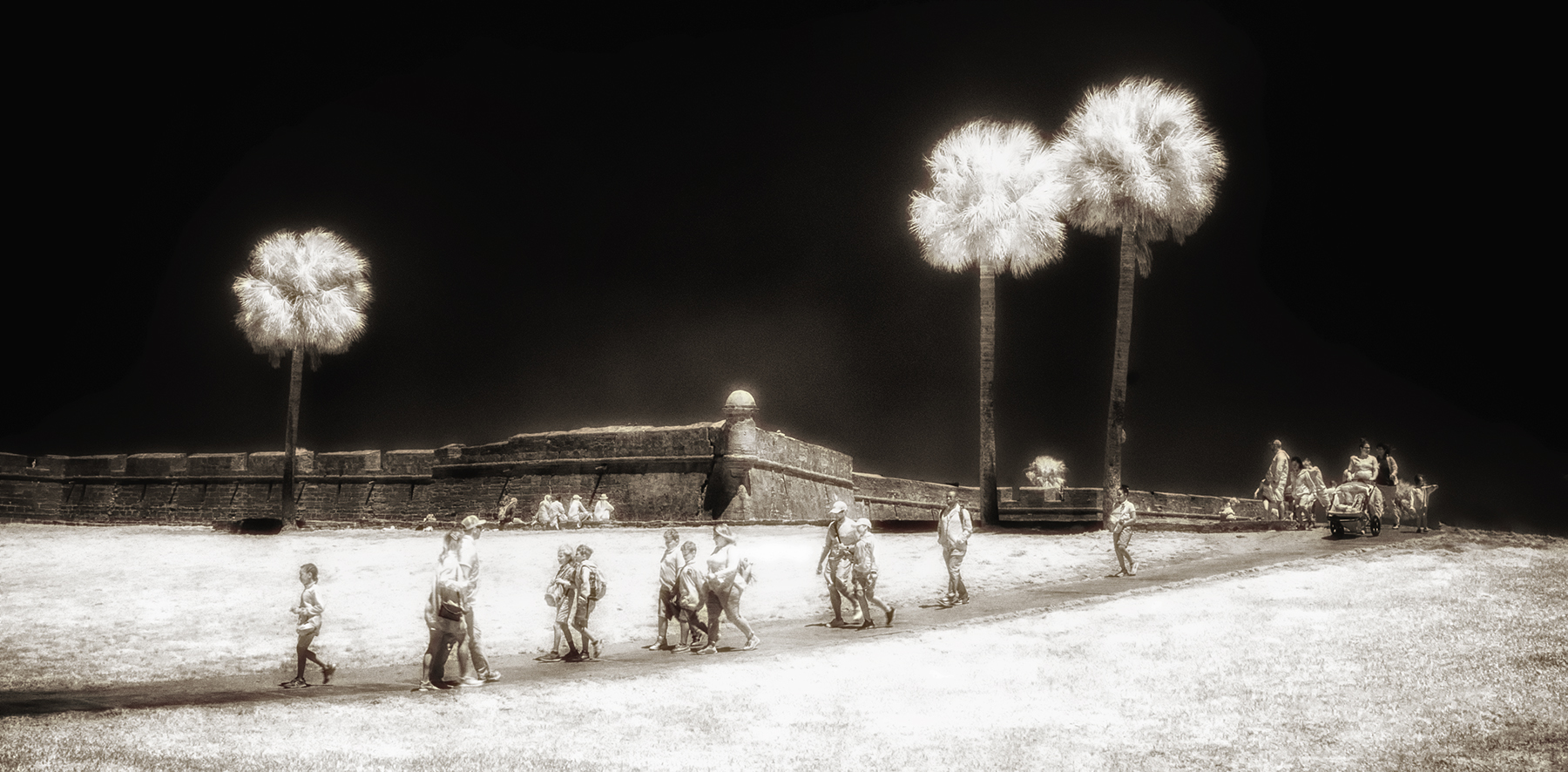
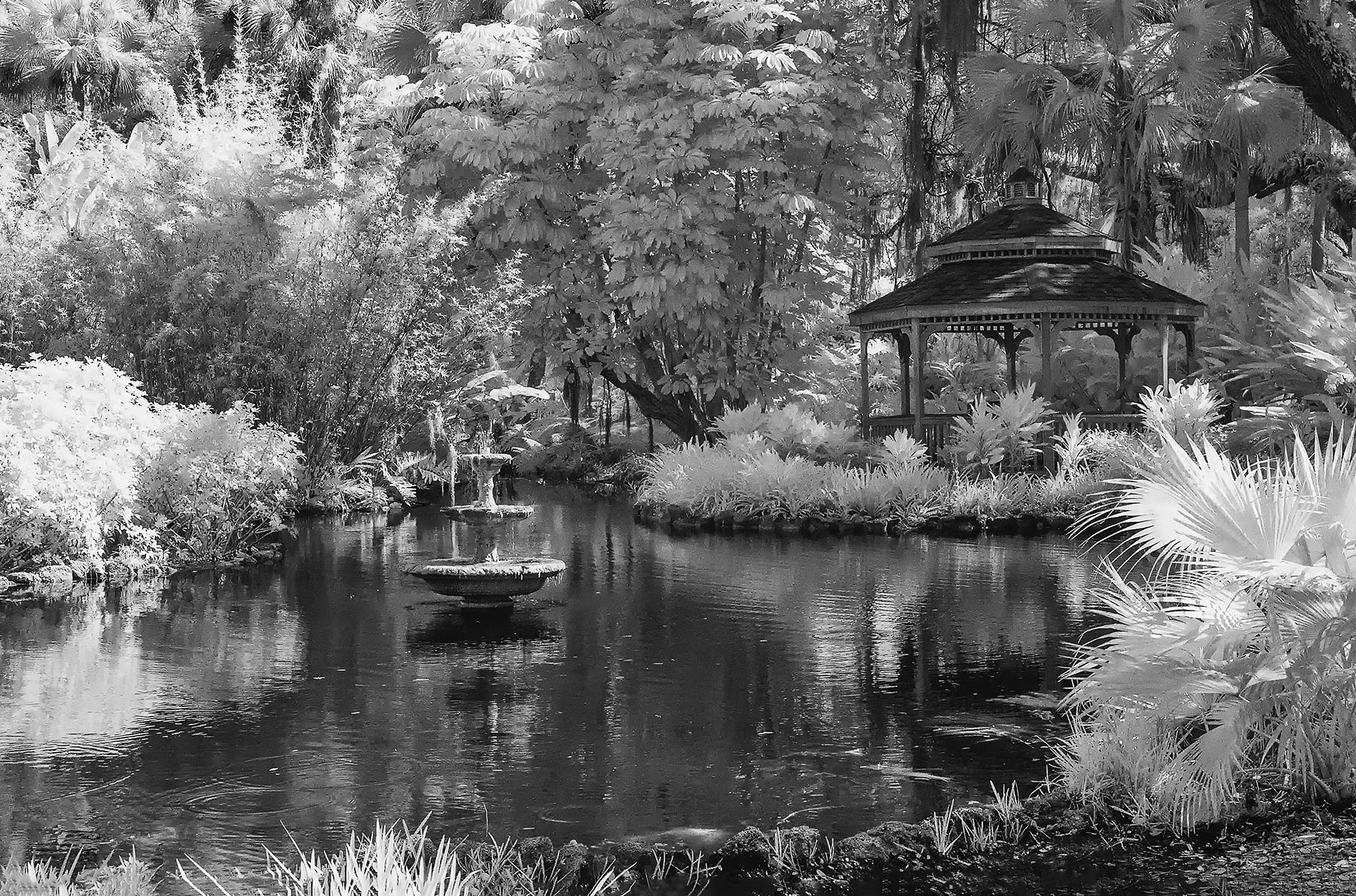
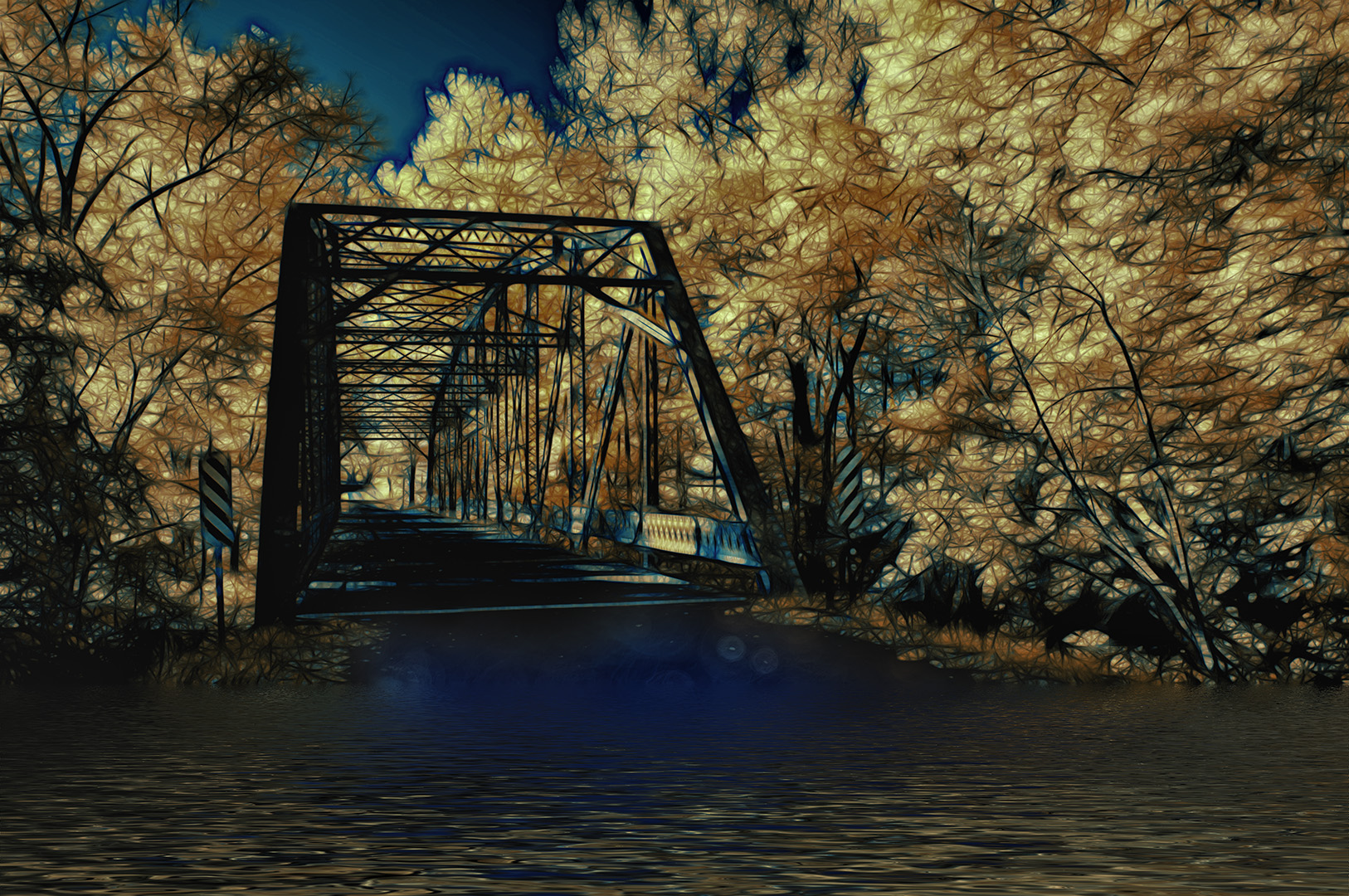
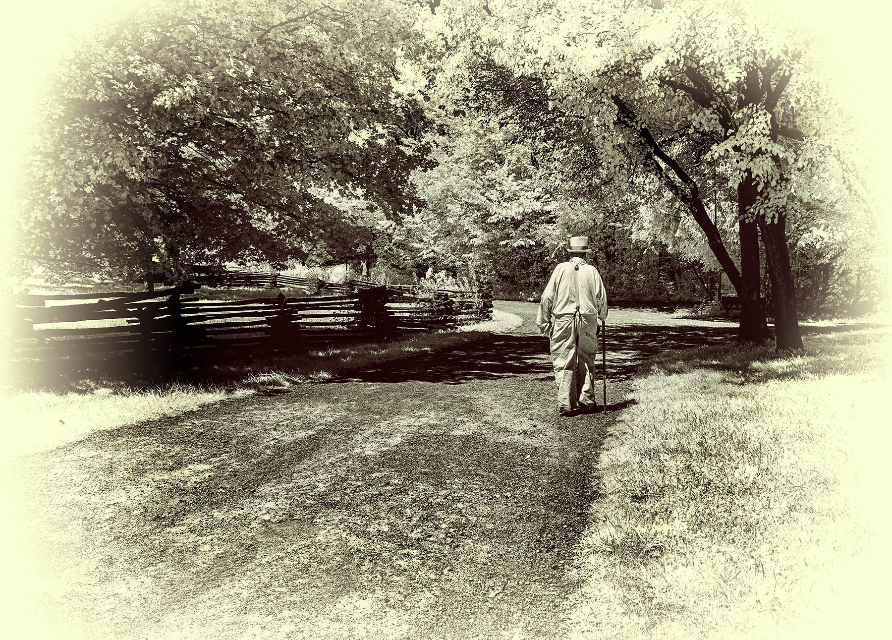
Greetings, Charles,
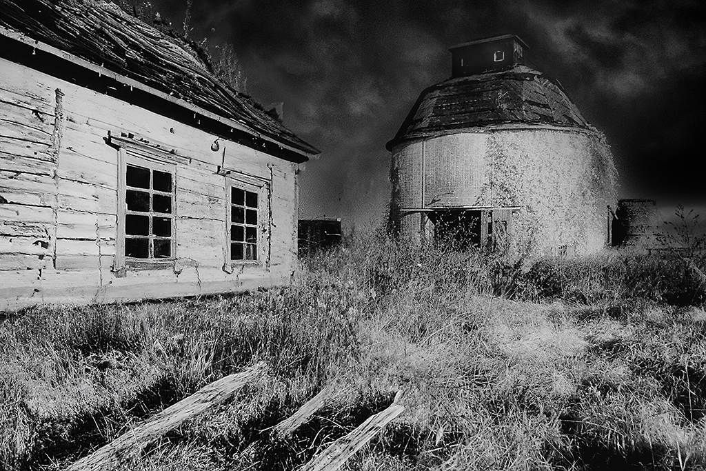
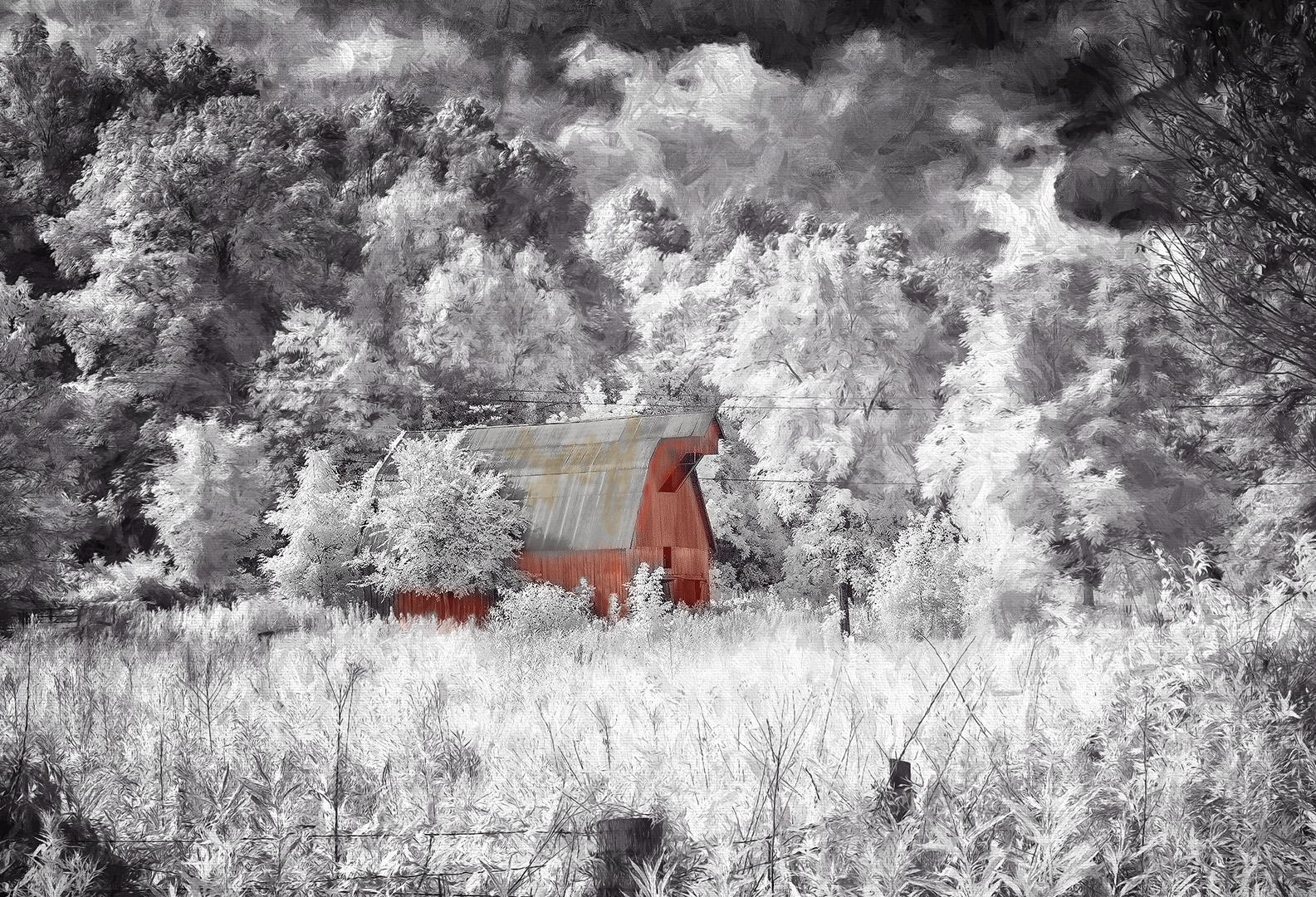
This is indeed a Florida pastel scene, and I find it very pleasing to the eye. Just a single person lounging on the chairs on the right would add to the composition, but like you said...not to be. I'd like to see the palm intruding on the left cropped or cloned out along with the shadow of it. Can we also have the whole chair and not see a clip of one leg? You may have a few random dust spots in the blue sky. Thanks for giving us a different IR treatment from our normal images. |
Aug 1st |
| 66 |
Aug 20 |
Comment |
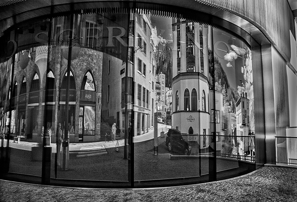
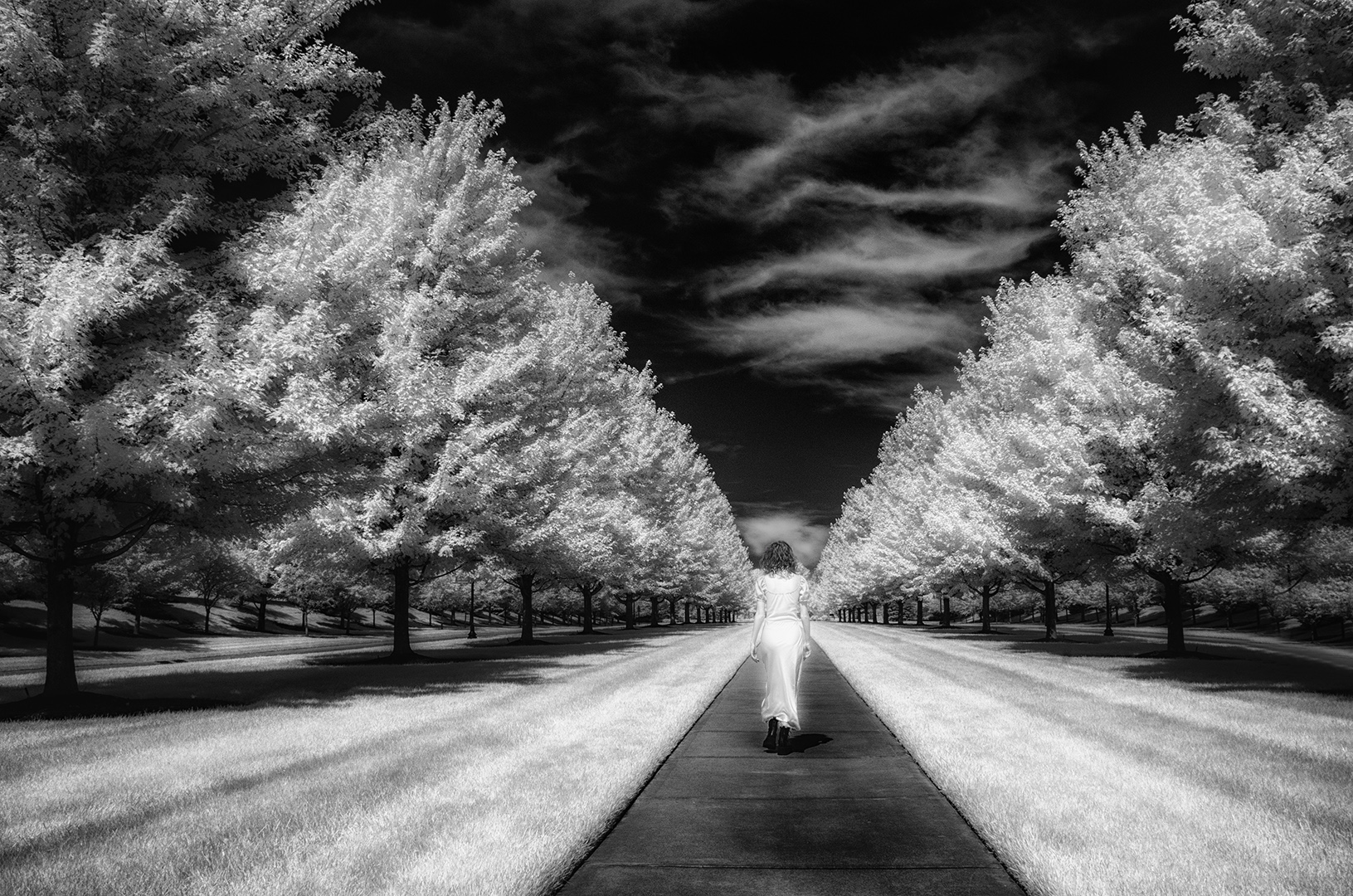
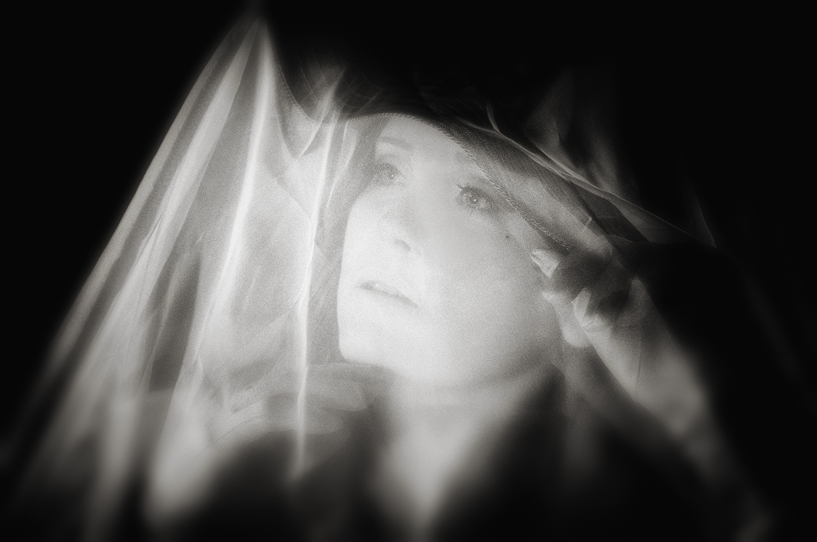
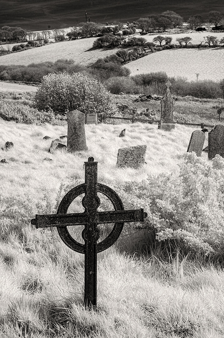
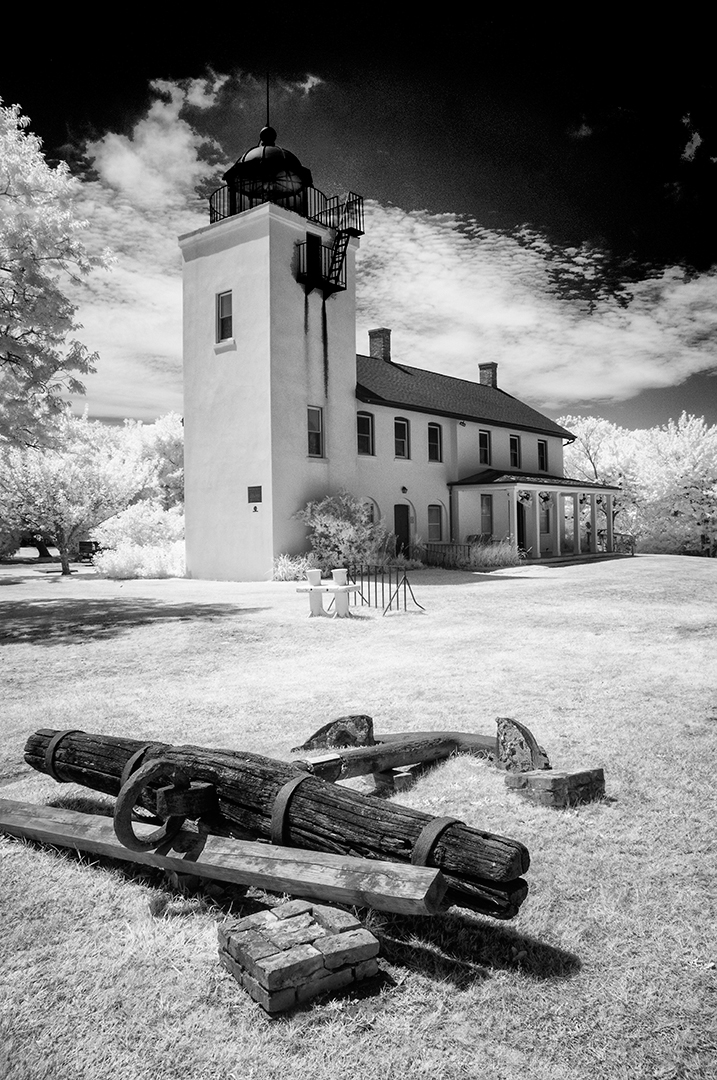
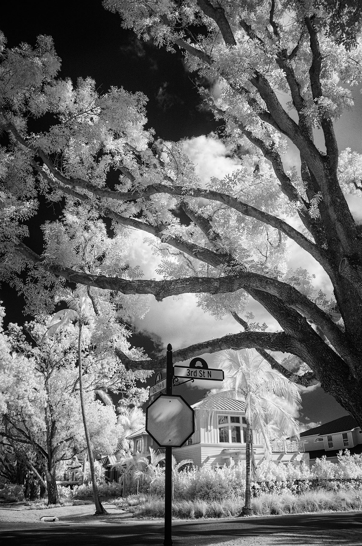
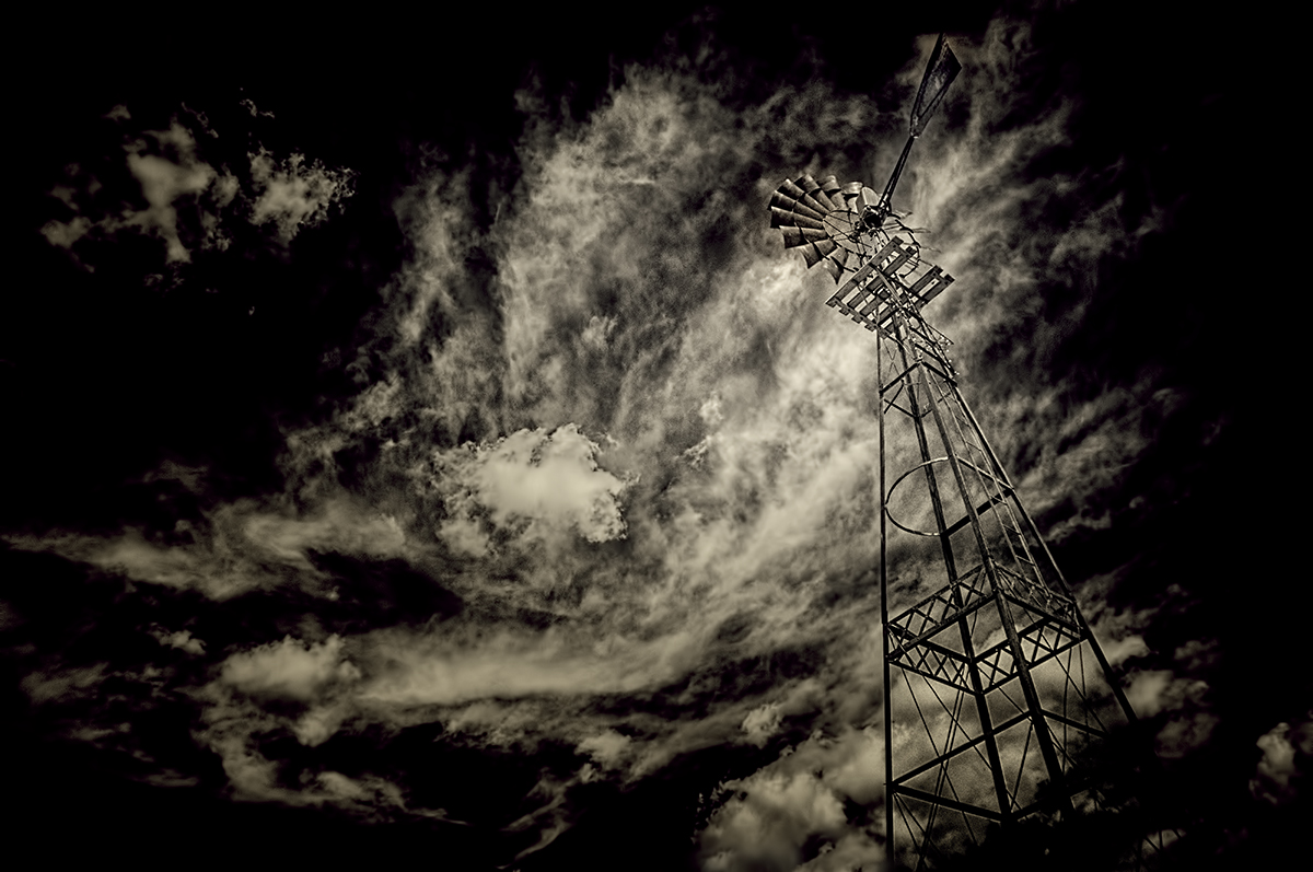
Hi John,
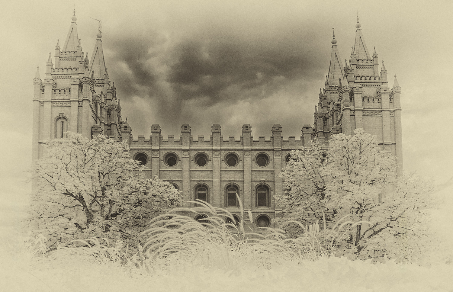
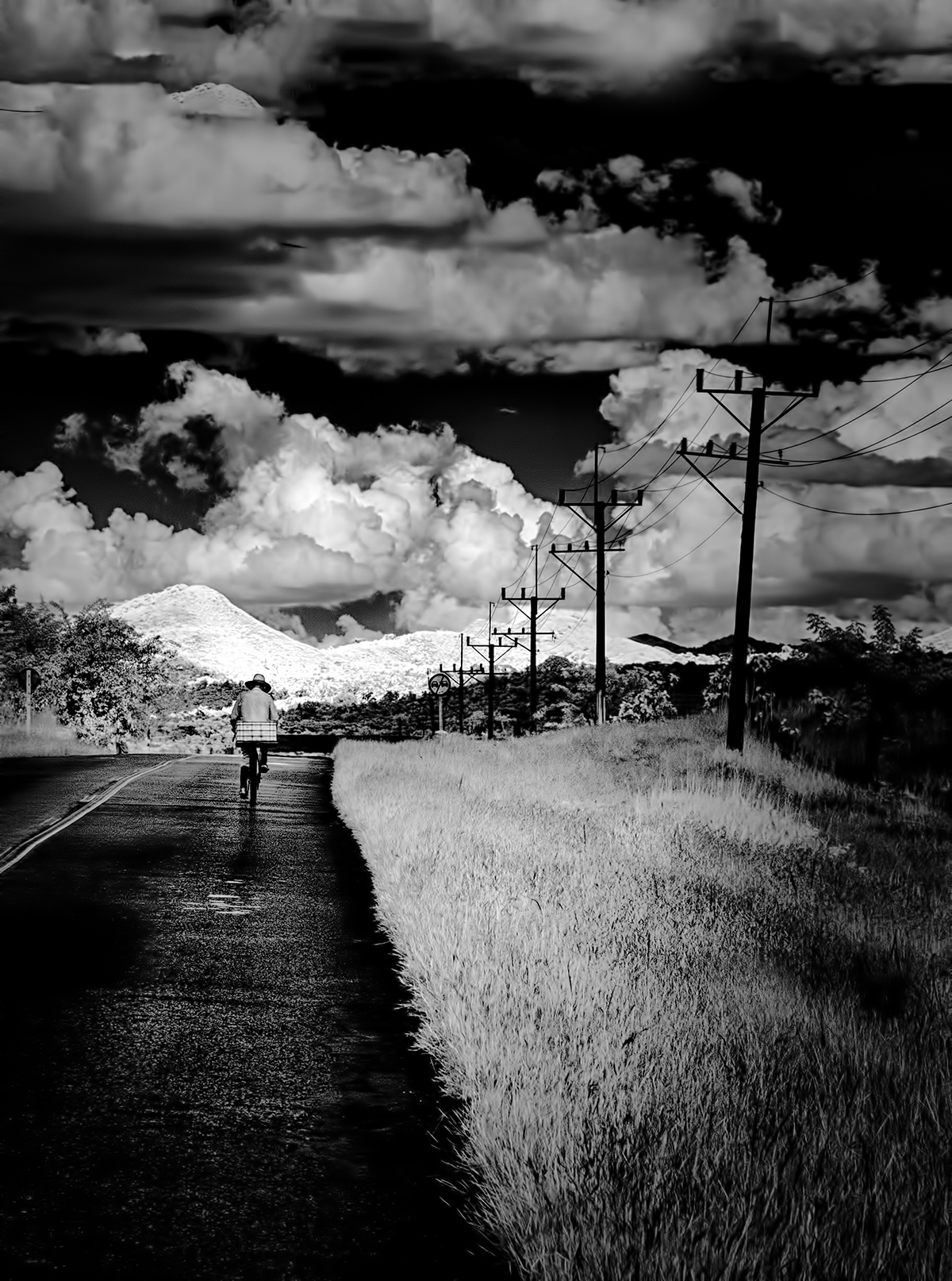
Welcome to our group! I'm sure you'll enjoy the experience, and we all learn something each time we submit. I know you've been in DD groups earlier...glad you are part of ours. I like this very much. The tone appears to be slightly cool, and I find it effective without a strong presence of the sun. I took your file and applied a simple LEVELS adjustment to get a white point and a black point. See if you like it better with a bit more 'punch'. |
Aug 1st |
 |
| 66 |
Aug 20 |
Comment |
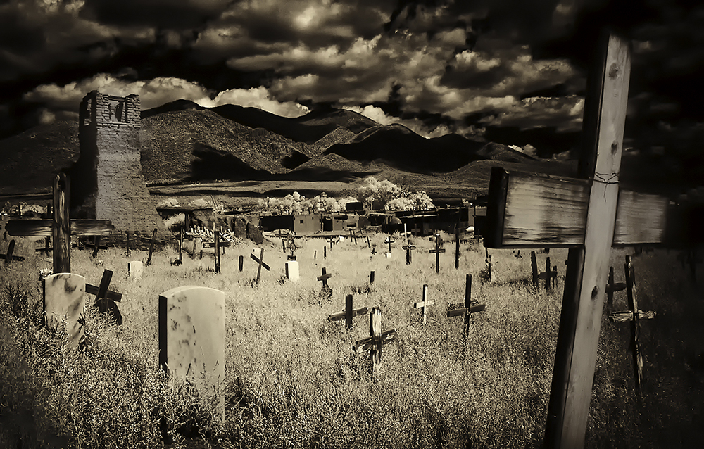
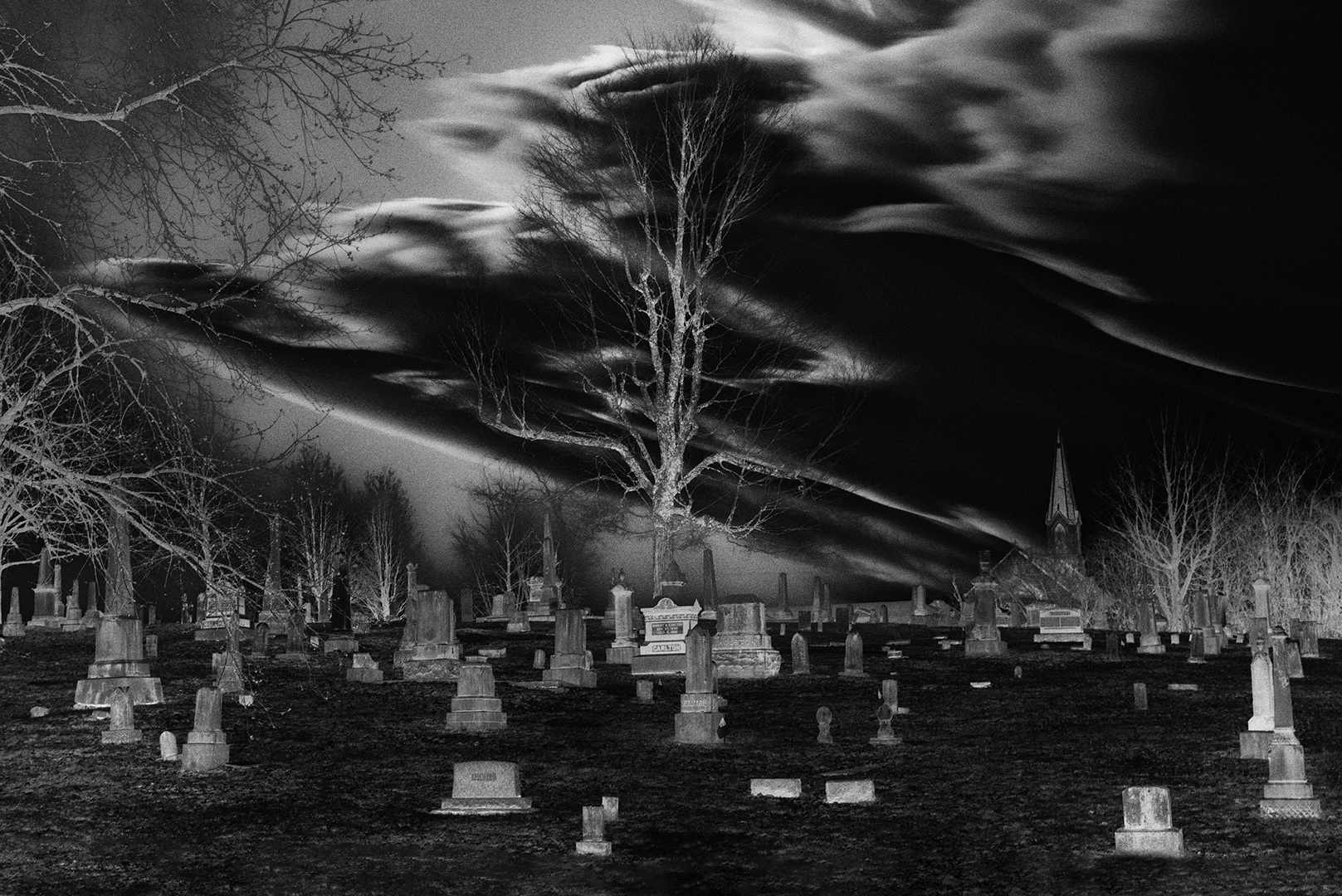
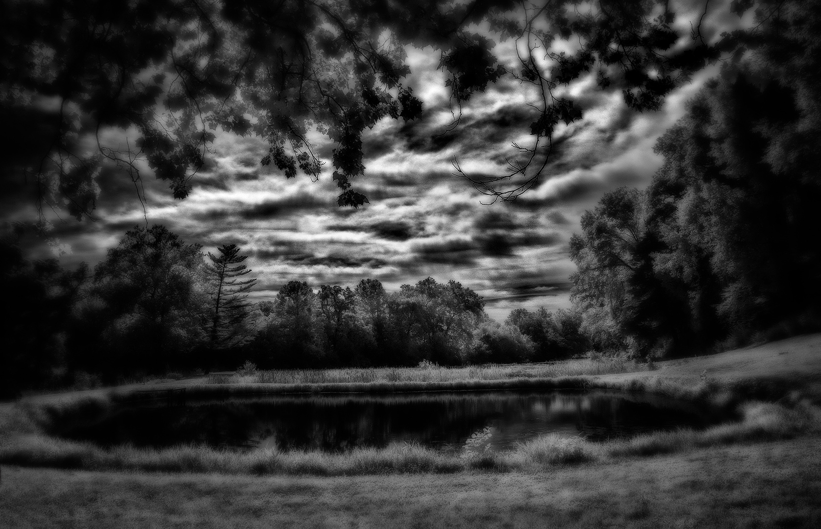
hi Melanie,
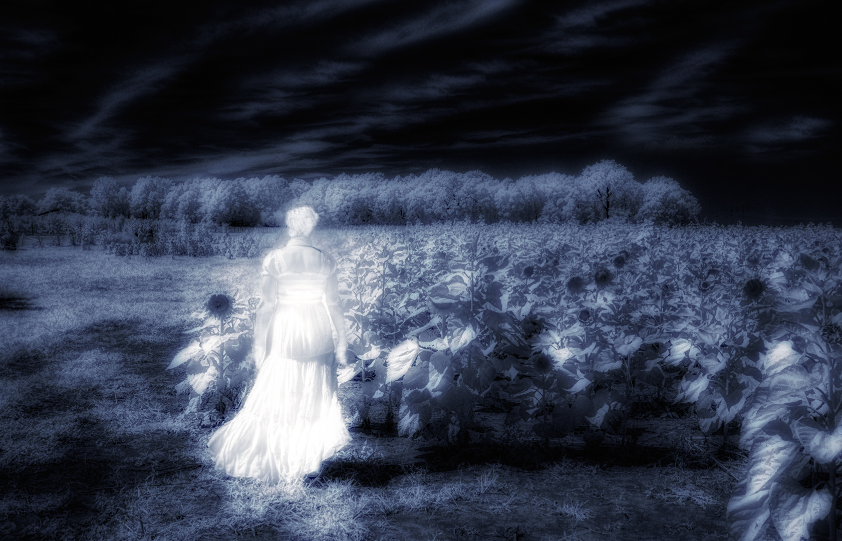
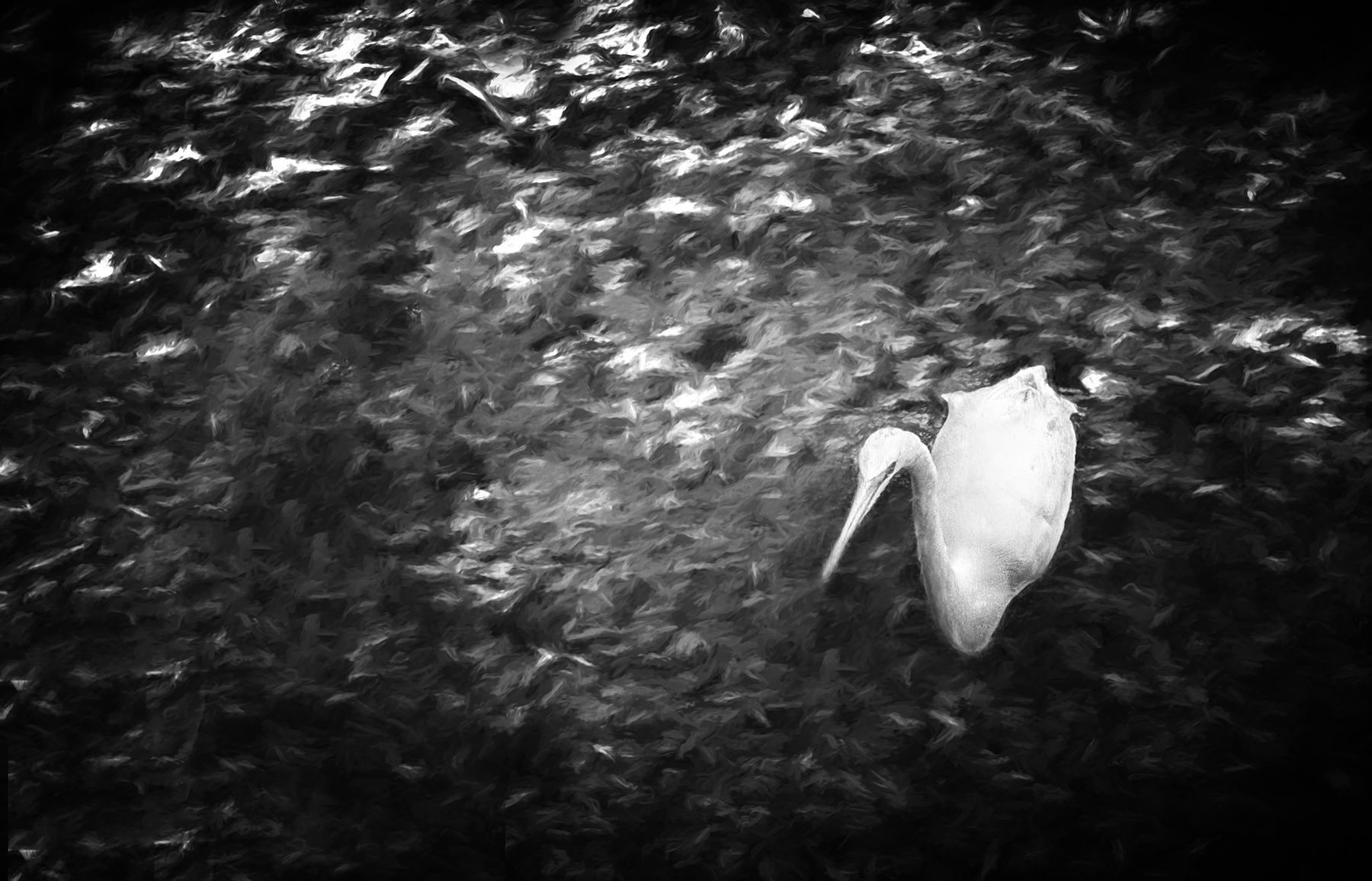
I really like the image for the 'story' it is telling me about the people of Kliptown. I find the people walking directly toward you to be an effective way to compose the image and give it a sense of place. My only though is...I find very little to say "IR" with this image...it seems to me to be a conventional monochrome for the most part. And...that's ok too! |
Aug 1st |
5 comments - 5 replies for Group 66
|
5 comments - 5 replies Total
|