|
| Group |
Round |
C/R |
Comment |
Date |
Image |
| 78 |
Jan 26 |
Reply |
So cool, Ed! |
Jan 26th |
| 78 |
Jan 26 |
Reply |
I love this mono version. It gives us the rich mess, but removes the distractions. I think this is your best version! |
Jan 26th |
| 78 |
Jan 26 |
Reply |
Thanks for your feedback, Ed. I appreciate it! |
Jan 26th |
| 78 |
Jan 26 |
Reply |
I can't change the color of the bird since I want it to be accurately colored. But I agree there is a lot of blue, maybe I will make the sky even more pale. Thanks for the feedback! |
Jan 26th |
| 78 |
Jan 26 |
Reply |
Check out my latest version below. Do you like it better with the changes I added? |
Jan 16th |
| 78 |
Jan 26 |
Reply |
Kathryn, Check out my latest version below. I added more texture to the feathers. Better? |
Jan 16th |
| 78 |
Jan 26 |
Reply |
Check out my latest version below. I followed your advice and put more contrast between the bird and sky. Better? |
Jan 16th |
| 78 |
Jan 26 |
Reply |
Check out my latest version below. I followed your advice and I started over and left the bird "framed" by branches so it feels more the story of acorns, as you suggested. However, I feel it might keep us from seeing the bird clearly. What do you think? |
Jan 16th |
| 78 |
Jan 26 |
Reply |
Check out my latest version below. Is the eye better? Thanks! |
Jan 16th |
| 78 |
Jan 26 |
Comment |
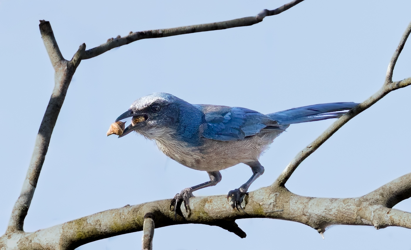
Thanks for all the advice! I brightened the eye as Robert suggested.
Sunil suggested I show more branches to explain the acorns. I added more branches and expanded the crop. Do you think it makes the endangered bird too far away?
Jean suggested the sky be lighter to separate the bird. Better? Too bright?
I look forward to your feedback on my revised image.
Kathryn recommended more texture on the feathers. Better? |
Jan 16th |
 |
| 78 |
Jan 26 |
Reply |
Thank you, do you have any suggestions to improve the bird? |
Jan 15th |
| 78 |
Jan 26 |
Reply |
Got it! Let me know you are now receiving emails from DD 78. Thanks! |
Jan 14th |
| 78 |
Jan 26 |
Reply |
Robert, I like your changes! It does "look cleaned up". I would love to see some salt crystals, if they turned out to be cool! I hope you get some cold weather so we can see some more snowflakes! |
Jan 14th |
| 78 |
Jan 26 |
Reply |
Thanks so much! Good idea, I'll add that with everyone's comments and rework my Florida Scrub Jay!
|
Jan 10th |
| 78 |
Jan 26 |
Reply |
Thanks for your ideas. I'll try them out after I get everyone's feedback. |
Jan 8th |
| 78 |
Jan 26 |
Reply |
Thanks, Sunil! I like your ideas and I'll try them when I get everyone's ideas. |
Jan 8th |
| 78 |
Jan 26 |
Reply |
Thanks so much, Robert. I'll add that to the ideas I collect from everyone. |
Jan 4th |
| 78 |
Jan 26 |
Comment |
I love what you did here! I can't even fathom how you got the truck to look like it belonged! Do tell!
I do love the monochrome. I think Robert's idea of getting some more contrast and tonal range would really elevate this even more.
Thanks for bringing your complex projects to us! |
Jan 2nd |
| 78 |
Jan 26 |
Comment |
Great attempt! Thanks for the original image, as its helpful to see how far you have to be with a macro. I know snowflakes are tough and conditions have to be perfect. My girlfriend has photographed snowflakes, and she uses a microscope that she uses.
I do like the look of your image, it looks like jewelry. I'm not clear what the thin white lines are? I might consider removing them.
Lots more winter to keep trying! |
Jan 2nd |
| 78 |
Jan 26 |
Comment |
Love this! Fabulous image and gorgeous bird! Very nice processing to remove the darker streaks and bright red on the bottom of your original image.
I like Robert's ideas of extending your image to include the red flowers.
I might try to add a bit of sharpening to the bird's foot.
Great capture!
|
Jan 2nd |
| 78 |
Jan 26 |
Comment |
Kathryn, Wow! Great image for your first bird! I believe its a Great Horned Owl, but not sure, since we don't see much. It's difficult to find owls, and they are tough to photograph, because they are out at night.
You were close for 202mm! Beautiful definition and the eye is spectacular.
You might explore Robert's idea of opening the opening a tad. |
Jan 2nd |
| 78 |
Jan 26 |
Comment |
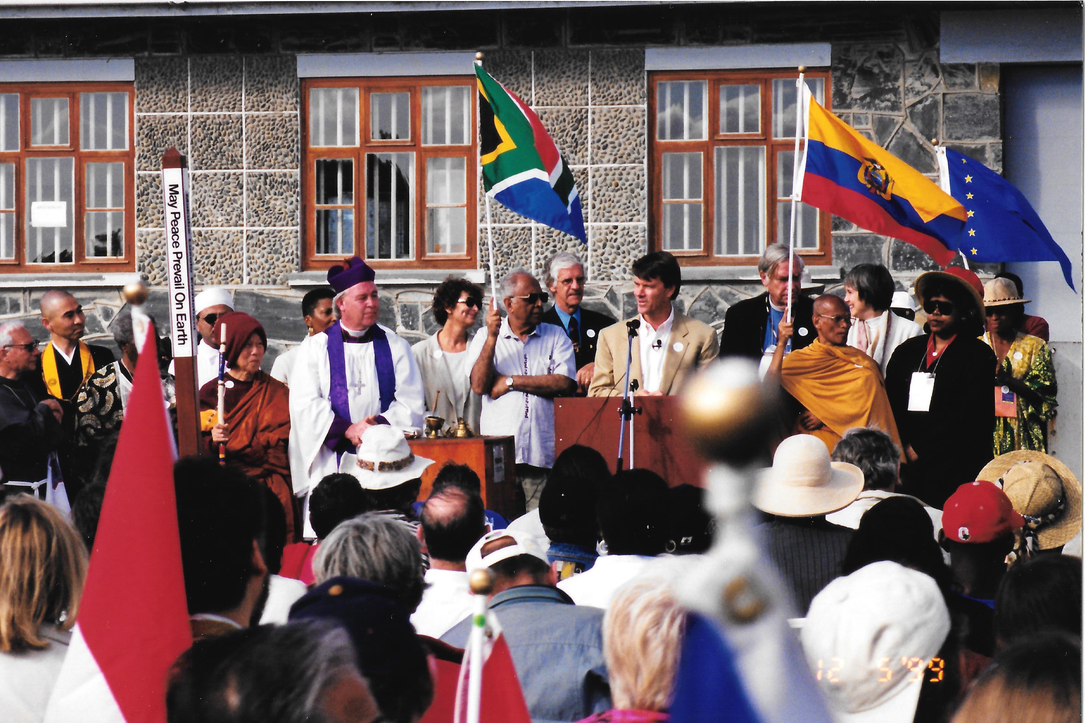
Such a powerful image, thanks for sharing it with us. Your monochrome change is brilliant.
I met Nelson Mandela and heard him speak at the Parliament of World Religions in South Africa in 1999. I was with the group that planted the Peace Pole at Robben Island with Bishop Tutu (with hat on) and Nelson Mandela's right hand man, Ahmed Kathrada (holding South African flag). The speaker is Reverend John Morton, of the Institute for Individual and World Peace. |
Jan 2nd |
 |
| 78 |
Jan 26 |
Comment |
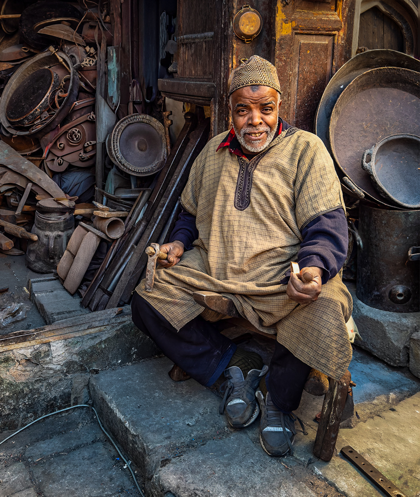
I've not been to Morocco, did you enjoy it? I imagine its a great place to photograph!
Since the subject is the craftsman, keep in mind you might want to get eye to eye with your subject next time, as you tower over him in this shot. If you can't squat, you can always hold your phone low.
The copper pieces are very impressive. I'd be tempted to remove the food by his feet and the wire on the lower right. I'd probably remove the white "trash" on the left side of him that draws our eye. If you don't want to remove it, you can darken it. I would do the same for the photo frame above him, that looks blown out.
I reworked the image in my style. I removed the bright pieces and "trash" and cropped in to get to what I found the most interesting. I added more contrast and brightness and warmth to the subject and darkened everything else. I added a vignette and then used a brush to subtly brighten some of the more intricate pieces of copper, to entice us to go into the photo more.
I know its not your style, but I loved the image and thought it would be fun to explore the depth of it!
|
Jan 1st |
 |
| 78 |
Jan 26 |
Comment |
I've not been to Morocco, did you enjoy it? I imagine its a great place to photograph!
Since the subject is the craftsman, keep in mind you might want to get eye to eye with your subject next time, as you tower over him in this shot. If you can't squat, you can always hold your phone low.
The copper pieces are very impressive. I'd be tempted to remove the food by his feet and the wire on the lower right. I'd probably remove the white "trash" on the left side of him that draws our eye. If you don't want to remove it, you can darken it. I would do the same for the photo frame above him, that looks blown out.
I reworked the image in my style. I removed the bright pieces and "trash" and cropped in to get to what I found the most interesting. I added more contrast and brightness and warmth to the subject and darkened everything else. I added a vignette and then used a brush to subtly brighten some of the more intricate pieces of copper, to entice us to go into the photo more.
I know its not your style, but I loved the image and thought it would be fun to explore the depth of it!
|
Jan 1st |
 |
8 comments - 16 replies for Group 78
|
8 comments - 16 replies Total
|


