|
| Group |
Round |
C/R |
Comment |
Date |
Image |
| 78 |
Dec 25 |
Reply |
I like both of your revisions, especially the monochrome. |
Dec 27th |
| 78 |
Dec 25 |
Comment |
The main concerns of the group seemed to be the saturation level and the reflected frame. I dropped the saturation. So I cropped off the bottom and went with, also.
Like it better?
The image I submitted to you was chosen by The Digital Photo Academy as the November Image of the Month. They sent me a metal 11x17 print as the prize. |
Dec 27th |
 |
| 78 |
Dec 25 |
Reply |
Pei-Fan, I am honored you like my photography!
KelbyOne is a big photo online training school and hundreds of Lightroom/Photoshop classes from hundreds of instructors. https://kelbyone.com/
They also have a three year mentoring program. It's expensive and hours of work a week. I can't imagine doing it with a real job. However, I do think I'm a much better photographer and just starting Year 3. We have members from all over the world. Our top classmates are from India and Denmark. https://kelbyone.com/vip/
|
Dec 27th |
| 78 |
Dec 25 |
Reply |
Thanks so much for your kind words and I'm glad yo could appreciate the effort I made to do something creative. |
Dec 20th |
| 78 |
Dec 25 |
Reply |
Poor Leonardo! I'm sure he would be very sad that his incredible work has turned into my festive derivative! |
Dec 13th |
| 78 |
Dec 25 |
Comment |
Ed, this is a great sweet image. So homey and inviting! I love the yellow sunlight in the green trees.
A couple of thoughts from me...the "inside" portion seems a bit bright on my monitor. Perhaps a bit of darkening or darkening to pop the barn/house a bit?
Another thought from me...a bit of vignette? Perhaps darken the outside sky to increase the sky blue and and a bit of darkening the mulch in the foreground. |
Dec 7th |
| 78 |
Dec 25 |
Comment |
Very beautiful! I love the colors and the droop of the Celosia. So super sharp, yet delicate. All that stacking at work! Great blurred background. Bravo! |
Dec 7th |
| 78 |
Dec 25 |
Comment |
Wow, I'd love to photograph some surfers! Great image!
Some thoughts....I agree with Jean that the lower right side splashes are bright and out of focus, so remove them. I probably wouldn't crop up to remove them, as it puts surfer-boy more in the center.
I might make the water a bit more dynamic, maybe a bit more green or blue.Maybe a tiny bit darker to bump up the contrast between the spray and the ocean? And perhaps consider lightening the surfer's face?
Awesome, awesome capture!
|
Dec 7th |
| 78 |
Dec 25 |
Comment |
Kathryn, When I studied your image, I thought it would look more hostile and forbidding ("prison-like") if it were a contrasty monochrome. Looks like Ed delivered my vision for me!
I did find your version a bit too orange, a warm color. If you aren't loving the monochrome idea, perhaps drop the color to a gray or brown palette?
Two parts of the image particularly draw me. The metal floor is made up of fabulous leading lines and draw us in. And at the end of the walkway of metal lines, we have the steps leading us upstairs, which really messed with my brain, since all the other lines are verticals and horizontals!
Regardless of whether you stay with your original tone or go to monochrome or something else, I would recommend making just these two areas very prominent with options like clarity, dehaze and contrast.
I agree you have a great eye for the unusual!
|
Dec 7th |
| 78 |
Dec 25 |
Comment |
I think it is fun that your friend walked right into the frame. I actually like the image and the symmetry and and don't see another crop option. I think the partial head off the poster and legs off your friend work.
I'd like to see it in black and white, which might make it more art-like. And you are the master of monochrome, no doubt of that! |
Dec 7th |
| 78 |
Dec 25 |
Comment |
I really like it! I love that spot! Here's my version of it from 2016 when I was just learning photography. I used a long-exposure and tripod. I also find the brown sky unpleasing and do think Ed's sky filter is a move in the right direction. It gives you a warm/cool feel. |
Dec 7th |
 |
| 78 |
Dec 25 |
Reply |
That is a nice version! |
Dec 7th |
| 78 |
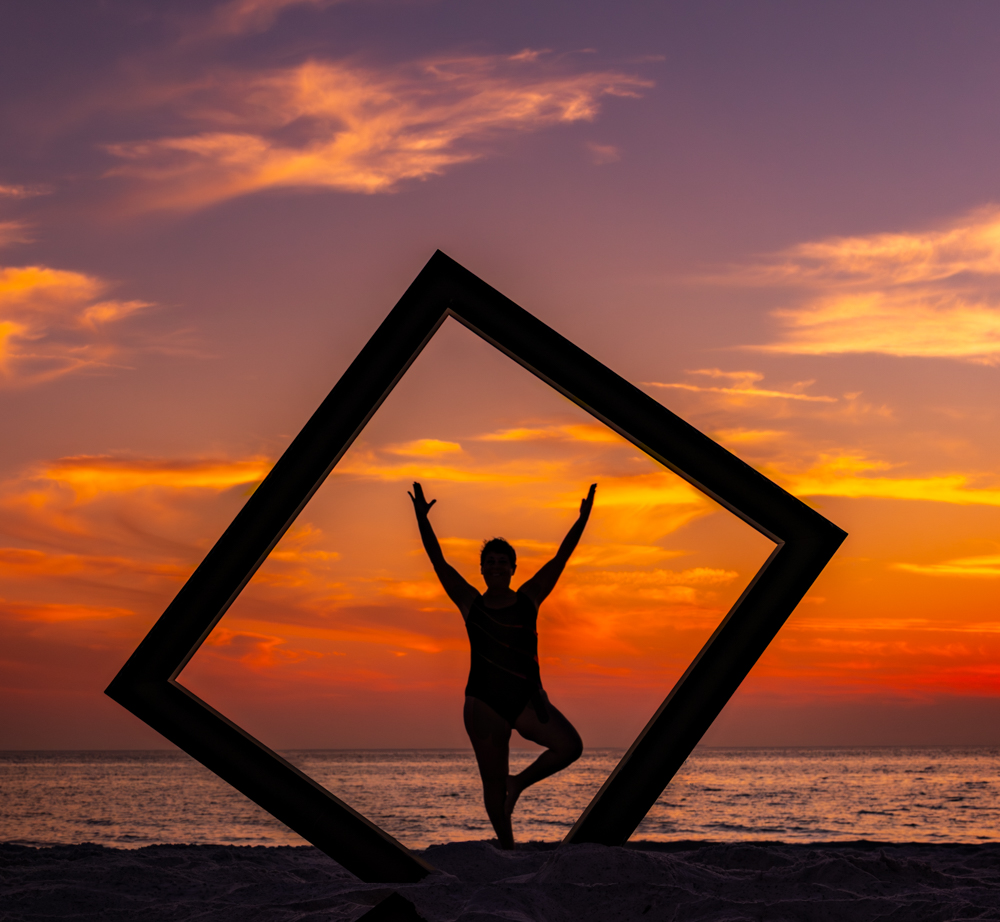
Dec 25 |
Reply |
Hi Ed, The reflection is just the top image flipped, nothing is changed. I did not use the mirror for my final.
The reflection isn't meant to be water. The mirror is to get the sky reflection, which adds a different image. Hmmm...not sure what the reflection would be after the frame and 20' from me. But worth a try. I could try your post idea, too. The reason for the frame in the ground is so your feet fit. It's tricky to hit the right spot so your feet fit. You can see what happened with my cousin in the frame with me. Of course, I added the night sky, I photographed it in the Badlands.
Thanks for all of your great ideas! |
Dec 7th |
 |
| 78 |
Dec 25 |
Reply |
Thanks, Sunil! I will rework it making it a little less intense. I did want to make it a fantasy type pic and a "normal pic" because I can't do much post processing with my birds. |
Dec 7th |
| 78 |
Dec 25 |
Reply |
Thanks, Jean! Do you like this version? It was photographed the night before. I don't like the pose as well. |
Dec 7th |
 |
7 comments - 8 replies for Group 78
|
7 comments - 8 replies Total
|


