|
| Group |
Round |
C/R |
Comment |
Date |
Image |
| 78 |
Sep 25 |
Comment |
I agree with Sunil, I think this version reads better. Thanks for the revision! |
Sep 26th |
| 78 |
Sep 25 |
Reply |
Very nice improvements!! I'm excited to learn about these guys! |
Sep 26th |
| 78 |
Sep 25 |
Reply |
It is a style where you'll get one good image for every 100 or so. It does need to be something fast, bicycles and trotting horses are difficult unless using a very slow shutter speed.
Keep playing with it, it can be super fun! |
Sep 26th |
| 78 |
Sep 25 |
Reply |
I love it! |
Sep 26th |
| 78 |
Sep 25 |
Reply |
I think it is spectacular! I love your "eye" to see this fabulous scene. I think your latest revisions are great! Brava! |
Sep 26th |
| 78 |
Sep 25 |
Comment |
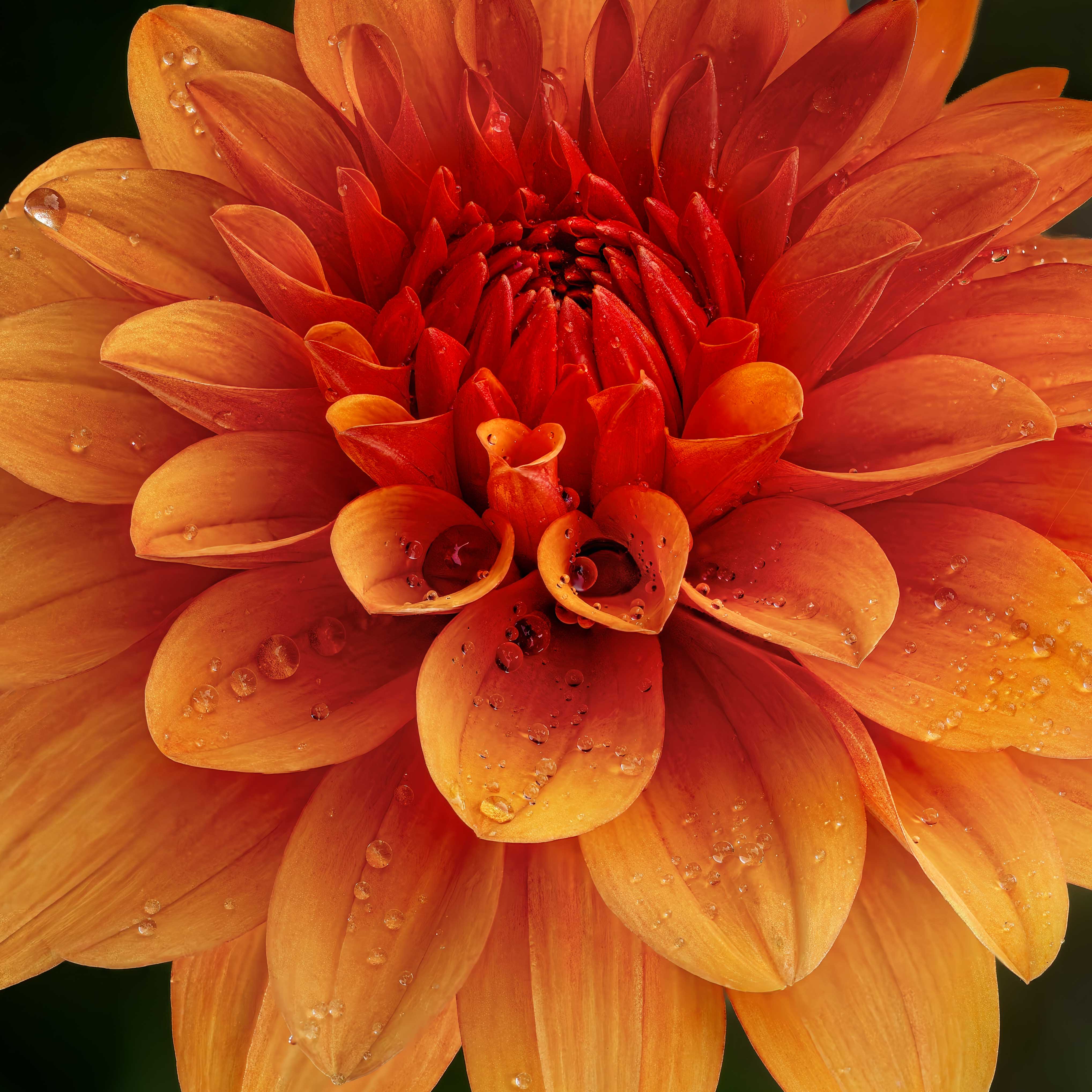
Amid my husband's fractured pelvis surgery and our 40th anniversary party for 100 people from 7 states on Saturday, I reworked my image.
I used Robert's suggestion of turning it upward, but the droplets are going the wrong way. Is that a distraction? Should I remove some of the key droplets that show up "wrong"?
I also saturated the center, and removed saturation from edges, which made them lighter. Better?
Thanks in advance for your thoughts! |
Sep 25th |
 |
| 78 |
Sep 25 |
Reply |
Thanks, Kathryn! I was surprised by the saturation suggestion, as I use a lot of saturation in my images already. But I'm going to play with the orientation and saturation and see if I don't create two very different images. |
Sep 19th |
| 78 |
Sep 25 |
Reply |
Thanks, Ed! It was my first time photo stacking, so I wasn't going to buy software until I figured out what was going on. I agree the rotation works well! |
Sep 19th |
| 78 |
Sep 25 |
Reply |
I am glad you enjoyed the image. I'd love your feedback when I redo it shortly. Thanks! |
Sep 15th |
| 78 |
Sep 25 |
Reply |
Thanks for the compliment! I've gotten a lot of great feedback, I'll try them all in my rework. |
Sep 15th |
| 78 |
Sep 25 |
Reply |
Thanks for your ideas, Jean! I'll consider them when I rework my image. |
Sep 15th |
| 78 |
Sep 25 |
Reply |
Thanks for your ideas, Robert! Somehow, I didn't get emails notifications for everyone's comments this month. I will update my image with your comments in mind. |
Sep 15th |
| 78 |
Sep 25 |
Comment |
I agree with Robert that something feels off. Perhaps darkening your mid ground and foreground would make it feel more "almost sundown". And perhaps a bit of gold or blue?
There are presets in Lightroom and Camera Raw made just for this type of image, that add a "look" or "feel" to tie everything together in a composite. Might be worth a look.
In Photoshop, the Sky Replacement feature has several features to make the image feel "compatible" or "believable. |
Sep 4th |
| 78 |
Sep 25 |
Comment |
I love it, Robert! You'll see I'm following in your footsteps with my image after months of you sharing focus stacking with us.
I think its amazing, how many images did you stack?
I'm not a fan of "Maturation" as a title. I don't think these are winning titles, but some thoughts: "Blooming Bells" or "Open and Shut" or "Opening Buds".
One tiny thing that caught my eye: There is a lower right orangey spot that might benefit from some desaturation.
Wonderful!
|
Sep 3rd |
| 78 |
Sep 25 |
Comment |
I think you have a crazy subject! I agree with Jean that if we can bring out the critters better, the more exciting this image will be. Why does one have its "fin" up? I would really focus on the face and eyes. With those bulbous eyes and open mouths, its gonna be killer.
I would also consider cropping to bring us much closer to the big action! |
Sep 3rd |
| 78 |
Sep 25 |
Comment |
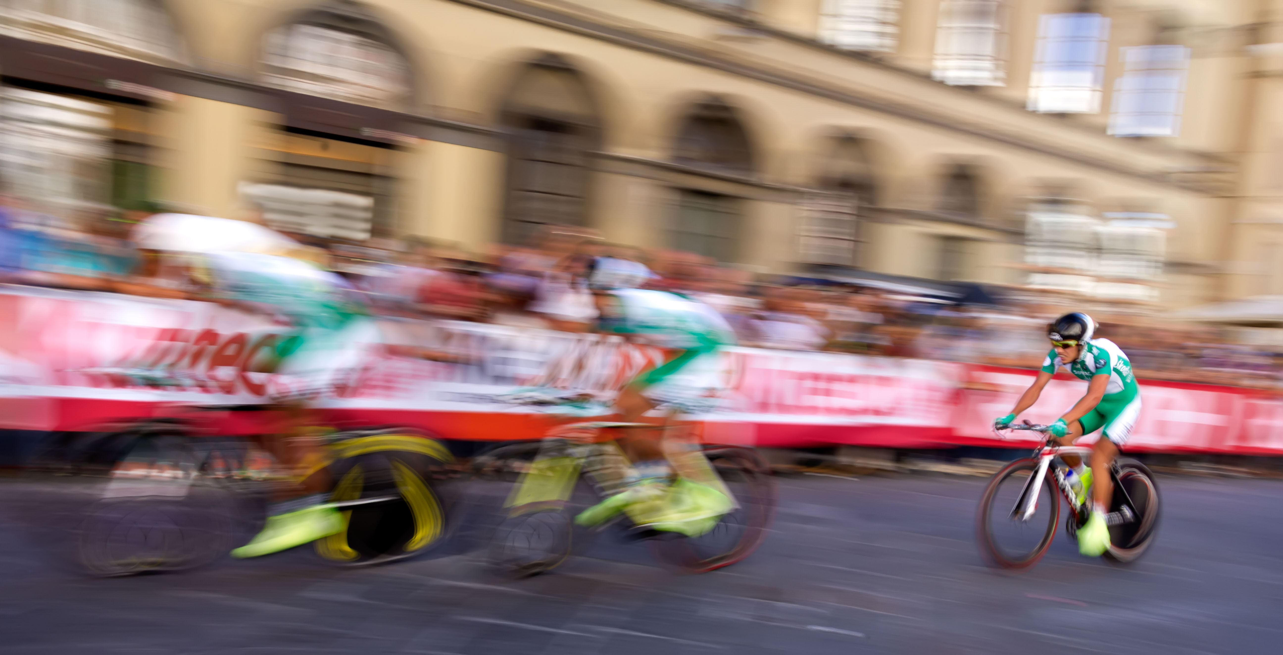
Another images with a lot of blur, but it adds interest and the last bicycle is more or less in focus. |
Sep 3rd |
 |
| 78 |
Sep 25 |
Comment |
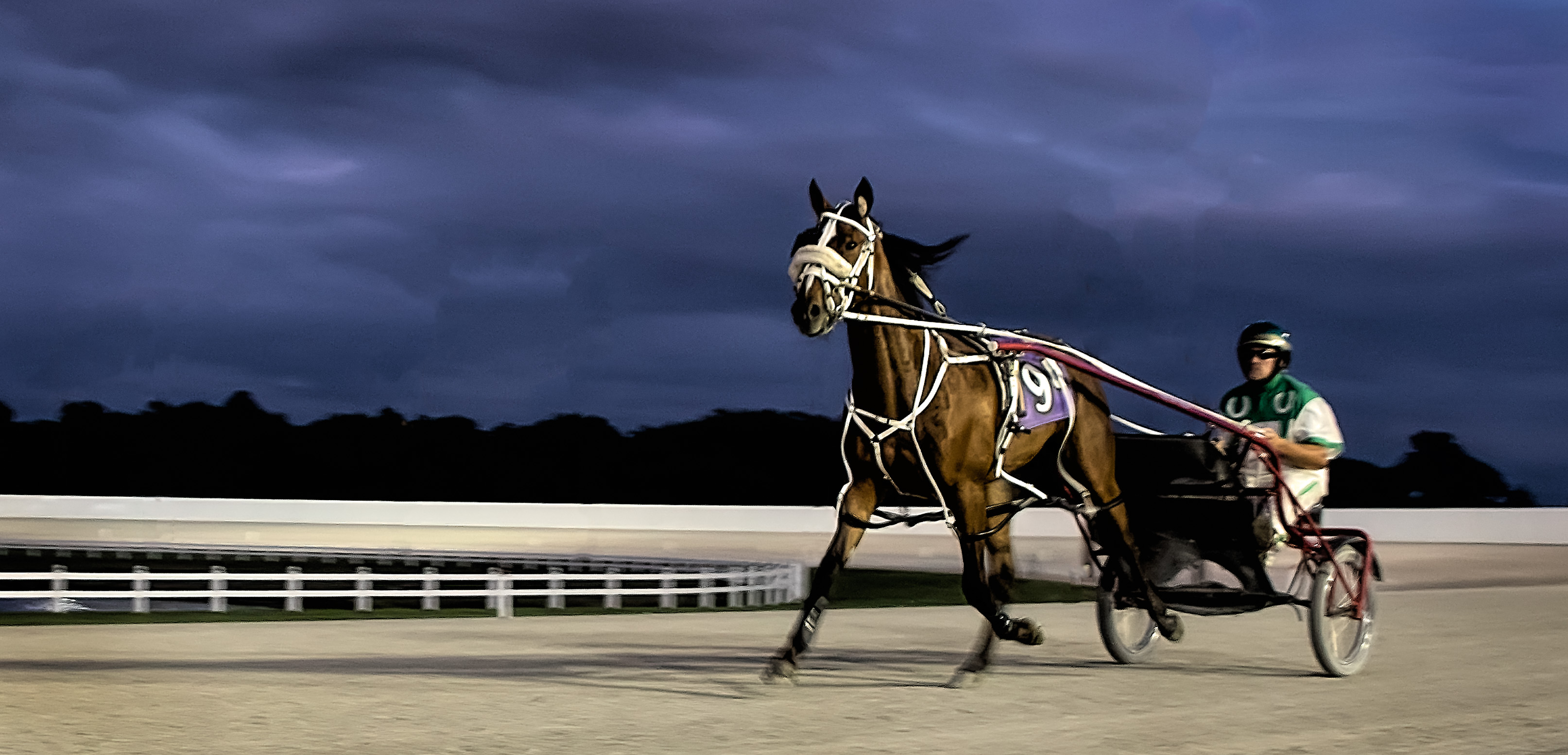
In this image, I wanted the horse's legs to be moving (blurred) and was fine with the driver blurred, as I wanted the number and horse's face in focus. Harness racing is very slow, so this was a tricky shot to get. |
Sep 3rd |
 |
| 78 |
Sep 25 |
Comment |
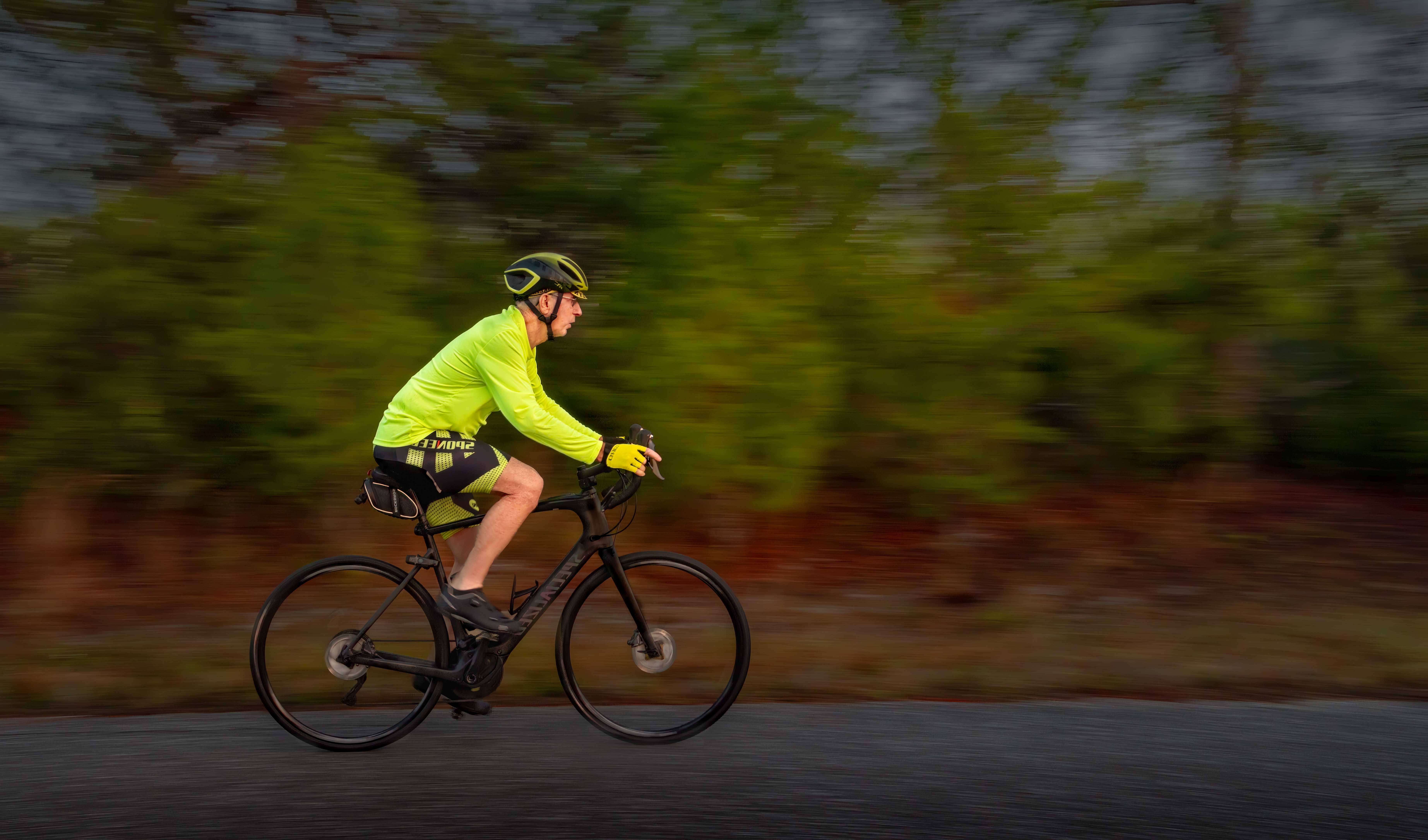
Nice effort! It takes a LOT of images to get one good panning images. Maybe one good one for every 100 images you shoot, as they will be slow and you have to track just right.
You Tube is a great place to watch and get some clever ideas.
In the pic I attached, I went with a neutral background, so I didn't have all the wires and cones and stuff in your pic.
You can crop up from the road and crop out the wires and some from the left and it will make your image less cluttered.
|
Sep 3rd |
 |
| 78 |
Sep 25 |
Reply |
Great suggestions, Jean. I agree that those subjects are very interesting and pretty when done. |
Sep 3rd |
| 78 |
Sep 25 |
Comment |
Again, you chose a different and unique image. I do like your wife there, especially since it is a romantic image.
I think you did a nice job catching the sculpture in a nice light.
I find a couple of minor things distracting me. On the left side on the wall is some writing that you might consider removing.
Another couple of considerations would be to darken the pavement circle, as there is a lot of patterns and designs there to distract us. And I might try blurring the trees a bit, as they are in between a blur and sharp. |
Sep 3rd |
| 78 |
Sep 25 |
Comment |
Very clever how you used a blur on certain areas! I love this! Great lines and colors! Perfect!
How did you apply the blur in just the specific areas In Viveza? |
Sep 3rd |
10 comments - 11 replies for Group 78
|
10 comments - 11 replies Total
|