|
| Group |
Round |
C/R |
Comment |
Date |
Image |
| 78 |
Mar 25 |
Comment |
My friend, Mitch Heydt, is in Hokkaido, and just put this image out on Facebook. I think his snow is a little too magenta, but gives you the idea about a clean background and the magenta snow actually creates a nice separation from the white of the cranes. . |
Mar 22nd |
 |
| 78 |
Mar 25 |
Reply |
So gorgeous! Love those night pix! |
Mar 21st |
| 78 |
Mar 25 |
Reply |
Pei-Fan, you do have RAW on iphone 13 Pro. It makes a HUGE difference when you process it in Lightroom or Photoshop. So much more detail and pixels to edit. I use it for any "important" photos. |
Mar 21st |
| 78 |
Mar 25 |
Comment |
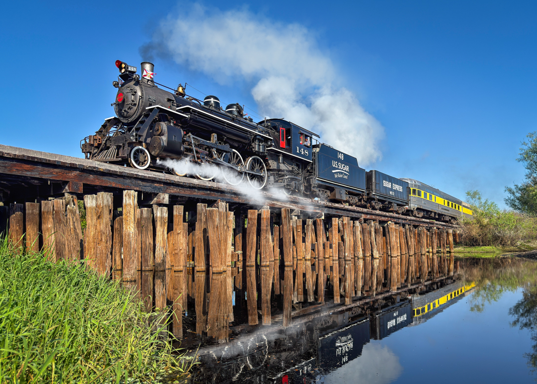
I have to say I was troubled on what changes I'd like to make.
I did add the brake smoke reflection in the water that Sunil suggested. What do you think?
What are everyone's thoughts on Robert's feedback--does the smoke feel fake, because we are used to more dark and dense smoke rising?
Robert's thoughts on more puffy smoke and how it rises is very valid to look more "real". I have entered the same image into my Digital Study 52 Competition group, where no one can see anyone else's comments and see what additional feedback I get from them. I'll then email this group my changes once everyone's weighed in. Thanks so much for your feedback to help me make the best image possible. |
Mar 21st |
 |
| 78 |
Mar 25 |
Reply |
Thanks, Pei-Fan! I appreciate your thoughts. Quite a discussion going here, as Robert is not in favor of the wheel smoke. That's what is great about this group! Lots of ideas to improve the image! |
Mar 13th |
| 78 |
Mar 25 |
Reply |
Thanks for your thoughts on the grass. I thought it stopped the action and reflection. And I liked the green against the yellow/red on the train.
I'll play with it and see what I get.
Thanks! |
Mar 8th |
| 78 |
Mar 25 |
Comment |
Robert, I love this! Such and amazing "sculpture", is it a frozen waterfall? As gorgeous as it is, it does seem too blue. I would correct the white balance. It might be a bit too sharpened. It might be worth trying a selective contrast brush and help define the depth of the ice.
Great image, absolutely worth doing some research on working ice images. I live in Florida, just to avoid ice and snow. Ed might be knowledgeable on this. |
Mar 8th |
| 78 |
Mar 25 |
Comment |
Pei-Fan, what an exciting trip! I'd love to see these cranes! If you are not competing, how Ed edited your image was exactly what I would recommend.
Nice shot! |
Mar 8th |
| 78 |
Mar 25 |
Reply |
As far as competing, Jean, in PSA Nature, you cannot remove anything. It is a reality based category (just like PSA Travel and PSA Photojournalism).
The judges can tell by pixel-peeping as AI does not have the same pixel density as the original. Judges will disqualify images and sometimes ask for the original image. And, of course, its based on the honor system.
Other categories, like PSA Color and PSA Monochrome, allow any changes as long as it is not AI. Sky replacements allowed if the sky was also photographed by the photographer. I know of no competitions by any group that currently allow AI made changes.
You can click on each of the categories to read definitions and rules. https://psa-photo.org/page/division-definitions |
Mar 8th |
| 78 |
Mar 25 |
Reply |
Word for word what I was going to say, Ed! Nice job! Getting the snow the right color is key. Snow is tough! |
Mar 8th |
| 78 |
Mar 25 |
Reply |
Jean, I can remove the bottom left grass if I enter it in PSA Color. I'll try that and see how it looks. Thanks! |
Mar 7th |
| 78 |
Mar 25 |
Reply |
Thanks for your idea of entering PSA Travel, Ed! But I wouldn't be able to with the changes I made to it, but could enter a version with the smoke fixed. I also don't get the PSA Journal since we have two houses. I'll look through some online journals and see if I can find an expert that can help me with my mistakes. Thanks! |
Mar 7th |
| 78 |
Mar 25 |
Comment |
I think it is a fun photo with a great story and I love the vibrancy in the umbrella. I also had the same experience as Robert, where I didn't catch that she was sleeping either.
A couple of thoughts for you to take us into your story. Perhaps crop in from the bottom, as that would take us closer into Veronica.
A second thought is that Veronica's sign is very bright and difficult to read. Perhaps dropping the vibrancy or darkening the text on her sign would give us more info on the subject.
A third idea would be to crop in from the right to again bring us into your story, although you lose Veronica from the center.
I love how you see things other folks miss! |
Mar 5th |
| 78 |
Mar 25 |
Comment |
Jean, what a beautiful flower1. I think you made a good decision to darken your background and darken in between the petals.
As Robert indicated, it looks like you photographed in bright light. Flowers look best when photographed in shade. They look great to our eye in the sun, but somehow, they photograph best in complete shade and soft light.
I just watched the 2-day KelbyOne iPhone Conference and one of the tips was to photograph in RAW (top of screen when photographing on your iPhone). This gives you even more information when using PS and NIK. You may have already known this, but thought I'd mention it for everyone else.
I'm interested in how you set this up. Handheld? Macro? Or used RAW with a large f/stop number to get more details? Thanks!
|
Mar 5th |
| 78 |
Mar 25 |
Comment |
https://www.wqad.com/article/entertainment/events/steam-train-cpkc-tour-davenport/526-8ea89fdb-de08-49ac-a62b-d1fce23b648d
Here's a steam train video I used.
Any suggestions are welcome. |
Mar 5th |
| 78 |
Mar 25 |
Comment |
|
Mar 5th |
 |
| 78 |
Mar 25 |
Reply |
Thanks, Robert! I made some creative choices to not streak the train, as I wanted to show the details of the historic locomotive. I actually did watch a number of videos and photos of the steam trains, and the puffing happens if they are just starting out. The steams gets moved quickly down the train's wake, as you can see in my original. The train does have steam come from the bottom of the train, too. I've attached some of the photos I used for reference.
I certainly don't want it to look fake, I can make it look like it puffs and not fall, if that makes it feel more like people expect. |
Mar 5th |
 |
| 78 |
Mar 25 |
Comment |
Ed asked me to mention that he entered this in a Travel competition and didn't do very well.
Ed, did you enter it in a PSA Travel competition? If so, its a reality based competition (strict editing rules) and the location often needs to be obvious to indicate where you traveled to. I can send you the link to the rules, if interested. You have a lot of images that would do very well in travel! |
Mar 3rd |
9 comments - 9 replies for Group 78
|
9 comments - 9 replies Total
|


