|
| Group |
Round |
C/R |
Comment |
Date |
Image |
| 78 |
Sep 24 |
Reply |
I am glad you found some suggestions helped improve your image! All set for PSA Competition! |
Sep 27th |
| 78 |
Sep 24 |
Reply |
I like your changes, Jim! Did you feel it improved the image, or do you like your first version better? |
Sep 27th |
| 78 |
Sep 24 |
Reply |
Sunil, in the end, it has to be what you like and envisioned. We can only offer suggestions. I'm glad that the idea to remove the lights did not work for you--it is a good test to see what you really wanted! |
Sep 27th |
| 78 |
Sep 24 |
Reply |
JoAnn, I made some changes. I'd love it if you'd take a look at my 9/23 revision and see if you think its improved. Thanks! |
Sep 23rd |
| 78 |
Sep 24 |
Reply |
Check out my 9/23 revision and let me know your thoughts. Thanks so much! |
Sep 23rd |
| 78 |
Sep 24 |
Reply |
Ed, thanks for your ideas. Check out my 9/23 revision and let me know your thoughts. I appreciate you! |
Sep 23rd |
| 78 |
Sep 24 |
Reply |
Loved your idea of going darker. Check out my 9/23 revision. Too blue, or dark enough? Thanks! |
Sep 23rd |
| 78 |
Sep 24 |
Reply |
Thanks, Jim! I used two of your ideas in my rework. Please check them out at my 9/23 post! |
Sep 23rd |
| 78 |
Sep 24 |
Comment |
Thanks for all your comments! The Milky Way was directly over the church in real life, which I felt symbolized heavenly energy or angels or whatever, so I decided to keep it that way. Milky Way fans track this and they would know the Milky Way would not be anywhere else based on where I was standing.
The sky was very dark in real life, so I did go with Robert's idea and darken the sky further, which I really liked. Ed also showed a dark sky in his revision.
Jim had suggested lightening the grass on the side of the church, but with darkening the sky, I decided to stay dark on the ground.
Several brought up that the subject is the church, not the Milky Way. The current vogue in Milky Way photography is to have a strong foreground, so that the Milky Way is "in situ" or seen where it really was, and not just a "floating Milky Way band". This is why you'll see old barns with the Milky Way, or mountains. Something to anchor the star of the show.
My Milky Way was not very powerful (look at Ed's own Milky Way on my image in his revision!), so I think that's why there is some confusion as to the subject. I think it is both--the church and the Milky Way need each other to be a better composition.
Jim had suggested a crop. I used a minor crop compared to Jim's rework, but I think the idea was a good one, and I'm very happy with my new rework!
Additional thoughts? Thanks, everyone! |
Sep 23rd |
 |
| 78 |
Sep 24 |
Reply |
Thanks for trying another version! I would recommend lightening your shadows on your hummer, and darkening or desaturating the green staircase. |
Sep 23rd |
| 78 |
Sep 24 |
Reply |
I didn't think of each version that way. Thanks, JoAnn! A new version coming. |
Sep 23rd |
| 78 |
Sep 24 |
Reply |
Thanks, Sunil! I appreciate you saying the windows were well lighted and I straightened the church well. Another version coming. |
Sep 23rd |
| 78 |
Sep 24 |
Reply |
You got a great Milky Way! I'm going to play with the revision here in Italy and see what I can post. Thanks! |
Sep 23rd |
| 78 |
Sep 24 |
Reply |
Thanks, Robert! I stood so that the Milky Way did go up right out of the cross, up to heaven. Milky Way enthusiasts will call it out if I change it, as that is not where it would ever be.
I will try a darker blue and see what that looks like, thanks! |
Sep 23rd |
| 78 |
Sep 24 |
Comment |
JoAnn, what a wonderful moment and I'm glad you captured it!
To improve in the future, think about the composition--an uncluttered background, the color (the green wall is much brighter then the "star of the show" and light (the hummingbird is dark, perhaps changing your angle would have given you a more radiant bird.
|
Sep 14th |
| 78 |
Sep 24 |
Reply |
Great catch on the quality, Jim! Hopefully, that will help. Pei-Fan does not say if she sharpens and removes noise in her description. |
Sep 3rd |
| 78 |
Sep 24 |
Reply |
Thanks, Jim! I actually darkened the green grass, so I can bring that back easily. It does look good with the roof and tower of the church. I do like the Milky Way, but perhaps a crop more towards yours would work well. Thanks for your ideas!
|
Sep 3rd |
| 78 |
Sep 24 |
Comment |
I think you've done a great job bringing a young Buddha into focus and being a subtle, but salient, part of the image. I like the pastel dusky skies and that its a very early dawn. I have no suggestions. ISO 12,800....yikes!!!
One option in the future would be to bracket, so you have the buddha properly exposed and the sky properly exposed and blend them.
|
Sep 2nd |
| 78 |
Sep 24 |
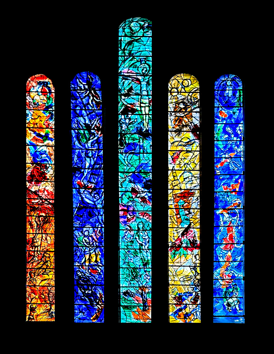
Comment |
What an incredible work, Chagall was such a genius. I added some contrast and dropped the exposure a bit to darken the glass and make the Jesus images show up a bit more. It doesn't give that "luminance" one sees with stained glass, so I'm not sure I'm helping helping the image. |
Sep 2nd |
 |
| 78 |
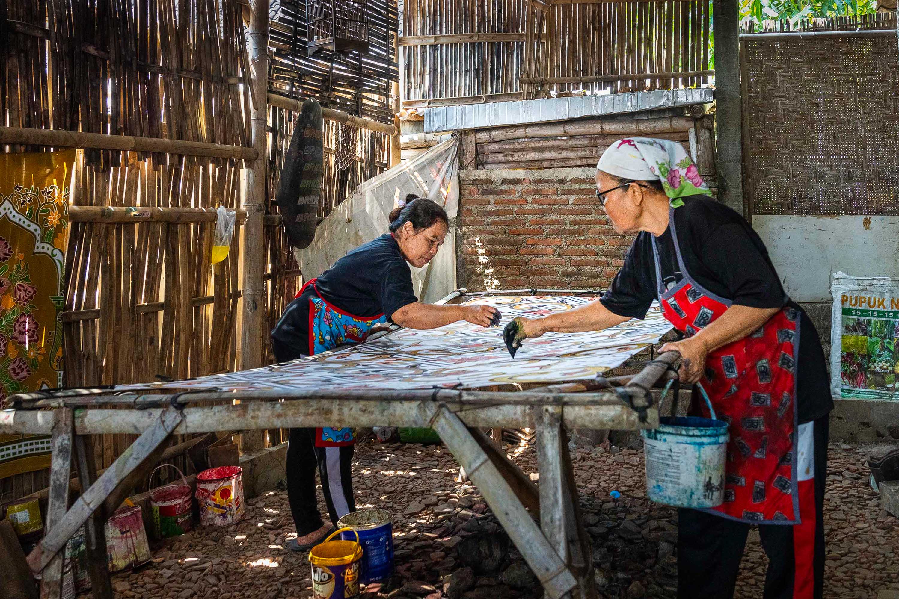
Sep 24 |
Comment |
I wish we could see what the women are working on, so I worked to make this more clear.
In Camera Raw--
I straightened the image.
I removed the fertilizer pack, extra buckets, a bag on the wall and other items that I think were distracting. Some/all might be essential to their art and could be added back.
I used a Linear Gradient to bring down the Highlights across the top, I find this is more effective that a brush, as it is consistent.
I used a radial gradient across the women's faces and artwork to brighten them and have it feel like light leaking in the bamboo walls.
I used NIK HDR-like at low opacity, to add some definition to the women and their art, trying to keep the emphasis there.
I did not use Noise Reduction, as I thought the grain added to the primitive location and women's focus.
If you have an image without the legs being cut off of the woman on the right, it might be a stronger image. Holding your camera up a bit higher to show us the work and what their tool(s) are, might tell a stronger story.
Where was this photographed and what are the women doing? Is the piece on the far left one of their pieces? If so, it might have worked to show more of the finished piece to hint to us what was happening.
I've not seen anything like this! Good job!
|
Sep 2nd |
 |
| 78 |
Sep 24 |
Comment |
I think it is beautiful glass and you've done a nice job to show the dimensionality and its color at its best. Bravo! |
Sep 2nd |
| 78 |
Sep 24 |
Comment |
Jim, I thought it was an interesting image and I liked your darkening. I thought it was a bit dark, so I added just a radial gradient around the blacksmith to lighten the tools in the background and more details brought out on him. Besides adding a bit of exposure with the radial gradient, I also added a bit of yellow to warm it up a bit.
I'm not sure it is any better, but thought I'd share. |
Sep 2nd |
 |
7 comments - 15 replies for Group 78
|
7 comments - 15 replies Total
|


