|
| Group |
Round |
C/R |
Comment |
Date |
Image |
| 78 |
Jul 24 |
Reply |
Thanks, Jo-Ann! The "material" is actually a bromeliad flowering plant the frog is climbing, which works well with his eye color and body color.
As you know, AI isn't allowed in PSA, and not allowed in competitions anywhere. But it sure is fun to play with. Maybe someday! |
Jul 29th |
| 78 |
Jul 24 |
Reply |
Thanks, Jim! You inspired it! |
Jul 29th |
| 78 |
Jul 24 |
Reply |
Jim, did you post a worked image? Nothing shows? |
Jul 29th |
| 78 |
Jul 24 |
Reply |
Would you take a look at my July 20 post where I reworked the image? Improved? Any additional suggestions? Thanks! |
Jul 20th |
| 78 |
Jul 24 |
Reply |
Would you take a look at my July 20 post where I reworked the image? Improved? Any additional suggestions? Thanks! |
Jul 20th |
| 78 |
Jul 24 |
Reply |
Would you take a look at my July 20 post where I reworked the image using your suggestions? Improved? Any additional suggestions? Thanks! |
Jul 20th |
| 78 |
Jul 24 |
Reply |
Would you take a look at my July 20 post where I reworked the image? Improved? Any additional suggestions? Thanks! |
Jul 20th |
| 78 |
Jul 24 |
Reply |
Would you take a look at my July 20 post where I reworked the image? Improved? Any additional suggestions? Thanks! |
Jul 20th |
| 78 |
Jul 24 |
Comment |
Once again, I found value in everyone's input! Ed and Sunil recommended a tighter crop frame. I was going for the feeling of a tiny frog, but now have cropped in to take you closer to it. Â
Jim felt it was too bright and saturated, so I did brush down the brightest parts, and opened up the blocked up blacks in the background. I also brushed some exposure around the frog, so he didn't look pasted on the background. I took down the exposure on the red vrisea bromeliad, so it shows its natural red without being too bright.
Any additional feedback before I put this is PSA PID Color competition? Thanks so much! |
Jul 20th |
 |
| 78 |
Jul 24 |
Reply |
Thanks, Sunil! I'm going to rework my image a couple of ways and get the group's feedback. |
Jul 20th |
| 78 |
Jul 24 |
Reply |
Thanks, Robert! I think I can take down some of Froggie's shine and still have it feel bright and the red bring your attention. |
Jul 12th |
| 78 |
Jul 24 |
Reply |
Thanks for your suggestions, Jim. I think it is a good idea to take down the brightness.
|
Jul 12th |
| 78 |
Jul 24 |
Reply |
This is the full frame, do you have a crop suggestion? As I mentioned above, it was during a macro workshop in Louisville, Kentucky. It's a poisonous frog from Central and South America. |
Jul 10th |
| 78 |
Jul 24 |
Reply |
Thanks so much, Pei-Fan! I appreciate it! |
Jul 10th |
| 78 |
Jul 24 |
Comment |
I appreciate all the work you did to get this, and thanks for detailing your focus stacking settings and procedure.
It's not grabbing me, I'm not sure why? Maybe the Queen Anne's Lace isn't very bright? Or its a little busy and took a while to realize we were under it? And the light is under it(not over it like the sun)?
I definitely would love to see your color version, as I am a fan of your photography and creativity, and adore Queen Anne's Lace.
I hope Sunil will have some monochrome magic that will take your idea to the next level. |
Jul 6th |
| 78 |
Jul 24 |
Comment |
Oh, I think this is my favorite of your focus stacked images! And so excited its with the gear I own! Can't wait to recover from my bicycle accident and try it!
Wow! It's almost like a fireworks explosion! Super crisp, clean and the green background looks great against the shades of blue. There is a tiny leaf at the bottom...kinda distracting...will wait for others to weigh in on the tiny leaf, as its also kinda cute!
I also like that you have a little angle on this, it fills the frame and adds a diagonal to add even more interest.
Sorry to hear you haven't found the perfect spots in your new 'hood, but I'm excited we might enjoy some landscapes from you!
|
Jul 6th |
| 78 |
Jul 24 |
Comment |
Hi Pei-Fan, its an attractive bird. The original and the reworked image look very similar, are they the same?
You might rework this by cropping in to see the bird, the out of focus background is not important. I choose "Subject" in Camera Raw to sharpen just the subject (bird), we don't want the rest sharpened, we want it soft and out of focus, so we only see the bird. Also, I used Camera Raw Noise reduction to remove the noise that your sharpening added. Notice how the background in my version is not "crunchy" or "grainy"? |
Jul 6th |
 |
| 78 |
Jul 24 |
Comment |
Welcome to the group, JoAnn! And congrats on retiring at the end of this month, allowing you much more time for photography!
My first suggestion would be to straighten the monument using Auto in Camera Raw. I would also try to bring back some detail to the sky.
I find the repaired crack and plants in the foreground to be distracting, so I've removed them. I've also used Generative Fill to add back the left side of the monument that does not appear.
Finally, I tried a monochrome conversion, since there isn't a lot of color in the image.
Using Generative Fill on this image is AI and can't be used in most Clubs or any PSA competitions.
|
Jul 4th |
 |
| 78 |
Jul 24 |
Comment |
Congrats on the Leica Gallery! They love you (as do we!).
A couple of tiny things on your beautiful conversion of pure black to pure white!
On the left foreground, there is a small light streak going off the page on the left. I don't think it serves any purpose and takes our eye off the dome.
On the far right trees, there is a halo where they meet the sky. This is easily fixed with the clone stamp, set on "Darken" (not Normal!) and 70% and then clone from the sky close to the halo and this will put sky there instead of the leftover halos from sharpening.
Fabulous conversion! |
Jul 4th |
| 78 |
Jul 24 |
Comment |
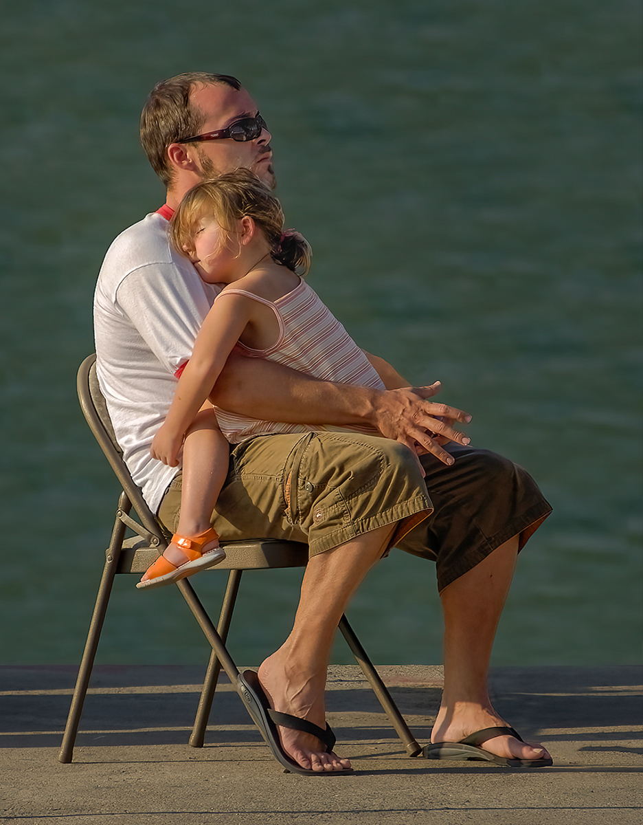
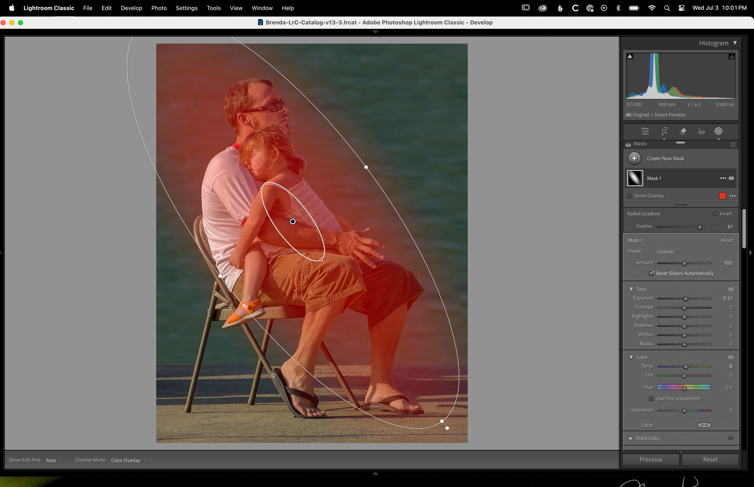
My rework of your image with the radial gradient increasing exposure and warmth over the subject. Also cropped. Thoughts? |
Jul 3rd |
 |
| 78 |
Jul 24 |
Comment |
Great work getting rid of the distractions, Jim!
Since its such a sweet thing, I made a couple of changes. I cropped to bring us closer to the scene. And then I added a radial gradient in Camera Raw (or Lightroom Classic). I added a little bit of exposure and a little yellow light to make it feel like sunlight. The completed image is below. |
Jul 3rd |
 |
8 comments - 13 replies for Group 78
|
8 comments - 13 replies Total
|