|
| Group |
Round |
C/R |
Comment |
Date |
Image |
| 78 |
Apr 24 |
Reply |
Thank you so much, Pei-Fan. I appreciate your feedback. |
Apr 25th |
| 78 |
Apr 24 |
Reply |
Thank you! |
Apr 25th |
| 78 |
Apr 24 |
Comment |
Sunil, I appreciate you re-working your image TWICE! I think it improved both times! |
Apr 25th |
| 78 |
Apr 24 |
Reply |
Pei-Fan, I re-edited my image. I would love for you to check my April 25 version and see if you think it is improved. Thank you! |
Apr 25th |
| 78 |
Apr 24 |
Reply |
Sunil, I used all of your suggestions. Do you like the latest version or should I lighten the whole scene a bit? |
Apr 25th |
| 78 |
Apr 24 |
Reply |
I did make changes, do you like my 4/25 version better? Thanks for checking it out! |
Apr 25th |
| 78 |
Apr 24 |
Reply |
I did make changes, do you like my 4/25 version better? Thanks for checking it out! |
Apr 25th |
| 78 |
Apr 24 |
Reply |
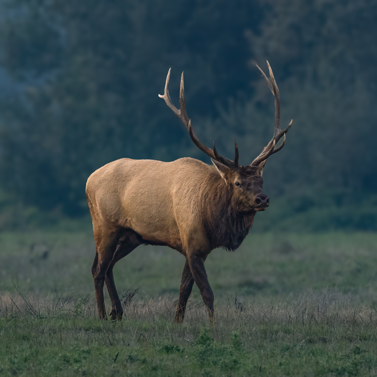
Thanks for the ideas, I did lighten the face and chest in my 4/25 version below. Better, or need more (especially with my DeHaze changes making it darker)? |
Apr 25th |
| 78 |
Apr 24 |
Comment |
Thanks for the advice! I did take Sunil's advice and chose Subject, and lightened shadows for a brighter head and chest and then DeHazed the elk. I also added a bit of clarity. I then chose Background and Dehazed, and added a touch of blue and desaturation of the grass, as it got a bit green with the DeHaze. Robert had suggested I lighten the head and chest and that was done in the process.
I noticed the grass was very yellow around his feet, so I darkened the grass.
I think its a better image. Any thoughts? Thanks! |
Apr 25th |
 |
| 78 |
Apr 24 |
Reply |
Thanks, Pei-Fan. I appreciate it. |
Apr 18th |
| 78 |
Apr 24 |
Reply |
It does seem to be crisp when I look at it closely, but the smaller version looks so interesting! |
Apr 15th |
| 78 |
Apr 24 |
Reply |
I like it! Adam Jones, one of my photo gurus, used the TK mixer and gets great results, too!
|
Apr 15th |
| 78 |
Apr 24 |
Reply |
Love your changes, thanks! |
Apr 15th |
| 78 |
Apr 24 |
Reply |
Thanks for stopping by, Stephen! I am going to re-read Puddn'head Wilson, based on your advice. I was a kid when I read it, so its worth a revisit!
|
Apr 15th |
| 78 |
Apr 24 |
Reply |
That's cool, Ed! |
Apr 15th |
| 78 |
Apr 24 |
Reply |
Thanks, Sunil. It's a great idea. Will experiment with DeHaze, too. |
Apr 15th |
| 78 |
Apr 24 |
Reply |
Thanks so much, Ed! I so appreciate it! Woot! |
Apr 7th |
| 78 |
Apr 24 |
Comment |
Thanks so much for the vote of confidence, Jim! |
Apr 3rd |
| 78 |
Apr 24 |
Reply |
Best of luck on the eclipse and clear skies, you shared your last one with us!
I really like your revision! I would use generative fill orr content aware fill to carry the bricks out into the cement road in the top left, as the light color draws us away. Mr. Twain really is the center stage now and shows up beautifully! |
Apr 2nd |
| 78 |
Apr 24 |
Comment |
It does feel like a snowstorm! Although it seems a bit bright on the top left, it does work in this composition. The near trees are sharp and beautiful and then the composition blurs in the snowstorm.
I believe "reverse vignetting" is out of fashion, but it works very well here and I'd keep it (or reduce slightly, as Robert suggests).
Love how unconventional your choices are and how you created something so unique and beautiful! |
Apr 2nd |
| 78 |
Apr 24 |
Comment |
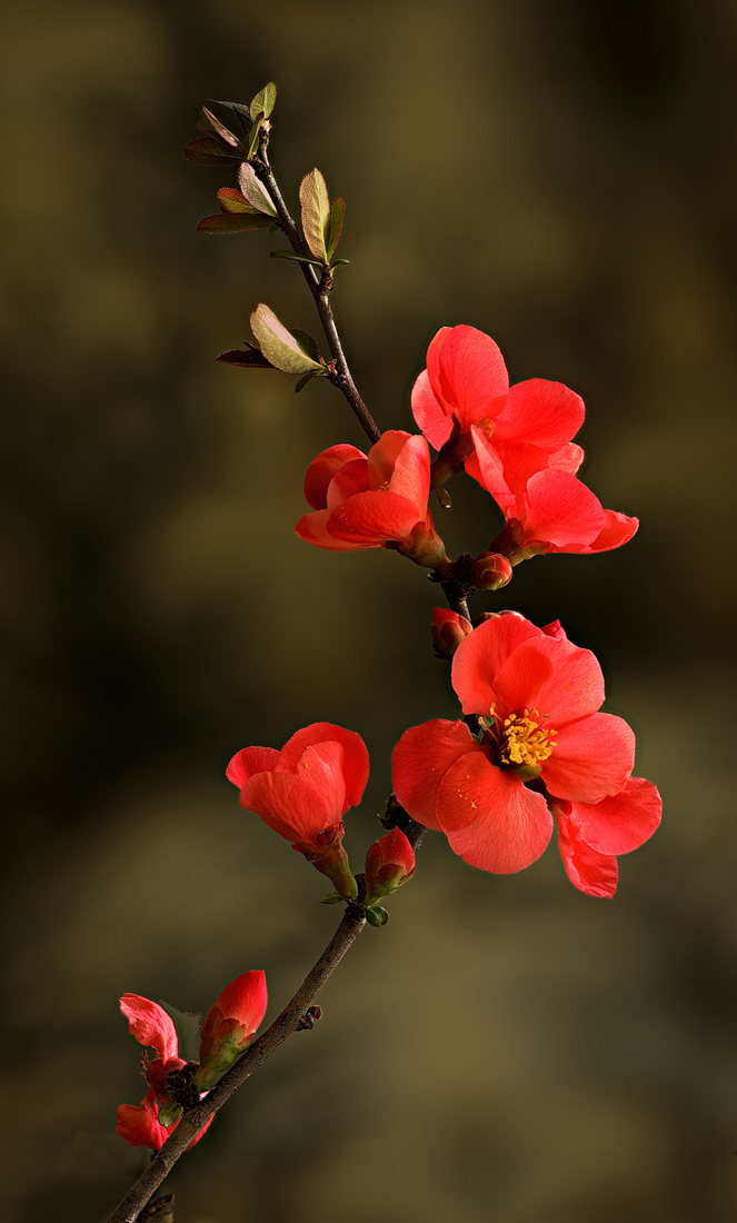
Wow, your prettiest image yet! I would add a bit more space with Content Aware Fill at the bottom to give the bud a bit more room. It looks like you have more room at the top and just a smidge more room would let the flower breathe more.
I actually used Generative Fill to create just a quick example of adding a bit of room top and bottom to allow a bit more room for the flower.
Love this!! |
Apr 2nd |
 |
| 78 |
Apr 24 |
Comment |
I've never heard or seen a "sun dog" or "sun halo". Incredible! I like how you have lightened the color and brightened the image. It's very tricky with snow to get the color right, but I think your snow works well with the image. Thanks for sharing such an unusual phenomenon! |
Apr 2nd |
| 78 |
Apr 24 |
Comment |
I love Mark Twain, I grew up very close to his residence (a museum) in West Hartford, Connecticut and have read all his books.
I love the statue and how you have shown it. I agree with Robert that the surroundings seem incongruous with the statue. The pillars draw my eye down the walkway and away from Samuel Clemens (his real name).Perhaps removing the pillars and darkening the walkway. |
Apr 2nd |
| 78 |
Apr 24 |
Comment |
I LOVE the texture of the roof and door. Great eye! The lines of the outdoor wall and flooring really leads us to the people. Nicely done.
I agree with Robert that the green is a bit bright and takes us away from watching your people. Perhaps a linear gradient along the right side and darken, to keep us focused on the fabulous porch and your subjects. |
Apr 2nd |
| 78 |
Apr 24 |
Reply |
Thanks for the idea of brightening the head and chest. I like, "King" as a title. |
Apr 2nd |
8 comments - 17 replies for Group 78
|
8 comments - 17 replies Total
|