|
| Group |
Round |
C/R |
Comment |
Date |
Image |
| 78 |
Feb 24 |
Reply |
Oh, so cool. I think I like this one a tad more, but I would be thrilled to have either of these. Living in two flat states (Florida and Indiana), the first image shows me more of the steep mountain, which is novel and exciting for me. |
Feb 28th |
| 78 |
Feb 24 |
Reply |
Thanks for reworking your image! In comparing them, the action seems more intense in your original image--the bright white splashes everywhere show the boy's efforts. Perhaps doing just a small percent of what you did to take down a little of the brightness of the water splashes would give you the best version. I look forward to what the others suggest. |
Feb 24th |
| 78 |
Feb 24 |
Reply |
The foot is an odd thing, as I didn't catch it until I reworked it the second time! Since this is Color and not Nature, removing the foot might be a good choice. Thanks! |
Feb 23rd |
| 78 |
Feb 24 |
Reply |
Ed, can you use your eagle eye on my 2/17 version and see if its better without any artifacts? Do you like the darker version? Many thanks! |
Feb 17th |
| 78 |
Feb 24 |
Reply |
Pei-Fan, can you check my latest version on 2/17, and see if you think it is improved or have any suggestions? Thank you so much!
|
Feb 17th |
| 78 |
Feb 24 |
Reply |
What do you think of my 2/17 version? It's different than you suggested, but am I on the right track? |
Feb 17th |
| 78 |
Feb 24 |
Reply |
Can you take a look at my version on 2/17 below and if I captured your ideas? |
Feb 17th |
| 78 |
Feb 24 |
Reply |
I've reworked the owl on 2/17. Can you take a peek and see if I've captured your ideas in my latest image? Thanks! |
Feb 17th |
| 78 |
Feb 24 |
Reply |
I went with something very similar, please see my entry below on 2/17 and let me know what you think. Thanks!
|
Feb 17th |
| 78 |
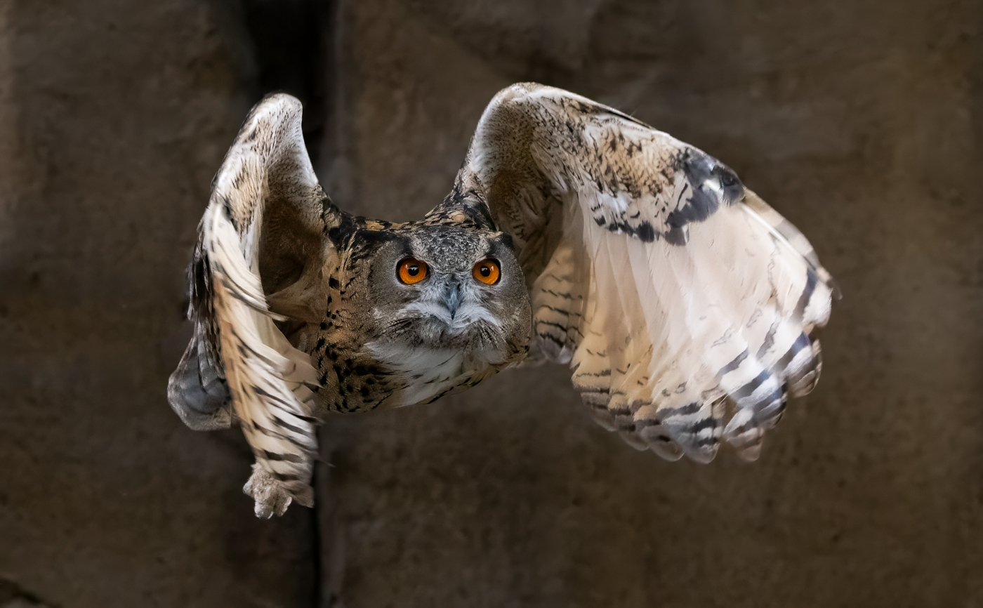
Feb 24 |
Comment |
I reworked my owl image, using everyone's advice. I started over, using the raw image. I used DeNoise first, then went darker on my owl AND darker on the wall--which I think created a more mysterious and ominous image. I used the patch tool to replace the vine and jesses on the owl, so that the quality would be the same (great catch, Ed!).
I did leave the deep crevice behind the owl, as I feel it adds dimension and a place for the owl to have flown out of.
I am tempted to lighten the owl's face, but I think it is more powerful darker as it is now. Thoughts? Additional suggestions? |
Feb 17th |
 |
| 78 |
Feb 24 |
Reply |
Thanks so much, Sunil! I'm going to try a couple of different versions and come back for more feedback. I appreciate the support!
|
Feb 15th |
| 78 |
Feb 24 |
Reply |
I never would have caught the artifacts. I'll start over and get it cleaned up and come back for more feedback. Thanks so much! |
Feb 15th |
| 78 |
Feb 24 |
Reply |
Thanks, Robert! I'm going to try a couple different re-works and get everyone's thoughts. I appreciate your feedback. |
Feb 15th |
| 78 |
Feb 24 |
Reply |
Thanks for your thoughts on the wing and I'll play with the wall. I kind of like the deep crack, of a place it could have flown out of. We'll see what the rest of the group thinks. |
Feb 5th |
| 78 |
Feb 24 |
Reply |
Nice rework! The tree removed helps, as do your other changes. |
Feb 5th |
| 78 |
Feb 24 |
Reply |
Ah, the straightening and brightening the doors helped bring this closer to my vision, Jim. Thanks! |
Feb 5th |
| 78 |
Feb 24 |
Reply |
James, a very good suggestion to bring back the highlights and whites on the droplets. Maybe dropping contrast and texture would help also. |
Feb 5th |
| 78 |
Feb 24 |
Reply |
Thanks for your EXIF data, glad to see the f/22!
I understand how frustrating it is to get differing opinions. It's up to you to sort and pick what fits your artistic view, that's why its a "discussion". I certainly have no judging skills, so I'd go with your PSA class instructor's opinion!
As an aside, I'm in a PSA Study Group (as opposed to Digital Dialogue), where everyone gives their opinions blindly, and no one knows what others said until the end of the month when it is posted. There isn't any discussion afterwards, so its "take it as it is". Six different members and they offer dramatically different opinions. Sometimes everyone dislikes the image, which is disheartening, but very valuable feedback, especially since I am looking for competitive images.
The second image is what I was imagining! And the shadows on the pathway add some surprising additional leading lines! The guys and locks add another interesting element, since the cityscape is far off and not especially eye-catching (like a New York skyline would be). To me, this is a unique and fresh approach to briges/leading lines/city scapes, and is one of my favorites of yours. ;-).
|
Feb 5th |
| 78 |
Feb 24 |
Comment |
Thanks for the ideas, Jim! I'll see what other suggestions come up and then rework him. |
Feb 4th |
| 78 |
Feb 24 |
Comment |
Ed, I LOVE this and I can't believe you "found" this composition from the larger one!
I took a screen shot of your images and your properties panel for reference for when I try this on my own (I don't have mountains and cool white trees in Florida or Indiana, but I'll come up with something).
You might think of entering it in PSA's Facebook Image of the Day and see how it does when judged by a rated judge. Of course, there are hundreds entered daily and only one chosen, but might be fun and its free. Rules are pinned at the top, but basically you can't replace skies, use AI, etc. No size requirements and you can add signature/copyright. https://www.facebook.com/groups/359957924457298
If I were judging, its a great monochrome, its different, its interesting, it would be a winner. It could also be in Nature. Sunil is really good in b/w, we'll see if he has any feedback. And Jim Hagan had incredible competition experience, so we'll see what his thoughts are, also.
|
Feb 4th |
| 78 |
Feb 24 |
Comment |
I love that you have photographed this sculpture for years. I love that you got down low. I find the strong tree line on the right a distraction, and the branches cover up the "doors" for the lantern, which look like they would be interesting and give us an additional texture and a differing color from the concrete.
I bet Spring is the time to photograph this, when the Japanese maple is looking its best and we don't have the messiness of dead leaves on the ground. I appreciate you wanted fall color, but maybe this was too late in the season.
Perhaps if you went around the sculpture to the right, you'd miss the tree and miss the large boulder in the background, for a cleaner look. You don't give us EXIF data, but I would think that focus stacking wouldn't be necessary for a small sculpture such as this, and you could use a modest f/stop like f/8 and get it all in focus? But focus stacking is certainly an option and you are great with it.
On the background blur, have you tried the new blur in Lightroom? It gives a really natural fall-off so that it is somewhat in focus right behind the subject, but then blurs gradually behind. There are several options for more bokeh and what is in focus (I'd go for the wooden doors) and when you want the background to fall off.
Here's a tutorial on the new Lightroom blur I found helpful, but every instructor has a couple videos, if you don't care for this. https://photoshopcafe.com/lens-blur-in-lightroom-and-camera-raw-ultimate-guide/
I love how you are always finding interesting subjects and trying new techiques! |
Feb 4th |
| 78 |
Feb 24 |
Comment |
Welcome to the group, Pei-Fan! We are delighted to have you join us!
Congrats on creating a composite image, creating a much stronger image than the original image without the third boy or the image with all three boys, but not as dramatic.
The expressions on all three boys are great, and good for you to photograph them in mud! It makes for great action.
I think it would be perfect, but it seems oversharpened. The drops especially seem overly crisp. You might consider starting again with your two images and not sharpen them nearly as much (or at all), and see if you like that look better. And sometimes noise reduction will reduce sharpness, which might be helpful here.
One other thought--the third boy that is added does not seem focused on the ball when he is added to the composite image. Perhaps turning him or skewing him just a few degrees would have him more engaged. But this is a very minor point.
Well done! I'd love to see your rework! Do you enter Club or PSA competitions?
|
Feb 4th |
| 78 |
Feb 24 |
Comment |
Do you have an image that takes us across the bridge? This has a dominant walkway and a vivid red bridge, but its not attached to the City in the background--it just is a large red structure jutting into the sky. I think that if you have an image walking a dozen steps to the right, leading our eye across the bridge into Winston-Salem in the background, it would be a powerful leading line image (particularly with a red bridge starting us off!).
Although the warm light is nice on the grasses, the sky is a bright blue, which doesn't match the late day sun. I might also open the shadows for some of the grasses and for Winston-Salem.
You don't give us any EXIF data of how you shot this. For landscapes, the traditional way to shoot it is with a very small aperature--f/22 or so, so that Winston-Salem is in focus.
This would be a great scene for focus-stacking--we want the bridge, the grasses, and the cityscape to be in focus. Using a tripod and a cable release allows you to use a low ISO and get everything as crisp as possible by shooting several images, with a focus point in foreground, middle ground and background. I believe you live near here, so this might be something you can reshoot and experiment with leading lines and traditional landscape photography. Good luck! |
Feb 4th |
| 78 |
Feb 24 |
Comment |
Brave to be in the NY subway station alone late at night!
It seems a bit flat to me, with so much of the ceiling a flat color. The signs always grab my attention--we are so trained to read things. It's a bit difficult to see what the woman is doing, so that also seems to keep my eye moving.
I definitely see what you are going for...lots of great pattern in the pavement and great ceiling curves and nice chair and escalator repetition leading us to the woman. Perhaps something more contrasty or film noir would make this feels like the history you mention? |
Feb 4th |
| 78 |
Feb 24 |
Comment |
Jim, what great info on your area and the positive changes one man made. I like everything about your image, but it seems a bit over-sharpened and crunchy to me. It might be because of the floor pattern, which seems to dominate with the bright color and very strong lines. I'll be interested in what others think.
Did you consider using 2-3 of your exposures to see if an HDR image merged in Lightroom Classic (or PS) gave you a starting point you liked more?
Do you know what the white sink in the foreground is for? It doesn't look like there is a sink behind each chair, as we have today to shampoo and rinse hair (at least in women's hair salons).
Would you enter in PSA Travel? If not (since Travel Rules wouldn't allow this), I'd consider removing the stenciling on the picture window, since it is backwards and takes away from the movie theatre and street scene. |
Feb 4th |
8 comments - 17 replies for Group 78
|
8 comments - 17 replies Total
|


