|
| Group |
Round |
C/R |
Comment |
Date |
Image |
| 2 |
Dec 23 |
Reply |
Jim, here's what I was thinking...a little more natural. |
Dec 12th |
 |
| 2 |
Dec 23 |
Comment |
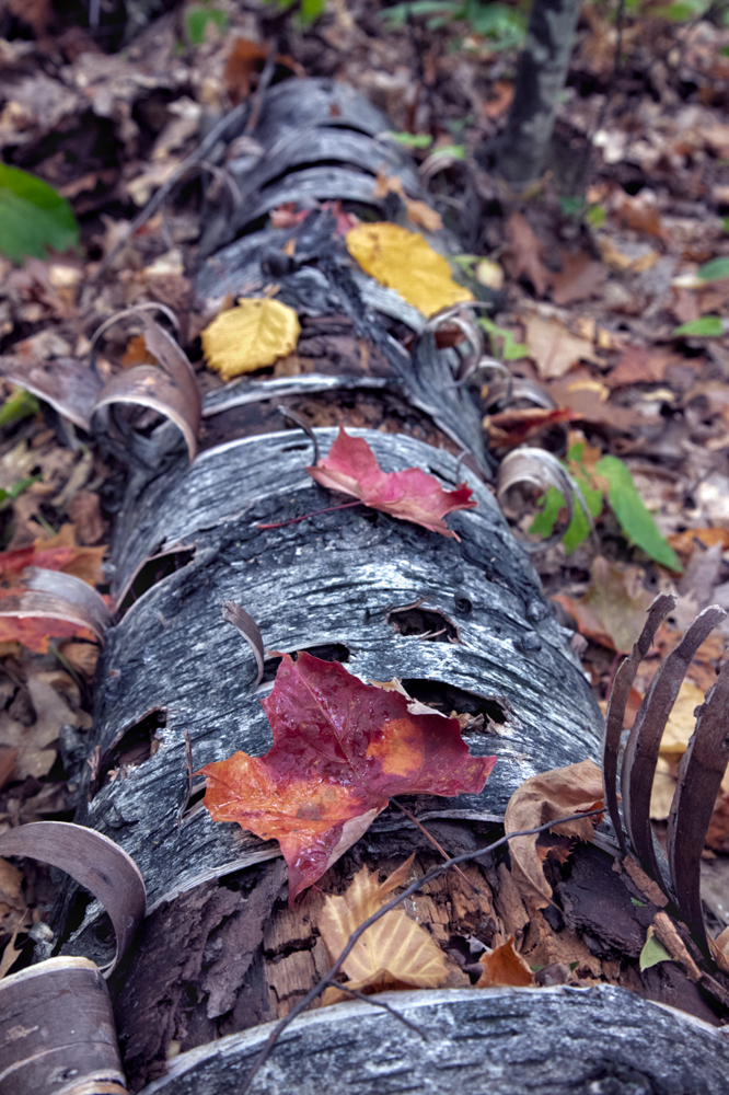
Yay for you to learn focus stacking! You'll find it very helpful on landscapes, where everything is in focus.
I like the moisture on the leaves, great addition. The log looks great, although I'd be tempted to add some more texture and a bit of clarity to bring out even more of the bark, although its very nice as it is.
For me, the leaves in your final look too bright and saturated to be realistic. Perhaps a lessening your the greens, yellows saturation and luminance on just those leaves might make them feel more natural. They'll still be eye catching and it will still be a beautiful image.
A final thought...the log is center and takes us very quickly bottom to top and out of the frame. Do you have more room to crop the log into more of a diagonal?
Congratulations on taking a "bucket list" trip and having a great time and learning some new skills! |
Dec 8th |
1 comment - 1 reply for Group 2
|
| 78 |
Dec 23 |
Reply |
It is a fun image to explore. Congrats!! |
Dec 20th |
| 78 |
Dec 23 |
Reply |
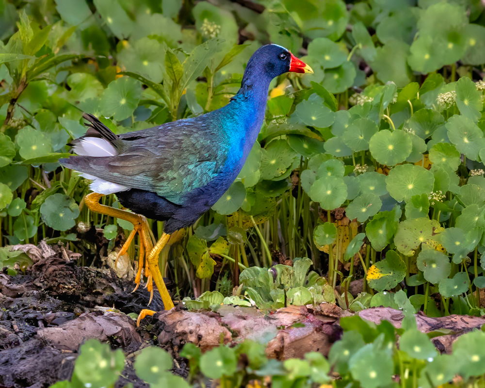
Thanks for your idea to add more room to the bird's head. It is a good idea! |
Dec 20th |
| 78 |
Dec 23 |
Reply |
I agree! James did a great job coming up with another version that lends itself to a historic look. Really like it! |
Dec 17th |
| 78 |
Dec 23 |
Reply |
I do like Sunil's version, where we clearly can see what it is and the greenery, web and drops all work together nicely. |
Dec 17th |
| 78 |
Dec 23 |
Reply |
Thanks for your thoughts, James! |
Dec 17th |
| 78 |
Dec 23 |
Reply |
Under our "Bulletin Board" at the top of our page, I put the video links on learning how to compete in PSA International competitions.
Hopefully, that will be helpful to you and anyone else interested. |
Dec 17th |
| 78 |
Dec 23 |
Reply |
James, I have all the rules for all the areas I compete. I'm happy to walk you through the competition stuff..there is a great hour long video on how to fill out the forms and track. Good luck! |
Dec 16th |
| 78 |
Dec 23 |
Reply |
Sunil,
I did revise my crop and give the bird more room. Please check out my 12/15 post and how I changed my thinking on this image. Thanks so much for all your feedback...it was so helpful in re-doing this image! |
Dec 15th |
| 78 |
Dec 23 |
Reply |
Jim, thanks for your thought about the missing foot. I looked through all my images and chose this one because the one foot showed so well. I wasn't able to fix the foot, but had a different thought process about the image. I'd love your feedback on my 12/15 image and write-up. Thanks in advance! |
Dec 15th |
| 78 |
Dec 23 |
Reply |
James, thanks for your feedback, it caused me to rethink this image. Check out my 12/15 revision. I used your horizontal crop, but read about my process when you look at the new pic. Thank you! |
Dec 15th |
| 78 |
Dec 23 |
Reply |
Ed, check out my 12/15 version. I did change my crop and lower the legs saturation. Better? Additional suggestions? Thanks! |
Dec 15th |
| 78 |
Dec 23 |
Reply |
Check out my 12/15 version...I made the legs less bright and brightened the eye...both were your suggestions. Any additional suggestions? |
Dec 15th |
| 78 |
Dec 23 |
Comment |
I've redone my purple gallinule, taking into account everyone's comments.Thanks for all the feedback! I started over with the raw image. I reduced the brightness of the legs, so they did not distract from the bird. I gave the bird more head room and room to move into. I brightened the eye.
I decided to not enter it in PSA Nature, as there is not much of a Nature story (its just walking...not breeding, fighting, eating). So I will enter it in PSA Color, just looking for a single acceptance, as I need another title. Because I will compete PSA Color, (and not PSA Nature, where I cannot remove the sticks) I was able to remove all the sticks that expanding my crop brought into view. I did go with a 4 x 5 crop, but was assured by two international PSA judges that the crop does not play into any decisions...you do not need a standard crop ratio on any digital or print image in PSA competition.
Any additional thoughts? Thanks again! |
Dec 15th |
 |
| 78 |
Dec 23 |
Reply |
Sunil, I had always understood you could use any crop you wanted in digital, as the crop didn't need to fit in frame. I checked in with two PSA judges. Heide Stover did say my bird needed a little more room (and should compete in color, not nature, since not a nature story), but that she pays no attention to the crop ratio in judging or training judges.
I then checked with Nan Carder, who is a judge in many top PSA international competitions. This was her reply: "I crop where it needs to be cropped for both digital and even my prints. I don't think it has affected any of my scores, especially in prints. I do only the small prints, they are the size that suits the image."
So, I think if two judges are competing and not using standard crops, its just personal taste. I will add more room to my purple gallinule, for sure. Thanks! |
Dec 15th |
| 78 |
Dec 23 |
Comment |
I was going to send this to just James since he mentioned entering PSA Nature competitions, but thought everyone might find this helpful.
It looks like a lot--23 pages--but most are pix showing "acceptable" and "not acceptable" versions of each aspect of the rules. I find this very handy when deciding whether I can enter an image in Nature or it is better off in Color or Mono.
https://cdn.ymaws.com/psa-photo.site-ym.com/resource/resmgr/pdf/divisions/nd/nd-judges-guide.pdf |
Dec 15th |
| 78 |
Dec 23 |
Reply |
I'm emailing you, James. |
Dec 12th |
| 78 |
Dec 23 |
Reply |
Ed, great question about cropping to a rule. The general rule, as I have learned it (which may or may not be right), is: "Don't put horizon in middle and split image in half. Favor the ground 2/3 and sky 1/3, depending on what has the most interest, or reverse to avoid chopping image in half."
So, in your image, the sky has nothing much to offer, so we would crop some sky. The ground has some interest. I would also offer that the horizon is not a feature in your image. We see only a little bit of it, and the barn buildings and trees are the subject and fill most of the horizon, so there is little/no feeling of image chopped in two like there would be if we just had a sunset over this field with no buildings. A great discussion item for everyone to commment on!
|
Dec 11th |
| 78 |
Dec 23 |
Reply |
Nice version, Jim! |
Dec 11th |
| 78 |
Dec 23 |
Reply |
Wow, such a fascinating original! I'd be tempted to crop out the pine needle, since it severs the pic and we don't know what it is. That would give you a nice vertical. We would see more of the plants and the suspended drops and I think its really interesting.
I am looking forward to some of our veteran photographers thoughts, as this is such an unusual photo and I'm not sure what I'd do to show it off to its best. Great job!
|
Dec 11th |
| 78 |
Dec 23 |
Reply |
James, thanks for your idea to show a bit more of the environment and to not "pretty it up" too much (within the confines of Nature rules). I'll darken his legs and lighten his eye and look at expanding his "world". Thanks! |
Dec 11th |
| 78 |
Dec 23 |
Comment |
Beautiful, rustic scene. The trees behind the shed don't bother me, and they do add to the image, giving us some depth.
I would have also added more contrast, as Robert did, but understand that isn't your style.
You might consider Robert's idea of cropping some of the bright sky. I do like the idea of cropping from the bottom and bringing us closer to the barn and shed.
Another idea would be to add some texture and clarity to the big barn, to add a more "old" and "rough" feel to it. Right now, it seems quite new and well made, and some texture might age it for you.
Can't wait to see it in snow! |
Dec 8th |
| 78 |
Dec 23 |
Comment |
Robert, good for you to see something like this and shoot it so well!
Sadly, it took me a long time to see the spider web. Do you have a little more "outside" the image that would give us context?
And the dew seems a little crunchy to me, and I thought it was carbonated bubbles. Perhaps since there wasn't any depth of field, the focus stacked all in one place? Perhaps a single image or two might be better? I'm not sure, but are the edges of the dew drops blown out? They seem very bright to me.
I think this has great potential and I'll look forward to any thoughts anyone else has on how to make it look more like dewdrops on a spiderweb. Very tough subject! |
Dec 8th |
| 78 |
Dec 23 |
Comment |
James, nice job at a muscovy portrait! I would use camera raw to sharpen the subject only, and would use camera raw to blur the background even more. And then use your DeNoise software to remove the noise.
I'm happy to help you with this and go over what software you use and what would work well with this type of image. We can easily Zoom.
There also seems to be a horizontal scratch(?) on the eye, and that would be an easy fix.
It's an interesting up close and personal image, and the "roosters" on the muscovy are always so weird. I like it a lot!
|
Dec 8th |
| 78 |
Dec 23 |
Comment |
Sunil, Good for you to see this! I do agree with the guys that black and white is more attractive. The white "lines" of the cathedral will take our eyes to and from Moses. My only suggestion is that there seems to be a lot of sky with nothing in it. Maybe adding a tad more at Moses' feet and remove a little from the sky? |
Dec 8th |
| 78 |
Dec 23 |
Comment |
What a nice scene, Jim! I agree with Ed that the entire left side would have been great. I love the hills to the right, and have me wondering what crop would be cut into such artistic rows? In your revision, I am still looking at the corn(?) and didn't notice the curved road.
Last month, we started a conversation about PSA Travel rules. I had time to look them up. Removing signs is against the rules. This image also might not represent a country or place sufficiently to qualify, but you certainly could enter this in PSA Color or Landscape. Or Sunil might have some monochrome magic for it.
I found this expanded set of rules with pix of qualifying and not qualifying images very helpful. I'm getting ready to enter some travel images after my Covid sabbatical, and wanted to read the updated rules.
https://cdn.ymaws.com/psa-photo.org/resource/resmgr/pdf/divisions/ptd/ptd-judges-guide-english.pdf |
Dec 8th |
| 78 |
Dec 23 |
Reply |
I will brighten the eye as Robert suggested, and desaturate the legs as you suggested. They are very colorful legs, but I do want people to see the interesting colors in the feathers, too. Thanks! |
Dec 8th |
| 78 |
Dec 23 |
Reply |
Thanks, Robert, you are always first to the critiques! I will brighten the eye and maybe less saturate the legs as Ed suggested. They are very colorful legs, but I do want people to see the interesting colors in the feathers, too. |
Dec 8th |
7 comments - 20 replies for Group 78
|
8 comments - 21 replies Total
|


