|
| Group |
Round |
C/R |
Comment |
Date |
Image |
| 78 |
Oct 23 |
Reply |
Thanks, I'm glad you felt it was an improvement! Thanks for your ideas! |
Oct 29th |
| 78 |
Oct 23 |
Reply |
I think that is a great idea! You only need one acceptance!
|
Oct 25th |
| 78 |
Oct 23 |
Reply |
Nice improvements! Glad you received some helpful ideas from the group! Awesome image! |
Oct 19th |
| 78 |
Oct 23 |
Reply |
Thanks, Sunil! I am glad that you like my revision. That's what is so great about our group...getting all the same feedback and realizing I had really missed the mark! |
Oct 19th |
| 78 |
Oct 23 |
Reply |
Ken, I cropped in quite a bit for a different sky and less beach. I'd love your thoughts on my 10/19 image below. Thanks so much! |
Oct 19th |
| 78 |
Oct 23 |
Reply |
James, if you have time, I'd love for you to take a look at my rework on 10/19 below. Thanks for your thoughts! |
Oct 19th |
| 78 |
Oct 23 |
Reply |
We loved Cannon Beach and were going to head to Oregon again for a couple of weeks to photograph the coast. But maybe that's a bad idea...we had perfect weather, morning noon and night! |
Oct 19th |
| 78 |
Oct 23 |
Reply |
Thanks so much, Ed! I started over and would love for you to take a look at my 10/19 image below and let me know if I'm going in the right direction. Thanks! |
Oct 19th |
| 78 |
Oct 23 |
Reply |
I like all your ideas, Sunil! I did choose a different version of the image, and used a crop to remove much of the sand. What are your thoughts on my 10/19 image below? Thanks! |
Oct 19th |
| 78 |
Oct 23 |
Reply |
I followed your advice and went with less blue. Take a look below on 10/19. Thanks! |
Oct 19th |
| 78 |
Oct 23 |
Reply |
Robert, let me know your thoughts on my redo below. I appreciate you!
|
Oct 19th |
| 78 |
Oct 23 |
Comment |
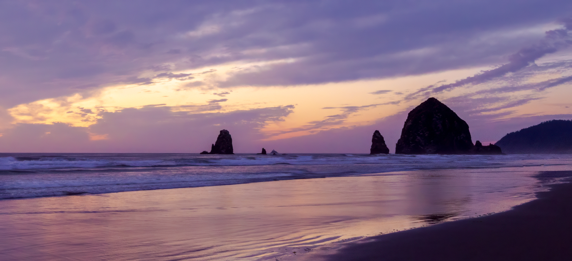
Thanks, everyone! Instead of working on this image, I used the HDR series taken right before the entered image. The light was softer. I used a tighter crop, which allowed me to remove a lot of the "blank sand" taking up so much of the image. I cropped in and brought us closer to the Haystack.
I did decide to not open the shadows on the rocks. They are definitely silhouettes in real life and they have a great shape.
I'm open to your thoughts on 1) new crop and 2) new colors and 3)anything else. |
Oct 19th |
 |
| 78 |
Oct 23 |
Reply |
It's a great start! They are very different from most object that hold relatively still while we photograph them. Birds are the toughest! Give yourself a big pat on the back!
|
Oct 19th |
| 78 |
Oct 23 |
Reply |
I love this version with the extra sky! How fantastic you could print it this big. Looks fantastic! |
Oct 19th |
| 78 |
Oct 23 |
Reply |
I think it was a great exercise if you wound up taking out the bright spot on the pavement and the distraction at the glass door. And you learned you liked the doors to complete the story...I think that's what the group is about. Sort through everyone's ideas and make the picture your own, no matter what! |
Oct 19th |
| 78 |
Oct 23 |
Reply |
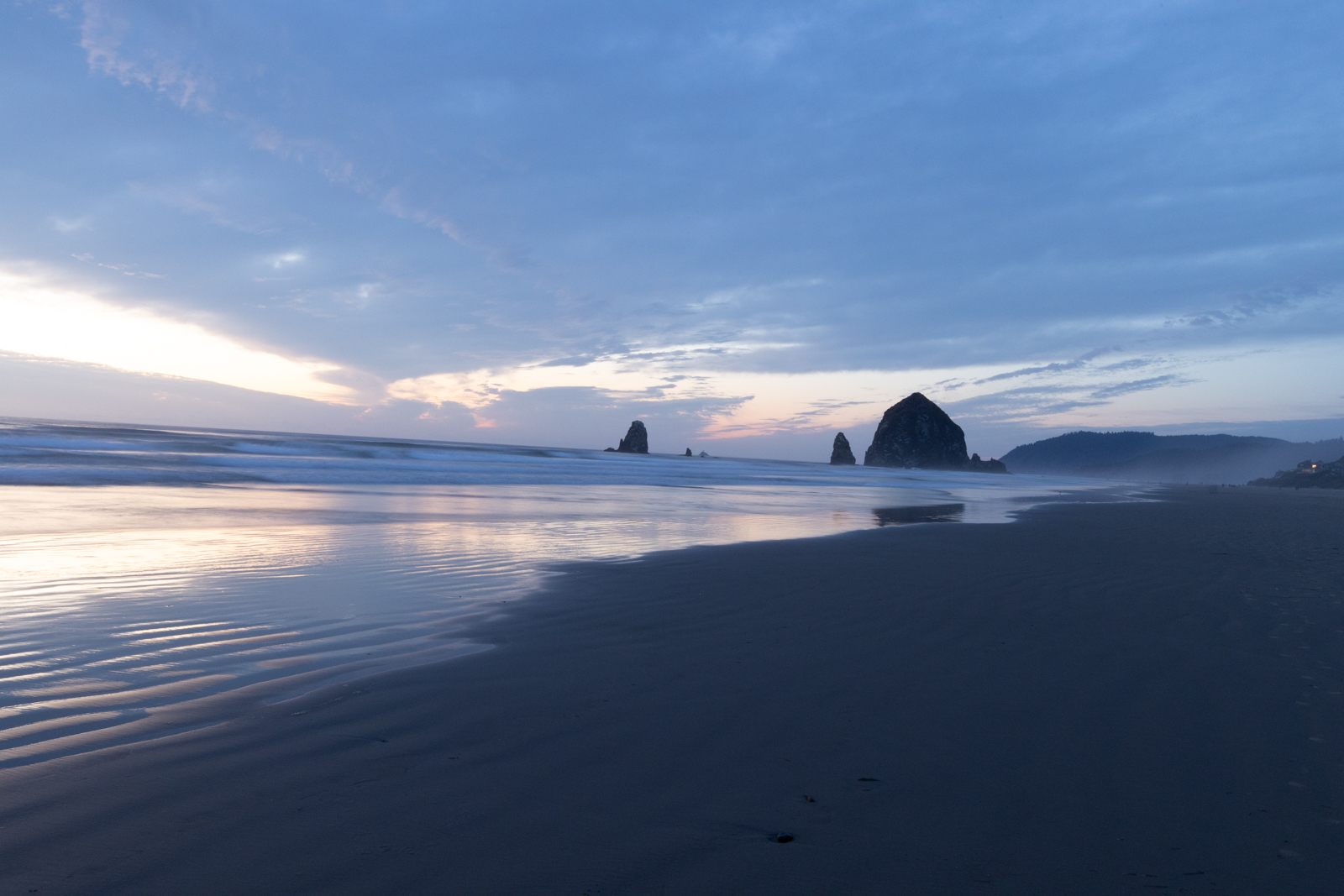
Sunil, here is one of the images that was in the HDR, uncropped. I'd love to see your crop idea! Thanks! |
Oct 9th |
 |
| 78 |
Oct 23 |
Reply |
Wow! Don't believe you are 83!! Your latest version does look much sadder, which was the idea.
I wonder if the problem is switching from raw to jpg and not PSA. I am in ProPhoto and a full color gamut, and then down to sRGB when going to the jpg output. That changes a lot. Also, monitor calibration can help pull your colors into the norm. I am not a tech, we'll wait to everyone weighs it
|
Oct 8th |
| 78 |
Oct 23 |
Reply |
Wow! Don't believe you are 83!! Your latest version does look much sadder, which was the idea.
I wonder if the problem is switching from raw to jpg and not PSA. I am in ProPhoto and a full color gamut, and then down to sRGB when going to the jpg output. That changes a lot. Also, monitor calibration can help pull your colors into the norm. I am not a tech, we'll wait to everyone weighs it
|
Oct 7th |
| 78 |
Oct 23 |
Reply |
Two great improvements, Jim! We'll see what ideas come forward from the rest of the group!
|
Oct 7th |
| 78 |
Oct 23 |
Reply |
Thanks, Jim! I'll rework trying your ideas when I hear from everyone! I appreciate your visual feedback!
|
Oct 7th |
| 78 |
Oct 23 |
Reply |
Thanks so much Robert! All great ideas! I'll wait for everyone's comments and then rework it. |
Oct 7th |
| 78 |
Oct 23 |
Comment |
|
Oct 5th |
 |
| 78 |
Oct 23 |
Comment |
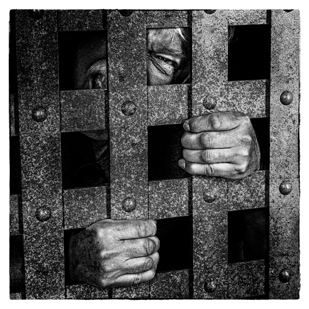
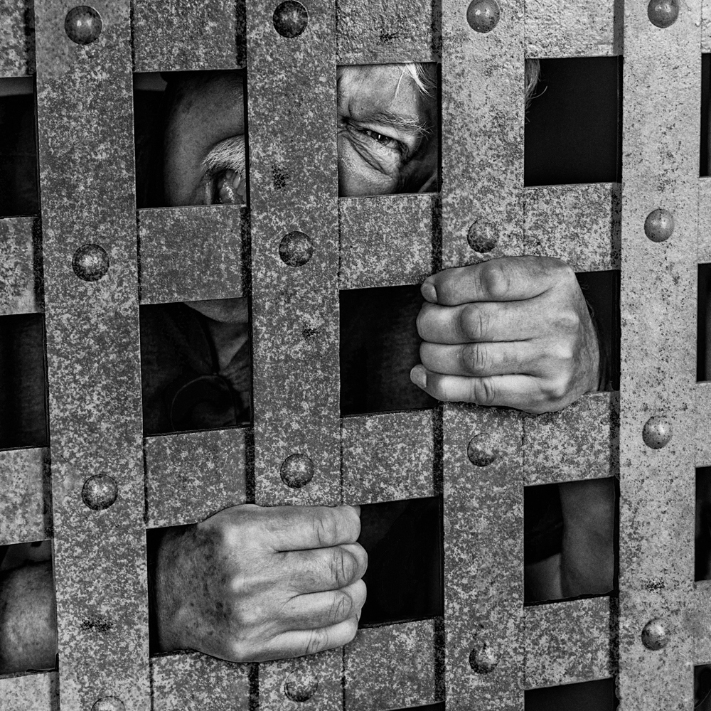
Fun idea! I love that you gritted up the bars and your friend gave us a mean face. However, your pal has pretty soft hands and nice hair and teeth, which makes everyone's best efforts still feel a tad fake.
I took it into NIK Silver Efx and chose a couple of more gritty filters to see if you liked the roughed up hands and the dark cell. There are dozens more, and you could use Lightroom/ACR Presets or Profiles to get similar looks. And in a layer, you could take this down or use a mask to tame it. Personally, I liked the roughness of these. |
Oct 5th |
 |
| 78 |
Oct 23 |
Comment |
If this is what you are going for, it is well done! Flower is sharp and background nicely blurred. If you want it to look "sad", you might desaturate a bit of magenta. You might want to darken the background more, as the back is fresh and upbeat. So to stay with the "over-the-hill" theme, darkening the background or desaturating the green might help you carry the theme.
Personally, I was disappointed not to see another perfect flower from under your lens!
|
Oct 5th |
| 78 |
Oct 23 |
Comment |
I am in awe of your recovery, bravo! Thanks for your process.
It's great, but here are a couple of suggestions. Perhaps you ACR to lighten his eye a bit so we have a little more contact with him. The new ACR has a Person picker, and you can just check "iris" and "Scelera" (white of eye) and then move the sliders where you want.
I also find the flagon a tad distracting, as its very bright and I'm seeing trees? clouds? in it? You could clone some of the darker metal from his helmet or just darken so it doesn't look so "modern".
I really love the richness of his mail and tunic. And he definitely looks the part!
|
Oct 5th |
| 78 |
Oct 23 |
Comment |
Yay for joining the birding world! I agree with Robert and Jim's comments about it being sharp and well done.
A couple things to keep in mind for your next birds...they look way better on a natural setting like a tree than on a plank or bird feeder. Your cardinal looks a little worn out...feathers missing, off color, and a chunk out of his crest. A top bird (or flower) always makes a better subject.
Birds are tough to catch, they move so quickly. Nice start! |
Oct 5th |
| 78 |
Oct 23 |
Comment |
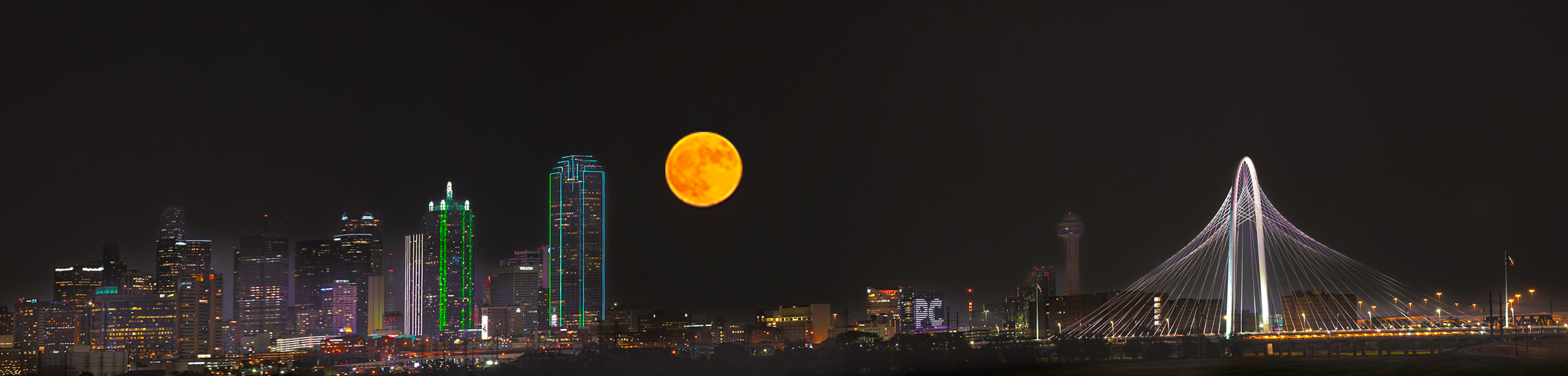
Sunil,
Great job! The trouble with panoramas is its difficult to see many details since it is so long and narrow. To adjust for this, I added contrast and saturation and exposure to the buildings below to add some additional punch.
I also find that the moon is much bigger in real life than it is in a landscape image. So I cut out your moon in a separate layer and then enlarged it and replaced your smaller moon.
Great job on a moon pano!
|
Oct 5th |
 |
| 78 |
Oct 23 |
Comment |
Love your reconstruction of the original, making it much brighter.
I was wondering if the trash bag needed to be removed from the front door, as its the first thing we see the women walking to. But Robert's crop solves the trash bag situation. It would also work nicely in a landscape format.
|
Oct 5th |
8 comments - 20 replies for Group 78
|
8 comments - 20 replies Total
|


