|
| Group |
Round |
C/R |
Comment |
Date |
Image |
| 78 |
Sep 23 |
Reply |
A vast improvement! Deeper colors, more separation in the flowers, and we really see the "pyramid" shape, which adds interest and keeps me moving around the composition!
My only final suggestion is to not use red as a border. What I have been taught is to make the border not attract attention, as that pulls us off the page. So in this case, a super dark green or black would work well. With borders, many club competitions and PSA competitions don't allow them, so just make sure you have looked at the rules before entering it. But I agree it would work nicely here, in a more subtle shade.
Have you thought of making a calendar for 2024, with your flower images? It would be a very nice gift for your friends, supporters and family. And flowers are YOU.
|
Sep 27th |
| 78 |
Sep 23 |
Reply |
I like all your changes, Sunil. Really a unique and serene scene.
My only suggestion is that many of the rocks still seem bright to me and might benefit from a bit of darkening.
I do like the corner of blue sky, which complements the blue of the stream. |
Sep 27th |
| 78 |
Sep 23 |
Reply |
LOVE this version! I was just going to write that I thought the revised version was too "neon" bright, and too stark, and dogwood blossoms in nature are so calming. And then I scrolled down and saw your newest pastel version, which is WONDERFUL!
Please tell your wife that we bought the bacon smasher she demonstrated for us when we had breakfast with you, and we LOVE it! Getting one for our Florida house, too! |
Sep 27th |
| 78 |
Sep 23 |
Reply |
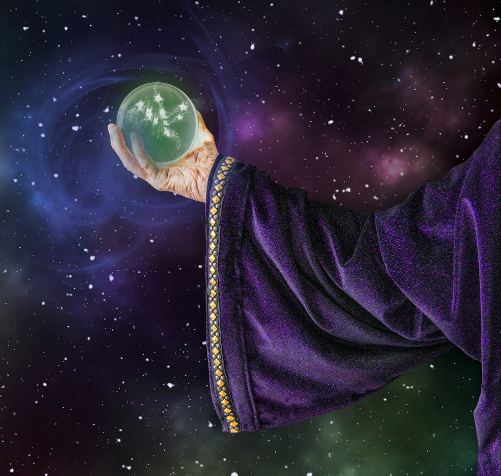
Ahhhh, I think the problem is calling him "Merlin" and that means different things to different people, depending on the books or movies you've seen. What about "Mystical Magic" and then one doesn't have to have the same reference points?
The stars in the ball bother me, so I'll play with them and see if I can make it more mystical. I was trying something besides the rays I had shooting out from my first rendition, but I will try some more "magic" tricks. Thanks! |
Sep 27th |
| 78 |
Sep 23 |
Reply |
I went back and forth on the green/blue on his fingers. Would the ball light radiate on his hand? I can certainly remove it, as you found it distracting. |
Sep 27th |
| 78 |
Sep 23 |
Reply |
I removed the fogginess and used a lot of the suggestions. Do you like my new revision below? Thanks! |
Sep 26th |
| 78 |
Sep 23 |
Reply |
Ken, I got rid of the foggy look. what are your thoughts in. my new revision, posted below? Thanks! |
Sep 26th |
| 78 |
Sep 23 |
Reply |
Jim, I have posted my revision below, using some of your suggestions. Like it better? Worse? Thanks! |
Sep 26th |
| 78 |
Sep 23 |
Reply |
My new version is below, what do you think? I used a different pic where I could make the sleeve more prominent. Thanks for your thoughts! |
Sep 26th |
| 78 |
Sep 23 |
Reply |
Thanks! I reworked the ball, see below. I did keep the galaxy background, and tried to age the hand. Any better? |
Sep 26th |
| 78 |
Sep 23 |
Comment |
Hello from the Grand Tetons! I reworked my image and toned down the various rays on the ball. I used a different image that shows the sleeve as not so long and shows better definition. The hand has less attention, as he's holding the ball with his other hand.
I used the background I had created and used in my first rendition. I'm not in love with the stars in the center...thoughts on what you like and don't like?
Thanks!
|
Sep 26th |
 |
| 78 |
Sep 23 |
Reply |
Wow, good for you! Your better mask and the dark background really shows off your furry relative! I'm glad my idea helped and I think you'll really enjoy how much you can do with LR and PS! Yay, James!
Scott Kelby does a FREE weekly Facebook Podcast called the Grid, where he talks about different photo topics. You can go back through the recordings for his monthly, "How I Would Edit your Photo". You can skip the commercials and I find them very helpful for how he does the latest techniques with LR/PS.
Scott also has FREE "Blind Critiques" on the Grid, and these are very helpful to see what he likes/dislikes in images. Great comparisons.
Find them here: https://www.facebook.com/SKelby
Do follow Matt K and subscribe. He does free short recordings every couple of weeks and I learn something every time. He's a great instructor, too.
|
Sep 24th |
| 78 |
Sep 23 |
Comment |
I really like this image. As soon as I saw it, I thought, "Liatris", so glad to know I was on track. I agree with Ken on the dead flowers always ruins an image.
In my opinion, the saturation is fine, at least on my monitor. I like the background, also. One thought not mentioned by the others--some flowers are cut off on the right and left of the image. I'd consider using content aware fill to remove them, as they seem to draw my eye off the page (or you could crop). |
Sep 14th |
| 78 |
Sep 23 |
Comment |
Wow, I have to agree with everyone that you took a ho-hum image and made a fantastic portrait. I would never have thought to rotate the image, and that made all the difference. It really shows how post-processing can make a huge difference. Bravo! I have no ideas for you, and that never happens! |
Sep 14th |
| 78 |
Sep 23 |
Comment |
|
Sep 12th |
 |
| 78 |
Sep 23 |
Comment |
I screen shot these on Instagram. I did not crop them to take out the Instagram stuff on purpose, as I completely wanted it to be clear that I was not the photographer. |
Sep 12th |
 |
| 78 |
Sep 23 |
Comment |
Well, I LOVE THIS image! And bravo that you keep working it as products improve and new tricks emerge. That's what I love about digital, you can work an image a dozen different ways, it doesn't have to be "final".
We've had better night sky folks than me offer up great suggestions and renditions, but I'll share a tip I got from Erik Kuna, from Kelby One, who teaches night sky classes.
He recommends using DeHaze heavily, which removes a lot of stars, but puts the focus on the Milky Way. You can use a brush and play with it. He also adds a lot of contrast and some purple and blue to his Milky Way to make it much more dramatic. I think this is really beautiful and serene, and may not benefit from that treatment, but just showing you the other end of the spectrum. |
Sep 12th |
| 78 |
Sep 23 |
Reply |
Good suggestion, Ken! |
Sep 12th |
| 78 |
Sep 23 |
Reply |
Jim, I love your version, too! |
Sep 12th |
| 78 |
Sep 23 |
Reply |
Spectacular renditions, Sunil! |
Sep 12th |
| 78 |
Sep 23 |
Reply |
All good points, Robert. |
Sep 12th |
| 78 |
Sep 23 |
Comment |
James, It's sweet you are doing a doggie portrait! There is a trick to the hairs, process it in the CLOUD. In Photoshop, when you "select subject", choose cloud from the pull-down at the top. It does a far better job on everything.
Here's Matt K's short video showing how it works. https://mattk.com/one-click-to-better-photoshop-selections/
My suggestion would be to put in a completely different blurred background...sky replacement, trees, anything. I think that would show your grandpup off better than the road cutting him into sections and distracting us from that adorable tongue! |
Sep 12th |
| 78 |
Sep 23 |
Comment |
Sunil,
I love the scene. There are a couple of bright rocks along the borders, and I would darken them, so our eye does not keep traveling to the light rocks.
I particularly like Ken's crop, although I recommend you watch the bright rocks on the edge.
So glad you took this out of the "reject" pile, its one of my favorites! And delighted you left it in color, as the sunlight through the trees and warmth of the horse against the cold rocks and water is beautiful. |
Sep 12th |
| 78 |
Sep 23 |
Reply |
Ken, I like this rendition even more! Really moves to "tranquil" |
Sep 12th |
| 78 |
Sep 23 |
Reply |
Nice rendition!
|
Sep 12th |
| 78 |
Sep 23 |
Reply |
Sharp eye, Robert! I missed it!
|
Sep 12th |
| 78 |
Sep 23 |
Reply |
Thanks for the ideas, Ken! I'll zip back in with some edits when we aren't in the Wild West boondocks. Clearly Wifi is not a thing in Wyoming, Idaho and Montana! |
Sep 11th |
| 78 |
Sep 23 |
Reply |
Thanks so much, Jim. All good suggestions! |
Sep 10th |
| 78 |
Sep 23 |
Comment |
I have no IR knowledge, so I can only say what appealed to me. I agree with others, the Original 2 is fantastic. And I would love to see what mono might look like, as Ed suggested. I love that you are still creating!
|
Sep 8th |
| 78 |
Sep 23 |
Reply |
Thanks, Ed! A bunch of links are available on creating a lens flare, here is Adobe's easy directions.
https://www.google.com/search?q=create+lens+flare+photoshop&oq=create+lens+flare+&aqs=chrome.0.0i512l2j69i57j0i512j0i22i30l4j0i15i22i30l2.22237j0j7&sourceid=chrome&ie=UTF-8#vhid=me0avxlgYkj5eM&vssid=l
I added brushes, the blue and gold are brushes, and a few radial gradients. |
Sep 8th |
| 78 |
Sep 23 |
Reply |
Thanks so much, Sunil! I'll work on the sleeve and consider limiting my light flashes. |
Sep 8th |
| 78 |
Sep 23 |
Reply |
Robert, Thanks for your thoughts! My friend will love that you think his hand looks young! I hadn't thought it might look like God, I'll mull over how I can stay with the magic idea. Thanks! |
Sep 8th |
9 comments - 23 replies for Group 78
|
9 comments - 23 replies Total
|


