|
| Group |
Round |
C/R |
Comment |
Date |
Image |
| 78 |
Aug 23 |
Reply |
Great tip! Thanks! |
Aug 19th |
| 78 |
Aug 23 |
Reply |
I was going to add in some of the pretty pink petals, so if you don't have any with them, I can't really do anything. Everyone LOVES what you did do with it, so great job! Ed's edits really made a lovely difference!
|
Aug 19th |
| 78 |
Aug 23 |
Reply |
James, really nicely done! That fixes all of my concerns about it! I would not have thought about sky color and gradients on both sides...yay for you! |
Aug 19th |
| 78 |
Aug 23 |
Comment |
Some good suggestions! James, do you like any of them? |
Aug 19th |
| 78 |
Aug 23 |
Comment |
Jim, I must have bounced back and forth a dozen times trying to see what people changes you made...lol! Subtle, but a nice improvement!
I love everything in your revision, except the sky...not sure why it feels fake to me? |
Aug 19th |
| 78 |
Aug 23 |
Reply |
I liked your idea of the entire front leaf and I started a rework right at the beginning doing that. But part way through, I just couldn't love it, and decided to go a different way. Check out my 8/19/23 version. Any other suggestions? Thanks! |
Aug 19th |
| 78 |
Aug 23 |
Reply |
I did crop in much tighter, I liked your suggestions on that. What would you do next? |
Aug 19th |
| 78 |
Aug 23 |
Reply |
Check out my newest version entered on 8/19/23, I used your ideas! Thanks so much! |
Aug 19th |
| 78 |
Aug 23 |
Reply |
Ed, thanks so much for your encouragement and saying that "low in the frame" wasn't bothersome! Check out my newest version entered on 8/19/23 |
Aug 19th |
| 78 |
Aug 23 |
Comment |
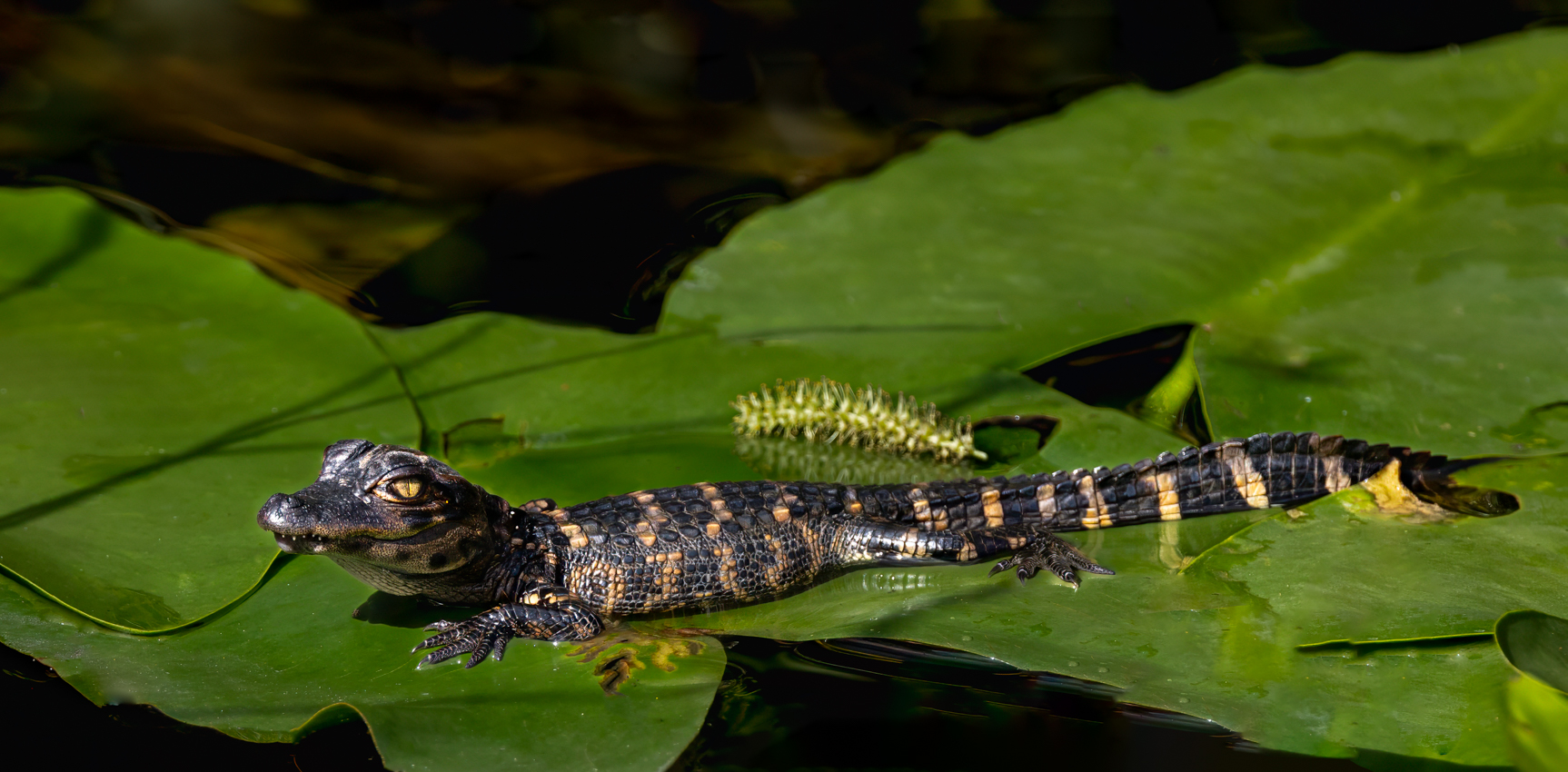
OMG! Everyone's comments were SO helpful this month! After reading everyone's comments and reworks, I realized my little alligator is not going to make a good nature image with that interfering lily pad in the foreground (it's actually a plant called spatterdock).
Onto Plan B, which was suggested by Jim Hagan. I stopped using PSA Nature Rules and went to PSA Color rules. This allowed me to remove the big front leaf, and clean up the little distractions. I'm not sure he can do well in Color, but I'll enter once and see.
I did darken everything (Thanks, Jim) and used James's settings idea. I did use Photo AI to sharpen, skipping NIK.
I wish I had been paying attention and photographed him from several angles and tried to get a better image of the baby alligator. Next time!
Any suggestions for a title or any additional improvements? Is my lily pad removal believable? |
Aug 19th |
 |
| 78 |
Aug 23 |
Reply |
Thanks, Jim!
In PSA Nature, I can't remove the brown leaf, any other suggestions to handle it? I can remove it as you did, and then enter in PSA Color. But I think it would struggle to do well in Color.
Thanks for the idea of dropping brightness and increasing the sharpness, both are improvements. |
Aug 8th |
| 78 |
Aug 23 |
Reply |
Great edits, Ed! Now those eyes really become the focus. Wonderful "trick", in my opinion. |
Aug 4th |
| 78 |
Aug 23 |
Reply |
Thanks, Ed! I'm glad you liked my little friend. Believe me, I looked for mom a long time before moving to get the image I wanted. Mostly alligators don't care for people and move away. We kayak in a lake full of gators and they completely ignore us. The exceptions are nightfall, mating season, people tormenting a gator, and protecting the kids. |
Aug 4th |
| 78 |
Aug 23 |
Reply |
Can you attach your version, Ed?
|
Aug 4th |
| 78 |
Aug 23 |
Reply |
Wow, love how the clapboard shows up in the house with your version, Ed. I would have just removed the car to keep the entire house, and parking lot (removing stripes), but I do like how the detail in the house shines now. |
Aug 4th |
| 78 |
Aug 23 |
Comment |
Ed, I think you did a wonderful job with this! Yes, the fisheye lens gave you a really unique perspective and worked beautifully with your horizontal and vertical walkways.
I would be tempted to take down the blue sky a bit, I find myself looking there, and not at my flowers. I might enrich my greens in front.
The lightest thing in the image are the super white clouds and the white walkways, is that were you want our attention going? I might darken the pathways just a bit.
This has me wanting to buy a fisheye! And the circular image is 100% way to go. |
Aug 3rd |
| 78 |
Aug 23 |
Comment |
Darn, I played with crops, trying to keep the image from being broken into several sections. The big pilings split the image and "stop" the boat, in my opinion. I tried cropping the far right piling out, and the boat doesn't have enough room to move into.
I think you did an admirable job working on an older pic and recovering it. Sadly, I think the boat is too small and the pilings too prominent for this to be an image I love. |
Aug 3rd |
| 78 |
Aug 23 |
Comment |
I'd love to hear about your gear and process steps to get this crisp and detail of a bee!
How is the bee holding still for multiple images, including his wings and antennae? Was he chilled?
Removing the pink behind him was a good call, however, you can see your "tracks". I find I have to really zoom in and use a tablet and pen to remove the pink. I wonder if maybe using the HSL to remove the pink area would work more easily?
For PSA competition, you couldn't remove the pink and enter it in PSA Nature. But you would be fine in PSA Color.
I'd love to play with a crop with the pink and with some pink petals. Do you have the bee closer to petals than in this image for me to play with it?
Can't wait to learn how to do this! You get such impressive image with focus stacking!
|
Aug 3rd |
| 78 |
Aug 23 |
Comment |
Ken, super catch of the unicyclist juggler! I think it could be a great image, but I have just a couple of things stopping me from giving you a "10".
The juggler seems way too bright given the background. Brightening him with a radial gradient with the way the light was might look more realistic (Scott Kelby trick). Another technique from Matt K is that in Photoshop you have this layer on top, and the original below. Add a mask to the top layer and use a soft, low opacity brush on the outline of the subject to blend the two. This gives a more believable look.
I am happy to dig up the video or Zoom with you to show the technique, if you are interested. It's even simpler than I described.
A second thing is that the subject is haloed or has an edge along his legs and arms. This is really common with lighten subject/darken background. There are several techniques to remove the white "cut-out" line around the subject, if you google it. I use the clone tool most often, on "Darken". Happy to show you that, too.
I think you caught a great moment, with a nice background scene, and this is a wonderful image. |
Aug 3rd |
| 78 |
Aug 23 |
Comment |
Sunil, I can't believe you got this from your original! You are the Monochrome Master!
Very lovely image! Great as is, but here are a couple of variations to consider. 1) remove the car--the building is timeless and the car is cropped and wrecks the prettiness. If you aren't going to compete with it, the new Photoshop Beta generative fill will remove that car in one easy swipe. Happy to Zoom with you and show you this, its fabulous for images not competing.
And I love your sky. Soft, some interest, and doesn't compete with the location. Beautiful!
2) Maybe remove the parking stripes? They are as bright as the Christmas lights, and don't add to the timelessness of the scene.
3). I love the Christmas tree in the top right window. I didn't catch it until my second or third look. Perhaps add a tiny bit of exposure or contrast or a radial filter to it to make it pop?
4). On the left side down the street, there are some bright street lights just on the edge of the image. I don't know if you can crop them out or just remove them. And you could remove the tall house on the left side of the image, also, if you wanted George's to have more space. |
Aug 3rd |
| 78 |
Aug 23 |
Comment |
Jim, wow, Topaz Sharpen did a nice job recovering your image!
Good job cleaning up the sensor dust or dust on your lens that is thick in your original.
I prefer the richer colors in your original. The sky is a richer blue and the rocks look less bright.
I am not a huge fan of the folks all in a cluster and most in odd positions with their back to us. If you are entering this in PSA Travel, you'd need to keep the group. If this is a PSA Color image, you could remove all but one. This might show the vastness and the aloneness of the park, particularly if the image isn't quite so bright.
Great recovery from an "oops" taking the image! Love Monument Valley! It was fun to learn about John Ford, I didn't know any of the film making here.
|
Aug 3rd |
9 comments - 12 replies for Group 78
|
9 comments - 12 replies Total
|


